Once More Around the Sun, Rick Geary!

« Hey — if you’re looking for that curly machine, I saw some beasts run off with it. »

Missouri native Rick Geary, born 72 years ago today, on February 25, 1946 (in Kansas City, which isn’t in Kansas, despite its name) is in a classe à part: a true iconoclast, he’s quietly, steadfastly carved out for himself (and his fans) a varied and consistently strong œuvre, seemingly free from petty compromise.

GearySelf85A
A 1985 self-portrait.

He first gained notice in the mid-70s through his fanciful contributions to National Lampoon and Heavy Metal, and just kept up the pace from there. These days, he mostly concentrates on his true crime graphic novels series, published by NBM. One gets a sense of a man who works in comics because he’s passionate about the possibilities the form offers. A 1994 recipient of the National Cartoonist Society’s Magazine and Book Illustration Award, he certainly doesn’t need to work in the comics industry.

GearyPetMiraclesA
This charming one-pager saw print in the anthology Animal Confidential (May 1992, Dark Horse.)

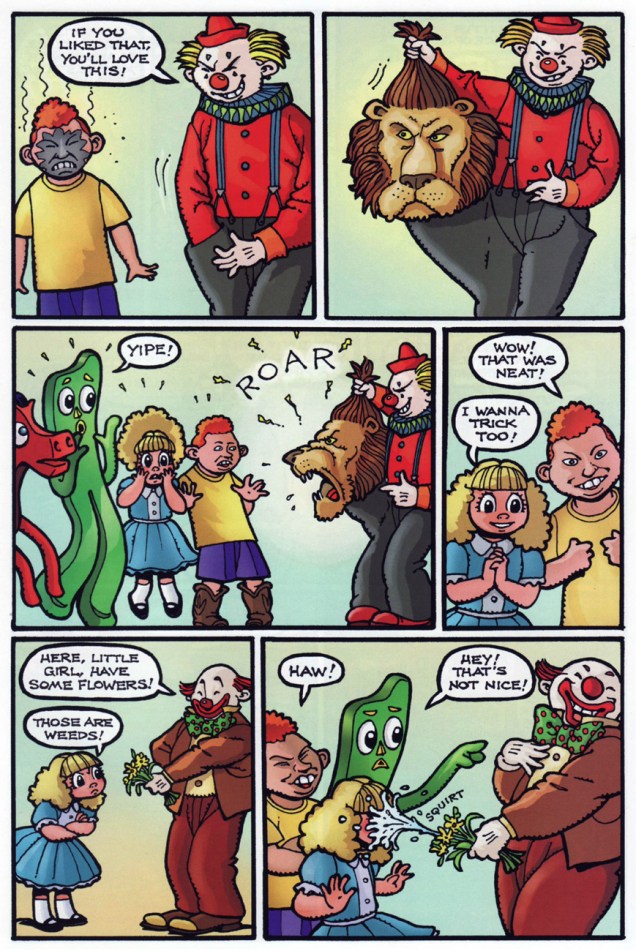
He’s collaborated with fellow oddball genius Bob Burden, of Flaming Carrot fame, a dream pairing that manages to surpass the lofty expectations it implies. Their take on Art Clokey‘s legendary claymation characters Gumby and Pokey manages to be true to its source and to espouse both Burden and Geary’s respective slants.

Here’s a sequence from Gumby no. 1 (July 2006, Wildcard Ink.) Story by Burden, art by Geary, and let’s not forget the contribution of hue ace Steve Oliff. When it comes to Gumby comics, however, mind your step: don’t settle for anything less than Burden (whether with Arthur Adams or Rick Geary). A recent revival fumbles the childlike mood of infinite possibility and mires itself in mere childishness instead.
GearyGumby1AGearyGumby2AThe Exploits of the Junior Carrot Patrol (2 issues, 1989-1990) was a solo Geary endeavour, but  « based upon characters and concepts created by Bob Burden ». Pictured here is #2. From left to right: Dusty, Ethel and Chuck.

JuniorCarrot2A

GearyStampA
Perhaps the ultimate bonafide as a Geary-head: I am the proud possessor of a rubber stamp designed by the great man himself. Furthermore, I have it on good authority that one of our regular readers proudly wields a genuine Geary rubber stamp of his own, albeit a different one. For this particular print, I took advantage of the vegetable world’s finest provider of ink: a slice of beet.

Happy birthday, dear Mr. Geary!

– RG

Visionary Meets Mundane: Richard Powers at Western Publishing

« Are all your projects this dangerous, Dr. Solar? »

Dateline: 1962. Printer-packager Western Publishing had just dealt its biggest client, Dell Comics, its slow death sentence (by mutual agreement, it is diplomatically claimed), though Dell should have seen it coming: for decades, Western Publishing Co. had « secured the rights, created the comics, printed them and shipped them out for Dell. Dell acted as the publisher and distributor and did the billing and paid Western for its creatively manufactured products*. » In 1962, Western cut out the middleman and launched its Gold Key imprint (1962-1984.)

Enter, briefly, revolutionary illustrator Richard M. Powers (1921-1996), who successfully wed representational and abstract art for his paperback covers of the 50s and 60s, bringing science-fiction visuals an unprecedented visual maturity. Don’t merely take my word for it: treat your peepers to a gander at his work. You may well find that you know it already.

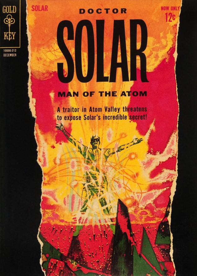
What with a Cold War on, in the early 60s, atom-powered heroes were understandably in vogue. Charlton even had two: after Al Fago‘s 1955 creation Atomic Rabbit, came Joe Gill & Steve Ditko‘s Captain Atom. In 1962, the newly-founded Gold Key threw their hat into the nuclear furnace with the advent of Doctor Solar, Man of the Atom. He was created by writer Paul S. Newman and editor Matt Murphy.

PowersSolar1A
Doctor Solar, Man of the Atom no. 1 (October, 1962)
PowersSolar2A
Doctor Solar, Man of the Atom no. 2 (December, 1962)

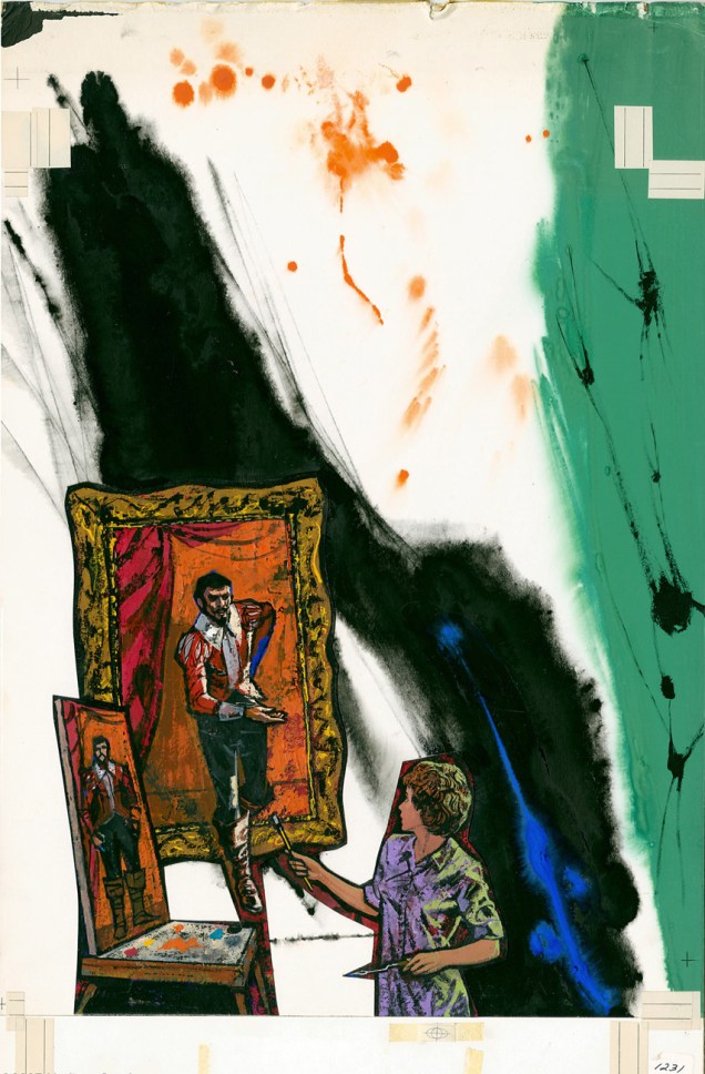
So far so good, right? And then… we may never know exactly what transpired, but I assume that some art director at Western Publishing chose to second-guess Mr. Powers… smothering the tonal and compositional balance of his painting (« can’t… bear… negative space! »), and likely depriving the outfit of Powers’ further services. He was at his peak, was being offered assignments than he could hope to fulfill, assignments surely more lucrative and friction-free. He wisely scooted along.

The printed version:

KarloffThriller2A
Boris Karloff Thriller no. 2 (January, 1963.) It was decades before I realized that this ho-hum comic book cover was the work of Richard Powers. In truth, the scales only fell from my eyes when I caught a peek of the original art. The printed version is so tame, so drained of its power(s) that the issue didn’t even appear in Jane Frank’s checklist of book covers in her fine The Art of Richard Powers (Paper Tiger, 2001).
PowersThriller2A
See? Now *that* is clearly Powers. « Just slap a 60% cyan overlay over the dang thing, Gertrude. It’s too effin’ artsy! »

And the tale might have ended there, but here’s the curveball: in the mid-to-late Seventies, Powers provided the fading publisher with a pair of gorgeous, but seldom-seen cover paintings.

Starstream1PowersA
A lovely Rorschach blot of a cover for the inaugural issue of Starstream, issued in 1976 under Western’s Whitman imprint. Starstream‘s four issue-run offered sober adaptations of smartly-chosen science-fiction short stories by the exalted likes of Theodore Sturgeon, Robert Bloch, A.E. Van Vogt, Robert Silverberg, Isaac Asimov, Larry Niven, Jack Williamson, et al.
UFOOuterSpace17A
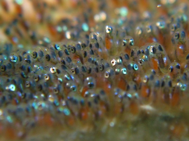
Let’s hear it for unearthly-looking extraterrestrials. With their translucent skin, these guys remind me of unhatched fish. The fifth and final cover created by Richard M. Powers, this is UFO & Outer Space no. 17 (continued from UFO Flying Saucers), published in September, 1978.

See what I mean?

Anemone_Fish_Eggs

If memory serves, my own Powers epiphany took place in the autumn of 1982, in Lennoxville, a small college town in the Eastern Townships of Québec. There was this little bookstore… and its fine selection of 60s horror and science-fiction paperbacks, priced in the 35-to-50-cents range. The kind of place book lovers dream about stumbling upon, and wake up dismayed to find themselves in the real world… empty-handed.

My favourite (inside and out) of the lot I picked up that day? Fritz Leiber’s (despite the name being misspelled on the cover) Night’s Black Agents (June 1961, Ballantine Books). If you’ve had a similar thrill of discovery with Powers’ art, please do tell us about it!

NBALeiber

-RG

*quoted from an interview with Gold Key’s Matt Murphy.

Gahan Paints What He Sees!

Another day, another birthday, it would seem. Well, I feel this one’s of particular importance… Gahan Wilson, born February 18, 1930, turns 88 today. As you may know, many an artist burns bright and burns fast, enjoying a peak of a handful of years followed by a settling into habit or mediocrity. That’s not our Mr. Wilson, who’s been prolific, reliable and versatile for over a half-century. That makes him, I suppose, easy to take for granted. Let’s not, shall we?

Most visibly, he’s built up a splendiferous body of work at Playboy, which was collected in exemplary fashion (2010), for your convenience, by the fine folks at Fantagraphics (in case you don’t have room for the entire magazines.) With the possible exception of Shel Silverstein, Gahan was perhaps the only cartoonist Hugh Hefner didn’t habitually encourage to throw in some buxom females.

GahanGeriatricHeroA
« Well, it certainly is nice to know someone’s looking out for us old folks! » (Playboy, November, 1987.)

He’s also been a regular contributor to The Magazine of Fantasy & Science Fiction since 1964, again gathered by the reprobates at Fantagraphics, this time in a tome entitled « Gahan Wilson’s Out There » (2016). Significantly, the book includes Wilson’s prose works for the magazine, gems of concision and dark wit.

GahanPlugA

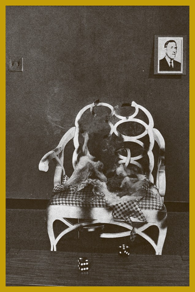
Which brings us to another facet of Gahan’s œuvre: his writing. I greatly enjoyed his regular film column in Twilight Zone magazine (1981-89). For the publication’s August, 1985 issue, he provided, in addition to his regular contribution, an eye-catching (watch out!) cover illustration and a feature article « I Hear You Callin’ Cthulhu », a review of the role-playing game Call of Cthulhu. « Hot on the trail of Dagon, the shoggoths, and other Lovecraftian horrors, the noted cartoonist (and intrepid TZ columnist) finds himself drawn into a labyrinth of secret caverns, sinister intruders, tentacled monstrosities — and a terrifying thing called the Insanity Table. »

GahanTwilightZone85A

GahanDice1A
« Our intrepid gamesman gathers his courage… »
GahanDice2A
« … tests his luck against the dark gods… »
GahanDice3A
« … reads his fate in the faces of the dice… »
GahanDice4A
« … and when the smoke clears, is seen no more. »

Happy Birthday, and thanks for all the tentacles, Mr. Wilson!

– RG
“Has It Got a Message?”

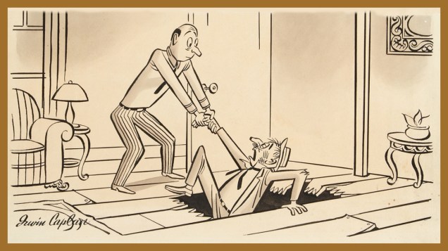
Here’s a merrily libidinous one (who’s chasing whom, really?) from Irwin Caplan (1919-2007), originally published in Liberty Magazine in 1946.

MessageA

From the 1940 to the early 1960s, Caplan’s work appeared regularly in all the big ones: Collier’s, Liberty, The Saturday Evening Post (with his strip “Famous Last Words”), Parade, Life, the Sunday supplement This Week, and so forth. For my money, his early work is his finest, boasting a crisper line and more distinctive in style and substance.

Caplan was also a successful fine art painter, art director, advertising illustrator and graphic designer… which may have somewhat watered down his legacy. Nevertheless, what matters is the strength of his œuvre, and the fact that he had a varied and rewarding career.

Here’s an obituary from the Seattle Times (he was born in Washington and remained a lifelong resident of The Evergreen State) that provides a fuller account of this jovial man’s life and times.

As a bonus, a Caplan cartoon of undetermined vintage and publication history… but a timeless one, you’ll surely agree.

CaplanRentIncrease
« I was saying, Sir, in view of recent improvements, I am raising your rent. »

– RG
Bob White, Forgotten Archie Artist

Of course, you can take that ‘forgotten artist’ notion with a grain of salt: most Archie artists aren’t forgotten, because they were rarely acknowledged in the first place. There are cases such as that of Scrooge McDuck creator Carl Barks, aka the Good Duck Artist, whose identity latterly became known through the efforts of a handful of devoted fans… but such fortuitous events are rare as Gladstone Gander’s off days.

No such luck for Robert “Bob” White (1928-2005), who got the short end of the stick despite being the Archie line’s signature artist during its peak period* (pretty squarely 1959 to 1965) and crafting uncluttered, expertly-designed covers and stories. Of course, these years coincide with most of the classic Archie bullpen hitting its stride, bookmarked at one end by the ascent of White (who’d arrived at Archie around 1954, but details are scant) and at the other by Samm Schwartz‘s departure for greener, but sadly ephemeral (1965-69) pastures, an art director post with Tower Comics.

According to The Comics Reporter, writing on the occasion of White’s passing, « He was let go by Archie after working on Tippy Teen for Tower, at which point he moved into other lines of work, including a stint as an artist at United Artists. »

Archie’s illiberal response to a guy simply, and wisely, trying to avoid putting all his eggs in one basket was typical of the publisher, and of the reactionary comics industry in general, but it’s to White’s credit that, unlike Dan DeCarlo and Samm Schwartz (who at least made a break for it), he didn’t just fold, kiss their ring and take their abuse. Who’s to say? Perhaps that principled departure really stuck in their craw.

There are simply too many outstanding White covers to feature in one go; I suppose I’ll have to return to the well a couple of times. Still, these ought to give you a sense of the man’s style.

LWA5A
Before Afterlife With Archie, there was… Life With Archie, which « was a comic book published from 1958 to 1991. It featured Archie Andrews in adventure stories that were more dramatic than the standard Archie tales. » This is Life With Archie no. 5 (November, 1960.)
Madhouse15A
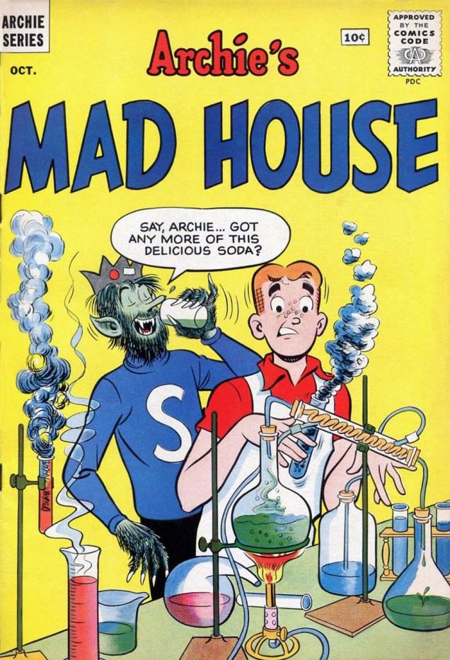
« As I looked there came, I thought a change – he seemed to swell – his face became suddenly black and the features seemed to melt and alter… » ― Robert Louis Stevenson, The Strange Case of Dr. Jekyll and Mr. Hyde
‘Delicious’ is a good start, but what about the side effects? This is Archie’s Mad House no. 15 (Oct. 1961).
Laugh129A
Hey, the Macabre Trio’s in town! This is Laugh no. 129 (December 1961). Cool ghoul Bob White is truly in his element here. Also, do bear in mind that the word “Horror” was banned by the Comics Code Authority, yet they approved this cover. Asleep at the switch!
LWA12A
This is Life With Archie no. 12 (January, 1962.) Correctly acknowledging the facts of evolution? Obviously, Al Hartley hadn’t made the scene yet.
Pep153A
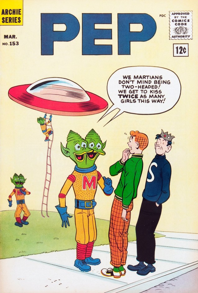
I’m especially fond of the period when you get a sense from the covers (chiefly those produced by White and Schwartz) that Riverdale was built over the Hellmouth or an ancient burial ground, as monsters and aliens routinely ask for directions or take Betty out for a soda. This is Pep no. 153 (March, 1962).
LWA16A
Ah, there’s some of that “more dramatic” stuff. Life With Archie no. 16 (September, 1962.)
Madhouse27A
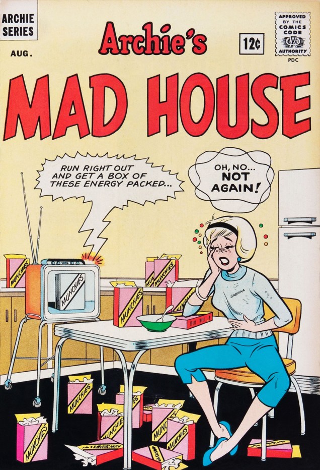
« So don’t be persistent / Please keep your distance / You know my resistance is low »
It would appear that Madison Avenue’s brand of wizardry is more than a match for Sabrina’s. This is Archie’s Mad House no. 27 (August, 1963).

– RG

*I’m in complete agreement with cartoonist-connaisseur Gregory Gallant, aka Seth, when he writes, in his introduction to John Stanley‘s Thirteen ‘Going on Eighteen’ (Drawn & Quarterly, 2009… where’s volume 2 at?) that « I like Archie comics quite a bit and own hundreds of issues of Archie and its various spin off titles. I can even tell you which years are the good years (1959 to ’65, incidentally) »

Spending Some Quality Time With Barbara Shermund’s ‘New Woman’

Although it’s tempting (but lazy) to assume so, men didn’t *altogether* corner the risqué cartoon niche.

It would be quite an injustice to count out the magnificent Barbara Shermund (1899-1978), prolific contributor to The New Yorker (including eight covers) and Esquire magazines, and so much more.

Far too little is known about this pioneering artist, but here’s an insightful piece aiming to rectify the situation, at least a little, written by Caitlin McGurk:

https://library.osu.edu/blogs/cartoons/2012/03/27/womens-history-month-barbara-shermund-1899-1978/

ShermundVersatile
Nothing new under the sun! Frankly, that situation hasn’t gained a wrinkle since this cartoon’s appearance in The New Yorker‘s July 21, 1928 edition.
NewYorker1935A
One of Ms. Shermund’s aforementioned New Yorker covers, from the June 29, 1935 edition.
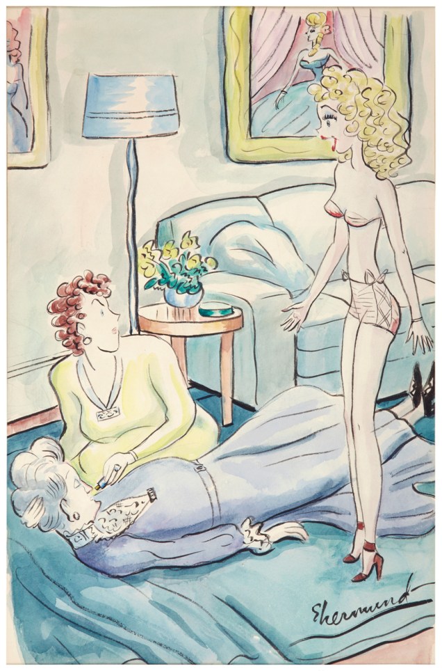
ShermundGrannyFaintA
« All I said was, ‘Granny, how do you like my new bathing suit?’ » Undated piece in ink and watercolour.
ShermundLostA
« She’s lost! » Esquire, 1944. Ink and watercolour.
ShermundTunnelA
« Mr. Dillon, I’d like to ask your daughter’s hand in marriage. » (1953, ink and watercolour.)
ShermundApeA
« Who was that fellow I saw you with at Ciro’s last nite? » (Cheering Section, 1955. Ink and watercolour.)
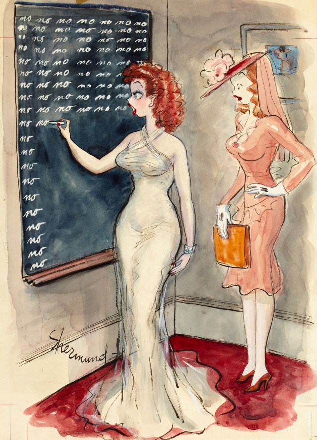
BarbShermundNoA
« Mother always makes me write it five hundred times before I go out with Mr. Parker » Esquire, publication date unknown, ink and watercolour.
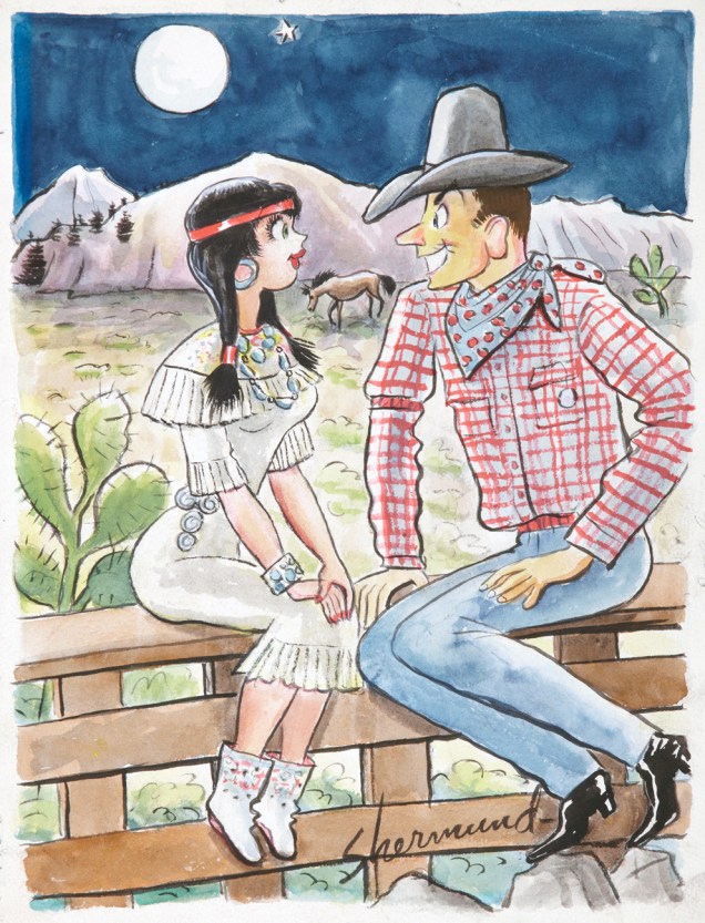
ShermundCowboyIndianA
« Let’s play cowboy and indian! » (Cheering Section, 1959. Ink and watercolour.)

I can’t help but be reminded, by that final piece, of Jack Cole‘s rather more trenchant take on a similar power imbalance, published a year earlier.

ColeUncleSamMaidenA
« Well, there’s history repeating itself. » (Jack Cole, from Playboy, January, 1958.)

A postscript: in March, 2022, Ms. Shermund was the subject of an article in the New York Times’ ‘Overlooked No More’ series, comprising belated obituaries for notable folks whose departure flew under the radar, so to speak. In this case, we learned that:

« Shermund lived out her last years drawing at her home in Sea Bright, N.J., and swimming at a beach nearby. She died on Sept. 9, 1978, at a nursing home in Middletown, N.J.

In 2011, a niece, Amanda Gormley, decided to research her family’s history and was surprised to find that Shermund’s ashes had been left unclaimed in a New Jersey funeral home since 1978.

In May 2019, Gormley raised money through a GoFundMe campaign and, with the contributions of many artists and cartoonists, saw to it that Shermund’s ashes were buried alongside her mother’s grave in San Francisco. »

– RG

From off the streets of Cleveland comes…

« What kind of people are these?
Where do they come from,
what do they do? What’s in a name? »

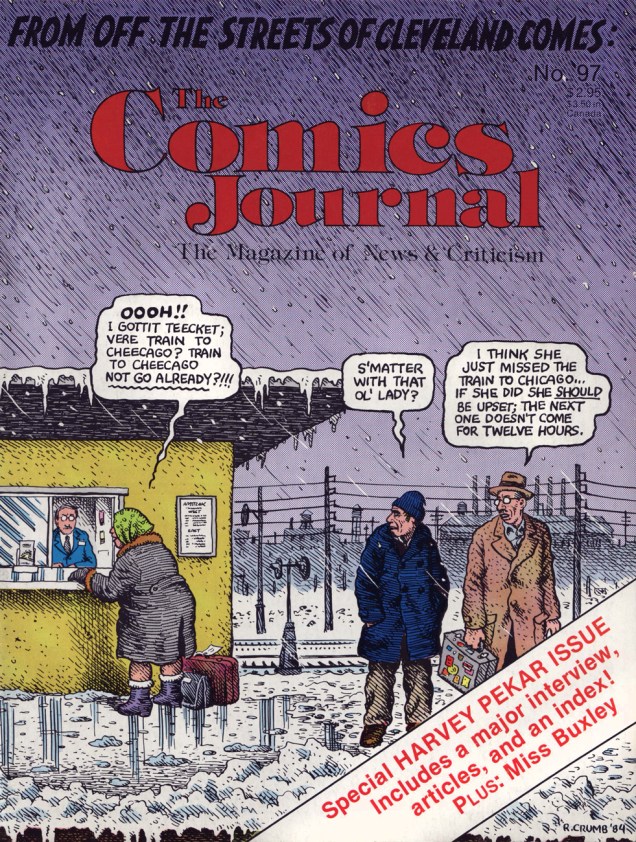
Coming out of nowhere (well, “From off the streets of Cleveland“, as it happens) in 1976, Harvey Pekar’s American Splendor was one of comics’ truest and most bracing alternatives. It wasn’t part of the Underground Comix movement, despite the participation of Pekar’s old friend and fellow record collector Robert Crumb, and it wasn’t like anything pushed out by the mainstream comics industry.

JournalPekarA
This is The Comics Journal no. 97 (April, 1985). Cover by Crumb and Pekar.

Crumb’s introduction to Doubleday/Dolphin’s 1986 anthology of early AS strips describes Pekar’s appeal better than anyone else is likely to:

« Yeah, Harvey is an ego-maniac; a classic case… a driven, compulsive, mad Jew… it’s something to see. But how else could he have gotten all those comics published, with almost no money; in total isolation from any comic-publishing ‘scene’ such as exists here in California, or in New York; constantly brow-beating artists to illustrate his stories; handling the distribution himself… only an ego-maniac would persist in the face of such odds. »

« The subject matter of these stories is so staggeringly mundane, it verges on the exotic! It is very disorienting at first, but after awhile you get with it. Myself, I love it… Pekar has proven once and for all that even the most seemingly dreary and monotonous of lives is filled with poignancy and heroic struggle. All it takes is someone with an eye to see, an ear to hear, and a demented, desperate Jewish mind to get it down on paper… there is drama in the most ordinary and routine of days, but it’s a subtle thing that gets lost in the shuffle… our personal struggles seem dull and drab compared with the thrilling, suspense-filled, action-packed lives of the characters who are pushed on us all the time in movies, tv shows, adventure novels and… those *other* comicbooks.

What Pekar does is certainly new to the comicbook medium. There’s never been anything even approaching this kind of stark realism. It’s hard enough to find it in literature, impossible in the movies and tv. It takes chutspah to tell it exactly the way it happened, with no adornment, no great wrap-up, no bizarre twist, nothing. Pekar’s genius is that he pulls this off, and does it with humor, pathos, all the drama you could ever want… and in a comic book yet! »

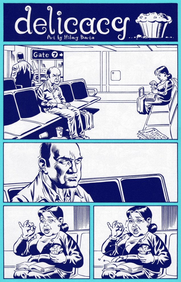
And here’s an atypical example of Mr. Pekar’s storytelling art, a rare but eloquent pantomime vignette. It originally saw print in DC Comics’ run of American Splendor comic books (no. 1, Nov. 2006, published under the Vertigo imprint and edited by Jonathan Vankin.) The symbiosis at play here between writer and artist makes ‘Delicacy’ my very favourite story by Hilary Barta, who somehow never gets matched with a script worthy of his tremendous talent, even when he’s working with Alan Moore (Moore can be very funny, but superhero parodies, even his, seldom are… and Splash Brannigan wasn’t exactly side-splitting). This is a wonderful oddity, one of two times that Barta and Pekar collaborated. Bon appétit!

PekarDaVinci1APekarDaVinci2A-RG

Blink-and-you-miss-it: Terrance Lindall, Warren cover artiste

« How do I get myself in these situations? »

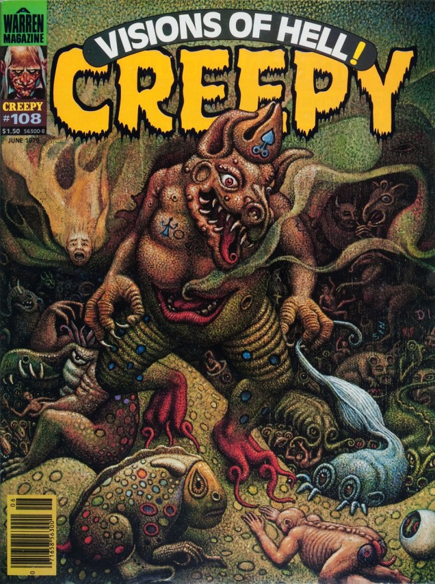
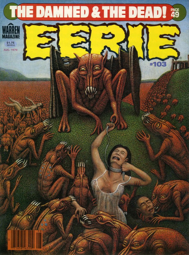
As the close of the 1970s neared, James Warren‘s magazine empire was inexorably crumbling. I like to imagine that it was decided, in desperation, that a little fiddling was in order… just a smidgen. Some enlightened soul (my pick is new editor Chris Adames) got the notion to bring on board Terrance Lindall (1944-) to produce some covers for the magazines. He painted a mere five, but made each one memorable, to say the least, evoking justified comparisons to Matt Fox, Lee Brown Coye, sans oublier the venerable Hiëronymus Bosch.

Well, then, let us bask in the comforting, bucolic visions of Terry Lindall at Warren, in their order of publication. Makes you want to pack a picnic lunch and go for a leisurely ramble through the countryside with your faithful Hound of Tindalos.

Creepy108A
Creepy no. 108 (June, 1979.)
Eerie103A
Eerie no. 103 (August, 1979.)
Creepy116A
Creepy no. 116 (March, 1980.)
Vampi86A
What do you know? Terrance Lindall actually manages to make perennial fanboy wankbait Vampi look downright classy. This is Vampirella no. 86 (April, 1980.)
Creepy127A
And all too soon, it’s over, with Creepy no. 127 (May, 1981.)

Oh, how Creepy’s long-time readers must have wailed and moaned at these singular, quease-inducing mise-en-scènes! “Bring back Boris Vallejo!”

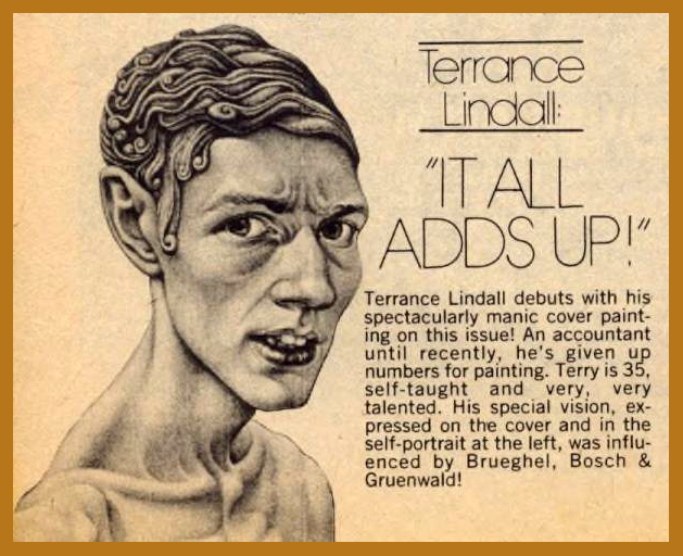
Nowadays, Lindall earns his keep as co-director and chief administrator of the Williamsburg Art and Historical Center in Brooklyn, New York. Doesn’t he just perfectly look the part?

Terrance_Lindall

LindallBio
The new kid’s mini-bio, as it appeared in Creepy 108 (June, 1979).

If you’re craving more Lindall visions, who am I to discourage you? Slide on over to http://www.escapeintolife.com/artist-watch/terrance-lindall/

-RG

Steve Skeates’ “… and the Dog Howls Through the Night!” (1974)

« Who’d ever believe a story like that? »

On this fine day, we pay tribute to shifty scribe Chester P. Hazel (who sometimes goes by the unlikely nom de plume of Steve Skeates). It is whispered that Stephen, along with his nefarious twin Warren Savin, first invaded this plane of existence on January 29, 1943. That would make him/them/it seventy-five earthly rotations old, should these windblown tattles hold any credence.

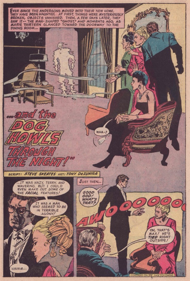
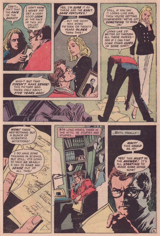
Happily, in this case, picking out a Skeates favourite to share was no ordeal: I’d been meaning for some time to shine a light on one of his neglected gems, one that salt-rubbingly ran without proper attribution in The Phantom Stranger no. 34 (Dec. 1974-Jan. 1975, DC Comics.)

The cases of Dr. Terrance Thirteen, ghost breaker, must have been easier to write back in the 1950’s, when DC Comics’ default setting in its mystery titles was to explain away the supernatural element before the curtain call. DC’s resident skeptic first shared his insights in Star Spangled Comics, his feature lasting from issue 122 (November, 1951) to issue 130 (July, 1952). He then moved to The House of Mystery for a handful of appearances, then faded away. He returned to action, along with his also long-dormant colleague  and foil The Phantom Stranger, in 1969’s Showcase no. 80. In the Supernatural Seventies, all poor Dr. Thirteen could do is vainly and stubbornly play the cards of reason and logic against a house deck stacked to inevitably favour the uncanny and the unreal. He was doomed to be a comic book version of The X-Files’ Dana Scully, Fritz Leiber‘s Norman Saylor (Conjure Wife, 1943) or Night of the Demon‘s Dr. John Holden, all skeptics coming off as hopelessly obdurate and clueless in light of the “facts”.

Sounds like today’s so-called post-fact world… in which we need true skeptics (as opposed to deniers) and cool, rational minds more than ever.

Anyway, it wasn’t the first time wily Skeates had faced such a storytelling impasse: he’d had to ring the changes on pacifist character Dove (of Steve Ditko’s eternally squabbling Hawk & Dove) within a universe of hard-slugging super vigilantes.

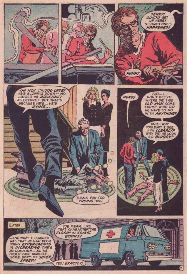
Dr. Thirteen bounced around various DC titles in the early-to-mid 70s. This is the series’ last bow in the back pages of The Phantom Stranger, and ironically its finest hour, alongside the penultimate entry, The Ghosts on the Glasses, which ran in Adventure Comics no. 428 (August, 1973.) In both cases, the inspired artwork is that of Filipino master Tony DeZuñiga (1932 – 2012), who was clearly in his element.

DrThirteen1ADrThirteen2ADrThirteen3ADrThirteen4ADrThirteen5ADrThirteen6ADrThirteen7ADrThirteen8A

A character likens the dead scientist’s ill-fated velocity experiments to comic book character The Flash… but it’s a cinch that what the impish* Mr. Skeates really had in mind was Virgil “Guy” Gilbert, aka Lightning, whose début, The Deadly Dust! he had scripted back in 1965 (T.H.U.N.D.E.R. Agents no. 4, April 1966). Here’s a relevant excerpt, featuring art by Mike Sekowsky and Frank Giacoia.

LightningA

In closing, a biographical blurb from DC’s T.H.U.N.D.E.R. Agents Archives, circa 2002: « A native and longtime resident of the Empire State, Steve Skeates began his work in comics as an assistant editor at Marvel Comics in 1965 – a job which he quickly abandoned in favor of writing comics as a full-time freelancer. Over the next twenty years he did work for nearly every major comics publisher, including DC, Marvel, Charlton, Tower, Warren, and Gold Key. Since leaving mainstream comics in the mid-1980s, he has worked as a reporter, bartender, and Zamboni operator, as well as publishing his own comics titles, which he continues to do from his home base in Fairport, New York. »

Happy birthday, Mr. Skeates, and thanks for everything!

-RG

*I mean to refer to Mr. Skeates’ undisputed status as King of the unofficial inter-company crossover. Naughty!

Buon compleanno, Gianni De Luca!

« Though this be madness, yet there is method in’t. »

On the ninety-first anniversary of his birth, we take the opportunity to salute fumetti gran maestro Gianni De Luca (b. January 25, 1927; d. June 6, 1991)… and to share some of the striking images he crafted. In comics, the term « innovative » has been applied far too liberally, all too often in ignorance. In the case of of Mr. De Luca, no hyperbole is involved, I assure you.

I first came upon his work in the mid-70s, through my parent-sponsored subscription to the québécois catholic youth magazine Vidéo-Presse (1971-1995), which was kind of didactic, I suppose, but still quite fun. The publisher had licensed much of its comics content from Italy, and it was definitely high-toned stuff, such as adaptations of Jules Verne novels. I recall « L’Île mystérieuse » being among them. Accustomed as I was to the madcap and hyperkinetic tone of the dominant Franco-Belgian and American schools, the Verne stuff, while clearly well-executed, seemed a bit languid and wan.

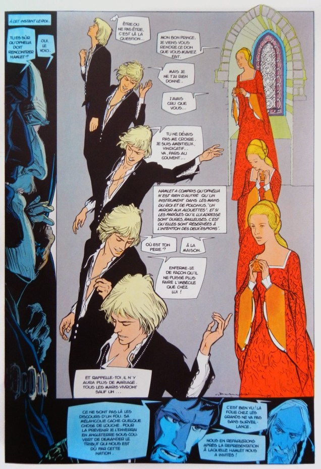
However, this feature was followed by, as fate would have it, the bane of any schoolboy*, Shakespeare adaptations. But wait… these were MIND-BLOWING. Decades later, I became fast friends with another cartoonist roughly my age, and he’d had the very same epiphany with De Luca’s Hamlet. Other than that, I’ve never really met anyone familiar with the work. Even locating a copy was a bit of an ordeal, but I managed to snag, a few years ago, a handsome volume gathering Hamlet and La tempête (The Tempest), published by Les Humanoïdes Associés in 1980.

Hamlet19A
Hamlet, page eighteen. Adaptation by Barbara Graille and lettering by Roberto Roquemartine. Colours presumably by De Luca himself, as the credits are mute on that point.
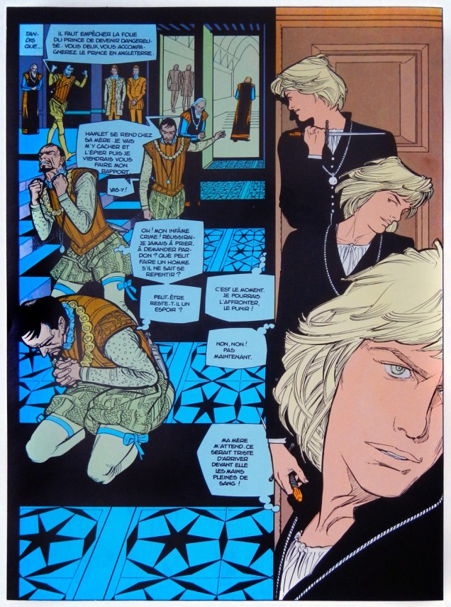
Hamlet22A
Hamlet, page twenty-three.
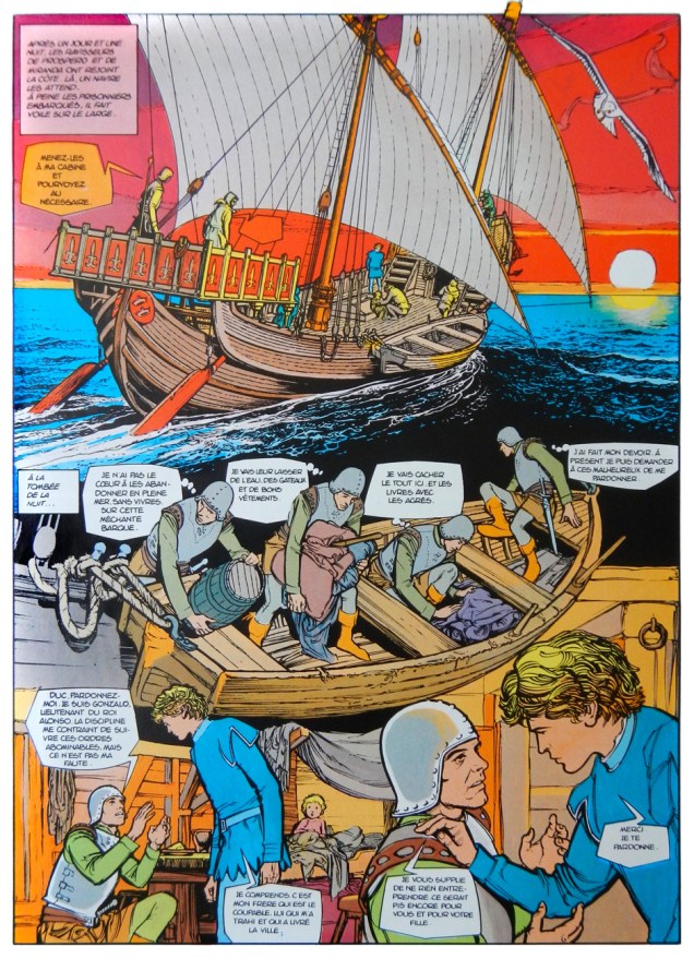
Tempête57A
La tempête, page five.
Tempête64A
La tempête, page twelve.

I don’t believe there’s any De Luca out there in the English language… save for one happy exception: UK publisher Running PressThe Mammoth Book of Crime Comics, discerningly edited by critic Paul Gravett**, contains « Strada », a superior entry in writer Gian Luigi Gonano and De Luca’s ‘Il Commissario Spada‘ series (1970-1982). « The series was groundbreaking in many ways, since it introduced subjects like violence, organized crime, satanic sects, terrorists and murderers to the pages of a Catholic magazine for young readers, that was at the time mainly distributed in parishes. »

*To be fair, we never studied Shakespeare in school.

**Speaking of Mr. Gravett, he happened to write an illuminating essay on De Luca’s Hamlet: http://www.paulgravett.com/articles/article/gianni_de_luca_hamlet

-RG