« But Mireault was, here as ever, a little too raw, a little too honest, a little too vulnerable for what comics might expect. » — Zach Rabiroff
This is as sombre as I’m willing to go. Hallowe’en, to me, is more about a seasonal mood and a welcoming sort of darkness… than serial killers and other aspects of people’s inhumanity to one another. And yet…
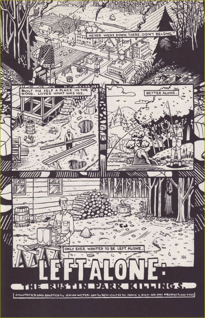
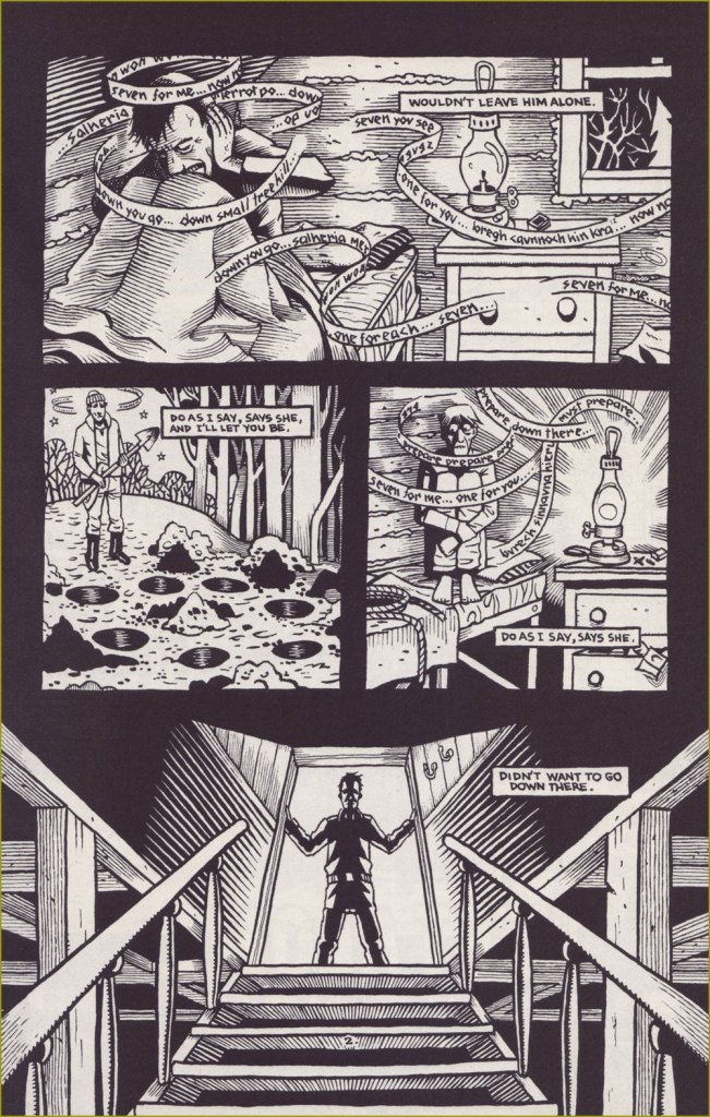
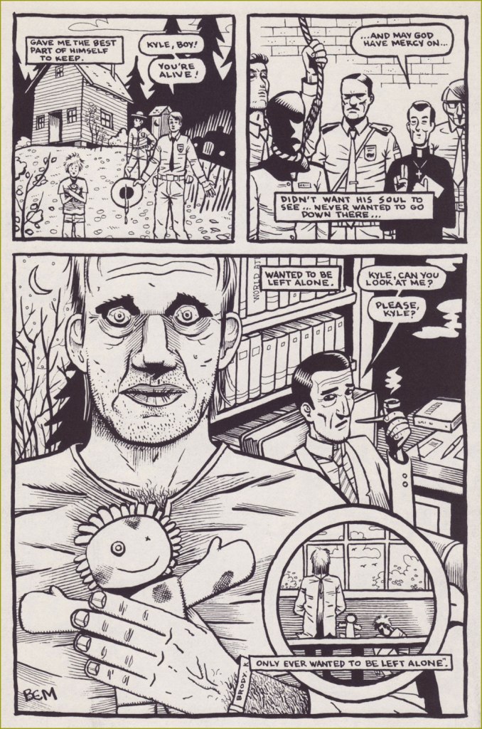
This is a testament to the late Bernie Mireault’s compositional virtuosity and mastery of the syntax of comics… but it’s also evidence of how deeply he could look into the abyss.
It’s obviously not a joyous read, but Zach Rabiroff’s Remembering Bernie Mireault: 1961-2024, recently posted on The Comics Journal’s website, is an exemplary tribute to a great overlooked talent.
Last month — and some twenty-five posts ago — I wrote about Bernie, showcasing a pair of stories poles apart from today’s offering… but they’re all Bernie’s. He was that solid a stylist.
Left Alone: The Rustin Park Killings, written by Jennifer Van Meter and illustrated by Mireault, appeared in The Blair Witch Project no. 1 (Oni Press, July 1999).
You see, there were these two competing comics publishers…
… which is to say DC Thomson and the dystopian-monikered International Publishing Corporation (IPC); between them, they dominated the UK comics market. By the late 1970s, said market had surpassed circulation of ten million copies, its rosiest sales outlook ever.
To be perfectly cynical, the rival publishers’ editorial vision was mostly to copy one another’s successes. Same mouldy old dough.
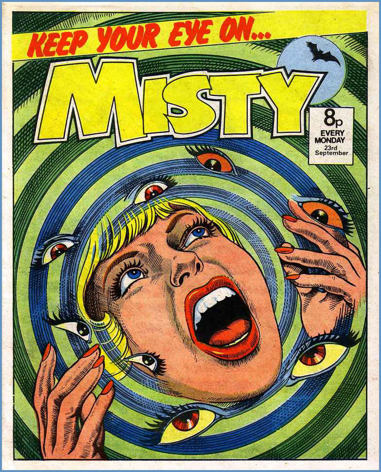
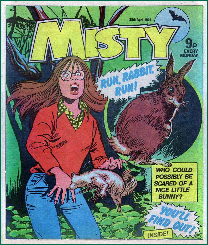
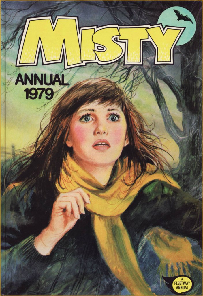
In 1977, « Freelance writer Pat Mills had an idea for a girls’ horror comic* that would use his 2000 AD approach — longer stories, bigger visuals, with adaptations of stories from big name writers… Misty was about to be born. »
This, of course, is the Stan Lee version of an ‘idea’, for what IPC was commissioning, and Mills was providing, was a copy of DC Thomson’s existing Spellbound. However, since Mills was asking for a piece of the pie, he was sacked before the new magazine’s launch, and replaced with a perhaps more pliable sancho.
In terms of timing, Spellbound happened to cease publication (after 69 issues) just a few weeks before its clone’s launch. For its part, Misty lasted 101 issues before being folded** into the more reliably successful Tammy; a common practice in England for underperforming magazines that still have a following. After all, Spellbound, upon its own cancellation, had been whisked into Debbie.
This is Misty No. 22 (July 1st 1978, IPC). This one I can credit: Jordi Badía Romero (1958-1984).This is Misty No. 28 (Aug. 12 1978, IPC).This is Misty No. 34 (Sept. 23 1978, IPC).This is Misty No. 64 (Apr. 28 1979, IPC).This is Misty No. 94 (Nov. 24 1979, IPC).
And here’s a short story.
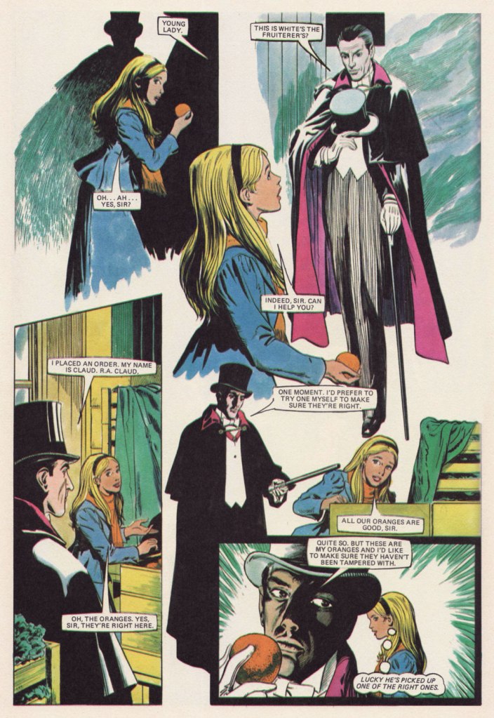
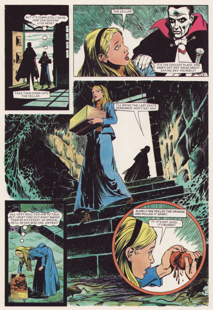
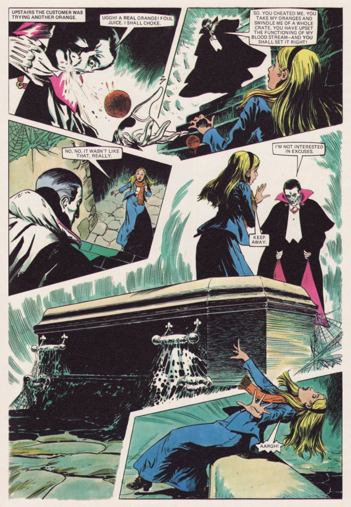
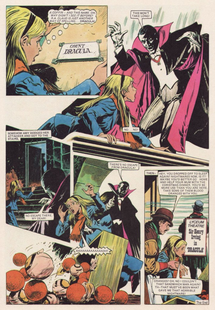
Dr. Julia Round recalls, in her foreword to Misty: 45 Years of Fear (2023, Rebellion): « Misty is perhaps best remembered for its one-shot stories, which were vicious cautionary tales in which characters would be brutally punished for a mistake or misdeed. There was a strong sense of dramatic irony in these stories — wishes backfire, magical items that are gained dishonestly turn on the owner, and unkindness to animals or nature sees girls transformed into bugs or plants. » This particular example is gentler, obviously.
Blood Orange was published in Misty Annual 1979. No credits whatsoever, thank you very much.
-RG
*It’s worth noting — with a shudder — that UK comics were both stringently gender *and* genre specific.
** « Most titles were folded when they got down to about 200,000 sales. They said is was not viable, but can you imagine now, having a circulation of 200,000? » — Wilf Prigmore
« Most magazines have peak moments. They live on, they do just okay, or they die. ‘The New Yorker’ has had a very different kind of existence. » — David Remnick
Oh, Françoise. It’s funny — while researching this post, I consulted, among other sources, Françoise Mouly‘s Covering the New Yorker (2000, Abbeville Press). When it came to whittling down my choices to a manageable handful, I realised that the magazine’s long-time ‘art editor’ and I must have fundamentally divergent tastes, for we concurred on but a single entry, one that mostly made the cut so I could include something moderately modern. That would be Charles Burns‘ Strange Brew… which Mouly art-directed.
To be fair, I already knew that the lady and I didn’t see eye to eye. In two words… no, make that one: ‘Tomine‘, I find her taste lacking. It’s not that The New Yorker doesn’t frequently boast outstanding covers; given the depth of the talent pool at its disposal, how could it be otherwise? But like many other fabled institutions, it just isn’t what it once was.
That said, few topics capture cartoonists’ (or should I posh up and say ‘illustrators’?) fancy more than that of Hallowe’en. Check out these beauties Françoise didn’t rate!
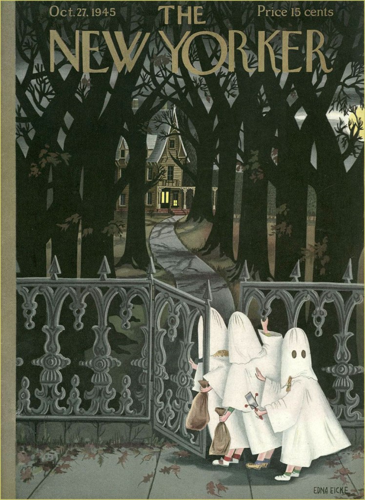
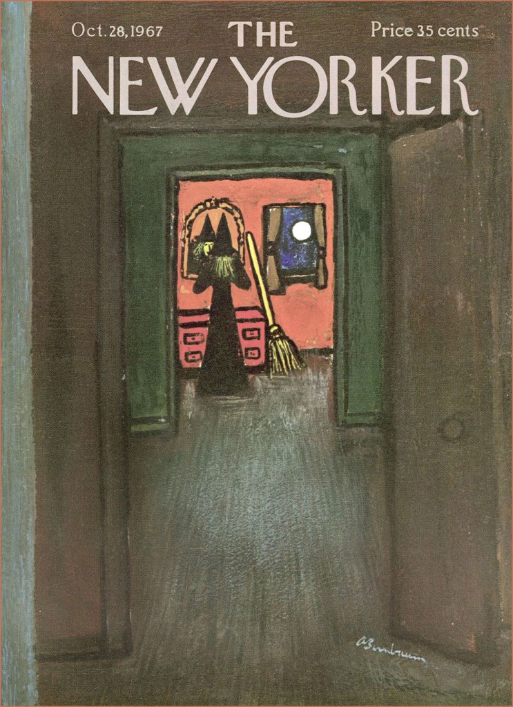
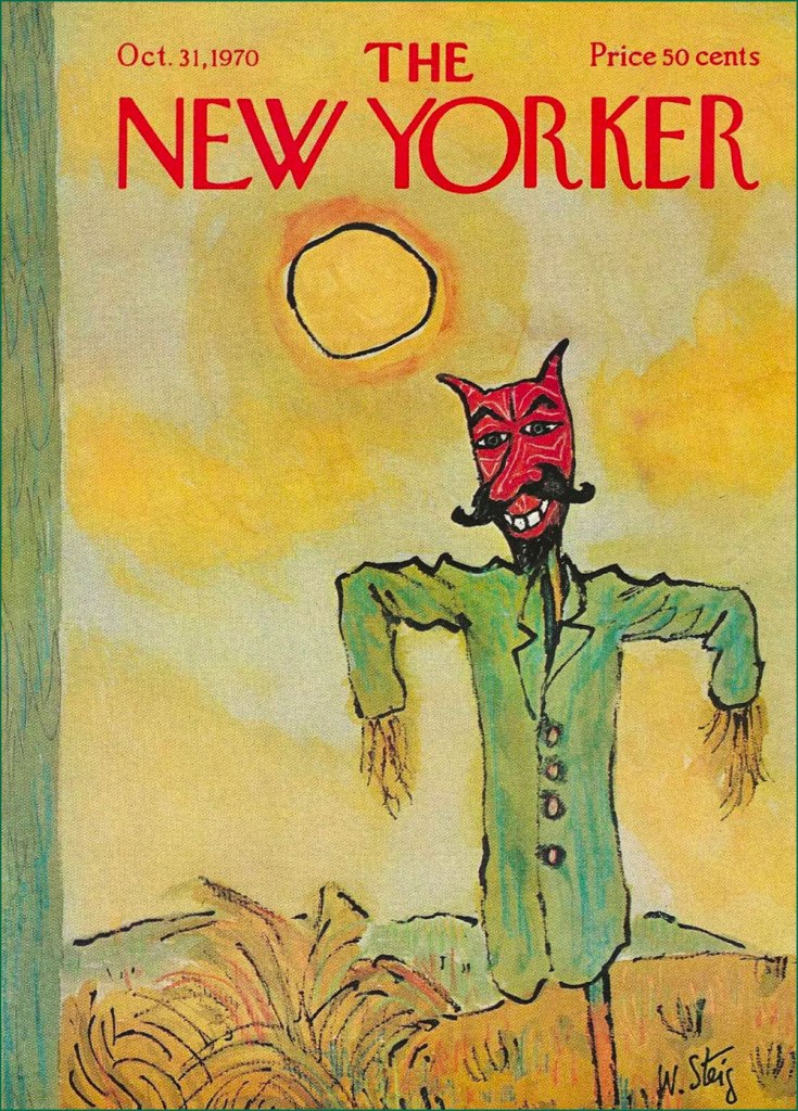
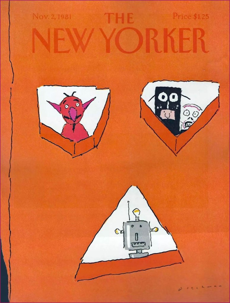
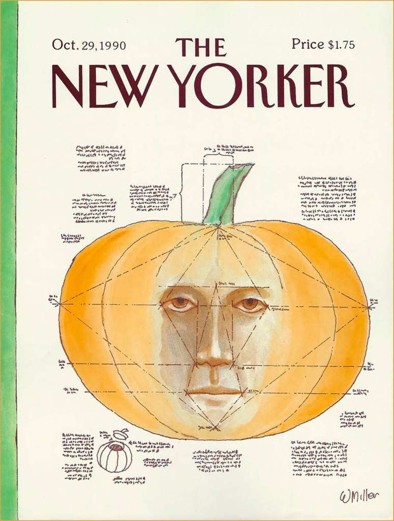
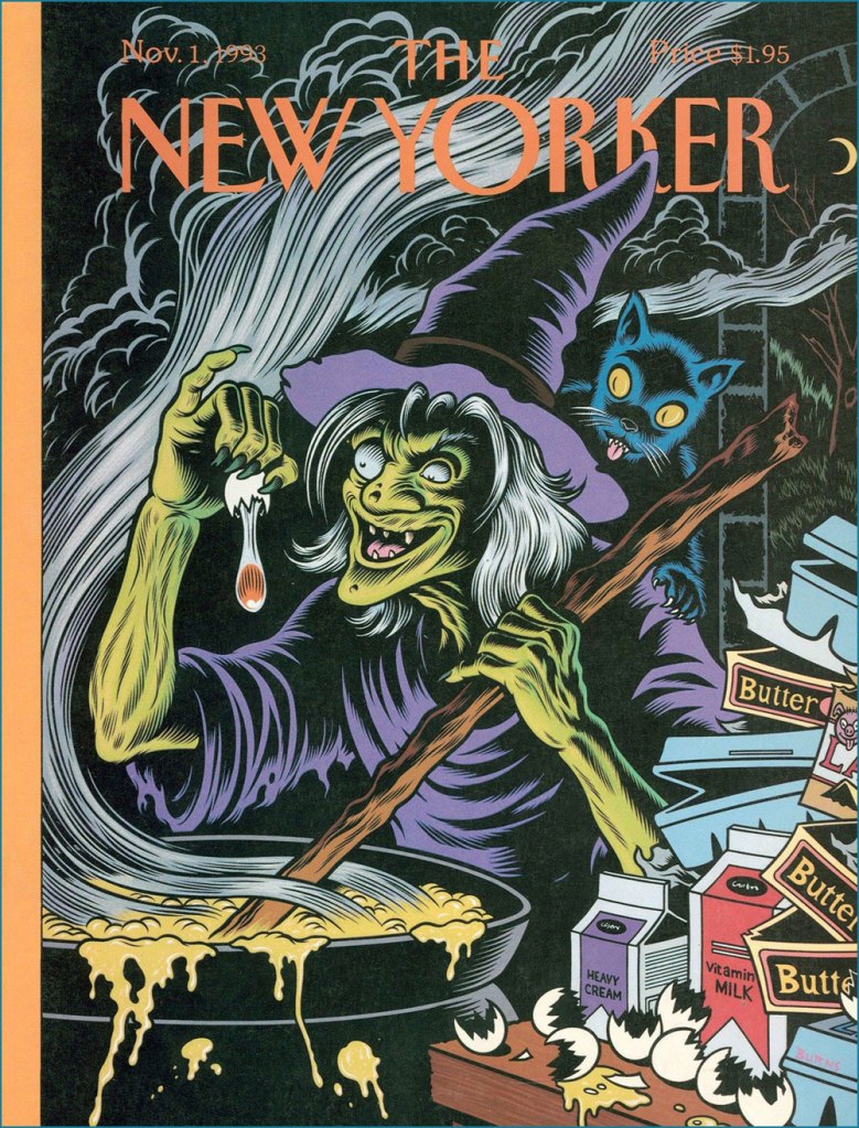
Mysteriously, this one came out nearly a month after Hallowe’en. Most topical and too good to waste? The attack on Pearl Harbor was just around the corner, and with it the beginning of America’s official involvement in WWII. But Bogeyman Adolf was already weighing on countless people’s minds. Cover by Rea Irvin.A moody one by Edna Eicke (1919-1979), this was the Oct. 27, 1945 issue.Another one by Rea Irvin, one of the magazine’s co-founders and its first art editor.This stunning mixed media beauty is one of versatile Laura Jean Allen’s sixteen covers for The New Yorker. Check out more of her work here.A special night requires special preparation! A fetchingly low-key scene from the agile brush of Abe Birnbaum (1899-1966); he painted nearly 200 New Yorker covers, and judging from this one, it’s easy to see why.This one just fills me with glee — and a soupçon of melancholy. It’s not even nocturnal, and yet just exudes Hallowe’en spirit! It’s by the mighty William Steig (1907-2003). For more Steig wizardry, check out our jazzy entry Steig Swoops In: The ‘Epic in Jazz’ Cat Sextet.This one’s by the marvellous Robert Blechman (born 1930 and still with us).A true delight from the pen of Arnie Levin (born 1938). Check out this fine interview with the man.No assortment of New Yorker Hallowe’en covers would be complete without at least one contribution from Charles Addams. I resisted the urge to include more, leaving myself the option of an eventual solo exhibition for the master.A helpful tutorial from Warren Miller (born 1936).This, obviously, is Charles Burns‘ Strange Brew. That is *not* a vegan brew.
« A gentleman does not boast about his junk. » — Emily Post*
Good manners… where have they gone, along with the other social niceties?
To prepare some of you for this satire, you need to be aware of who 19th century débutante and eventual étiquette authority Emily Post (1872-1960) was. The author of Etiquette in Society, in Business, in Politics, and at Home (1922… and updated to this day) was among the earliest American self-proclaimed experts on good manners. « Today, of course, you can barely dig up a débutante, let alone a ladies’ maid. And yet from the great beyond Emily Post continues to offer counsel. “Etiquette,” revised and edited by her great-granddaughter-in-law, a former flight attendant, is now in its seventeenth edition. » [ source ]
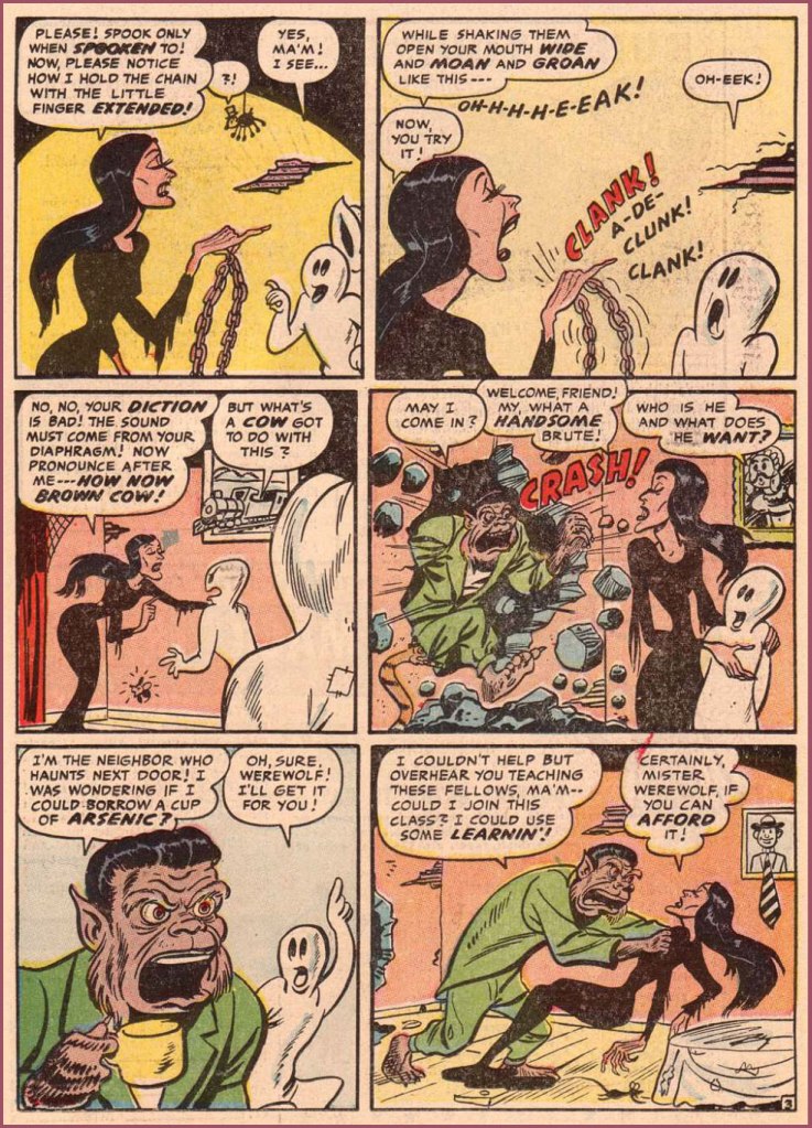
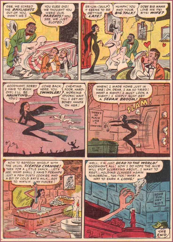
Well, that should suffice. Here’s a fun little parody from the early Silver Age. Both writer and artist are unknown, appropriately enough — it would be gauche to draw attention to oneself, don’t you know?
Don’t Be a Stumbling Spook! originally appeared — well concealed — in the back pages of Dark Shadows no. 2 (Jan. 1958, Farrell). An obscure story from an obscure title from an obscure publisher — the trifecta!
This is the one! The entire issue is available for free perusal right here.
I leave the esteemed Ms. Post to deliver the closing words, as I presume a gentleman should: « The only occasion when the traditions of courtesy permit a hostess to help herself before a woman guest is when she has reason to believe the food is poisoned. »
-RG
* That purported quote was too cute to pass up, apocryphal as it may be. Or is it a case of meaning drift? MIght ‘junk’ actually refer to bric-a-brac or — miraculously — a Chinese ship?
« With pen and ink, I can achieve a scratchy, foggy effect that is appropriate. It was a continual process of learning. » — Nick Cardy
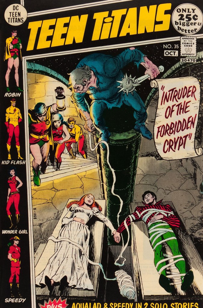
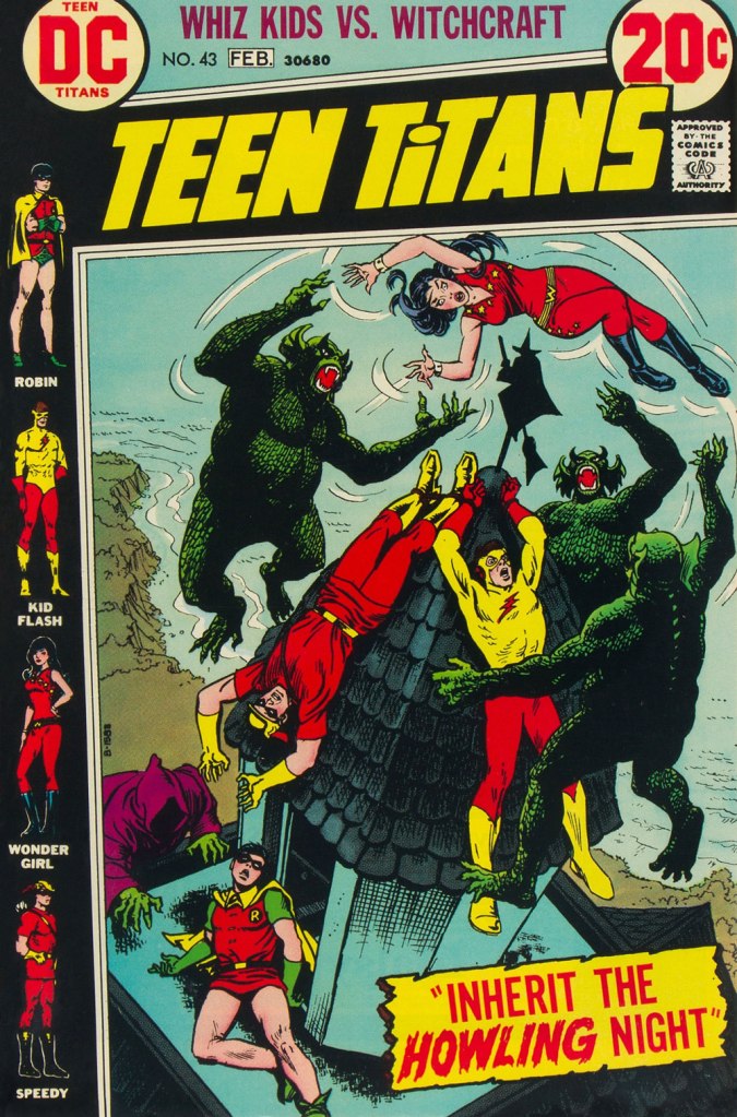
While WOT? favourite Nick Cardy (1920-2013) — who would turn one hundred and four years old today! — spent a lot of time chronicling the undersea adventures of Aquaman, his lingering true love, despite his busy schedule as DC’s premier cover artist, was the Teen Titans — he contributed, either as penciller, inker… or cover artist — to all forty-three issues of the original series.
And what I loved most about editor Murray Boltinoff‘s books is that they were packaged as horror books even when they nominally featured superheroes, a welcome respite. The costumes seemed an afterthought, a most unusual and refreshing attitude. Here, then, is a gallery of Mr. Cardy’s moodiest, most sinister Teen Titans cover artwork.
This is Teen Titans no. 33 (May-June 1971, DC). This is Teen Titans no. 34 (July-Aug. 1971, DC). Lettering by Ben Oda.This is Teen Titans no. 35 (Sept.-Oct. 1971, DC).This is Teen Titans no. 36 (Nov.-Dec. 1971, DC).This is Teen Titans no. 41 (Sept.-Oct. 1972, DC).This is Teen Titans no. 42 (Nov.-Dec. 1972, DC).This is Teen Titans no. 43 (Jan.-Feb. 1973, DC).
« Dick’s Monster was something to behold. Whatever possessed him to put the creature’s nose up on the forehead is beyond us — but it worked, making it possibly the weirdest Frankenstein Monster ever done. » — Ray Funk and Al Dellinges, 2005
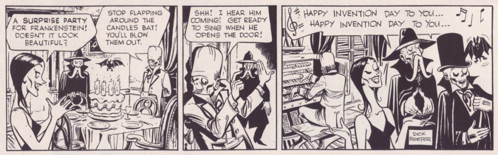
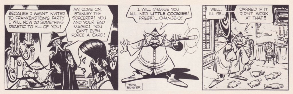
Golden Age cartoonist Richard “Dick” Briefer (1915-1980) had a special fondness for Dr. Frankenstein’s creation. Between 1940 and 1954, he wrote and illustrated scores of the Monster’s further adventures, both as tragedy and as farce… with equal aplomb.
This is Frankenstein no. 7 (May-June 1947, Prize), the lighter version.In a darker vein, this is Frankenstein no. 27 (Oct.-Nov. 1953, Prize), the darker one.
Having left the troubled comics industry after its censor-imposed purge in the mid-50s, Briefer put together an exquisite proposal for a daily newspaper strip featuring the Creature and his pals, thirty-six strips in all. Here’s a handful of them. Don’t you wish comic strips were half as well written and drawn nowadays?
In a 1979 letter to Al Dellinges, Briefer recalled « Frankenstein, the comic version, was always a joy, and I have some superb samples of a projected daily strip that had been turned down by syndicates in the past. At this stage in my life, even though ‘horror’ is ‘in’, I’m too lazy to start sending it out again. »
For further reading on this subject, do seek out the inaugural volume in Craig Yoe’s ‘Chilling Archives of Horror’ series, Dick Briefer’s Frankenstein (2010, IDW).
« Religion is like a blind man looking in a black room for a black cat that isn’t there, and finding it. » — Oscar Wilde
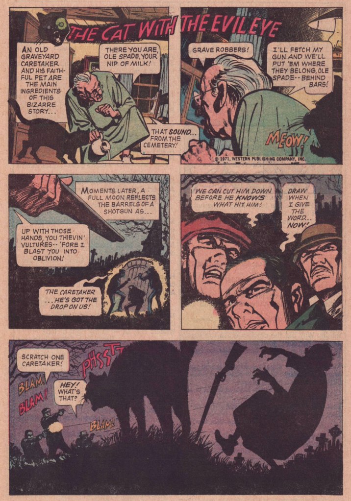
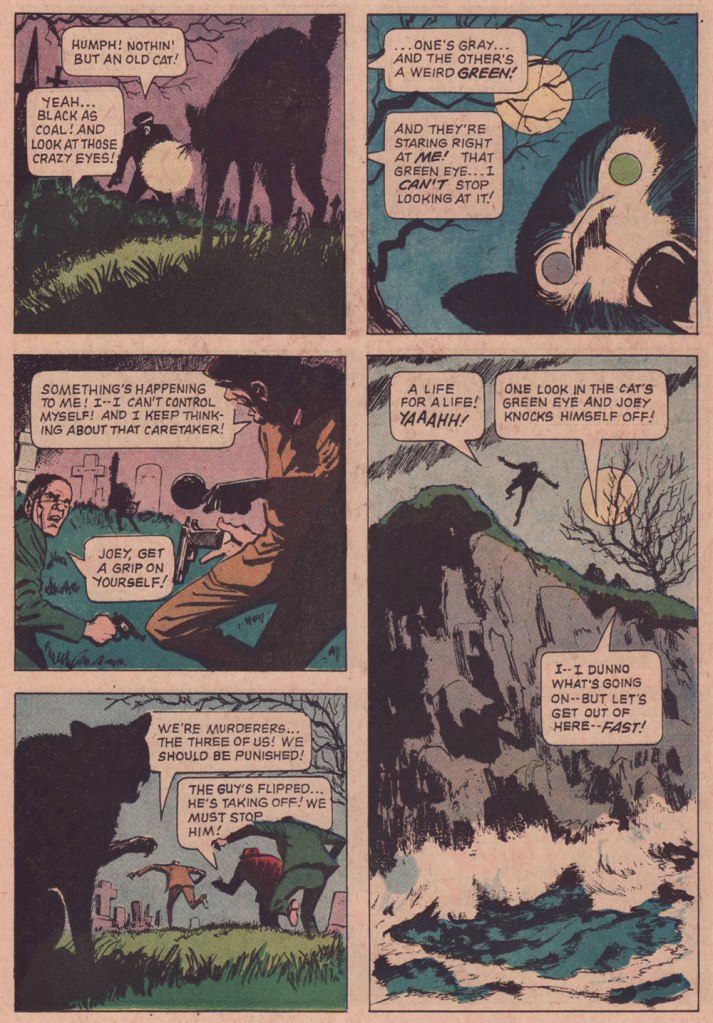
We certainly can’t have an Hallowe’en countdown without at least one black cat, can we?
Here we have Hamilton, Ontario’s Win Mortimer (1919-1998) at his most stylish. A competent craftsman, he drew a lot of Superman and Batman for DC in the Golden Age, and may be most remembered by readers of a certain generation for his work on Marvel and The Children’s Television Workshop‘s Spidey Super Stories (57 issues, 1974- 1982). As for me, I was always fondest of his work for Gold Key’s mystery titles, where he seemed to be having more fun.
And never did he cut loose more expressively than with this tale of « The Cat with the Evil Eye », from The Twilight Zone no. 38 (July 1971, Western). Working from a barebones scenario by the über-prolific Paul S. Newman, Win messes around with shapes and textures at a breakneck pace. Four pages flicker by and it’s all over but the mournful yowling.
« His deadline-flouting attention to detail was so ambitious that, whenever one of his jobs was delivered, editor Archie Goodwin reported, everyone gathered around to see what “that crazy bastard Heath” had done. » — Michael Dean
In my opinion, Atlas comics generally weren’t very good. But they remain fascinating because of one impressive asset: the line boasted no less than four absolutely top-notch cover artists, namely Joe Maneely, Bill Everett, John Severin… and Russ Heath. It may seem like nothing, but that was a truly phenomenal assemblage of talent in one place at one time. However, the writing was pedestrian and the second-stringers were, well… second-rate. But oh, some of those covers…
Today, we’ll coyly peek at some of Mr. Heath’s horror covers.
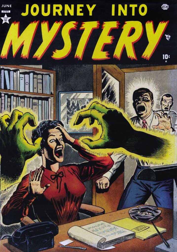
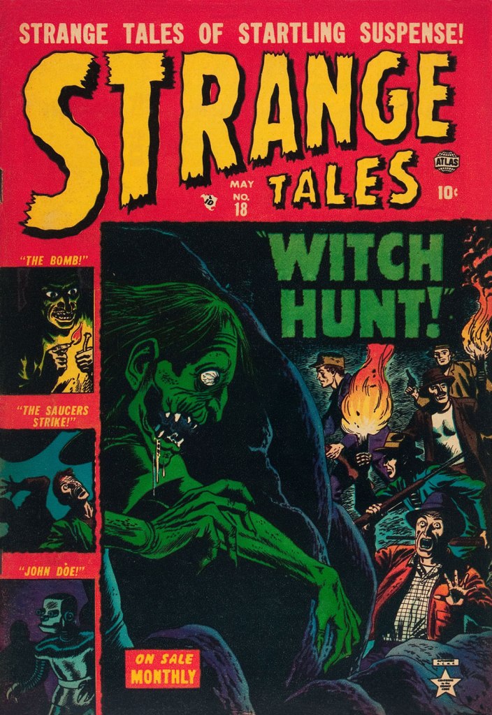
This is Marvel Tales no. 104 (Dec. 1951, Atlas); colours, in every case, by Stan Goldberg.This is Astonishing no. 9 (Feb. 1952, Atlas).This is Suspense no. 14 (Feb. 1952, Atlas). This one’s especially intriguing: there’s so much going on, yet it’s not overly busy… the mark of a first-rate cover designer.This is Journey into Mystery no. 1 (June 1952, Atlas). By now, I have a sneaking suspicion that Mr. Heath liked his ladies… on the buxom side.This is Adventures into Terror no. 11 (Aug. 1952, Atlas).This is Spellbound no. 3 (May 1953, Atlas). Yes, it’s the worm.This is Strange Tales no. 18 (May 1953, Atlas).
« Well, as everyone knows, once witchcraft gets started, there’s no stopping it. » — Mikhail Bulgakov
Another, day, birthday post? Well, it’s still a mighty special occasion, as we’re celebrating the one-hundred and fourth birth anniversary of our beloved Samm Schwartz (1920-1997).
One year ago to the day, we gave you Love in Broom, first of a loosely connected two-parter (‘loosely connected’ is the strongest dose of ‘continuity’ one could expect from the Archie folks in those days).
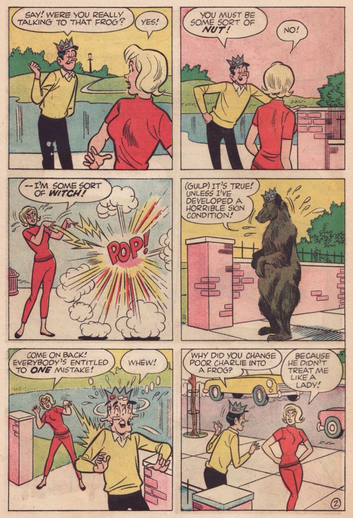
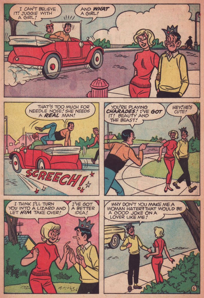
Of course, the now-named Samantha the witch — and the rest of the cast, notably Jughead and Reggie — appear to have forgotten all about their earlier encounter… but that’s just fine: the burden of continuity is one I’m glad to see sloughed. The chief constant is that our witch has quite a yen for Jug.
Switch Witch first appeared in Archie’s Pal Jughead no. 123 (Aug. 1965, Archie). It was presumably scripted by George Gladir (not coincidentally co-creator of Sabrina the Teenage Witch a couple of years earlier), and unmistakably illustrated by Mr. Schwartz. Of Mr. Gladir, Mark Evanier wrote: « Even when they had no credits, you could generally spot a George Gladir script. They were a little wackier, a little sillier, a little more human in their humor. And oh, yes — they were usually fresher than the ones crafted by younger writers. » This certainly fits the bill.
I had to buy three different copies of this issue to get a complete one… and it’s still a brittle mess. But hey, my ordeal, your benefit!
« I’ve had great success being a total idiot. » — Jerry Lewis
Hey, it’s Bob Oksner‘s birthday! I hope you’ll forgive me for double-dipping into that particular well — he also illustrated our earlier Mary Marvel entry — but I still wanted to highlight the occasion, incorrigible Oksner booster that I am.
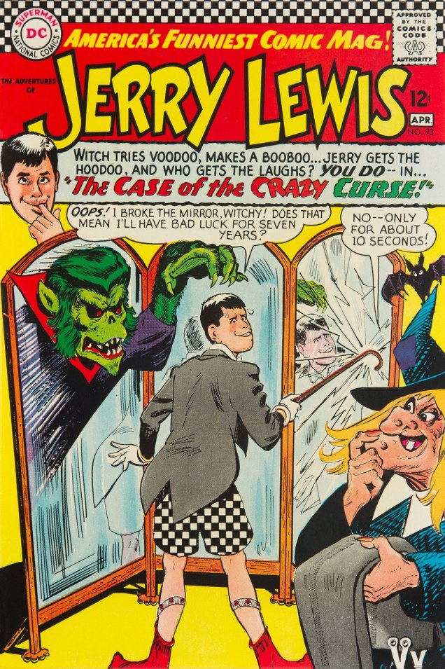
DC’s Jerry Lewis (or Bob Hope, or Dobie Gillis…) comics weren’t even remotely funny, but they sure boasted some spiffy covers. Here’s a gallery of the most Hallowe’en-appropriate, from the pencil and pen of Mr. Oksner.
This is The Adventures of Jerry Lewis no. 87 (Mar.-Apr. 1965, DC).This is The Adventures of Jerry Lewis no. 88 (May-June 1965, DC).
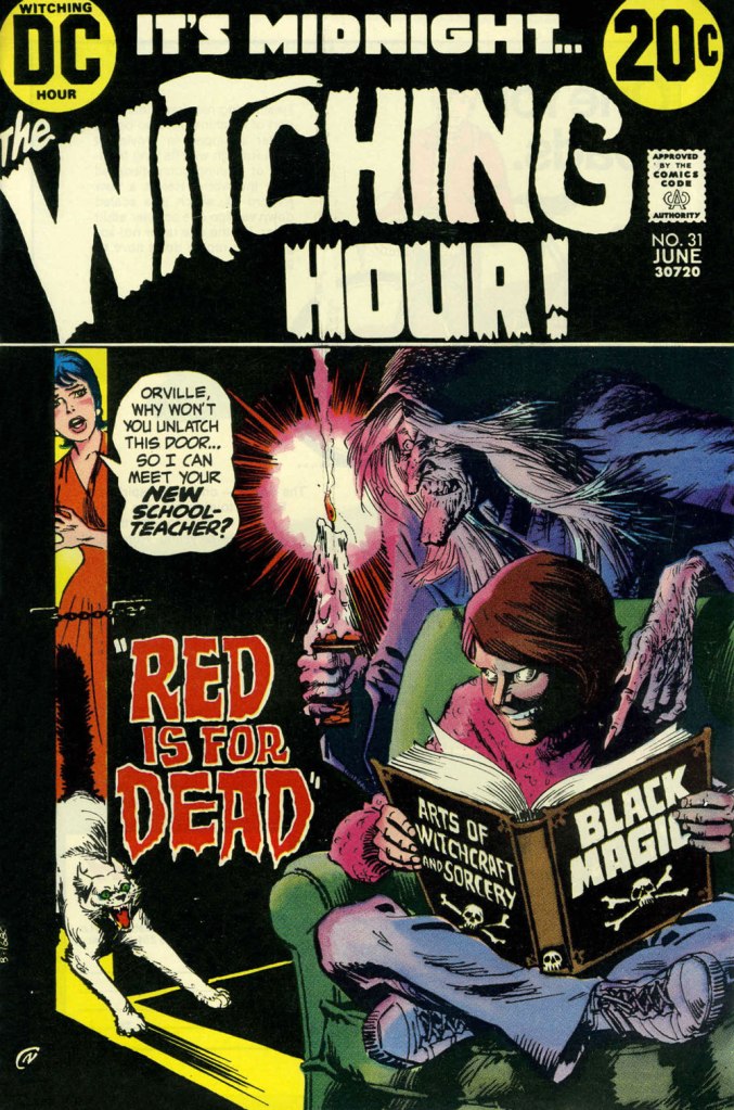
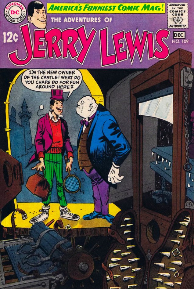
TAoJL editor Murray Boltinoff (1911-1994) had a soft sport for that particular cover concept, since he recycled it, eight years later and with a different tone, for another title he was overseeing:
Here, for comparison, is It’s Midnight… the Witching Hour no. 31 (June 1973, DC). Art by Nick Cardy.This is The Adventures of Jerry Lewis no. 93 (Mar.-Apr. 1966, DC).This is The Adventures of Jerry Lewis no. 94 (May-June 1966, DC).This is The Adventures of Jerry Lewis no. 98 (Jan.-Feb. 1967, DC).And finally, The Adventures of Jerry Lewis no. 109 (Nov.-Dec. 1968, DC). This one’s another riff on a rather hoary theme.