Jughead’s Pal, Samm Schwartz

« What is it about me, Pops? Am I different than normal people? »

One (more) thing I’ve learned in this world is that the vast majority of people, from the man or woman in the checkout line to the hard core of comics aficionados… can’t tell Archie artists apart, let alone name any of them.

If you scratch deep enough, one name will come up, like pebbles from a fallow field: Dan DeCarlo. I’m reminded of the annual restaurant poll a local alternative weekly used to hold: McDonald’s unfailingly took its category in a landslide, because of its ubiquitous familiarity. And so it is with Archie artists: DeCarlo must be the best because… well, that’s what we’ve always been told.

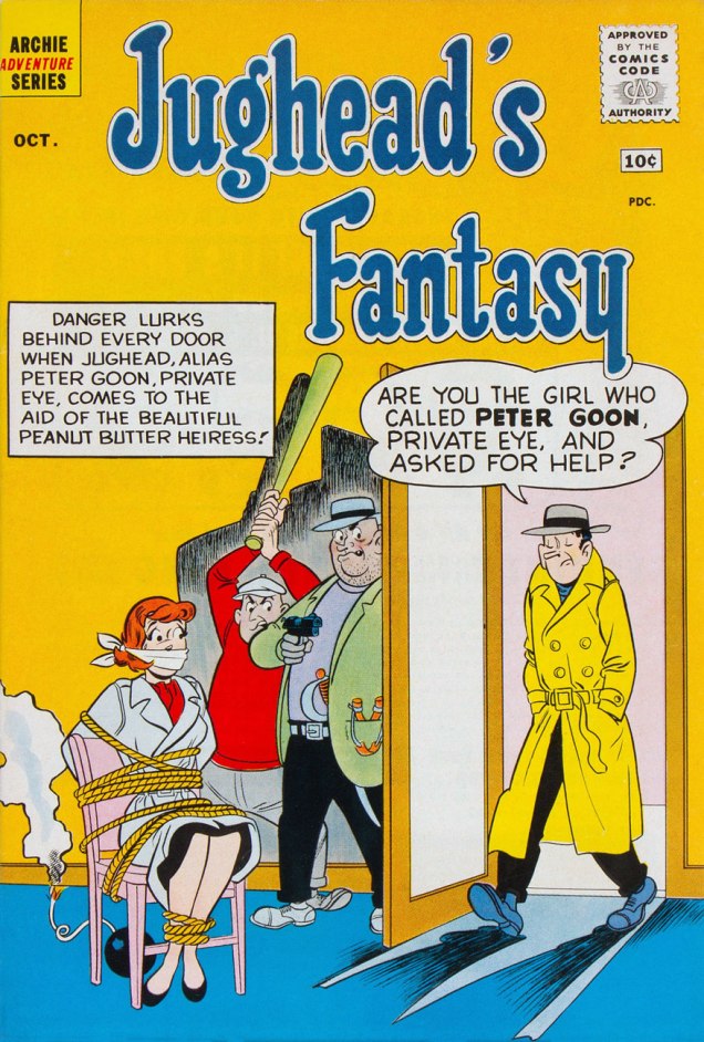
If you ask me, much of his peers’ work gets attributed to him. For instance, check out our gallery of Bob White covers. That Archie’s Mad House no. 27 cover, in particular…

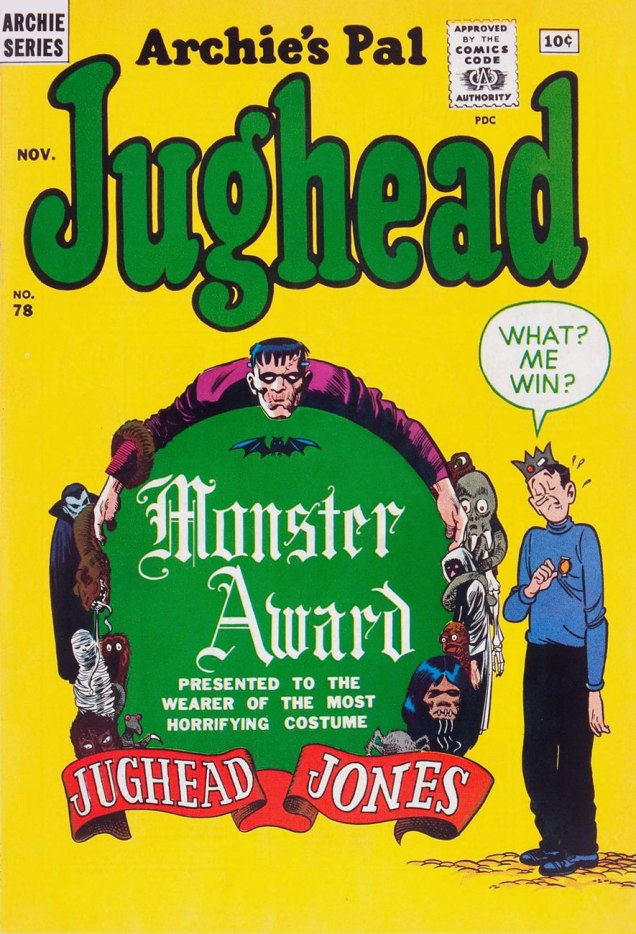
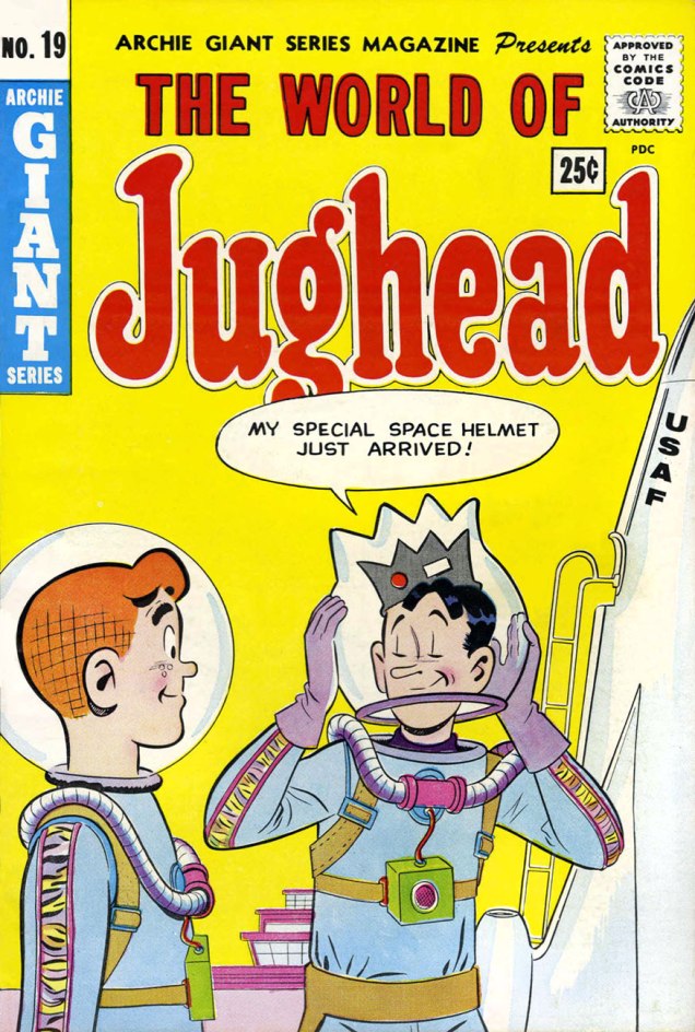
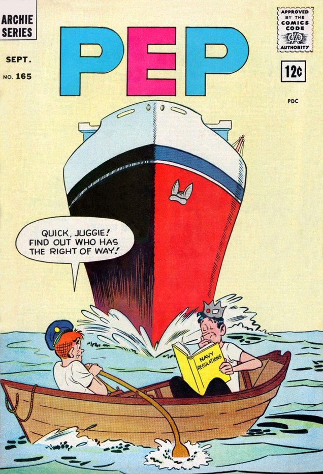
WOT’s pick for top artist on the Archie totem is handily Samm Schwartz (1920 – 1997). He’s easily the smoothest, most inventive storyteller in the Archie universe. Despite his skill as a cover designer during Archie’s best years (1959-1965, a figure proposed by cartoonist-scholar Seth and worth carving in stone), there were no Schwartz covers chez Archie after 1965.

The likely reason? In ’65, Schwartz was hired away by Wally Wood‘s Tower Comics (by managing editor Harry Shorten, a former Archie writer-editor) to serve as their art director. While there, he conceived Tower’s relatively prolific teen humour line, featuring Tippy Teen, Go-Go and Animal, and Teen-In, often glibly dismissed as “Archie clones“, by people who clearly haven’t read the work. We’ll return to these eventually.

Now comes the clincher: Schwartz in turn hired some of his former Archie colleagues to pitch in (presumably at higher page rates); DeCarlo (a handful of stories in early issues of Tippy Teen), Harry Lucey (a decent batch, actually) and reportedly Bob White (no sign of him, though). But the bulk of the work was done by Schwartz and future Archie artist Doug Crane.

Now the Archie people didn’t like this one bit; it was a clear case of sedition, a threat to their tidy little work camp system. After the industry’s near-collapse in the mid-1950s, there weren’t a lot of options in the tight-knit little club that remained; let’s not forget that even Jack Kirby was driven to such humbling desperation in the early 1960s. It was all too easy to be blackballed. The Goldwater clan, Archie’s reigning dynasty, took careful note of Schwartz’s break for freedom and the names of his accomplices. After Tower called it a day in 1969, Schwartz went to DC for a year, but it didn’t take. He was forced to return to Archie, which certainly suited the publisher since Schwartz’s signature title, Jughead, had been wilting away in his absence.

The terms of his return are unknown… but against all odds, Samm proceeded to create the finest work of his career, pencilling, inking and lettering hundreds of inspired Jughead stories until, well, until he couldn’t any more. But no covers, considered a plum job: these went exclusively to DeCarlo (with an occasional Lucey) and later to versatile mediocrity Stan Goldberg, aping DeCarlo’s style and random design sense*.

Jughead's-Fantasy02A
Jughead’s Fantasy no. 2 (Oct. 1960); a parody of the excellent 1958-61 detective show… and yes, Peter Gunn did get conked on the head an awful lot.
Jughead78A
Archie’s Pal Jughead no. 78 (Nov. 1961)
Jughead81A
Archie’s Pal Jughead no. 81 (Feb. 1962). Check out Reggie’s body language, in particular.
Archie's-Jokes17A
Archie Giant Series Magazine no. 17 (Archie’s Jokes, Summer 1962). There goes Archie, into the next county.
Laugh136A
Laugh Comics no. 136 (July 1962)
Jughead86A
Archie’s Pal Jughead no. 86 (July 1962)
Jughead89A
Archie’s Pal Jughead no. 89 (Oct. 1962)
WorldofJughead19A
Er, interesting choice of space pioneers, USAF. Could this mission be some sort of tax dodge? Perhaps Mr. Lodge has a financial stake in it, and gently “suggested” Archie for the possibly one-way trip. Archie Giant Series Magazine no. 19 (World of Jughead, Dec. 1962)
Pep165A
Pep no. 165 (Sept. 1963). My college graphic design teacher told our class that a poster should be “One Angry Fist”, which certainly applies to comic book covers, and this is a fine, fine example of making the most of a format.
Madhouse33A
Archie’s Mad House no. 33 (June 1964)
BettyVeronica102A
Archie’s Girls Betty and Veronica no. 102 (June 1964). The new, definitely not improved cover layout of the Archie line rears its homely head.
SammSchwartzA
Mr. Samm Schwartz, date unknown, though the cars should certainly serve as a clue.

To quote his daughter, Joanne Colt, from the introduction of 2011’s The Best of Samm Schwartz (it isn’t, but it’s pretty good): « He drew for Archie until his death on November 13, 1997, my birthday. There was an unfinished story on his drawing board. »

-RG

*the way I see it, the difference between a Bob White or a Samm Schwartz cover and a DeCarlo is the difference between a considered, effective layout and the act of pointing a camera at random and snapping the shutter. To be fair to DeCarlo, his girlie cartoons for Martin Goodman’s Humorama were excellent, and his first half-decade at Archie (60-65) was fine… then the company wore him down into a sad hack and the unfortunate protagonist-victim of a cautionary tale.
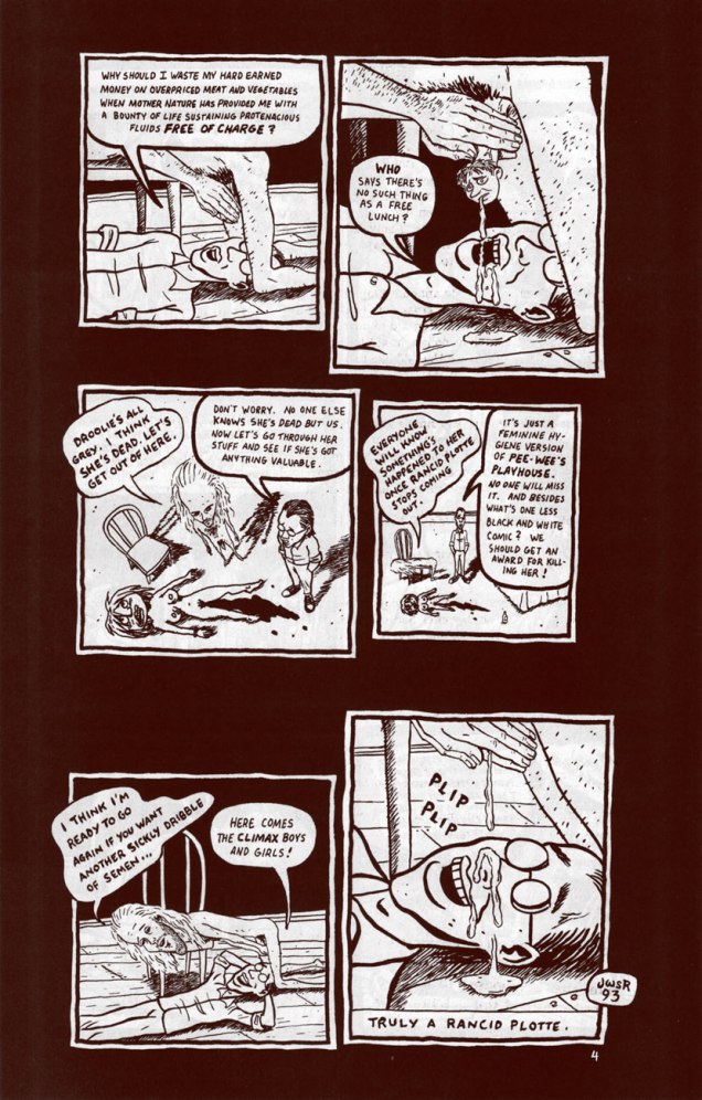
A Garrulous Dilettante and Her Pals: Tom Hachtman’s Gertrude’s Follies

« Everybody thinks that this civilization has lasted a very long time but it really does take very few grandfathers’ granddaughters to take us back to the dark ages. » — Gertrude Stein

Several years ago, while browsing in the comics section of a rather lousy bookstore (by which I mean a book shop in which none of the employees know a thing about books, let alone are actual readers… I suspect that this is becoming more common, with predictable results), I stumbled upon an oddball item, a faded-looking, obscure comic strip collection lost amidst the monotonous stacks of DC ‘n’ Marvel superhero fare and the perennial dusty Garfield and Doonesbury paperbacks.

This was Fun City (1985), the second recueil of Tom Hachtman‘s newspaper strip Gertrude’s Follies, which at the peak of its circulation appeared in… well, one paper, but a good one, at least. That was the SoHo Weekly News (1973-82). After the weekly’s demise, a handful of episodes appeared in the fast-fading National Lampoon. Much, much later (which is to say currently) the strip lives on within the pages of American Bystander, an astonishingly well-staffed humour magazine. I smell doom.

Anyway, here’s Hachtman’s recollection of the strip’s genesis, from a 1980 interview conducted by Maxine Fisher for Funnyworld no. 22 (”The world of Animated Films and Comic Art”):

MF: What was your inspiration for a strip about Gertrude Stein and her companion, Alice B. Toklas?

TH: I knew of them, but I didn’t know much about them. And then I saw a photograph of them [by none other than Man Ray] sitting in a room at the home on the rue de Fleurus in Paris. I looked at this famous lesbian couple sitting across from one another — so far apart– and I thought: ”Look at that! One of them is fat, and the other one’s skinny. That’s funny. They’re just like a comedy routine. I wonder if they had any fun.” It didn’t look like they were having any fun in that picture; they just looked like they were posing for a picture. But I thought: ”maybe they ran around and had lots of fun.” So I started drawing pictures of them, and drawing pictures of their friend Pabs, and looking at pictures of them, and looking at pictures of Picasso.

Anyway, I started drawing Gertrude and Alice and Pabs and Hemingway and putting them into situations in my sketchbook.

Basically, I was doing Abbott and Costello or I Love Lucy starring Gertrude, Alice, and their friends.

I knew if would make a nice comic strip in a newspaper. And that narrowed it down. Here was a comic strip about a lesbian couple and all their artist friends. There weren’t too many newspapers that were going to publish this. In fact, I thought, there’s only one. And I started to watch the SoHo News, wondering where it would fit. Where would they put this thing? Would they give me a whole page to do a comic strip?

More juicy details from another interview, this one conducted in 2018 by Martin Kozlowski:

MK: One of the unique features of the strip is the blending of Jazz Age Paris and Punk Rock New York. Was that a deliberate strategy or did it naturally evolve?

TH: I was living in NYC in the 1970s. I only know Paris from movies and books. That’s right; I have never been to Paris. So, when I draw a mailbox I am too lazy to research what a mailbox looks like in Jazz Age Paris. I just draw a mailbox as I know it. I have been told that my readers in Paris find this very amusing. So, the blending happens — naturally.

GertrudeFollies02A

GertrudeExorcism02AGertrudeExorcism04AGertrudeExorcism05A

GertrudeExorcism07A
However, something that Stephen King does mind

GertrudeFollies01AGertrudeFollies03A

GertrudeBrideA
Oh, I’ll bet dear old Dr. Pretorius would be right chuffed with this Alice Bride. « To a new world of gods and monsters! », as the good doc famously exclaimed.
GertBucketAliceA
Our heroines in a more (or less) realistic vein. In the usual order: Gertrude, Bucket, Alice.
HachtmanCafeLaMamaPosterA
Despite, or perhaps because of the liberties he takes with these semi-sacred historical figures, Hachtman’s Gertrude appears to be rather beloved of the keepers of Gert and Alice’s mad flame. For example: « I look at the cover of the soon-to-be-reborn Follies several times a day and have a laugh each time. Too funny, Hemingway’s teeth, silly Picasso avec crayon, Basket’s slobbering excitement and Alice’s cigarette charm!! And Gert, yes sir, she is fierce!!! Rose flying like arrow ready to hit Alice’s nose. This can’t get any better! I hear the brooch ringing… Bravo! » –– Stein scholar Renate Stendahl
HachtmanPortraitA
The auteur, circa the late 70s. Say, what’s that he’s sporting?
GertrudeFolliesSunA
Un mini-parasol, une ombrelle. For shade, not protection from the rain. Hachtman was fond of road-testing some of the props employed by his players. Gives the strip that je ne sais quoi of authenticity, don’t you know.

If  you like what you see, you may rejoice in the fact that Gertrude’s Follies has lately become more widely available (whilst retaining its elusive cachet) thanks to the efforts of Now What Media. Amble over to their website, where they provide a generous sampling of strips and biographical information, not to mention the possibility of acquiring the collections.

Oh, and do check out Alice’s unusual, lasting contribution to popular culture.

« I love you, Alice B. Toklas, and so does Gertrude Stein… »

-RG

“Just a feminine hygiene version of Pee-Wee’s Playhouse”: Russo & Wong’s ‘Rancid Plotte’ (1993)

« We’re not very accepting of people who act strangely. » — Chester Brown

Scott Russo’s Jizz, published by Fantagraphics in 1991-93 (10 issues in all), was a fearless, often downright incendiary and frequently fascinating repository of vitriol from the heart and soul of Mr. Russo. As his own drawing style was pretty rudimentary (but clean and distinctive), the auteur drew upon collage, détournement and plain old text pieces for variety. Russo may have been embittered and misanthropic, but the entertainment he proffered was quite deliberate; a fine, dexterous trick to pull off.

Here, from Scott Russo’s Jizz no. 10 (March 1993, Fantagraphics), is his merciless but spot-on takedown of publisher Drawn & Quarterly‘s stable of neurotics: Julie Doucet, Joe Matt, Chester Brown and Seth, rendered in a breathtakingly accurate facsimile blend of their respective styles and schticks. Script by Russo, art by his trusted confederate ‘Master’ Jeff Wong. Not particularly ‘safe for work‘, I should say.

RussoRancidPlotte01ARussoRancidPlotte02ARussoRancidPlotte03ARussoRancidPlotte04A

Russoolive01A

Russoolive02A
From Scott Russo’s Jizz no. 7 (Sept. 1991, Fantagraphics). I’ll always be grateful to Mr. Russo for this scathing exposé of the Olive Oil industry. My girlfriend at the time was taking a chemistry class at McGill University, during which they subjected various brands of olive oil to chemical analysis and essentially confirmed Russo’s claims. Now I merely snicker and shrug when I see someone shell out big bucks for the stuff… sometimes there’s no sense in trying to convince anyone.

-RG

Marooned in Time With Paul Gillon

« We all have our time machines. Some take us back, they’re called memories. Some take us forward, they’re called dreams. » — Jeremy Irons

Today, we note the birth anniversary of the powerful French bédéiste Paul Gillon (May 11, 1926- May 21, 2011). Working in a classical, realistic style, he began his career in comics with the weekly Vaillant. For daily newspaper France-Soir, he co-created the daily soap opera strip 13, rue de l’Espoir (1959-1962, scripted by Jacques Gall and François Gall), strongly inspired by Elliot Caplin and Stan Drake’s The Heart of Juliet Jones, but set in Paris.

Then, in 1964, for the short-lived bédé newspaper Chouchou (an eight-pager published for a mere 14 issues, a tragedy!), Gillon co-created, with scripter J.C. Valherbe (alias Jean-Claude Forest, of Barbarella fame), one of the great classics of French science-fiction comics, Les naufragés du temps (“Castaways of Time”). Several wonderful features (for instance, Georges Pichard‘s Ténébrax) were left stranded by Chouchou’s demise, including (literally) Les naufragés.

Fortunately, its authors deemed its premise too worthy to let the matter drop forever. Nearly a decade on, Gillon tweaked the saga’s opening pages and resumed the narrative, which France-Soir published. Forest scripted the first four collections (1974-76), then Gillon took full command of the strip, which found a warm new home in Métal hurlant from 1977 right to the end of the series with Le cryptomère (The Cryptomeria), collected in 1989.

GillonNaufragés01AGillonNaufragés02AGillonNaufragés03A

Les naufragés’ premise is this: In 1990, a man (Chris) and a woman (Valérie) are placed into suspended animation. A thousand years hence, the man is picked up and woken. Where’s the woman?, he wants to know. A futuristic bout of cherchez la femme ensues, to make a long story short.

Forest, wrote, in 1967, of his original plans for the saga: « Chris was searching for an image. After many adventures, he manages to find Valérie only to realize that this image no longer fitted that of his dream. »

The sequence presented here comprise the second, third and fourth pages of the first tale, as they appeared in Chouchou in 1964. Say, that cool metal creature reminds me of one of the most ridiculous Marvel super-baddies of the 1960s, disgruntled government employee Alexander Gentry, aka… (see below for the answer).

GillonNaufragésÉtoileA
The first album in the series, L’étoile endormie (The Sleeping Star) – 1974
GillonNaufragésCannibaleA
The fourth album in the series, L’univers cannibale (The Cannibal Universe) – 1976
GillonNaufragésChimèreA
The fifth album in the series, Tendre chimère (Sweet Illusion) – 1977

A peek at a page of original art from album 3, Labyrinthes (1976):

NaufragésOriginalA

More about the series: http://www.coolfrenchcomics.com/naufragesdutemps.htm

… and you can read the entire series here (if you can read French) or, if not, just admire the artwork.

– RG

… and here’s your answer:

TTA48PorcupineA
Stan Lee and Don Heck‘s The ‘Dreaded’ (ha!) Porcupine, or what happens when neither Steve Ditko nor Jack Kirby are on hand to design your costume (and ghost-write your story). Incidentally, Stan, porcupines don’t project their quills. Here he is depicted by Kirby, from the cover of his inaugural appearance, in Tales to Astonish no. 48 (October, 1963).

Treasured Stories: “I Wonder Who’s Squeezing Her Now?” (1979)

« When a man steals your wife, there is no better revenge than to let him keep her. » — Sacha Guitry

Here’s my contender for the most adult thing ever published in a Warren Magazine, as opposed to adolescent. It was also Wally Wood’s final significant contribution to his bibliography (though it was created around 1971); by the time of its belated publication Wood’s work had degenerated into depressing, crude porn before he tragically took his own life in November, 1981. As Witzend sadly proved, most comics creators, when handed a creative carte blanche, would merely regurgitate the same old thing they were doing for the mainstream, but with the addition of tits and/or gore. This, however, whilst featuring a generous dollop of T&A, is another breed of beast. It was published, of all places, in Warren’s SF anthology 1984 (issue 5, Feb. 1979). Go figure.

IWonderWho01AIWonderWho02AIWonderWho03AIWonderWho04AIWonderWho05AIWonderWho06AIWonderWho07AThe marvellous Bhob Stewart queried Nick Cuti about the story during a roundtable gathering of former Wood assistants in Derby, Connecticut, in July 1985. The discussion later appeared in Against the Grain: MAD Artist Wallace Wood, edited by Stewart (2003, TwoMorrows Publishing)

Bhob: You worked on “Last Train to Laurelhurst“? [the story’s original title]
Cuti: « As a matter of fact, I’m in it on the opening page. That’s me — right there [points to foreground figure in splash.] I used to wear muttonchops in those days. We wrote that together; Woody came up with the basic storyline, and I wrote a lot of dialogue. I hated his ending. I said, ‘Woody, you really ought to change the ending.’ The ending was that the guy blasted his faithless wife and her lover and then walked away. I said, ‘Gee, that’s what he’s intending to do in the very beginning. There’s no switch at the end. If you change it around somehow, it would make it a little bit more surprising.’ So he went home and rewrote the ending. I thought that the ending he came up with was far superior and made it a really brilliant story, to really tell you what life can be like.

Ernie Colón did the pencils. It was Woody’s idea, and I wrote some of the script, I don’t know how much because we used to toss things back and forth all the time when I was at the studio.It was for a magazine called Pow that never came to be. [Jim] Warren had approached Wood to do an adult humor magazine which would have had serious stories, very sexy, something that adults would enjoy reading. Unfortunately, Woody and Warren had diametrically opposed personalities, and they couldn’t seem to get together on it.

There was a funny story: Ernie had done the pencils with a soft pencil, and Woody and I were wondering what the heck we could do to make sure it didn’t get smudged. I was very carefully going over the pencils with an eraser to get out the smudges. I came in the next day with the pencils and said, ‘I found the perfect way to avoid smudging the pencils.’ Woody said, ‘What?’ And I said, ‘I sprayed them.’ Woody’s face dropped, and he almost reached over the strangle me before I stopped him and said, ‘Hey, Woody, I’m only kidding!’ [laughter] Because when you spray something, you can’t erase the pencils any more. You would have ink and pencil on the same paper. He almost had a heart attack right there; his mouth dropped open, and he said, ‘Oh, no!’ Then he started laughing after I told him it was only a joke. Later, when I walked into the house, and Marilyn said, ‘Oh, Woody, Nick’s here. You know, the fellow who sprays all your pencils?’ Obviously, he had thought enough of the joke to tell her about it. »

Speaking of Pow, here’s a cover sketch Wood did in 1971.WallyWoodPowRoughAAn adult humour magazine? I guess they hadn’t quite settled on the tone.

-RG

The Case of the Cackling Conjurer!

« Never keep up with the Joneses. Drag them down to your level. » — Denis Charles Pratt (1908-1999)

Longtime companions Bruce and Alex, who spend their days tracking down and investigating “queer events”, presumably for a guide they’re putting together, happen to drive near Oakville, where a gleeful oldster is on a tear.

BailyQueer1A

I’m thinking Quentin Crisp, because his fellow raconteur and bon vivant Sir Noël Coward wasn’t especially into large, floppy hats.

QuentinCrispA
« The very purpose of existence is to reconcile the glowing opinion we hold of ourselves with the appalling things that other people think about us. » — Quentin Crisp ( Denis Charles Pratt)

BailyStraightLineA
You don’t say, Bruce! Let’s face it, screwball ideas hardly ever fail to bear fruit in these zany yarns.

BaileyQueer2A
More action-packed merriment with Bruce & Alex, roving queerness inquirers!

Alex has a plan, and Bruce grasps instantly what Bruce has in mind. It’s like they’ve done this before. Somehow, Alex’s brainstorms always involve Bruce disrobing, and, judging from his expression, he’s unfailingly eager to comply.

This saga is that of The Cackling Conjurer (Strange Adventures no. 201, June 1967, DC), writer regrettably unknown, art by that magnificent oddball Bernard Baily. Edited, of course, by Jack Schiff; he may have screwed DC out of Jack Kirby’s talent throughout the 1960s, and nearly drove the Batman titles over the cancellation cliff, but he certainly produced some perversely entertaining crap. Incidentally, Schiff retired from comics two issues after this one, but surely that’s mere coincidence.

StangeAdventures201A
As you can see, the rest of the issue was quite mundane and utterly devoid of eccentricity. Cover by Carmine Infantino and George Roussos. That’s a rather… intimate hold the Mod Gorilla Boss has on Animal-Man, don’t you think?

– RG

Earth Day With Jim Woodring and Friends

« Oh Beautiful for smoggy skies, insecticided grain,
For strip-mined mountain’s majesty above the asphalt plain.
America, America, man sheds his waste on thee,
And hides the pines with billboard signs, from sea to oily sea. » ― George Carlin

On this day, the forty-ninth edition of Earth Day, we feature some little-seen work (by his usual audience, at any rate) by Jim Woodring and his collaborator Scott Deschaine*. Given the current political climate, an increasingly dire state of affairs, I’ll (mostly) skip the chit-chat and make with the visual riches.

WoodringGreenTreeA
Among the Woodring / Deschaine collaborations, One Green Tree (1990) is the masterpiece, and the only full-on Woodring, visually-speaking, with its expressive inks, unsimplified art and lush palette.

WoodringTreeЗ5A
An interior (in more than one sense) page from One Green Tree, a sixteen-pager. Full marks to Deschaine, a science popularizer of the first order, and a cartoonist himself, which goes a long way in explaining the success of these collaborations.

WoodringUnderwoodA
Incidentally, Woodring drew himself into the story as the friendly guide, Mr. Underwood.

WoodringElephantLifeA
As it happens, Earth Day 2019’s theme is « Protect Our Species », and few species need more protection than the gentle elephant.

WoodringElephantsA
An excerpt from An Elephant’s Life (1999), written by Mike Benton and Scott Deschaine, illustrated by Woodring.

WoodringSoil_A
Search for Soil (2000, Discovery Comics) features Woodring in a simpler style, but it’s still gorgeous and effective. And hey, a Tiny Perfect Mole!

WoodringNorthwestA
And for those of you who may find this all too earnest, cute and family-friendly, I’ve saved a Woodring piece to soothe your savage brow. This is the one-shot Northwest Cartoon Cookery (1995, Starhead Comix), also featuring fine work by J.R. Williams, Donna Barr, Ellen Forney, Roberta Gregory, Michael Dougan, Mark Zingarelli… and a couple of pages of Ed Brubaker’s dismal artwork.

« What we are doing to the forests of the world is but a mirror reflection of what we are doing to ourselves and to one another. » ― Chris Maser, Forest Primeval: The Natural History of an Ancient Forest

-RG

*French family names, after spending some time in English-speaking lands, tend to distort in interesting ways: “Deschaine” makes no grammatical sense. It likely started out as “Deschaînes” (of the chains), or its homonym, Deschênes ou Duchêne (of the Oaks or the Oak). Sometimes, the name gets so badly distorted that it’s quite unpronounceable: Shia LaBeouf  (Leboeuf, the ox) or Cara Delevingne (Delavigne, of the vine)… not that I’d want to utter these names, save perhaps as curses.

The Quite Wacky Adventures of Cracky

Country Boy: What are you doing?
City Boy: Drawing.
Country Boy: Where are your guns?
— Submitted by Steven Feinstein, 7, Philadelphia, PA (circa 1965)

Cracky the parrot was introduced in the role of mascot for Western Publishing‘s general-interest kids’ mag The Golden Magazine (1964-71), which heavily drew upon the successful Jack and Jill (published since 1938 by The Saturday Evening Post Society) formula.

For much of its existence, The Golden Magazine thrived, having access to top creative talent from the Western publishing empire (Whitman, Gold Key, Golden Press, Golden Book Encyclopedia…)

GoldenApr69A
At first, Cracky stuck to sharing reader-submitted jokes. Then, around 1968, he began to show up on covers, generally depicted by versatile Canadian illustrator Mel Crawford (1925-2015). This is one such case, from April, 1969.

JokesCracky2A
In 1970, Cracky saw his old job expanded, branching out into two titles, Jokes by Cracky and  Pencil Puzzle Fun, the latter outlasting its parent, The Golden Magazine. This is Jokes by Cracky no. 2 (1970); Cover art by Mel Crawford.

CrackyNewJobA
Then, in 1972, it gets interesting: the lowly parrot mascot broke into comics.

As Archie Comics had their Christian-zealot madman in Al Hartley, so did Western in the person of Vic Lockman. A significant difference, however, is that Hartley, despite quite stiff competition, is arguably the very worst Archie artist; he’s certainly got my vote [Seconded! ~ ds]. Lockman (1927-2016), a prolific but often terrible scriptwriter, was a terrific cartoonist, blessed with a gorgeously fluid line and exemplary design sense, lively and detailed. Here, then, is a story from Wacky Adventures of Cracky no. 3 (June, 1973). Script and art, including his distinctive lettering, by Mr. Lockman.

VicLockmanMcCracky01AVicLockmanMcCracky02AVicLockmanMcCracky03AVicLockmanMcCracky04AVicLockmanMcCracky05AVicLockmanMcCracky06A

During the run of his comic book, Cracky (and sidekick Mr. Kaws) wore many hats: detective, inventor (presumably giving Lockman the chance to recycle some of his rejected Gyro Gearloose scripts), ship’s captain, escape artist, sheik… And yes, he did encounter some choice tentacles, but I leave it to my partner to conduct her own investigation. Lockman beautifully handled the first ten issues of WAOC; the instant he stepped away, the thing dissolved into tripe. Avoid accordingly.

Lockman, who seemed a loveable, well-meaning coot, was also twelve kinds of batty. Biblical Economics, anyone? For as full a picture as can be reasonably assembled, read Mark Evanier‘s fine, thoughtful obituary of Lockman.

Lockman was also among those sadly deluded souls (hello, Chuck Dixon) who tried to lay claim to the title of most published comics writer. Let’s face it: the most likely contenders (Joe Gill, Paul S. Newman, Gaylord DuBois) toiled in anonymity for most of their long careers.

CroakyA
In 1971, The Golden Magazine was sold (to The Saturday Evening Post Company!) and renamed, becoming Young World in 1972. Young World, in turn, got incorporated into Child Life in 1979, but that’s a story for another day. Many of TGM’s features were retained but slightly… tweaked. For instance, see who inherited Cracky’s old desk?

« Moo! I say Moo! »

-RG

Will Eisner’s The Spirit at Kitchen Sink (pt. 1)

« Hello… Times? … I want to place an ad in your Situation Wanted column! Wanted… dangerous assignment… will go anyplace, anywhere, anytime… contact The Spirit, Box 35! » – The Spirit, Apr. 30, 1950

If you’ve followed our series dogging the steps of The Spirit, you won’t be in the least surprised that, after a sixteen (plus colour special) residency with Warren Publishing (Apr. 1974 – Oct. 1976), the late Dennis Colt found himself, after a year’s break, updating his mailing address once more. As returning publisher (and later, also Eisner’s agent) Denis Kitchen put it Kitchen Sink’s inaugural magazine issue (no. 17, Winter 1977):

« Welcome back, SPIRIT fans! Several years ago, we launched an experiment, publishing Will Eisner’s SPIRIT in ‘underground’ format. The experiment was so successful that Eisner arranged for Warren Magazines to publish his stories in a larger format, distributed on a national scale. 

Seventeen issues later, we once again have the rights to THE SPIRIT. We will continue publishing stories never before reprinted, on a quarterly basis. In addition, we are adding new features, virtually eliminating the ad pages, and upgrading the quality of the paper. We hope you like the difference and will continue to support THE SPIRIT. »

Well, the first issue was all right, but looked a bit shoddy, a surprise, given the usually-solid production hand of KS’s peerless production man, Pete Poplaski. With the following, er… quarterly issue (five months later), all the kinks had been worked out, and every subsequent entry looks sharp and terrific.

Ah, but there’s the rub: Kitchen Sink’s magazine ran for 25 issues, most of them boasting spectacular, brand-new wraparound watercolour paintings by Eisner. Some brutal excisions had to be made, to say nothing of the backbreaking process of smoothly collating the front and back halves (we have standards!). Hence the necessity of “pt. 1”. Will you settle for my dozen picks of the twenty-five? I’m afraid you’ll have to.

Spirit18A
This is The Spirit no. 18 (May, 1978), featuring a half-dozen Spirit tales, namely: “The Seventh Husband” (May 20, 1951); “Thanksgiving Spirit” (Nov. 20th, 1949); “Future Death” (Jan. 21, 1951); “Barkarolle” (July 18th, 1948); “Mad Moes” (Feb. 9, 1947); “Fan Mail” (Jan. 1, 1950), as well as some vintage Clifford one-pagers by Jules Feiffer.

Spirit19A
This is The Spirit no. 19 (Oct. 1978), featuring five Spirit tales, namely: “Money, Money” (Nov. 23, 1947); “April Fool” (Mar. 30 1947); “Gold” (Oct. 10, 1948); “The Chapparell Lode” (Nov. 14, 1948); “Halloween” (Oct. 31, 1948), as well a pair of Clifford one-pagers by Jules Feiffer, a Lady Luck four-pager by Klaus Nordling, and part one of Eisner’s brand-new, hard-hitting serial, Life on Another Planet (eventually coloured and collected as Signal From Space).

Spirit20A
This is The Spirit no. 20 (Mar. 1979), featuring five Spirit tales, namely: “Quirte” (Nov. 21, 1948); “Cromlech Was a Nature Boy!” (July 4, 1948); “War Brides” (Mar. 14, 1948); “Time Bomb” (Apr. 15, 1951); “Census ’50” (June 25, 1950); and “[Mission… the Moon]” (Aug. 3, 1952), plus part two of Eisner’s Life on Another Planet and some informative articles.

Spirit24A
This is The Spirit no. 24 (May 1980), featuring five Spirit tales, namely: “Boombershlag” (Mar. 23, 1941); “Beauty” (June 9, 1946); “Cargo Octopus” (July 14, 1946); “A River of Crime” (Nov. 30, 1947); “Rescue” (Aug. 24, 1952), plus a chapter of Life on Another Planet and a host of other features, including a Spirit checklist

Spirit27A
This is The Spirit no. 27 (Feb. 1981), featuring six Spirit tales, namely: “The Devil’s Shoes” (Feb. 1, 1942); “M.U.R.D.E.R.” (July 19, 1942); “Montabaldo” (Jan. 25, 1948); “Rife” (Jan. 14, 1951); “The Amulet of Osiris” (Nov. 28, 1948), “The Return” (Sept. 21, 1952), plus a new Eisner ‘Big City’ nine-pager, “The Treasure of Avenue ‘C‘”… and more.

Spirit29A
This is The Spirit no. 28 (Apr. 1981), featuring six Spirit tales, namely: “Sphinx & Satin” (Oct. 5, 1941); “Professor Pinx” (Aug. 2, 1942, with Lou Fine); “Survivor” (July 16, 1950); “Deadline” (Dec. 31, 1950); “Return From the Moon” (Sept. 28, 1952), “The Martian” (Oct. 10, 1952), plus a Feiffer Clifford one-pager, a ‘Shop Talk’ discussion between Eisner and Gil Kane, and so forth.

If you’ve just joined us mid-programme, fret not: simply rewind to our earlier instalments, if you will:

… or simply click on its general category, That’s THE SPIRIT!, and find yourself with everything at your blue-gloved fingertips.

-RG

Treasured Stories: “American Squalor” (1988)

« People think the show gave Letterman an opportunity, but they don’t see the table with 10 guys in shorts wearing baseball caps pitching jokes for things for him to say. They don’t see the index cards that say: ‘Ask this first.’ It’s all spelled out for him, and everything is pre-interviews. He’s basically had to be this hand puppet, with everybody’s hands up his butt to tell him what to say and do. » — Joyce Brabner on David Letterman

We already snuck a peek at the darker side of DC Comics’ short-lived ’80 mirage Wasteland (18 issues, 1987-89), but the title’s modus operandi was variety… within a set format. Here’s another highlight from one of the earliest and strongest issues, before its co-authors The Second City comedy legend Del Close and Grimjack co-creator John Ostrander lost the plot, interest, or both. This is American Squalor (Wasteland no. 3, Feb. 1988, DC Comics). The underrated Don Simpson, the Wasteland bullpen’s utility player, its most versatile and loyal member, gets to strut his stuff, albeit in a lovely Crumb ersatz, down to the lettering.

« Our next guest works as a file clerk at a Cleveland hospital… »

AmSqualor01AAmSqualor02AAmSqualor03AAmSqualor04AAmSqualor05AAmSqualor06AAmSqualor07AAmSqualor08AAmSqualor09A

What I find so impressive about this story is the scope of its ambition, fulfilled on several unlikely levels: it achieves success as a parody, a pastiche, a tribute, and as its own, standalone bit of workaday folk philosophy. Clearly, calling upon the trappings and rhythms of Crumb and Pekar’s American Splendor was just the starting point.

I’d love to track down (Close’s old Second City colleague) the Severn Darden monologue Close claims to have used as a springboard, but not everything was dutifully recorded for “posterity” in those days…

« I loved Harvey. He was a wonderful guest. The kind you don’t see anymore. The only real problem with Harvey was my immaturity. » — David Letterman

-RG