« Every scarecrow has a secret ambition to terrorize. » — Stanisław Jerzy Lec
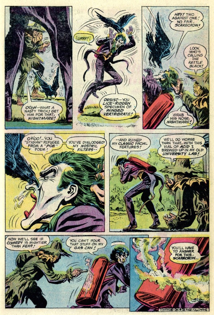
I can’t help but feel that a villain who makes time in his nefarious schedule for taking his, er, pooch for regular walks can’t be *all* bad. Likewise for a rogue who appreciates the cleverness and joie de vivre of a raven.
This is The Joker no. 8 (July-August 1976), featuring The Scarecrow’s Fearsome Face-Off!, which was edited by Julius Schwartz (in case the alliterative title hadn’t tipped you off), scripted by Elliot S! Maggin, pencilled by the always-solid Irv Novick and inked by Tex Blaisdell. Cover by Ernie Chan (as Ernie Chua).
In the mid-70s, The Clown Prince of Crime held his own book for ten issues (nine of which appeared at the time… the tenth only seeing print in… 2019!), and its stories chiefly (and rather winningly) focussed on his squabbles with other members of The Batman’s rogues’ gallery (certainly the finest in comics). I haven’t followed the dodgy shenanigans of the back issue marketplace in decades, but I was amused and bemused by the lofty prices that this otherwise-innocuous little series commands. Overflow from his cinematic popularity, perhaps?
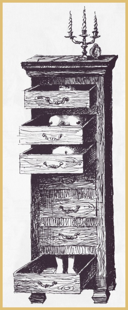
I like the way Professor Crane works. Over these past couple of years, this last two panel sequence has probably come to pass in real life more often than one would care to count.
The Joker adopting a hyena as a companion was but a cruel cover dodge, but The Scarecrow‘s pet raven, Nightmare, is present and accounted for, superbly crafty and most efficient, just like the genuine article!
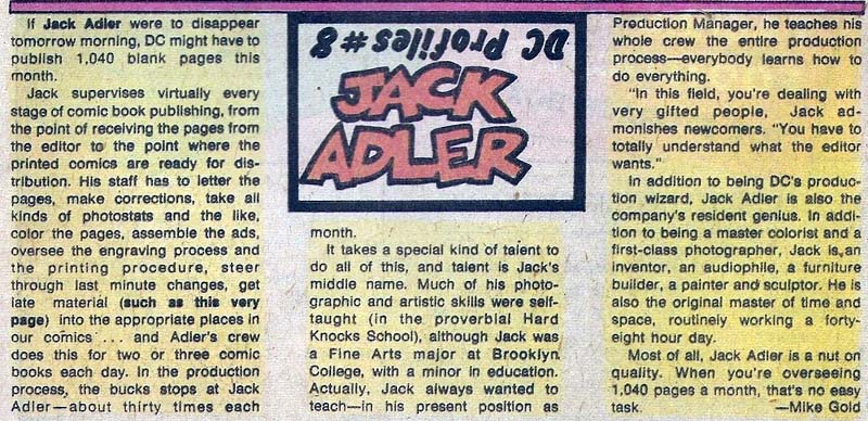
The same page, from the original printing. In closing, a slight editorial note: It’s easy to forget that, unless you kept close tabs on the printer’s work, most mainstream comics were quite badly printed… it’s especially easy to forget since much of the more popular work has since been reprinted from the original art or photostats, and digitally coloured-and-printed. Conversely, when it comes to the work of defunct publishers, and if the original artwork, or quality photostats of same, is no longer in existence or otherwise unavailable, reprinters have to make do with a flawed, not to mention secondary, sources — at best. For instance, the printing of my original edition of this Joker issue is dreadfully out of register. In the wings, things were quickly shifting at DC: as of late ’75, Carmine Infantino (publisher, etc.) and Nick Cardy (art director, etc.) were out, and an absolutely crucial production technician, Jack Adler, was being sidelined. He would retire a few years later. Long story short, Sturgeon’s Law in action, and why I went with the digital colour job. After toning down the contrast a bit. A guy’s got to have standards.
« Dennis the Menace was probably the most realistic comic book ever done. No space aliens ever invaded! » — Gilbert Hernandez
Is it already October? So it is. Well, here we go again with our annual Hallowe’en Countdown. We’ll kick this edition off by featuring that pint-sized bundle of toxic toddler masculinity, Dennis the Menace (I can’t help but think that his French name, Denis la Malice, is a far more accurate description of his sociopathic essence).
Here at WOT?, we’re both (amble over to ds’ earlier DTM spotlight) huge fans of Hank Ketcham’s cartooning finesse… I mean, these are beautiful! But… drawing skill aside, the stuff is hard to take is large doses. To quote one frazzled babysitter to Dennis’ parents: « how can you stand it? »
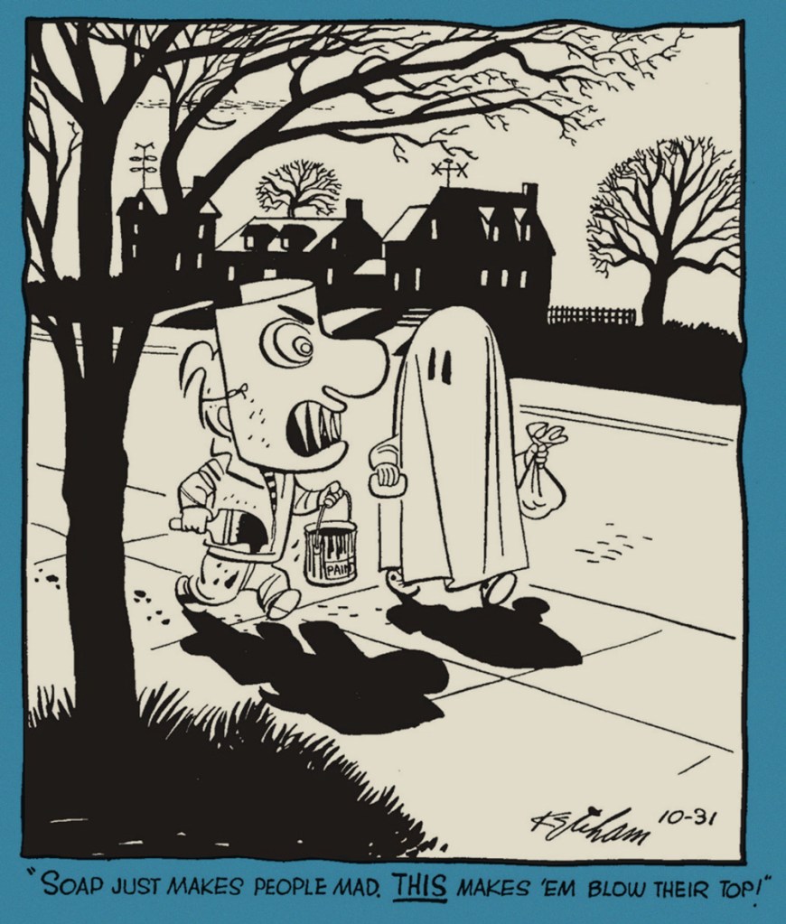
Dennis’ first Hallowe’en, from Oct. 31, 1951, the strip’s inaugural year.
October 30, 1952.
Just put yourself in Dennis’ parents’ shoes, and you get a better sense of the sheer magnitude of his malevolence. His poor folks don’t seem to have done anything to deserve being forever trapped in this relentless cycle of humiliation and injury. October 31, 1952.
The old lady didn’t think it was so silly. October 31, 1953.
This is Dennis the Menace Bonus Magazine Series no. 155 (July, 1976, Fawcett).
And a look inside…
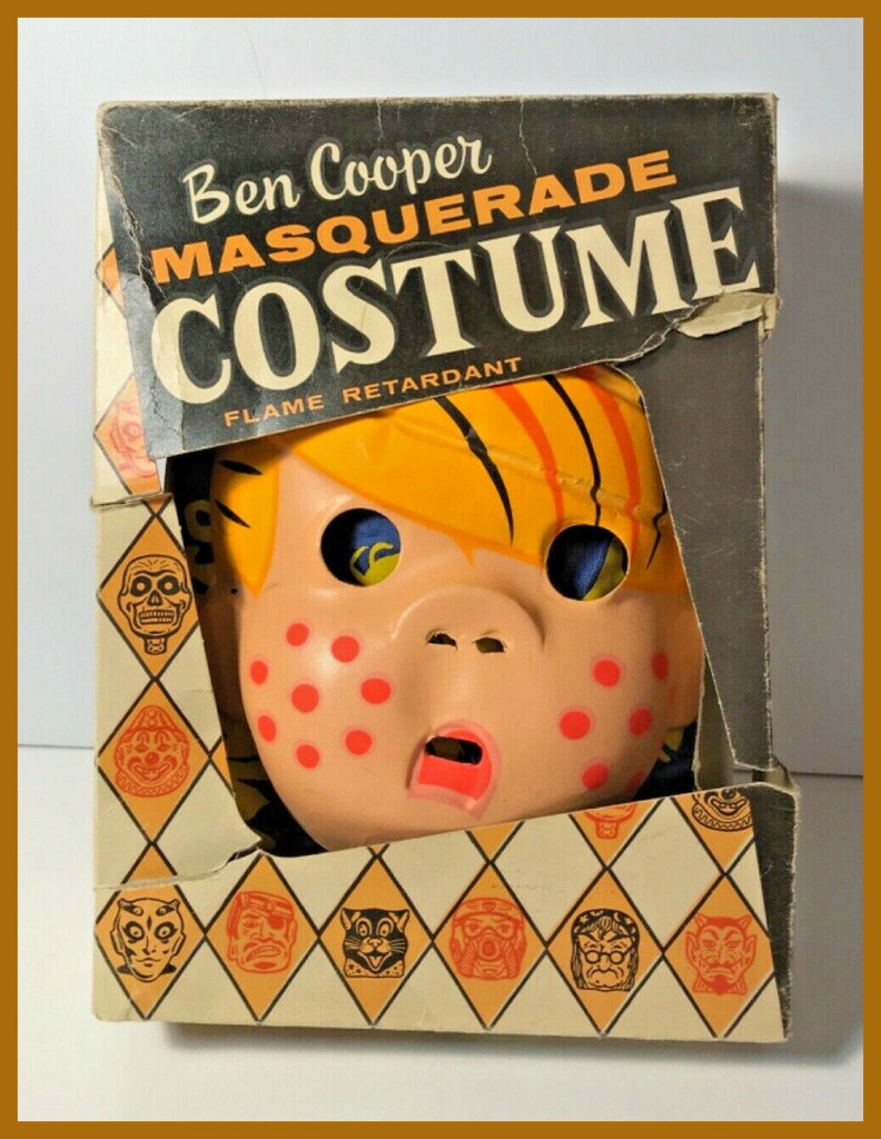
Back in the day, you could *be* Dennis (more or less) for trick or treating, thanks to that fondly-remembered purveyor of cut-rate (but cool in their way) costumes, Ben Cooper, Inc.
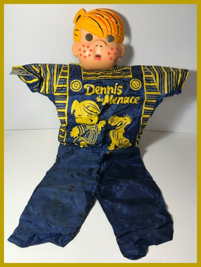
A fuller look at the Dennis ensemble. And do check out this bit of Ben Cooper history!
« Like its politicians and its wars, society has the teenagers it deserves. » — J. B. Priestley
Here at WOT central, we’re both massive Bob Oksner (1916-2007) fans, and it’s not generally for the writing. For a long time, his multi-faceted talent was used to great effect all over the DC Comics line, but he rarely received the acclaim he so richly deserved.
After DC sent up a trial balloon with Showcase no. 70 a year prior, Binky returns after a decade’s sabbatical (an eternity in the teen world!). This is Leave It to Binky no. 61 (June-July 1968, DC). The product was slightly updated (fashions and hairdos) dusty reprints with fabulous new covers.
This is Leave It to Binky no. 62 (Aug.-Sept. 1968, DC). For the record, Peggy is Binky’s blonde girlfriend. Let’s face it, she’s the true star of this book.
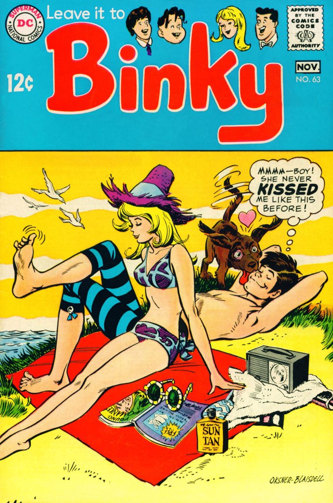
This is Leave It to Binky no. 63 (Oct.-Nov. 1968, DC). Lovely inks provided by fellow Golden Age veteran Tex Blaisdell (1920-1999).
This is Leave It to Binky no. 64 (Dec. 1968-Jan. 1969, DC).
This is Leave It to Binky no. 65 (Feb.-Mar. 1969, DC).
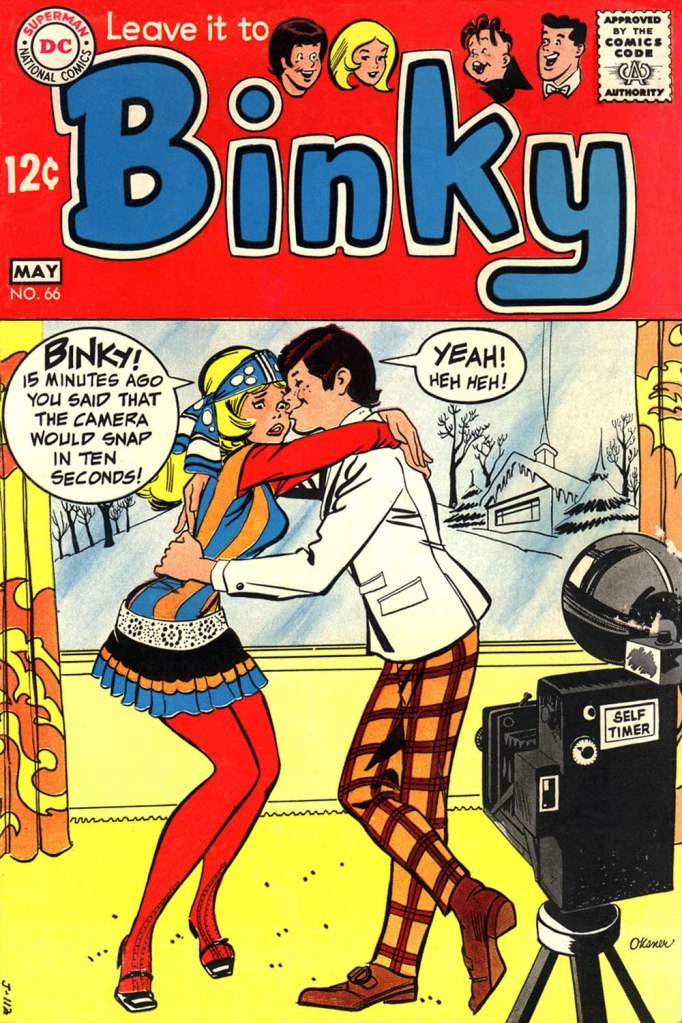
This is Leave It to Binky no. 66 (Apr.-May 1969, DC).
During last year’s Hallowe’en Countdown, I spotlighted Mr. Oksner’s fine work on DC’s long-running licenced Bob Hope and Jerry Lewis titles, but also featured his holiday-appropriate Binky cover. For thoroughness’ sake, here it is again: this is Leave It to Binky no. 67 (June-July 1969, DC).
And one more: this is DC Special no. 2 (Jan.-Mar. 1969, DC). Hard to fathom why this one came out at all, its great cover aside.
And then it was over, in this visual idiom anyway: with the following issue (LITB68), DC brought in well-traveled Henry Scarpelli to handle the covers and create the impression that Binky was just one more Archie clone. Over the subsequent four issues, a handful of (pretty good) new stories were mixed in with the reprints. Then came a change of title and a new logo. The book, now simply called Binky, was a full-on Archie ersatz, and lasted another ten issues into 1971… with one final special popping out of nowhere in the summer of ’77. For ol’ Binky, par for the course!
In 1973, he gave us Birds of Israel (included at the end of this post); farther along, he (with his frequent collaborator, Montréal-born writer Sean Kelly) gave us a look at The Birds of Summer, (2007, The New York Times). And in 2016, these ardent but irreverent crypto-ornithologists were at it again with Odd Birds, which added in excess of one hundred and fifty fascinating new species to the tally. However, Meyerowitz only illustrated a handful (but such a handful!), which I present to you here. Still, how I would love to behold his depictions of, for instance: The Three-Day Lark; the Venomous Spite; the Oblivious Walking Jay; the Perpetual Jackhammer; the Yellow-Bellied Stool Pigeon; the Groveling Wince; the Hoodwinked Bagholder; the Celibate Tot-Fondler; Zimmerman’s Cryptic Drone; the Barecheeked Thongbird; the Bald-Faced Lyre; the Fact-Spinning Mockingbird; the Screaming Scarlet Manager; the Gulf Coast Petrel Dumper; Oscar’s Pink-Bottomed Boychick; the Crapulous Binge; the Free-Screech Owl… or the Swaggering Gut-Sucker! Man, this project needs to go the full book route.
THE RAVING HOMELAND JINGO: « This recently introduced European species is often mistaken (by itself) for native American. It proudly displays its red neck, white knuckles, and bluenosed morality, kept aloft by drafts of hot air. The Jingo emits gruesome shrieks in defense of its territory against the occasional Left-Winged News Hawk. The Jingo is anatomically anomalous, in that its testicles are located in its cranium, and its brains are safely secured behind and exceptionally tight sphincter. »
« The all-too-common Back Lot Goose, with its natural prey, the Wide-eyed Chippy. »
Meet HITCHCOCK’S MacGUFFIN — « An Old World species, introduced to California: a plump, lugubrious bird given to stealthy silences, sudden shrieks, and terrifying displays. Its diet consists of red herrings and snakes in the grass. Despite its reputation, has laid the occasional egg. Sometimes mistaken for Hammett’s Maltese Falcon; not to be confused with any of Spielberg’s Mawkish Cliff Hangers. »
THE CHRISTOPHER WREN: « Like the Francis Drake, the Dean Swift and the Florence Nightingale, this bird prefers a cold, damp, dreary environment such as the city of London, England, in which the Christopher Wren constructs nests of preposterous design, monumental size, and no apparent use. (This species is not related to the similarly named Christopher Robin, native to the Hundred Acre Wood in East Sussex.) »
« A grizzled Hoary-Headed Junk Chucker faces down a Stat-Grubbing Peckerhead. »
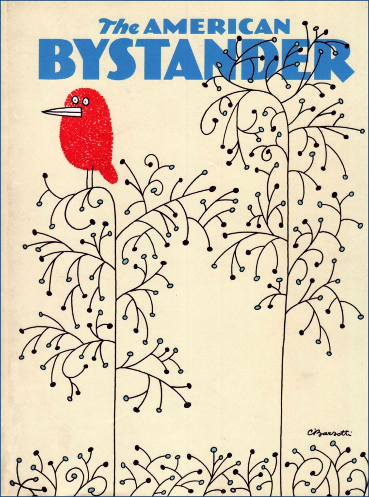
These cartoons appeared within the pages of The American Bystanderno. 2 (Spring 2016), bearing this soothing cover by the esteemed Charles Barsotti (1933-2014). Do check out and lend your support to the Bystander, which has most deservedly been deemed “The last great humor magazine“.
Where the good Mr. Meyerowitz seems to have first hatched his theme: Birds of Israel, from The National Lampoon Encyclopedia of Humor (1973, edited by Michael O’Donoghue).
« By 1948, the Italians had begun to pull themselves together, demonstrating once more their astonishing ability to cope with disaster, which is so perfectly balanced by their absolute inability to deal with success. » — Gore Vidal
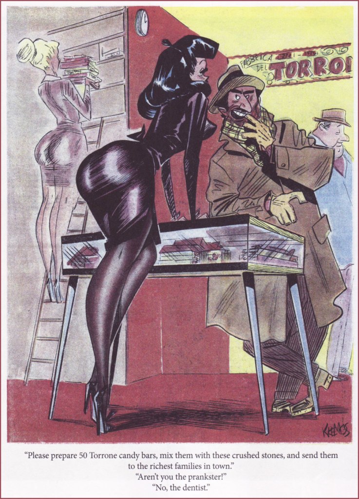
The accomplished Italian graphic designer, animator and illustrator Niso Ramponi (1924-2002), is perhaps most renowned (it’s all relative, but not to actual merit!) under his pinup cartooning nom de plume of “Kremos”.
Ramponi champion Joseph V. Procopio sheds some light on the genesis of this alias:
« Ramponi’s pen name, Kremos, was born of necessity: Like many of his generation, after the war Ramponi was conscripted into the Italian army for a year of service. Loath to abandon his budding cartooning and illustration career but barred by military regulations from working as a freelancer, Ramponi conspired with a friend named Sandro Cremo, who acted as his intermediary to secure and deliver freelance art assignments on Ramponi’s behalf. To maintain the ruse, Ramponi signed his work Kremos, a pseudonym that stuck even after his discharge from military duty. »
My own initial exposure to Ramponi/Kremos’ work came through Lawrence Lariar and Ben Roth’s splendid, but woefully short-lived Best Cartoons From Abroad collections (1955-60), which contrasted favourably against the genteel contemporary American humour anthologies. Fortuitously, Signor Procopio eventually assembled, circa 2015, twin collections of Ramponi’s finest cartoon work, ‘Kremos: The Lost Art of Niso Ramponi‘, volumes 1 (b&w) and 2 (colour). Grab ’em while you can!
Here’s a mixed even dozen of my favourite Kremos cartoons. Buon appetito!
From Travasissimo no. 41 (Jan. 1951).
Worry not: she’s not bad, she’s just drawn that way. From Travasissimo no. 50 (Oct. 1951). I see much kinship between Ramponi and Jack Cole‘s pinup styles, don’t you?
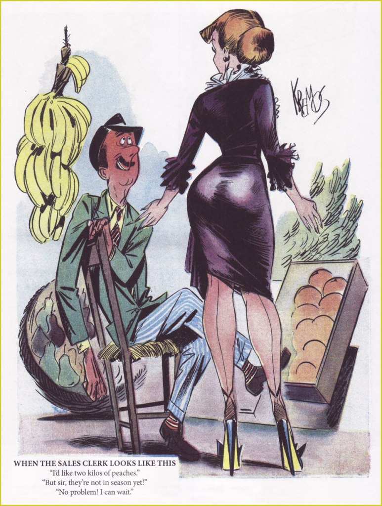
Ah, yes, when one ate fruit and vegetables only when they were in season. I miss that; it seems more honest, less decadent and wasteful. From Travasissimo no. 57 (May 1952). For the strangest reason, this doesn’t leave me craving peaches, but rather… aubergine.
From Il Travaso (Jan. 18, 1953).
From Travasissimo no. 76 (Dec. 1953). I do believe that this is an encore appearance from the previous cartoon’s exam taker.
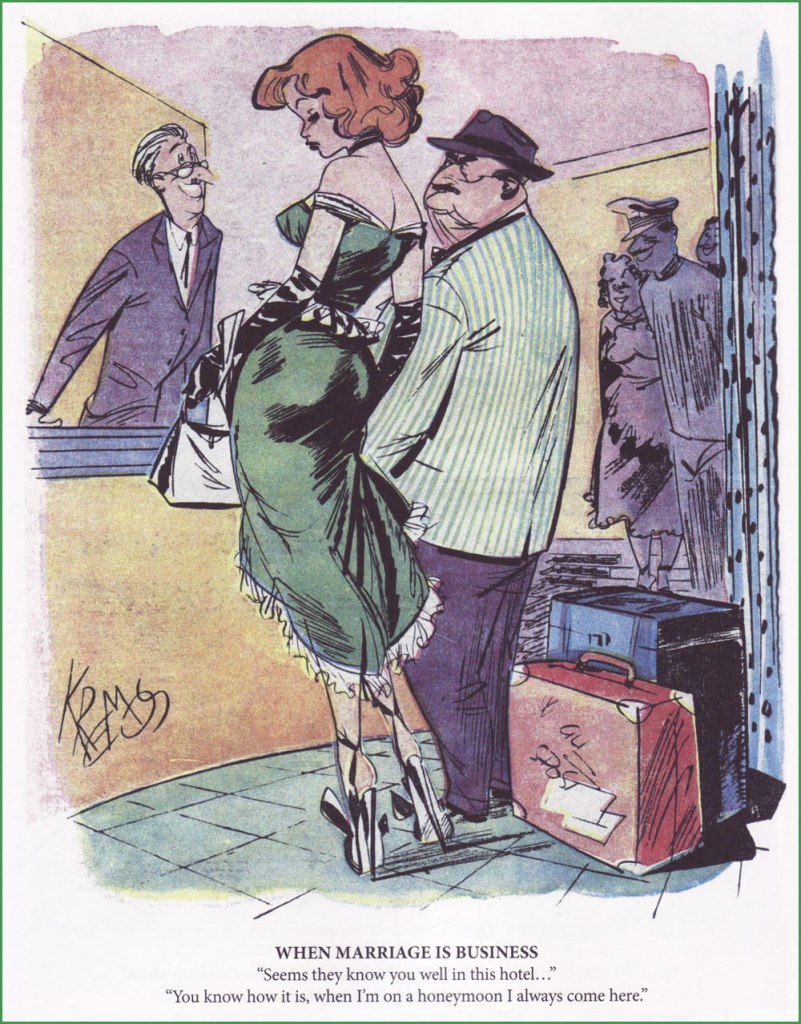
From Travasissimo no. 85 (Sept. 1954); translated version from Best Cartoons From Abroad 1955, my inaugural, unforgettable brush with the Kremos aesthetic.
From Travasissimo no. 88 (Dec. 1954). The caption was completely rewritten for the cartoon’s English-language appearance in Best Cartoons From Abroad 1955, edited by Lawrence Lariar and Ben Roth. The original gag went: Husband: “You know, dear… I took some swimming lessons from the lifeguard because I wanted to surprise you…“ Wife: “Now?” Husband: “No, in April!“
From Il Travaso –“The overflow” for you English speakers (May 26, 1958).
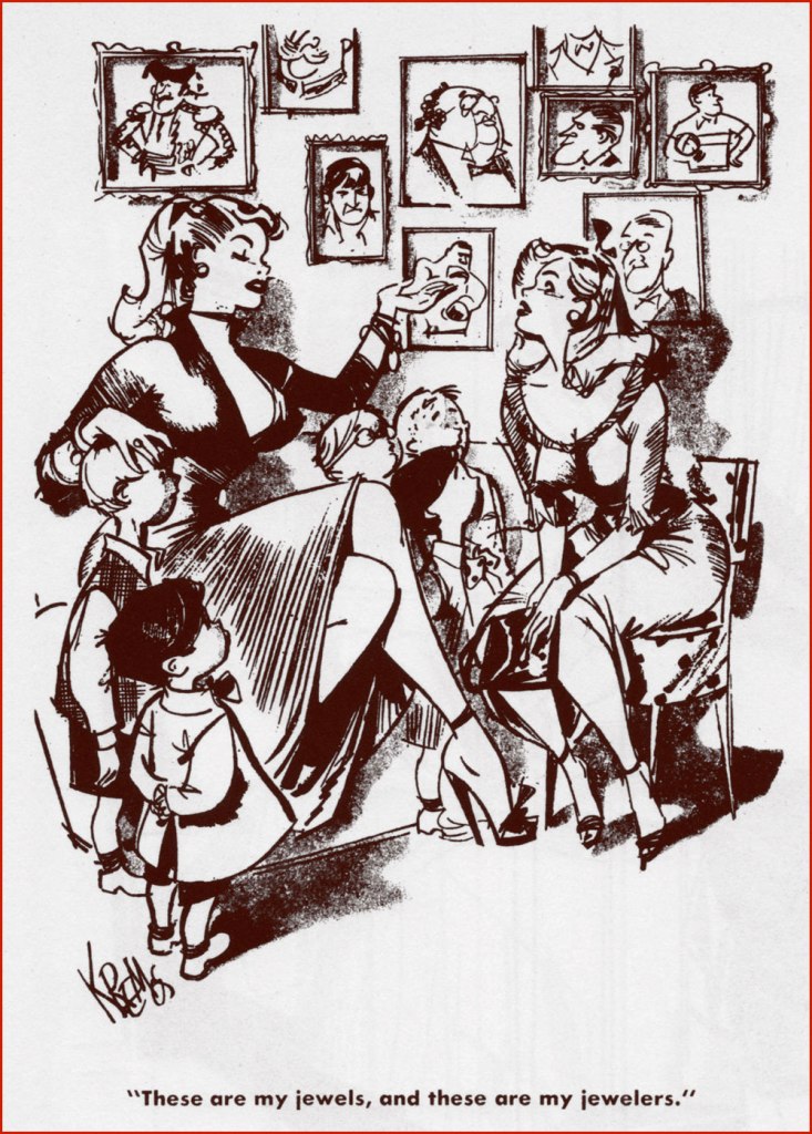
From Il Travaso, circa 1958; reprinted in Best Cartoons From Abroad 3, edited by Lariar and Roth.
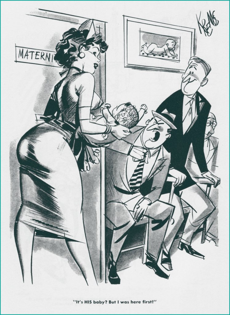
From Il Travaso, circa 1958; also reprinted in Best Cartoons From Abroad 3.
From Il Travaso, circa 1958; again reprinted from Best Cartoons From Abroad 3. Those American editors loved their Kremos. I love the word “pappagallo” which, in Italian slang, means a wolf… autrement dit, a randy ragazzo.
From Il Travaso, circa 1959; reprinted in Best Cartoons From Abroad 1959, edited by Messrs. Lariar and Roth.
« Doublethink means the power of holding two contradictory beliefs in one’s mind simultaneously, and accepting both of them. » — George Orwell
For its July 4, 1949 issue, Life Magazine pulled a couple of rather unusual moves: it featured an elaborate preview of George Orwell’s just-published novel Nineteen Eighty-Four and, as if that wasn’t weird enough, it called upon the services of renowned cartoonist Abner Dean to (copiously) illustrate the article.
Typically, given the USA’s usual political temperament and the then-prevailing climate of McCarthyism and the Red Scare, Life resorted to some choice bits of disinformation and misdirection to sell Orwell and his book to its decidedly whitebread readership. No irony whatsoever.
« British novelist George Orwell, 46, who fought in the Spanish Civil War, saw firsthand what the Communists were up to and has since devoted all his talents to warning the world of the fate which awaits it if it confuses liberalism with regimentation. His new novel, Nineteen Eighty-Four, is a terrifying forecast of what the world of human beings may be like 35 years hence. It is a July selection of the Book-of-the-Month Club and will be condensed in the September Reader’s Digest. It is guaranteed to make the flesh creep on anything except brass monkeys and commissars. »
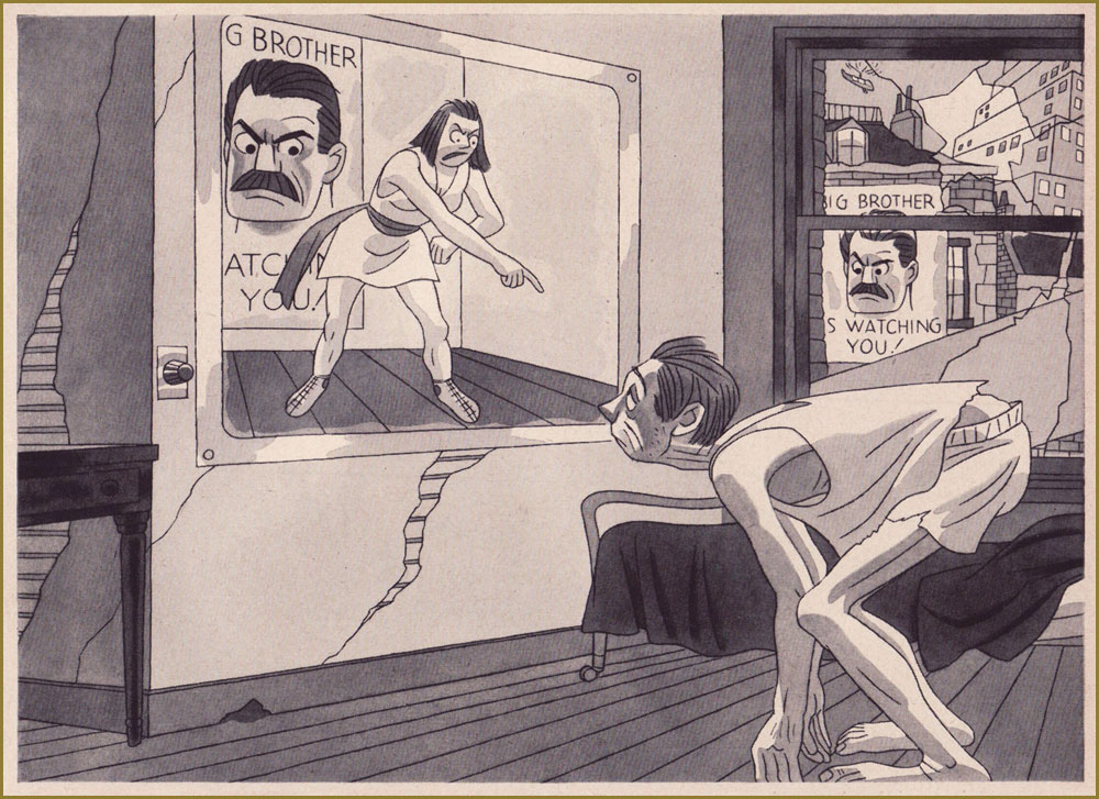
Dean’s huge (52 cm x 24 cm) spread ushering readers into The Strange World of 1984. It’s hard to do it justice at this reduced size, but open it in a separate tab for a closer look.
Let’s see, now. Orwell fought in the Spanish Civil War. Fair enough. Let’s dwell on that detail for a bit. Which side was he on?
« In December 1936, Orwell went to Spain as a fighter for the Republican* side in the Spanish Civil War that was provoked by Francisco Franco’s Fascist uprising. He did not join the International Brigade as most leftist did, but the little known Marxist POUM. In conversation with Philip Mairet, editor of New English Weekly, Orwell said: ‘This fascism… somebody’s got to stop it’. To Orwell, liberty and democracy went together, guaranteeing, among other things, the freedom of the artist; the present capitalist civilization was corrupt, but fascism would be morally calamitous.
He joined the Independent Labour Party contingent, which consisted of some twenty-five Britons who had joined the militia of the Workers’ Party of Marxist Unification (POUM – Partido Obrero de Unificación Marxista), a revolutionary communist party. The POUM, and the radical wing of the anarcho-syndicalist CNT (Catalonia’s dominant left-wing force), believed General Franco could be defeated only if the Republic’s working class overthrew capitalism — a position at fundamental odds with the Spanish Communist Party, and its allies, which (backed by Soviet arms and aid) argued for a coalition with the bourgeois parties to defeat the fascist Nationalists. » [ source ]
So… Orwell was not merely a communist, but a Marxist advocating the overthrow of capitalism. Just like your average Reader’s Digest subscriber, obviously!
« THE TELESCREEN dominates the lives of Party members; it is a kind of television set which can never be turned off, and which can pick up as well as receive images. Over it the members hear what they are supposed to do and believe — and from the other end the dreaded Thought Police can see everything they do and hear everything they say. » Prophetic? Now don’t be silly.
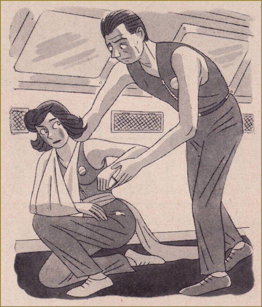
« TWO MINUTES HATE is a daily institution designed to keep Party members in a frenzy of excitement and rage against the Party’s enemies. »
A LOVE AFFAIR in six panels. Spoilers galore. Protagonist Winston Smith meets Julia.
Julia hands Winston a note, which he drops into the memory hole (basically an incinerator) as a precaution.
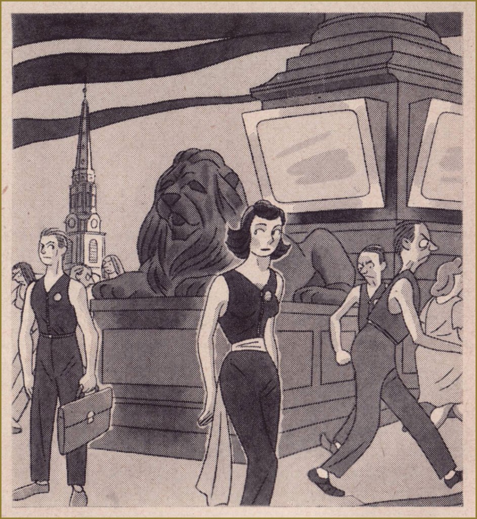
They meet in the midst of a crowd in Victory Square, and Julia whispers some instructions to Winston.
« Now, in a trysting place beneath the trees he finds a kindred soul in the rebellious Julia; she removes the hateful sash of the Anti-Sex League and they enter upon one of the most furtive and pathetic little love affairs in all literature. » The anonymous author of the article does not seem to approve.
« Julia is good at smuggling forbidden pleasures; they have real coffee (not the ersatz ‘Victory’ mixture) and chocolate, and Julia adorns herself with cosmetics and perfumes which no Party member is ever supposed to see. »
« But eventually, the Thought Police catch up with them. For the unspeakable crime of indulging in a human emotion they are arrested and hauled away to repent their sins in the horrible confines of the Ministry of Love. » I did warn you about spoilers: indeed, Winston Smith Takes It on the Jaw!
It’s intriguing that LIFE would devote this much space to such a controversial topic, but hardly surprising that it would stack the deck. It’s a regrettable hallmark of blind hubris to believe that only ‘the opposition’ is capable of totalitarian atrocities, when allowed unchecked power. Benevolent dictators have always been very, very scarce. To quote Margaret Atwood, a lady who knows her way around a dystopia, « ‘1984’ is not a wonder tale. Not only could it happen, but it has happened, but under different names. »
« Competition brings out the best in products and the worst in people. » — David Sarnoff
The other day, my partner was trying out a video game whose soundscape seemed exceptionally judicious and well-integrated to the action. At one point, she noticed that the optimal way to play was by matching one’s pace and movements to the musical rhythm. I said, “Oh, it’s just like that Star Rovers story!”
And now for a bit of context: The Star Rovers was a short-lived series that sporadically appeared in the back of DC’s Julius Schwartz-edited titles, mainly Mystery in Space, backing main feature Adam Strange.
As Michael Uslan beautifully puts it, in his introduction to Mysteries in Space: The Best of DC Science-fiction Comics (Fireside/Simon and Schuster, 1980):
« The Star Rovers were a whole other category of space heroes, typical of the kind of originality demanded by Julius Schwartz. A transgalactic trio of playboy, glamor-girl and novelist-thrill-seeker, they rarely agreed about anything and were rarely right about anything even when they did agree. »
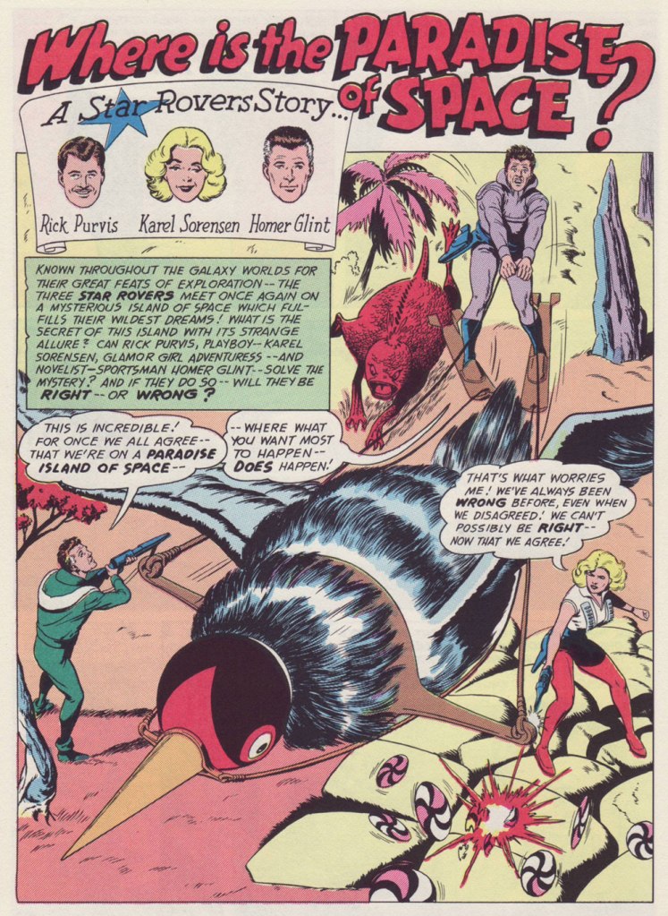
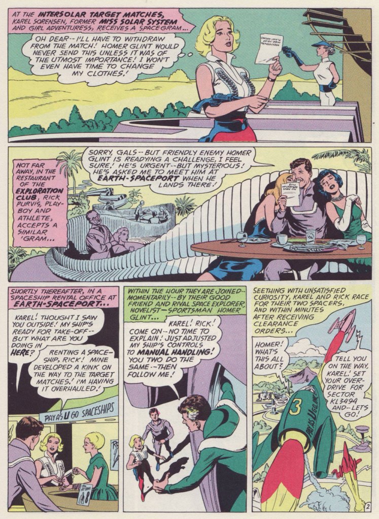
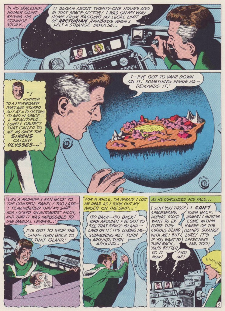
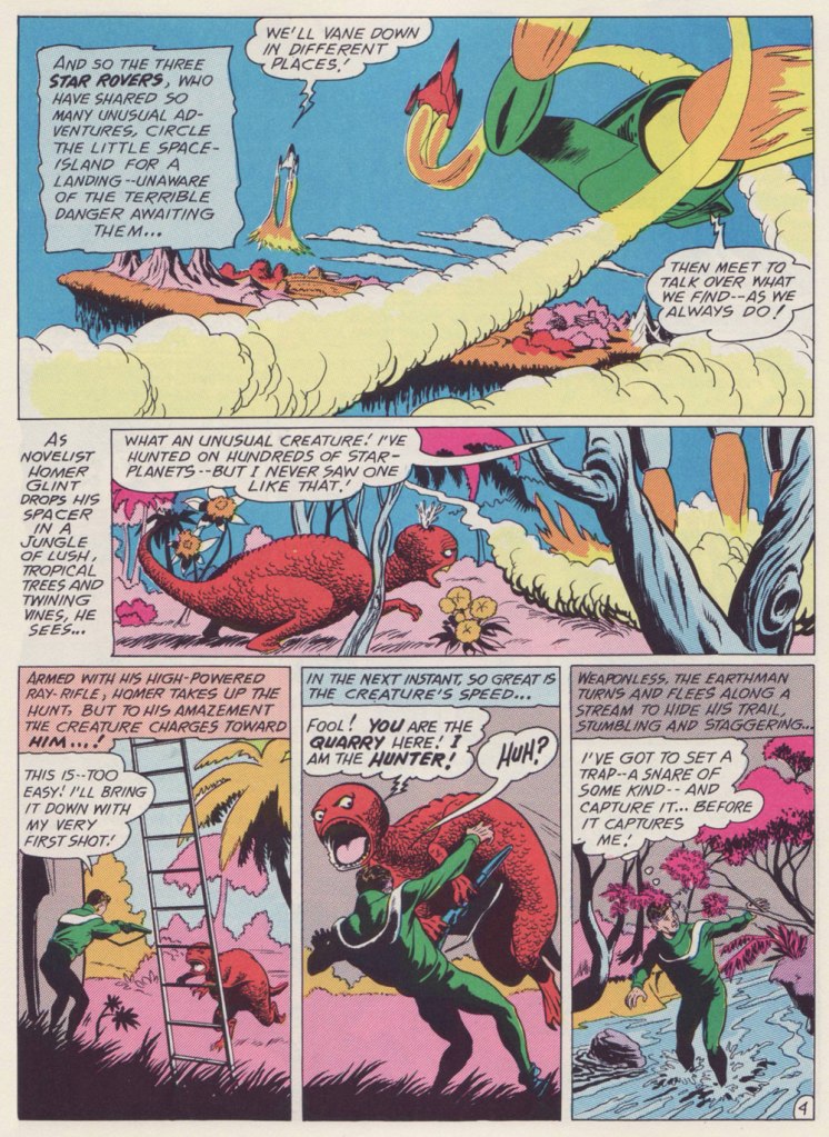
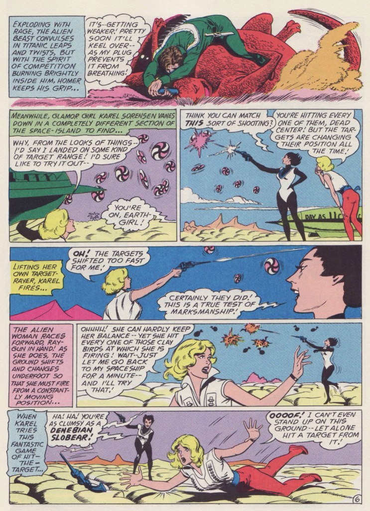
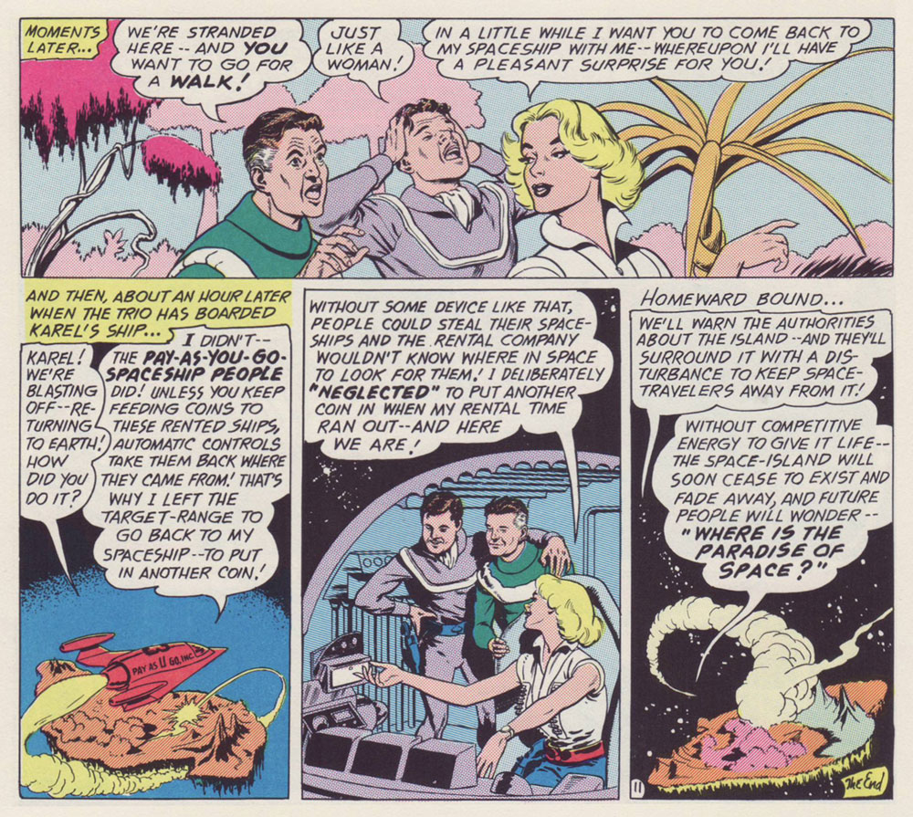
This is the third Star Rovers episode, Where Is the Paradise of Space?, from Mystery in Space no. 74,Mar. 1962, DC).
This is the sequence that brought this story to my mind.
One of the most charming aspects of the Star Rovers is the protagonists’ equal footing. In this case, Karel is a bit more than the fellows’ equal, but the series is mostly exempt of the sexism you’d expect from the period of its creation.
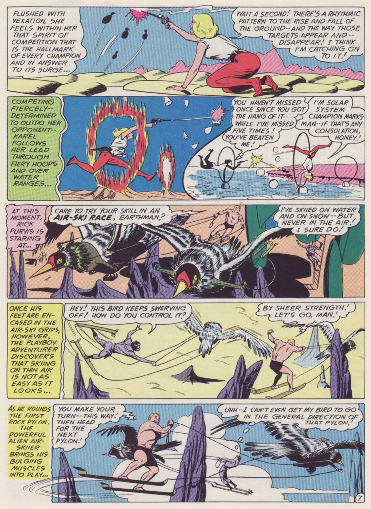
Much of the appeal of the Star Rovers is that they’re not a team: they’re friendly rivals, ‘frienemies’, as we’d call them these days. Aside from matching wits and theories, they never directly compete, as differences in their fields of endeavour would make the exercice pointless. There’s a light, jovial tone to these mysteries, yet they can still be taken seriously as intriguing puzzles.
All nine episodes were edited by Schwartz, scripted by Gardner Fox, and illustrated by Sid Greene (1906-72). The latter, a veteran of the comics industry with published work going back to 1940, arguably turned in the finest work of his busy career, and likely would have kept on doing so had it not been for… Batman’s troubles.
To make a long story short, as the Batman titles were shedding readers like there was no tomorrow (making it possible that there would, indeed, be no tomorrow), DC bigwigs opted to switch things around a bit, pulling editor (and Jack Kirby blackballer) Jack Schiff off Batman and Detective Comics and handing him the reins of Schwartz’s SF titles Strange Adventures and Mystery in Space. He ran those into the ground, but in goofily entertaining fashion, at least. Unlike the bat-books, there were expendable to DC.
As the ultimate Star Rovers tale appeared in the final issue of the Schwartz-edited Strange Adventures before the changeover, it seems likely that the series would have carried on under a Schwartz régime. But the Rovers weren’t at all in Schiff’s wheelhouse: the delicate premise called for deft, intricate plotting and wit, qualities not to be found within Schiff’s stable of writers. Gardner Fox and Greene were among Schwartz’s trusted confederates, and talent poaching was rarely allowed within DC’s editorial enclaves.
After this editorial switch, Greene was, with few exceptions, put to work inking the pencils of Schwartz’s big three: Carmine Infantino on Batman and The Elongated Man, Gil Kane on Green Lantern and The Atom, and Mike Sekowsky on Justice League of America. The problem, at least as I see it: Greene’s inks didn’t mesh well with any of these pencillers’ styles. Oh well — it’s a living. At least Greene was able to return to full pencil and ink duties on a handful of short stories for editor Murray Boltinoff, mostly in the pages of The Unexpected. Better late than never.
Finally, for your edification and amusement, here’s a Star Rovers checklist:
Who Caught the Loborilla? (Mystery in Space no. 66, Mar. 1961) What Happened on Sirius-4? (Mystery in Space no. 69, Aug. 1961) Where Is the Paradise of Space? (Mystery in Space no. 74, Mar. 1962) Where Was I Born– Venus? Mars? Jupiter? (Mystery in Space no. 77, Aug. 1962) Who Saved the Earth? (Mystery in Space no. 80, Dec. 1962) Who Went Where– and Why? (Mystery in Space no. 83, May 1963) When Did Earth Vanish? (Mystery in Space no. 86, Sept. 1963) Will the Star Rovers Abandon Earth? (Strange Adventures no. 159, Dec. 1963) How Can Time Be Stopped? (Strange Adventures no. 163, Apr. 1964).
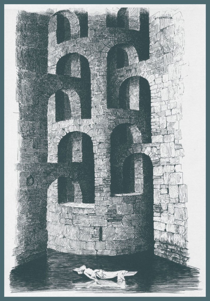
« It’s true that Gourmelin’s world has everything to unsettle the general public: it contains as much horror as black humour, as much morbidness as sombre poetry. But to classify his drawings in a well-defined genre is a hopeless enterprise, and we well know how our times need clear, idiotic and exact labels. This relegates Gourmelin to some fuzzy area, a sort of no man’s land where one can find anything — even fanatics — but never a thing to eat or to drink. » — from the artist’s presentation in the anthology Les chefs-d’œuvre du dessin d’humour*(1965, Les éditions Planète; ).
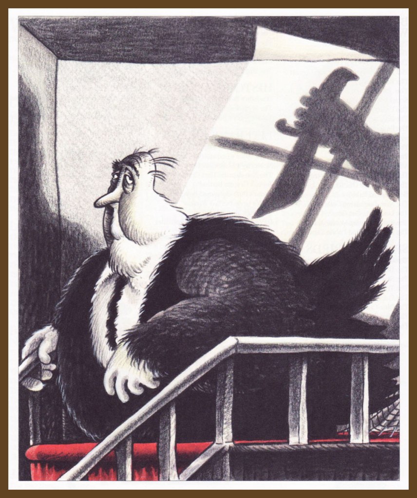
While France’s Jean Gourmelin (1920-2011) started out as a painter and practiced — and often mastered — scores of artistic techniques and media (etching, technical drawing, sculpture, stained glass, wallpaper design, and so on…), he’s more commonly remembered for his stark black and white, wordless pen and ink drawings. Even as they remain open to interpretation, their power and eloquence are undeniable.
While his earliest drawings appeared in print sporadically from 1951, his crucial turning point was his 1961 encounter with Belgian writer-historian Jacques Sternberg, who encouraged Gourmelin to emphasise, in his work, idea over form. This canny shift in approach soon landed his newly-galvanised work in the pages of Planète, crucially, but also those, just as notable, of Bizarre, Midi-minuit Fantastique, Pariscope, Hara-Kiri… with occasional forays into other media, for instance some striking production design for a 1967 TV adaptation of Gustav Meyrink‘s classic novel, The Golem. Here’s an unexpected (and fine!) article in English about Gourmelin’s work on the film.
Here, then, are some (dark) highlights of Gourmelin’s work in the 1960s.
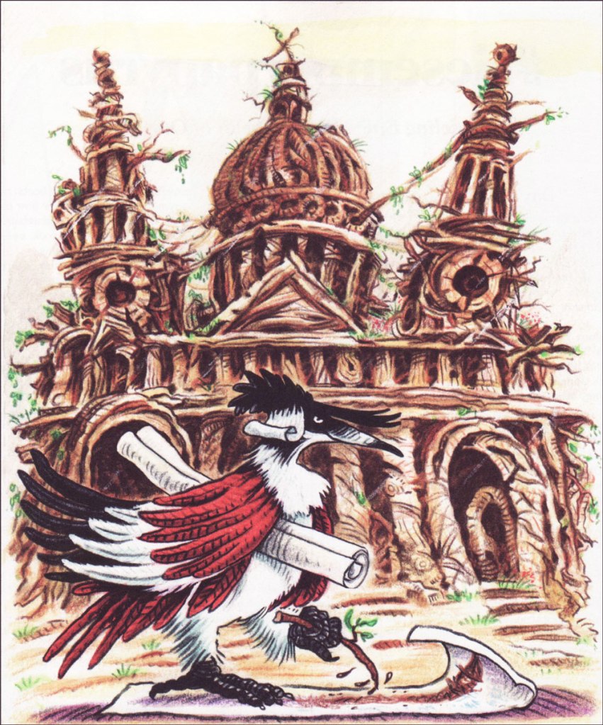
This piece appeared in Les chefs-d’œuvre de l’épouvante (1965, Les éditions Planète), accompanying Claude Farrère‘s classic 1928 short-short story, Le Train perdu, which you can read here (in the original French). Gourmelin also provided the anthology’s arresting cover and frontispiece artwork. Maybe next time…
-RG
*It says something (flattering, if you ask me) about the Gallic character that Gourmelin’s work would fall under the category of “humorous”. We’re a looong way from, say… Dave Barry.
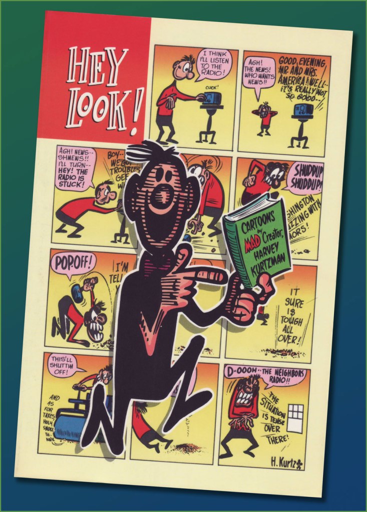
« Hey, Look! is essential reading for any cartoonist. » — the late and much-missed Patrick Dean, who truly knew what he was talking about.
Sometimes I think of a post topic and dismiss it with a ‘nah, too obvious’… but on some of my brighter days, I run the idea past my wife, who provides a welcome reality check: ‘Obvious to whom?‘, she asks. Well, there’s been a collected edition… which has been out of print for most of the nearly thirty years since it hit the stands. Fair enough.
As I’ve been lately foraging through the crumbling back pages of Golden Age humour comics (see my previous post), it would be negligently immoral for me to pass over one of the crown jewels of the genre, the era and the medium.
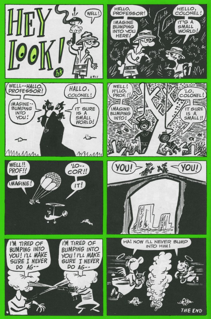
One* of the redeeming features of Marvel’s overwhelmingly crass Dynamite (magazine) rip-off, Pizzazz, was its reprinting of a handful of Harvey Kurtzman‘s majestic Hey Look! strips. Of course, it made perfect economic sense: grab some already (and barely)-paid-for, all-but-forgotten ‘filler’ from the 1940s, slap some new colour on ‘em, and wham! One less egg to fry.
Here’s the collection in question. Published in 1992 by the venerable Kitchen Sink Press, it has yet to be improved upon. In addition to all the Hey Look! strips, it includes an unsurprisingly excellent introduction by the erudite John Benson, and further sweetens the pot with Kurtzman’s other Timely features of the era, namely Genius, Egghead Doodle and Potshot Pete. The latter is particularly worth a look-see.
The earliest Hey Look! strips are cute and of some historical significance, but rather scattershot and tentative. Here’s roughly where Kurtzman starts to really, and consistently, cook. Originally published in Gay Comics no. 33 (Aug. 1948, Timely).
Mr. Kurtzman was ahead of the game, anticipating the superhero genre’s dark turn of the mid-80s and beyond, and pointing out its inherent fascism. Already a bit too close too home at the time of its creation, this piece languished in limbo until its publication in 1966 in a limited-edition portfolio.
Originally published in Nellie the Nurse no. 16 (Dec. 1948, Timely).
Originally published in Hedy Divine no. 30 (Dec. 1948, Timely).
Originally published in Joker no. 35 (Jan. 1949, Timely).
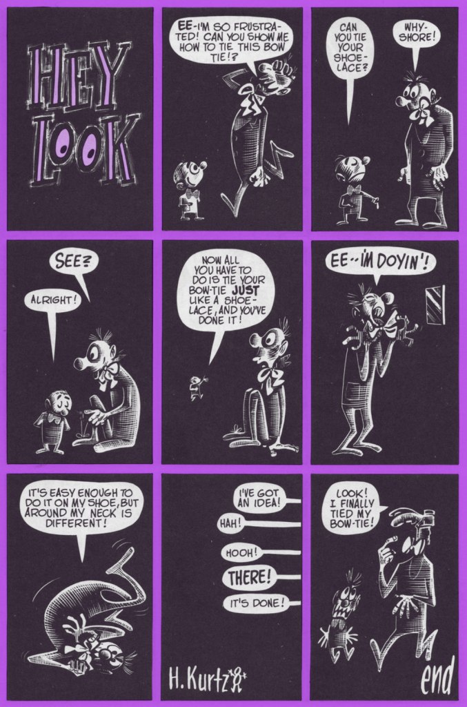
Originally published in Millie no. 16 (Feb. 1949, Timely). Always experimenting: dig here Kurtzman’s elegant use of the scratchboard technique.
Originally published in Nellie the Nurse no. 19 (Apr. 1949, Timely). With the miniaturisation of electronics, and cameras in particular, there’s (of course) been an opposing movement toward huge telephoto lenses. Read into it what you will.
I was, and remain, especially fond of this one, originally published in Gay Comics no. 37 (Apr., 1949) and reprinted in Pizzazz 15 (Dec. 1978)… the one with the Battlestar Galactica cover. ‘Cabazziz’ is made up, but Podunk has roots.
Originally published in Patsy Walker no. 22 (May 1949, Timely). Incidentally, generic ‘teen’ humour character Patsy Walker has since (circa 1976) been refashioned and recycled, in the tried-and-true ‘waste not, want not’ Marvel manner, into a superheroine, Hellcat. Sheesh.
« I think the most gruesome thing in life is people — if they let themselves go. I’ve been letting myself go for years, and I’m beginning to feel gruesome. I want to entertain and communicate. I don’t want to hurt anyone’s feelings, but I have to be honest — like that old baseball umpire — and call ’em like I see ’em. My drawings aren’t as bad as the models themselves. » — Basil Wolverton
Here at WOT? headquarters, we’re both card-carrying, fervent Basil Wolverton* fanatics, but we haven’t devoted the column space commensurate with our affection for his work. Why? Because Wolverton, despite toiling in underpaid obscurity for most of his career and inevitably never becoming a household name, was always a critic and historian’s darling, insofar as there was a scholarly press to express its appreciation. Things began to turn around in the early 1970s, just in time.
Whatever subject or genre he put his hand to, Wolverton’s singular style shone through, and not as a handicap: his funnies were hilarious, his horror was harrowing… but they were distinctly from that same, most gifted of hands.
The artist at work (presumably) on his caricature of Red Skelton, circa 1949.
Most of Basil’s humour work was (with the partial exception of Powerhouse Pepper, 1942-49) relegated to ‘filler’ features, generally hidden gems glittering in the mediocre midst of loads and loads of higher-profile rubbish. Don’t just take my word for it: here’s a typical example of the sorry setup.
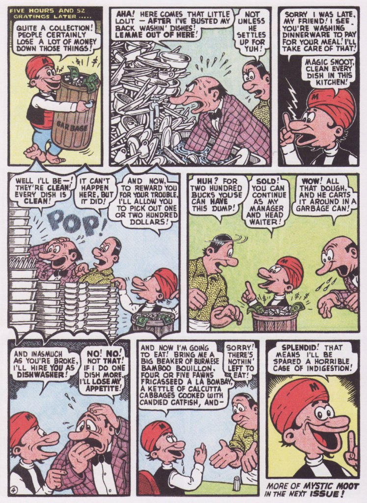
From this thrilling new assemblage, I’ve picked a pair of short samples, both featuring my favourite Wolverton protagonist, Mystic Moot (and his Magic Snoot). Sadowski informs us that:
« In July 1945, editor Virginia Provisiero invited the artist to submit ideas for a four-page ‘magic or mystic character’. He responded with Champ Van Camp and his Magic Lamp, but the editor suggested ‘a weird magician who had hocus-pocus powers instead of this lamp and genie affair‘. Wolverton hit the bull’s-eye with his second try, Mystic Mose and his Magic Nose, though Managing Editor Will Lieberson came up with a catchier moniker. »
Historian Henry Steele, in his indispensable overview of Wolverton’s career (published in Bill Spicer‘s blandly-titled but most excellent Graphic Story Magazine‘s issues 12 and 14, circa 1970-71), eloquently describes Mystic Moot as :
« Basically a kindly and almost simple soul, he is eternally cheerful and never at a loss. He is perennially helping others, usually unfortunate nobodies liked the jobless glutton, the bankrupt small businessman, the farmer with no crop, the henpecked husband, intimidated lumberjacks and prospectors, widows, orphans and kindred down-and-outers. He uses his magic powers only in the most haphazard ways, and never relies on them on his own behalf unless it is absolutely necessary.
Perhaps because of the passive Eastern philosophy of its subject, Mystic Moot strikes one as being the most minor key of all Wolverton’s features — which, while it implies difference, does not mean inferiority in any sense. »
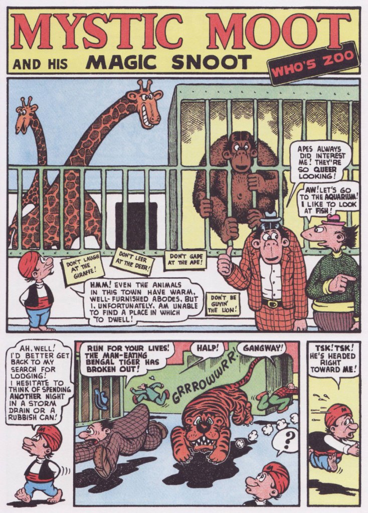
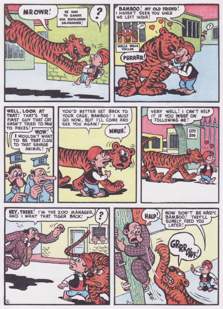
Originally published in Comic Comics no. 2 (May 1946, Fawcett).
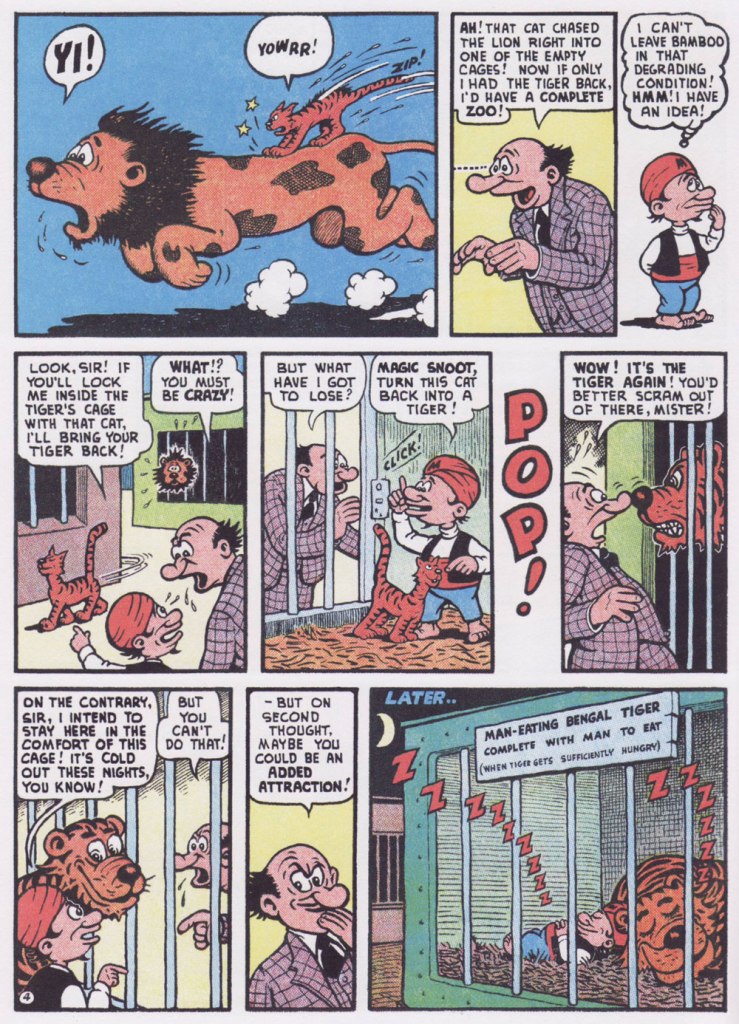
Here’s one for my fellow animal lovers out there!
Originally published in Comic Comics no. 7 (Oct. 1946, Fawcett).


