Treasured Stories: “The Set-Up Caper” (1975)

« The hardest tumble a man can make is to fall over his own bluff. » — Ambrose Bierce

Today, I’m going totally ‘mainstream’ on you for a change. Last week, I ventured into a movie theatre for the first time since 2019 (Knives Out was my last such outing) to see my first superhero film since 2012 (The Avengers was my last such outing). And so, while the new Superman epic wasn’t perfect, I found much to enjoy about it.

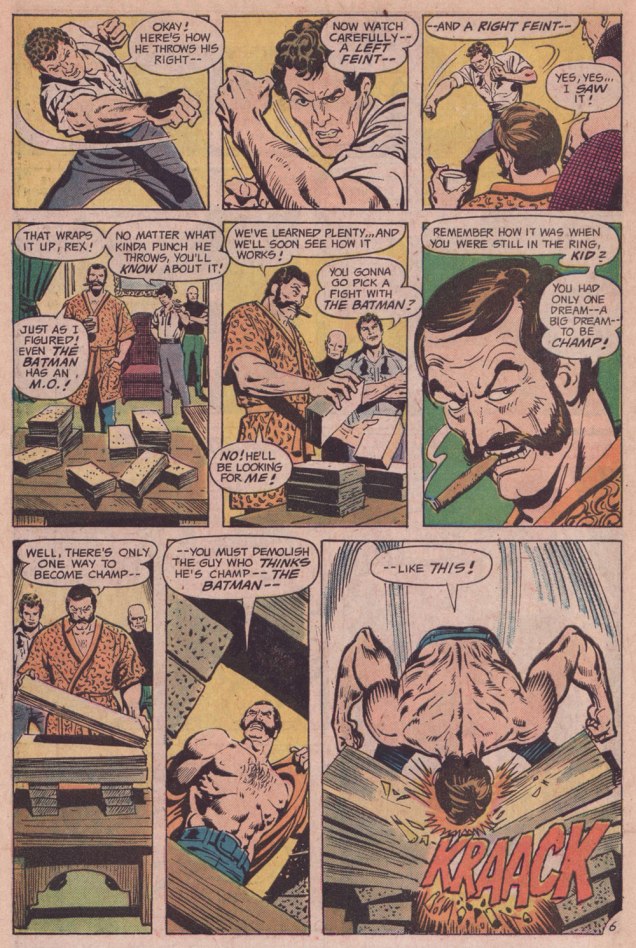
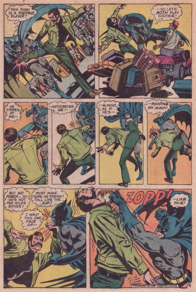
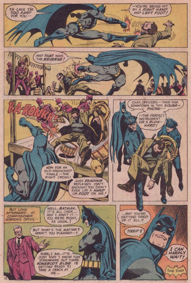
Among the ideas explored in the film was that baddie Lex ‘Elon’ Luthor, from carefully observing The Man of Steel over several years’ worth of skirmishes, had managed to analyse and codify his combat moves, in order to predict and counter them.

I was reminded of that angle serving as the basis of a favourite Batman story by my favourite Batman writer (and hardly anyone else’s, apparently), David Vern Reed (1914-1994). Despite its publication in a popular, long-running title, this tale is obscure to the point of never having been reprinted in English.

So then, here is “The Set-Up Caper“, written by Reed, pencilled by José Luis García-López, inked by Ernie Chan, and edited by Julius Schwartz… who likely thereby had a hand in the plot.

Originally published in Detective Comics no. 454 (Dec. 1975, DC). Ernie Chan’s cover is on the mediocre side, so I won’t waste space by including it.

Unlike your average Marvel comic of the era, the fisticuffs are not only justified, but they’re absolutely crucial to the scenario.

Ah, the ‘sweet science‘ of pugilistics.

Oh, and check this out: comics scribe Paul Kupperberg recalls the colourful David V. Reed.

I’m terribly fond of the Schwartz-era Batman, especially the 1970s, because it’s relatively light on costumed supervillains, Batman acts like the detective — albeit a remarkably athletic one — he’s supposed to be, and the plots often hinge on ‘ordinary’ (though clever) criminals striving to outsmart Bats. A favourite example: Vern’s « The Underworld Olympics ’76! » (Batman 272-275, Feb.-May 1976) tetraptych. I think I can safely rule out childhood nostalgia: in my small town, distribution was quite spotty, so I never even *saw* those issues at the time, encountering them instead as an adult, decades on.

If I have a quibble about the art, it’s that Ernie Chan’s finishes mesh poorly with García-López’s usual rock-solid breakdowns. Perhaps it’s because Chan likes to have more to do; given that García-López, his own best inker, typically turns out pencil renderings that are utterly complete and tight as a drum, the job is quite unlike, say, Chan inking a Big John Buscema Conan job — as he so often did — wherein Chan has to do 80 percent of the work over Buscema’s sparse breakdowns, stock poses and rote shortcuts. In contrast, inking García-López essentially reduces the task to tracing over his flawless pencils, which can’t be all that stimulating, educational as it may be.

Speaking of Garcia-Lopez, a priceless anecdote: writer Andrew Helfer, a frequent collaborator, recalled, in his introduction to TwoMorrows’ Modern Masters Volume Five (2007):
« … it was Jean Giraud, aka Mœbius, and he was staring at a drawing of Wonder Woman by José Luis García-López.
« This García-López », he asked in a heavy French accent. « He uses models, no? »
« No, » I answered, smiling.
« Son of a bitch! » Mœbius hissed.

-RG

Through Émigré Eyes: Miroslav Šašek’s World

« We live in the age of the refugee, the age of the exile. » — Ariel Dorfman

The tale of Czechoslovakia is a fascinating but painful one — as anyone who’s read any Kundera at all surely knows — between the Nazi and Soviet occupations, Czechoslovakia suffered steadily and profoundly through most of the 20th century. For my part, I gained a sharper view of the situation from reading an in-depth 1969 article about Czech economist Ota Sik (1919-2004).

Meanwhile, our protagonist, painter-illustrator Miroslav Šašek (1916-1980) had fortunately already settled to Paris by the time things got too ticklish back home.

For several years, he’d been mulling over the idea of a ‘kiddies’ guide to Paris’, and in 1957, he was ready to shop it around. Venerable English publishing firm W.H. Allen (1835-1991) took a gamble, and Tintin’s home, the even more venerable Belgian maison Casterman (founded in 1780 and still around) signed on as well. Pictured here is an early German edition.
Collage *and* a prudent black cat? Count me in. The closing piece (I haven’t seen them all and counted, but I’m told each book in the series comprised eighty illustrations) from This Is Paris / Paris. Here’s a handful of other drawings from the book.
Original art from an interior ‘This Is London‘ illustration, second book in the series and published in 1959. Read it here! « London is full of interest. On Sunday morning you can go up to Petticoat Lane open-air market. » Good old British cuisine… after ninety-four years in business, Tubby Isaac’s Jellied Eel Stall closed for good in 2013. Jellied Eel made it to an impressive second place in Ranker’s List of Most Disgusting Meats, bested (ha!) only by Icelandic Rotten Shark Meat (fresh shark was nasty enough for me — holy ammonia, Batman!). You can still cast your votes for your favourites loathsome viands.
The trusted old house of WH Smith is nowadays but a shell of its former glory.
Illustration from This Is Rome (1960). Such masterful use of a) negative space and b) collage. For the record, SPQR stands for Senatus Populusque Romanus, which translates to “The Senate and People of Rome”. The acronym has lately been misappropriated by white supremacists. So many dog whistles fouling the air these days…
Cover art from (just like it says) This Is Venice (1961). Those were better days: note the welcome absence of billionaires’ yachts.
Illustration from This Is Edinburgh (1961). « The trip to Edinburgh was one of Šašek’s favourites — “I loved working on This Is Edinburgh, though I hated the weather there. In the middle of summer, it was cold and rainy. You needed a hot-water bottle in bed with you. Working conditions were good though because the nights are very short in Edinburgh. I worked from 4 a.m. to midnight and finished the book in two months.” » W.H. Allen employee Jeffrey Simmons, who worked with Šašek throughout the series, stated that « [ Šašek ] … always made the decision himself about which destination to tackle next. And I confess that sometimes they seemed quite perverse choices to me. They weren’t always chosen on a commercial basis, I don’t think. They were all successful, of course, but some much more so than others. ». I suspect that he was referring to his pick of the Scottish capital, who had a population of less than half a million at the time. But if it inspired him — and it clearly did — I wouldn’t call it perverse.
This Is San Francisco (1962). « After the book’s publication in 1962, Šašek returned to receive the Key to the City. »
Interior illustration from This Is San Francisco (1962). These elements likely wouldn’t have worked as a photograph, but the greater flexibility of illustration — more latitude in colour and contrast, the dropping out of extraneous visual components — make this composition sing (like the wires, presumably.)
An incredible one from This Is Hong Kong (1965). « “Hong Kong was a hard book to do because of the language problem. It took me hours and hours to draw the characters of the alphabet. I tried to use a camera, but it didn’t work. Sometimes I could have screamed! Three times, ten times, twelve times over it took me to perfect one picture! » While some artists may have been satisfied with a generic representation of the Chinese characters, Šašek’s respect for his readers would not allow for any short cuts. He was acutely aware of the eagle eyes of children through the many letters he received from them. »
Nearing the end of the line: a look at some original art from This Is Australia (1970), the penultimate book in a series of eighteen.
A portrait of the artist mid-musing, dated 1961.

While the series, obviously a product of its time, receded in popularity over the years, it’s thankfully been undergoing a revival in this century. Such an invaluable time capsule deserves to be preserved for posterity, both on historical and artistic grounds.

-RG