« When a man steals your wife, there is no better revenge than to let him keep her. » — Sacha Guitry
Here’s my contender for the most adult thing ever published in a Warren Magazine, as opposed to adolescent. It was also Wally Wood’s final significant contribution to his bibliography (though it was created around 1971); by the time of its belated publication Wood’s work had degenerated into depressing, crude porn before he tragically took his own life in November, 1981. As Witzend sadly proved, most comics creators, when handed a creative carte blanche, would merely regurgitate the same old thing they were doing for the mainstream, but with the addition of tits and/or gore. This, however, whilst featuring a generous dollop of T&A, is another breed of beast. It was published, of all places, in Warren’s SF anthology 1984 (issue 5, Feb. 1979). Go figure.
The marvellous Bhob Stewart queried Nick Cuti about the story during a roundtable gathering of former Wood assistants in Derby, Connecticut, in July 1985. The discussion later appeared in Against the Grain: MAD Artist Wallace Wood, edited by Stewart (2003, TwoMorrows Publishing)
Bhob: You worked on “Last Train to Laurelhurst“? [the story’s original title] Cuti: « As a matter of fact, I’m in it on the opening page. That’s me — right there [points to foreground figure in splash.] I used to wear muttonchops in those days. We wrote that together; Woody came up with the basic storyline, and I wrote a lot of dialogue. I hated his ending. I said, ‘Woody, you really ought to change the ending.’ The ending was that the guy blasted his faithless wife and her lover and then walked away. I said, ‘Gee, that’s what he’s intending to do in the very beginning. There’s no switch at the end. If you change it around somehow, it would make it a little bit more surprising.’ So he went home and rewrote the ending. I thought that the ending he came up with was far superior and made it a really brilliant story, to really tell you what life can be like.
Ernie Colón did the pencils. It was Woody’s idea, and I wrote some of the script, I don’t know how much because we used to toss things back and forth all the time when I was at the studio.It was for a magazine called Pow that never came to be. [Jim] Warren had approached Wood to do an adult humor magazine which would have had serious stories, very sexy, something that adults would enjoy reading. Unfortunately, Woody and Warren had diametrically opposed personalities, and they couldn’t seem to get together on it.
There was a funny story: Ernie had done the pencils with a soft pencil, and Woody and I were wondering what the heck we could do to make sure it didn’t get smudged. I was very carefully going over the pencils with an eraser to get out the smudges. I came in the next day with the pencils and said, ‘I found the perfect way to avoid smudging the pencils.’ Woody said, ‘What?’ And I said, ‘I sprayed them.’ Woody’s face dropped, and he almost reached over the strangle me before I stopped him and said, ‘Hey, Woody, I’m only kidding!’ [laughter] Because when you spray something, you can’t erase the pencils any more. You would have ink and pencil on the same paper. He almost had a heart attack right there; his mouth dropped open, and he said, ‘Oh, no!’ Then he started laughing after I told him it was only a joke. Later, when I walked into the house, and Marilyn said, ‘Oh, Woody, Nick’s here. You know, the fellow who sprays all your pencils?’ Obviously, he had thought enough of the joke to tell her about it. »
Speaking of Pow, here’s a cover sketch Wood did in 1971.An adult humour magazine? I guess they hadn’t quite settled on the tone.
Web of Horror no. 1 (Major Magazines, December 1969). Painting by Jeff Jones.
I understand that the artist left quite a lot of empty space on purpose – to be filled with pointless text – but still, was it necessary to plaster nearly every inch of the image with captions yellow, red and purple? (I do like how the WEB seems to be made out of plasticine… and likely was.) Here’s the cover without all that wordy fluff:
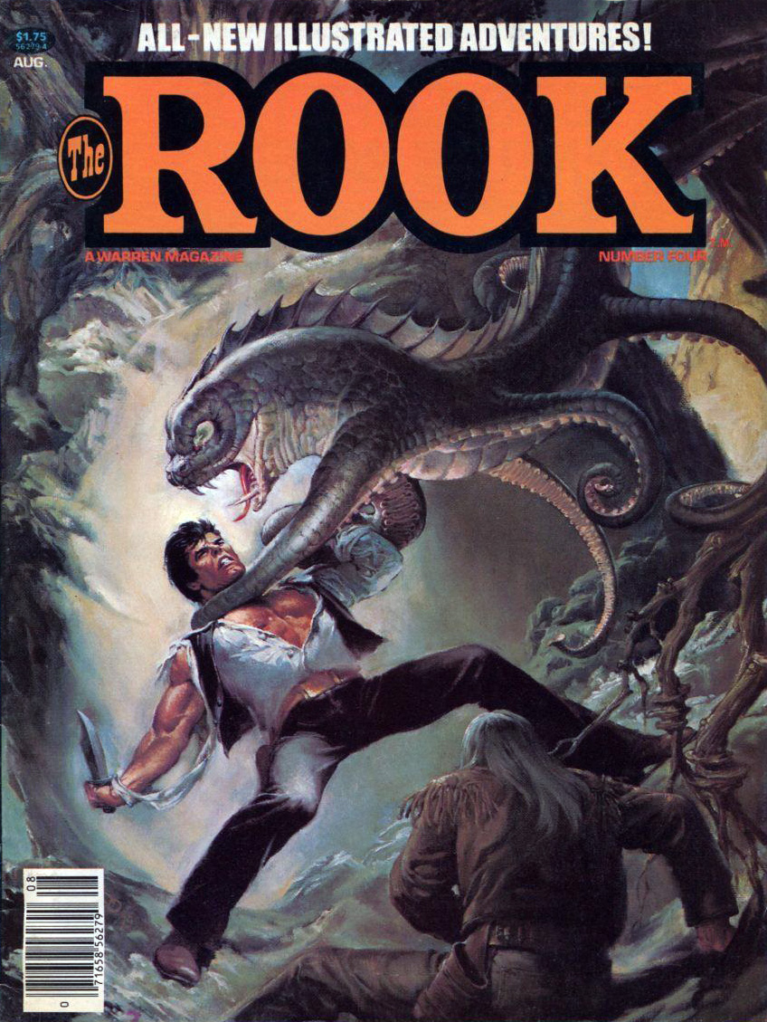
The Rook no. 4 (Warren, August 1980). Cover by Nestor Redondo.
The Rook couldn’t quite kill the fishy brute’s whole family in #4, so he had to confront its slightly more colourful cousin in issue 7:
The Rook no. 7 (Warren, February 1981). Cover by Jordi Penalva. It’s nice to see that men (not exclusively Doc Savage) get strategically ripped shirts, too, sometimes. Eye candy!
Co-admin RG suggested I check Eclipse Magazine‘s tentacular offerings for this post, and he was correct, there was one issue involving an octopus used as a coffee table.
Eclipse Magazine no. 4 (Eclipse, January 1982). Cover by Carl Potts. I went snorkeling a few months ago and the scene was not dissimilar (minus, sadly, the mermaid).
Marvel’s Epic Illustrated, with its 70-odd pages per issue, surely offered something for everyone. The aforementioned offerings were quite hit-or-miss, but the occasional presence of Stephen Bissette, Rick Veitch, Basil Wolverton (in reprints), Berni Wrightson, Ernie Colón, P. Craig Russell, et al. makes it worthwhile to go through its 34 issues (okay, maybe not all in one sitting, unless you have quite a few thermoses of tea prepared – or something stronger).
Epic Illustrated no. 12 (Marvel, June 1982), cover by Frank Brunner. You can read the whole issue here.
Brunner’s painting is rather nice – the mermaid and her friendly octopus both look so serene! – that here it is again. And read an interview with him while you’re at it: Legendary Feathers: Interview with Frank Brunner. (I apologize for linking to a website titled Fanboy Nation, though. Erk.)
Issues 10 to 17 of Epic Illustrated featured Rick Veitch’s Abraxas and the Earthman, a purported retelling of Moby Dick (although frankly, aside from a vengeful squid, the similarities are not striking). Naturally, tentacles abound. Really freaky, creepy tentacles, much like the rest of the story.
Page from “The Hunt: Chapter Three”, written and drawn by Rick Veitch, printed in Epic Illustrated no. 12.
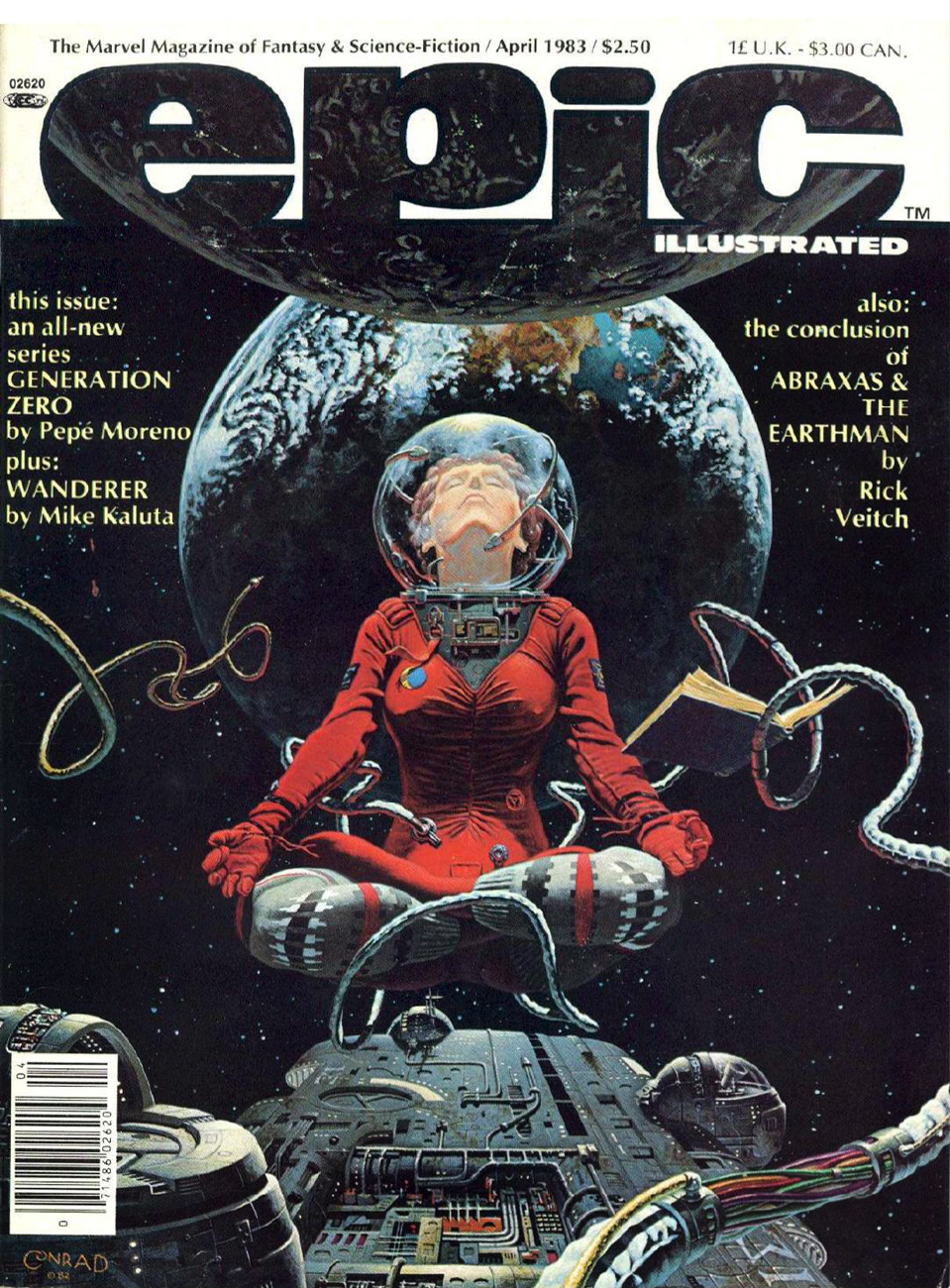
Epic Illustrated no. 17 (Marvel, April 1983), cover by Tim Conrad. Read it here.
Veitch’s fucked-up (I mean that as a compliment), imaginative tale continues with “Man and Whale (Chapter Eight)”, the final installment. Alongside a plethora of sea-creatures (no longer in the sea), there’s this Devourer of Awareness, Bearer of Tentacles:
Epic Illustrated no. 22 (Marvel, February 1984). Cover by John Bolton. Read the issue here. It’s a bad, unconvincing cover, but hey, this is an inclusive post.
Speaking of Bolton, he drew “Wizard’s Masque” (another chapter in the cycle of Marada the She-Wolf), a story scripted by Christopher Claremont.
« Quodo seemed to be a paradise. It was a lush green planet of peace and solitude. Then the pilot met the blonde… » — Nicola Cuti, “Weird World”
Kenneth Smith (1943-), the fantasy artist, inhabits the same body as Kenneth Smith, the retired philosophy professor and incorrigible obfuscator. Whereas someone like, say, Bertrand Russell would make his point clearly and concisely, Kenneth would just pile it higher and higher, leaving the reader entangled in a maze of syntax and syllogism.
Since you may not be familiar with the man’s infamous column in The Comics Journal, Dramas of the Mind, here’s a typical quotation from the man, where he, er… takes on “obscurantism”:
« In characterizing realities no less than in taking positions on issues, consciousness generalizes, i.e. genericizes: in articulating or formulating, it reduces things, even our own selves, to forms, abstractions, idealizations, types, archetypes, simplisms. “Thinking” is an activity that ultimately grounds or resolves itself in the satisfying, self-certain form of orthodoxies, preconceptions, uncriticized and imperative norms; and it is overwhelmingly inept to recognize just how pathetic, parasitic or placental is its relation to its “own” fundamental norms of understanding and valuation. Rarely if ever does any act of thinking grow so laserlike or iconoclastically intensive as to escape from the dense miasma of what is acceptable. To think what actually is is even more contranatural for humans than to see what actually is: as subjectivizing as “seeing” is, “thinking” is many degrees or magnitudes more saturated with conditioned biases, delusions, self-deceptions. A program of hygiene or asepsis for the sanity, acuity and clarity of syncretic or wholesided thinking—a discipline of orthotics for sobering, grounding and polemicizing of well-formed gnoseonoesis—is needless to say unknown in modernity. Not just language but virtually all of intellect, education, culture, etc. have been adapted into utilities, tools whose very aspectivity militates against the nakedness of “evidence,” which is to say, against candor and against truth: regardless of what it may be called, “evidence,” even the most obvious and blatant, is in actuality not so “evident” to most people, and the modern development of “sophistication” or “education” typically worsens the obscurantism. »
For all that, I’ll take a guy with such an overflowing abundance of vocabulary and ideas that he doesn’t know when to quit… over most of the boneheads frequently passing for writers nowadays. Still, if you don’t mind, we’ll (mostly) stick to his Warren artwork today.
Creepy no. 35 (Sept. 1970). Regardless of its month of release, its lovely shades of emerald bring thoughts of springtime to mind.
Creepy no. 36 (Nov. 1970), unique amidst Smith’s Warren covers in that it presents the human form in a somewhat less… grotesque fashion.
This is Creepy no. 41 (Sept. 1971). Owing to its lower than usual print run, this ranks amongst the scarcest Warren issues.
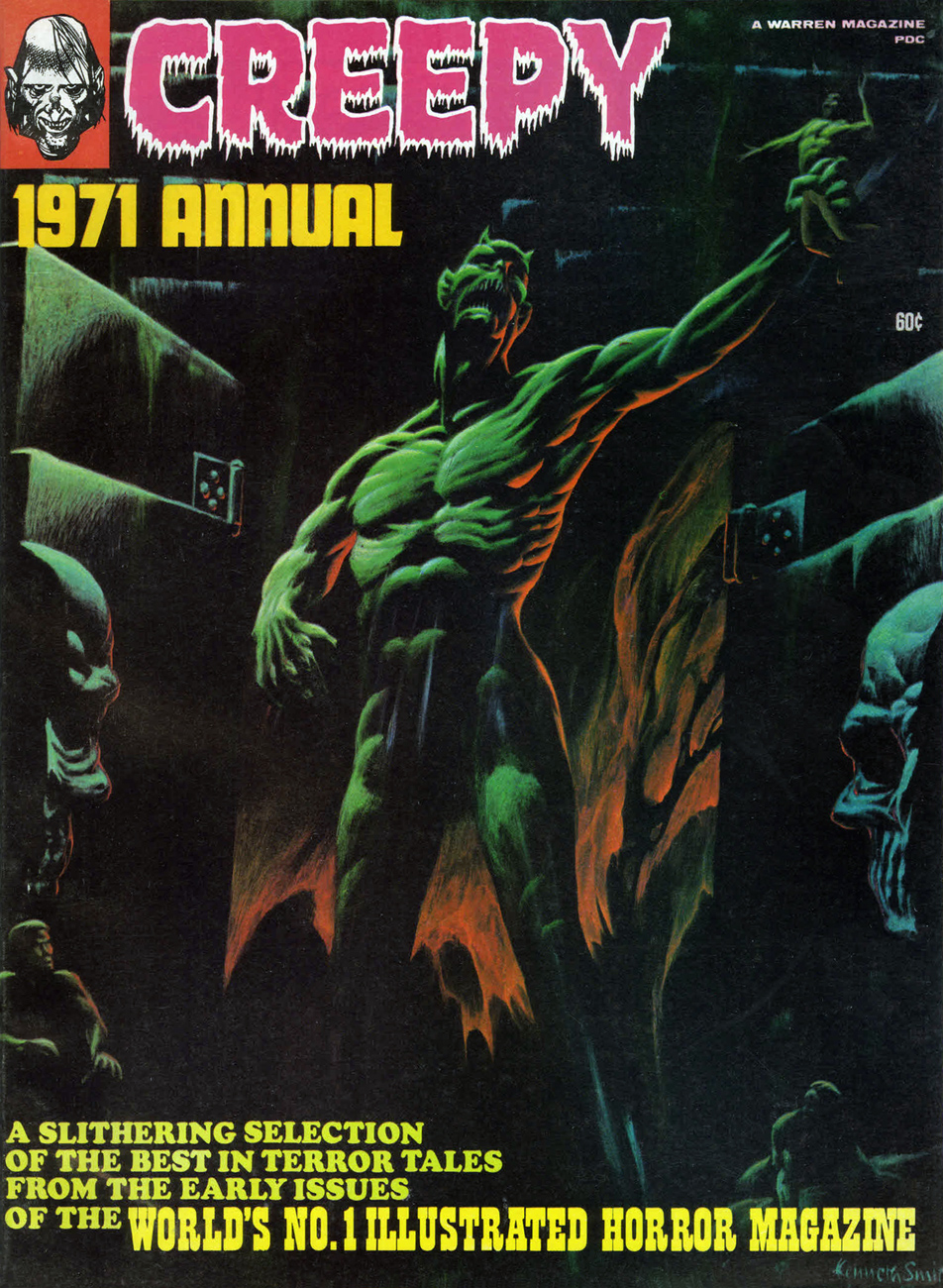
This is Creepy 1971 Annual, all reprints, but quite a choice roster of them: Ditko, Toth, Boyette, Craig, Crandall, Sutton, Adams, and Torres.
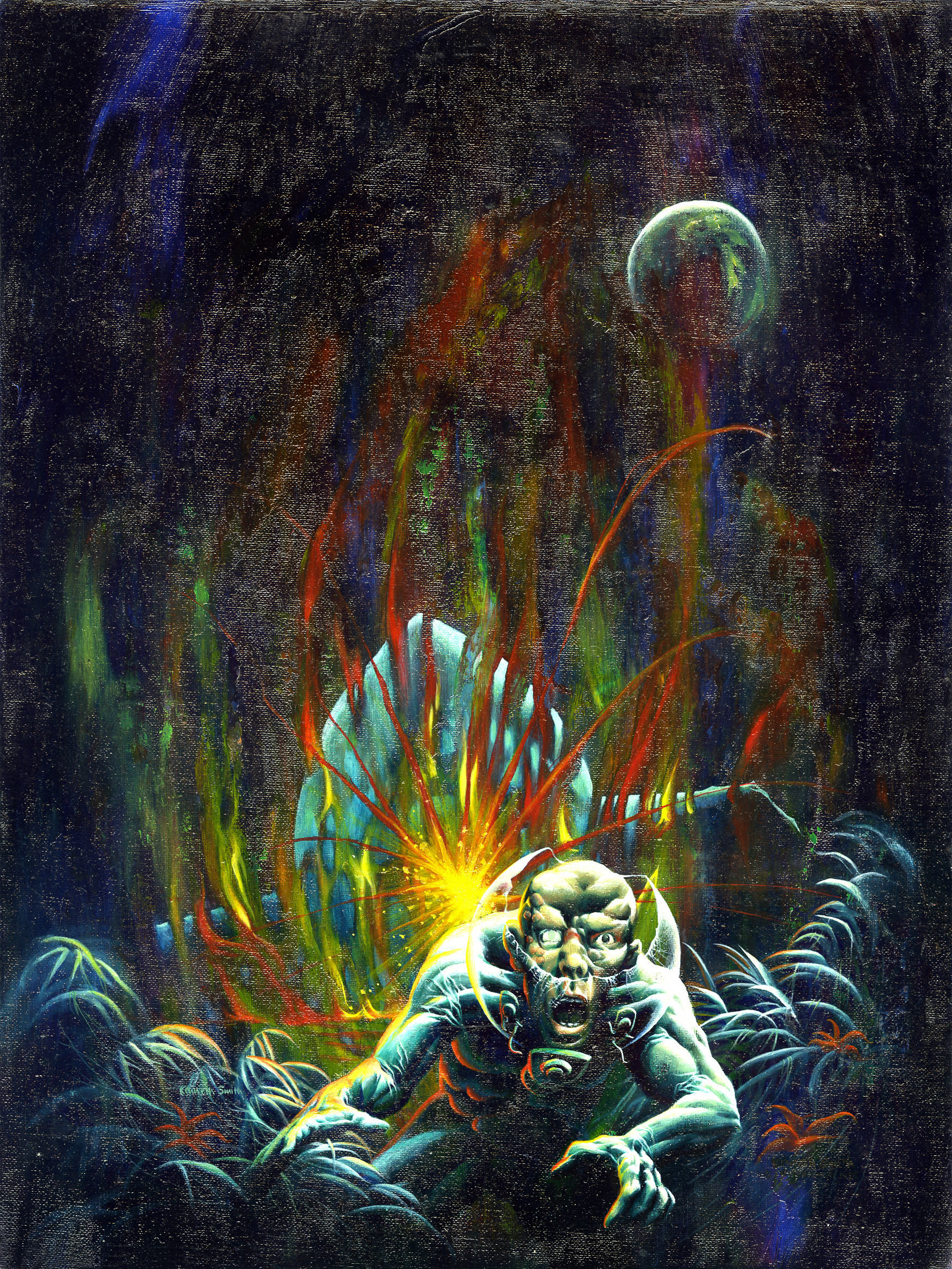
And here we have Mr. Smith’s last, and arguably least, Warren cover. Only a detail of the full painting was used. Eerie 1971 Annual also features naught but reruns.
And this is the original painting in its entirety. Sorry about the glare, but this is likely the only publicly available image of this privately-owned piece.
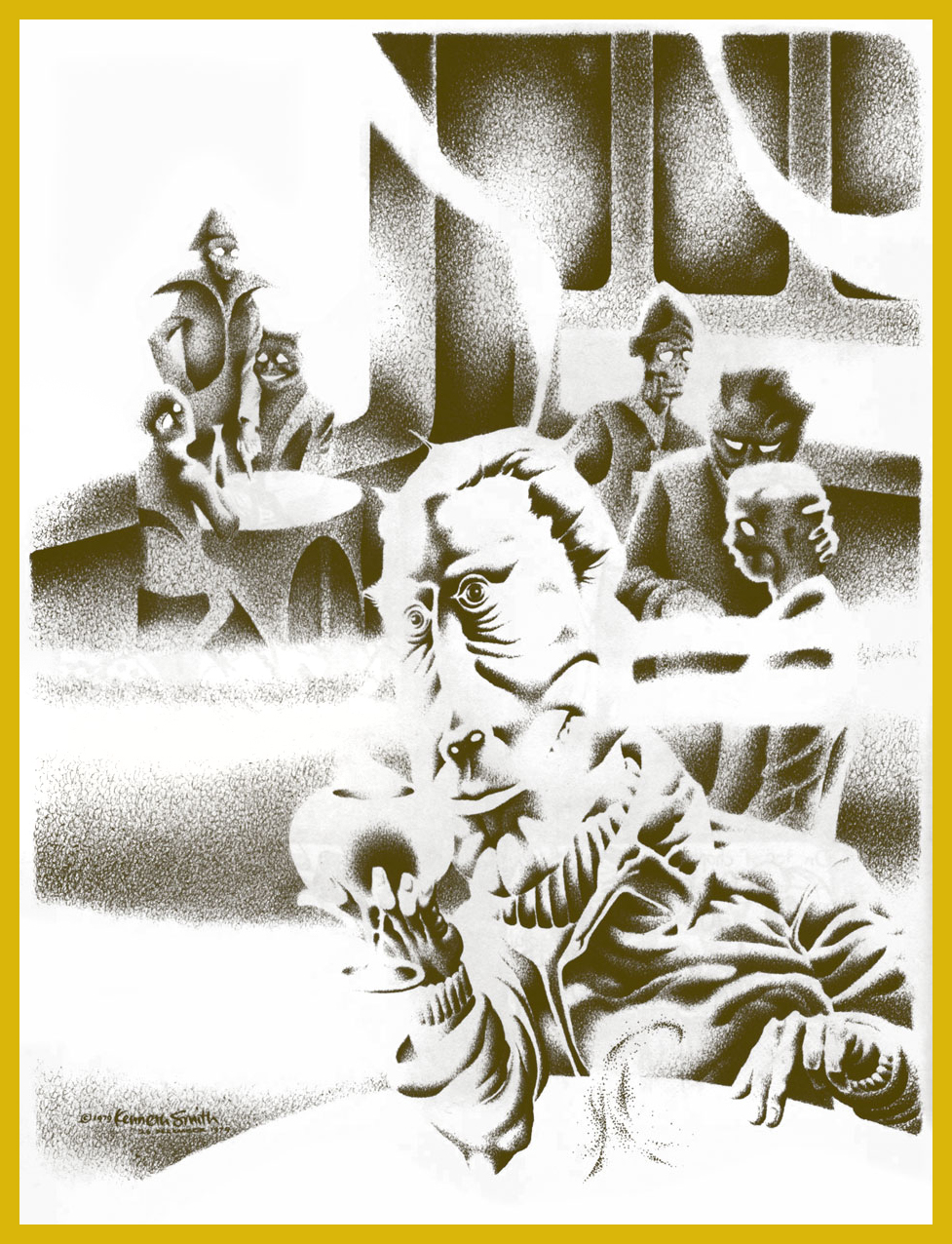
Bonus time: Mr. Smith created this lovely piece to illustrate R.A. Lafferty‘s masterful short story Mr. Hamadryad. I first encountered them* in the anthology Prime Cuts no. 1 (Jan. 1987, Fantagraphics). Hey, any fan of Old Man Lafferty’s is someone I’d happily clink glasses with. Cul sec, Mr. Smith!
« I believe that Mr. Hamadryad was the oddest-looking person I had ever seen. Surprisingly I regarded him so, for I first became aware of him in The Third Cataract Club in Dongola, and some very odd-looking gentlemen came into The Third Cataract. If you cock an eyebrow at someone in that place, then he’s really odd. » — R.A. Lafferty
*Smith’s illustration first graced Lafferty’s tale in the limited edition (1000 copies) collection Golden Gate and Other Stories (1982, Corroboree Press, MN). However, “Mr. Hamadryad” first turned up in STELLAR I (Judy-Lynn Del Rey, ed., 1974).
« Be silent in that solitude which is not loneliness — for then the spirits of the dead who stood in life before thee are again in death around thee — and their will shall then overshadow thee: be still. »
— Edgar Allan Poe (1829)
It was on this day, two hundred and ten years ago, that the great writer, poet and posthumous master of all media Edgar Poe (Jan. 19, 1809 – Oct. 7, 1849) was born in Boston, Massachusetts. I’ll spare you the usual biographical details, widely available elsewhere, and we’ll concentrate on his unflagging ubiquity in the medium of comics.
Poe’s literary reputation was in tatters in America, thanks to a rash of hatchet jobs and dismissals, some of the most vicious from the pen of one Rufus Griswold, the very worm he’d named his literary executor (!), as well as such notables as Ralph Waldo Emerson and T.S. Eliot… while his renown was undimmed in Europe, particularly in France (in no small part owing to Charles Beaudelaire’s legendary translations), rehabilitation at home slowly came as the 20th century crept along, but it was likely the publication of Arthur Hobson Quinn’s definitive Poe biography, in 1941, that sealed the deal and opened the floodgates.
Top two tiers from page 2 of The Spirit‘s August 22, 1948 episode. Layout by Will Eisner, pencils and inks by Jerry Grandenetti. As Dave Schreiner puts it: « Grandenetti captures the asthenic look of Roderick Usher that Poe described. The man is a decadent waif; insular, fragile, high-strung, possibly in-bred. »
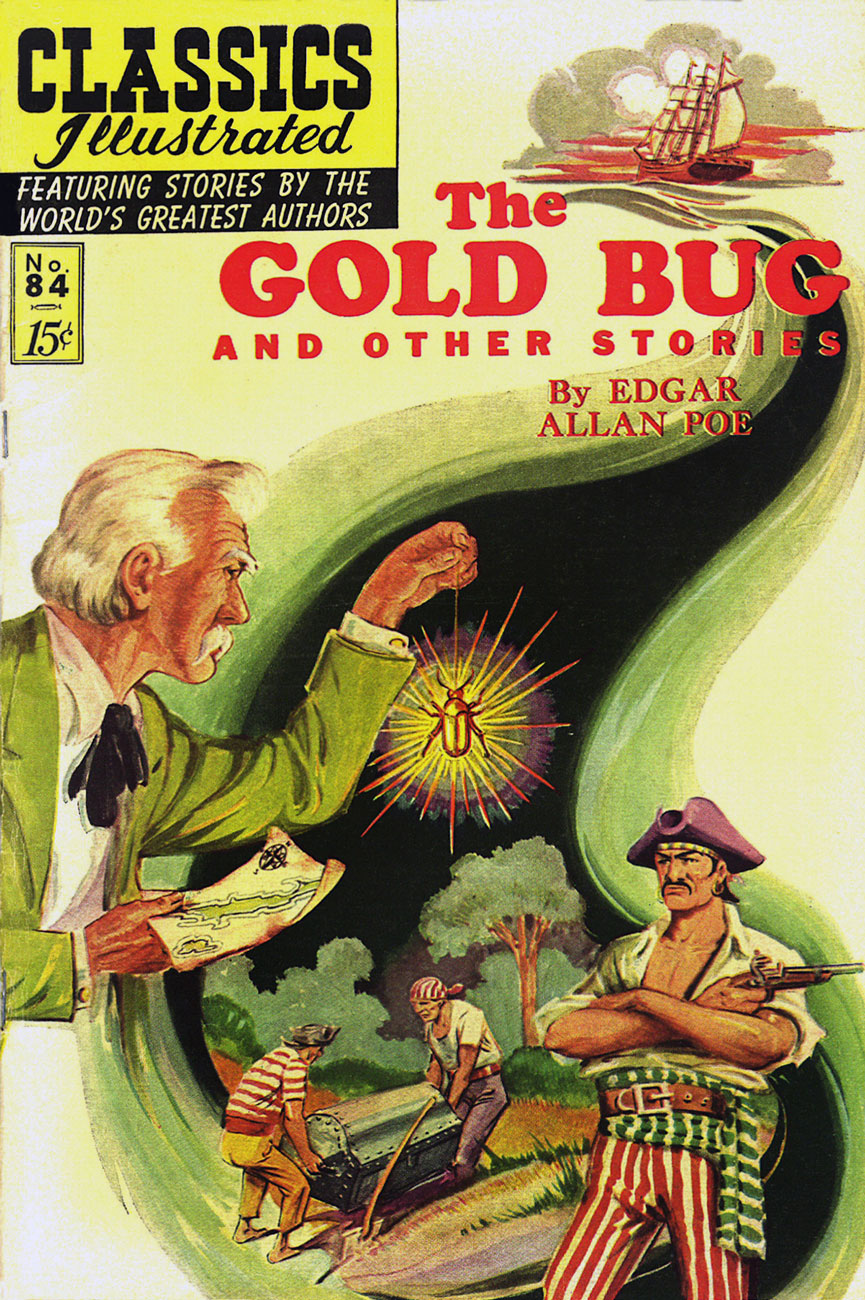
Classics Illustrated publisher Gilberton was first out of the gate with Poe adaptations, at first tentatively with a pair of poems (Annabel Lee, then The Bells)**, then more substantially with The Murders in the Rue Morgue, in Classic Comicsno. 21 – 3 Famous Mysteries (July, 1944), sharing the stage with Arthur Conan Doyle and Guy de Maupassant. Read it here. Pictured below is Classics Illustratedno. 84 (June 1951, Gilberton), cover by Alex A. Blum. Read the issue here.
A relevant passage from Simon Singh‘s fascinating (if you’re into that sort of thing… and I hope you are) The Code Book: The Secret History of Codes and Code-Breaking (1999): « On the other side of the Atlantic, Edgar Allan Poe was also developing an interest in cryptanalysis. Writing for Philadelphia’s Alexander Weekly Messenger, he issued a challenge to readers, claiming that he could decipher any monoalphabetic substitution cipher. Hundreds of readers sent in their ciphertexts, and he successfully deciphered them all. Although this required nothing more than frequency analysis, Poe’s readers were astonished by his achievements. One adoring fan proclaimed him ‘the most profound and skilful cryptographer who ever lived’. In 1843, keen to exploit the interest he had generated, Poe wrote a short story about ciphers, which is widely acknowledged by professional cryptographers to be the finest piece of fictional literature on the subject. The Gold Bug tells the story of William Legrand, who discovers an unusual beetle, the gold bug, and collects it using a scrap of paper lying nearby. That evening he sketches the gold bug upon the same piece of paper, and then holds his drawing up to the light of the fire to check its accuracy. However, his sketch is obliterated by an invisible ink, which has been developed by the heat of the flames. Legrand examines the characters that have emerged and becomes convinced that he has in his hands the encrypted directions for finding Captain Kidd’s treasure. »
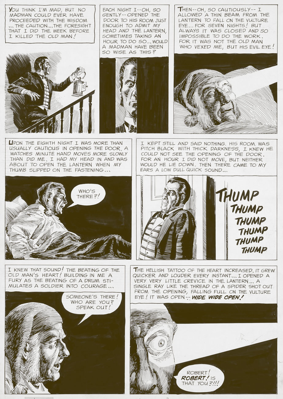
A page from EC Comics great Reed Crandall‘s exemplary adaptation of Poe’s The Tell-Tale Heart, from Creepyno. 3 (June, 1965). While Crandall’s work is outstanding, scripter-editor Archie Goodwin tried to ‘improve’ upon Poe by tacking on a tacky ending, a nasty habit he would indulge in again on subsequent adaptations, notably issue 6’s The Cask of Amontillado!. Read The Tell-Tale Heart. And don’t miss The Cask…, if only for the artwork.
« The rays of the moon seemed to search the very bottom of the profound gulf; but still I could make out nothing distinctly, on account of a thick mist in which everything there was enveloped, and over which there hung a magnificent rainbow, like that narrow and tottering bridge which Musselmen say is the only pathway between Time and Eternity. » In 1976, a peak-form Berni Wrightson got out his brushes and paint tubes for a heartfelt portfolio of Poe-inspired oils. A sensitive and subtle sense of colour was among Wrightson’s chief assets; it’s a shame we didn’t see more of it. I opted to feature my favourite piece from the lot, A Descent Into the Maelström, but by all means feast your eyes on the whole shebang.
In 1976, Marvel Comics set out to make their mark on the classics… with dubious, but predictable results. It wasn’t what their zombie readership had clamoured for. Here’s the best page (art by Rudy Mesina) from Marvel Classics Comicsno. 28, The Pit and the Pendulum (1977), featuring three tales adapted by scripter Don McGregor, and including future superstar Michael Golden‘s abysmal professional début on yet another helping from The Cask of Amontillado, where he demonstrates how he believes wine is to be drunk just like Pepsi. See what I’m griping about here.
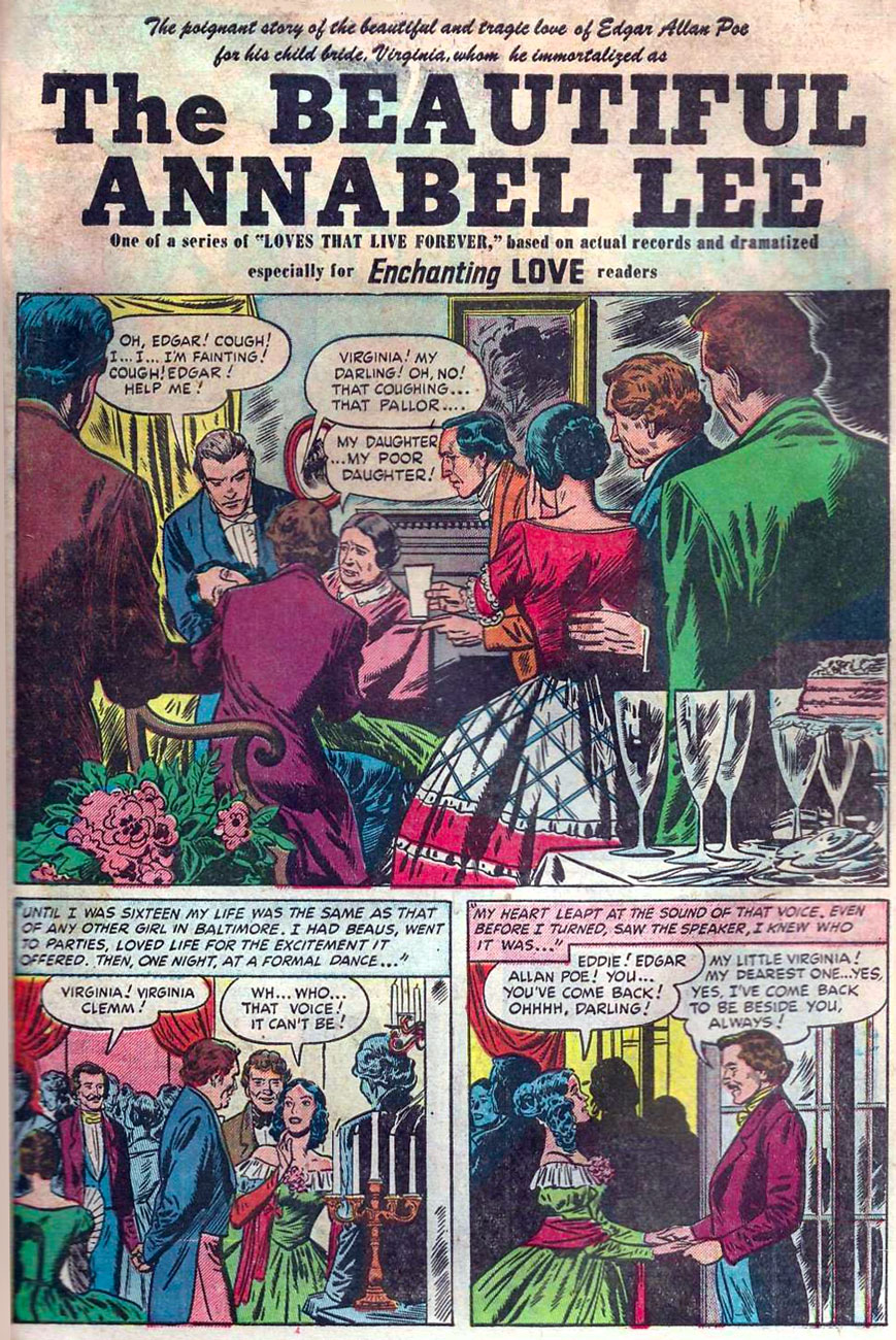
Think Poe’s all about the horror? Think again! You don’t become a household name by putting all your eggs in the same basket. Meet Edgar ‘Eddie’ Allan Poe, romantic leading man. “Based on actual records…” and sanitized beyond recognition. Given that Virginia and Edgar were first cousins and that they married when she was thirteen, you can see how absurd this strip is. Read the full tale of romance and pathos right here. The Beautiful Annabel Lee appeared in Enchanting Loveno. 2 (Nov. 1949, Kirby Publishing). Writer unknown, art by Bill Draut and Bruno Premiani.
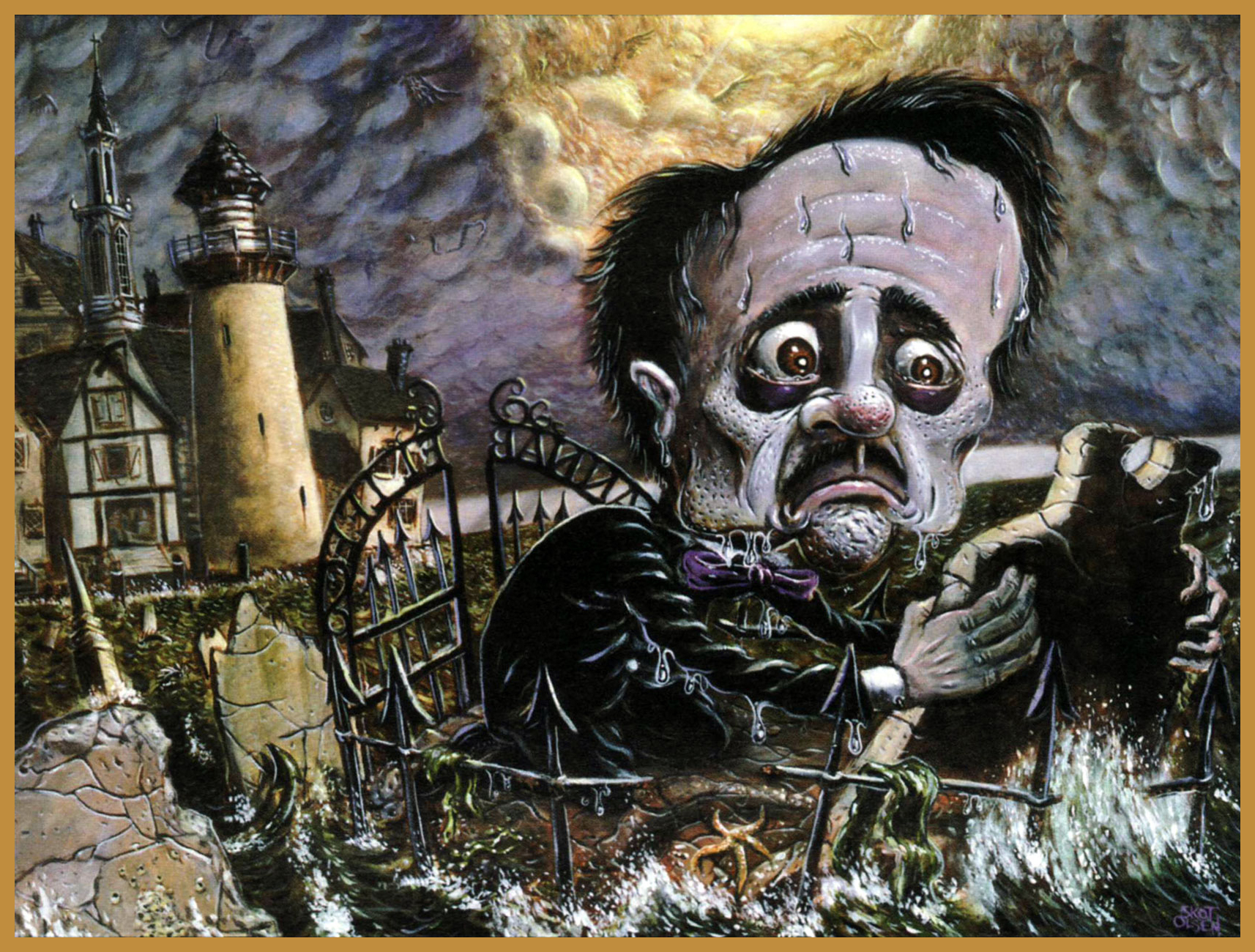
Kubert School alum Skot Olsen‘s cover illustration for the revised and expanded second edition (July, 2004) of Graphic Classics‘ Poe compendium.
As with, say, Elvis or H.P. Lovecraft, when both legend and œuvre reach a certain tipping point of iconic fame, one can bend and twist the concepts any which way and they’ll still be recognizable. Here’s a panel from Harvey Kurtzman and Will Elder‘s faithful-in-its-fashion take on The Raven, from Madno. 9 (Feb.-Mar. 1954, EC).
Michael Kupperman strikes again. From Snake ‘n Bacon’s Cartoon Cabaret ( 2000, HarperCollins)
Hot off the presses! It’s Edgar Allan Poe’s Snifter of Terror no. 2 (Nov. 2018, Ahoy), featuring a collaboration between Rachel Pollack and the fabulous Rick Geary. Don’t miss it! Oh, and if the pose looks familiar, you’re thinking of this.
Whew — that’s it for now. In closing, I must bow and salute before the gargantuan endeavour accomplished by Mr. Henry R. Kujawa on his truly indispensable blog, Professor H’s Wayback Machine. Thanks for all the heavy lifting, Henry. I get exhausted just thinking about it.
« According to statistics, millions of Americans read millions of the most carefully written crime and crime detection stories in the world! Expertly told… and prepared, after exhaustive research — the best of these are, in effect, lessons in crime and criminal psychology!Yet could you, sitting in the trolley or bus or subway at night, pick out the killer sitting opposite you? » — The Killer (Dec. 8, 1946)
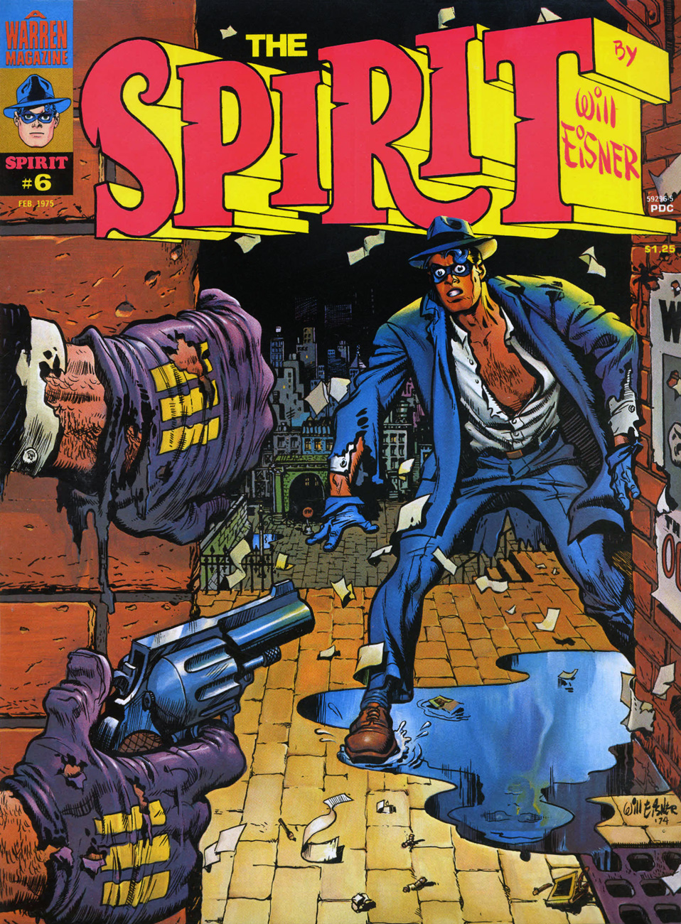
Welcome to the fourth entry in our chronicle of the variegated ambulations of the former Denny Colt. Begin if you will, as we did, with his time at Quality, then follow his path through Fiction House, then on to Harvey, Super and Kitchen Sink; at that point, you’ll be all caught up.
Okay, now that we’re all here, let’s pose and answer the next burning question: how did The Spirit come to make landfall at Warren Magazines? Thankfully, we’re spared the motions of idle speculation in this case, since Jim Warren himself revealed all in the course of an interview with Jon B. Cooke, published in The Warren Companion (2001):
JW: « I would have mortgaged everything I owned to publish Will Eisner — to be involved in anything Will Eisner was doing. I called Will and said, ‘Mr. Eisner, I’d like to take you out to lunch.‘
I knew Will was talking to Stan Lee about The Spirit and that DC was interested in his company, American Visuals. I also knew that Harvey Comics had done a couple of Spirit reprints and that they might be interested again. I had to move fast.
So I took him out to lunch, sat him down, and said, ‘There’s no possible way that I’m going to let the great Will Eisner escape. You are someone I have revered since 1940, when I saw the very first Spirit section in the Philadelphia Record with that splash page that changed my life. Do you think I’m going to let you go to Stan Lee, whom I ‘hate’ and ‘despise’ as a competitor? Do you think I’m going to lose you to that unrepentant sociopath? You’re just going to be a computer number to Marvel; they have a factory, where they cookie-cut comics, turning out 400* titles a month!’
And I saw the expression in Will’s face — he had his pipe in his mouth at the time, just like Commissioner Dolan — and I could see that I had him. »
Let’s have a look at some covers. Most of the sixteen (plus the colour Special) are terrific, but I skipped a few of the lesser ones: issue one is a not-quite successful Eisner-Basil Gogos painted collaboration, and issue two is just okay. Issue 11 is another Ken Kelly painting over Eisner pencils, and 12 to 16 are composites using inside panels. Fine, but facultative. And now, on to the gems!
This is The Spiritno. 3 (Aug. 1974), reprinting eight post-WWII stories: Black Alley (June 5, 1949), Fox at Bay (Oct. 23, 1949), Surgery… (Nov. 13, 1949), Foul Play (March 27, 1949), The Strange Case of Mrs. Paraffin (March 7, 1948), The Embezzler (Nov. 27, 1949), The Last Hand (May 16, 1948) and Lonesome Cool (Dec. 18, 1949). Cover pencils and inks by Eisner, colours by Richard Corben.
This is The Spiritno. 4 (Oct. 1974), reprinting eight post-WWII stories: Life Below (Feb. 22, 1948), Mr. McDool(Oct. 12, 1947), The Emerald of Rajahpoor (May 30, 1948), Ye Olde Spirit of ’76 (July 3, 1949), The Elevator (June 26, 1949; in colour), The Return of Vino Red (Sept. 25, 1949), The Guilty Gun… (June 6, 1948), and Flaxen Weaver (Dec. 11, 1949). Cover colours by Ken Kelly.
This is The Spiritno. 5 (Dec. 1974), reprinting eight post-WWII stories: The Return (Aug. 14, 1949), The Spirit Now Deputy (Apr. 24, 1949), The Hunted (May 1st, 1949), The Prediction (June 19, 1949), The Deadly Comic Book (Feb. 27, 1949; in colour), Death, Taxes and… The Spirit (Mar. 13, 1949), Hamid Jebru (May 18, 1949), and Ice (Jan. 2, 1949). Cover colours by Ken Kelly.
« You cannot stop me now… I am at the threshold of immortality… Yowch! » This is The Spiritno. 6 (Feb. 1975), featuring seven black & white (and one full-colour) presentations of tales from the 1940s: Showdown (Aug. 24, 1947), The Wedding (May 2, 1948), The Job (May 9, 1948), The Lamp (July 27, 1947), Glob (March 6, 1949; in colour), The Winnah! (Dec. 3, 1950, This is ‘Wild’ Rice (Apr. 4, 1948) and Taxes and the Spirit (Apr. 16, 1950). Cover colours by Ken Kelly.
This is The Spiritno. 7 (Apr. 1975), reprinting eight post-WWII stories: The Big Sneeze Caper (Feb. 6, 1949), Hoagy the Yogi (Pt. I) (Mar. 16, 1947), Hoagy the Yogi (Pt. II) (Mar. 23, 1947), Cheap Is Cheap (June 13, 1948), Young Dr. Ebony (May 29, 1949; coloured by John Laney); A Moment of Destiny (Dec. 29, 1946); The Explorer (Jan. 16, 1949); and A Prisoner of Love (Jan. 9, 1949). Cover colours by Ken Kelly.
This is The Spiritno. 8 (Apr. 1975), reprinting eight post-WWII stories: “Sand Saref” (Jan. 8, 1950), “Bring In Sand Saref…” (Jan. 15, 1950), “Thorne Strand” (Jan. 23, 1949), “A Slow Ship to Shanghai” (Jan. 30, 1949), “Assignment: Paris” (May 23, 1948; coloured by Michelle Brand), “A Pot of Gold” (Apr. 3, 1949), “Satin” (June 12, 1949), and “Visitor” (Feb. 13, 1949). Cover colours by Ken Kelly.
This is The Spiritno. 9 (Aug. 1975), reprinting eight post-WWII stories: The Candidate (Aug. 21, 1949); White Cloud (Aug. 28, 1949); Stop the Plot! (Dec. 5, 1948); Lovely Looie (Apr. 10, 1949); The Space Sniper (May 22, 1949; in colour); The Vernal Equinox (Mar. 20, 1949); Black Gold (June 15, 1947); and Two Lives (Dec. 12, 1948). Cover colours by Ken Kelly.
« The Octopus is at it again. This time his thugs have the Spirit cornered. Has his incredible luck finally run out? A tense moment captured by Will Eisner and Ken Kelly. » Evidently, Warren’s readership wasn’t content with line art covers, fancily wrought and gorgeous as they were; so Ken Kelly was brought in to slap some paint over a tight Eisner layout et voilà! An interesting hybrid, but I’m not quite convinced of its necessity. This is The Spiritno. 10 (Oct. 1975), reprinting a whopping ten post-WWII stories: Heat (July 15, 1951); Quiet! (July 22, 1951); Death Is My Destiny (March 4, 1951); Help Wanted (April 29, 1951); The Origin of the Spirit (From Harvey’s The Spirit No. 1; in colour); Sound (Sept. 24, 1950); A Time-Stop! (Jan. 7, 1951); The Octopus Is Back (Feb. 11, 1951); Hobart (Apr. 22, 1951) and The Meanest Man in the World (Jan. 28, 1951).
Among my favourite features of the Spirit’s Warren run are the single, well-selected, lushly-coloured story appearing in each of the first ten issues. This, from no. 1, is page 4 of El Spirito (Feb. 1st, 1948). The Octopus’ buxom accomplice is Castanet. While I’m strictly underwhelmed by Rich Corben’s interchangeable tales of bald, lumpy, donkey-donged bodybuilders roaming the land and forever risking ritual castration at the hands of amazon tribes, his colour work here is simply sublime.
As you can see, the panel montages were extremely well-done; The Spirit Special (1975) handily gathered in one place the colour stories from issues one to ten. According to the GCD: « Available through mail purchase only, just over 1500 are thought to have been printed. »
In closing, this final, telling exchange from the Jim Warren interview:
Jon Cooke: Do you recall dealing with Denis Kitchen about The Spirit? Jim Warren:Will had given his word — and his word is his bond — for Denis to reprint The Spirit (this was before Will and I negotiated a deal). Denis had spent money on preparing the reprints. Will said to me, « It would be a nice gesture if you would reimburse Denis, who is a good guy, for the material he’s already prepared. » I think Will looked on me kindly when I said « Absolutely. » (What Will doesn’t know if that if he had asked for me to give Denis a Rolls-Royce, I would have driven it to Wisconsin myself!)
*an exaggeration, of course, but a pointed one. At the time, Marvel *was* doing its worst to flood the market in order to starve its competitors.
« Christmas, Christmas, Christmas, Christmas makes me happy I love Christmas cold and grey, I love it sweet and sappy Says crazy kissin’ Cousin Flo: ‘Let’s break out the mistletoe’ »
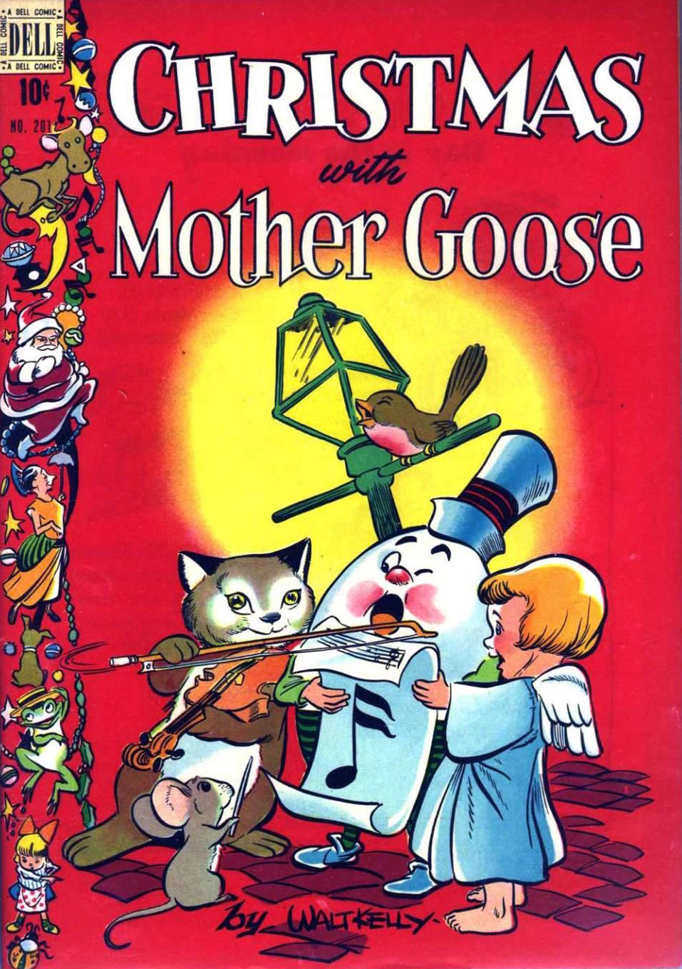
The heart-warming cover of that Four Color no. 201, 1948. Art by Walt Kelly. Check out the adorable moon-jumpin’ cow in the top left corner!
This is the back cover of Dell’s Four Color no. 302 (Santa Claus Funnies), 1950. Such warm colours. Art by Canadian Mel Crawford, who worked on various Dell publications in the 1950s (such as Howdy Doody, Mr. Magoo, and Four Color Comics) to later become an accomplished watercolours/acrylics painter.
« Christmas, Christmas, Christmas, Christmas out the waz Christmas, Christmas, Christmas, Christmas up the schnozz Come all ye faithful, don’t be slow It’s Christmas time, you can’t say no»
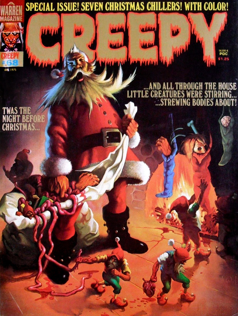
Creepy no. 68 (January 1975), cover by Ken Kelly. “House’ and “about” don’t rhyme, but it’s the season to forgive. I like how Santa appears to be bawling in frustration.
Vault of Horror no. 35 (EC, 1954), cover by Johnny Craig. Maybe open the lid of the coffin first, dumbass?
« Momma wants a kitchen sink And daddy wants a stiffer drink Grandma wants us to cut the crap Grandpa wants a nice long nap »
Illustration by Richard Thompson. Who else wants some Festive Dietetic Crackers? I’d definitely sit with the mouse.
« Christmas, Christmas, Christmas, Christmas everywhere Christmas, Christmas, Christmas, Christmas pullin’ out my hair Shoppers lined up out the door Traffic backed up miles and more It’s Christmas time, so what the heck Let’s go spend the whole paycheck »
A Little Lulu cartoon by Marge Buell (Saturday Evening Post, 1944).
« These dreams? Hallucinations… or whatever you call them! It was on a business trip… in the middle of nowhere… I’ll never forget it! » — Alex Colby, who swears he saw them.
When people talk about Warren magazines cover artists, the name of Vic Prezio is rarely brought up. Well, someone has to, and it might as well be me. It doesn’t help that he only painted a handful of covers for Warren, but hell, I love them all in their pulpy glory.
Prezio is better known for his over-the-top men’s adventure magazine covers and, to a lesser extent, his Magnus: Robot Fighter covers for Gold Key. Mostly anonymous work, though. It’s a filthy business.
In Part One, we looked at Prezio’s Creepy Covers. As it’s « age before beauty », Cousin Eerie now gets his turn to bow.
« Don’t you dare presume to tell me what I can and can’t do, Sheldon! » Some guys turn mean when their male pattern baldness spreads to their entire face.
An inspiring reminder of why you shouldn’t let the naysayers drag you down (even six feet under). Be all that you can be, on this side of the grave and beyond!
This alien encounter is *not* going to turn out all fuzzy-friendly.
Prezio’s painting conveys vividly the high paranoia of Archie Goodwin and Alexander Toth‘s The Stalkers, reprinted in this issue from Creepy no. 6, just a couple years old by then. Warren Publications were *not* in good shape at the time, having lost more of their key talent and left to the bare minimum of original material, including, thankfully, the covers. The out-of-left-field success of Vampirella would swoop in and save the enterprise in 1969. Close call!
Possibly the lesser entry amongst Prezio’s Warren pieces, but still an attractive cover, if not exactly terrifying. Somehow, it brings to mind Aurora model kit art more than it does a Warren cover (still, comparison to early-ish James Bama should hardly be considered a slag.)
« AAAAAAAAAGAH! What is it? » I’ve often pondered that very question myself, sometimes while perusing this “throbbing” issue.
Another striking (if a bit rushed-looking) Prezio cover, this time representing Slight Miscalculation by writer Bill Parente and artists Bill Fraccio and Tony Tallarico. The much-maligned Fraccio and Tallarico often worked together under the joint nom de plume of Tony Williamsune (it is said that Tallarico pulled most of the weight.)
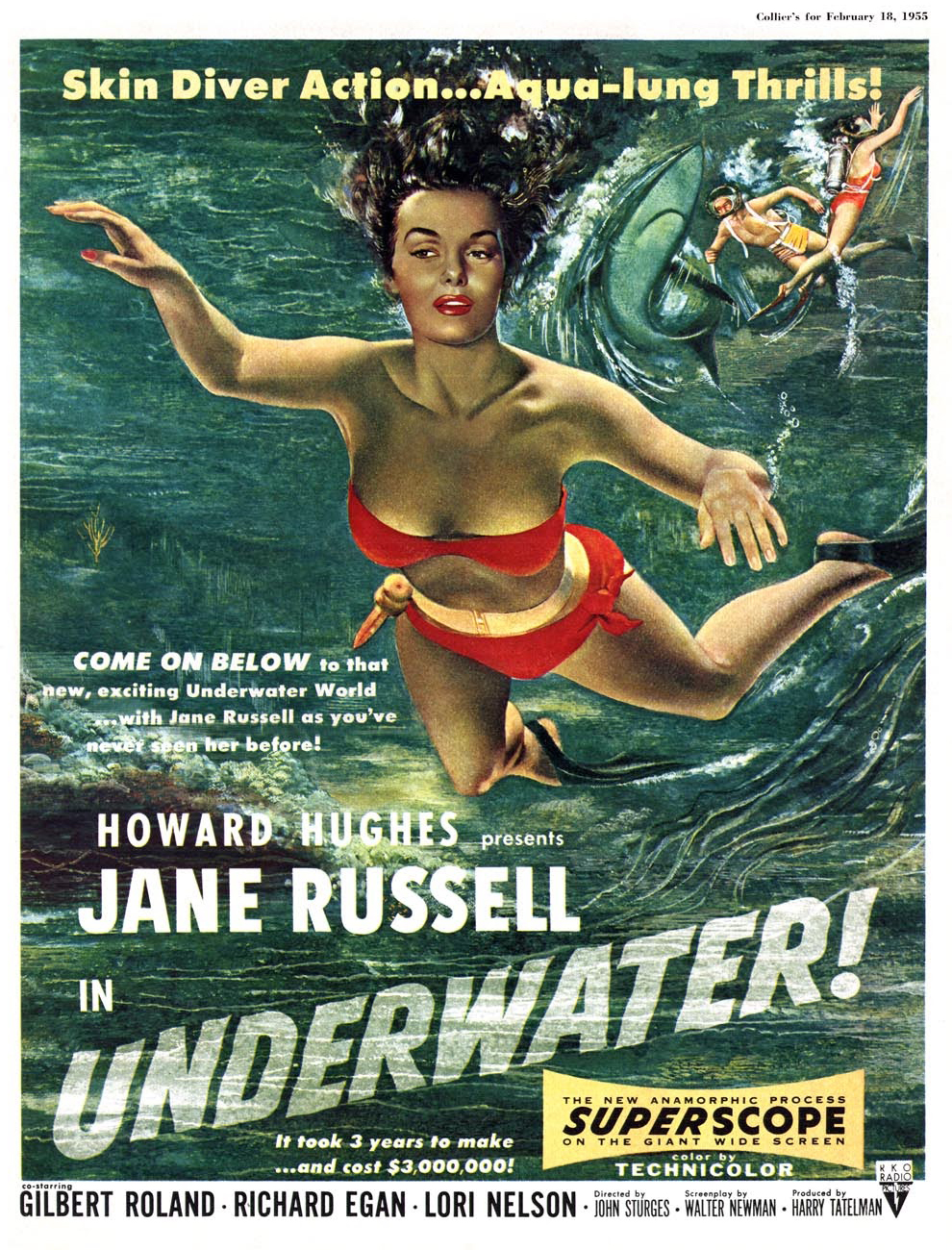
This time out, the cover story is H2O World by Larry Ivie, Al Williamson, and his Fleagle Gang acolyte and mentor Roy G. Krenkel, a reprint from Creepy no. 1 (1964).
… itself swiping heavily from a 1954 Collier’s cover painted by Bill Baker. « You’ll find skin-diving now from Maine to California, wherever there is enough water for a person to plunge into. Divers, like the spearfishing pair on our cover, have made it America’s fastest-growing sport. » I’ll bet she’d rather dive with her husband, armed with a spear, than in the darkness with overly-friendly monsters.
Prezio’s final Eerie cover (he would paint a couple of beauties for FMOF the following year), this lugubrious tableau from the bone-chilling month of November 1969, is likely my favourite Prezio. It illustrates Bill Parente and Michael Royer‘s Head for the Lighthouse!
Warren seemed, at this point, without a decent in-house copy editor. Witness the cover’s “Scavanger” Hunt, and inside, a story mistitled « The Wrong Tennant ».
« Wrong Tennant? You don’t say! I’d read *that*! »
All tomfoolery aside, this wraps up our survey of Mr. Prezio’s work at Warren. Hope you enjoyed the ride!
« Stop that whimperin’, Emma — or I’ll lay into ya like a butcher in a cowpen! » — Raymond Marais, Rescue of the Morning Maid
The mysterious, but nonetheless well-remembered journeyman pulp illustrator, Vic Prezio, though chiefly associated with the infamous Men’s Sweat adventure magazines (« Weasels Ripped my Flesh! ») also produced notable work for Dell (The Outer Limits, Kona, Naza, Brain Boy, Frogmen…), Gold Key (Magnus, Robot Fighter) and Warren, and that’s just the tip of the iceberg. I did say he was a journeyman.
In all, Prezio produced, for the Warren Magazine line, six covers for Famous Monsters of Filmland, some of them classics, four for Creepy and six for Eerie. And that’s not all: Prezio painted a pair of covers for FMOF companion title Monster World (no. 2, Jan. 1965, and no. 4, June 1965); these would have been his earliest Warren contributions. Thanks to eagle-eyed Michael Prince for bringing these last to my attention!
Today, we’ll admire Uncle Creepy’s dodgy wares, and reserve Cousin Eerie’s mouldy goodies for part two. The FMOF issues regrettably fall outside our purview, but for the record, these are numbers 35, 36, 38, 39, 67 and 68. Check ’em out.
Oh, it’s just your lousy luck: you finally get your best girl alone on your raft, then along comes this humongous critter to put a damper on the romantic mood. Prezio brings the scene to life for issue 18 of Creepy (Jan. 1968)… but I can’t quite shake the feeling that said scene looks sort of familiar…
Ah, that must be it. I see there used to be two snakes involved.
A look at the original painting, which thankfully survives. Can’t take such things for granted.
« Good Lord! » I wonder what that ‘one thing’ is. Prezio’s cover for Creepy no. 28 (Aug. 1969) is based on Archie Goodwin and Dan Adkins‘ story The Doorway, reprinted in this issue. Read it here, if you must.
Some editorial second-guessing went on, as evidenced by the most consistent colour scheme of the original painting. It’s a great piece, so it works all the same.
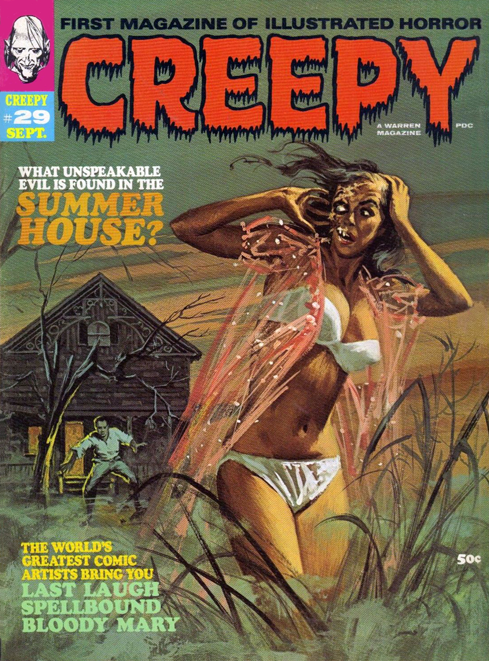
« Come back, baby! Sure, my saliva’s a bit… corrosive, but you’ll get used to it! » Vic Prezio’s twist on the then-prevalent gothic romance trope of the gorgeous, scantily-clad damsel-in-distress running away from some castle or mansion. This is Creepy no. 29 (Sept. 1969).
Now, Vic’s original painting: the image was flipped for publication (as if you couldn’t tell), which was probably a sound decision. Left to right motion is more visually natural and dynamic.
« I don’t like mushrooms! We’ll find a way out yet! » – John Agar as Dr. Roger Bentley
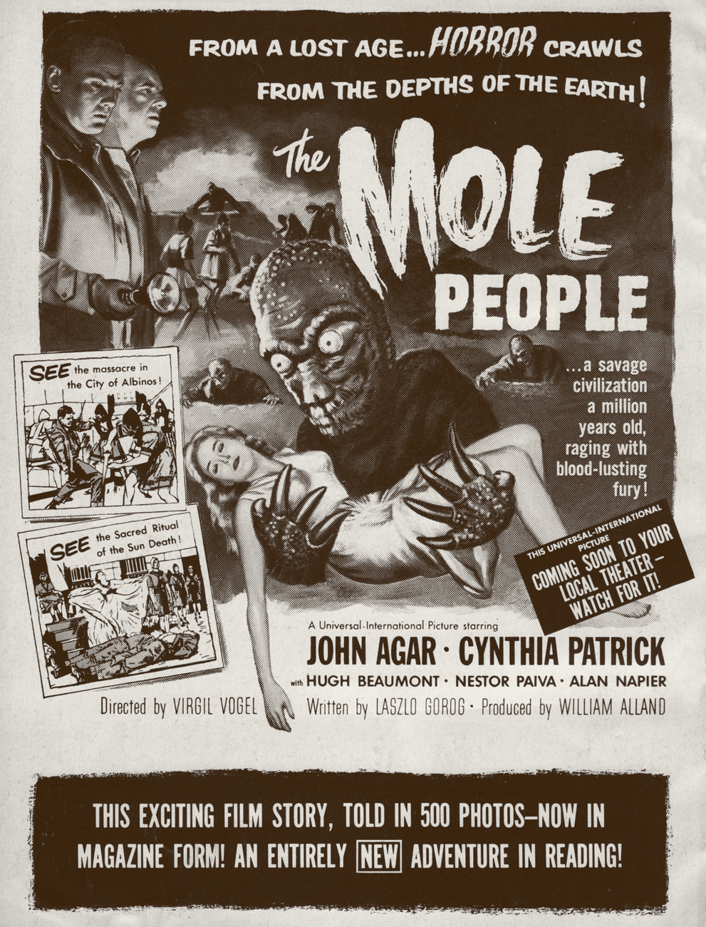
Fumetti: from the italian, it means « little smoke », describing the word balloons as they emanate from characters’ mouths. It’s comics, in other words. In English, it has come to denote comics created using photos instead of illustrations, also known as Fotonovela or, in French, photo-roman. Confused? No need to be. Here’s a rare American specimen of the beast, issued by Warren Publications, home of Famous Monsters of Filmland, Creepy, Eerie and Vampirella, in MCMLXIV (hey, that’s what the indicia says!).
The back cover image, featuring the film’s wacky poster art.
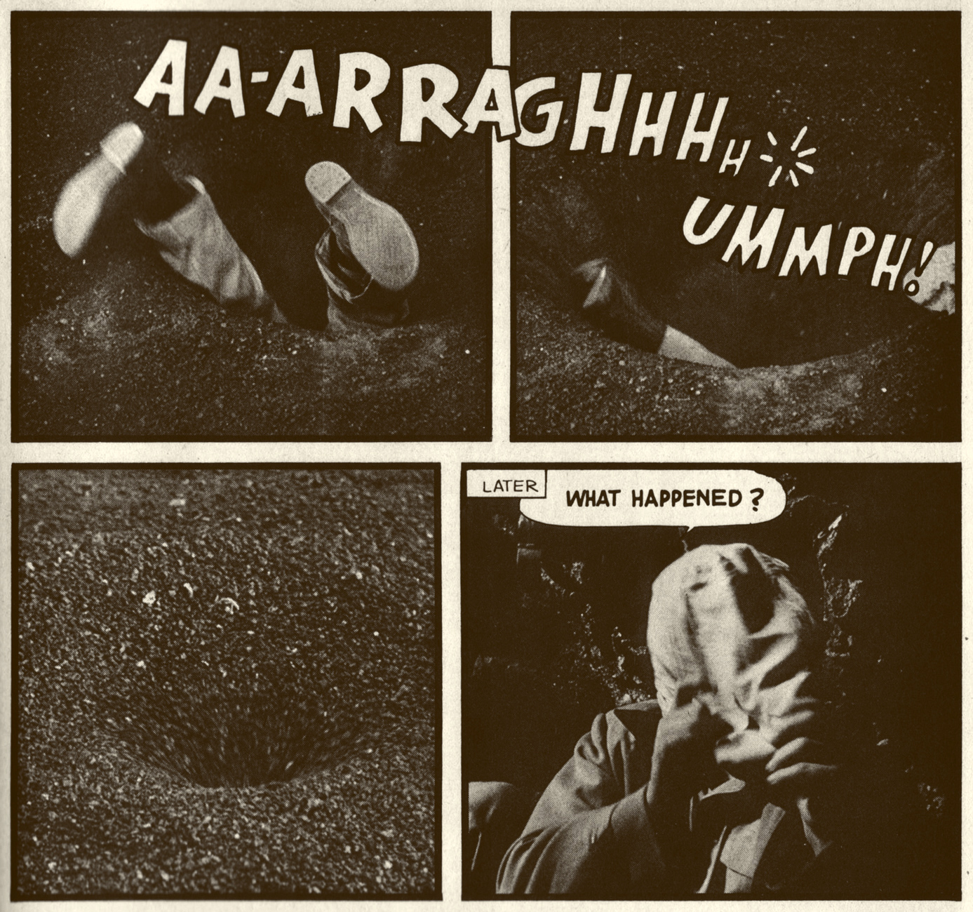
We’re dealing with the familiar (but welcome) scenario, in the worthy tradition of Herbert George Wells‘ The Time Machine… of the Normals turning out to be evil pricks and the presumed Monsters really being sweet if you treat them with any kind of basic decency.
The human prisoners are treated to an exclusive semi-musical number by a young Björk Guðmundsdóttir.
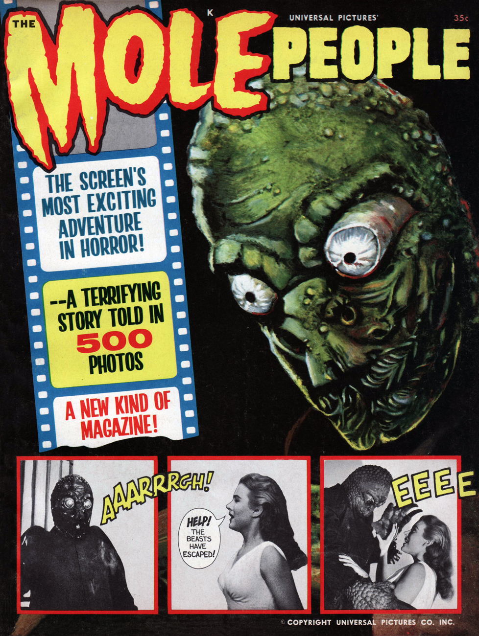
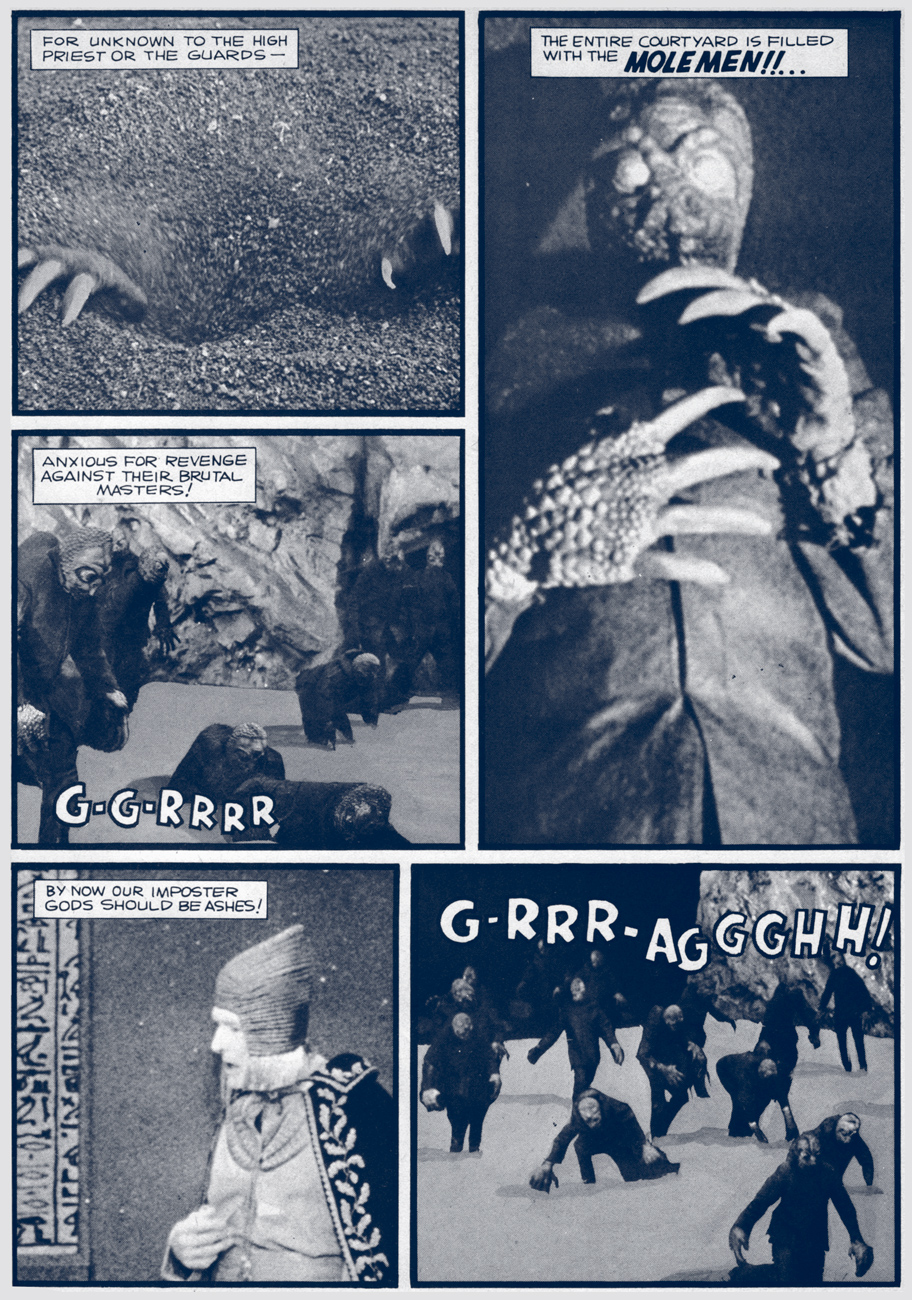
This Captain Company ad from the 1970s always made these titles seem so mysterious and enticing. The Mole People are first in the middle row. Dan Clowes was a big fan of that first Screen Thrills cover.
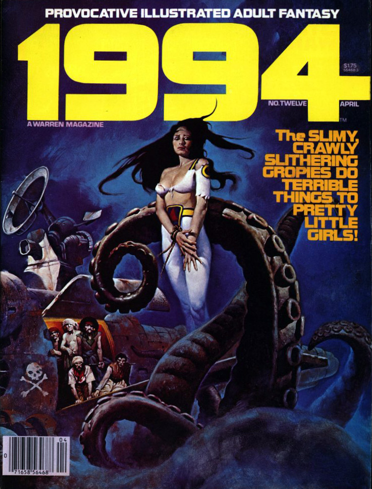
Welcome to Tentacle Tuesday! Today’s edition features beautifully painted covers from series published by Warren, and oh boy oh boy, are there are a lot of tentacles to be found there! To borrow a title from the first cover we’ll be ogling today, “THE SLIMY, CRAWLY SLITHERING GROPIES DO TERRIBLE THINGS TO PRETTY LITTLE GIRLS!” It’s a tad lacking in subtlety, but summarizes the state of things quite nicely.
On with the show…
1994 no. 12 (April 1980). The cover was painted by Sanjulián (his real name is Manuel Pérez Clemente), a Spanish painter who started working for Warren publishing in 1970. The girl’s demure pose coupled with her terrified eyes is quite striking.
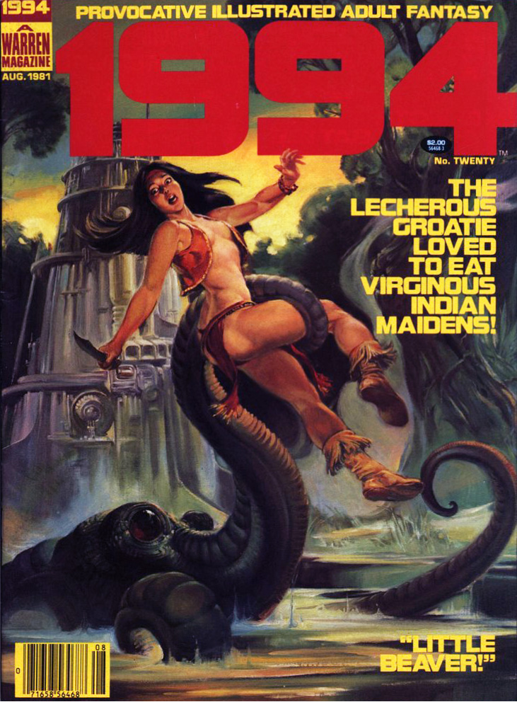
1994 no. 20 (August 1981). Cover by Nestor Redondo, an exceptional Filipino artist.
I wouldn’t expect cephalopods to care for patriarchal, machismo standards of female purity, but apparently Lecherous Groatie (great nickname) wants his maidens virginous (which isn’t even a word, you guys). “Little Beaver!”, you say? Way to go in being offensive to both tentacled creatures *and* Indians. This issue also contains the story “The Russians Are Coming… All Over America!”, a title which I, for one, find hilarious.
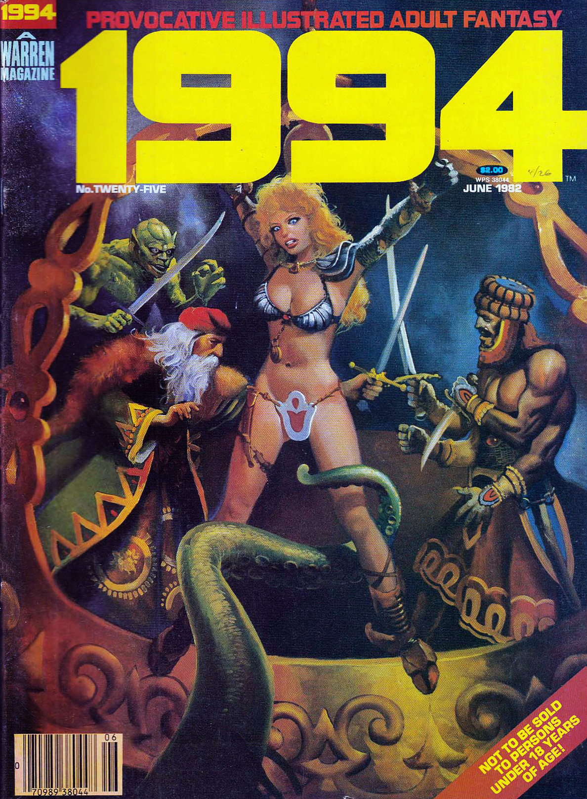
1994 no. 25 (June 1982). Cover by Lloyd Garrison. Aaah, a rare silent cover. It’s clear enough: Ukranian Santa will surely rescue the maiden, if he doesn’t get too distracted by her ass or Chinese-takeout container-inspired undergarment.
Leaving 1994 behind (although technically we’re going back in time), and moving on to Eerie, we get to tentacles that look like worms coming out of a lumpy, squishy brain – the joy of any good anatomical pathologist.
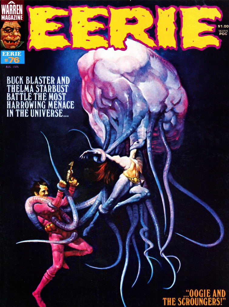
Eerie no. 76 (August 1976). The cover the aforementioned Sanjulián, who has quite the talent for painting extremely realistic textures, as demonstrated by this rather unsettling cover.
One understands the guy’s desperate attempts to get free, but why is the woman so placid, serenely exposing herself to the creature’s grasp? I guess Tentacle Tuesday doesn’t have the same effect on everyone. Interestingly, Sanjulián seems to have tweaked his art for the cover – here’s his original painting, in which the girl’s face is clearly visible.
Let’s visit good old Vampi and see what sort of cephalopod encounters she’s had.
Vampirella no. 101 (December 1981); art by Noly Panaligan (who, by the way, is another Filipino artist).
The tentacled creature in question is the “star-beast” advertised on the cover – an alien (suspiciously similar to an octopus) who, as usual, tries to take over the earth by breeding (which for some reason involves a lot of nude & nubile college students as sacrifices) and is killed when Vampirella crashes a car into it. Starting on an epic, inter-planetary scale and ending it all with a banal road accident is a bit of an anti-climax.
Is this Vampirella’s last encounter with tentacles, you ask? Don’t be silly – of course not. As the Russians say, « and yet again the little hare will go out for a walk. »
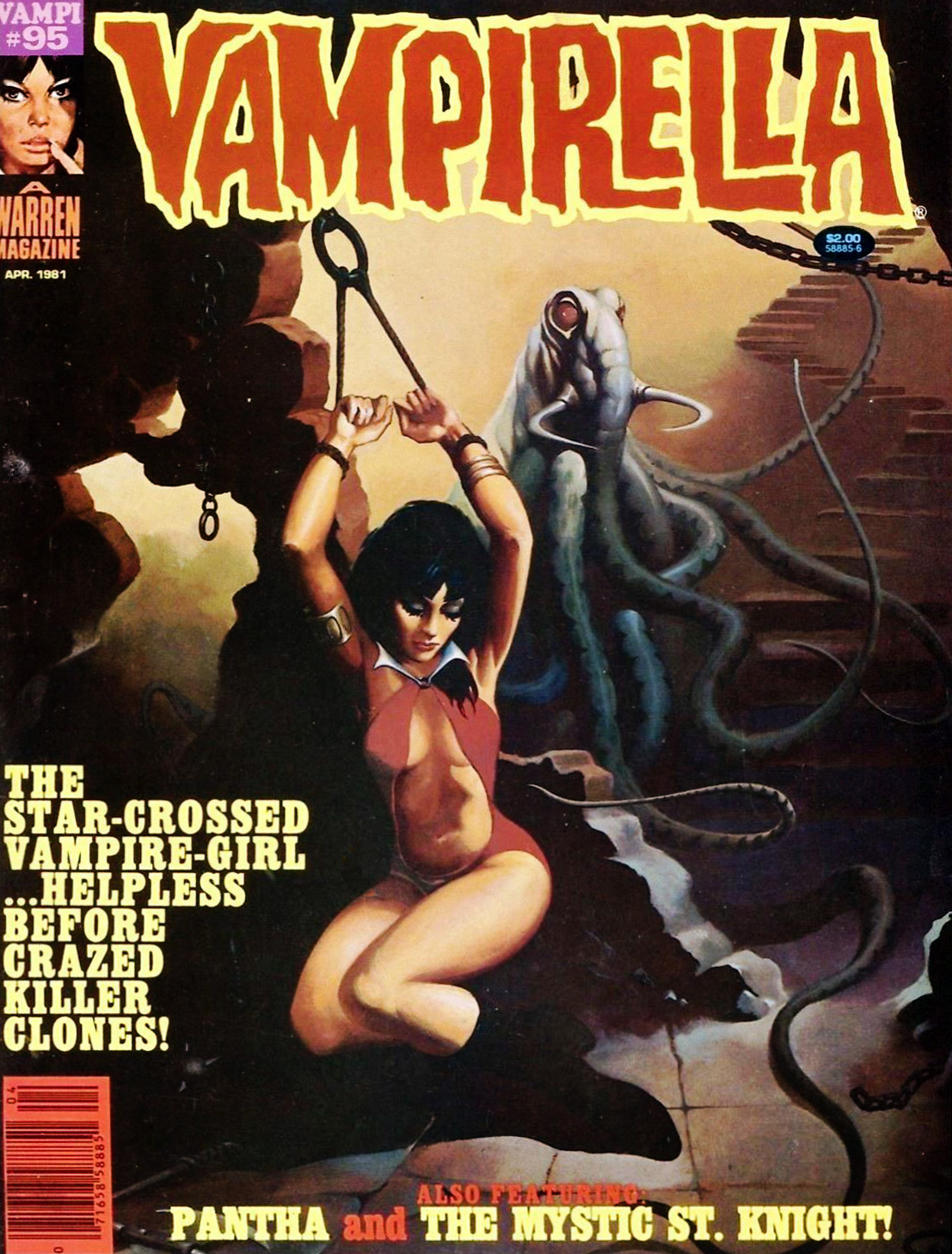
Vampirella no. 95 (April 1981), cover by Ken Kelly. “O Mr. Walrus-with-tentacles, please don’t hurt little old me!”
More? Well, okay, one last cover.
Creepy no. 67 (December 1974), cover by Ken Kelly (not one of his better efforts, to be honest). We’ll return to sweet ol’ Bowser on another occasion.


 The marvellous Bhob Stewart queried Nick Cuti about the story during a roundtable gathering of former Wood assistants in Derby, Connecticut, in July 1985. The discussion later appeared in Against the Grain: MAD Artist Wallace Wood, edited by Stewart (2003, TwoMorrows Publishing)
 An adult humour magazine? I guess they hadn’t quite settled on the tone.