« I opened my magazine (What did you see?) / I saw Mr. France (What did he have?) / A girl on each shoulder (What else?) / And one in his pants » — 10cc, Sand in My Face (1973)
You may think of this post as a companion piece, a spinoff of its predecessor. I’d had for some time, in the back of my mind, the notion to showcase some obscure French ‘human sculpture’ ads, but it needed more. Comments on the previous post provided the spark.
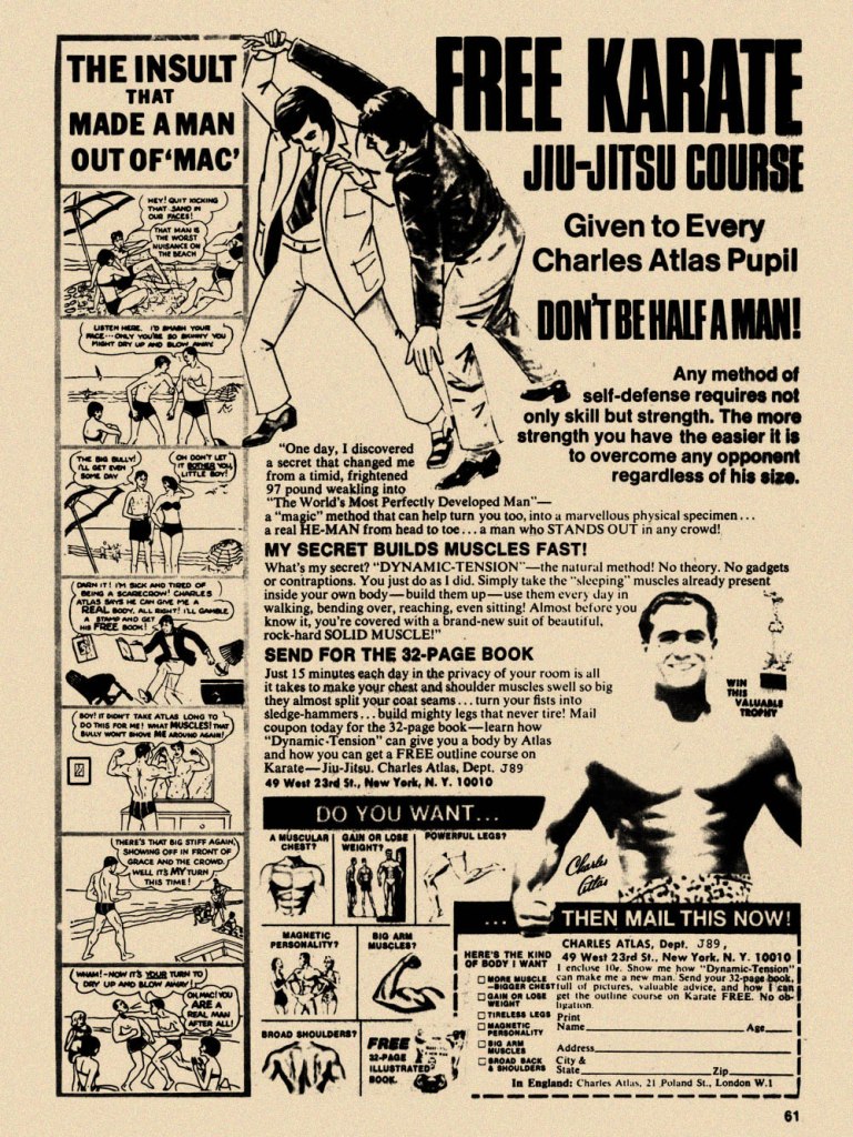
Is there a more classic “humble immigrant makes good in the USA” yarn than that of Angelo Siciliano, born in 1892 in the tiny Italian town of Acri? The Smithsonian has told the full, colourful story, so I’ll spare you a rehashing of it.
Let’s just say that young Siciliano worked hard to overcome adversity and redeem his puny physique, and the rest is the stuff of legend. The principles of ‘dynamic tension‘ and his immortal moniker aside, Angelo’s finest brainstorm was to employ the lowly but then-ubiquitous medium of comic books to introduce his product and its natural audience to each other. Let’s take the tour!
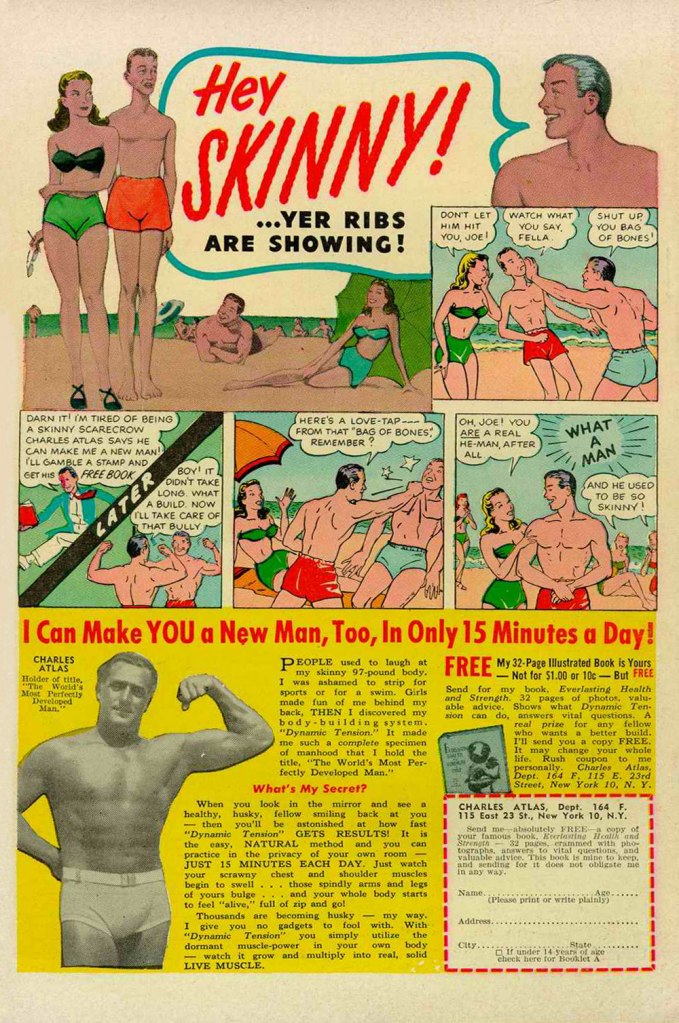
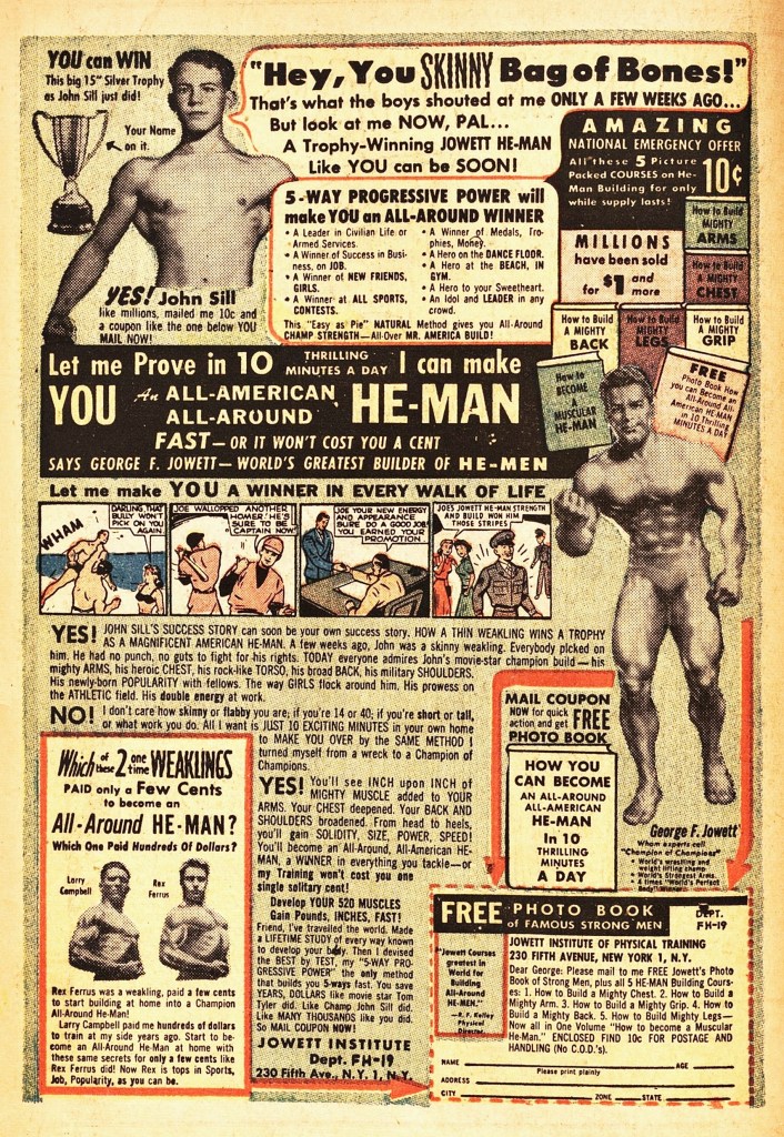
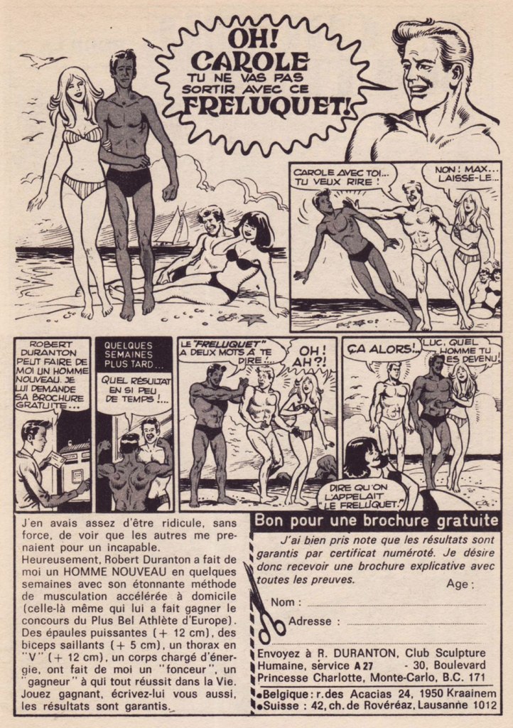
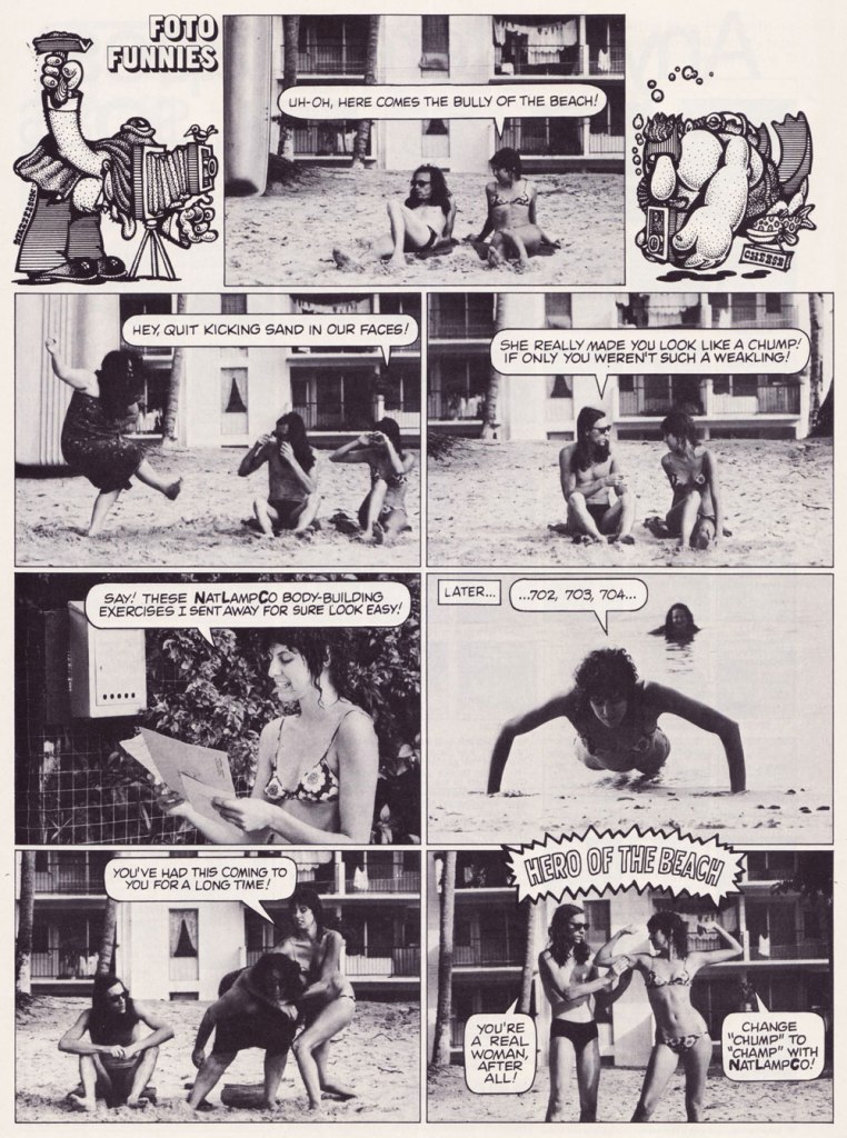
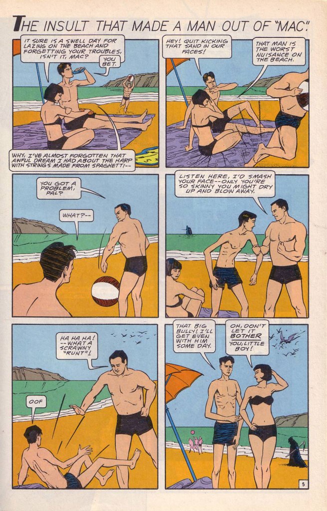
While the Charles Atlas ads began running in the 1930s, this is probably their classical expression. This one saw print as the back cover of Mad no. 14 (Aug. 1954, EC). Its opening insult even inspired Miles Heller’s 1995 salute to the great old comic book ads, Hey Skinny!There was inevitably fierce competition in the self-improvement field. This entry, from the U.S. Nature Products Corp., appeared in Stan Lee’s oh-so-macho Man Comics no. 10 (Oct. 1951, Atlas).Lots and lots of copy — but the all-important cartoon hook is present and accounted for. From the pages of Firehair no. 9 (Fall 1951, Fiction House). The Jowett Institute of Physical Training wants you to get buff! To be fair, George F. Jowett got there first.This is surely the definitive version, with the unforgettable tag line and ‘hero of the beach’ conclusion. I pulled this one from The Witching Hour no. 25 (Nov. 1972, DC), which hit newsstands just a few months before Mr. Atlas passed away, aged 80, on Christmas Eve. I can’t help being amused: French publisher Arédit, whose digest-sized collections of (mostly) reprints of US comics proudly bore the tag « Comics for adults », featured very few outside ads… and those were almost exclusively for self-defense and body-building systems. Here’s a sample trio. This one appeared in Maniaks no 4 (Fall, 1971). This title featured reprints of DC Silver Age ‘humour’ comics… all but the only actually funny one (that would be Sugar and Spike, of course).Oh, I’m sure the ERB Estate got their cut. And who might that R. Duranton fellow be? Four times Mr. France, for one thing! Here he appears with Louis de Funès in a famous scene from Le Corniaud, a 1965 farce starring beloved stars André Bourvil / De Funès and directed by Gérard Oury. This one’s from Kamandi no. 4 (Summer 1976, Artima), which featured reprints of various 60s and 70s DC adventure comics. It was an affordable way to catch up on material one might have missed — or couldn’t afford!This refreshing gender-switched lampoon comes from the pages of National Lampoon no. 26 (May, 1972), the ‘Men!’ issue, guest-edited by Anne Bats, No other credits, dammit. The opening page (of four) of Steve Skeates and Sergio Aragonés‘ wacky satire, from the pages of Plop! no. 2 (Nov.-Dec. 1973, DC). There have been truly countless spoofs of the Atlas adverts… most of them quite dire. Once more, I’ll spare you.By the mid-1970s, with America in the kung-fu grip of martial arts fever, it’s understandable that many a young man was envisioning Bruce Lee‘s lithe, compact physique as an alternative to the hulking musclemen of yore. The Charles Atlas company tried to cover all bases with this ad; from — speaking of old-time musclemen — Doc Savage no. 2 (Oct. 1975, Marvel).
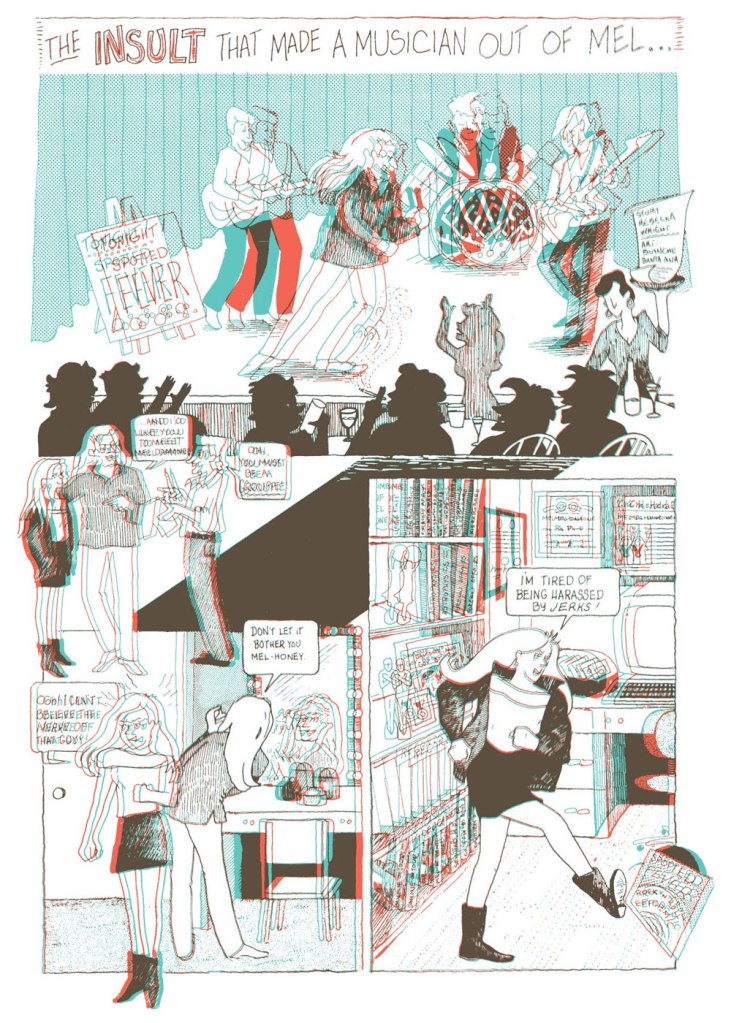
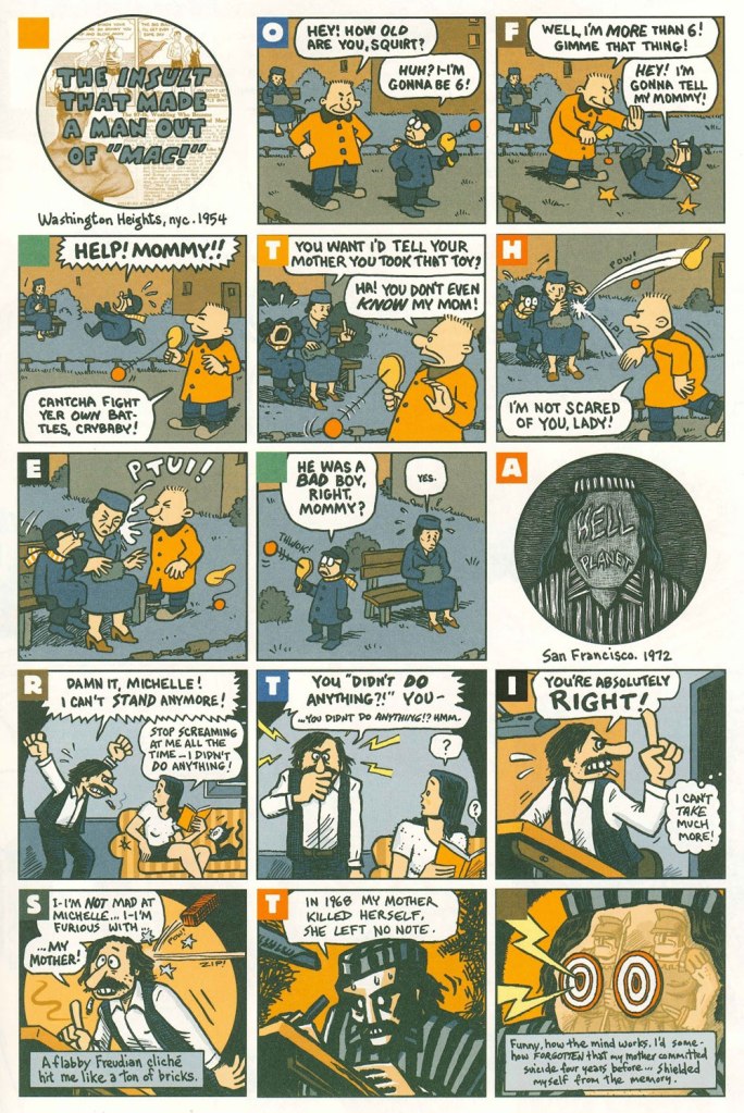
Ah, yes — those days when ‘Bruce‘ was the stereotypical gay name. From the ‘Playboy Funnies’ section of the magazine’s November, 1977 issue.And for something a bit off the beaten path: this is The Insult That Made a Musician Out of Mel, scripted by Rebecka Wright, illustrated by Blanche Santa Ana, with 3-D effects by Ray Zone, from Wimmen’s Comix no. 12 (Nov. 1987, Renegade Press), edited by Angela Bocage and Rebecka Wright.Does this look familiar? This is the first page of Flex Mentallo’s origin tale, as it appeared in Doom Patrol no. 42 (Mar. 1991, DC), written by Grant Morrison, with art by Mike Dringenberg and Doug Hazlewood. I have no idea whether Atlas had a sense of humour, but his successors sure didn’t, as evidenced by the lawsuit they filed against DC Comics over this clear — if brazen — case of satire. I much prefer the TV show version of Flex, I confess.Peter Kuper deftly used the cliché to take a jab at George Bush Sr.’s image and the first Gulf War. Dated and irrelevant? Trying to prove your ‘manhood’ remains distressingly au courant… just consider these two schmucks, to cite but one recent example. And hey, here’s “Stormin’ Norman lying on T.V.” From Bleeding Heart no. 1 (Winter 1991-92, Fantagraphics).Art Spiegelman digs deeper and makes more discerning use of the raw materials at hand with The Insult that Made a Man out of “Mac!”, first previewed in The Virginia Quarterly Review and then collected in Breakdowns Portrait of the Artist as a Young %@?*! (Oct. 2008, Pantheon).
« In the summer of 1977, New York City was bankrupt. Times Square was run-down and dangerous at night, subways were decrepit, with floor-to-ceiling graffiti and no air-conditioned cars in the underground roast. A garbage strike left mountains of uncollected trash and evil-looking rats scurrying underfoot. A serial killer, Son of Sam, terrorized the city and when a blackout hit in July, looters tore up the town. I was in heaven. »
I first encountered American artist Peter Kuper (b. 1958) through Mad’s Spy vs. Spy feature, which he took over as scripter and illustrator with Mad Magazine no. 356 (April 1997). At that point, I had only seen creator Antonio Prohías‘ take on that strip, and I was impressed with Kuper’s style and energy.
But my favourite of his books is Drawn to New York: an Illustrated Chronicle of Three Decades in New York City (2013, PM Press), both for the wide variety of styles used in this loosely-themed collection of strips, doodles and sketches, and for its beating urban heart. It captures a part of New York City that I love – not its glamour nor its electricity-guzzling lights, and definitely not its famous fops and varnished coquettes, but its boisterous mix of cultures and the seedy, scaly alligator underbelly. It’s not the same city it was in the mid 70s and early 80s – the era of Kuper’s reminiscences on the subject – but you can still spot remnants of the past in older neighbourhoods.
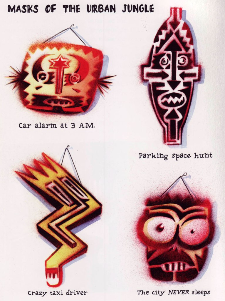
As mentioned earlier, Kuper executes a number of styles with ease, but he is most easily recognized by that ‘spray-painted stencil thing’ he does so well, as well as his favourite palette of dark reds:
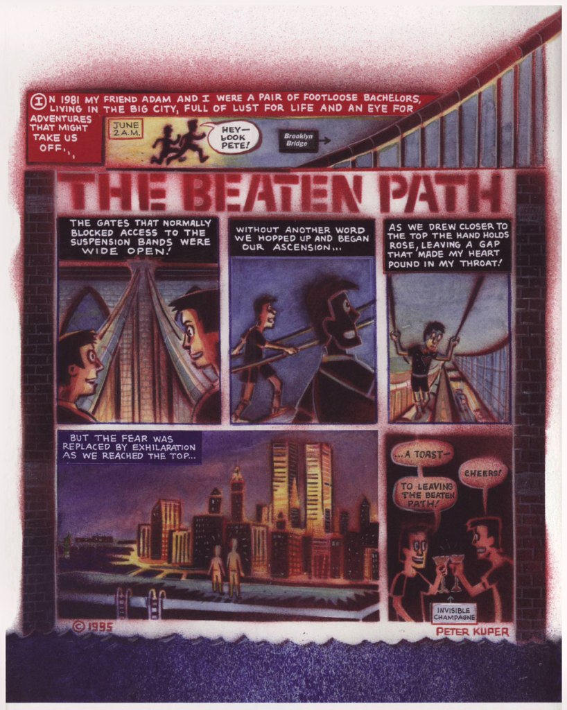
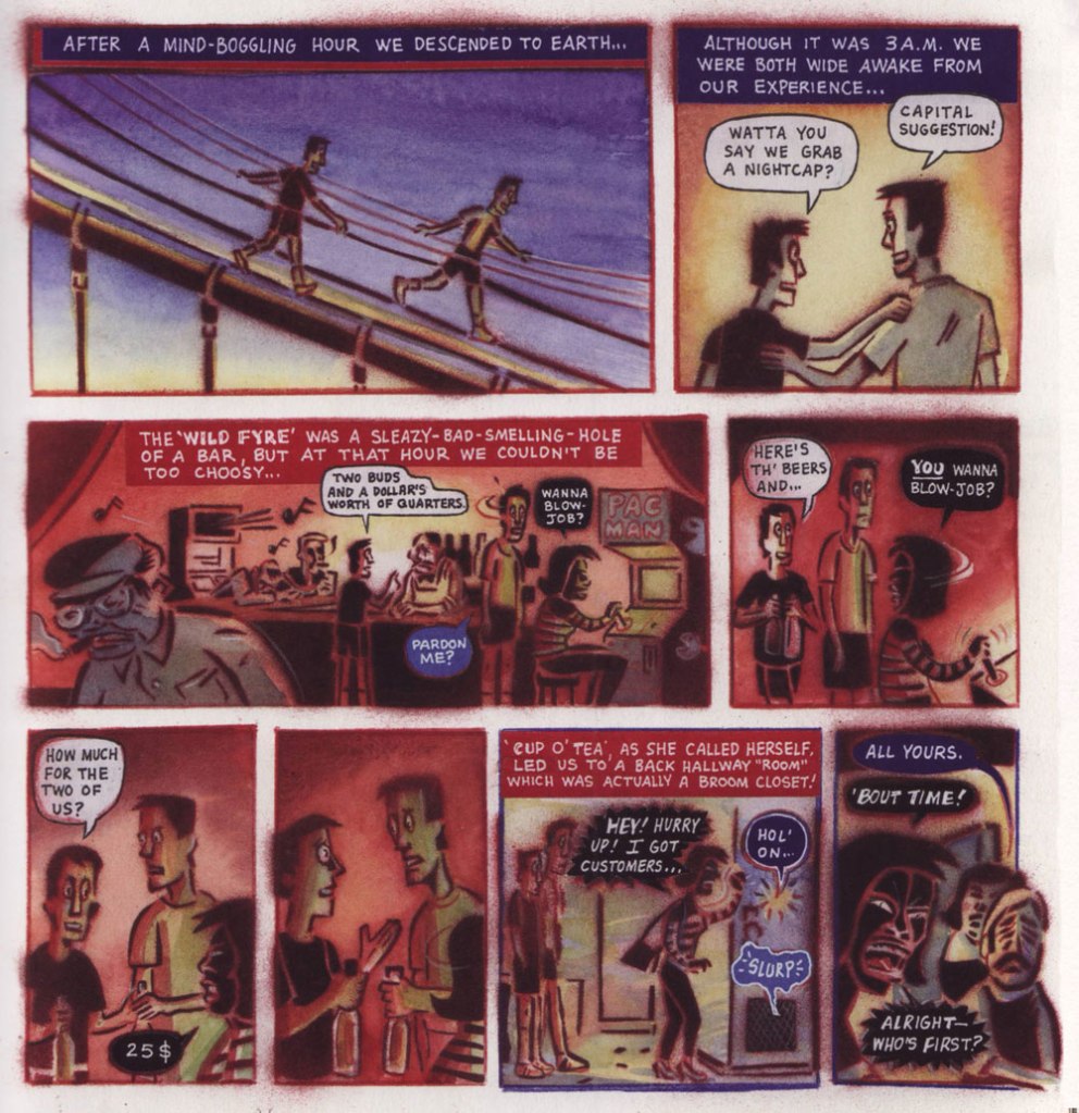
One of the more memorable stories of Drawn to New York is the following three pager, following the nocturnal adventures of Peter and his friend Adam as they scale a bridge and awkwardly navigate the social etiquette involved in engaging the services of a blowjob prostitute:
The healing and restorative powers of a view from a sky-high bridge at night cannot be overestimated.
Here’s one of the many cynical pieces:
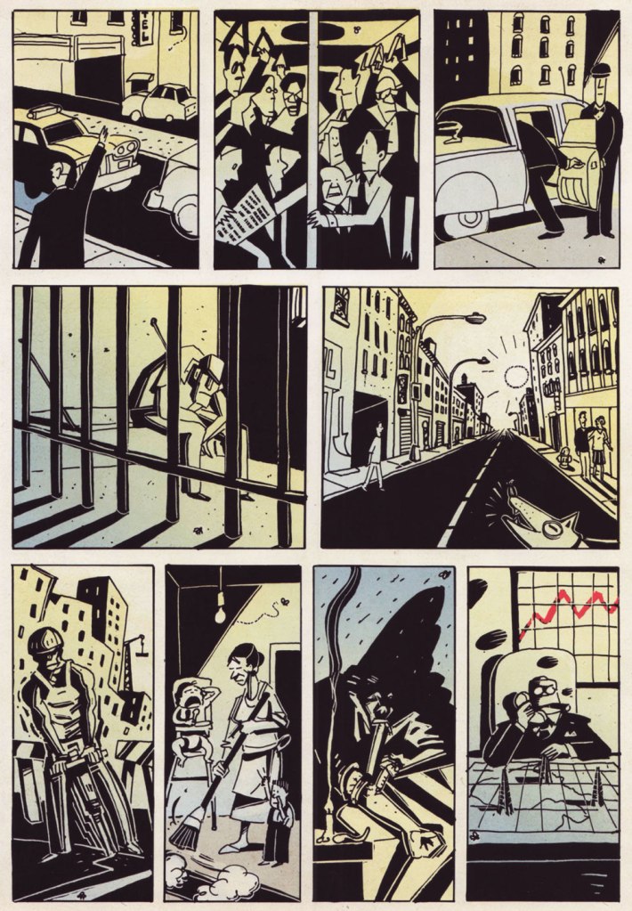
The following is a page from the mute Twenty-Four Hours, which chronicles the strikingly different lives of NYC denizens as they go about their day:
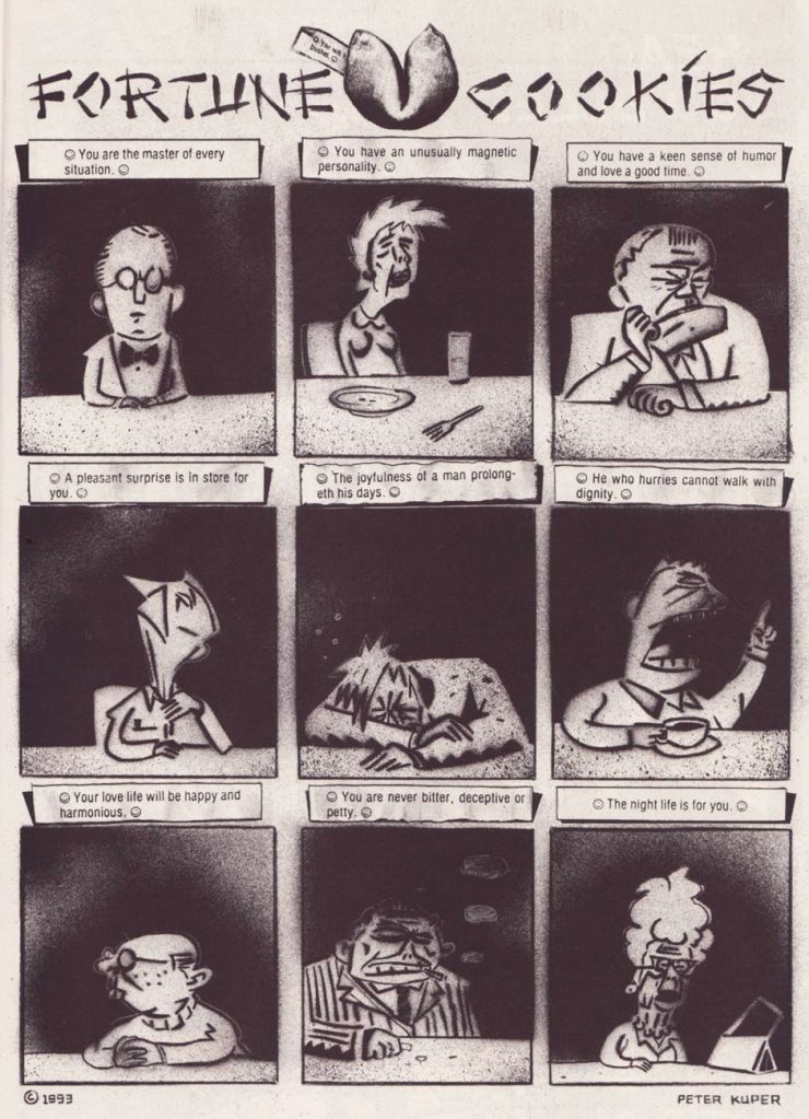
All the above images are excerpted from Drawn to New York, but I’d also like to include a bonus: a strip published in Bleeding Heart no. 5 (August 1993, Fantagraphics) which fits today’s theme rather well.