« Truly the universe is full of ghosts, not sheeted churchyard spectres, but the inextinguishable elements of individual life, which having once been, can never die, though they blend and change, and change again for ever. » — H. Rider Haggard
Here at WOT?, we’re both Russell aficionados, but with some reservations. I think I needn’t delve into such details, when my partner ds already eloquently laid it out in her post Grains of Golden Sand: P. Craig Russell’s Fantasies… and I happen to fully agree with her reasoning.
What’s perhaps not been explicitly stated is Russell’s virtually infallible way with a cover, both in design and execution. As I keep emphasising, great — and consistently great at that — cover artists are pretty thin on the ground.
Someone at DC must have seen his gorgeous seven-issue run of covers for Elric Stormbringer*(1997, Dark Horse/Topps) and offered him the Spectre gig.
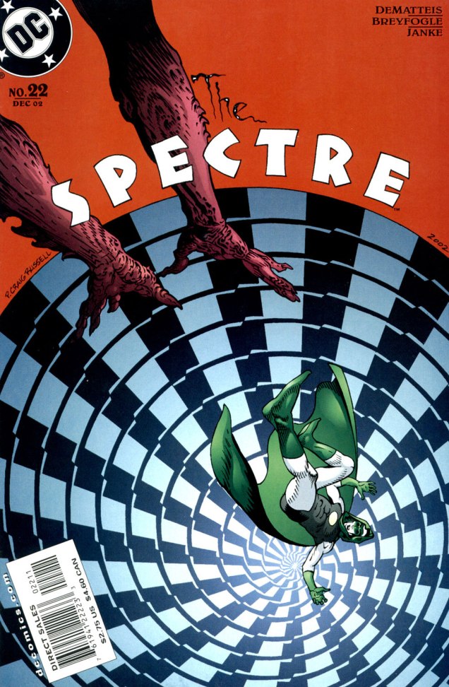
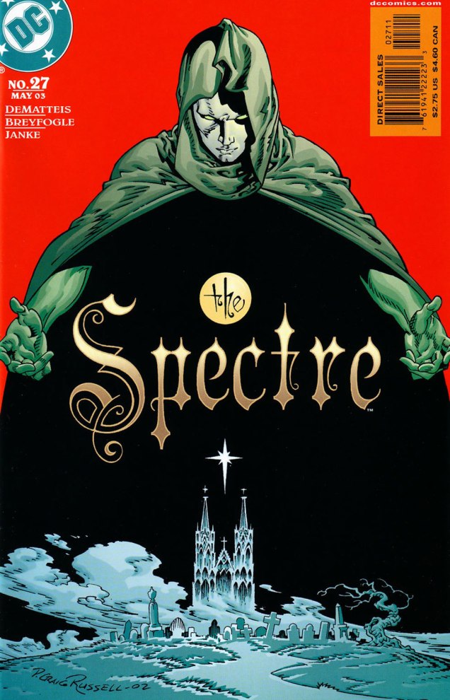
Hey, something from this century! This is The Spectre no. 19 (Sept. 2002, DC). A nice bit of Kirby tribute on Darkseid. In this case, and in fact throughout the Russell sequence, the expressive colours are the work of Lovern Kindzierski.This is The Spectre no. 20 (Oct. 2002, DC). It’s worth pointing out the added value of Russell being a consummate letterer/font designer. Without a logo set in stone (as is generally the case, usually at the insistence of the marketing department) the savvy artist benefits from the extra freedom of counting the title logo among the moving parts of his design. Cue the de rigueurWill Eisner/Abe Kanegson mention.This is The Spectre no. 21 (Nov. 2002, DC). When I showed her these, ds expressed some surprise at her failing to devote a Tentacle Tuesday Masters entry to Mr. Russell.This is The Spectre no. 22 (Dec. 2002, DC).This is The Spectre no. 23 (Jan. 2003, DC).This is The Spectre no. 24 (Feb. 2003, DC).This is The Spectre no. 25 (Mar. 2003, DC).This is The Spectre no. 26 (Apr. 2003, DC).This is The Spectre no. 27 (May 2003, DC). Thus ends the streak…. with the series.
It doesn’t hurt that The Spectre, the brainchild of Superman co-creator Jerry Siegel (1914-1996) and artist Bernard Baily (1916-1996), boasts one of the best-designed superhero costumes of all, virtually unchanged since his introduction, some eighty-five years ago. The exception in this case is the chest emblem, which I presume is meant to indicate that *this* Spectre is former Green Lantern Hal Jordan, instead of defunct flatfoot Jim Corrigan. A bit of a boneheaded notion, imho, and typical of the incessant rebooting and tinkering these poor legacy characters are subjected to by dishwater-dull ‘creatives’.
-RG
*The Elric series was also under consideration, but The Spectre’s nine-issue streak is numerically more impressive.
« To many people in the mid-19th century, Canuck was merely a casual synonym for French-Canadian — and like the nicknames for people of various other ethnicities or nationalities, it came with unpleasant overtones. The word is“used vulgarly and rather contemptuously” »
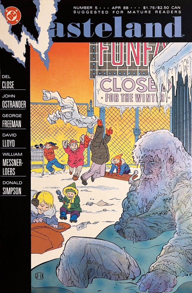
A friendly birthday how-do-you-do to mighty Manitoban George Freeman (born May 27, 1951 — that’s seventy-one years ago — in Selkirk, MB). Some of you will remember him for his Jack of Hearts mini-series at Marvel or his collaboration with Michael T. Gilbert on Elric for First; the more adventurous will recall his fine and, ahem, too-brief work on DC’s Wasteland.
By the 1990s, he was also affiliated with Winnipeg’s celebrated Digital Chameleon studio… but to me, he’s the guy who made Richard Comely and Ron Leishman’s Captain Canuck into a contender, as far as I’m concerned.
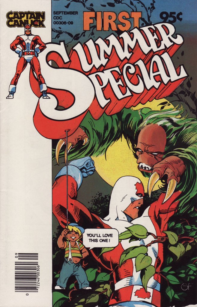
This is Captain Canuck no.7 (Dec. 1979-Jan. 1980, CKR Productions), featuring Ruse, story by Richard Comely, art by George Freeman. Cover by Freeman, with colours by Freeman or Jean-Claude St. Aubin.This was the Captain’s first (and sadly, only) Summer Special (July – Sept. 1980, CKR Productions); a winningly mixed bag, it *was* a lot of fun. Cover by Freeman.Among the goodies included in the Summer Special was a preview of the short-lived CK newspaper strip, which ran in three daily newspapers in Western Canada. It looked quite promising! Written and lettered by Comely, illustrated by Freeman and St. Aubin.This is Captain Canuck no.14 (Mar.-Apr. 1981, CKR Productions), the final issue — just when the series was going from strength to strength. Sigh.
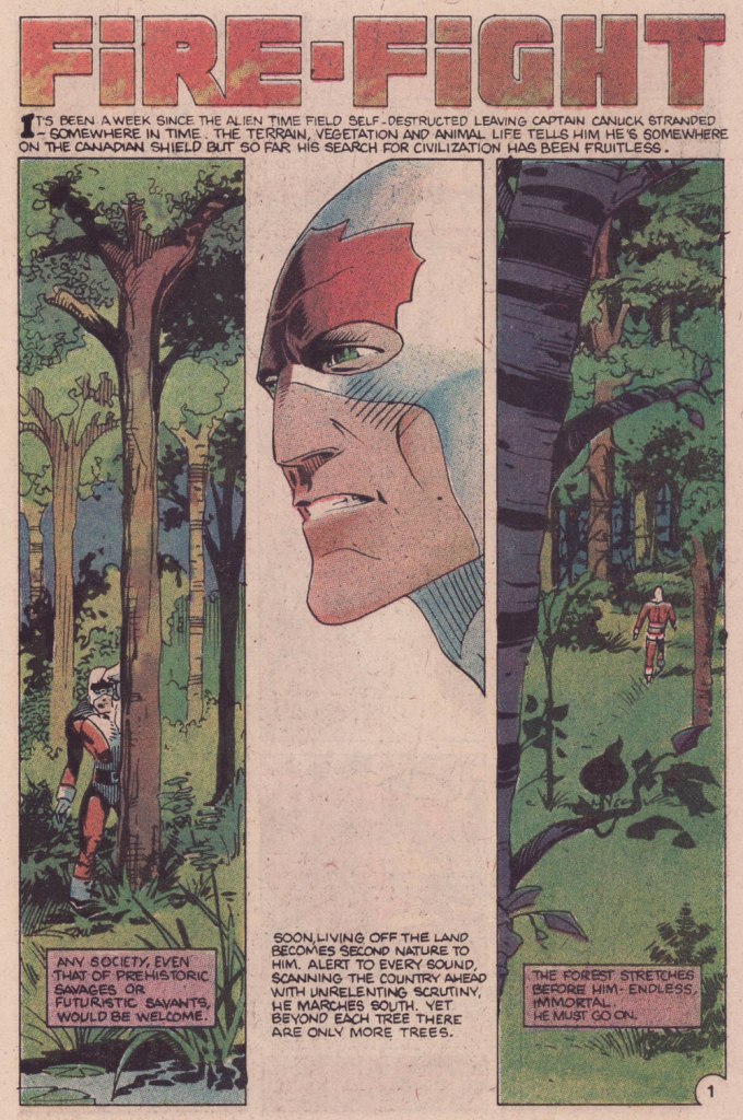
To demonstrate, here’s the opening sequence from that issue. Freeman and St. Aubin were evidently pushing hard against the conventions and constraints of the era’s crappy printing standards.
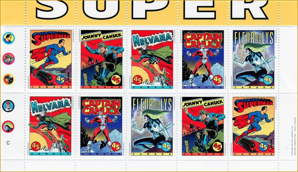
In 1995, the Captain even got his own stamp. Quoting the press release: « What do Superman, Nelvana of the Northern Lights, Johnny Canuck, Captain Canuck and Fleur de Lys have in common? For one thing, they’re all super heroes sprung from the wondrous pages of comic books; and for another, they’re all the marvelous creations of Canadian talent. On October 2, these five super heroes will find new adventure in a booklet of 10 stamps from Canada Post Corporation, to be issued in conjunction with Stamp Month 1995. A universal hero in concept, Captain Canuck is undeniably Canadian in nationality, costume and mannerisms. The concept can be traced to Ron Leishman and Richard Comely. Comely changed Leishman’s Captain Canada to Captain Canuck, and in 1974 established the only independent full-colour comic book in Canada. The cover price was 35¢ – 10¢ higher than other comic books at the time – but that didn’t stop Captain Canuck from outselling all American titles. Unfortunately, the series folded with issue No. 14, in March 1981. »
Part one of The Jack of Hearts’ limited series (Jan. 84, Marvel). The character was introduced in, of all places, an issue of The Deadly Hands of Kung Fu (no. 23, Apr. 1976, Marvel); The Jack shuffled around various Marvel titles for a time, culminating in this solo four-parter scripted by his co-creator, Bill Mantlo, and illustrated by Freeman. That costume must have been a bitch to draw.
Oddly enough, while Freeman was my favourite among the stable of artists chosen to illustrate John Ostrander and Del Close‘s scripts on Wasteland (Don Simpson and David Lloyd got the best), I feel he was assigned the least interesting ones to work on, with the exception of the excellent Del Close autobiographical two-parter, On the Road (issues 6 and 7). Beyond that, he drew one cover and split, unwittingly triggering the debacle that was the second half of the series’ run.
This is Wasteland no. 1 (Dec. 1987, DC). Pencils and inks by Freeman, colouring by his Digital Chameleon accomplice, Lovern Kindzierski.This is Wasteland no. 5 (Apr. 1988, DC). Pencils and inks by Freeman, colouring by Lovern Kindzierski. As denizens of Winnipeg, a notoriously cold city, the guys would know how to colour ice, all right. To quote another famous native son, Randy Bachman : “Portage and Main, Fifty below“.
On the subject of chameleons, it appears that the traditionally held ‘camouflage’ theory of their colour changes is simplistic and generally incorrect.