And Now a Word From Our Sponsor

« Advertising – A judicious mixture of flattery and threats. » — Stephen Leacock

It’s long been established that one can scarcely be too skeptical in the face of advertising, and the sooner one starts questioning its wooly claims, the better. In the early 1950s, Harvey Kurtzman‘s Mad shone the giddily harsh light of truth on, well, just about everything, but Madison Avenue‘s tactics were a favourite and frequent target, and for good reason. In 1956, Kurtzman heatedly left his creation after a mere 28 issues; while it retained much of its cultural influence as its reach increased, it degenerated into rigid formula in the hands of his too-cautious successor at the helm, Al Feldstein.

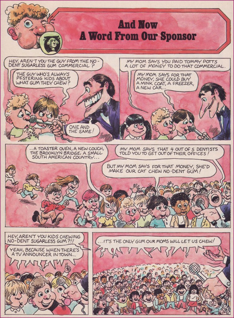
Fast-forward to 1974, and Dynamite Magazine‘s sixth issue. Readers presumably too young for Mad could now receive their monthly inoculation against the advertising industry’s tainted baloney.

From 1974 to 1981, the feature was illustrated by Calvin Sanford “Sandy” Huffaker, Sr. (1943 – 2020); then the reins were passed into the able paws of future Mad art director (small world!) Sam Viviano. But that’s a tale for another day.

Since Huffaker was only credited for illustrating the feature, it stands to reason that it was written in-house, and that narrows it down to two main candidates: editor Jane Stine or Linda Williams Aber (aka “Magic Wanda”); my money’s on Aber, who also wrote Count Morbida’s Puzzle Monthly Puzzle Pages.

As Dynamite’s ‘Inside Stuff’ table of contents always billed it, here’s « A Dynamite look at BADvertising »!

The feature’s inaugural entry, from Dynamite no. 6 (Dec. 1974, Scholastic). The voracious oldster lampooned here is Euell Gibbons, who shilled for Post Grape-Nuts (which contain neither grapes nor nuts!) in this vintage commercial.
From Dynamite no. 7 (Jan. 1975, Scholastic). You might recognize Nancy Walker, aka Rhoda’s mom Ida, and future director of Can’t Stop the Music! (trigger warning: Steve Guttenberg); here she is, pre-orange hair, in a Bounty Paper Towel spot from the Me Decade.
From Dynamite no. 9 (Mar. 1975, Scholastic). Here’s a 1971 Bufferin vs. Aspirin ad. Place your bets!
From Dynamite no. 19 (Jan. 1976, Scholastic). You just may be familiar with the object of this parody.
From Dynamite no. 25 (July 1976, Scholastic). Here’s another ‘wonderful, quickJell-o recipe from those gelatin-happy days.
From Dynamite no. 26 (Aug. 1976, Scholastic). Remember Morris? Here’s the famously fussy feline in a 1974 Nine Lives ad.
From Dynamite no. 27 (Sept. 1976, Scholastic). Here’s a Hamburger Helper commercial of the corresponding vintage.
From Dynamite no. 28 (Oct. 1976, Scholastic). Here’s our pal Poppin’ Fresh in a 1972 commercial.
From Dynamite no. 37 (July 1977, Scholastic). On that topic, here’s our look at the 1970s bubble gum explosion!
This subscription ad appeared in Dynamite no. 26. I suspect it was a draft for issue 28’s more focused Laverne and Shirley cover, which had been previewed in ads as a photo cover.
From 1971, young Sandy wears his Ed Sorel influence a little heavily, but he was learning fast and from the best! For those who may not know — or who’ve forgotten — David Frye was possibly the nation’s premier Tricky Dick Nixon imitator. Was he? Listen here and judge for yourself!

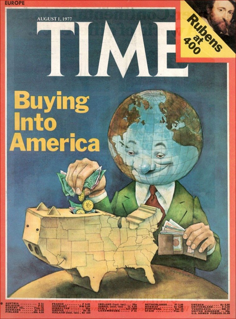
Thanks to his versatility and ability to nail a likeness, Huffacker was among the most sought-after illustrators of the 1970s. Quoting from the Chattanoogan.com’s obituary:

« Huffaker was a highly acclaimed political cartoonist who started his career with The Birmingham News and the Raleigh News and Observer. He later moved to New York City and illustrated covers and articles for such publications such as Time Magazine, The New York Times, Sports Illustrated, Businessweek, People and Fortune Magazine. Some of the accolades awarded for his artwork include two Page-One Awards from the New York Newspaper Guild, three nominations for Cartoonist-of-the-Year by the National Cartoonists Society, A Desi Award of Excellence (Graphic Design Magazine), 20 Award of Merit citations from the Society of Illustrators, and was twice nominated for a Pulitzer Prize for illustration. »

Here’s one of his aforementioned Time covers.

In a 2012 interview, he recalled those halcyon days: « During one week at the peak of his career as an illustrator, Sandy Huffaker had assignments from Time, Sports Illustrated and Businessweek. He had to turn down a fourth assignment that week from Newsweek. “I just didn’t have time. »

-RG

Hallowe’en Countdown VII, Day 4

« … so I’d work on it until three or four o’ clock in the morning — that is the time to do Loevecraftian machinations. » — Tom Sutton (2001)

If you ask me, Marvel’s attempts at humour never came off*, being both strained and generally directed at superheroes, who are ridiculous in the first place. It’s like mocking pro wrestling — What’s the point?

Marvel did half-try its clammy hand at a horror humour comic book midway through the 70s, and while much of it looked decent, it was consistently unfunny. You can give it your best Will Elder, but it won’t stick if you don’t have that rare magic comical gene.

And while I’d love to say that Tom Sutton (1937-2002) had it, I’m afraid he didn’t. But Gerald’s World was a story close to his heart, to the point where he actually remembered creating it and having fun doing so.

« Right, and I did “Gerald”, who stayed up all night watching Fay Wray or something like that. I had fun with those! You know there were people who really didn’t like those things? » (Comic Book Artist no. 12, 2001)

It’s overstuffed, but it’s brimming with mood and solid craft. Take it away, Tom!

For a dose of real-life, depressing horror, read the definitive, late-in-life Tom Sutton interview, ‘An Odd Man Out‘. I’m afraid it’s unlikely to leave you swooning with affection and goodwill for the comic book industry.

And here’s Marie Severin‘s cover for that issue. This is Arrgh! no. 2 (Feb. 1975, Marvel). By issue five, the final one, Marvel were down to licencing 1954 Get Lost! material from Ross Andru and Mike Esposito.

-RG

*there’s always an exception, isn’t there? I’ll proudly vouch for Scott Gray and Roger Langridge‘s Fin Fang Four stories, circa the late Oughties. Recommended? You bet.

Hallowe’en Countdown IV, Day 30

« The world will come to an end, but the monster models will still be around. » — James Bama, who went on to paint artwork for over twenty of Aurora’s kit boxes.

Well-executed comic book ads were often just as enticing (and sometimes more, depending on the title) as the contents proper. A prime example, this lovely Aurora Monster Kit campaign, announcing the epochal model maker’s forays out of the Universal ménagerie of misunderstood fiends with Toho’s Godzilla and RKO’s King Kong.

The first Aurora monster model advertisement, it appeared in various DC Comics titles dated November and December, 1963.
The ad ran on the back cover of various DC titles in late 1964. In this case, House of Secrets no. 69 (Dec. 1964). The artwork is almost certainly that of Mr. Murphy Anderson, who goes uncredited, but is betrayed by the characteristic finesse of his inking.
A couple of the models that usually received considerably less attention got their turn in the spotlight in this ad that appeared on the back cover of select DC titles cover-dated October, 1965.

Incidentally, if you were wondering, indeed, the giant monsters cost more… 50 cents more. A bunch more empty bottles to collect, son.

In the late ’60s, a new twist was added: phosphorescence! A cool idea, it however made painting the models, a tricky task to begin with, even less rewarding, as opacity was a bitch to achieve. It worked okay if you had mostly light-coloured The Mummy, but otherwise… This advert appeared on the back cover of DC Comics dated October, 1969… and thereabouts.
The Spring, 1970 collection.
Here’s where Aurora’s close business relationship with Warren Magazines became most evident, with the appearance of a Vampirella model kit. Controversy ensued, once moms caught a glimpse of Junior’s new model kit, the heirloom of his bedroom. Speaking of controversy, Vampirella’s quip about New York was likely a barb about the infamous Kitty Genovese case. This pitch showed up in various DC titles, again, in and around June, 1971.

Warren sold a lot of Aurora kits via his mail order business, and a decision was made to include his character in the line rather than risk dissolving a partnership. Unpainted, she appeared to be virtually naked. Her counterpart, the Victim, sported hot pants and a halter top; a dress or flowing skirt was deemed impractical in order to have her fit on the torture rack. [ source ]

This beautifully-designed ad showed up in October, 1971 DC titles.
At this point, the diluted message is a hint that the bloom is off the rose. An ad from November, 1971.
As a bonus, here’s Big Frankie, the seldom-seen, long-unavailable Aurora grail (until its relatively recent reissue). As the largest Aurora model of all, BF fetched, at the time, an astronomical $4.98; now it goes for a hundred smackers, so don’t complain. Take a look at the big fella!

Though the original Aurora issues of these classic kits are mostly rare as hen’s teeth, enterprising contemporary kit companies have reissued these babies, and you now can actually afford to free the monsters from the confines of their box and assemble and paint ‘em. Mint in Box? Pfui!

– RG