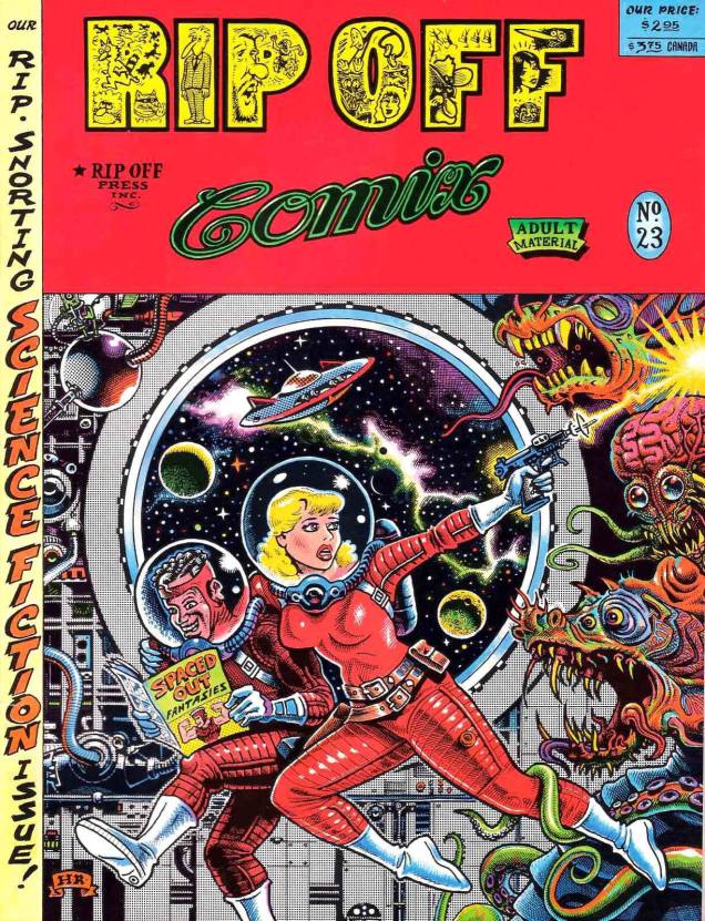
Let’s commence Tentacle Tuesday on a ticklish note (tentacles are itchy, you know, especially when they’re crawling up one’s leg) with Rip Off Comics no. 23, “the rip-snorting science fiction issue!”
Typical: the good-looking gal has to defend herself and her goofy-looking idiot of a partner from tentacles, claws, fangs, and other typical dangers of deep space. Rip Off Comics no. 23 (summer 1989), cover by Hal S. Robins, with colours by Guy Colwell. Look closely at the tiny drawings hiding inside “Rip Off”, and you’ll see Fat Freddy’s cat bouncing around merrily! Actually, you’ll see pretty much the whole cast of Furry Freak Brothers, and then some.
If a tentacle creeps out from the pages of a book you’re reading to gently prod you, you know you’ve made the right choice of reading material.
This Wacky Packages card (from the 14th series, released in April/June 1975) is painted by Norman Saunders from a concept by Jay Lynch (which looks like this). Given that the moon is grinning at them, I think these two are high on something (I’m willing to accept tentacles in space, but I draw the line at anthropomorphized satellites).
Sometimes tentacles masquerade as waves, but we know better! Dunno why some sea god would want a cyborg chunk of metal, though.
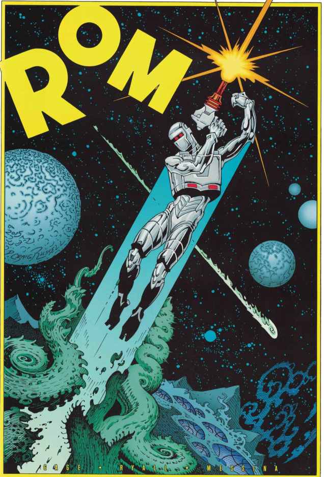
Rom no. 1, July 2016 (IDW), a variant cover from something called « Retailer Incentive ». Art by the ever-decorative and undeniably stylish P. Craig Russell, who unfortunately seems to mostly have squandered his talents on operatic and fairy tale adaptations (not counting a few marvelous short stories). Some people’s thing, no doubt, but not mine!
Rom the Spaceknight was a toy created by three men (Scott Dankman, Richard C. Levy and Bryan L. McCoy) in 1979. His creators called him COBOL (a programming language), but he was renamed into ROM (« read only memory ») by the executives of Parker Brothers, the company that bought rights to the this « beeping, thinking toy » (which Time predicted would « end up among the dust balls under the playroom sofa »). As part of a promotional effort, Parker Brothers promptly licensed him to Marvel. Rom the toy was a commercial failure, but Rom the comic book went on to last 75 issues, beeping its last bleep in 1986 (not counting the comic’s revival by IDW in 2016).
The comic may have passed from Marvel’s hands into IDW’s, but the description still seems to have been written by a hyper-ventilating lummox flinging spit everywhere as he croaks: “WE’VE BEEN INVADED AND ONLY A SPACE KNIGHT CAN SAVE US! Now the ongoing tale of ROM begins in earnest! Christos Gage, Chris Ryall, and David Messina kick off the wildest new series of the year as Rom’s war with the DIRE WRAITHS hits close to home in ‘Earthfall, part 1!’ ‘The long-beloved and even longer absent space hero returns at long last! First, we brought back MICRONAUTS! And Now… ROM! As if Rom’s return wasn’t enough, wait’ll you see how this one ends!” Brr.
So far, the tentacles featured have been rather on the tame side. Let’s have something properly terrifying…
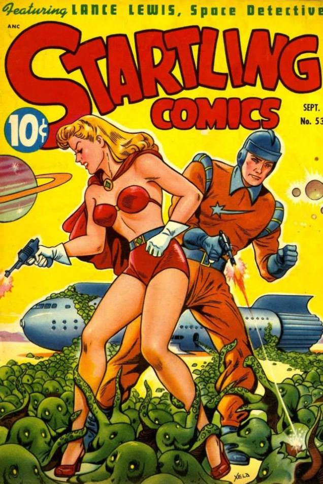
Lance Lewis (Space Detective) and his girlfriend Marna may be in a tight spot… but I’m sorry, I’m having trouble imagining the terror of being overcome by these teeny-tiny octopuses. They’re just too dang cute, clinging to Marna’s legs like puppies begging for food. Startling Comics no. 53, 1948, the last issue of this series. Cover by Alex Schomburg (1905-1998), a prolific Puerto Rican artist (this is signed as Xela).
Oh well, terror petered out today. I guess this Tentacle Tuesday is not going to scare anybody witless. There’s always next time!
« Krokodil » («Крокодил» in Russian, a crocodile) was a Soviet satirical magazine founded in 1922 and that outlasted the Soviet Union by a number of years. In 2000, it was driven to its deathbed by a general lack of interest and failing finances – no longer being relevant to the modern age, alas! – and though weak attempts were made to breathe life into it in the 2000s, it finally croaked altogether, wheezing its very last in 2008.
Right from the beginning, The Crocodile (personified by a pipe-chomping red crocodile, holding a pitchfork) featured quite a lot of satirical drawings, which were basically panel cartoons, and sometimes even actual comics. The magazine’s modus operandi was to viciously skewer various enemies of the State and the People, such as bureaucrats, alcoholics, bribe-takers, church-goers, various delinquents, ne’er-do-wells and anti-Soviet villains. Institutions were also attacked, sometimes gleefully and sometimes sternly, and that list was long, too: American imperialism and capitalism, German Nazism, colonialism, and more other -isms that you could shake a stick at.
“There were pickpockets, dope peddlers, murderers and thieves Card shark gamblers with aces up their sleeves Bank robbers, burglars, boosters and pimps Prostitutes and call girls and all kinds of nymphs Loan sharks, swindlers, counterfeiters and fences Crooked politicians spending campaign expenses Hijackers, arsonists, bookies and the mob And anybody else who ever killed, cheated or robbed” Hustler Groove, Apollo 440
I would not like to leave you with the impression that Mr. Crocodile was an unsympathetic fellow, however; in its gentler moments, Krokodil’s tongue-in-cheek humour could be a delight, and its savage attacks sometimes masked a subversive anti-Soviet streak. Many prominent writers and artists worked for the magazine, and some of them started their careers within its pages. Aside from a plethora of cartoons, the magazine also featured news, stories, aphorisms, epigrams, and reviews of books, films and theatrical plays, etc.
June 1927, cover by Hrapkovskoy.
Mr. Crocodile came with an extensive family. He had a wife, the Big Krokodila, who lost her marbles in the 1930s, and two twin children, who acquired hilariously caricatural careers in 1990 – Totosha went into management and Kokosha moved to the U.S. to design men’s magazines. These (and other recurring) characters marked several generations of Soviet citizens, and many of their catchphrases have become an everyday part of the Russian language.
Without further ado, here’s a few Krokodil cartoons on very Slavic topics, like drunkenness, and general debauchery and bureaucracy, including the disappointing lack of goods (and poor quality control of actually available goods). In no particular order…
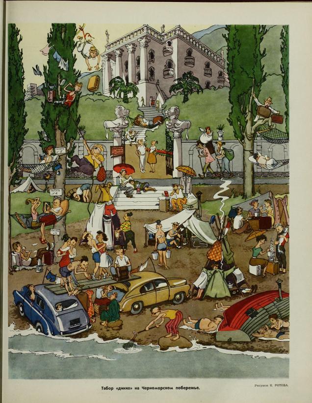
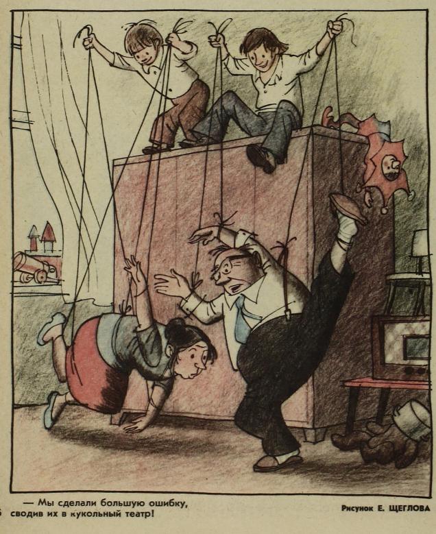
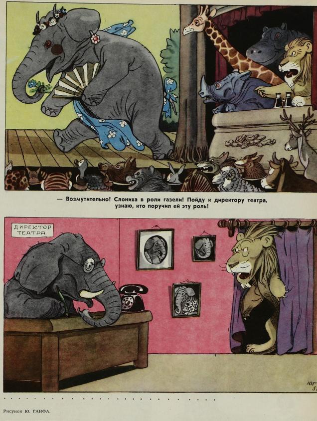
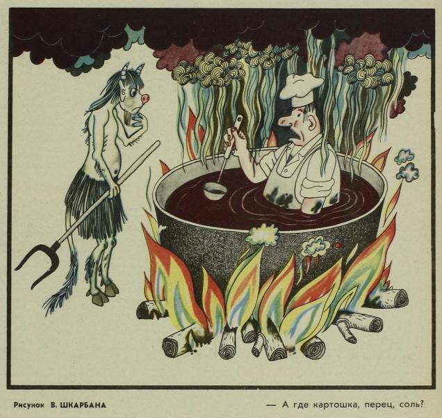
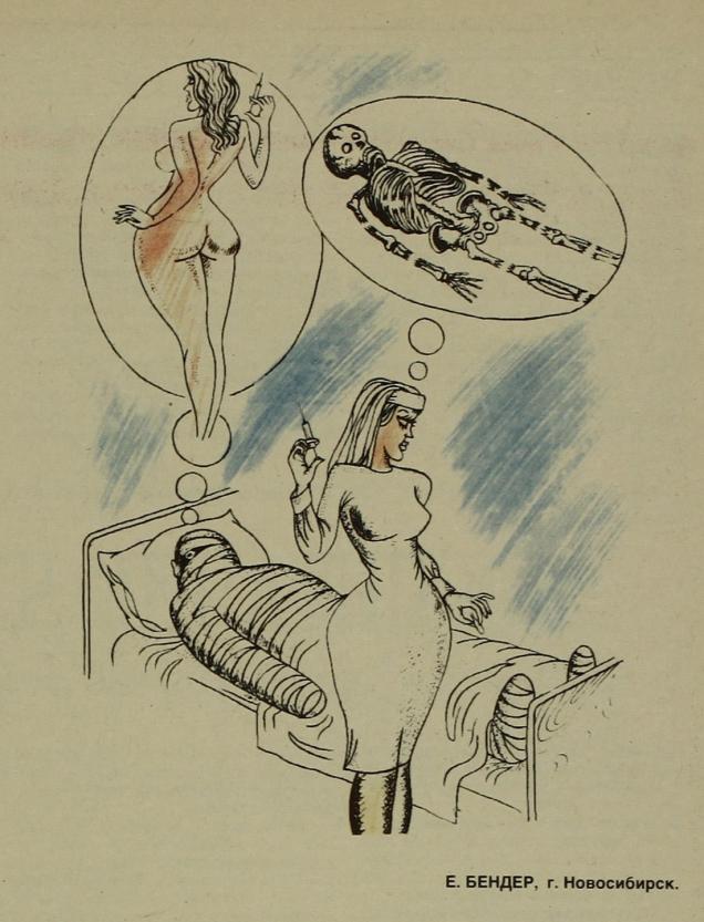
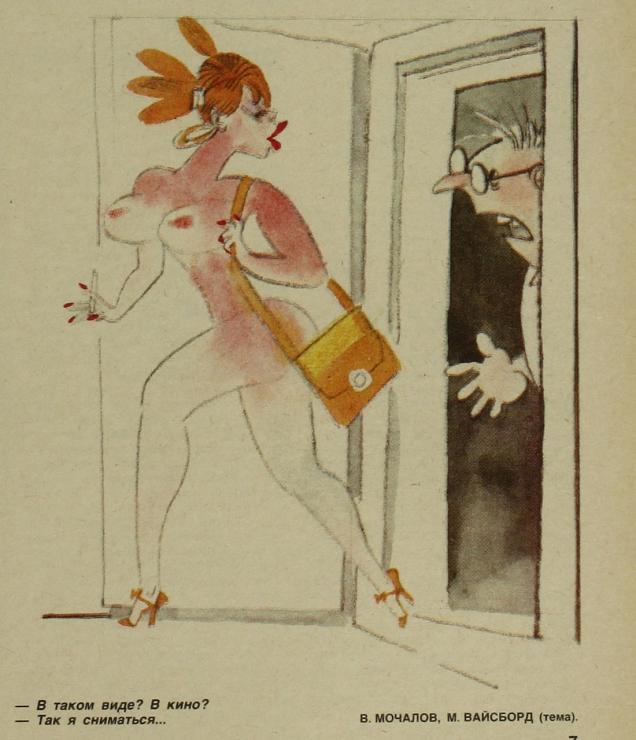
“Fritz in Hell”, 1942. Illustration by Y. Ganf. “Fritz” is used as a moniker for any of your average, humdrum Nazi.“Tribe of wild ones at the seashore”, 1956. Illustration by I. Rotov.“We made a big mistake when we brought them to the puppet show!” 1978.“THE MAN WITH THE SUITCASE IS INDIGNANT: What the hell is happening!… There’s so many prostitutes… One doesn’t know… which one to pick!” Illustration by I. Yang, 1929.1987. Illustration by L. Nasirov. Nearly 50 years later, prostitutes are still around, but their goods are a little more on show. You couldn’t really be an above-board pin-up artist in the USSR, but some people clearly had, shall we say, proclivities for depicting the female form.The lion says in the first panel: “It’s disgusting! An elephantess in the role of a gazelle! I’ll go to the theatre manager and find out who gave her this role!” 1956, illustration by Y. Ganf.A charming case of bribery: “And here, dearie, is some evidence for your examination!” Perhaps this requires some context: this charming granny makes moonshine at home, and she hopes to soothe off the irate-looking policeman with an offering of a glass of vodka and a pickle (traditional accompaniment to vodka – highly recommended, perhaps with some mushrooms. I’m getting distracted, sorry.) Illustration by G. Ogorodnikov.“It’s a good omen: first let a cat walk into a new apartment!” 1975, cover by G. Andrianov.“And where are the potatoes, the pepper, the salt?” Illustration by V. Shkarban, 1979.1989, illustration by E. Bender. I think somebody wanted an excuse to draw voluptuous women!“Dressed like that? To the cinema?’ “– I’m going over there to be filmed…” Illustration by V. Mochalov, idea by M. Vaisbord, 1989.“Now just watch it: oink the way I taught you to!” Illustration by S. Kuzmin, 1963. What happened to the missing pigs? They were most likely sold off to finance the kolhoz foreman’s drinking and gluttony. A kolhoz was basically a sort of collective farm or production cooperative, but corruption and negligence ran rampant.“Same thing as in the vegetable patch: old horseradish next to a young potato.” Illustration by I. Semenov, 1945.“Where are all the Red Riding Hoods going?” “–To grandma’s. She decided to write a will for her country house.” Illustration by G. Yasinkiy, 1984.“In honour of the International Women’s Day, the dance of the Little Swans will be performed by the stage crew workers!” The 8th of March was a big deal in the U.S.S.R., and not only for one’s mothers and grandmothers; if I recall correctly, even students were supposed to bring in flowers for their female teachers. Illustration by I. Sichev, 1975.
« Hey — if you’re looking for that curly machine, I saw some beasts run off with it. »
Missouri native Rick Geary, born 72 years ago today, on February 25, 1946 (in Kansas City, which isn’t in Kansas, despite its name) is in a classe à part: a true iconoclast, he’s quietly, steadfastly carved out for himself (and his fans) a varied and consistently strong œuvre, seemingly free from petty compromise.
A 1985 self-portrait.
He first gained notice in the mid-70s through his fanciful contributions to National Lampoon and Heavy Metal, and just kept up the pace from there. These days, he mostly concentrates on his true crime graphic novels series, published by NBM. One gets a sense of a man who works in comics because he’s passionate about the possibilities the form offers. A 1994 recipient of the National Cartoonist Society’s Magazine and Book Illustration Award, he certainly doesn’t need to work in the comics industry.
This charming one-pager saw print in the anthology Animal Confidential (May 1992, Dark Horse.)
He’s collaborated with fellow oddball genius Bob Burden, of Flaming Carrot fame, a dream pairing that manages to surpass the lofty expectations it implies. Their take on Art Clokey‘s legendary claymation characters Gumby and Pokey manages to be true to its source and to espouse both Burden and Geary’s respective slants.
Here’s a sequence from Gumby no. 1 (July 2006, Wildcard Ink.) Story by Burden, art by Geary, and let’s not forget the contribution of hue ace Steve Oliff. When it comes to Gumby comics, however, mind your step: don’t settle for anything less than Burden (whether with Arthur Adams or Rick Geary). A recent revival fumbles the childlike mood of infinite possibility and mires itself in mere childishness instead.
The Exploits of the Junior Carrot Patrol (2 issues, 1989-1990) was a solo Geary endeavour, but « based upon characters and concepts created by Bob Burden ». Pictured here is #2. From left to right: Dusty, Ethel and Chuck.
Perhaps the ultimate bonafide as a Geary-head: I am the proud possessor of a rubber stamp designed by the great man himself. Furthermore, I have it on good authority that one of our regular readers proudly wields a genuine Geary rubber stamp of his own, albeit a different one. For this particular print, I took advantage of the vegetable world’s finest provider of ink: a slice of beet.
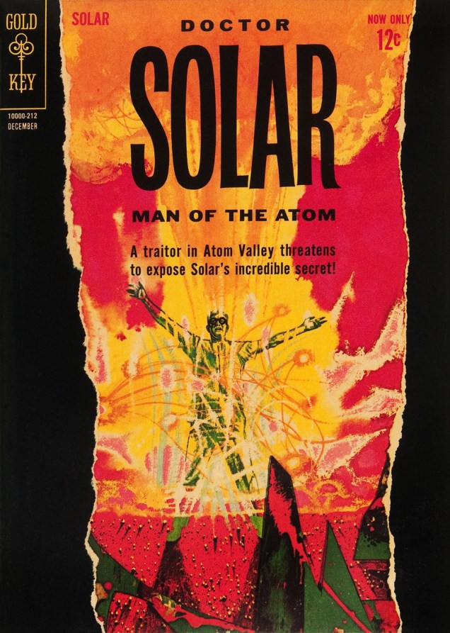
« Are all your projects this dangerous, Dr. Solar? »
Dateline: 1962. Printer-packager Western Publishing had just dealt its biggest client, Dell Comics, its slow death sentence (by mutual agreement, it is diplomatically claimed), though Dell should have seen it coming: for decades, Western Publishing Co. had « secured the rights, created the comics, printed them and shipped them out for Dell. Dell acted as the publisher and distributor and did the billing and paid Western for its creatively manufactured products*. » In 1962, Western cut out the middleman and launched its Gold Key imprint (1962-1984.)
Enter, briefly, revolutionary illustrator Richard M. Powers (1921-1996), who successfully wed representational and abstract art for his paperback covers of the 50s and 60s, bringing science-fiction visuals an unprecedented visual maturity. Don’t merely take my word for it: treat your peepers to a gander at his work. You may well find that you know it already.
What with a Cold War on, in the early 60s, atom-powered heroes were understandably in vogue. Charlton even had two: after Al Fago‘s 1955 creation Atomic Rabbit, came Joe Gill & Steve Ditko‘s Captain Atom. In 1962, the newly-founded Gold Key threw their hat into the nuclear furnace with the advent of Doctor Solar, Man of the Atom. He was created by writer Paul S. Newman and editor Matt Murphy.
Doctor Solar, Man of the Atom no. 1 (October, 1962)Doctor Solar, Man of the Atom no. 2 (December, 1962)
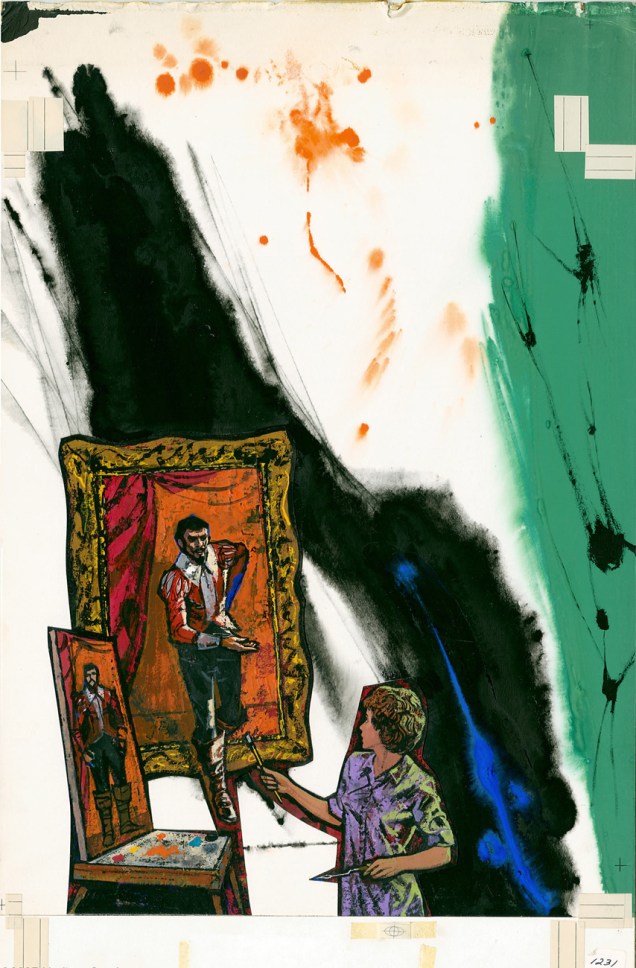
So far so good, right? And then… we may never know exactly what transpired, but I assume that some art director at Western Publishing chose to second-guess Mr. Powers… smothering the tonal and compositional balance of his painting (« can’t… bear… negative space! »), and likely depriving the outfit of Powers’ further services. He was at his peak, was being offered assignments than he could hope to fulfill, assignments surely more lucrative and friction-free. He wisely scooted along.
The printed version:
Boris Karloff Thriller no. 2 (January, 1963.) It was decades before I realized that this ho-hum comic book cover was the work of Richard Powers. In truth, the scales only fell from my eyes when I caught a peek of the original art. The printed version is so tame, so drained of its power(s) that the issue didn’t even appear in Jane Frank’s checklist of book covers in her fine The Art of Richard Powers (Paper Tiger, 2001).See? Now *that* is clearly Powers. « Just slap a 60% cyan overlay over the dang thing, Gertrude. It’s too effin’ artsy! »
And the tale might have ended there, but here’s the curveball: in the mid-to-late Seventies, Powers provided the fading publisher with a pair of gorgeous, but seldom-seen cover paintings.
A lovely Rorschach blot of a cover for the inaugural issue of Starstream, issued in 1976 under Western’s Whitman imprint. Starstream‘s four issue-run offered sober adaptations of smartly-chosen science-fiction short stories by the exalted likes of Theodore Sturgeon, Robert Bloch, A.E. Van Vogt, Robert Silverberg, Isaac Asimov, Larry Niven, Jack Williamson, et al.Let’s hear it for unearthly-looking extraterrestrials. With their translucent skin, these guys remind me of unhatched fish. The fifth and final cover created by Richard M. Powers, this is UFO & Outer Space no. 17 (continued from UFO Flying Saucers), published in September, 1978.
See what I mean?
If memory serves, my own Powers epiphany took place in the autumn of 1982, in Lennoxville, a small college town in the Eastern Townships of Québec. There was this little bookstore… and its fine selection of 60s horror and science-fiction paperbacks, priced in the 35-to-50-cents range. The kind of place book lovers dream about stumbling upon, and wake up dismayed to find themselves in the real world… empty-handed.
My favourite (inside and out) of the lot I picked up that day? Fritz Leiber’s (despite the name being misspelled on the cover) Night’s Black Agents (June 1961, Ballantine Books). If you’ve had a similar thrill of discovery with Powers’ art, please do tell us about it!
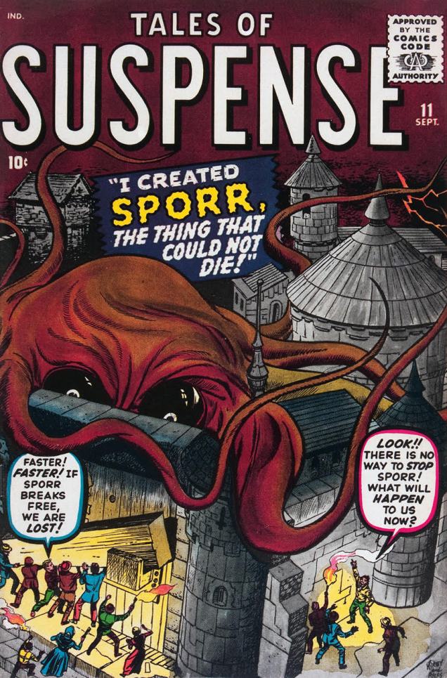
Compared to their bodies, octopuses have fairly small eyes. Yet in comics they often sport saucer-sized peepers, and like villains in a bad Broadway production, they love to glare menacingly at their potential victims from under their impressively wrinkled brows.
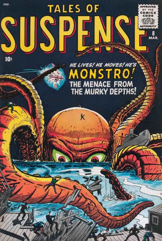
Case in point, these two Tales of Suspense covers, close cousins despite the change of scenery. They’re both from 1960, both penciled by Jack Kirby and inked by Dick Ayers. Both monsters promptly acquire loving nicknames from people you would think have more important things to think of, like not getting eaten and/or crushed. Meet Monstro and Sporr!
Tales of Suspense #8, March 1960. An octopus who was minding his own business gets temporarily but dramatically enlarged by radioactivity from nuclear tests (*communist* nuclear tests). “He lives! He moves!” – I fail to see why that’s amazing more than, oh, say “this thing’s gigantic on a scale heretofore unknown to man”.
Tales of Suspense #11, September 1960. A well-intentioned but overly enthusiastic scientist exposes an amoeba to an « experimental death ray » and the poor thing grows into this.
Not all puppy-eyed octopuses have two baby blues; unlucky cephalopods end up with Cyclopean anatomy and a bad case of suffering the wrath of grapes – a cherry in a glass of buttermilk, anyone?*
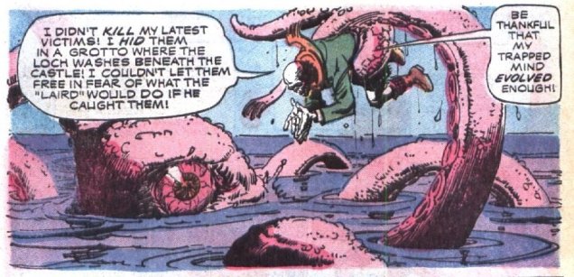
The original art for the cover of The Occult Files of Dr. Spektor #19 (Gold Key, April 1976). It was painted by Filipino artist Jesse Santos. Dr. Spektor is our protagonist, yet he looks particularly baleful here, hunchbacked and grinning, nothing like the kind of dashing hero who’d rescue a drowning maiden.A panel from « Loch of the Leviathan », also drawn by Jesse Santos, and written by Don Glut. I just love this panel – the gentle curve of tentacles, the skeleton and his pleading gesture…
I highly recommend the issue, certainly because of the art, but equally the story. You won’t find a straightforward man-finds-monster, man-kills-monster plot-line here; and there’s also bikini babes for your viewing pleasure.
* Your eyes look like two cherries in a glass of buttermilk
Don’t roll those bloodshot eyes at me
I can see you’ve been out on a spree (Wynonie Harris, Bloodshot Eyes)
Sometimes octopuses have big eyeballs *and* a vocabulary all their own.
Octopus language is the biggest mystery after “what does the fox say?” I bet you never knew that octopuses go “LURK LURK?!”
Akim was an Italian comic, published from 1950 to 1983, and translated into several languages, most notably French. Drawn by Augusto Pedrazza and wrtten by Roberto Renzi, Akim was a « tarzanide », which is to say heavily “inspired” by Tarzan, if not directly ripped off from it.
The LURK LURKs in panel above were no one-time occurrence. The octopuses in this story keep saying it again and again, and with different intonations, which I find hilarious. Turns out, a whole range of emotions can be expressed with this small four-letter word! My thanks go to co-admin and partner RG, who noticed this unpromising, poor-excuse-for-a-comic in a store and pointed out why we should pick it up after I had scoffed at it.
I can’t help but feel that the octopus is trying to say something important, but all its mouth (?) can form is a piteous luuurrrkk.
Another day, another birthday, it would seem. Well, I feel this one’s of particular importance… Gahan Wilson, born February 18, 1930, turns 88 today. As you may know, many an artist burns bright and burns fast, enjoying a peak of a handful of years followed by a settling into habit or mediocrity. That’s not our Mr. Wilson, who’s been prolific, reliable and versatile for over a half-century. That makes him, I suppose, easy to take for granted. Let’s not, shall we?
Most visibly, he’s built up a splendiferous body of work at Playboy, which was collected in exemplary fashion (2010), for your convenience, by the fine folks at Fantagraphics (in case you don’t have room for the entire magazines.) With the possible exception of Shel Silverstein, Gahan was perhaps the only cartoonist Hugh Hefner didn’t habitually encourage to throw in some buxom females.
« Well, it certainly is nice to know someone’s looking out for us old folks! » (Playboy, November, 1987.)
He’s also been a regular contributor to The Magazine of Fantasy & Science Fiction since 1964, again gathered by the reprobates at Fantagraphics, this time in a tome entitled « Gahan Wilson’s Out There » (2016). Significantly, the book includes Wilson’s prose works for the magazine, gems of concision and dark wit.
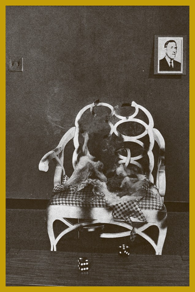
Which brings us to another facet of Gahan’s œuvre: his writing. I greatly enjoyed his regular film column in Twilight Zone magazine (1981-89). For the publication’s August, 1985 issue, he provided, in addition to his regular contribution, an eye-catching (watch out!) cover illustration and a feature article « I Hear You Callin’ Cthulhu », a review of the role-playing game Call of Cthulhu. « Hot on the trail of Dagon, the shoggoths, and other Lovecraftian horrors, the noted cartoonist (and intrepid TZ columnist) finds himself drawn into a labyrinth of secret caverns, sinister intruders, tentacled monstrosities — and a terrifying thing called the Insanity Table. »
« Our intrepid gamesman gathers his courage… »« … tests his luck against the dark gods… »« … reads his fate in the faces of the dice… »« … and when the smoke clears, is seen no more. »
Happy Birthday, and thanks for all the tentacles, Mr. Wilson!
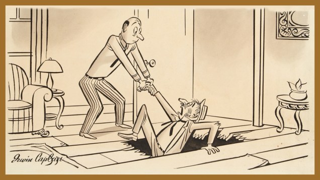
Here’s a merrily libidinous one (who’s chasing whom, really?) from Irwin Caplan (1919-2007), originally published in Liberty Magazine in 1946.
From the 1940 to the early 1960s, Caplan’s work appeared regularly in all the big ones: Collier’s, Liberty, The Saturday Evening Post (with his strip “Famous Last Words”), Parade, Life, the Sunday supplement This Week, and so forth. For my money, his early work is his finest, boasting a crisper line and more distinctive in style and substance.
Caplan was also a successful fine art painter, art director, advertising illustrator and graphic designer… which may have somewhat watered down his legacy. Nevertheless, what matters is the strength of his œuvre, and the fact that he had a varied and rewarding career.
Here’s an obituary from the Seattle Times (he was born in Washington and remained a lifelong resident of The Evergreen State) that provides a fuller account of this jovial man’s life and times.
As a bonus, a Caplan cartoon of undetermined vintage and publication history… but a timeless one, you’ll surely agree.
« I was saying, Sir, in view of recent improvements, I am raising your rent. »
I’d like to wish a loud and boisterous (or quiet and dignified, depending on what he prefers) birthday to Roger Langridge, who’s a jolly good fellow (which nobody can, or will, deny). If you’re looking for a reason to celebrate something on the 14th of February, but hate the Cheez Whiz of Valentine’s Day, this could be it!
Here are some of my favourite Langridge moments, by no means an exhaustive list, but hopefully a fun one.
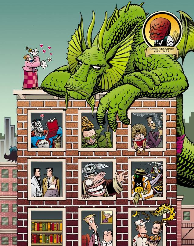
The cover Roger Langridge created for The Comics Journal no. 284, July 2007. Orbis terrarum est mei! (Which, as far as I can figure it out, means “the world is mine”.) A bored-looking Fin Fang Foom (he must not like flowers) presides over assorted Langridge characters frolicking in the windows below. Note the malevolent nun (Knuckles!) in the middle window.From « The Bald Truth » by Scott Gray and Roger Langridge, published in Fin Fang Four Return (Marvel, 2009), a hilarious – yet heart-warming – one-shot comic. “There was a time when giants walked the Earth! Monstrous creatures! Products of science gone mad!!! FIN FANG FOOM! ELEKTRO! GOOGAM! GORGILLA! Once they were great and terrible, and all trembled in their wake! Now, reduced to human size, they must live in the modern world and earn a buck. So what happens when the freakish foursome tries to play nice?” You can ignore the typical over-the-top Marvel description with lots of exclamation marks; this comic is surprisingly subtle. In 2012, Langridge decided he didn’t want to do work for Marvel anymore.« The Bald Truth » by Scott Gray and Roger Langridge, published in Fin Fang Four Return (Marvel, 2009). The moral of the story, as summarized by Fin himself: « Men need to grow brains, not hair. »
Our man of the hour has also written and drawn quite a few stories for « children », most of them published by KaBoom!, or their tot-friendly division, Boom!. I think there should be a special category for books that are fun for children, but even more entertaining for their parents (or the nulliparous amongst us). For instance, are the Muppets purely child-fare? Sure, little ones enjoy their madcap, sometimes surreal humour, but adults are often as smitten by it, if not more. I think it takes a special talent and superior intelligence to write stories that appeal to youngsters, but are complex enough to give their older relatives something to chew on. Throw a spirited sense of humour into the mix, and you’re all set.
Roger Langridge’s wonderful sense of humour is particularly suited for the comic book version of The Muppet Show, which he wrote and illustrated for BOOM! Studios starting in 2009 for a total of 15 (magnificent, by the way) issues.
To quote a perceptive review by Ryan Dosier (read it here),
« Once again, Langridge has beautifully captured the unhinged feeling that each of us enjoyed watching on the original Muppet Show. Zaniness reigns supreme, random Muppets hang out backstage, and we can once again feel like the show never ended. Roger Langridge has captured the Muppet spirit of writing in a way that is more than reminiscent of the Jerry Juhl days of The Muppet Show. He has a complete grasp on every character. Everything in the comic works, and it’s because of the quality of the writing that this is true. When there are, not one, but five chances for Fozzie to deliver a pun-filled monologue (each in a different comedic style) and hit each one out of the park (relatively speaking), you know the writing is top-notch. »
I don’t normally buy Disney products – Disney bought the Muppets intellectual properties from the Jim Henson company in 2004, but I made an exception and purchased The Muppet Show Omnibus (2014), and I am not regretting this decision.
This wasn’t the last time Langridge worked with the Muppets.
Jim Henson’s The Musical Monsters of Turkey Hollow, October 2014, published by Archaia. This is based on a lost television special originally written by Jim Henson and Jerry Juhl (respectively, producer and head writer of The Muppet Show) and (lovingly) adapted by Langridge for comic book form. Henson and Juhl wrote the script in 1968 (Henson was inspired by some footage he had taken of his daughters scampering through some trees during what must have been a particularly magical October), but nobody was interested in actually filming it, and so the story languished in the Jim Henson Company Archives until now. Langridge was a natural fit for this project, given that he had been the writer and main illustrator of Boom! Studios’ excellent The Muppet Show comics between 2009 and 2012.
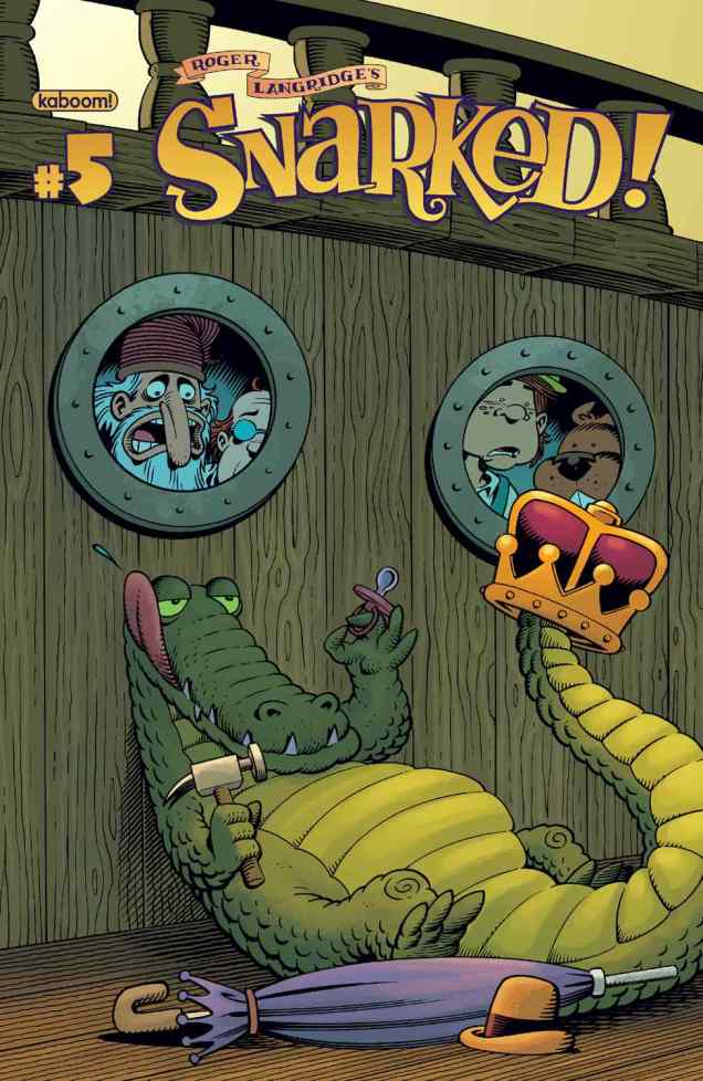
Among more recent adventures undertaken by Mr. Langridge and his lucky readers is Snarked!, his take on Lewis Carroll’s topsy-turvy world, Abigail & the Snowman, and the Baker Street Peculiars, written by him but illustrated by someone else. All of the aforementioned comics are life-affirming *and* vocabulary-expanding.
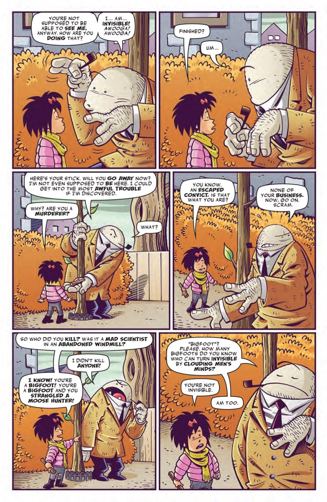
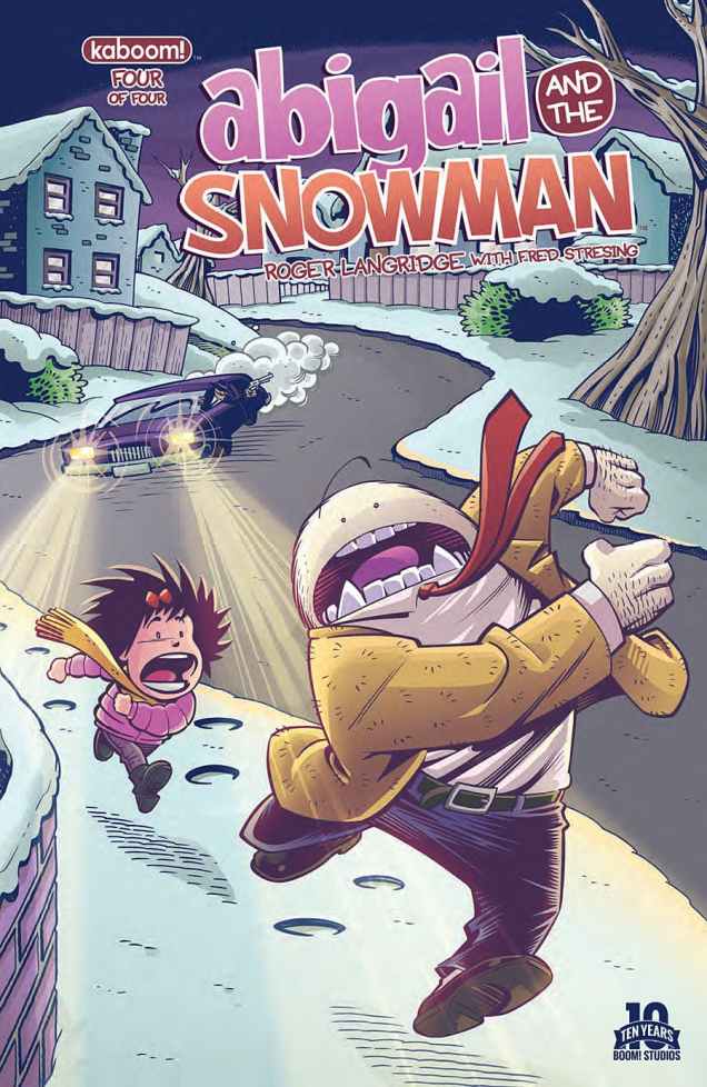
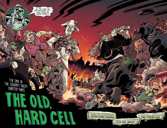
Snarked! no. 5, February 2012. « Presenting a fresh and incredibly modern “Langridge” spin on an already-warped classic, SNARKED starts here in an epic adventure featuring the Red Queen’s children, Princess Scarlett and her baby brother Rusty, as they set out in search of the missing Red King. And who better to help guide the way than the Walrus and the Carpenter from THROUGH THE LOOKING GLASS. » (description from publisher) Snarked! is also published by Kaboom.From Snarked! no. 11, August 2012. Would a child be able to appreciate the concept of “Aunt Fanny’s Leather Euphonium”? I don’t think so. An euphonium is a musical instrument, by the way, similar to a tuba in appearance.Page from Abigail and the Snowman no. 1, December 2014, published by KaBoom!. Claude is an erudite yeti on the run from evil scientists who want to continue experimenting on him.Abigail and the Snowman no. 4, March 2015. Yetis run better without shoes, that’s why the car is gaining on them.A splash page The Baker Street Peculiars no. 3, May 2016. Written by Langridge and illustrated by Andy Hirsch, with colours by Fred Stresing. Langridge-the-writer sometimes get paired with people who couldn’t draw if their life depended on it, and it’s a hideous waste of talent. Hirsch’s art is not quite as distinctive, but it fits the story well.
Wishing Mr. Langridge many happy returns, many productive collaborations, and above all the time and financial support he needs to pursue his solo projects.
In today’s Tentacle Tuesday, I’d like to demonstrate that Planet Comics, a sci-fi comic series published by Fiction House from 1940 to 1953, liked to tantalize its rapt audience by featuring tentacled monsters as often as basic decency permitted. Not to say that they limited their cheap pandering to tentacles; other tropes reared their ugly head, too. Faithful to its pulp magazine roots (Planet Comics was a Planet Stories’ spinoff), there’s always some stunning damsel in distress on the cover, and often some dashing muscle-head to rescue her. Mike Benton summarized Planet Comics’ raison d’être beautifully, if somewhat cruelly, in his Science Fiction Comics: The Illustrated History (1992) as «the barest smattering of sense and substance».
In its defence, P.C. also often ran stories in which female protagonists saved their friends’ bacon. How oddly progressive: the gals were clearly dressed to impress, but their skills and smarts repeatedly allowed them to overcome the odds while the big hunks stood helpless. Between that and all the tentacles, there’s a warm spot in my heart for Planet Comics.
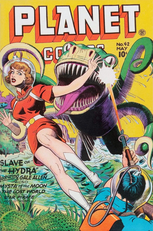
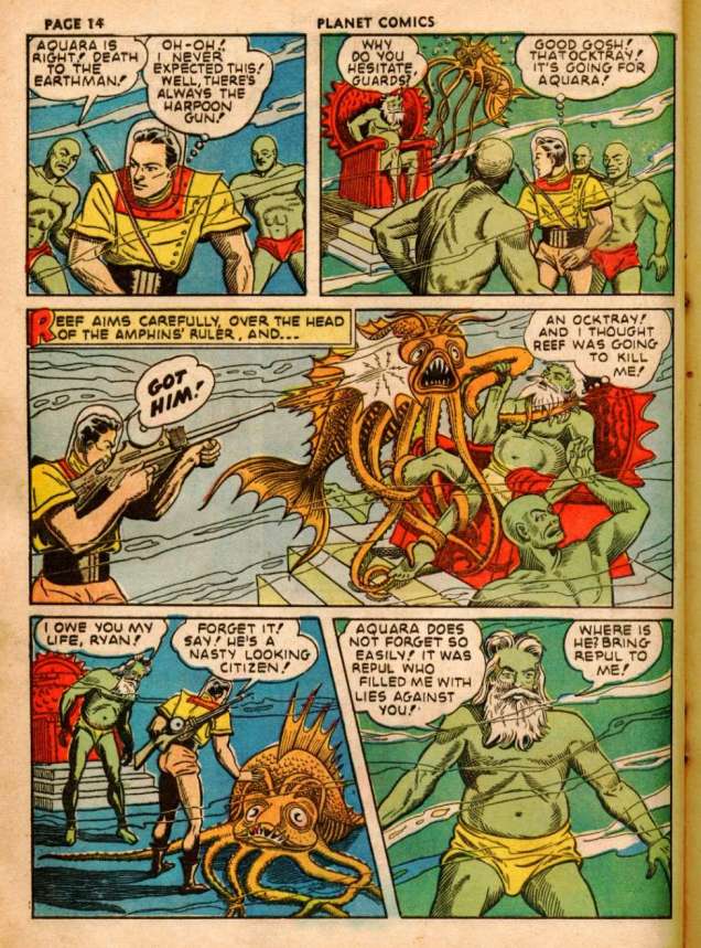
Let’s start with no. 42, which features Gale Allen, a Venusian princess with a knack for getting into trouble and the courage for getting herself out of it. Her Girl Squadron, comprising female pilots and soldiers, may have been an excuse for drawing yet more pretty girls, yet in the stories the squadron was still a force to be reckoned with, by friend or foe.
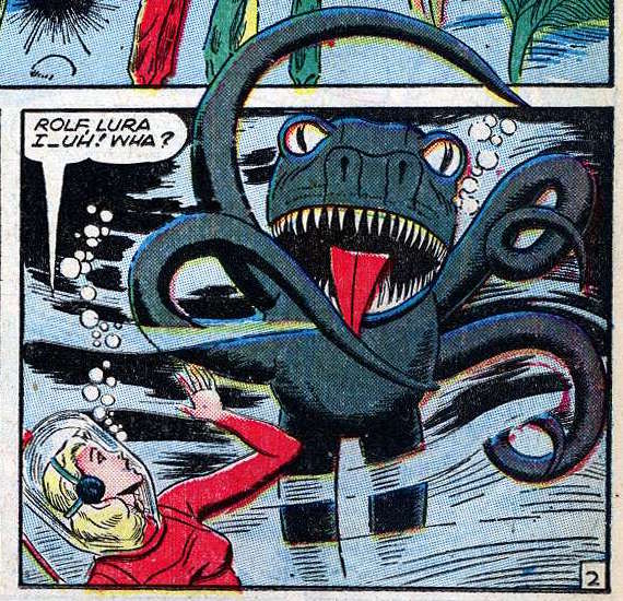
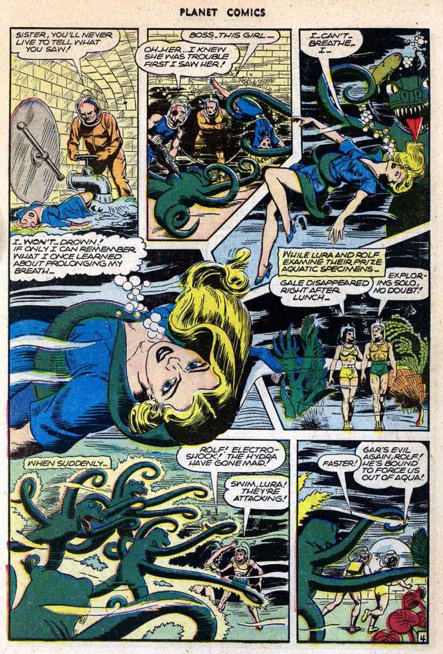
Planet Comics no. 42, May 1946. Cover by Joe Doolin, adept at depicting the female form in an aesthetically pleasing way. Here Gale is being rescued by some dark-haired stud with a laser gun (who cares about him?), but let’s peek inside…This is what Gale has to deal with in « Slave of the Hydra », also drawn by Doolin. This toothy beast is supposed to be a Hydra. Hydra of the Hydridae family, or the Greek many-headed serpent? Neither supposition makes sense.Our plucky heroine manages to save the day by escaping a certain drowning! It’s a little known fact that girls can actually store extra oxygen in their boobs. Kidding aside, I can understand why Planet Comics had a female readership that must have enjoyed reading about women who don’t crumble under pressure, and sometimes even kick monster tush.
Moving on to the next cover, an odd one even by Golden Age sci-fi standards:
Planet Comics no. 44 (September 1946), cover by Joe Doolin. She’s a generic damsel-in-distress, I get that, but the alien is strange – even for an alien. I imagine that the artist’s internal conversation went something like this: “okay, I’ll give him arms that double as tentacled snouts, and snail eyeball stalks. Oh, and I’ll make him a cyclops while I’m at it. And he’ll be drooling. And I’ll make him look black because that’s more exotic.” Yikes.
A glimpse at the stories inside quickly proves that the cover has nothing to do with Mysta of the Moon, or any of the “many others” advertised on the cover. There is, however, an octopus in the Futura story. Futura was another recurring heroine, an ordinary girl abducted by Brain-Lords of Cymradia and “improved” into a stronger, smarter version of her old self. Smart, resourceful and a damn good fighter, Futura is fun to watch in action. Especially when tentacles are involved! Take a look:
Officially signed by John Douglas; pencils and inks by Chester Martin. I feel oddly sorry for the crocodile.
Let’s have a look at several covers where tentacles are actually used as the good lord has intended, i.e. for grabbing pretty girls:
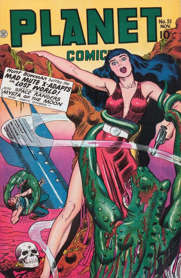
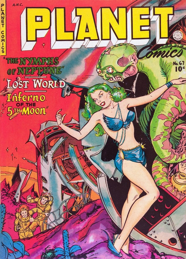
Ah, yes, the old “reptiles with tentacles” scare. Planet Comics no. 51, November 1947. Cover by Joe Doolin (again). Man, his girls are pretty delectable.Planet Comics no. 67, summer 1952. Cover by Maurice Whitman. There are absolutely no tentacles in any of the stories. Boo, I say.Planet Comics no. 70 (spring 1953), cover by Maurice Whitman. I like the alien’s get-up in general: his flappy ears, the motorcycle helmet, the hip lip piercings… He’s one cool cat. I am equally impressed by how he’s managing to fire a gun when he doesn’t have opposable thumbs (maybe the pistol is specially tentacle-adapted; instead of a trigger, some sort of squeeze sensor). Disappointingly, the insides of this issue don’t have any tentacles whatsoever, although there are some dinosaurs and giant man-eating spiders (and most of us will be happy to settle for that).
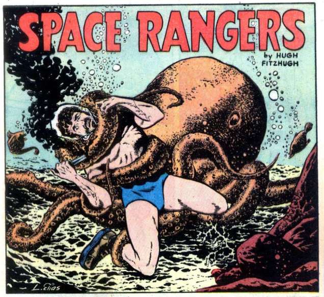
Oh, perhaps I have been neglecting burly heroes a tad. Those of us who prefer muscle to curve deserve some eye candy, too! So here’s good old Reef – and some green men in Speedos.
Planet Comics no. 17, March 1942. A Reef Ryan story, possibly pencilled by George Appel and inked by Al Gabriele, though it’s credited to Hugh Fitzhugh, a funky nom-de-plume for parties unknown.
And men get grabbed by tentacles, too:
Planet Comics no. 32, September 1944. Art by Lee Elias.
There’s about 10 more Planet Comics covers with tentacles left, and quite a few more interior pages showcasing the beauty of the octopus, or tentacled alien, or cephalopod reptile, or whatever else the kooky minds writing and drawing for Fiction House have dreamed up… but that’s enough for now. There’s only so much probing appendage the human mind can take in one go, so I’ll say Auf Wiedersehen.
Until the next time our paths (and tentacles) cross again!
Of course, you can take that ‘forgotten artist’ notion with a grain of salt: most Archie artists aren’t forgotten, because they were rarely acknowledged in the first place. There are cases such as that of Scrooge McDuck creator Carl Barks, aka the Good Duck Artist, whose identity latterly became known through the efforts of a handful of devoted fans… but such fortuitous events are rare as Gladstone Gander’s off days.
No such luck for Robert “Bob” White (1928-2005), who got the short end of the stick despite being the Archie line’s signature artist during its peak period* (pretty squarely 1959 to 1965) and crafting uncluttered, expertly-designed covers and stories. Of course, these years coincide with most of the classic Archie bullpen hitting its stride, bookmarked at one end by the ascent of White (who’d arrived at Archie around 1954, but details are scant) and at the other by Samm Schwartz‘s departure for greener, but sadly ephemeral (1965-69) pastures, an art director post with Tower Comics.
Archie’s illiberal response to a guy simply, and wisely, trying to avoid putting all his eggs in one basket was typical of the publisher, and of the reactionary comics industry in general, but it’s to White’s credit that, unlike Dan DeCarlo and Samm Schwartz (who at least made a break for it), he didn’t just fold, kiss their ring and take their abuse. Who’s to say? Perhaps that principled departure really stuck in their craw.
There are simply too many outstanding White covers to feature in one go; I suppose I’ll have to return to the well a couple of times. Still, these ought to give you a sense of the man’s style.
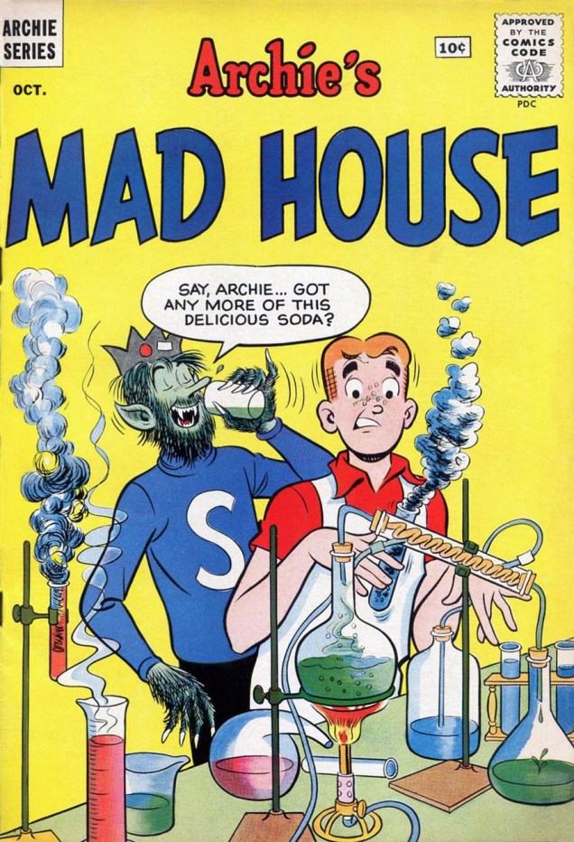
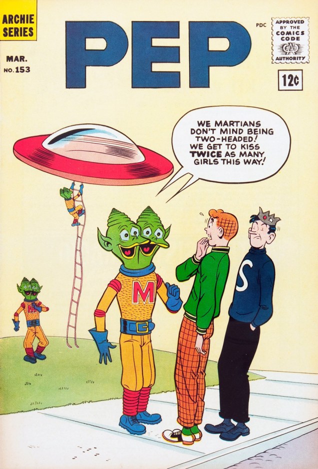
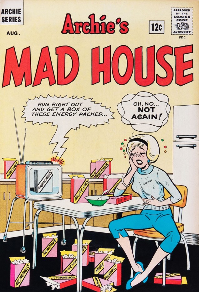
Before Afterlife With Archie, there was… Life With Archie, which « was a comic book published from 1958 to 1991. It featured Archie Andrews in adventure stories that were more dramatic than the standard Archie tales. » This is Life With Archie no. 5 (November, 1960.)« As I looked there came, I thought a change – he seemed to swell – his face became suddenly black and the features seemed to melt and alter… » ― Robert Louis Stevenson, The Strange Case of Dr. Jekyll and Mr. Hyde ‘Delicious’ is a good start, but what about the side effects? This is Archie’s Mad House no. 15 (Oct. 1961).Hey, the Macabre Trio’s in town! This is Laugh no. 129 (December 1961). Cool ghoul Bob White is truly in his element here. Also, do bear in mind that the word “Horror” was banned by the Comics Code Authority, yet they approved this cover. Asleep at the switch!This is Life With Archie no. 12 (January, 1962.) Correctly acknowledging the facts of evolution? Obviously, Al Hartley hadn’t made the scene yet.I’m especially fond of the period when you get a sense from the covers (chiefly those produced by White and Schwartz) that Riverdale was built over the Hellmouth or an ancient burial ground, as monsters and aliens routinely ask for directions or take Betty out for a soda. This is Pep no. 153 (March, 1962).Ah, there’s some of that “more dramatic” stuff. Life With Archie no. 16 (September, 1962.)« So don’t be persistent / Please keep your distance / You know my resistance is low » It would appear that Madison Avenue’s brand of wizardry is more than a match for Sabrina’s. This is Archie’s Mad House no. 27 (August, 1963).
– RG
*I’m in complete agreement with cartoonist-connaisseur Gregory Gallant, aka Seth, when he writes, in his introduction to John Stanley‘s Thirteen ‘Going on Eighteen’ (Drawn & Quarterly, 2009… where’s volume 2 at?) that « I like Archie comics quite a bit and own hundreds of issues of Archie and its various spin off titles. I can even tell you which years are the good years (1959 to ’65, incidentally) »


 The Exploits of the Junior Carrot Patrol (2 issues, 1989-1990) was a solo Geary endeavour, but « based upon characters and concepts created by Bob Burden ». Pictured here is #2. From left to right: Dusty, Ethel and Chuck.