Herluf Bidstrup: The Goal of Satire Is to Speak the Truth

I’d like to talk about Danish Herluf Bidstrup (1912 – 1988), yet another talented artist of some renown during his lifespan, but who soon sank into the oblivion of time. His wild popularity in the Soviet Union at the height of his artistic prowess not only resulted in honourable mentions in various works of Russian literature, but also in the printing of a bevy of collections both old and new. He has also received numerous awards from the USSR (most notably, the Lenin Peace Prize – a bit of a contradiction in terms – and the Order of the Red Banner of Labour). Now he’s forgotten by most everyone… except by Russians, who still carry a torch for his cartoons, and publish new collections of his work to this day. He produced around five thousand cartoons during his lifetime, so there’s certainly plenty of material to collect!

In Moscow, circa 1953.

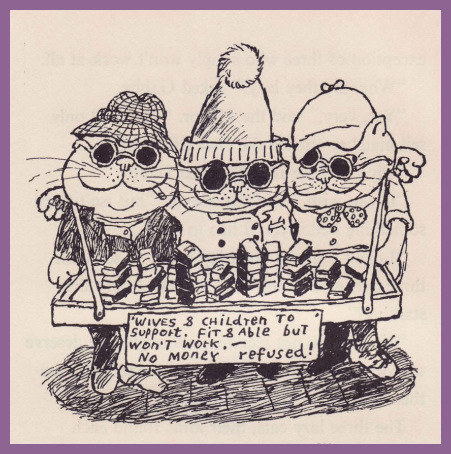
The openly anti-fascist Bidstrup had been contributing humorous drawings to various publications since 1935, but he truly found his voice in the underground (and illegal) newspaper, Land og folk, the offshoot of Denmark’s (also illegal) Communist party, which Bidstrup joined in 1943. While his work was also appreciated and published in East Germany, his obvious political stance significantly limited the scope of what could be printed. It even affected his career in his home country, as Denmark was economically dependent on then-Fascist Germany. Bidstrup himself considered that he was most accurately represented in the Soviet press, not only before and during WWII, but also after the war. In 1953, in a letter to his friend Soviet journalist Mikhail Kosov, translator of his work and main enthusiast, he wrote that « all Soviet anthologies which we have prepared together are a hundred times better than collections published in other countries… in the German version, I become more and more of a harmless humourist, and a completely toothless satirist. »

Bidstrup’s sketch of the Cathedral of Vasily the Blessed.

In a sense, Bidstrup can be compared to his contemporary, French artist Jean Effel (also a favourite of Soviet citizens): both were openly communists whose work confronted social injustice and inequality. But at the end of the day, artists aren’t much remembered for their ‘social conscience’: it’s their keen eye for everyday detail and sense of humour that allows cartoons to pass unscathed through decades, to touch and amuse us some seventy years on. In that sense, Bidstrup’s cartoons are arguably more ‘dated’, more tied to his politics than Effel’s, which perhaps explains why one encounters mentions of the latter a little more often. Still, there’s plenty there to admire and chuckle at.

Bidstrup Herluf: Drawings (2017, Mesheriakov Publishing House); such a nice shade of green.

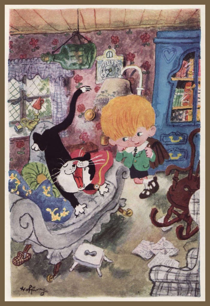
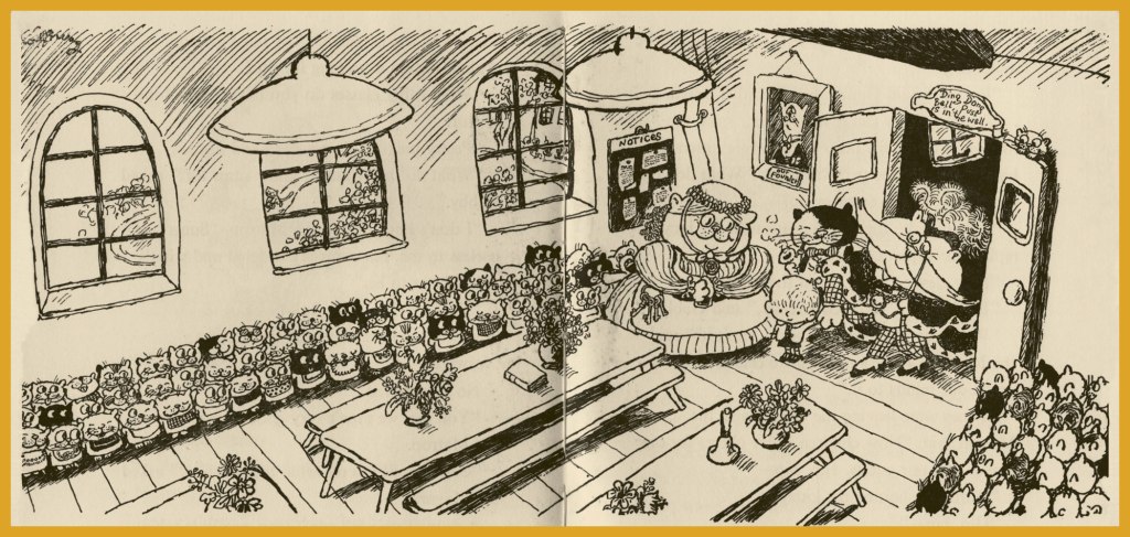
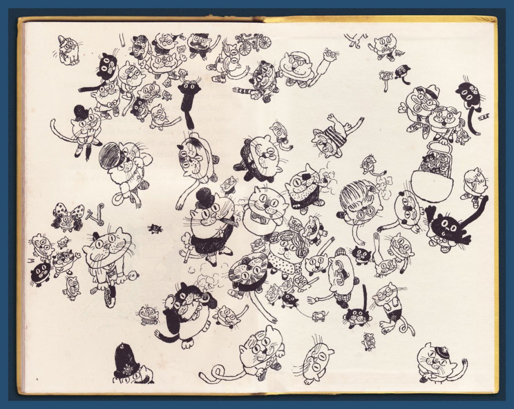
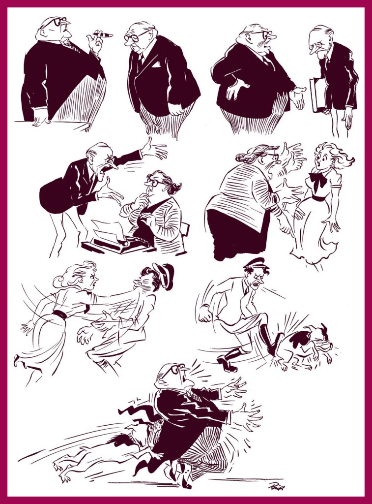
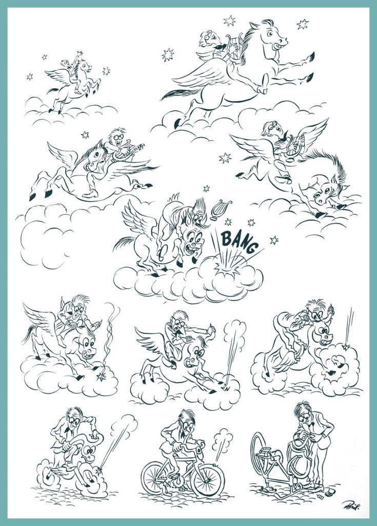
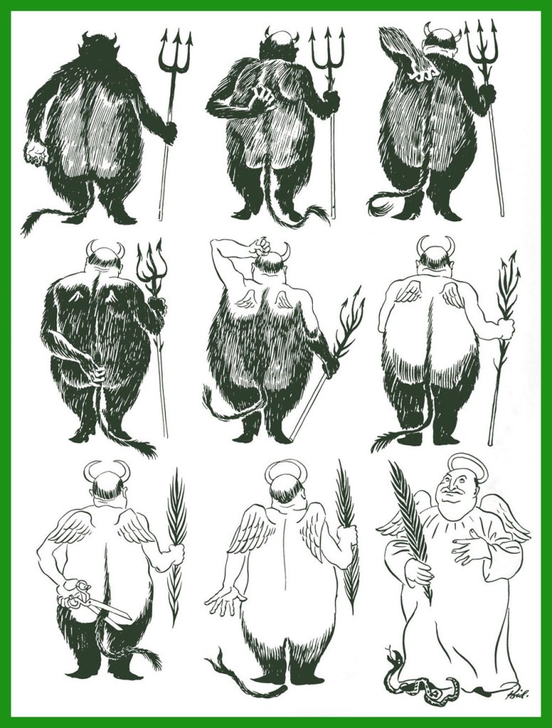
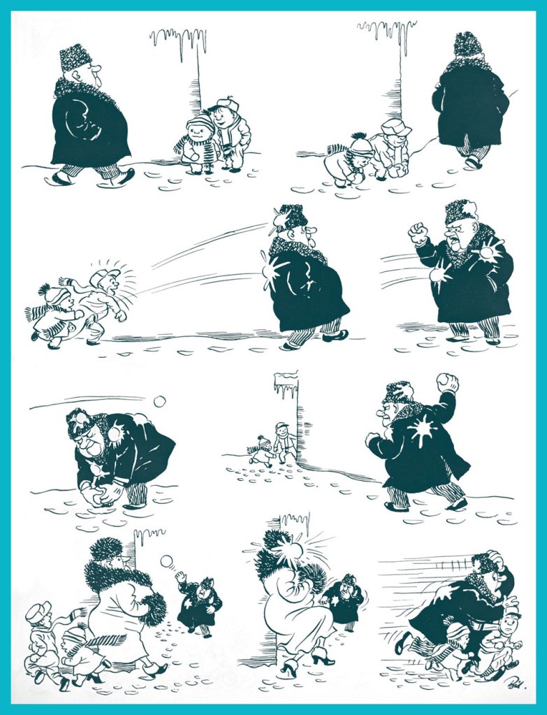
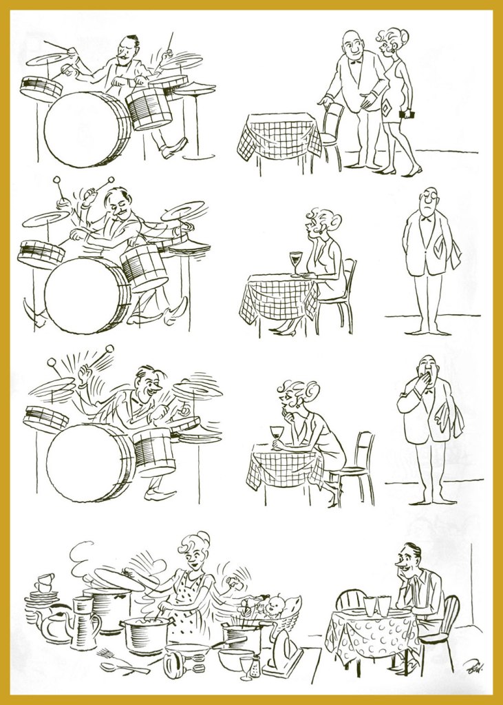
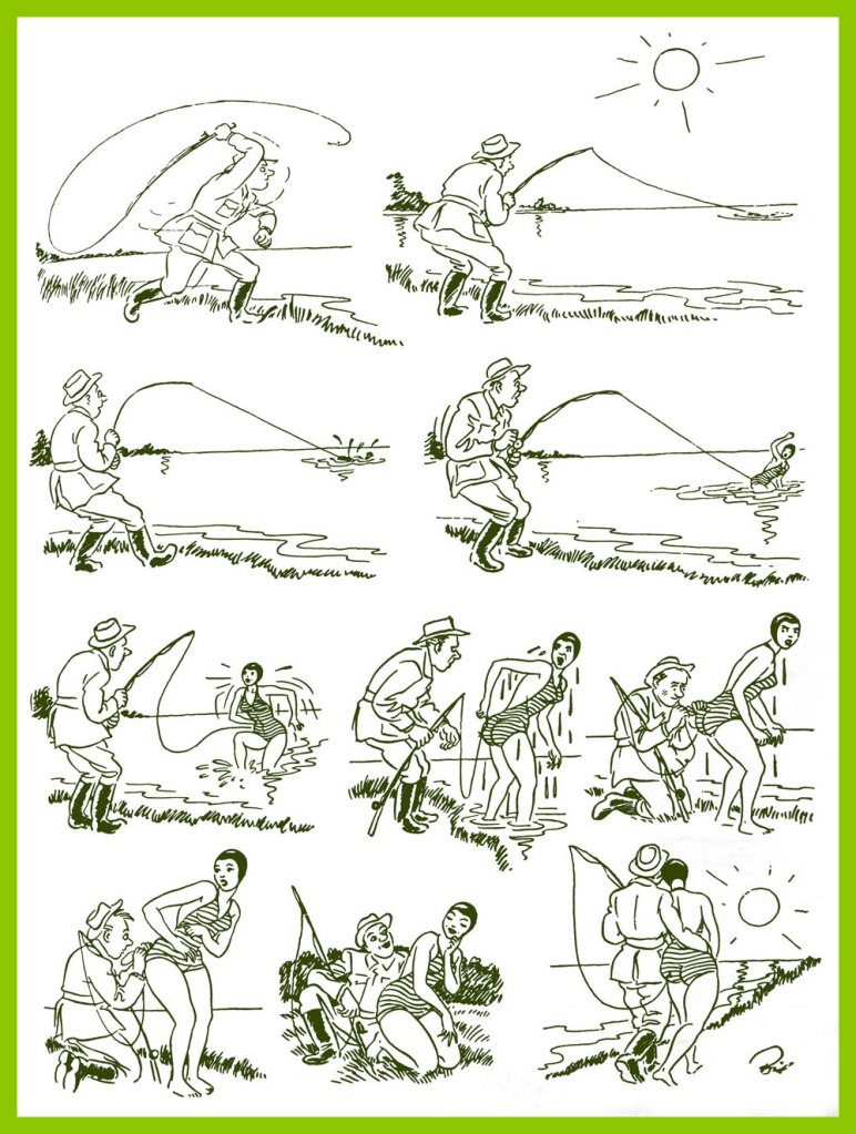
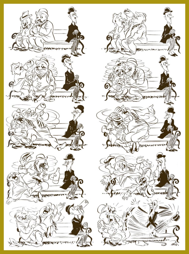
The following images have been selected from the collection seen above and kindly scanned and framed by co-admin RG.

«The circle closes.»
« On the wings of Pegasus. »
« Amateur photographer »
« Self-criticism »
« Direct hit »
« Life’s journey »
« Wife of a jazzman »
« Solitude »
« Fished out »
«The mirror of the soul »
« An extended game »
« A perfect example »

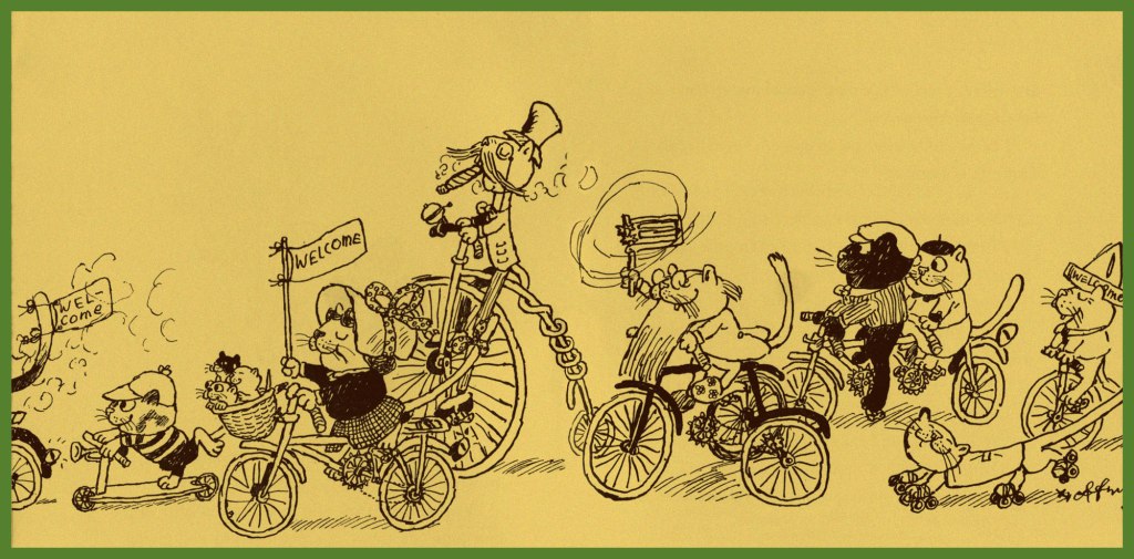
Finally, here is a charming cartoon that Soviet animation director Lev Atamanov produced in collaboration with Bidstrup during one of his many visits to the USSR.

I hope your enjoyed this walk down history’s lane. And if you’d like to see more, while Herluf Bidstrup may be relatively obscure, you can still see a nice collection of his cartoons here and here.

~ ds

Behold… the Great Shnozzola!

« That’s the conditions that prevail! » — Jimmy Durante

Today, we salute noted vaudevillian, piano player, comedian, singer, film and radio star, raconteur and unlikely comics legend James Francis “Jimmy” Durante, born on this day, February 10, in 1893 (as it was a Friday, the family presumably fasted or had fish for dinner). He truly was a master of all media, as you’ll witness.

This early bit of biography appeared in Juke Box Comics no. 4 (Sept. 1948, Eastern Color); it was illustrated by Ed Moore. Hear Cantor and Durante reminisce about their early days on this 1947 episode of The Jimmy Durante Show.
A passing mention of old Jimmy, from Nyoka the Jungle Girl no. 24 (Oct. 1948, Fawcett). Writer and artist unknown.
An early cover by Dick Ayers (1924-2014), this is Jimmy Durante Comics no. 1 (Oct. 1948, Magazine Enterprises).
The second and final issue of Jimmy Durante Comics (Winter 1948-49, Magazine Enterprises).
Mr. Durante rates a smashing musical appearance in this Rube Goldberg Device daily strip (Apr. 14, 1951, King Features Syndicate)… by Rube Goldberg, naturally.
And here’s the Shnozzola in the midst of a carnal melée of his fellow Old Hollywood legends (can you name them all, cinephiles?) This is Bill Griffith‘s cover for The Tiajuana Bible Revival Volume Two: Under the Stars in Hollywood (1977, Hooker, California: Paramounds Prod.). This was « An anthology reprinting 1930’s Tijuana Bibles, some of which were obscene parodies of popular newspaper comic strips of the day. Others made use of characters based on popular movie stars and sports stars of the day, such as Mae West and Joe Louis, sometimes with names thinly changed. Before the war, almost all the stories were humorous and frequently were cartoon versions of well-known dirty jokes that had been making the rounds for decades. » [ source ]
Pointillist-satirist Drew Friedman‘s immortal Jimmy Durante Boffs Young Starlets first saw print in National Lampoon vol. 2 no. 78 (Jan. 1985).
Durante briefly pops up (with the Checkered Demon!) in the second half of a truly all-star underground comix jam involving R. Crumb, Steve Clay Wilson (1941-2021… he left us just three days ago, aged 79… RIP), Victor Moscoso, Spain Rodriguez, Rick Griffin, Robert Williams and Gilbert Shelton. It appeared in Zap Comix no. 12 (1989, Last Gasp). Cartoonists are generally fond of the Schnozzola, but Underground cartoonists are just mad about him.
And finally, on a gentler note… here’s a clearly affectionate caricature (a preliminary sketch) of the esteemed Signor Durante (aw, he’s blushing!) by the amazing Sam Berman (crayon on onionskin paper, 1947). Berman (1907-1995) was, deservedly, quite a big deal in his day; as the erudite Drew Friedman told Print Magazine in his quality of co-curator of the 12 Legendary Caricaturists You’ve (probably) Never Heard Of exhibition at NYC’s Society of Illustrators, Berman « was indeed famous and celebrated in his day. Beginning his career in the late 1930s, he created iconic sculpted caricature covers for Esquire featuring their new mascot “Esky” (created by Berman) for an entire year. He created the sculpted caricatures of the leading actors (Fredric March, Carole Lombard, etc.) for the opening titles of the 1937 classic screwball comedy Nothing Sacred, did huge amounts of work for all the top magazines and newspapers of the day, including for Mark Hellinger’s popular column, created close to 60 amazing full-color portraits for the 1947 booklet The NBC Parade of Stars, drew children’s books, and arguably his most famous creation, the opening caricature of Jackie Gleason rising over Brooklyn for “The Honeymooners,” although he was never credited on the show for drawing that image, nor in any books. He then inexplicably went into map-making and faded quietly into obscurity. »

To wrap things up, here’s Jimmy D. and Frankie S. duetting in Russian. And why not? Happy birthday, Jimmy, wherever you are (and do say hello to Mrs. Calabash!)

-RG

Tentacle Tuesday: Barbarian Fatigue

Greetings all! Today we play whack-a-mole with a few warriors in loincloths – or at least that’s how I felt when looking for material in this post. Every time I found an instance of tentacles in some Conan the barbarian or Kull the destroyer tale, there was yet another one just an issue or a couple down the line. Let’s then consider this the end of a story begun with Tentacle Tuesday: the Savagery of Conan’s Savage Sword and continued with Tentacle Tuesday: Conan-o-rama: after this, I’ll be all Conan-ed out for a few years to come. So drink a shot of some concoction you like (be it coffee or the potent Zombie), and join me for this last foray into the dark, mysterious, predictable world of sword-and-sorcery heroes who run around half-naked (for better freedom of movement, no doubt).

Poor octopus, by far the most tragic figure of this story… These two pages are from The Dweller in the Dark, scripted by Roy Thomas and illustrated by Barry Smith, was published in Conan the Barbarian no. 12 (December 1971, Marvel).
You can’t have it both ways – praising a woman for exhibiting quintessentially ‘feminine’ characteristics and then getting pissed off at her dismay and fright when grabbed by a murderous monster.
The Sunken Land, scripted by Denny O’Neil (from a short story by Fritz Leiber), is pencilled by Walter Simonson and inked by Al Milgrom. This story was published in Sword of Sorcery no. 5 (Nov-Dec 1973, DC). I like Leiber, and I’ve been meaning to get to the Gray Mouser for a while – but I’m reading Andrzej Sapkowski’s Witcher right now, and one sword-and-sorcery saga at a time seems reasonable.
Page from Flame Winds of Lost Khitai!, scripted by Roy Thomas, pencilled by John Buscema and inked by Ernie Chan, published in Conan the Barbarian no. 32 (November 1973, Marvel). Interestingly, barbarians seem to universally abhor striking a woman; an attempt at primitive ethics from the part of the scripters.

One more Conan before we move on to Kull…

Page from Isle of the Dead, scripted by Bruce Jones and illustrated by Val Mayerik, published in Conan the Barbarian no. 138 (September 1982, Marvel). This page has the rare distinction of having the warrior-hero being less clothed than the girl he’s with.

As promised, here’s Kull the destroyer, engaged in battle with an eighties octopus (check out that mohawk!)

Two pages from The Thing from Emerald Darkness, scripted by Doug Moench, pencilled by Ed Hannigan and inked by Alfredo Alcala. This story was published in Kull, the Destroyer no. 17 (October 1976, Marvel). Why does a traitor (that’s not ‘traiter’) deserve better than to die from tentacles? That seems like no worse a death than any other in battle.
A page from City of the Crawling Dead, scripted by Don Glut, pencilled by Ernie Chan, and inked by Rick Hoberg. It was published in Kull, the Destroyer no. 21 (June 1977, Marvel).

Just before you pass out from over-consumption of alcoholic drinks (I’m having a gin and tonic over here!), I’d like to enliven this parade of humdrum tentacles a bit with this Conan pin-up:

This scene by Mike Zeck featured on the cover of long-running ad zine Rocket’s Blast Comicollector no. 119 (June 1975, James Van Hise).

~ ds

A Secret, Silken World: Max Andersson’s “Lolita’s Adventures” (1995)

« Most of us will still take nihilism over neanderthalism. » — David Foster Wallace

It’s become so quiet” “Yes“; from Galago no. 40 (1994, Atlantic Förlags AB)

Today, let’s dip a toe (at the risk of losing it) into the midnight domain of Swedish cartoonist and filmmaker Max Andersson (b. 1962). It’s a relentlessly-perilous scene, but like Kaz’s Underworld comic strip or Arnt Jensen‘s Limbo video game, I find it unexpectedly comforting in spite of (and thanks to) all the darkness, both thematic and in density of ink. In Andersson’s case, might it be owing to the author’s kindness to his protagonists? That’s a factor with odds I rather favour.

I don’t doubt that certain readers of a more sensitive cast will differ, but I posit that the cheerful lack of clemency the artist affords the callous, the cruel and the pernicious makes Andersson’s universe a profoundly moral one. Contrary to, say, your average American action blockbuster, such a purge of the villainous doesn’t restore the status quo… because here, malevolence is the status quo. Andersson’s put-upon little people are true outsiders, and his stories feel like Kafka, but blessed with dénouements far merrier yet merited.

Jolly carnage! Lolita’s Adventures appeared in the third issue (July, 1995) of Fantagraphics’ outstanding anthology title Zero Zero (27 issues, 1995-2000).

See? A happy ending and all, and even a rare glimpse of daylight.

Soon after he began to publish his work, Gary Groth spoke with Andersson (The Comics Journal no. 174 (Feb. 1995, Fantagraphics):

Groth: What would you point to as your defining influences? How did you develop this approach, style and point of view?

Andersson: What I always have in my backbone is the style of classic comics, the stuff I read when I was a kid.

G: I don’t see much Tintin.

A: No, but it’s there if you look closely. The basic technique of how to tell a story well. I try to do that because I want the storytelling to work, to be easy to read.

G: Were you influenced by sources outside of comics — film, literature?

A: Yeah, more of those than comics. The German Expressionist movies of the ’20s, Nosferatu; and artists from the period, like George Grosz.

And don’t leave out old cartoons! Andersson’s thoroughly animist way dovetails neatly with early animation’s unhinged, anything-can-happen mode. By which I mean that anything and everything possessed motion and sentience, be they boulders or pebbles, thunderclouds, petals or creepers, sparks or flames, pantaloons or braces, blunderbusses or bassoons…

As a bonus, a sequence from Andersson’s breakthrough work, Pixy (1993). The title character is the fœtus with a pistol, and the happy little fellows on the counter are units of money. Highly recommended, and likely available in the language of your choice.

About Pixy, fellow dweller-in-darkness Charles Burns exulted: « So you think it’s a cold, creepy, world out there, huh? Hah! Just wait’ll you get a load of Max Andersson’s Pixy… safe sex suits, buildings that eat people, drunken fœtuses with bazookas, money that shits on you, recyclable bodies… hey, wait a minute, that’s not creepy, that’s fun. MY kind of fun. »

For more dope on this important creator’s endeavours, do sidle over to his official website!

-RG

Tentacle Tuesday: Head Cases

Sometimes tentacles are positioned so close to the head that one gets the impression they’re sprouting directly from it. Whether accidental or not, the result is quite horrific – sometimes in a good way, if one enjoys the creepy and bizarre. In this Tentacle Tuesday, we’ll come across literal cases of octopus-instead-of-head, beard-tentacles (stylish!) and alien cepha-cerebellum-pods, which I hope will catch on as a term.

The following has been taken from The Octopeople of Ectroia, illustrated by Henry Kiefer, and published in Fantastic Comics no. 8 (July 1940, Fox Comics). If the introductory panel gives but a brief glimpse of the creature we are about to encounter…

… the splash page gives us an eyeful of her charms. Now we know what Baba Yaga would look like with tentacles instead of her usual limp grey tresses. Incidentally, a few days ago an enterprising fellow won enough support (and funding) from the Lego community to make his Lego Baba Yaga idea an (eventual) reality. She would come with her traditional hut on hen’s legs, a black cat and “everyday useful things” like horseradish drinks. Needless to say, I want one.

“Comics” McCormick has had more than just one encounter with cephalopod-headed men! The following is the cover of Fat and Slat no. 4 (Spring 1948, EC Comics), illustrated by Ed Wheelan.

And here is a page from The Octopus, printed in Terrific Comics no. 3 (May 1944, Helnit Publishing). Is it the same villain? Well, nearly: they’re Octopus-Man and Octopus, differentiated only by the costumes they sport under all those tentacles.

Edgar S. Wheelan (1888-1966) was the creator of Fat and Slat and “Comics” McCormick, and he is well remembered for his introduction of some cinematic techniques to comic strips. Of special significance is his Minute Movies, created for the George Matthew Adams Newspaper Service. This series of animated shorts not only had its stars (and continuity!), but also made full use of techniques that weren’t usually employed in comics, like close-ups, long shots and head shots with title cards.

The following sequence is an oldie-but-goodie from the oft-quoted Origin of the Species!, scripted by Bill Gaines and Al Feldstein, and illustrated by Feldstein. It was first published in Weird Fantasy no. 8 (July-August 1951, EC Comics). For those of you who may not have read it and are wondering whether those tentacled beasts were somehow the progenitors of the human race… no, they weren’t. As for the plot, it raises more questions than it answers, which I believe is not atypical of a Feldstein tale (from those I’ve read, they tend to be like a movie with plenty of drama and special effects, but little sense).

I recently came across a 3-part story published in Eerie numbers 91 to 93 that I quite liked: the tale of Moonshadow, the assassin who never failed, scripted by Bob Toomey and illustrated by José Ortiz. As luck would have it, two of the instalments were rife with tentacles!

The following page (and also the preceding panel) is from Suzanna Don’t You Cry, part 2 of the tale, published in Eerie no. 92 (May 1978, Warren).

Last but hardly least, a page from Kingdom of Ash, published in Eerie no. 93 (June 1978, Warren).

Fast forwarding some twenty years, we land in the middle of a pirate tale – and what suits a pirate more than a headful of tentacles (and a peg-leg)? This page is from Autopsy in B-Flat, written and illustrated by Gary Gianni and first published in Hellboy: Almost Colossus no. 1 (June 1997, Dark Horse) as a back-up feature. Gianni’s The Monstermen stories have since been collected separately.

What we gather from this dialogue is that octopus pirates like pork.

Finally, I think I promised some tentacles in lieu of beard, and the early stages of this guy’s transformation surely qualify:

This creature appears in the pages of Nocturnals: Black Planet (October 1998, Oni Press), with all plotting and art handled by auteur Dan Brereton. Actually the pages of this collection are so rife with tentacles that I’m going to force myself to be succinct.

Another instance of tentacles-as-hair:

Cover for Nocturnals: Black Planet (October 1998, Oni Press).

Thanks to friend Barney for pointing this last batch out!

~ ds

Take Ten With Shel Silverstein

« Join the army and see the next world. » — Dylan Thomas

A couple of eternities ago, in Shel Silverstein: Without Borders, we profiled you-know-who and showcased the travel cartoons he produced for Hugh Hefner and Playboy Magazine. Now, we reach back even earlier, to his first stirrings as a professional cartoonist… and a lifelong rover. As it would turn out, Shel truly was a free spirit.

A little bit of biography to set the stage… circa 1955. I can just about hear him, in that distinctive voice of his, hawking hot dogs at Comiskey Park!
« In 1955, Stars and Stripes published Take Ten, a book collection of his cartoons that was sold through military PXs et commissaries. » And also by mail!
« Here they are… the Centaurs and Bird men… the Geniis and Cobras… the fifteen-foot PFC’s and two-inch E-1’s. Here is TAKE TEN, the first collection of Shel Silverstein’s cartoons, taken from Pacific Stars and Stripes, Army Times and his untapped top drawer. Here is a pocket-full of cartoons that will make you smile and chuckle and laugh out loud. »

Lisa Rogak writes, in her A Boy Named Shel (2007, St. Martin’s Press):

Once he arrived in Tokyo, Shel was assigned to the Pacific Stars and Stripes to past up stories and photo features for the paper. When his work was done — which he performed as quickly as possible — he turned his attention to drawing cartoons using the material that was right in front of him: the military. Shel roamed the streets of Shinbashi, a neighborhood that GIs frequented that once served as the end of the line of Japan’s first railroad. He spent hours each day wandering the streets taking note of the activities of his fellow soldiers, which would invariably end up in one of his cartoons.

He initially did it for his own amusement, through within a few weeks, the paper began to print his work. After spending six months juggling newspaper paste-up with cartooning, he convinced his editors to take him off layout duties and allow him to wander the Far East and send back reports in the form of one-panel cartoons. They agreed.

Evidently, Mrs. Silverstein’s boy was a most charming and persuasive fellow. He would soon pull the same stunt on Hugh Hefner… but none can claim, in either case, that he failed to deliver on his lofty promises!

Here’s a little bit of background on that famous old General, should you need it.
Here’s a helpful guide to US Military acronyms. Who knows, it might spare you some confusion one day.

Even with his freedom, Shel had a hard time dealing with the restraints of army protocol. Corky Alexander, the late editor of the English language Tokyo Weekender, first met Shel at Stars and Stripes. “He was an army corporal and was perhaps the worst soldier in the history of armed might, down through the ages,” he said.

His technique followed a simple pattern. First he thought of an object — say, his first sergeant. He’d concentrate until he would come up with 20 or 30 gags on the one subject. Out of it came situations peopled by his long-nosed characters, his little men, his giants, the animals and the strange creatures for which he has a special affection.

His favorite overall targets were the officers. “They even made zebras off-limits to me because they had stripes,” Shel said.

Old habits die hard. An occupational hazard, you might say.
This, er.. pet might be an early prototype of Shel’s mythic Floobie Doobie Doo.
Now what is that?
It ain’t no dog and it ain’t no cat.
It’s nine feet tall with eyes of blue.
I never seen such a thing
As a thing called a Floobie Doobie Doo.
« Shel’s humor had struck such a nerve, and soldiers based in the Pacific shared his cartoons with their families and other civilians to show them what life in the military was really like, that a larger audience for his work was a natural consequence. In 1956, Ballantine Books published a thirty-five-cent mass market paperback edition of Take Ten called Grab Your Socks! »

In his foreword to Take Ten, Shel’s good buddy and PS&S colleague Bob Sweeney recounts:

In a letter to the home office, Bob Brown of the S&S Seoul Bureau wrote:
He stays up all night chewing pencils, drawing cartoons and writing ideas on little scraps of paper he never finds again. In the first twenty minutes he was here he had our little office more cluttered than the convention hall in his native Chicago.”

But,” added Brown, “he knows the people he draws. He’s lived through the same experiences and heard the same lines.

Here then are the simplicities as well as the subtleties — the obvious and the obtuse — the wonderful conglomerate of a man who loves to write, to draw, to create — and best of all — who loves to laugh.

-RG

Tentacle Tuesday: Educational Cephalopods

Today we bring you a selection of edifying cartons that will (hopefully) teach you something about our friends the cephalopods. Like how to check that you really are looking at an octopus, for instance: like with most things in life, just ask!

Cartoon published in Mad Magazine no. 486 (February 2008) The author, in all senses of the word, is our beloved Al Jaffee.

I like the idea of learning from comics, but stories written specially to teach children (or the occasional adult) moral lessons or scientific facts often end up incredibly boring, insultingly condescending, or painfully obvious. However, (gently) throw an octopus into the mix, and I’ll be willing to consider it!

Of course sometimes the octopus is the student, albeit an undressed one.

Treasure Chest Vol. 21 no. 4 (October 21st, 1965). The cover is by Pete Hironaka, born in California to Japanese parents. Treasure Chest of Fun & Fact was a comic book series that was Catholic-oriented and featured inspirational Christian stories and such, but also ran stories about science, history, and just plain adventure, emphasizing values like teamwork, honesty, etc. throughout. No, it’s not as boring as it sounds! Most of the stories weren’t at all preachy, just kind to their characters, which is something I really appreciate. The title was distributed throughout parochial schools from 1946 to 1972.

Are there tentacles inside? Well, yes!

I am slightly disturbed by how angry Murphy is at the octopus’ supposed ignorance (especially since he’s so blatantly wrong). Art by Pete Hironaka.
I wish octopus lobotomy wasn’t on the menu, but what can you do…

On the topic of classrooms – octopuses have to write essays, too, just like any old student Joe. It’s a bit hard to hold a pencil with a tentacle, though.

An illustration by Lynda Barry, 2018.

I’ve never watched SpongeBob SquarePants, because the idea of a protagonist who’s some sort of dumb-looking kitchen sponge (I’m sorry, “sea sponge”) has never appealed to me. It may be brilliant, for all I know. However, whenever I encounter a SpongeBob comic, I’m always surprised at how good the stories are. Given that the calibre of some contributing artists and writers (Ramona Fradon, Tentacle Tuesday Master Hilary Barta, WOT favourite Stephen R. Bissette, Tony Millionaire of Many Tentacles, the aforementioned Al Jaffee, Michael T. Gilbert… come on, it’s like a who’s who of comics talent), this is actually less astonishing than one might expect – and the fact that Stephen Hillenburg, the creator, managed to attract such talent speaks well of him. Another fact, namely that that he worked as a teacher of marine science at the Ocean Institute of Dana Point (California) and decided to create an educational comic book depicting the life of anthropomorphic sea creatures, confirms that he’s one cool (sea) cucumber.

A cephalopod installment of Flotsam & Jetsam, scripted by Maric Wicks and illustrated by Nate Neal. This page was published in SpongeBob Comics no. 9 (June 2012, United Plankton Pictures)

A final educational strip, although to be perfectly honest with you, a tad on the boring side. Mark Trail was created by Ed Dodd an eternity ago (which is to say, April 1946). Dodd was a national parks guide and (quite naturally, one would hope) an environmentalist, so his syndicated newspaper strip featured a lot of environmental disasters, mostly orchestrated by human hands (but the evil guys often received a satisfying punch in the mouth from Trail, a nature writer-cum-photographer – if only it were this easy in real life!)

This strip is from August 16th, 2020.

After passing through a few pairs of hands, the strip landed at the doorstep or artist James Allen, who began by assisting on the Sunday page in 2010, and formally took over in 2014, to continue until 2020, at which juncture he left his position by mutual agreement with the syndicate. After some years of reruns, Mark Trail is now continuing once again, this time with artist Jules Rivera at the helm.

I admire Dodd’s art and plotting, and in my opinion the others who have continued the strip in recent years (from 1978 and onwards) lack his doigté and his talent to various degrees. For example, take a look at the original art for the Sunday strip of September 25, 1955:

Clearly drawn by someone who loved and understood animals. Art by Ed Dodd.

Of course it doesn’t help that the recent Sundays had garish (by my assessment) colours. For a more detailed story of Mark Trail, head over to this Daily Cartoonist article.

~ ds

Off to the Isle of Cats — and Back by Teatime!

« It’s no good trying to teach people who need to be taught. » — Aleister Crowley

You may have happened across our earlier post on that astounding but tragically short-lived touche-à-tout, Gerard Hoffnung (1925-59). Well, here’s a look at another facet of the man’s work, crafted this time in tandem with, of all people, the definitive-but ambivalent biographer of opprobrious occultist and Ozzy song subject Aleister Crowley, namely the intriguing John Symonds (1914-2006). Come to think of it, the affiliation makes impeccable sense, and it proceeds swimmingly.

In an era where it often seems that those rare adults who yet read do so at toddler-ish levels, it’s easy to forget how many so-called children’s books of yore had plenty to offer the refined adult mind. Here, then, are some highlights from Messrs. Hoffnung and Symonds’ 1955 opus, The Isle of Cats.

« He closed his eyes, yawned, arched his back and began to dig his claws in and out of the sofa. Uncle Tom was no ordinary cat, for he could tell the time, look through a telescope (keeping one paw over the other eye, of course), beat up an egg, steer a raft, smoke a pipe and do many other things. »
« He’s the Mayor, » whispered Uncle Tom to Gabby, « so be nice to him. »
« He was still saying thank you as he and Uncle Tom were being driven away in the Mayor’s car, followed by various cats on bicycles, tricycles and penny-farthings. »
The wrestling bout pitting Tim the Terror (left) against The Furry Fury (right). Things end with a crash when Tim lets go.
« The Hall of Fame contained the portraits of the island’s most celebrated cats. »
« There were portraits of lots of other famous cats, including Martha who had seven hundred and forty nine children, six hundred and eighty three of whom survived, and were now working hard as tram-drivers, crossing-sweepers, lamp-lighters, pastry-cooks and so forth, with the exception of three who simply won’t work at all. »
« At the Orphanage, all the kittens were lined up on either side of the Great Hall, looking as good as gold, their hankerchiefs sewn to their shirts, close enough to their noses to blow into them. »
« Just then they sailed over the madhouse and saw some cats standing on their heads, waving their legs in the air. »
The book’s endpapers illustration, granting the reader a lofty view from the Mayor’s hot air (of course) balloon.

As a bonus, for the finale, here’s the poster Hoffnung was commissioned to illustrate for the classic, Brexit-anticipating 1949 Ealing Studios comedy Passport to Pimlico. [ watch the trailer! ]

Hoffnung’s loving widow, Annetta, wrote, in her 1988 biography of Gerard: « As he sat at his drawing board, increasingly involved and complicated fantasies tumbled from Gerard’s pen onto the paper. In 1949 came perhaps the most intricate of all, a drawing for the poster advertising a popular film of the day, Passport to Pimlico. I do not have the original design but it is unlikely to have been larger than 12″ x 15″, and to squeeze so much into so little space is no mean achievement. » I couldn’t find a trace of this image online, so I’m providing a nice ‘n’ large scan for you. Eat your heart out, Will Elder!

-RG

Tentacle Tuesday: The Tentacles Are Coming! The Werewolves Are Here!

« The tentacles had burned where they’d touched our skin… and the oozing slime they’d rubbed into the wound didn’t help. We panted and trembled »

I have little interest in werewolves, despite just having finished one in wool. I’d say I place them somewhere between Frankenstein’s monster (in which I have zero interest – sorry!) and Dracula (whom I am generally intrigued by, depending on whose version we’re talking about). Having said that, the bizarre concept of werewolf vs tentacles grabbed my imagination by its incongruity. “Grarr”, as the werewolf might say.

The author and her werewolf; he doesn’t have a name, yet.

The Giant-Size Werewolf may not be as rife in tentacles as the Giant-Size Dracula, but it has its moments. “A man, a woman… and rampaging hordes” has a certain nice ring about it!

A page from Tigra the Were-Woman!, published in Giant-Sized Creatures no. 1 (July 1974). Script by Tony Isabella, pencils by Don Perlin and inks by Vince Colletta.

When the Moon Dripped Blood!, scripted by Doug Moench and illustrated by Yong Montaño, was published in Giant-Size Werewolf no. 4 (April 1975):

Anybody would be startled by slimy tentacles coming out from under a robe… slimy and burning, at that.

Doug Moench continues his tentacle shenanigans one month later in Werewolf by Night no. 7 (March 1975).

Cover pencilled by Gil Kane (Tentacle Tuesday dabbler!) and inked by Tom Palmer.

The Amazing Doctor Glitternight was scripted by Doug Moench and illustrated by Don Perlin:

Likely beating all records for how much text you can cram into one splash page.
The “yecch-monster” awakens as Glitternight somehow manages to exude both light and darkness, and simultaneously nourish and feed. I get the impression somebody was paid by the word for this story.
Has the werewolf ever heard that “words are very unnecessary“? Was it essential to inform us that he might have been stunned, or maybe paralyzed, and it doesn’t matter anyway, as both are just words?

Next time the Werewolf encounters tentacles, it’s an epic, 2-issue tale of the desperate fight against ‘soul-eater’ Marcosa, an ectoplasmic wraith who occasionally takes a physical form and often deploys tentacles to do his dirty work for him.

Werewolf by Night no. 36 (January 1976). Cover Don Perlin.

Marcosa in Death (plot-spoiler: death is not actually involved) was scripted by Doug Moench and illustrated by Don Perlin:

Moral of the tale: don’t open doors when you don’t know what’s behind them.

Marcosa doesn’t quite die despite all the gnashing of teeth and ripping of tentacles, so the story continues to its grim conclusion in the next issue. The End, scripted by Doug Moench and illustrated by Don Perlin, was published in Werewolf By Night no. 37 (March 1976).

Perlin goes wild drawing teeth! An orthodontist’s worst nightmare (or perhaps a nice little earner).

What other giant-sized topic will we continue with next time? Only time will tell! Stay tuned…

~ ds

Treasured Stories: “Tee for Three” (1975)

« Coming to play golf is not what I would consider to be an essential purpose. » — Nicola Sturgeon

I’ve long wanted to showcase one of Samm Schwartz‘s Jughead stories on this blog, but always hit the same snag: which one? Not too long ago, while revisiting my trove of 1970s issues, I came upon just the specimen. Tee for Three appeared in Jughead no. 247 (Dec. 1975, Archie). I’ll spare you the hideous-as-usual Stan Goldberg cover.

While we know the story was illustrated by Samm Schwartz, the writer’s identity remains unknown. Schwartz usually took a hand in the scripting, but he didn’t really ever work alone. The likeliest miscreants are his usual accomplices, Frank Doyle and George Gladir.

Why this one among hundreds of others, then? For one thing, it’s longer; at eleven pages long, it’s a towering freak amidst the customary five-or-six pagers.

But that’s not all: Tee for Three also boasts an unconventional plot, one that cried out for (and received) a more leisurely deployment. Its tone is also surprising: it’s quite deadpan and sanguine in its absurdity.

For once, you can envision why these three, despite being frenemies or plain rivals, would actually hang out: they challenge and entertain one another. And even collaborate when the occasion calls for it. In this case, Jug, Archie and Reggie are so bonded in their good-natured folie à trois that the rest of the world doesn’t have a clue and hardly stands a chance.

While such a golf contest would surely result in much injury, property damage and litigation in the ‘real’ world, it sure seems like a rollicking bit of sport here, and isn’t that what good fiction is for(e)?

-RG