Panning the murky old print stream for the odd glimmering nugget
The Seventies, Ain’t It?
I hate that “Bronze Age” comics designation, with a beginning and end no-one seems to agree upon… because, well, it’s arbitrary. So let’s just focus on the numerical decade, shall we?
I’ve always been fond of this oddball little ad, which appeared in mid-70s comic books (in this case, a late 1974 DC 100-pager). It certainly demonstrates the considerable influence that pioneers such as Thimble Theatre creator Elzie Segar had on many an underground cartoonist.
If the advertised products had been iron-ons (à laRoach Studios*) instead of finished t-shirts, they’d be easier to find today. The Mickey Rat shirt is still being produced these days, though likely a grey market item… same as it ever was. On the other hand, I can find neither hide nor hair of the Hebrew Shazam shirt. Anyone? (2025 update: it’s available again here! A grateful tip of the hat to eagle-eyed reader Michael C. Rookard,)
A bountiful spread from The Natural Trading Company’s Mail-Order Catalog, which proposed T-Shirts – Posters – Art Prints – Buttons – Records – Comics… count me in!« Pinball Wizzard, you say? »
Here’s a bit of background on the Crazy World shirt, designed by (or swiped from) John Van Hamersveld, the genius behind the unforgettable The Endless Summermovie poster: « The face emblazoned across the chest of Mick Jagger in a 1972 New Musical Express feature on the Rolling Stones had a rich history according to its creator. The iconic image was the product of a mescaline and marijuana jag, after which Van Hamersveld was left with the enduring image of a man’s face with a big, toothy, wide smile. From a portrait of Jimi Hendrix he had made in 1968, Van Hamersveld came up with the Johnny Face logo the following year, which he used for promoting his own work. »
And there’s Mick, just like the man said.One of the current offerings. Oh, definitely a bootleg.
For me at least, it’s hard to look at Johnny Face without seeing in it echoes of The Face of Steeplechase, Coney Island’s widely-grinning mascot.
Trivia time: can you name the infamous individual behind the 1966 demolition of the beloved Steeplechase amusement park? Find the answer here.
As for the artist who crafted the Natural Trading Company ad, I was drawing a blank until a few years ago, when the wonderful Jay Lynch (1945-2017) kindly lifted the veil on that particular mystery: Jerry Kay was the stylish culprit. Much appreciated, Mr. Lynch!
– RG
*not to be confused with the originalRoach Studios, of course…
« Gary Groth: You did — God help you — you did an Alice Cooper comic in ’79. Were you out of it or what?
Tom Sutton: I listen to Mozart. I don’t know. I guess Alice Cooper was a musician. Some kind of giant snake or some damn thing.
Gary Groth: So why the hell didn’t you do a Mozart comic?
Tom Sutton: Nobody asked me to. »
When I wrote Tentacle Tuesday: a Treasure Trove of Charlton Tentacles, I skipped Tom Sutton, vowing to return to him at a later date. If there was anyone deserving the title of Tentacle Tuesday Master (applause, please!), it is him. I don’t know what the appropriate cluster term for tentacles is, but Sutton has surely brought a, um, pandemonium (a terror? a trepidation?) of tentacles to Charlton‘s pages.
Even outside of his tentacles, Sutton is a truly interesting artist. I highly recommend An Odd Man Out: Tom Sutton,Gary Groth’s interview with him for The Comics Journal. Just read Groth’s introduction, if nothing else – he does an excellent job of summarizing Sutton’s singular career and the conflicting influences that shaped it. The interview is 11 web-browser pages long, and throughout Groth and Sutton’s conversation, one gets the distinct impression that Sutton is a witty, self-deprecating man, the kind you want to take to a bar or something to listen to his stories. At some point he mentions that the tape (to record the interview) is probably running out, and Groth responds with «There’s not enough tape in the world for you, Tom», which is, I think, a good example of their easy banter as well as obvious camaraderie.
Anyway, back to the topic at hand – the art and writing is by Tom Sutton, unless indicated otherwise. You know those over-the-top Russian buffets, where food is overflowing from the table? This post is like that, but with tentacles.
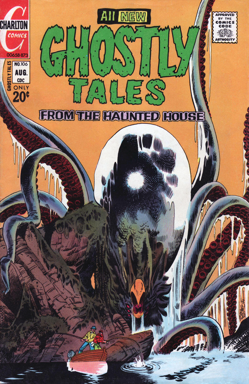
Ghostly Tales no. 106 (August 1973).
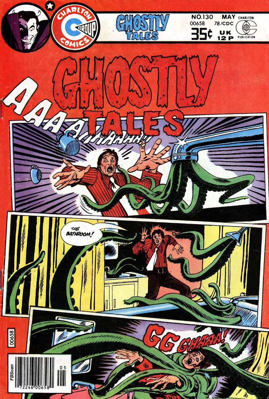
This story, titled simply (and à propos) Those Tentacles!, scripted by Nicola Cuti and illustrated by Sutton, has already been mentioned in Tentacle Tuesday: Domesticated Octopus Seeks Soulmate, but I’ve never posted this page. Dang, gave away the ending.
This story was repurposed as a cover for Ghostly Tales no. 130 (May 1978):
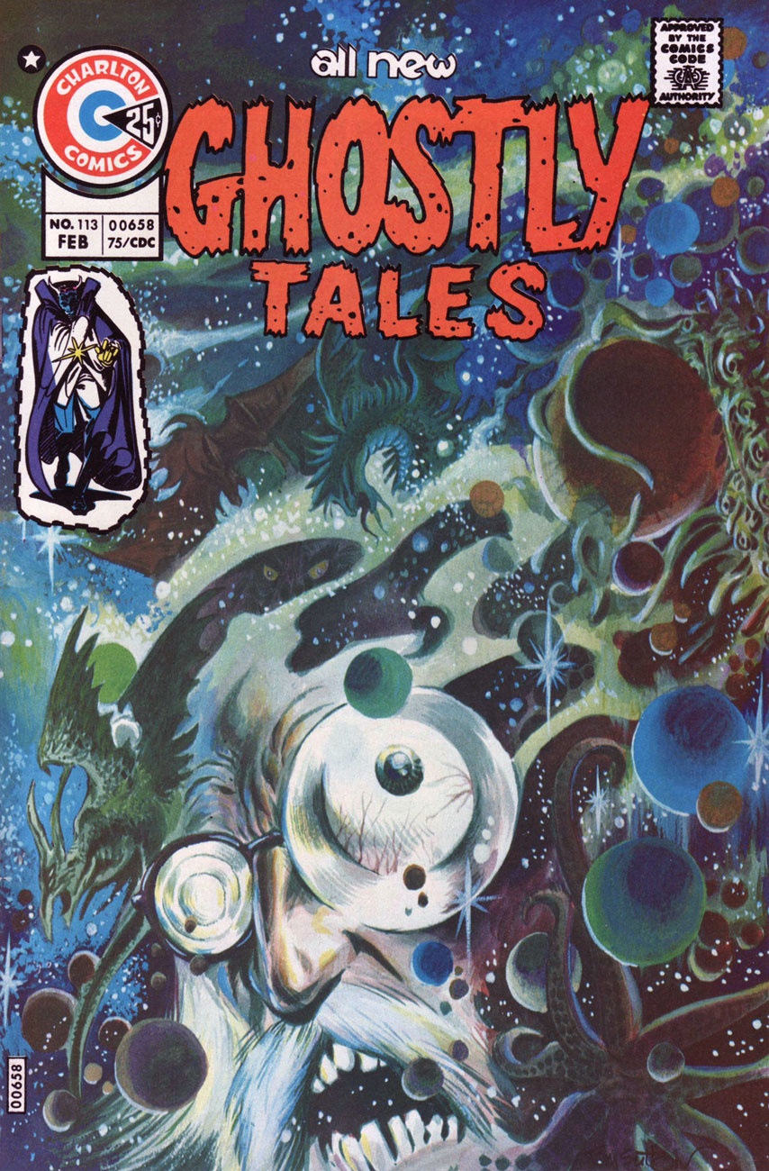
Ghostly Tales no. 113 (February 1975). Isn’t it a beautiful cover?
Page from Through a Glass Darkly, the (surprisingly, black and white; Sutton evidently knew it wasn’t feasibly colourable… and his publisher respected his wishes! As opposed to…) cover story of Ghostly Tales no. 113. Good thing we we treated to all those eye-pleasing blues and greens on the cover!
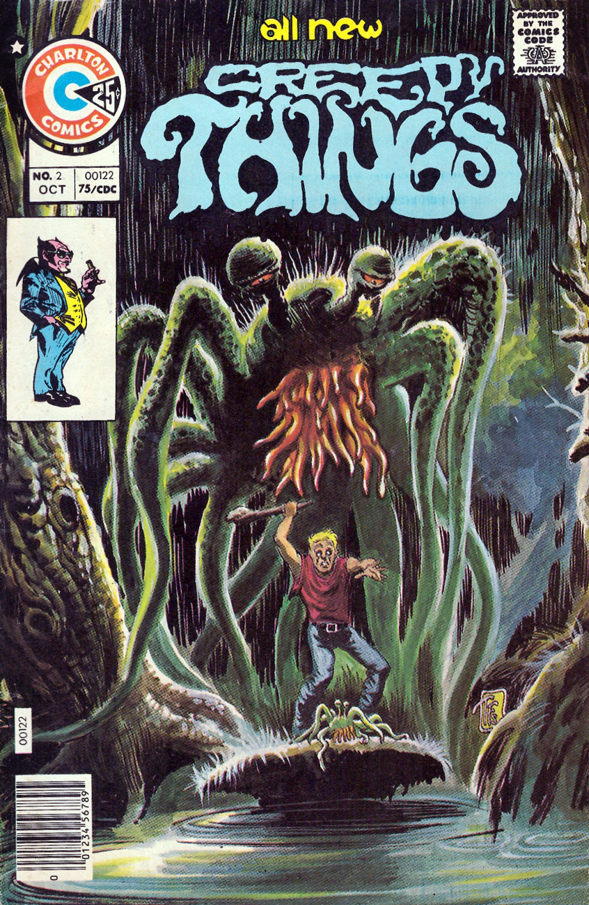
Creepy Things no. 2 (October 1975). You can read the full issue here. This is my favourite cover of this lot, both for the parent creature’s sad, slightly sleepy expression, and for the crispness of greens against black.
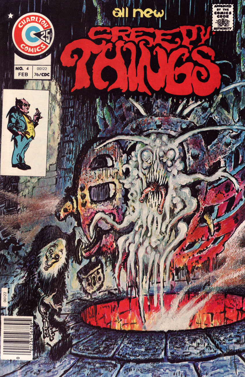
Creepy Things no. 4 (February 1976). I’ll bet that slug-thing glows in the dark.
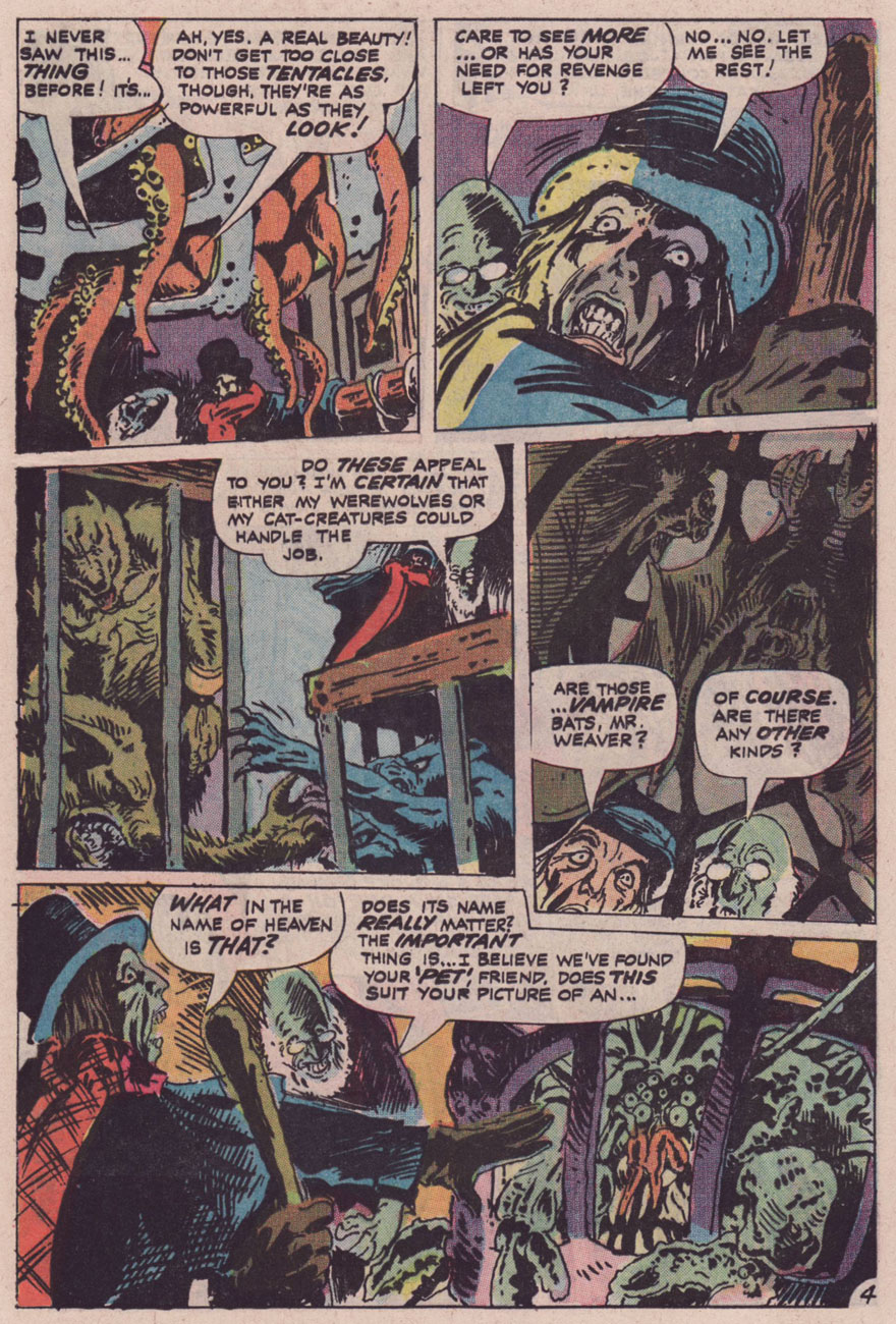
Page from Man’s Best Fiend, scripted by Joe Gill (as Tom Tuna) and illustrated by Sutton, printed in Creepy Things no. 4.
Ghost Manor no. 27 (January 1976)
Scary Tales no. 4 (February 1976). Scary Tales hostess Countess Von Bludd tackles tentacles! Now you can’t say this post doesn’t have any cleavage.
Haunted no. 20 (February 1975). My second favourite cover, for the completely horrified, totally Sutton-esque faces of the creature’s victims. I also like the way his signature is hiding at the foot of the tentacles.
Pages from Mountain of Fear, published in Haunted no. 20. This is likely the most Lovecraftian (and epic) of Sutton’s Charlton tales.
Page from Out of the Deep, published in Haunted no. 21 (April 1975). This panel was later used as the cover for Haunted no. 55 (May 1981). Read the full story here.
Page from Fear Has a Name!, scripted by Nicola Cuti and illustrated by Tom Sutton, published in Haunted no. 22 (June 1975).
Page from The Thing in the Hole, published in Ghostly Tales no. 111 (September 1974). Read the whole issue here.
For more Tom Sutton, head over to the great blog The Horrors of It All, where a fellow admirer has posted a bunch of his stories. I’m happy to say that Sutton aficionados are legion and they’re fairly rabid, so to speak.
Furthermore, you can read co-admin RG’s Mind the Quirks and Glitches: Petrucha & Sutton’s Squalor for one more, more modern, facet of Sutton’s varied career. And if you’d like a little piquant in your life, his post even includes links to Sutton’s erotic comics!
« The precious hours seemed to hurtle by, as if we were in some kind of vicious time machine! »
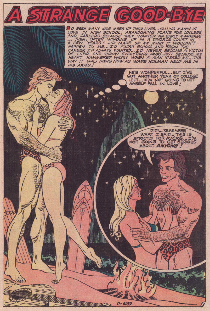
Today’s birthday number seventy-six for one of Charlton Comics’ most singular and hardest-working artistes, namely Enrique Nieto Nadal (born August 15, 1943, in Tangiers, Morocco, to Spanish parents), who injected some edgy excitement into the Charlton Comics line, handling with equal aplomb and virtuosity tales of romance, horror, war, adventure… and every combination thereof.
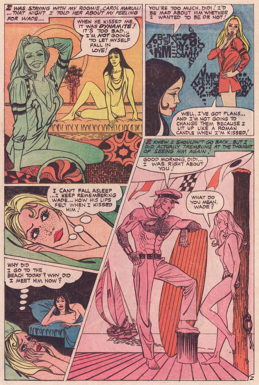
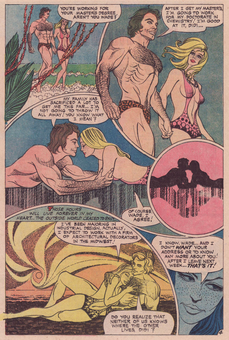
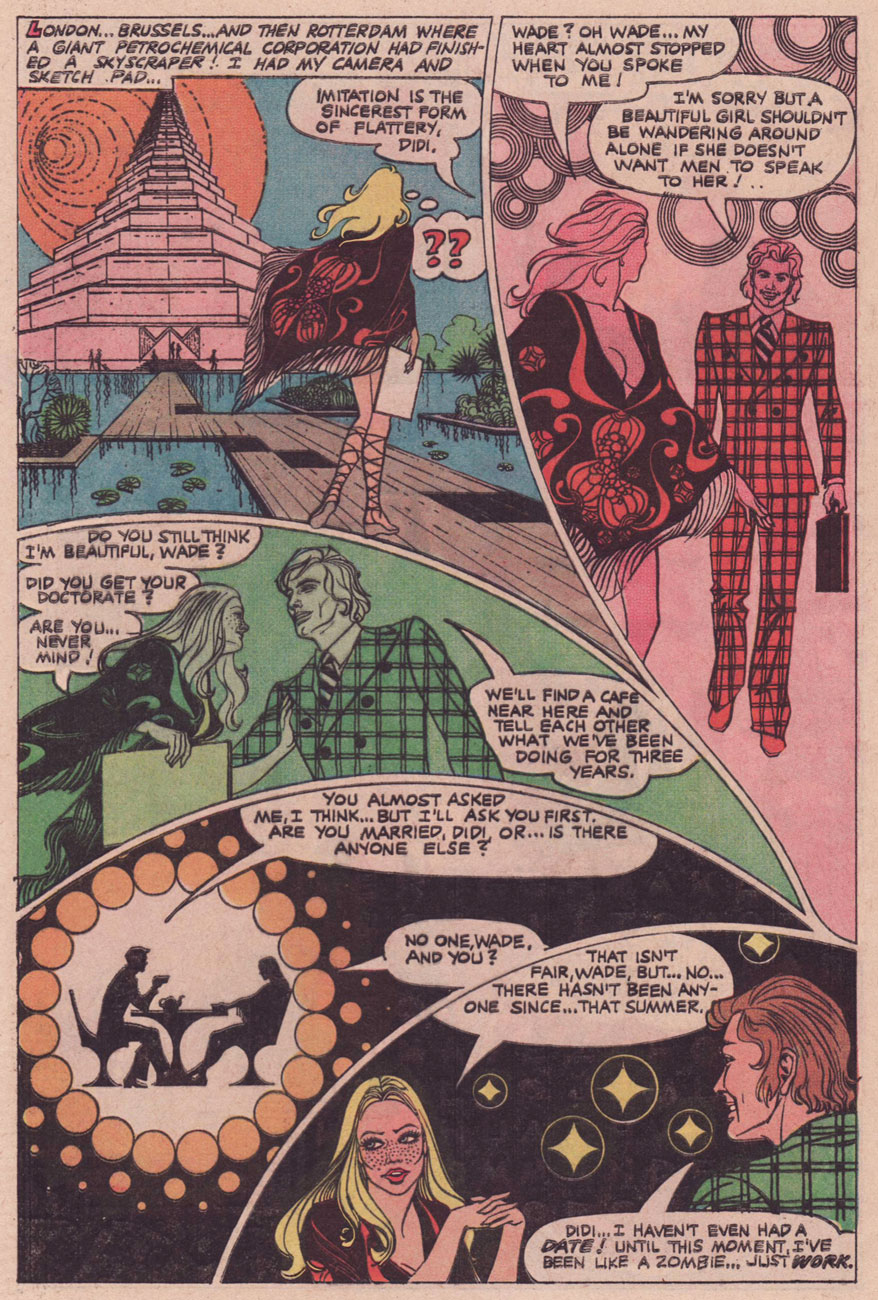
To mark this special occasion, I’ve picked out the lovely tale of A Strange Good-Bye from Love and Romance no. 20 (January, 1975); it provides a sterling showcase for his remarkable design chops and, as my dearest co-admin ds has earlier pointed out, Enrique’s tales provide, as a rule, beefcake and cheesecake in equally generous shares. Is anyone else that fair-minded?
I’m particularly fond of this yarn because of its unusual avoidance of most romance clichés: there are no scheming rivals, no duplicitous so-called friends, no disapproving parents, no melodrama… just two serious-minded, intelligent young people who are *really* into each other, but don’t lose their heads over it. And they may be yuppies, but success wasn’t just handed to them. Call me a sap, but I can’t help but sincerely root for Wade and Didi.
Oh, and let’s face it, can you think of any other US romance comics that pack such an erotic charge? It may be subjective, but I’ve rarely seen such convincing depictions of tenderness and affection, physical and otherwise, between two characters… and in mainstream, comics-code approved funnybooks yet. Full marks to Mr. Nieto and his masterful understanding and depiction of body language… male and female.
While he’s not credited, it’s still obvious to me that Joe Gill is the writer; my favourite facet of his romance tales is how he grounds what could be stock situations in the everyday, endowing his characters with actual, credible occupations, as opposed to soap opera ones. When a character describes a business deal or an industrial process, it makes perfect sense. I suspect this to be a by-product of Gill’s authorship of a 1973 series of promotional career-choice Popeye-branded comic books. The research clearly fed his subsequent work, which is just as it should be.
A Strange Good-bye was the cover feature of Love and Romance no. 20 (Jan. 1975). Blast that puzzle page!
« You’ve got his likeness emblazoned onto
the top of a tin box Perfect big heart
perfect blue eyes
perfect teeth and
perfectly flowing locks » — The Motorz, ‘Bobby Sherman Lunchbox’
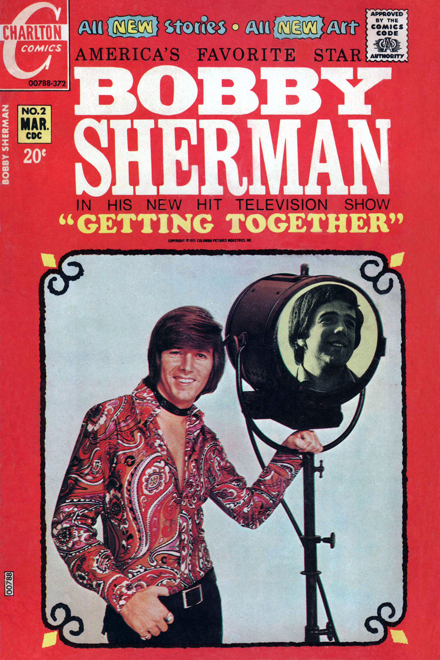
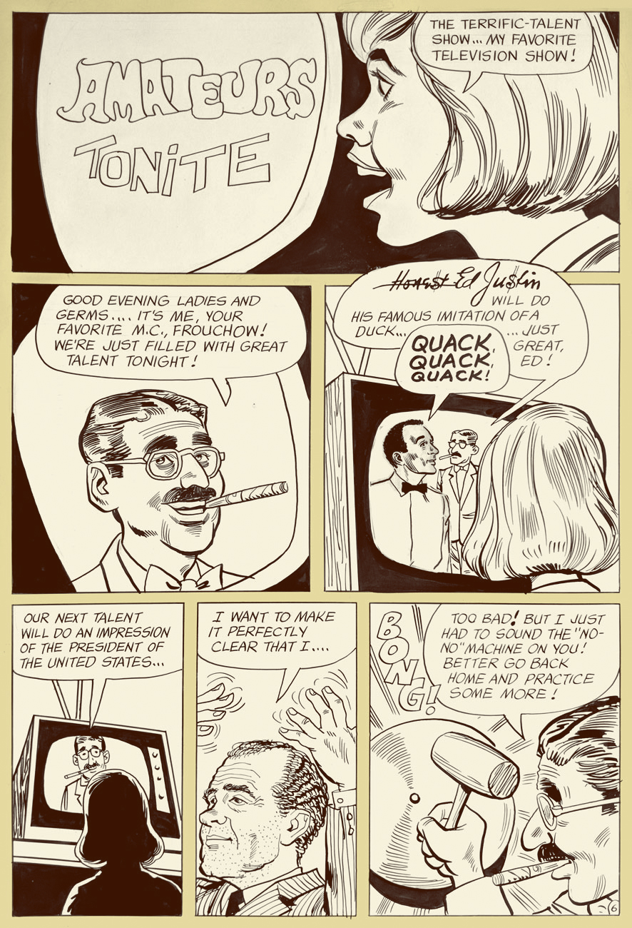
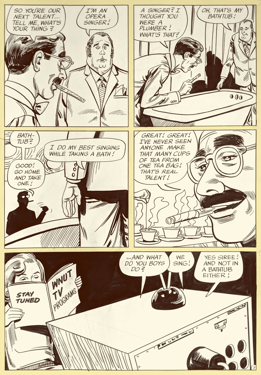
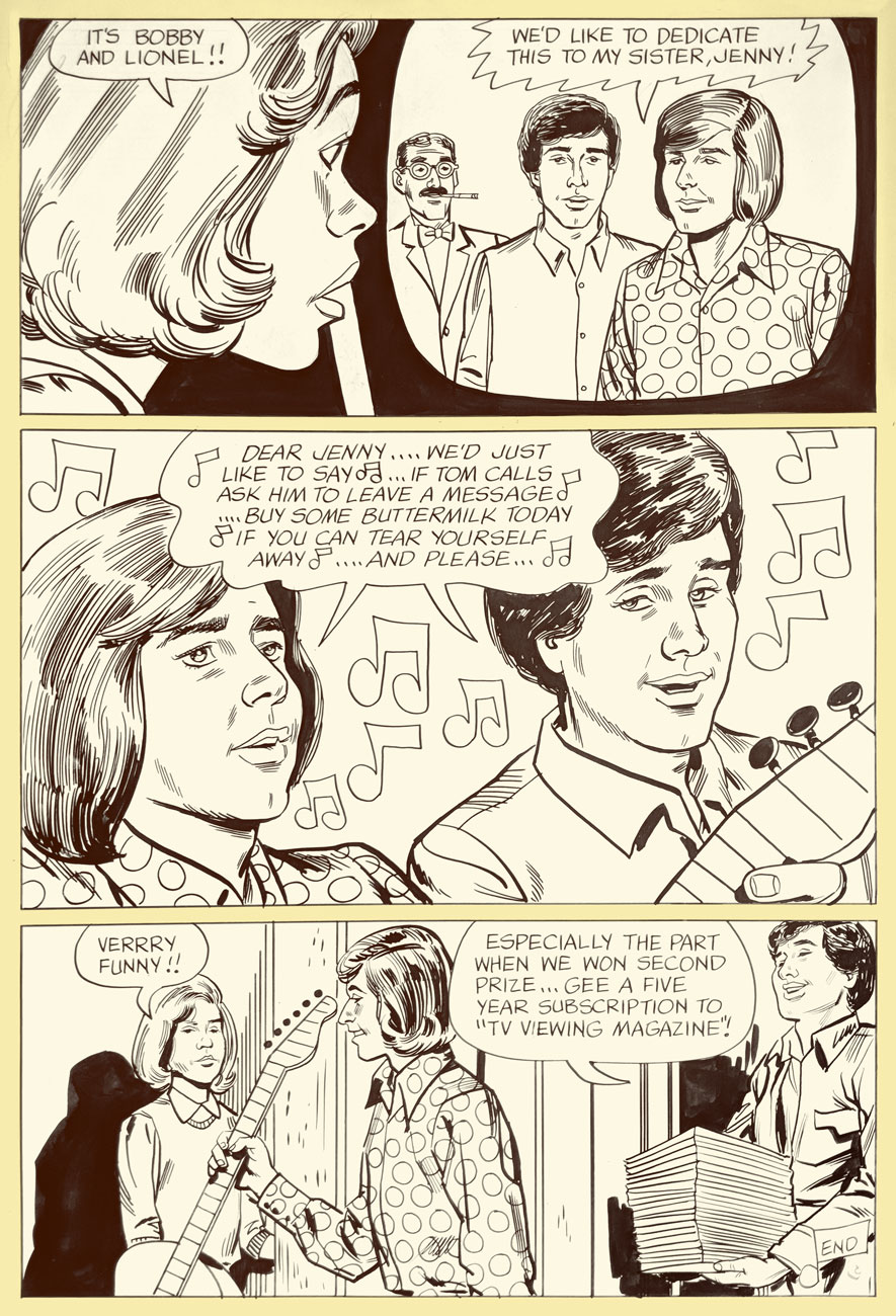
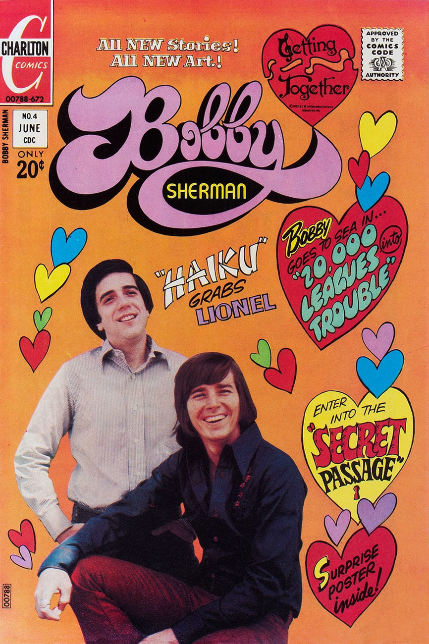
It’s birthday number seventy-six for singer, actor, songwriter, Charlton comics star and all-around swell guy Robert Cabot “Bobby” Sherman, Jr. (born July 22, 1943).
This is Bobby Sherman no. 1 (Feb. 1972). Story and art by the much-maligned Tony Tallarico. You know what, though: he’s alright in our book. One of these days, we’ll make our case.
His Getting Together co-star, Wes Stern, also celebrates his birthday this Thursday, July 25. He’ll be seventy-two. You may remember Wes from his recurring rôle as Brenda Morgenstern’s shy, foot-fetishist beau Lenny Fiedler on Rhoda (early on, before the show utterly went South).
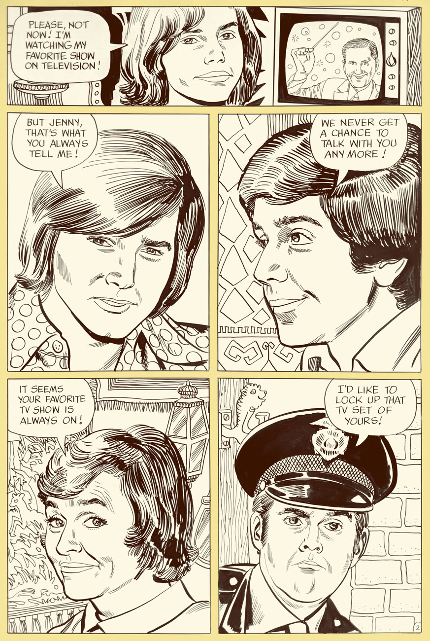
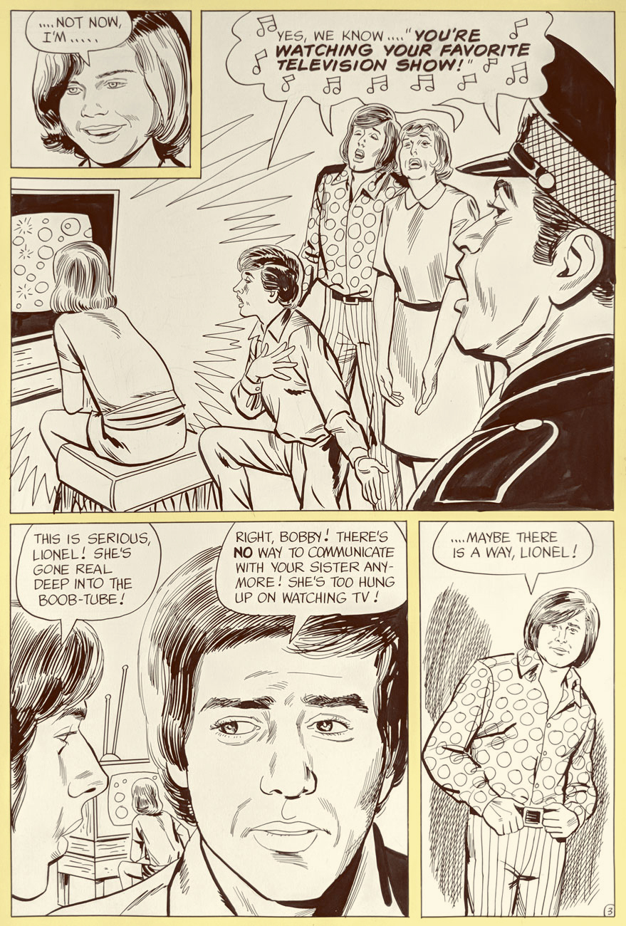
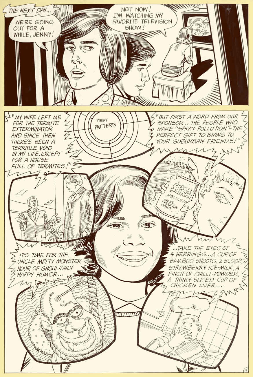
This is Bobby Sherman no. 2 (Mar. 1972). Story and art by Mr. Tallarico.
Bobby and Wes had the singular honour of starring in seven issues of their own Charlton comic book (February to October 1972). Our excerpt is number 2’s « A Guide to TV? », written and illustrated by Tony Tallarico and shot from the original art. Good-natured fun, especially when the Getting Together cast of characters is around. In the 1971 Fall season, the snappy little show was off to a promising start, but found itself, in the eleventh hour, scheduled against the powerhouse tv hit of 1971, Norman Lear’s abrasive All in the Family, and that was all she wrote.
Ah, back in those innocent days when watching seven hours of TV was the stuff of humorous exaggeration. Now (depending on how it’s defined and whom you ask) it’s *below* the daily average.
Inside joke alert: “Honest Ed Justin” alludes to one of Bobby’s songwriting partners, Ed Justin. Here’s one of their musical collaborations. And, hey, two posts in a row featuring Tricky Dick cameos… I’m on a roll! Incidentally, ‘Amateurs Tonight” predates The Gong Show by nearly half a decade. Was Chuck Barris perchance a Charlton reader?
But that’s all water under the bridge. By the mid-70s, Bobby basically walked away from the grind of public life, and the odd tour or charity event aside, he’s been volunteering with the LAPD, training recruits in first aid, CPR, and so forth. A solid citizen, no irony or sarcasm intended.
One more?
This is Bobby Sherman no. 4 (June, 1972). M. Tallarico strikes again!
Once again, we wish the most joyous of birthdays to Bobby and Wes!
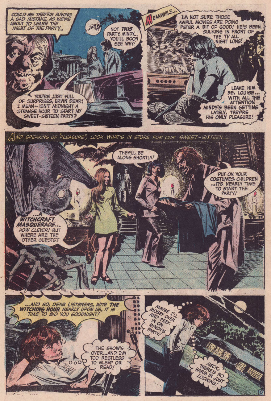
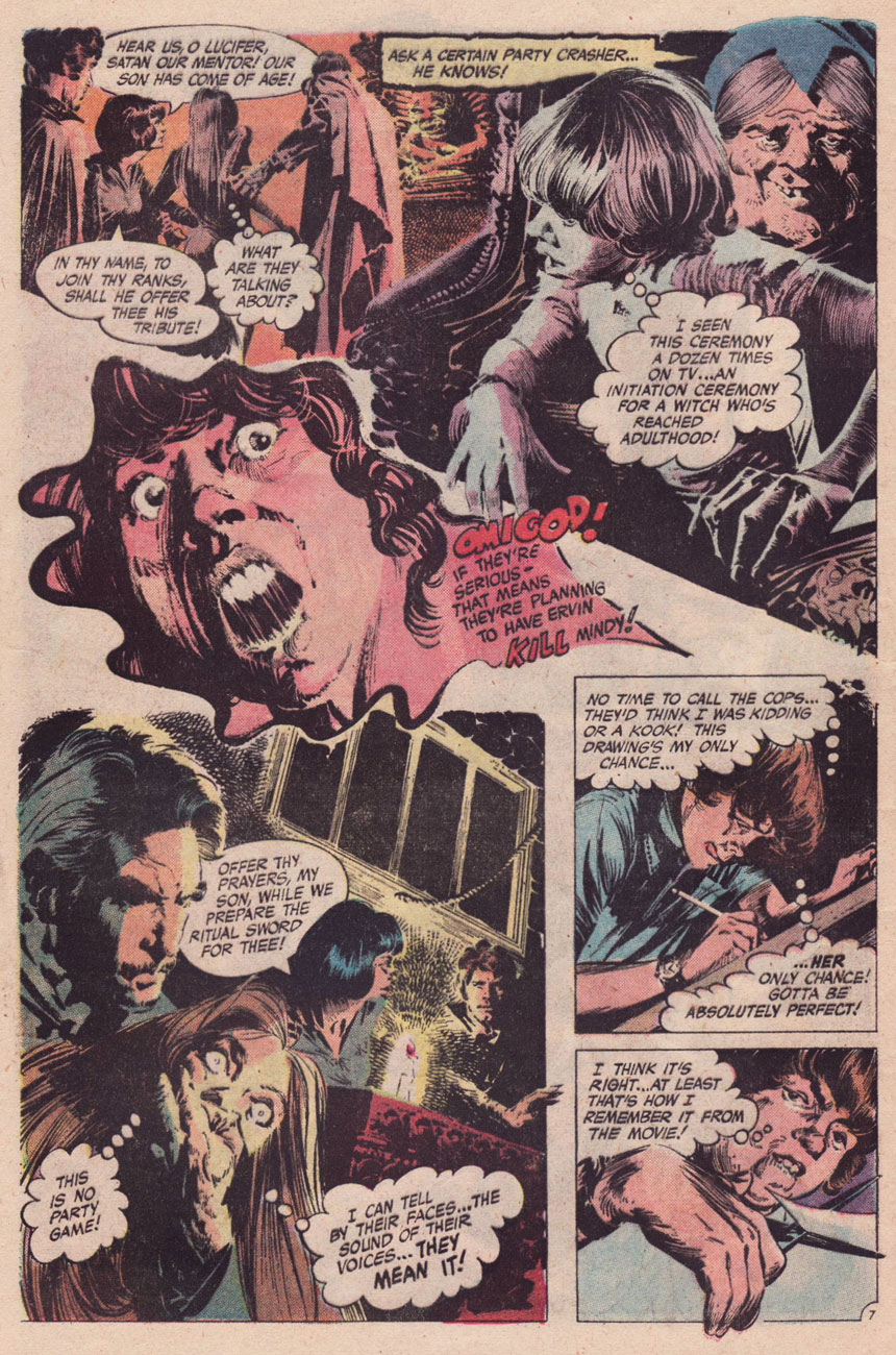
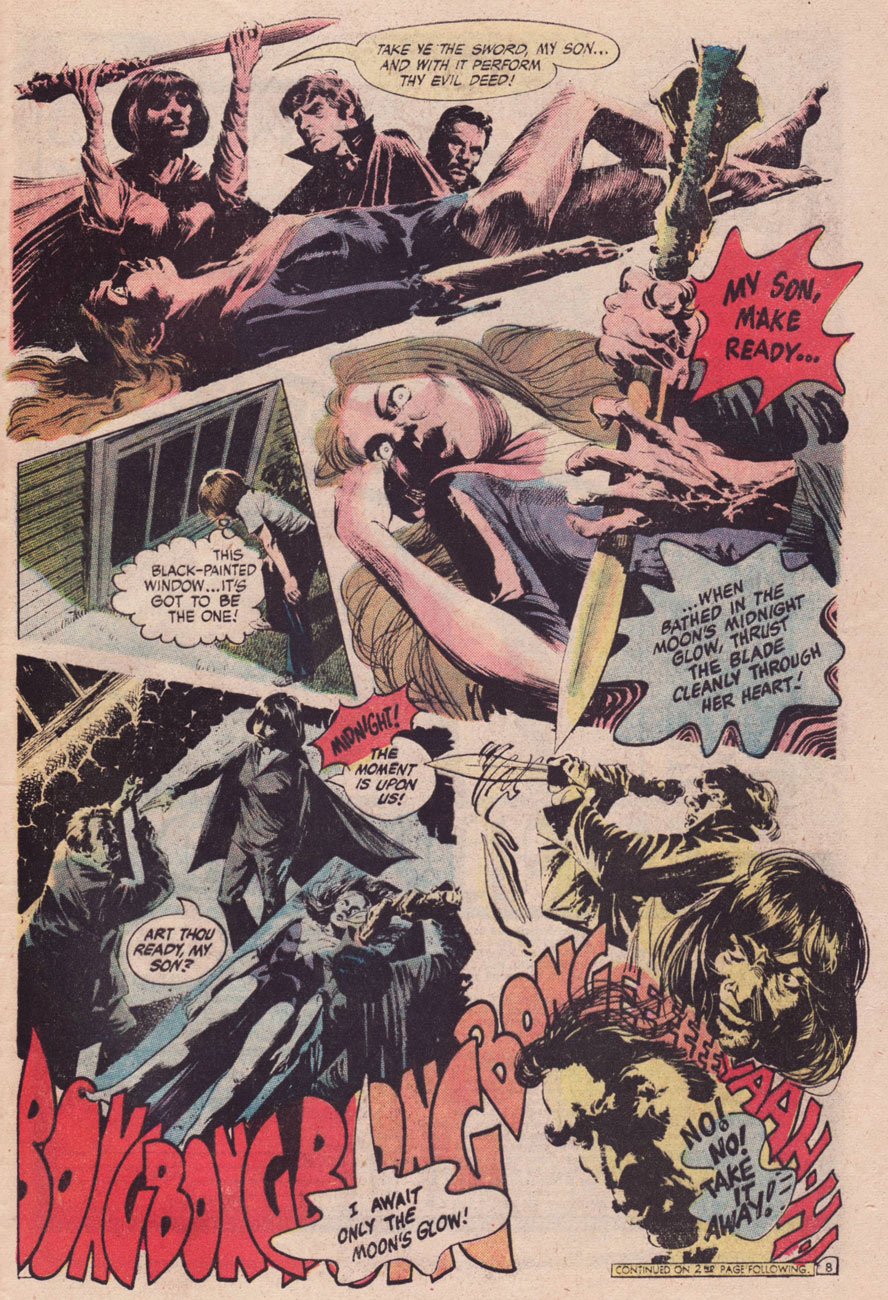
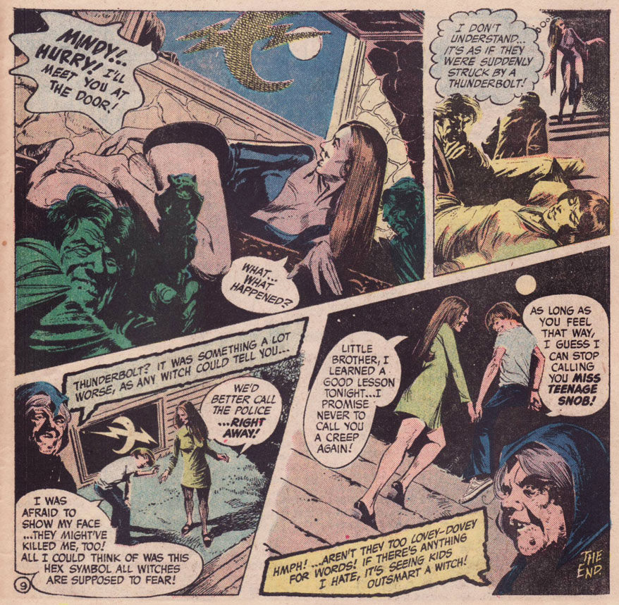
« Mom, my teacher, Mrs. White, has invited me to a slumber party at her house this weekend. She’s really nice. Can I go? »
« Sure, why not? » — from a Jack Chick tract, The Poor Little Witch (1987)*
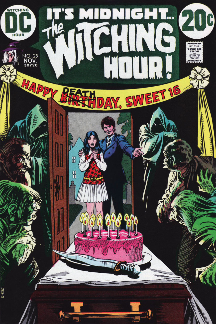
Today, we part the curtains and peek at the fair bosom of suburbia, circa 1972. In those gentle times of satanic panic, Tricky Dick’s political shenanigans, the oil crisis and all-around grooviness, the Manson ritual murders were recent history, Anton LaVey‘s The Satanic Bible (1969) and its sequel, The Satanic Rituals (1972) were all the rage, not to mention William Peter Blatty‘s The Exorcist (1971… the film another year away) and Ouija boards. DC Comics’ The Witching Hour (85 issues, 1969-1978) was well in keeping with the vibe of the times, and offered girls somewhat of an alternative to Archie, Little Dot and Young Romance. In fact, my recollection (and I’d welcome yours!) was that ghost and mystery comics overwhelmingly found favour with the ladies.
I’ve perhaps said it before, but DC’s mystery books were mostly well-drawn but mind-numbingly formulaic… but exceptions now and again slipped in.
Happy Deathday, Sweet 16! was a bit of lightning in a bottle. It was illustrated by the hardly-prolific Canadian Bill Payne, who drew a dozen or so jobs for DC’s mystery and war titles, lettered a few more, then vanished. I suspect he had a day job in some advertising agency and did a bit of comics work on the side for kicks. If that’s the case, he certainly applied himself, bringing actual realism and a bit of the old ‘Ghastly’ Ingels grotesqueness to the table. The writer, however, is uncredited. The writing doesn’t quite feel like the work of any of DC’s workhorses… it’s markedly better, rising beyond the stock situations and packing in plenty of credible detail to flesh out the players in its scant eight and a half page allotment. Sibling rivalry, social aspirations**, marital and parental discord, class warfare… Lucky Peter, though: he somehow seems to have continual access to Shock Theater; for me, that’s the main cause for suspension of disbelief.
Nick Cardy‘s sweet ‘n’ sassy cover for The Witching Hour no. 25 (Nov. 1972). It’s fun to see one of his winsome romance cover girls put in a rather… perilous cross-genre appearance.
These days, I suppose the fundamentals haven’t changed, though with so-called Christians behaving in most unchristian fashion, and Satanists displaying a puckish (honestly, kind of adorable) sense of humour, things are… interestingly confusing.
-RG
*Read it here; but remember, it’s “available only in multiples of 10,000 at half-price.” ** Let’s keep in mind that, as Lori Loughlin has pointedly pointed out, “Any mother would have done the same if they had the means to do so.”
« Though the refined eyes of the aesthete may consider Kirby’s work crude, ornery, and anti-intellectual, the fact remains that he combined the virtues and limitations of his class with a stubborn genius to produce a body of comics work that has remained consistently true to its source and is unparalleled both in quantity and quality. » (Gary Groth)
Strike while the iron is hot, it is said, and thus part II of our celebration of Jack Kirby‘s tentacle prowess comes hard on the heels of Tentacle Tuesday Masters: Jack Kirby, Part 1. I’d like to thank co-admin RG for his vast knowledge of Kirby comics, as well as his suggestions and scans – that’s what (among other things) partners are for. Whereas part 1 focused on Kirby’s 70’s work for DC, today’s post (also firmly entrenched in the 1970s) is a celebration of his brief but intense return to Marvel Comics.
All art is scripted and penciled by Jack Kirby and inked by Mike Royer, unless otherwise indicated.
We start with the somewhat less interesting, but nevertheless tentacular, Hercules.
Marvel Premiere no. 26 (November 1975), penciled by Kirby and inked by Vince Colletta. Only the cover is by Kirby, the inside story being a collaboration between Bill Mantlo, George Tuska and Vince Colletta.
Now that we have the boring stuff over with, we move on to the spacey part of this post: epic voyages into the cosmos, mind-shattering encounters with Gods and fights to the death with unthinkable monsters of fearsome power! As usual, in chronological order: one must respect tradition.
« To make his comic, Kirby watched 2001 again, referenced a stack of stills, and pulled from the screenplay and Arthur C. Clarke’s novelization. The illustrations were instantly recognizable to anyone who’d seen the film, but the characters were uniquely his: beefy and emotive with a touch of uncanny. There are also moments of pure Kirby: a splash page of a spacesuit-clad astronaut gaping at an exploding cosmic sky, an acid-trip interpretation of the climatic Star Gate sequence. »
Panel from Wheels of Death (again, read the story on Diversions of a Groovy Kind) published in 2001: A Space Odyssey no. 4 (March 1977). *My* question is, does anybody remember any tentacles in the film? I know, I really have a one-track mind.
« Kirby was the right choice for the assignment, but, Mark Evanier (a comic book writer, Kirby friend and colleague, and author of the biography Kirby: King of Comics) says, he was wary of taking on someone else’s story, especially one as iconic as Kubrick’s vision of 2001. “He didn’t feel he had a lot of wiggle room to expand or inject himself into it,” Evanier says. “He had to keep reminding himself, ‘That’s my viewpoint, that’s not Stanley Kubrick’s,’ and adjusting.”» (source: The Crazy Legacy of Jack Kirby’s Forgotten 2001: A Space Odyssey)
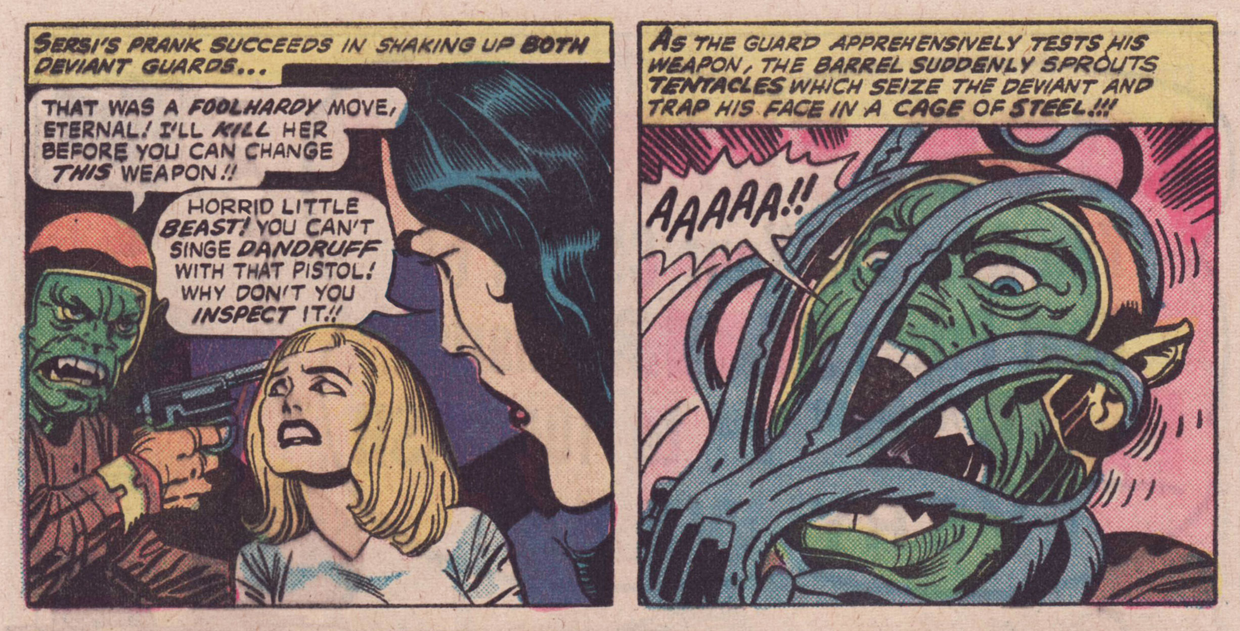
I wanted to find a good overview of The Eternals, and thought I had found it (plenty of pictures, an overall idea of the leitmotifs driving the series – and importantly, NO MENTION OF THE MOVIE)… until I came to the end of the article in question and saw that the author was next going to read Neil Gaiman‘s take on The Eternals* to see if the latter had fixed some of Kirby’s plot flaws, at which point I choked on the water I was sipping. But, but! the author repented, and so I give you Review: The Eternals by Jack Kirby from the blog Giant Size Marvel.
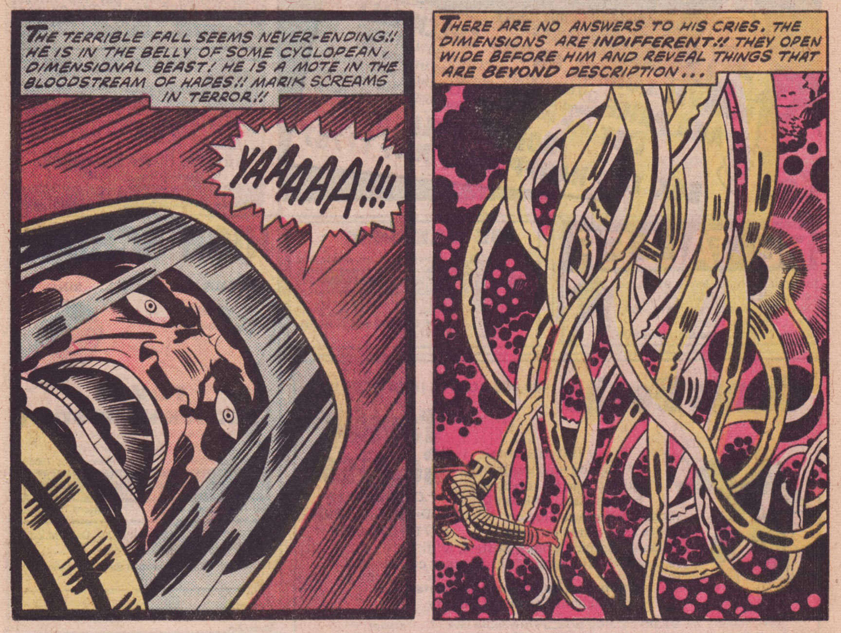
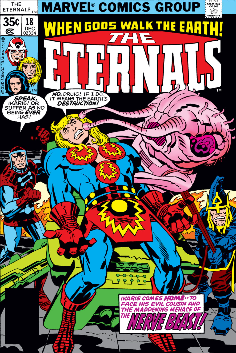
Panels from God and Men at City College published in The Eternals no. 6 (December 1976).
Panel from Disaster Area, published in The Eternals no. 15 (September 1977).
The Eternals no. 18 (December 1977), penciled by Jack Kirby and inked by Frank Giacoia.
Panels from To Kill a Space God, published in The Eternals no. 18 (December 1977).
Panels from To Kill a Space God, published in The Eternals no. 18 (December 1977).
Surely everyone knows Captain America already, but here are his 7 Most Awesome Moments (arguable, but a good starting point) by the good folks at Comic Alliance.
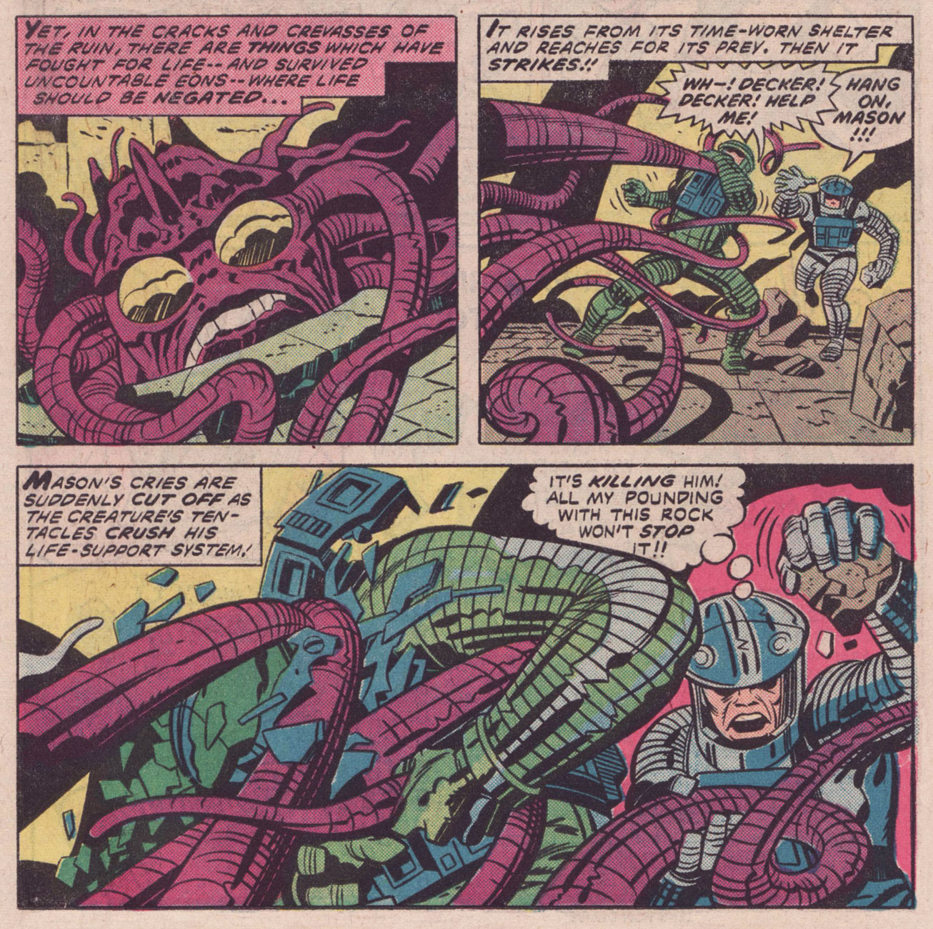
Here we have energetic tentacles, free-flowing-energy cephalopods…
Captain America no. 205 (January 1977), penciled by Jack Kirby and inked by Joe Sinnott. The thing with the tentacles is Agron, who (which?) will eventually learn to animate a corpse, but for now he’s just in his energy form.
Page from Agron Walks the Earth!, scripted and penciled by Jack Kirby and inked by John Verpoorten, published in Captain America no. 205 (January 1977). I *told* you Agron would animate a corpse, but did you listen?
Double splash from Arnim Zola — The Bio-Fanatic!!, scripted and penciled by Kirby and inked by Frank Giacoia and John Verpoorten, published in Captain America no. 209 (May 1977).
You asked for it (right?): Doughboy in action! Technically, those are rubbery arms, not tentacles, but as someone who regularly makes sourdough bread, I assure you, dough *does* sprout tentacles and will latch onto your hands and arms with them.
Page from Arnim Zola — The Bio-Fanatic!!, scripted and penciled by Kirby and inked by Frank Giacoia and John Verpoorten, published in Captain America no. 209 (May 1977).
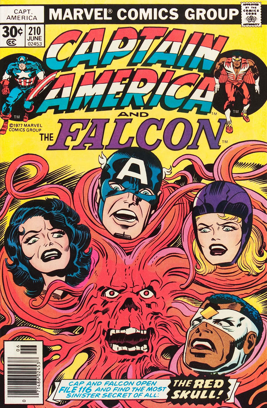
Captain America no. 210 (June 1977), penciled by Kirby and inked by John Verpoorten. The Red Skull taking a leaf out of Medusa’s book? Seriously, those have *got* to be hair extensions.
« Until now Mr. Cookie Monster refused to talk about the matter because his mouth was full, and it’s not polite to talk with your mouth full. » — Guest Star Robert McNeil
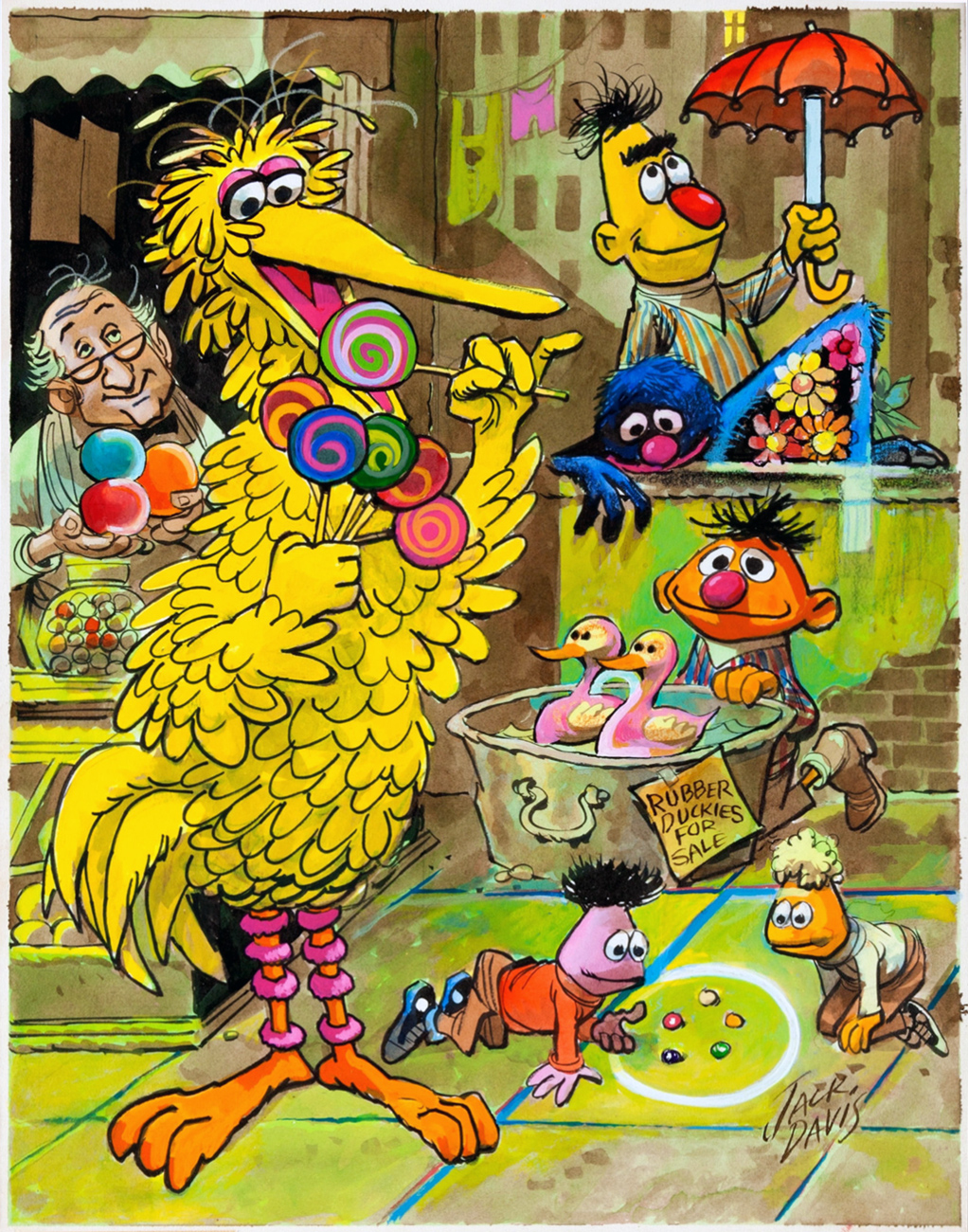
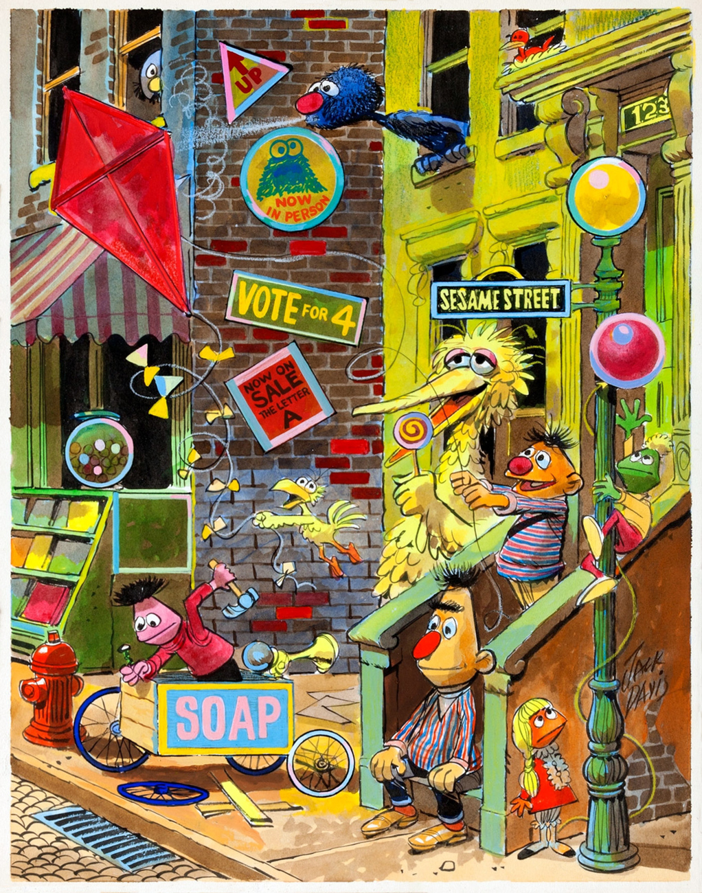
With the venerable MAD Magazine (1952-2019) bowing out after sixty-seven years, and kid’s educational show Sesame Street (singalong time!) about to hit the half-century mark, it seems à propos to salute one of the geniuses their respective histories share, Jack Davis (1924 – 2016)… rather than mire ourselves in the inevitable stack of lachrymose paeans to Harvey Kurtzman’s long-lost progeny.
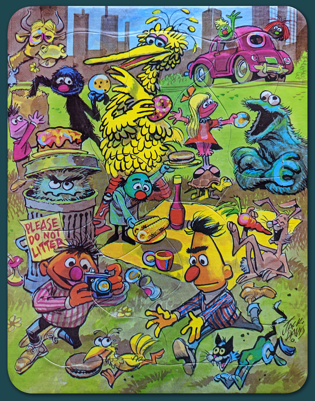
So, are you in need of a bit of cheering up after a down-in-the-dumps day? Take a stroll down friendly Sesame Street with sweet Mr. Davis! Now isn’t this a place where you’d care to linger a spell?
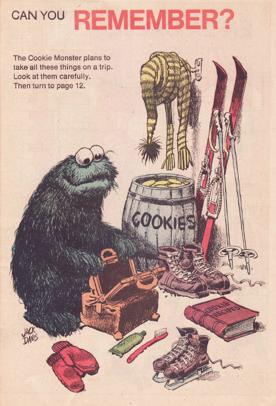
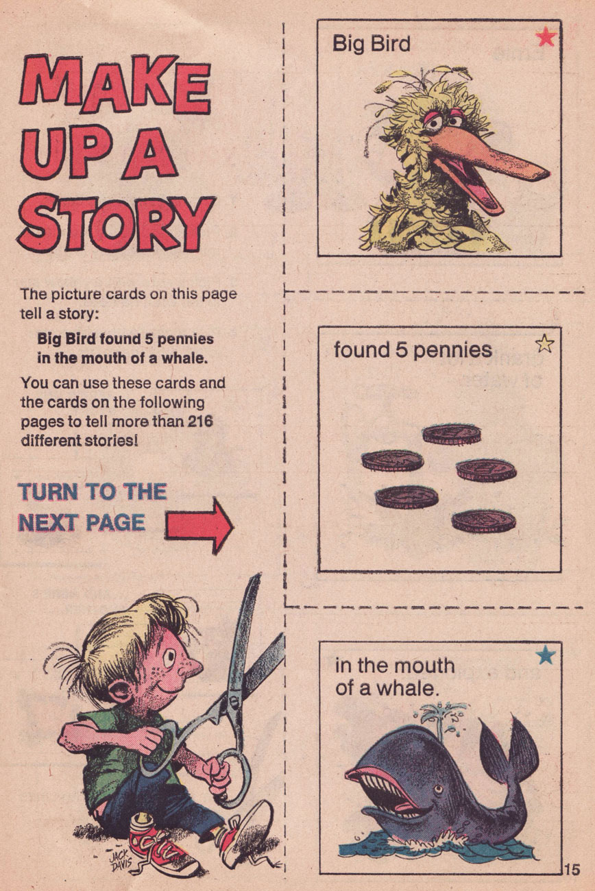
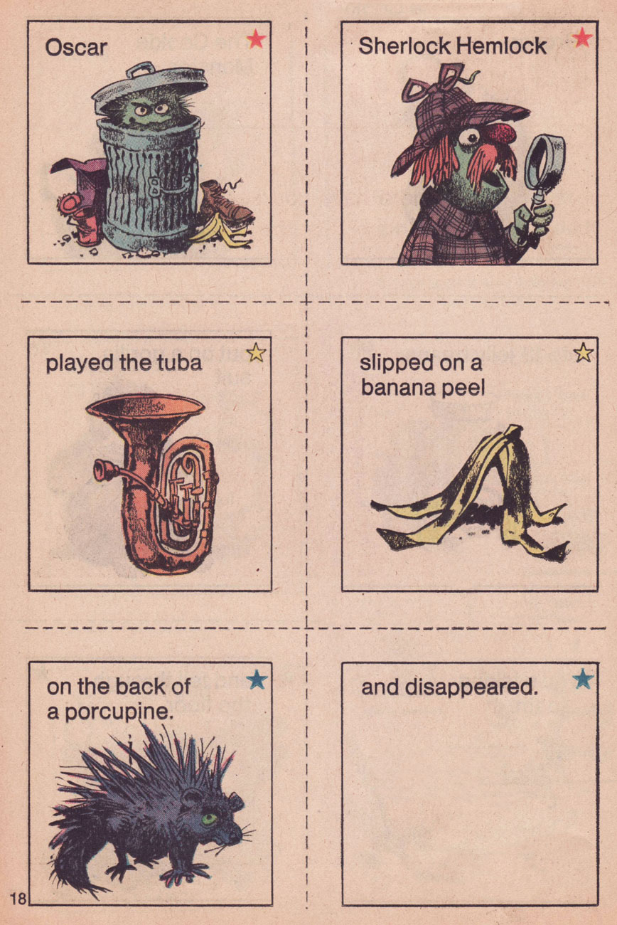
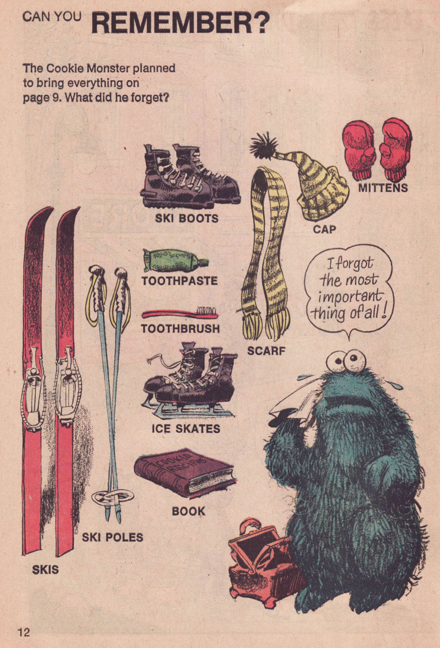
A lovely excerpt from the Sesame Street Annual (1972, Dell); according to the table of contents, it teaches ‘Planning’. Don’t worry, I won’t leave you in the lurch: the answers are at the end of this post. You’re welcome!
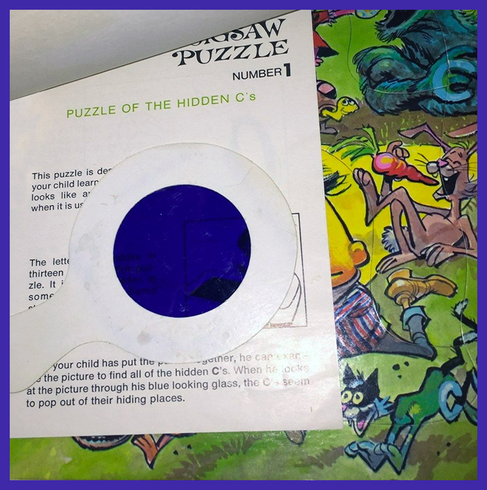
It’s a sunny day indeed when genial Jack Davis’ long legs come striding down Sesame Street! The series was called Sherlock Hemlock’s Hidden Answer Jigsaw Puzzles, and this is number one, The Puzzle of the Hidden C’s. Well, don’t just stand there gaping, how many can *you* spot, wise guy?
Spaghetti and chaos are on the menu in this scene that Davis was commissioned to create in 1971, early in the rise of the Muppet empire. This is number 2, The Puzzle of the Hidden S’s.
This is number 3, The Puzzle of the Hidden Numbers. Each puzzle was packaged with a blue transparency “looking glass”, which could be used to discover hidden shapes in the picture. I’m afraid I don’t have one to spare, so you’ll have to procure your own.
And here’s number four of the puzzle illustrations Mr. Davis created for Educational Toys’ Sherlock Hemlock’s Hidden Answer Puzzle series. This is número 4, The Puzzle of the Hidden Shapes… you know what to do next!
Here’s the aforementioned [Yves Klein] blue looking glass you’ll need.
Another Davis-illustrated exercise in fun from the 1972 Sesame Street Annual, which also features some gorgeous contributions from Mel Crawford and Davis’ fellow Usual Gang of Idiots member, Al Jaffee. This one teaches, again according to the “Parents’ Guide to Contents”, “Pre-reading skills”.
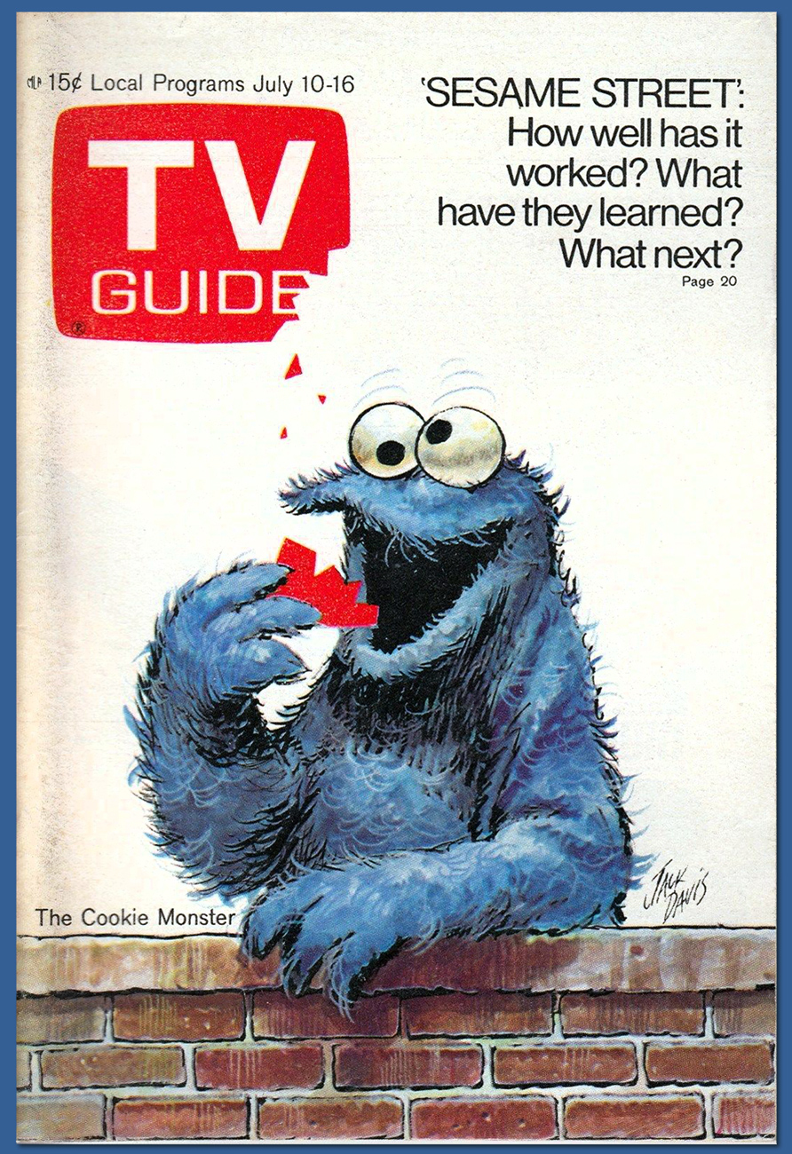
As one of America’s most distinctive and deservedly successful illustrators, Davis created scores of splendid TV Guide covers, and he was uniquely well suited for this one. This is the July 10, 1971 issue. I never would have figured the mag’s logo to be edible, but then the Cookie Monster’s idea what’s fit to eat is pretty liberal.
A very early Davis Sesame Street illustration initially used in The Sesame Street Learning Kit (Children’s Television Workshop, 1969); the show made its début on November 10, 1969, on the about-to-expire National Educational Television network. A merger soon turned the NET into the Public Broadcasting Service, which Sesame Street, now in its 49th season, calls home to this day.
And here’s your answer. Thanks for playing along!
In case one of you experts is wondering, I did leave out, deliberately, Davis’ single meatiest contribution to the show’s canon: The 1972 Sesame Street Calendar (which I look forward to reusing in 2028), twenty-five pages of pure Davis, including thirteen particularly lush watercolours. In order to do it justice, it’ll require at least one post of its own.
« Apparently he had never learned that a white man’s foot, though it wabble ever so, is given him wherewith to kick natives out of the road. » — John Russell
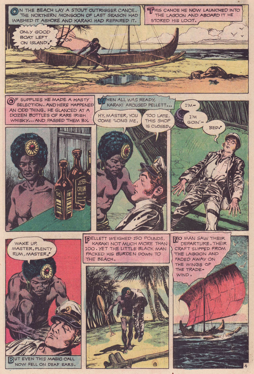
Welcome to another installment of Treasured Stories! This one’s a bit of a sequel, or rather a companion piece to an earlier entry, August Heat (from just about a year ago) as we’re featuring two of the same creators, namely scripter E. Nelson Bridwell (1931-1987) and penciller-inker Alfredo Alcala (1925-2000).
In this instance, we can surely witness judicious editorial sense at work, in terms of matching material to talent. While Bridwell likely selected the story, and though they’d worked together before, Alcala was a flawless choice to bring it to full visual bloom. A tale of the Pacific Islands illustrated by a Pacific Islander, and a masterful one at that… on both counts. Alcala’s expertly-paced, limpid, deliberate storytelling is a natural fit.
It’s easy to underestimate how daunting a challenge, in most cases, is the effective transition of material from medium to medium. In this instance, the source is a much-anthologized short story by John Russell, originally published in Collier’s, May 20, 1916. You can judge for yourself after reading the original text here.
Russell’s stories sharply veer from the usual civilisation vs savages colonialist tripe of the era in that the natives are depicted as oft-complex but subtle beings and the whites, as often as not, as pompously delusional savages; one sees the pattern emerge upon reading a few of Russell’s South Pacific tales (collected in Where the Pavement Ends, 1921); in my own case, I found a trio of these in Dennis Wheatley‘s excellent anthology Shafts of Fear (1964), an update and expansion of his earlier A Century of Horror (1935).
Still, I strongly suspect that Bridwell’s exposure to The Price of the Head came not from books, but rather from a radio play, as all three of his DC short story adaptations (TPOTH, August Heat and The Man and the Snake had received that particular treatment. To his credit, Bridwell went back to the source for his version.
You’ll note that the racism so refreshingly absent from Russell’s story has been painstakingly restored for the radio programmes. Now that’s dedication!
Quite recently, I was delighted to hear that Mr. Bridwell has not entirely been forgotten; indeed, he is to be bestowed, though posthumously of course, the Bill Finger Award for Excellence in Comic Book Writing on Friday, July 19 2019, during the Eisner Awards ceremony at this summer’s Comic-Con International in San Diego, CA. Bravo!
Read all about it on Mark Evanier’s fine blog. And thank you, Mark!
« In almost every picture, Batman looks as if he has spent the day greasing the Batmobile and didn’t bother to clean up afterwards. There is a difference between shadowing and what looks like globs of dirt and grime. » — letterhack Bob Rozakis (Detective 420, Feb. 1972), as astute an art critic as he would prove a writer.
Think about it: from his initial appearance in 1939’s Detective no. 27, the Batman was always a bit of a shop product. While notorious deceiver and glory-hog Bob Kane (né Kahn, 1915-98) loved to slap his name on anything and everything, his principal talent was self-promotion. Kane’s Batman was mostly the work of far more talented ‘ghosts‘ such as Jerry Robinson, Dick Sprang, Bill Finger, George Roussos, Jack Burnley, Win Mortimer… and so on, for decades. It’s unlikely that anyone ever produced the artwork for a Batman story on their own (well, professionally), let alone wrote *and* drew one. In a nutshell, that’s the assembly-line style US funnybook industry.
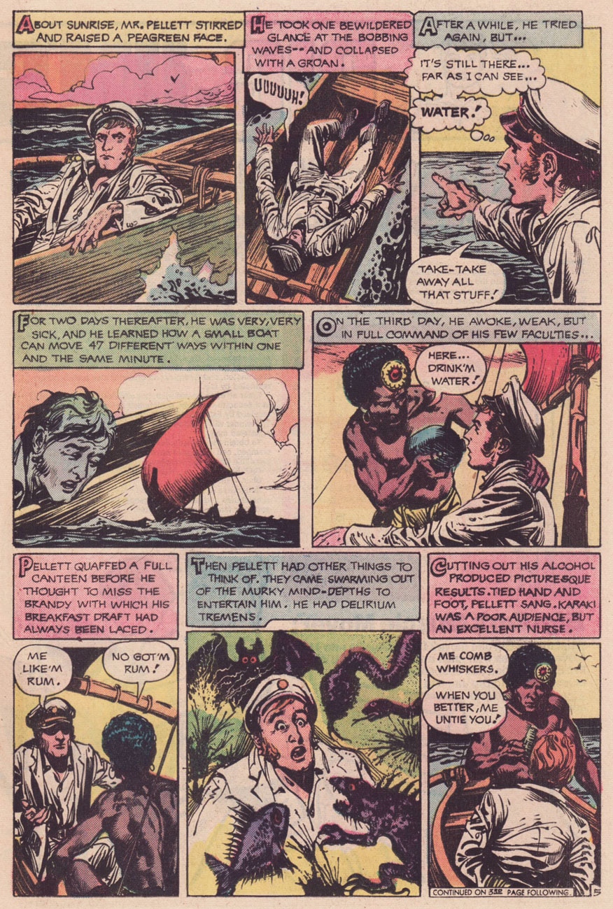
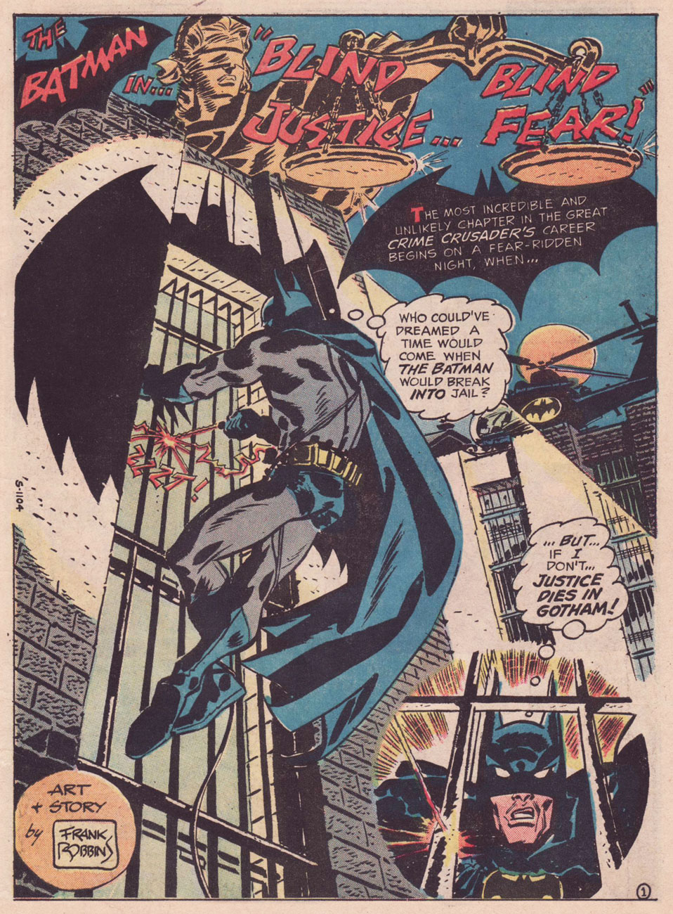
As far as the caped crusader is concerned, that state of affairs would briefly change with Detective no. 416 (cover-dated October, 1971): under a particularly clumsy Neal Adamscover, the lead story, Man-Bat Madness!, was scripted, pencilled, inked *and* lettered by Frank Robbins. He would produce four more solo Batman adventures: Forecast for Tonight — Murder! (Detective Comics no. 420, Feb. 1972); Blind Justice — Blind Fear! (Detective Comics no. 421, March 1972), Killer’s Roulette! (Detective Comics no. 426, Aug. 1972) and Man-Bat Over Vegas! (Detective Comics no. 429, Nov. 1972).
A sample from the first one-man Bat-Adventure, Detective no. 416‘s Man-Bat Madness! Robbins’ expertly fluid storytelling and confident spotting of blacks are well in evidence here.Opening splash from my pick of the solo Robbins Batman, Detective no. 421‘s Blind Justice — Blind Fear! [Psst! Read it here.]Those were the days of “relevance” in comics. The Attica Prison Uprising had just occurred…
Robbins had been scripting for DC since 1968 (starting right after the ignominious firing of many of their most seasoned writers… for presuming to request some social benefits after decades of loyal, and often forcibly exclusive, service*), but he didn’t get his brushes out until 1971, presumably wanting to draw his then-recent creation, Man-Bat** (Detective no. 400, June 1970).
After a final hurrah (script-only) with Batman 254‘s King of the Gotham Jungle! (Jan.-Feb. 1974), he was off to Marvel, where he did no writing, but illustrated tales of Morbius The Living Vampire, Dracula, Ghost Rider, The Legion of Monsters, Captain America, The Invaders, the Man From Atlantis, The Human Fly, Daredevil… generally while paired with inkers ranging from the decent (Frank Giacoia, D. Bruce Berry), to the inappropriate (Frank Springer) to the dismal (Frank Chiaramonte and… hello again, Vinnie). He walked away from the industry in the middle of a cliffhanger, after Daredevil no. 155‘s The Man Without Fear? (Nov. 1978). Beyond that, having endured far more than his share of fanboy sniping and editorial meddling, Robbins left comics forever, going off to paint in México. Wise man.
Robbins, as you may or may not know, was a truly polarising figure in 1970s comics. He was the bane of house-style loving fanboys, and it seems that anyone savvy enough to appreciate him at a tender age later became a cartoonist. The ample evidence (meaning far too much) witnessed on FB comics groups has led me to shrugging acceptance that most fanboys’ aesthetic sensibilities haven’t shifted an iota from when they were twelve… and won’t now or ever.
Another dodgy character encountered in recent years is the annoyingly common “I hated Robbins then, but I totally get him now” git, which brings to mind a certain science-fiction cliché.
« Yeah, we burned down his house, tarred and feathered him and ran him out of town… but looking back, he was a pretty swell guy! » Which stories are these? Find out at the end of the post.
Back to our regularly scheduled train of thought…
A sample from Detective Comics no. 420‘s Forecast for Tonight — Murder! Read it here, while you can.A moody teaser from Detective Comics no. 426‘s Killer’s Roulette!Peruse it here .The precarious opening splash from Detective Comics no. 429‘s Man-Bat Over Vegas! Play the odds right… here.
How I wish he’d gotten to illustrate his moody script for The Spook’s Master Stroke! (Batman no. 252, Oct. 1973), introducing my favourite Bat-villain, seldom-seen The Spook. He was difficult to write, so they killed him off after a handful of appearances.
While Robbins wasn’t my very favourite Bat-writer, (that honour goes to… David V. Reed), he generally delivered a solid tale… but when he was in full command, he was pretty top-notch.
-RG
*« Even though Fox has worked for several comic book publishers, he remains most associated with DC Comics, for whom he worked more than three decades. That collaboration came to an abrupt end in 1968. Fox had joined other comics writers like Otto Binder, John Broome, Arnold Drake, Bill Finger and Bob Haney, signing a petition to ask DC for more financial benefits, particularly regarding health insurance. Since the company regarded writers as expandable people they were all fired without mercy and replaced by more obedient newcomers. » [ Source ] (incidentally, Haney wasn’t fired… at least permanently)
**Neal Adams, having waited until everyone else in the room was dead (editor Julius Schwartz passed away in 2004), began to claim that Man-Bat had been his idea, with no-one’s help. Sorry, Neal, I think you’re a bit confused: you’re thinking of Valeria the She-Bat, and she’s all yours.
Mini-quiz answers: 1) Spores From Space (Mystery in Space no. 1, May 1951, DC); written by Gardner Fox and illustrated by… Frank Frazetta. 2) The Unknown Spaceman (Mystery in Space no. 11, Jan. 1953, DC); written by Gardner Fox and illustrated by Bob Oksner and Bernard Sachs; 3) I Created Sporr, the Thing That Could Not Die! (Tales of Suspense no. 11, Sept. 1960, Marvel); written by Stan Lee, art by Jack Kirby and Dick Ayers; 4) The Blip! (Tales to Astonish no. 15, Jan. 1961, Marvel); written by Stan Lee, art by Jack Kirby and Dick Ayers.
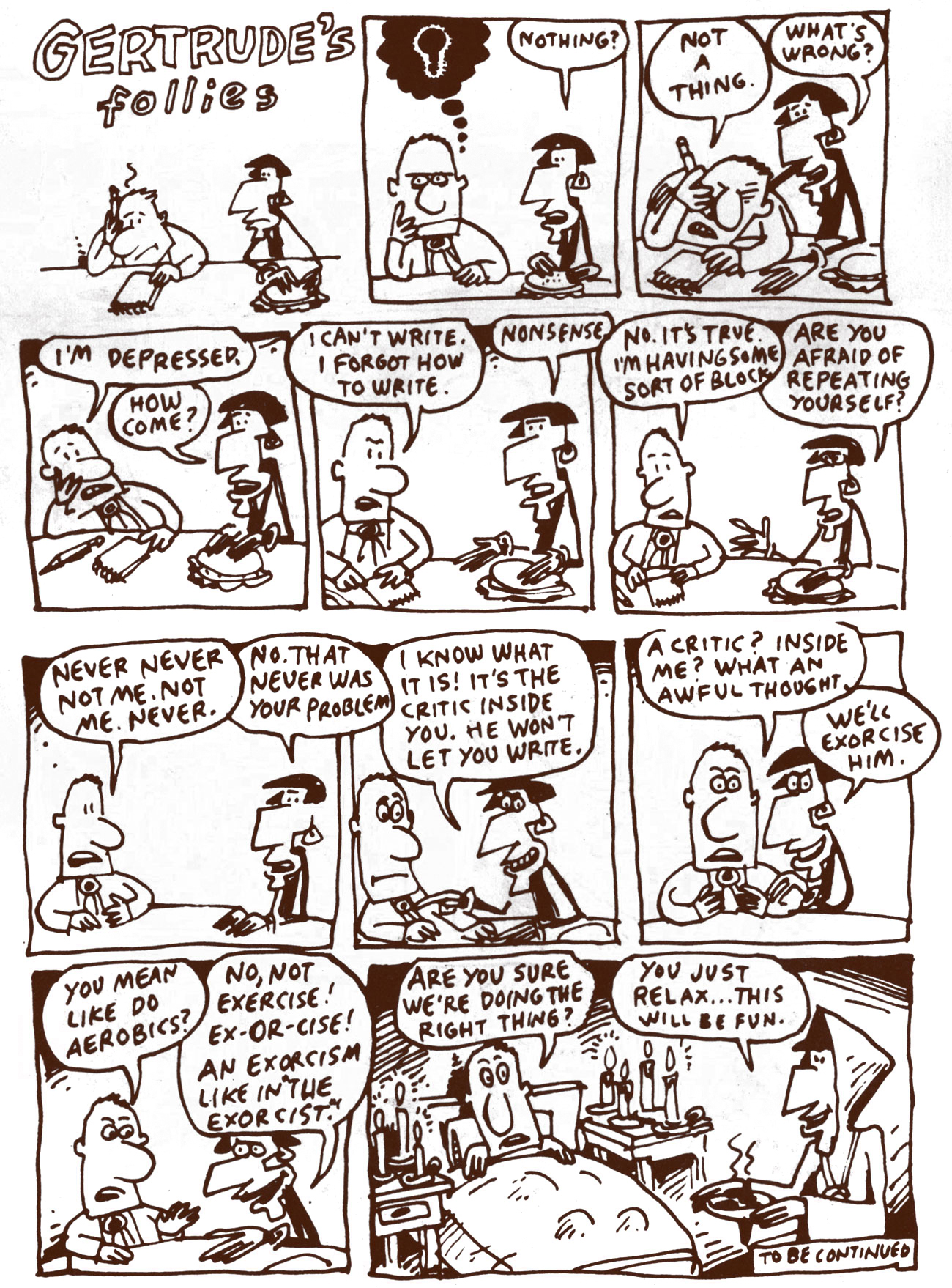
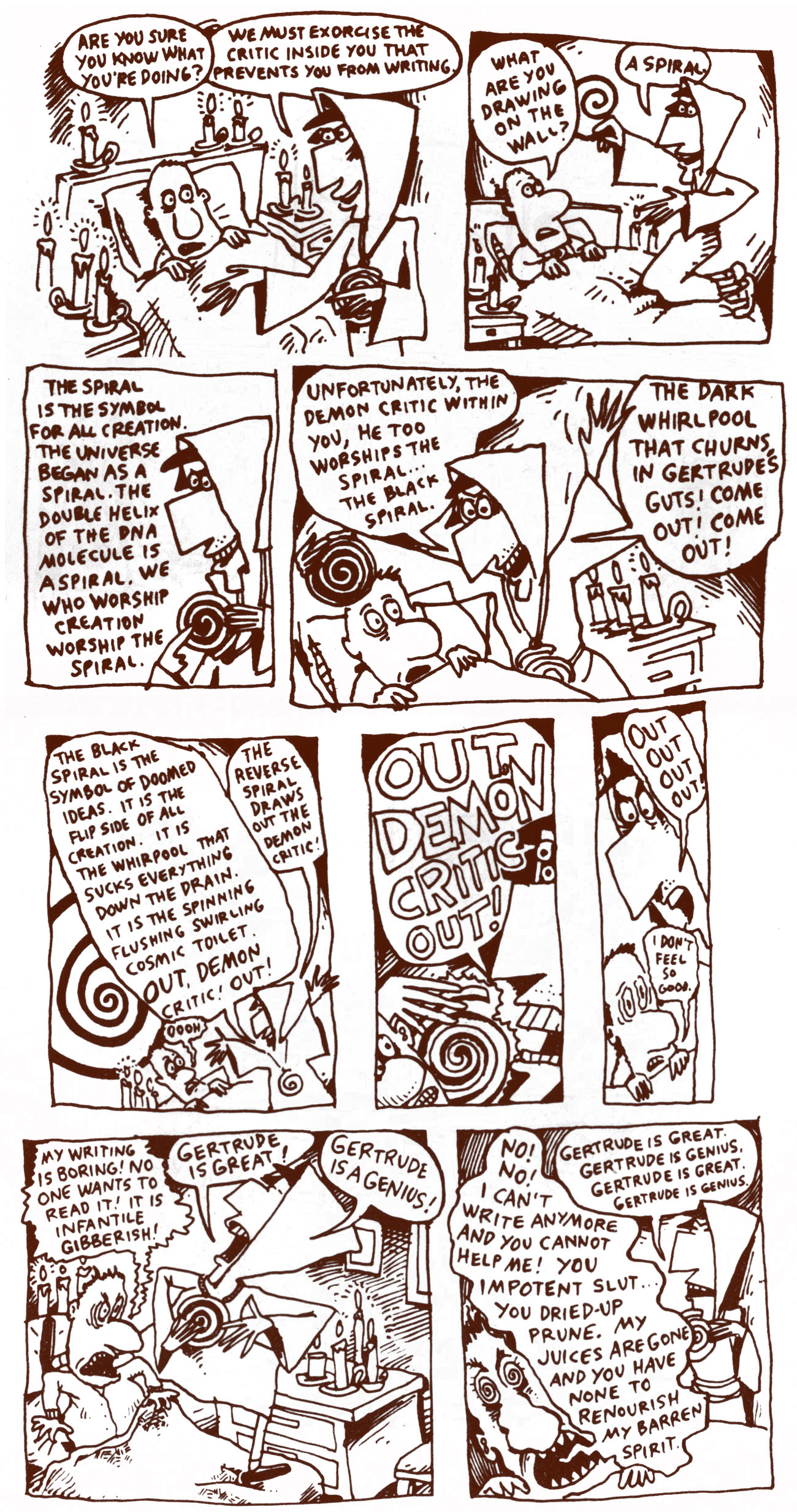
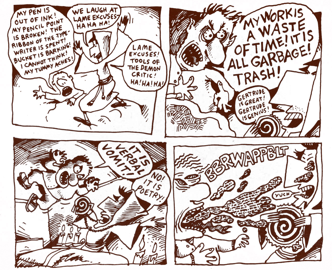
« Everybody thinks that this civilization has lasted a very long time but it really does take very few grandfathers’ granddaughters to take us back to the dark ages. » — Gertrude Stein
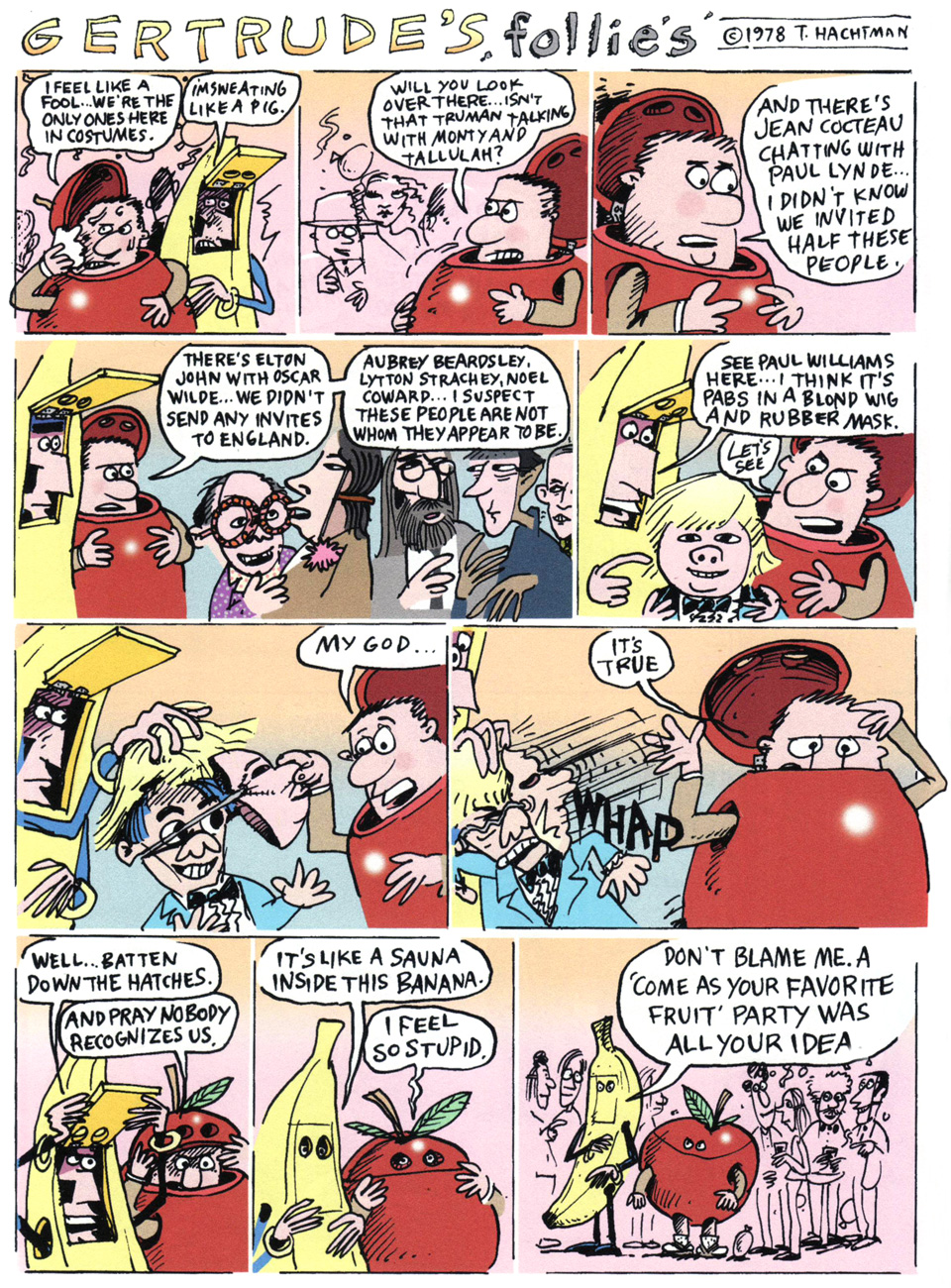
Several years ago, while browsing in the comics section of a rather lousy bookstore (by which I mean a book shop in which none of the employees know a thing about books, let alone are actual readers… I suspect that this is becoming more common, with predictable results), I stumbled upon an oddball item, a faded-looking, obscure comic strip collection lost amidst the monotonous stacks of DC ‘n’ Marvel superhero fare and the perennial dusty Garfield and Doonesbury paperbacks.
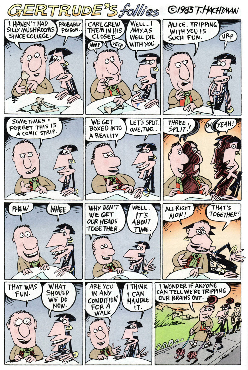
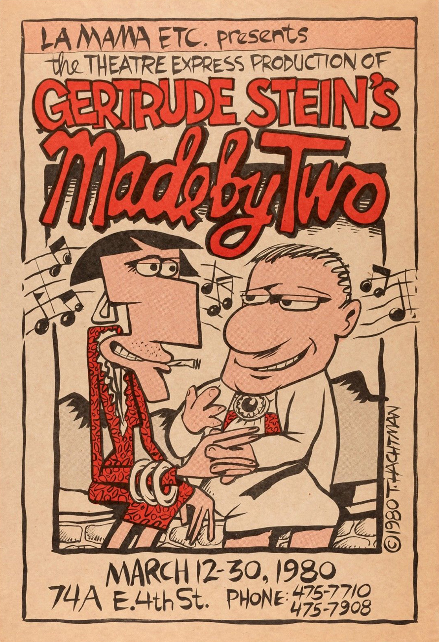
This was Fun City (1985), the second recueilof Tom Hachtman‘s newspaper strip Gertrude’s Follies, which at the peak of its circulation appeared in… well, one paper, but a good one, at least. That was the SoHo Weekly News (1973-82). After the weekly’s demise, a handful of episodes appeared in the fast-fading National Lampoon. Much, much later (which is to say currently) the strip lives on within the pages of American Bystander, an astonishingly well-staffed humour magazine. I smell doom.
Anyway, here’s Hachtman’s recollection of the strip’s genesis, from a 1980 interview conducted by Maxine Fisher for Funnyworld no. 22 (”The world of Animated Films and Comic Art”):
TH: I knew of them, but I didn’t know much about them. And then I saw a photograph of them [by none other than Man Ray] sitting in a room at the home on the rue de Fleurus in Paris. I looked at this famous lesbian couple sitting across from one another — so far apart– and I thought: ”Look at that! One of them is fat, and the other one’s skinny. That’s funny. They’re just like a comedy routine. I wonder if they had any fun.” It didn’t look like they were having any fun in that picture; they just looked like they were posing for a picture. But I thought: ”maybe they ran around and had lots of fun.” So I started drawing pictures of them, and drawing pictures of their friend Pabs, and looking at pictures of them, and looking at pictures of Picasso.
Anyway, I started drawing Gertrude and Alice and Pabs and Hemingway and putting them into situations in my sketchbook.
I knew if would make a nice comic strip in a newspaper. And that narrowed it down. Here was a comic strip about a lesbian couple and all their artist friends. There weren’t too many newspapers that were going to publish this. In fact, I thought, there’s only one. And I started to watch the SoHo News, wondering where it would fit. Where would they put this thing? Would they give me a whole page to do a comic strip?
More juicy details from another interview, this one conducted in 2018 by Martin Kozlowski:
MK: One of the unique features of the strip is the blending of Jazz Age Paris and Punk Rock New York. Was that a deliberate strategy or did it naturally evolve?
TH: I was living in NYC in the 1970s. I only know Paris from movies and books. That’s right; I have never been to Paris. So, when I draw a mailbox I am too lazy to research what a mailbox looks like in Jazz Age Paris. I just draw a mailbox as I know it. I have been told that my readers in Paris find this very amusing. So, the blending happens — naturally.
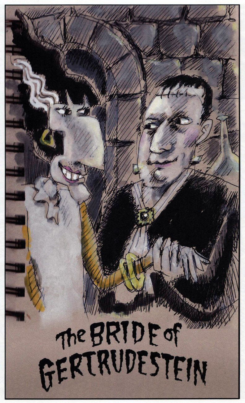
Oh, I’ll bet dear old Dr. Pretorius would be right chuffed with this Alice Bride. « To a new world of gods and monsters! », as the good doc famously exclaimed.
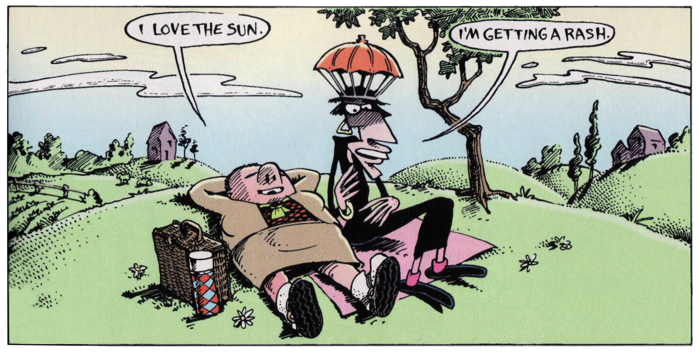
Our heroines in a more (or less) realistic vein. In the usual order: Gertrude, Bucket, Alice.
Despite, or perhaps because of the liberties he takes with these semi-sacred historical figures, Hachtman’s Gertrude appears to be rather beloved of the keepers of Gert and Alice’s mad flame. For example: « I look at the cover of the soon-to-be-reborn Follies several times a day and have a laugh each time. Too funny, Hemingway’s teeth, silly Picasso avec crayon, Basket’s slobbering excitement and Alice’s cigarette charm!! And Gert, yes sir, she is fierce!!! Rose flying like arrow ready to hit Alice’s nose. This can’t get any better! I hear the brooch ringing… Bravo! » –– Stein scholar Renate Stendahl
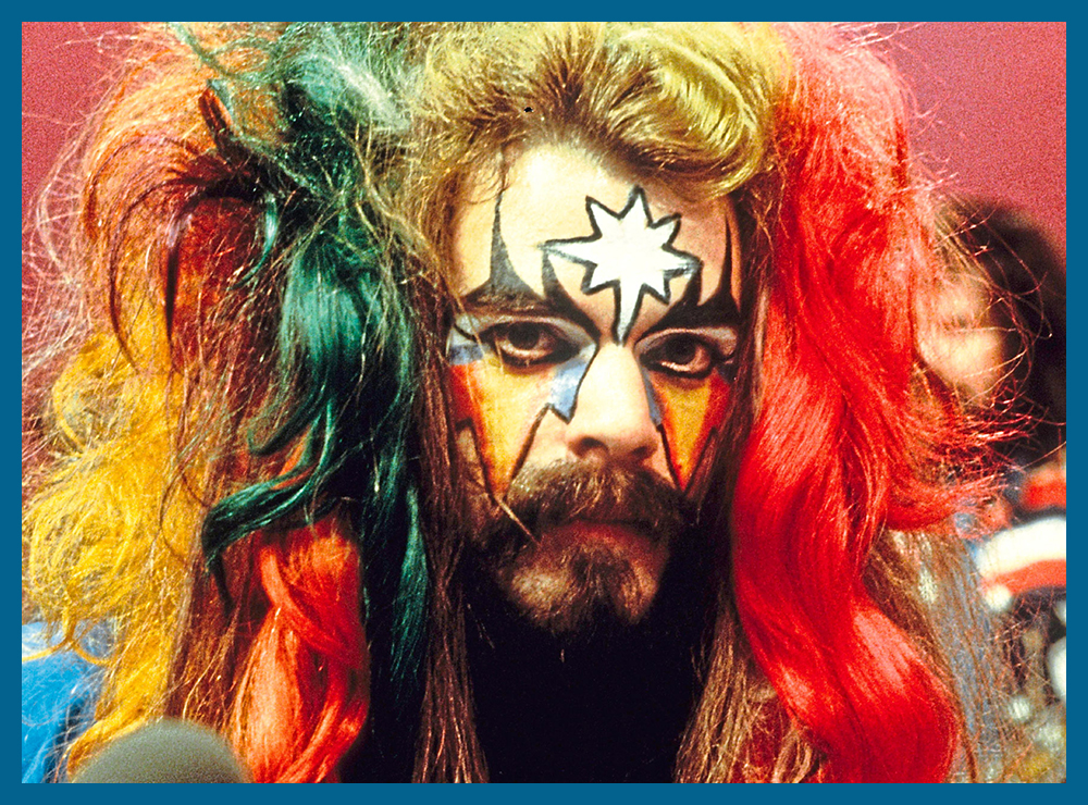
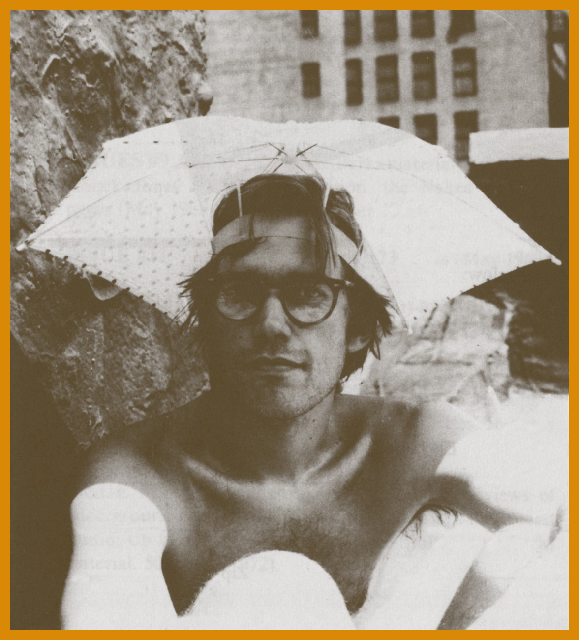
The auteur, circa the late 70s. Say, what’s that he’s sporting?
Un mini-parasol, une ombrelle. For shade, not protection from the rain. Hachtman was fond of road-testing some of the props employed by his players. Gives the strip that je ne sais quoi of authenticity, don’t you know.
If you like what you see, you may rejoice in the fact that Gertrude’s Follies has lately become more widely available (whilst retaining its elusive cachet) thanks to the efforts of Now What Media. Amble over to their website, where they provide a generous sampling of strips and biographical information, not to mention the possibility of acquiring the collections.