« Before the incalculable capacity of the Internet to answer nearly any question put to it while allowing a legion of pedants to hold forth without constraint, getting the facts of the matter took some effort. »
Weekly column ‘Why Things Are‘ ran in The Washington Post from 1990 to 1996. During these diverting (at least as far as the common topic is concerned) years, WOT favourite cartoonist Richard Thompson tackled such various brain bafflers as ‘what does the inside of your nose smell like?’ or ‘why does overdrinking cause a hangover?’ These, at any rate, were the questions posed by Joel Achenbach, staff writer for TWP, questions from which Thompson bounced into sometimes altogether unexpected directions. « The column was fundamentally zany », explains Achenbach in the introduction to the collection of Why Things Are, «though larded with real information and interviews. Richard, it turns out, had crammed his brain over the decades with all manner of esoteric information. The cartoons sang – and sing to this day – with the perfect pitch if the slightly demented intellectual. » There are few things closer to my heart than a non-sequitur with a pedantic bent!
Here is a selection of cartoons from the aforementioned collection, published in 2017 by Picture This Press. While these illustrations need no further accompaniment, the questions submitted to (or by) Achenbach are included under each image. Enjoy!
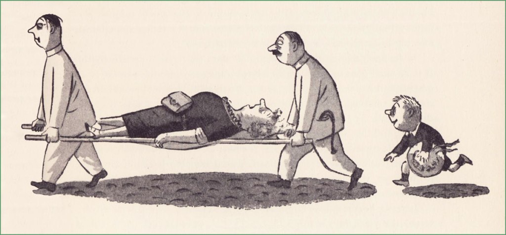
Why do sexual turn-ons vary so greatly from person to person? Undated (circa 1990-1992).
Why is some cholesterol good for you? Undated (circa 1990-1992). The cholesterol chap looks Klibanesque if not in line, then in spirit.
Why do beer companies brag that their products are ‘cold-filtered’ or ‘beechwood-aged’ or ‘drybrewed’ or ‘genuine draft’ even though no one knows what these terms mean? October 31st, 1993. Given the influx of shitty ‘artisanal’ beer produced by huge companies, I think modern society really needs an official term like ‘Pabst-smeared’.
Why do some people think watching birds is fascinating? February 6th, 1994. When one hits thirty, one is supposed to acquire a set of hobbies only appropriate for people who have suddenly waded into the category of ‘vaguely old’ – gardening, knitting, and, yes, bird watching. I plead guilty to all three.
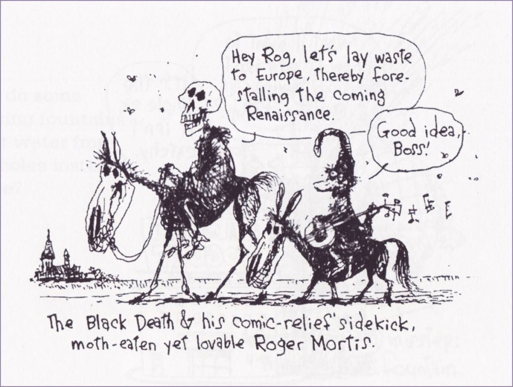
Why didn’t the Black Death kill everyone in Europe in the fourteenth century, rather than just a third of the population? Undated (circa 1990-1992). I couldn’t resist the adorable Roger Mortis.
Why is rain sometimes dreary and depressing, and other times wonderfully romantic? April 18th, 1993.
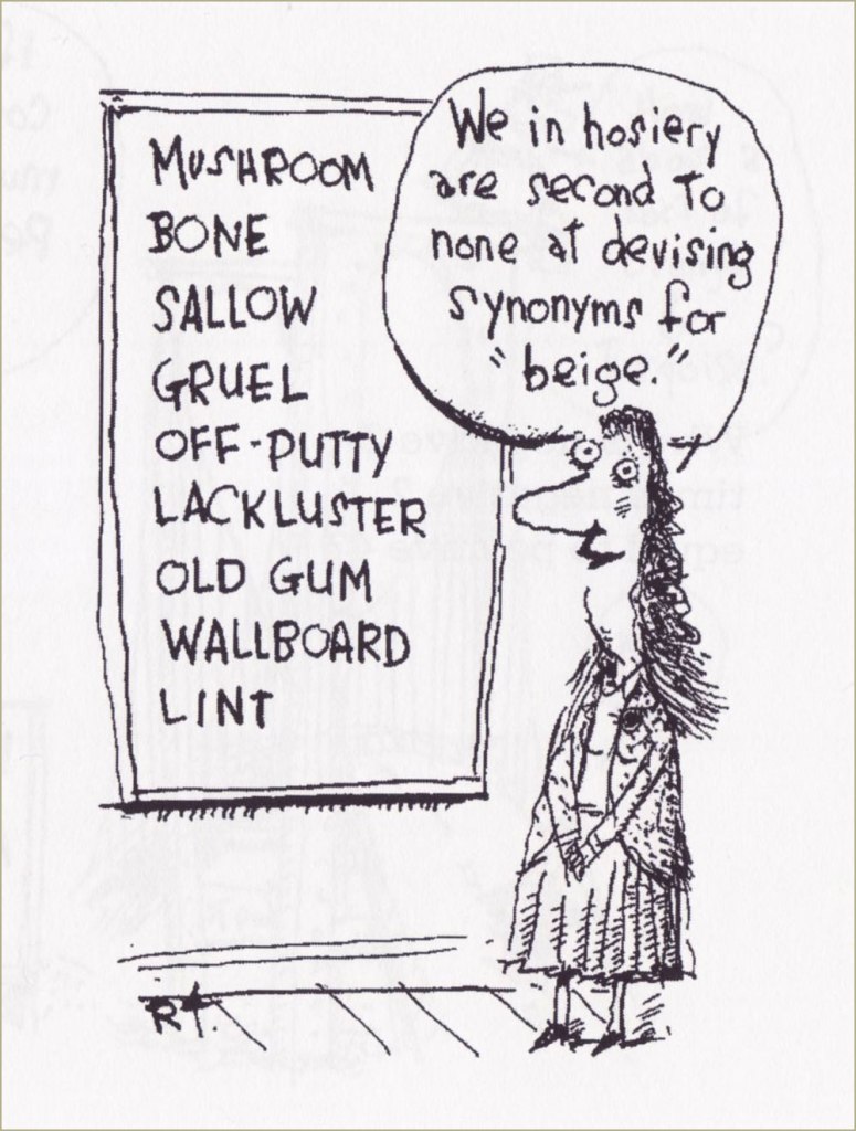
Why can’t they invent pantyhose that don’t run? May 30th, 1993. I recently stumbled across a ‘new’ colour, ‘greige’, a beautiful amalgamate of grey and beige. In a world where several shades of grey are on offer for items from radios to cars (battleship grey, steel grey, stormy grey…), I am not sure we needed this particular variation. As for rip-free tights, they do exist, but you pretty much have to sell one of your kidneys to get your hands on a pair.
Why did people once upon a time believe in vampires? Undated (circa 1990-1992). This guy reminds me both of our last company-wide meeting with an uplifting speech from the CEO and, in more pleasant associations, of Daniel Pinkwater‘s Vampires of Blinsh (illustrated by Aaron Renier).
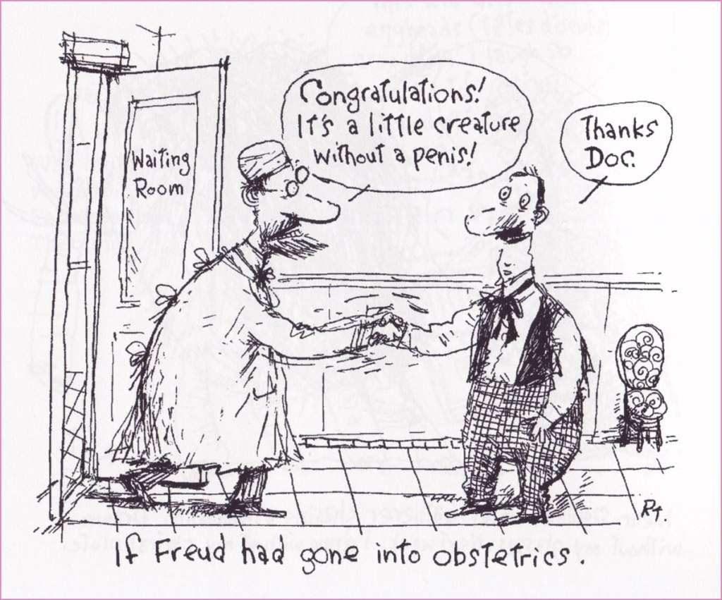
Why did Freud think women suffer from ‘penis envy’ when that is obviously absurd? January 16th, 1994. Well, that’s easy…
Why do owls seem to turn their heads 180 degrees without turning their bodies? August 1994. A lot of owls can actually turn their heads 270 degrees!
Why do the ‘f’ and the ‘s’ and the ‘p’ and the ‘t’ sound so similar over the phone? February 26th, 1995.
December 4th, 1994. If you’re not yet aware of the great and deliberate lemming fraud, just read this… or go jump off a cliff.
Why does hot water freeze faster than cold water in an ice-cube tray placed in the freezer? April 9th, 1995. Tax season is fast approaching – have you prepared your family-size package of prosciutto?!
« Addams’ idea of a bracing day’s outing is to visit an insane asylum. He takes a kind and friendly interest in the inmates and will chat with them unselfconsciously by the hour. “They have a refreshing conversational approach,” he says. » — John Kobler
For this, the penultimate entry in this year’s Hallowe’en, I’ve reached for one of the most prized items in my collection: a book I apparently picked up for 10 dollars in the 1990s… it’s a bit hazy. It was originally given to (or by) one ‘Sadleir’ on December 25, 1950.
Coming upon the tome while browsing the general humour section, I vaguely recall being intrigued by its title, ‘Afternoon in the Attic’, and upon realising that it was illustrated by Charles Addams, the deal was sealed.
Since most of you won’t make it past the paywall, here’s part of the author’s New York Times obituary:
« John Kobler, a writer whose early days on the crime beat resounded in an enduring biography of Al Capone, died on Monday in Manhattan. He was 90.
He was born in Mount Vernon, N.Y., and was a 1931 graduate of Williams College. He worked for various news organizations as a reporter before editing the crime reportage of PM, a 1940’s New York tabloid.
In World War II he was a civilian intelligence officer posted to North Africa, Italy and France, where he was attached to the United States Embassy. He returned to freelance for The New Yorker, Colliers, Vanity Fair and The Saturday Evening Post. His first book, published in 1938, was ”The Trial of Ruth Snyder and Judd Gray.’‘ It interwove trial testimony with commentary about a notorious 1927 murder case. ”Some Like It Gory” (1940) and ”Afternoon in the Attic” (1950) were collected essays about bizarre crimes and creepy characters. ”Afternoon’‘ was illustrated by Charles Addams.
He was best known for ”Capone: The Life and World of Al Capone,” a biography published in 1971 and reissued most recently in 1992 by Da Capo Press. It remains in print, as does ”Ardent Spirits: The Rise and Fall of Prohibition” (Da Capo, 1993).
He also wrote biographies about Henry Luce (1968), John Barrymore (1977) and Otto Kahn (1989), the banker and arts patron. His favorite among them was ”The Reluctant Surgeon: A Biography of John Hunter’‘ (1960), the 18th-century Scottish anatomist and precursor of modern surgery (1960). » [ source ]
My copy had already shed its dust jacket by the time it came into my possession, but the cover image was also used as a frontispiece.While Kobler provides what’s likely the definitive biographical essay on Charles Addams (at 10 1/2 pages), Addams, in return, gives us this picture presumably worth the proverbial thousand words.
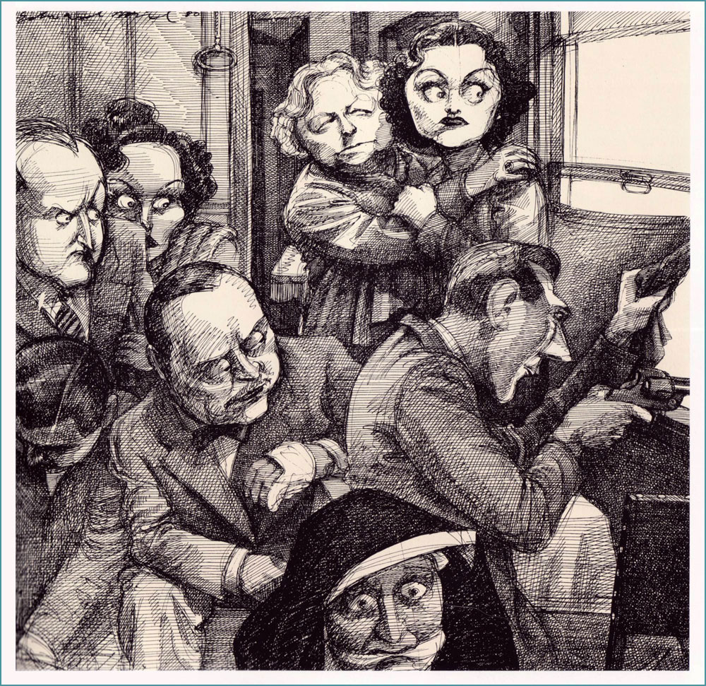
For this post, I’ll stick to a single essay, the one entitled « Next Week: Murder in a Madhouse ».
The introductory illustration…« Satisfied customers », quips the caption.
« The seats in front of me were occupied by an American family — father, mother, two girls and a small boy. “I just can’t bear it,” mother was saying, “I just won’t look.” The girls were chewing their programs which bore the Grand Gignol trade mark – a bat with a man’s head. The small boy, who I felt sure was a connoisseur of American comics, sat unruffled and superior. “Kid stuff,” he snarled. “Quiet!” said father, who seemed uncertain what his proper attitude ought to be. “The curtain’s going up.”
The climax bursts with all the restraint of a fire alarm. While Hunchback and Normandy Woman pinion Louise’s arms, One-Eye goes after the cuckoo bird with a knitting needle. Blood splashes all over everybody. (“Heavens!” mother gasped, forgetting not to look.) Louise’s screams shiver the scenery.
But a super climax is yet to come. Hunchback and Normandy Woman, suddenly fearful of what they have done, turn on One-Eye and force her face down upon a hot stove where it sizzles in a jet of smoke and flame like a barbecued mutton chop…
That was enough for father. He herded his family through the exit amid the shrill protests of the small boy who did not want to miss the rest of the program. What he missed included a maniac who disembowels small boys, a woman who gets shot in the head by a gangster and, sandwiched between for comic relief, a bedroom farce with lines never intended for little pitchers to hear, all of it staged with determined realism. »
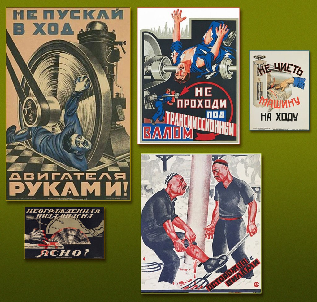
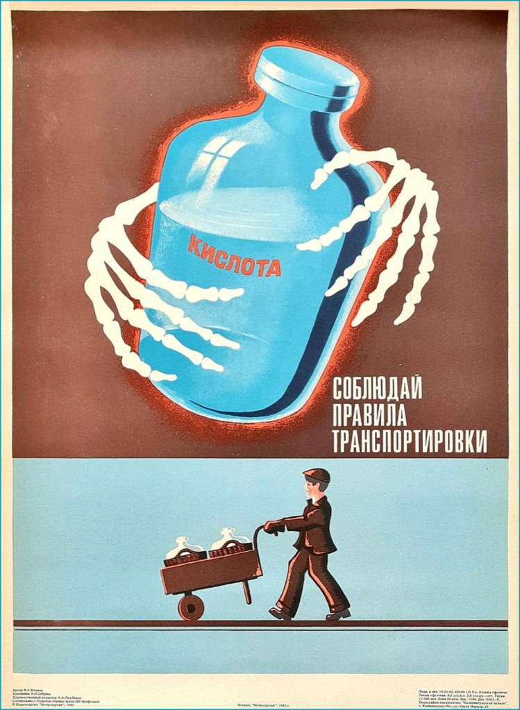
Look, some vintage horror movie posters! Or are they really?
Nope, they’re just posters reminding factory workers of some basic precautionary measures when working with all sorts of heavy equipment.
‘Don’t launch the motor using your hands‘ – ‘Don’t clean the machine while it’s on‘ – ‘An unprotected saw is dangerous – all clear?‘ – ‘Careful with the pitchfork‘
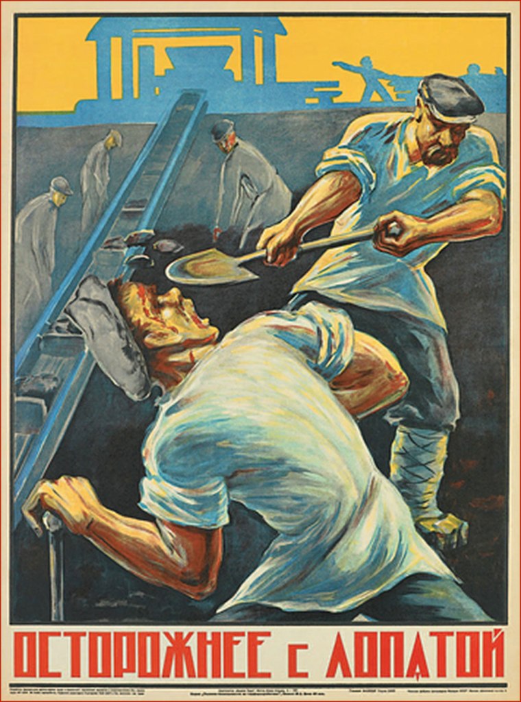
These images are undeniably striking, featuring bold fonts and surprisingly graphic imagery sending one’s imagination into the unpleasantly tactile land of torn appendages and squirting blood. Produced in the early-to-mid 20th century, these were meant to bring home a specific message* during dark times when safety measures were sorely lacking and working personnel was mostly illiterate. Unfortunately, it’s rather difficult to find these posters in decent condition, so today’s selection was somewhat dictated by what could be located online. This leaves out, alas, a couple of particularly gory examples. Still, I think you’ll agree that these fit a Hallowe’en count-down in graphics, if not necessarily in spirit!
*Something that goes like ‘don’t stick your body parts into the machine‘ is a good beginning.
‘Beware of railway couplings‘ – the distorted face of the victim expresses the grotesque horror of a saint being impaled by a devil. These posters must have been a great opportunity for artists to try out different styles in the restrictive atmosphere of the early Soviet union.
‘I was drunk in the workplace!‘
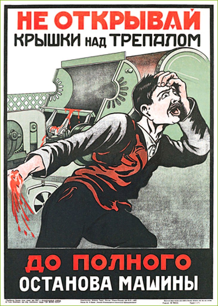
‘Don’t open the lid of the brake before the machine stops completely‘
‘People working above – don’t stand under the scaffolding‘… unless getting your skull smashed by a wrench seems like fun, that is.
‘Don’t leave anything unsecured on the scaffolding‘
‘Mind the wheels! In 1925, 200 people were injured under tramways.‘
‘Acid – follow the rules for its transport‘
The USSR was not the only country to resort to such candidly illustrated images in an effort to improve safety (let’s face it, a worker with fingers missing is no longer a good worker) – for example, Holland seemed to have its share of posters of chopped off fingers and electrocution.
« Epitaph: a memorial that usually lies about the one below. » — Unknown
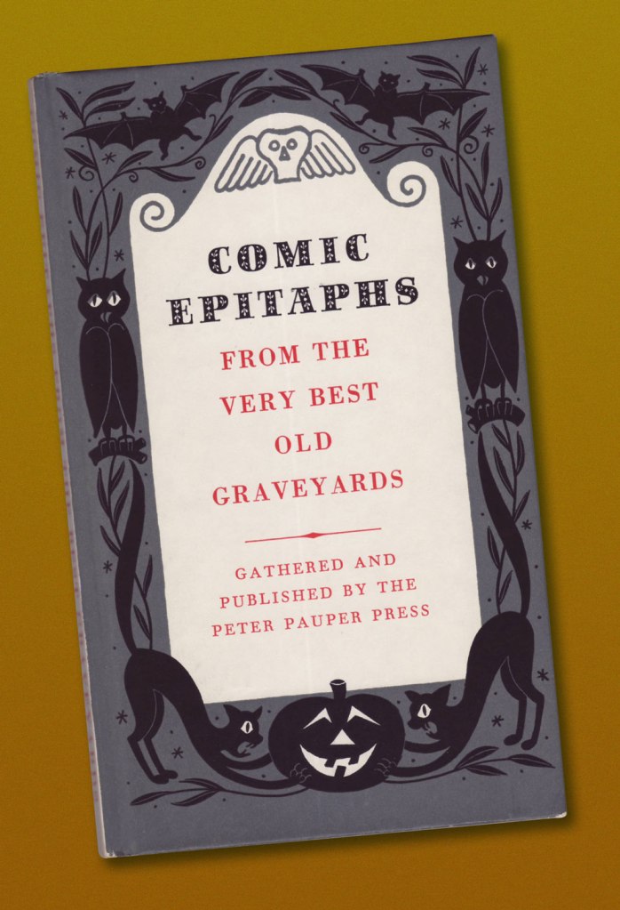
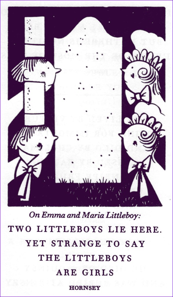
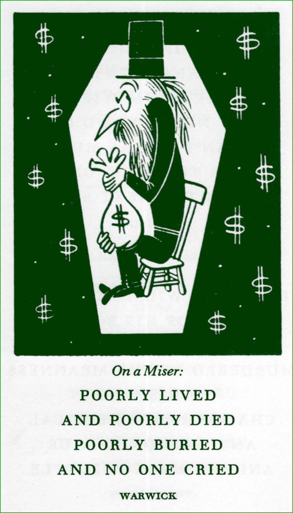
Ah, those lovely Peter Pauper Press books! They once were far easier to find*, but time marches on. This one’s a lightly macabre old favourite from 1957, wryly illustrated by long-time New Yorker cartoonist Henry R. Martin.
It is prefaced with this caveat: « The following collection of gravestone inscriptions is hardly a serious historical one. Most of the items are genuine, but many are suspect, and a few are frankly contrived. In some cases genuine inscriptions have been somewhat altered, and the place names are not reliable. Scholars are therefore warned not to find fault; but all men — and also any women who choose — are invited to read further for a little ghoulish amusement. »
-RG
*confirmed — anecdotally, I’ll grant you — by a visit, yesterday, to Maine’s spectacular Big Chicken Barn, where I didn’t stumble onto a single solitary PPP title.
« They wanted me to do something that would be absolutely horrific, and so I was thinking silly monsters and putting all kinds of political twists on it. Then I began thinking, what is really, really scary and hasn’t been faced? I thought of being a kid. » — Gahan Wilson
Gahan Wilson (1930-2019), who else? I’ll gladly confess that it’s always a bit daunting to pick the opening and closing salvos of a countdown… especially the opener.
I’m fairly confident there’ll be no controversy as to my decision to bestow the inaugural spot to one of Mr. Gahan Wilson’s creations.
After all, Gahan was truly one (along with colleagues Addams and Gorey, to name but an obvious pair) of those gnarly souls — bless and/or curse them all — who made each day Hallowe’en… in the finest way.
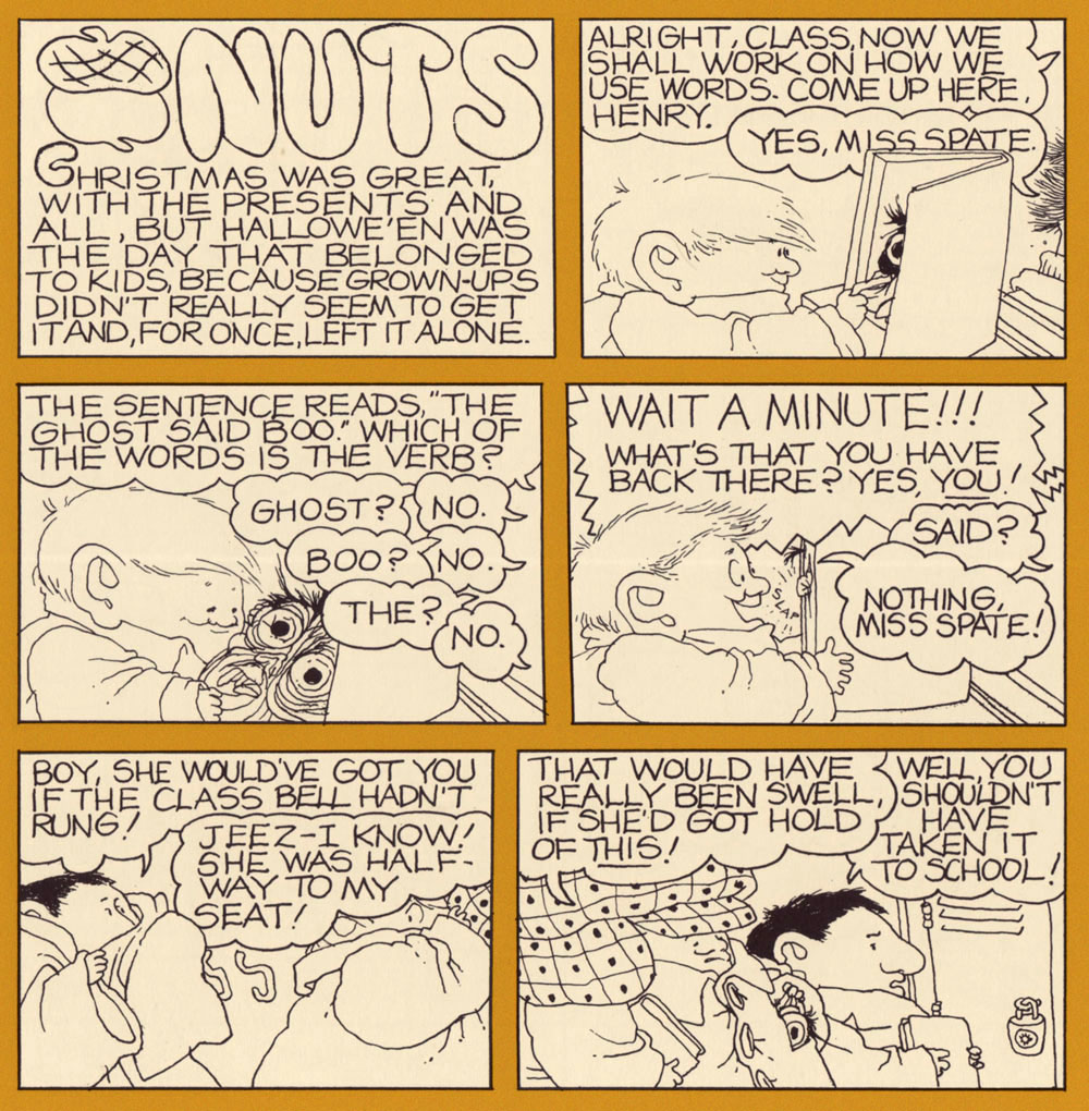
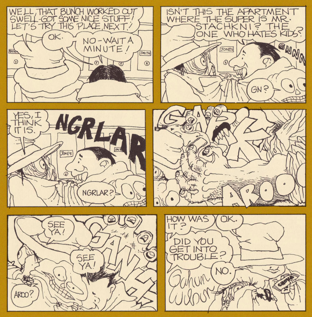
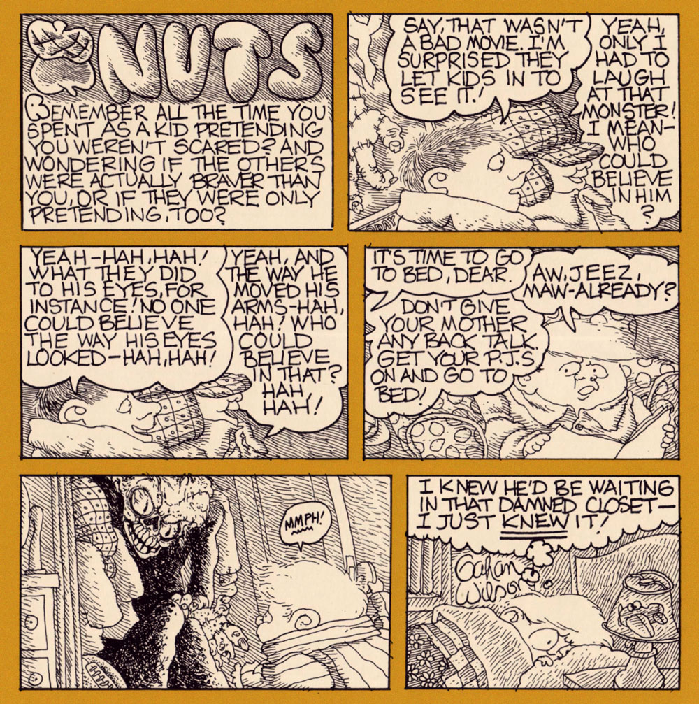
« Remember how confusing it was, being a little kid? Remember trying to make sense of the weird rules grownups always made you follow, and how you always guessed wrong and which ones they’d figure were really important?Remember how small you were and how brave you had to be to get through it all? »
Oh, what the heck. Here’s a bonus strip, still a perfect fit for the occasion:
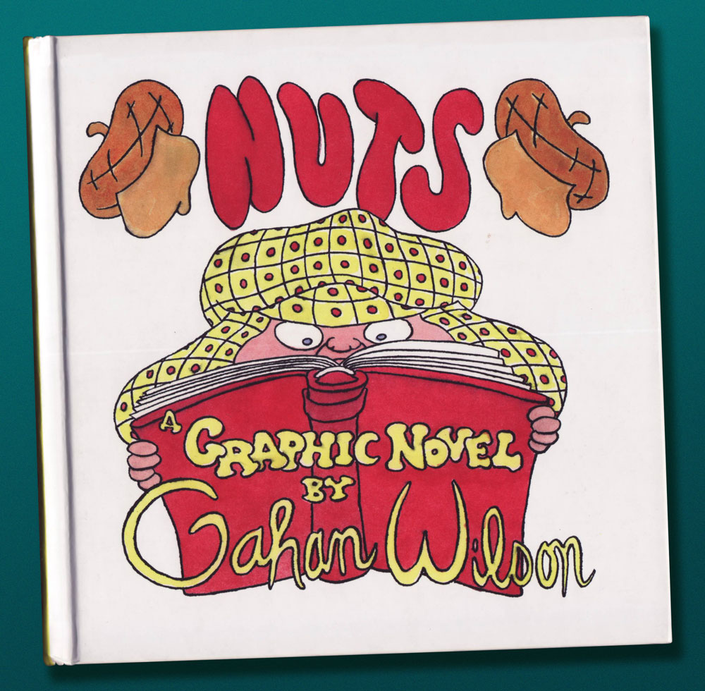
Incidentally, for those entirely unfamiliar with it, Nuts was Mr. Wilson’s first sequential strip, and it was published in the pages of The National Lampoon between 1972 and 1986.
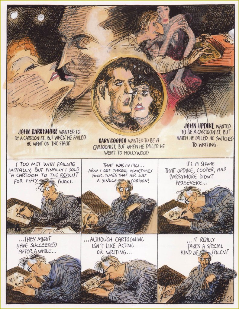
« If you take drawing seriously, you never quite feel you’ve arrived. » — Ed Sorel
This time out, I’m pinch-hitting for my co-admin ds, who’s burning the midnight oil these days.
Just about a month ago, when I wrote a piece about Seymour Chwast (b. Aug. 18, 1931), it occurred to me that I should also devote post-haste (just in case) some column space to his fellow surviving Push Pin Studios co-founder, Edward Sorel (b. March 26, 1929). Let us celebrate the living while we can. The dead don’t appreciate nearly as well such gestures .
Opting for a freelancing career, Sorel left Push Pin, just a few years after its founding. He made it, all right, becoming one of the greatest caricaturists of the century. But he was every bit as accomplished a writer, which elevates his work above the ‘merely’ visual.
I’ve always been blown away by how deceptively easy he makes it all look, and that’s what’s so impressive: very loose on the surface, but with an underlying, laser-sharp precision. I could easily go on at some length, but Sorel’s career and art are well-documented themes. Check out, for instance, The Enigmatic Edward Sorel(From The Comics Journal), or this fine New York Times review of his recent memoir (circa 2021), Profusely Illustrated.
And now, some of the man’s work:
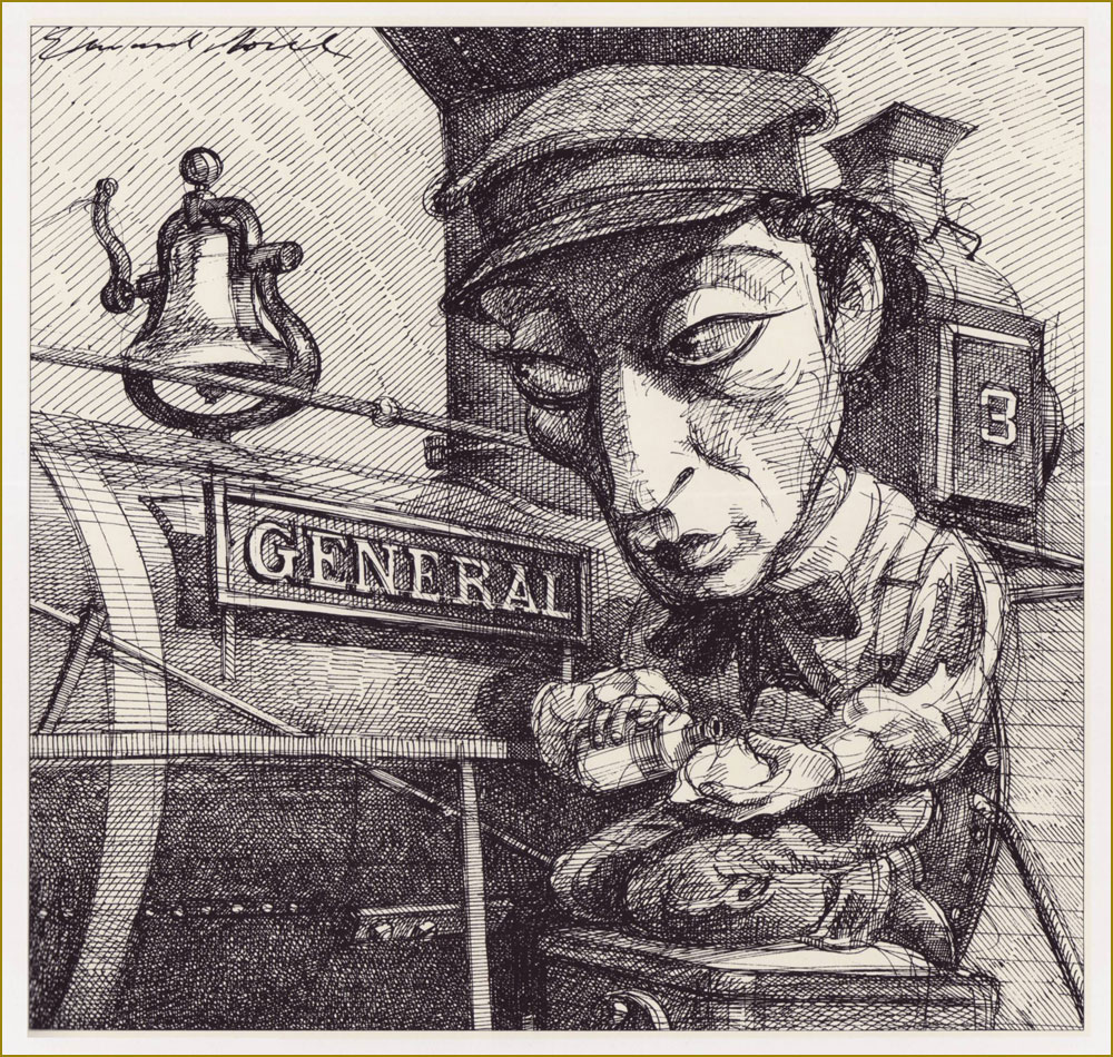
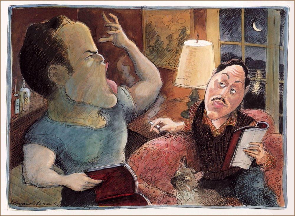
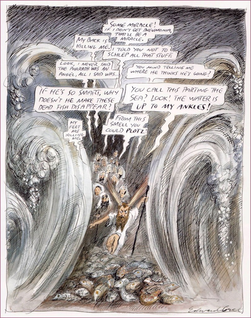
« My long association with Penthouse was unique. They bought every idea I submitted to them, and never changed anything except my spelling. This solipsistic strip appeared in 1990. »He can draw *anything*! This one appeared as The New Yorker‘s Jan. 31, 1994 cover illustration.I suppose every cinephile has his favourite Hitchcock film; mine’s The Lady Vanishes (1938). An entry in Sorel’s “Movie Classics” series, published in the March, 1981 issue of Esquire. « The General, starring Buster Keaton, is the only silent movie I included in my “Movie Classics” series. Based on an actual incident in the Civil War, it often has the look of a Mathew Brady photograph. » From Esquire, Dec. 1980.« Tenor Enrico Caruso is a guest at the St. Francis Hotel when the 1906 earthquake hits San Francisco. He vows *never* to return to a city “where things like this are permitted”. From Sorel’s pictorial essay “Keyhole History” (GQ, Oct. 1984).More rollicking blasphemy for Penthouse (Dec., 1992). Ah, yes. « The 1973 Academy Awards are remembered for Marlon Brando’s refusal to accept his Oscar for The Godfather. His emissary, Apache tribe member Sacheen Littlefeather, explained that Brando’s rejection of the award was to protest Hollywood’s depiction of Native Americans. Backstage, John Wayne was apoplectic. As John Lahr wrote in his article “The Birth of the Oscar“, “The Duke, who had dispatched many an Apache on film, didn’t take kindly to Brando’s protest… Wayne had to be restrained by six men from yanking Littlefeather off the stage.” From The New Yorker, March. 21, 1994. And speaking of Brando… « Marlon Brando is sent up to Cape Cod to read the part of Stanley Kowalski in A Streetcar Named Desire for Tennessee Williams‘ approval. First he fixes the nonfunctioning electricity and plumbing, then he auditions. His performance was stellar in every role. From Sorel’s “First Encounters” series, this entry appeared in Atlantic Monthly‘s July, 1994 issue. Note the kitty’s rapt expression.« Exodus revisited: an educated guess as to what Moses endured as he led his people through the Red Sea. A cartoon for Penthouse, the only mass-circulation magazine to welcome my blasphemy. » Penthouse (like the man said), Apr. 1995. Oh, and Plotz: To burst from strong emotion; often used humorously to express minor shock or disappointment (פּלאַצן, platsn, ‘crack’; cf. German: platzen;) and Schlep: To drag or haul (an object); to walk, esp. to make a tedious journey (שלעפּן, shlepn; cf. German: schleppen;).« Another of my egocentric ramblings, this one a rationalization for not becoming a great artist. » It appeared in the Aug. 21/28 issue of The Nation.« How Was I Supposed to Know? », from The Nation, Sept. 24, 1990. Oh, the sequels just write themselves.Here’s a rather famous one: « Back in the mid-sixties, my friend George Lois had an idea for an Esquire cover that couldn’t be done with photography. He asked me to do it, and I panicked — i.e. I tightened up. When I handed him my finish, he rolled his eyes and said he’d give me until the next morning to do it over. I went beyond panic, but nevertheless did a drawing we were both happy with. » It appeared on the cover of Esquire’s April, 1966 issue, with the caption of “The problems of power for Frank Sinatra”.« Director Michael Blakemore, at a rehearsal of Woody Allen’s one-act contribution to Death Defying Acts, watches in horror as Allen scribbles copious stage directions for him to execute. (Caricaturing Woody Allen is so easy that after drawing him, many an amateur comes to think of himself as a pro.) » From The New Yorker, June 3, 1996. Look at that pen move!
« The world of matis virtually inaccessible to foreigners studying Russian. It is too situational and semantically capricious, too dependent on ludic intonational subtleties. Mat is linguistic theatre, verbal performance art. It exploits the Russian language’s flexible range of suffixes and prefixes, and toys with phonetically similar words from the standard lexicon in order to generate anthropomorphic images. »
Invariably people ardently desire to learn bad words when encountering an immigrant who speaks a language they do not*. While one could surely write an essay arguing that the type of words used as expletives reveals something about the soul of the people in question (as a minimum, it’s a quick way to check what is considered more scandalous in that culture – genitals or religious terminology?), the allure of being able to say ‘fuck’ or whatever when it’s the only thing you can say in that language escapes me.
Idiomatic curses are another kettle of fish, a fascinating topic. Being the bearer of a language, one doesn’t often pause to think how weird a lot of sayings would sound to foreign ears. Russian cursing is quite popular in non-Slavic circles (see Elizabeth Olsen swearing at Conan in Russian on TBS…**), and its basic components are very straightforward (assorted body parts). However, there is considerable artistry involved in combining these blocks and spinning them into a scathing sentence that will inflict proper psychological damage to the target. This could be said about many cultures indeed, but I can confirm that the Slavs cherish their curse slang and go about using it with tender love and great gusto.
Journalist Elmira Kuznetsova and Canadian cartoonist and animator Jess Pollard have undertaken the charming task of (literally) translating and illustrating some choice Russian curses. I’ll quote from an article about this project:
« Jess is learning Russian and one night I was trying to translate to her the Russian curse “На хую я вертел.” The phrase translates as “I don’t care” but the literal meaning is “I spun it on my dick”. Just for laughs, Jess drew a sketch depicting random things being spun on male genitalia. We laughed so hard both at the image and at the absurdity of the literal translation, we decided to make more illustrations. This turned into a comic magazine that we called “An Illustrated Treasury of Russian Curses” that was printed in a batch of 50 copies and sold to our friends. »
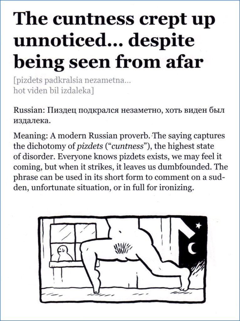
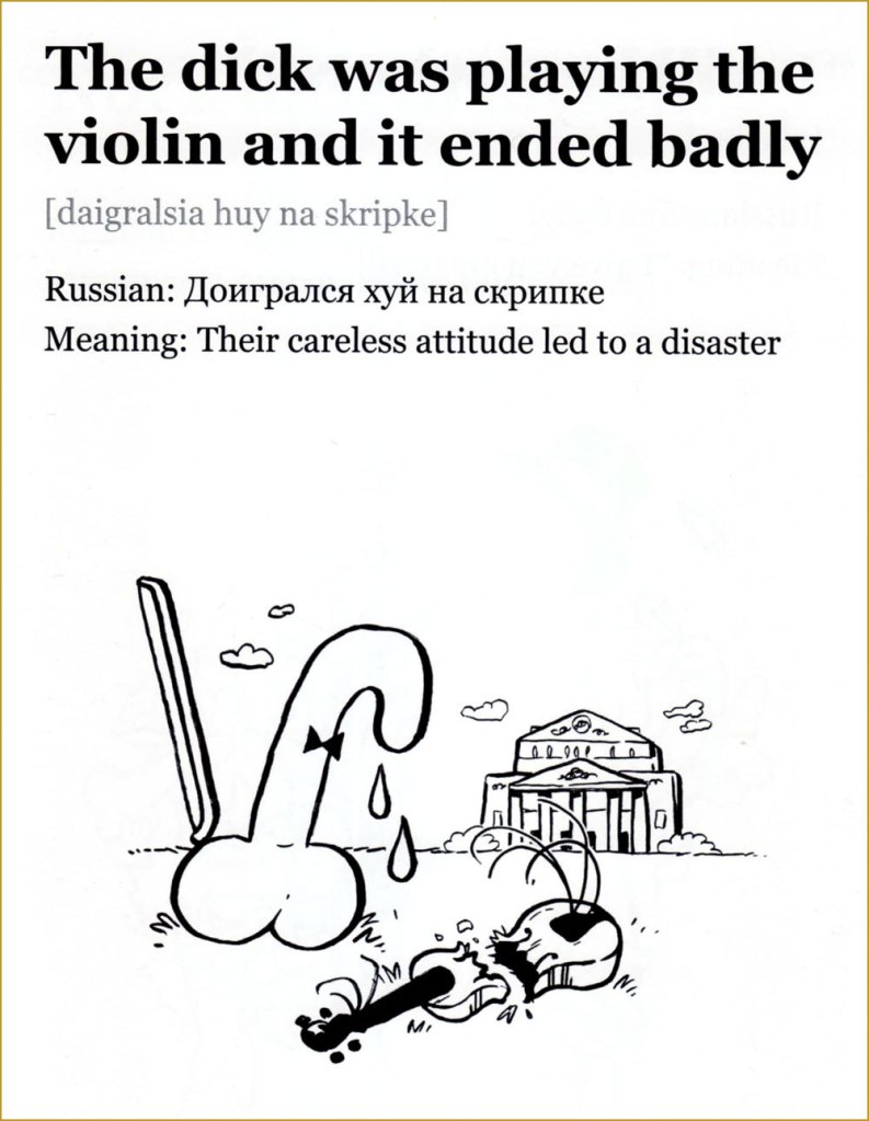
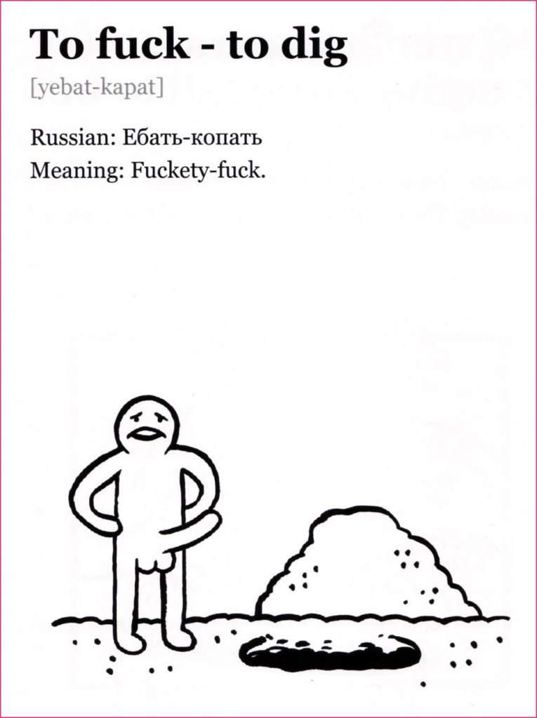
Please consider the following as a sampler of A Treasury of Russian Curses (A selection of curses for community building, successful business, and ideal first dates) — I selected a few favourites from volumes I, II and III. Follow this project’s Instagram account, and support a cool idea by buying printed copies or PDFs over at Pollard’s website.
I’d like to point out that the word ‘dick’ selected for these translations doesn’t carry even half the clout of the Russian equivalent, which is one of the Really Bad Words, with arguably more punch than ‘fuck’. The non seven-armed eight-dicked person looks genuinely horrified.
This is a downright poetic and melancholic mental image. Poor little dick.
Co-admin RG rightly pointed out that the bird illustrated resembles a swallow far more than a sparrow.
You will not be surprised to learn that this rhymes in Russian. This scene (complete with Pollard’s favourite smoking raven/crow that appears on the cover of every collection, as well as on her website) is very Slavic indeed, evoking folklore in which a bogatyrmust choose which path to follow at crossroads (also note the typical helmet).
More like surfing — and infinitely more stylish, wouldn’t you say?
I give the highest recommendation to The unique power of Russia’s underground language, written by Victor Evrofeyev and published in The New Yorker (a beautifully translated version by Andrew Bromfield) on September 15, 2003. This post’s introductory paragraph is from it, but here are a few more quotes to whet your appetite:
«When I think of mat, I think of the monstrous energy field of that planet. Mat is a protean language in which archaic strata mix with modernity. It has a unique ability to break free of its erotic context and to characterize universal human feelings and conditions, to express admiration and contempt, ecstasy and catastrophe. »
« Although it retains its sense of blasphemy, mat, in its original form, was also a language of peasant revelry and the liberation of the flesh. In traditional folk culture, women sang obscene ditties as a challenge to their husbands or an invitation to their suitors. Pushkin’s bawdy early poem « Tsar Nikita and His Forty Daughters » describes a culture that has lost the cunt, or, rather, forty cunts: the Tsar dispatches his heralds in search of them and after arduous ordeals they are recovered. »
~ ds
* Life is full of such little repetitive ‘pleasures’, like having to tolerate jokes about magic mushrooms whenever talking about about how one likes to go mushroom picking…
** Why they’re both amused that a reference to the ‘female region’ can be used as a bad word in Russian is puzzling, as English easily offers ‘cunt’ as an equivalent.
Not long ago, I chanced upon this passage from an interview with the lovely Ramona Fradon, wherein she touches upon her mid-70s work for Joe Orlando‘s ‘mystery’ comics at DC.
« Those were all Joe’s productions, and there was nothing he liked better than to get around the Comics Code. The fact that my drawing was comic helped him get away with more than he could with other artists. He was always pushing the envelope. »
To understand what she means, I refer you to this particular story, which I showcased last fall.
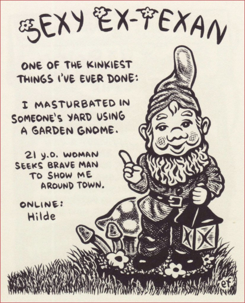
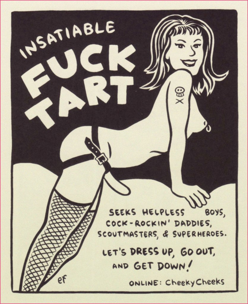
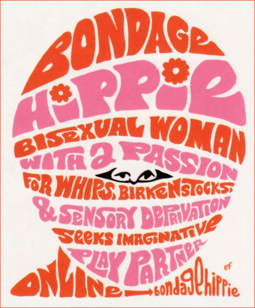
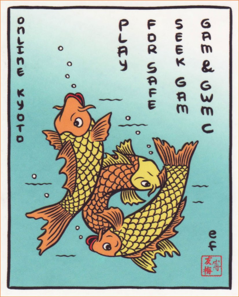
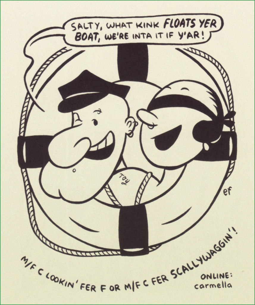
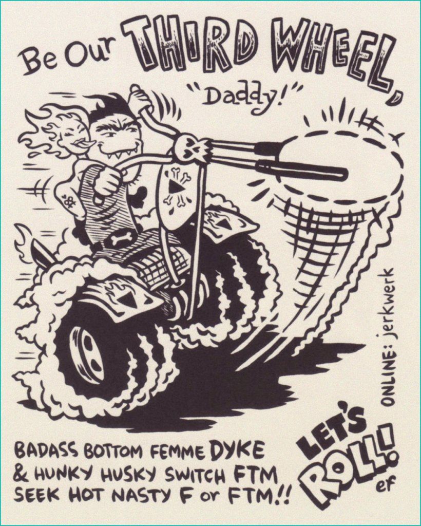
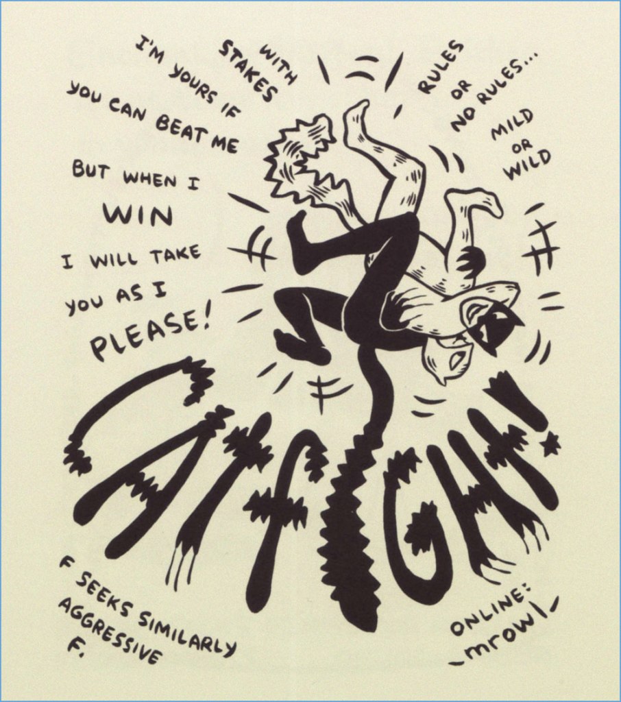
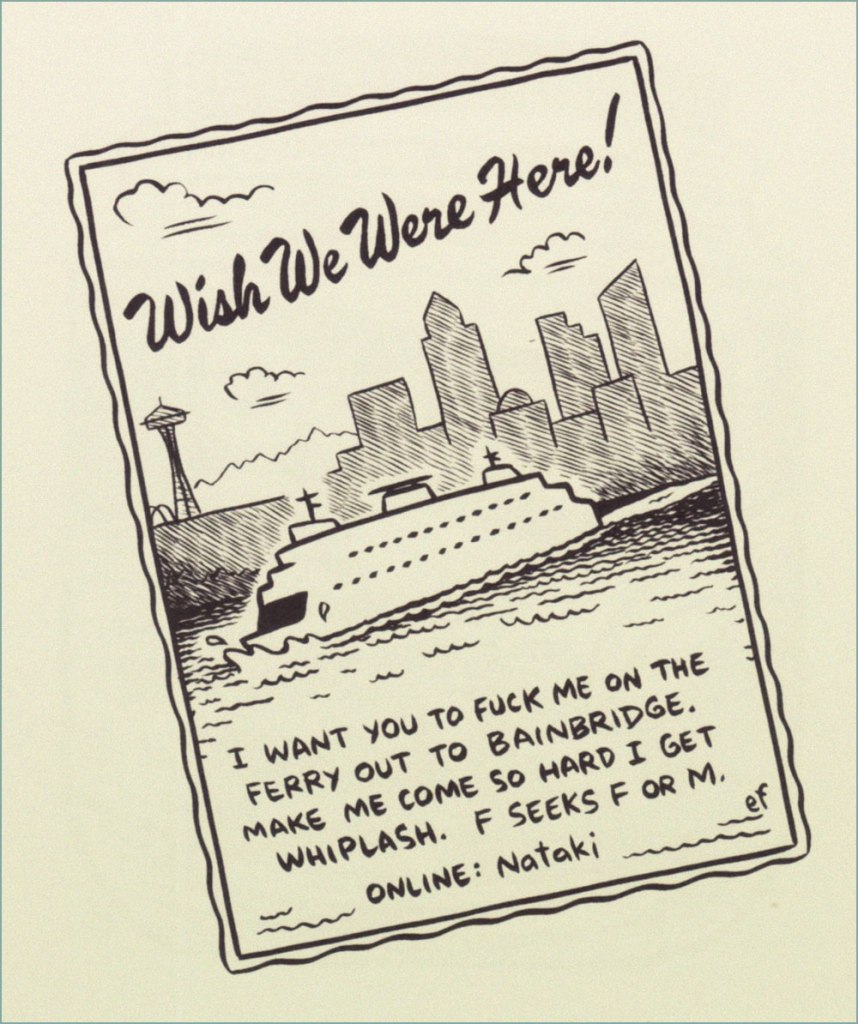
« So when we decided to start running a weekly illustrated personal ad — ‘Lustlab Ad of the Week’ — we knew right away what we didn’t want. We didn’t want to sensationalize what was already pretty sensational, thanks. And we didn’t want to hyper-sexualize what was already plenty sexual. We wanted an artist who could take short, pithy personal ads — short, pithy, filthy personal ads — and infuse them with the kind of playfulness that true kinksters bring to their sex lives. We wanted someone that could make someone into whips and chains and hoods look like someone you could take home to meet your parents.
We wanted Ellen Forney. »
Just like Ramona Fradon, Ms. Forney wields a friendly, extremely engaging and accessible style (as you’ll witness). Here, then, is a modest sampling from the four-year frolic of the ‘Lustlab Ad of the Week’, circa 2004-2007. Feel free to browse.
The feature’s highlights have been collected, in fine fashion, in a snazzy little hardcover entitled ‘Lust‘. (Feb. 2008, Fantagraphics). While it’s out of print by now, affordable copies appear to still be available. If it floats your boat at all, do not hesitate!
Having long followed the man’s career, briefly met him and heard him speak, I’m convinced that he deserves every accolade he receives, and I know all this attention won’t even go to his head for, in addition to his staggering talent, the man just radiates patience and kindness.
In 2006, he was concluding a talk in Montréal by taking some questions from the audience, and an old lady asked an incredibly basic one… that most would have dismissed or shrugged off with a « how can you not know that already? ». But no, he gently responsed to her query in the most illuminating way, elevating the moment to the delight of everyone in the audience, including, of course, the lady with the question.
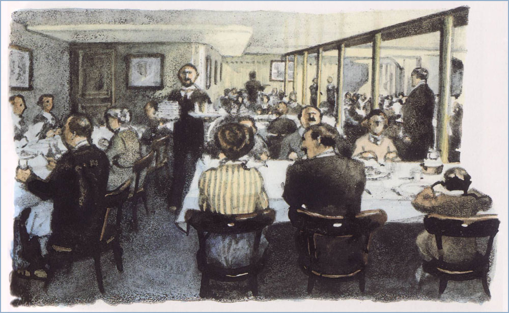
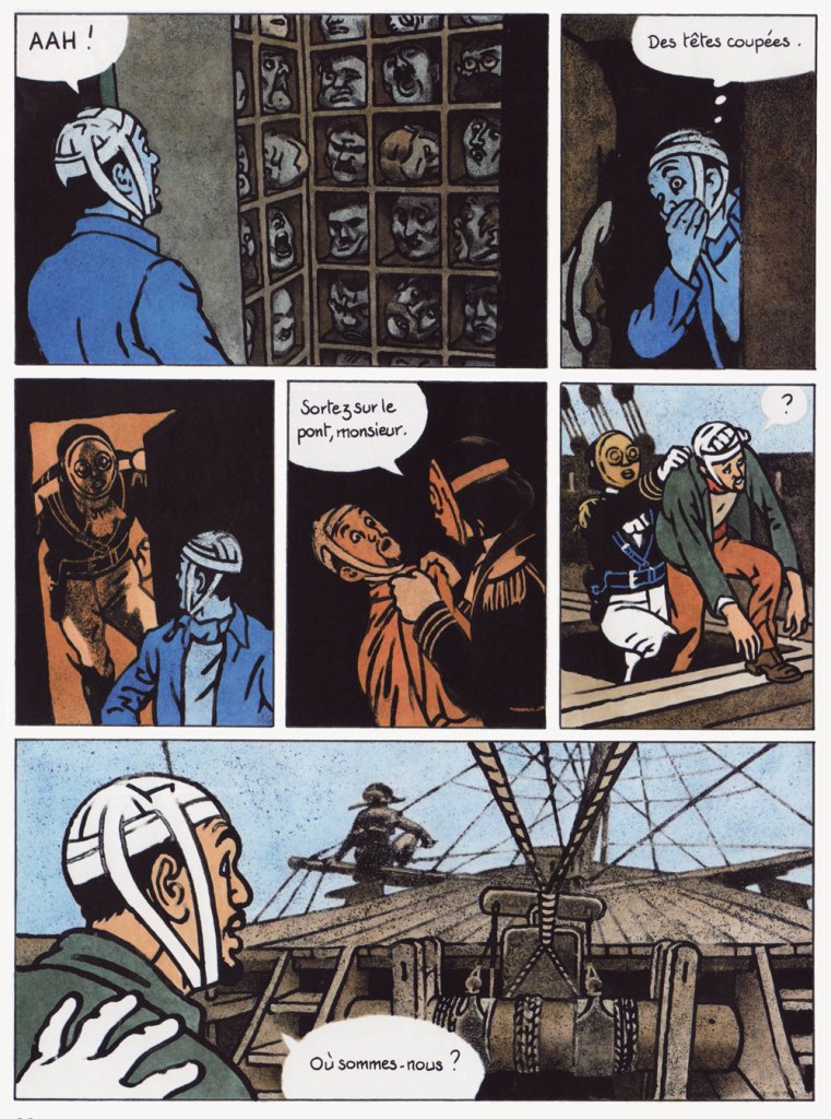
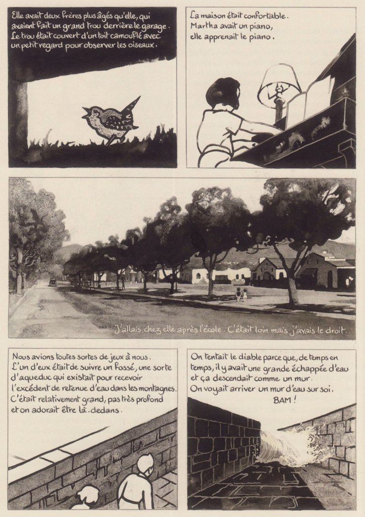
A 1997 illustration created for an issue of long-running (1971-) bright kids’ magazine Okapi on the theme of The Titanic. This shows the doomed ship’s third class restaurant.A sequence from the album that first brought Guibert to prominence, La fille du professeur, a collaboration with Joann Sfar, whose script won the 1997 René Goscinny award at the Angoulème festival. Note the remarkable fluidity and animation of the choreography. A sequence from his wild collaboration with WOT? favourite David B., 1999’s Le capitaine écarlate (The Scarlet Captain), which fancifully thrusts real-life author Marcel Schwob (1867-1905) amidst the lunatic fray.The pirate ship, travelling through the sky on its own wave, is trapped betwixt an airship and the grappling hooks of the Parisian police posted on the Eiffel tower. Of course.Here’s a glimpse into Guibert’s working method, two panels from Le capitaine écarlate: « Inking the pencils is always a problem: it’s even nonsensical to have to draw the same thing twice! Generally, the inking stiffens the drawing, since the pencilling stage is allusive and the inking stage is descriptive. So I try to do the opposite: I settle all the drawing problems in pencil and then, I put my page over a light table in order to reinvent the drawing in pen, leaving out a lot of the details. But that’s just a last resort. It’s hard to be quick and spontaneous while trying to convey subtle things. Ideally, I’d love to do without pencilling, but I need it to nuance my drawing. » (from a talk with Hugues Dayez published in La nouvelle bande dessinée, 2000, Éditions Niffle)A page from his probable magnum opus, La guerre d’Alan, in which he recounts visually the real-life recollections of an American exile he met by chance in 1994 on the Île de Ré. This part of the saga is available in English as Alan’s War. Here, a bunch of malnourished GIs hike for an hour for a steak meal provided by a lumberjack. For Alan, coming from a family of modest means, it was his first time eating steak. « Observe, improve yourself, fill up your noggin! » is the crux of his advice to young cartoonists. Leading by example, he’s constantly observing and rarely stops drawing. Thankfully, some collections of Guibert’s sketches have seen print, and they’re delightful. Here are some samples from Le pavé de Paris (Oct. 2004, Futuropolis), which is the exact size of a Parisian cobblestone, just like those lobbed at the police by demonstrating students during the tumultuous events of May 1968.I’m in awe at his ability to discern and render infinitely delicate shifts and nuances of colour and tone, especially in low light.« Drawing allows you to tear off pieces of reality and to take them home. In my notebooks, I know that the most beautiful drawings, the most vibrant ones, are those I did in places or before people that I want to keep near me. »« This is why my notebooks are so precious to me: they are riddled with accidents and unrepeatable little things. And while I practically can’t bear to open one of my published books, I often find myself checking out my notebooks. »A page, drawn in 1999 and intended for L’enfance d’Alan. Guibert initially planned to cover his friend’s life in order, but postponed the childhood part, since he possessed fuller documentation of Alan’s war years. In the end, this page didn’t make the cut, which gives you some idea of the very high standards Guibert sets for himself.L’enfance d’Alan appeared in 2012, and was followed in 2016 by Martha & Alan; like the rest of the Alan Cope memoirs, they were published by L’Association. The lion’s share of what’s kept me this long from showcasing one of my very favourite cartoonists: most of it is virtually impossible to scan, unless I’m willing to destroy the spine of some often rare, precious — and treasured! — volumes.
« We all have a thirst for wonder. It’s a deeply human quality. Science and religion are both bound up with it. What I’m saying is, you don’t have to make stories up, you don’t have to exaggerate. There’s wonder and awe enough in the real world. Nature’s a lot better at inventing wonders than we are. » ― Carl Sagan, Contact
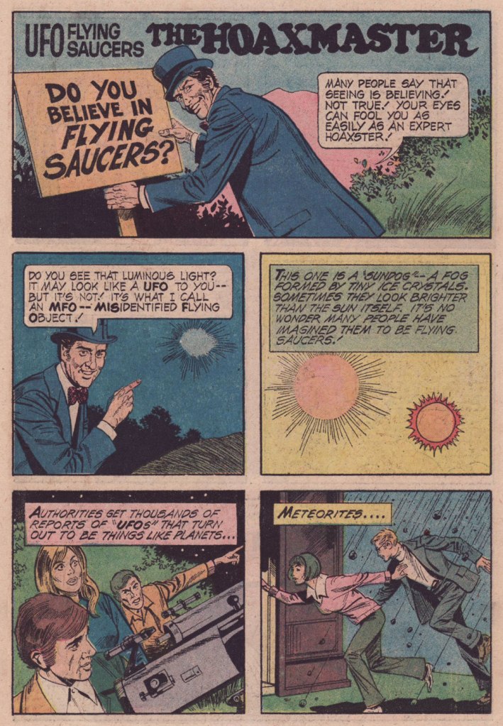
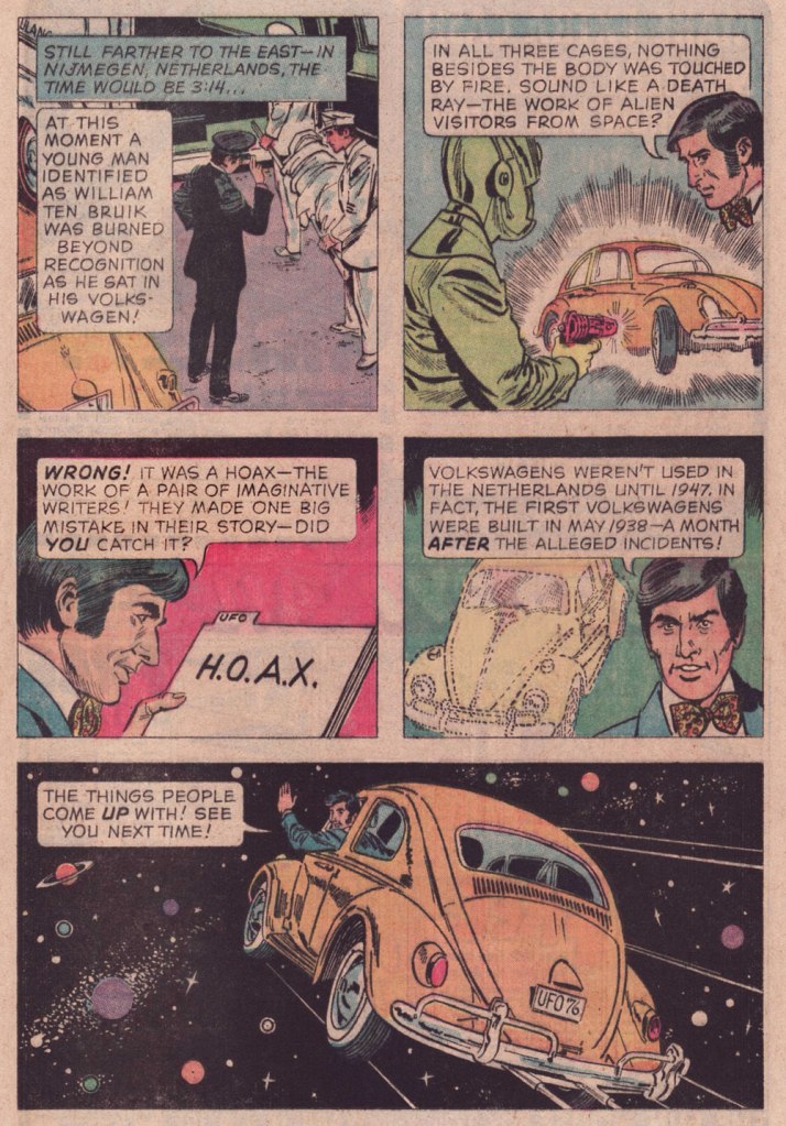
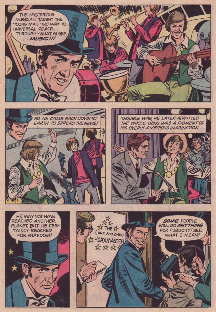
Time to keep a promise — a promise to myself, but just as worthy of being kept. A couple of years ago, I posted the first half of a favourite comics feature of mine, ‘The Hoaxmaster’, which ran in most issues of Gold Key’s UFO Flying Saucers in the 1970s. At the time, I declared that I might get around to posting the second half of the set some World Contact Day, which is today.
The bracing brand of skepticism demonstrated here by the Hoaxmaster, much needed as it was then — smack in the middle of the UFO-Spiritualism-Occultism mania of its era — is yet more urgently needed these days, as the merry-go-round of surreal disinformation spins faster and faster, further out of control with each passing day, it would seem. You may have noticed.
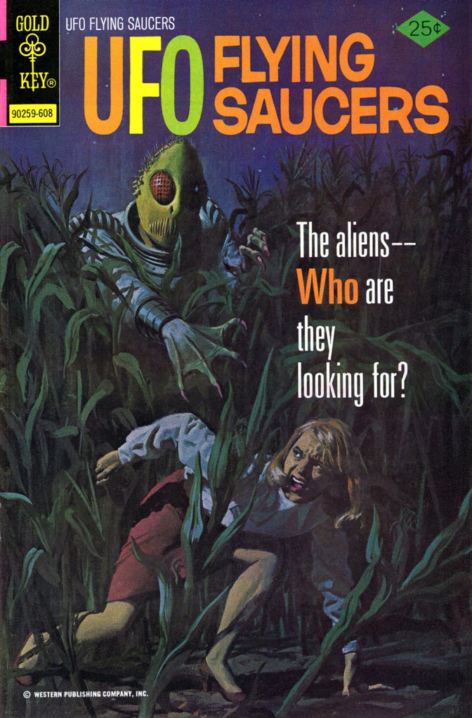
From UFO Flying Saucers no. 9 (Jan. 1976, Gold Key); as with all the Hoaxmaster vignettes, script by Pat Fortunato and artwork by Frank Bolle. From UFO Flying Saucers no. 10 (May 1976, Gold Key).From UFO Flying Saucers no. 11 (Aug. 1976, Gold Key).This was the issue in question, my introduction to the title; it bore this terrific — downright terrifying — painted cover by George Wilson.From UFO Flying Saucers no. 12 (Nov. 1976, Gold Key). Adamski!From UFO Flying Saucers no. 13 (Jan. 1977, Gold Key). Bolle was always a solid artist — which is certainly why he enjoyed such a long and busy career — but I can’t think of any, among the myriad of features he worked on, where he seemed to enjoy himself this much. His work always had a deadpan grace, but here, the wit deployed in the scripts allows him to reveal a seldom-seen facet of his talent.