« Listen, Angel! If they’re out of bananas… I’ll meet you at the corner fruit stand! »
Today, let’s combine our general theme with a celebration of the birthday of one of comics’ great, yet perpetually underappreciated talents: Bob Oksner (October 14, 1916 – February 18, 2007), DC’s go-to humour and good girl art guy. Can you beat that? Didn’t think so.
Bob had a winning penchant for mixing monsters and babes, and for this, he’s earned our lifelong gratitude.
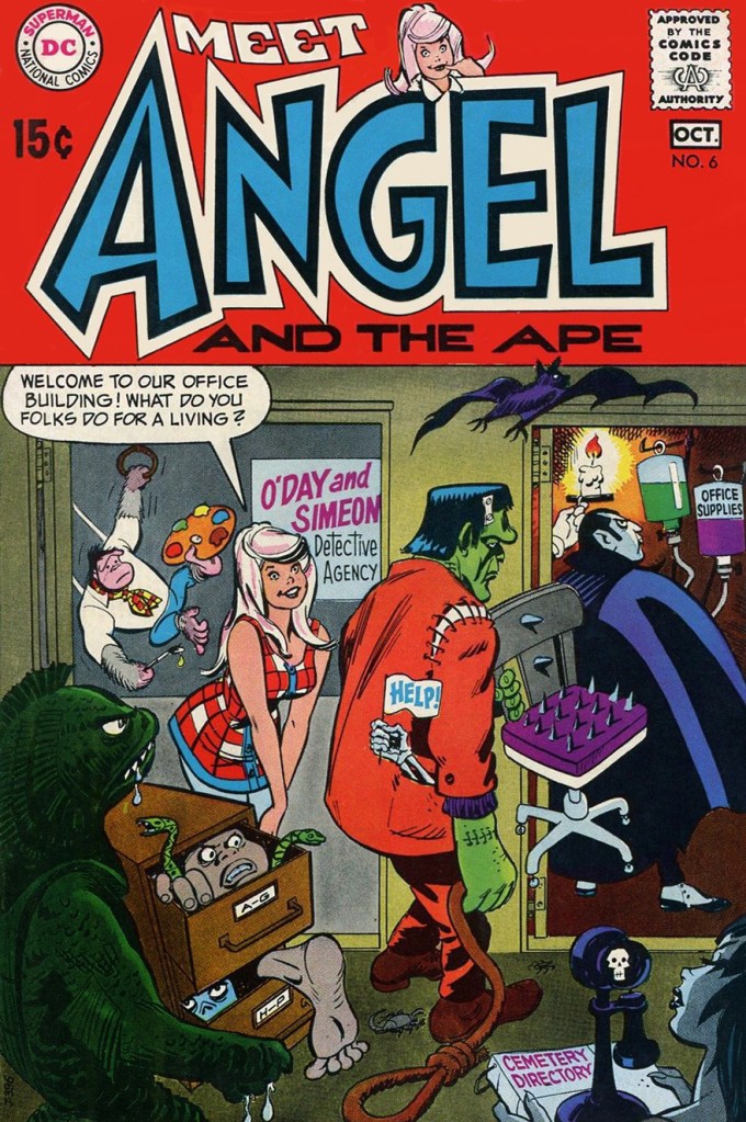
This is Angel and the Ape no. 6 (Sept.-Oct. 1969, DC), featuring The Robbing Robot and The Ape of 1,000 Disguises! (Would You Believe Four?), wittily written by John Albano, lusciously pencilled by Oksner, and creamily inked by Wallace “Wally” Wood. Truly swoon-inducing stuff. Edited by Joe Orlando (that explains all the monsters!), with a cover by Oksner.
You might say Angel and the Ape exist in an awkward sort of limbo: popular enough for the back issues to be kind of pricey, but not popular enough to have been reprinted (eight issues, including their Showcase appearance, ideal for a trade paperback, hint, hint).
So what else has Mr. Oksner cooked up over the years? Keeping to our theme, here are a few highlights, but first, a handy bio:
This piece appeared in The Adventures of Jerry Lewis no. 73 (Nov.-Dec. 1962, DC).
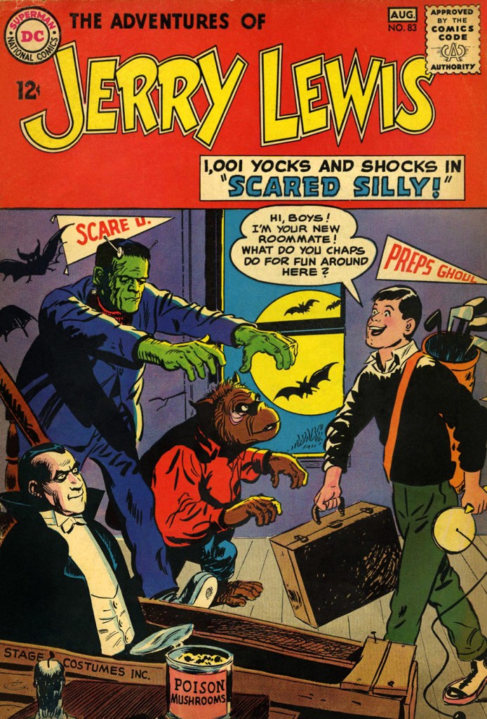
The is The Adventures of Jerry Lewis no. 83 (July.-Aug. 1964, DC). Formerly The Adventures of Dean Martin & Jerry Lewis… of course. The book (under both titles) featured some lovely artwork from Owen Fitzgerald, Mort Drucker and of course Oksner… but it was no Sugar and Spike. Still, it had its audience, long-lasting as it was (124 issues… Jerry wasn’t just big in France!)
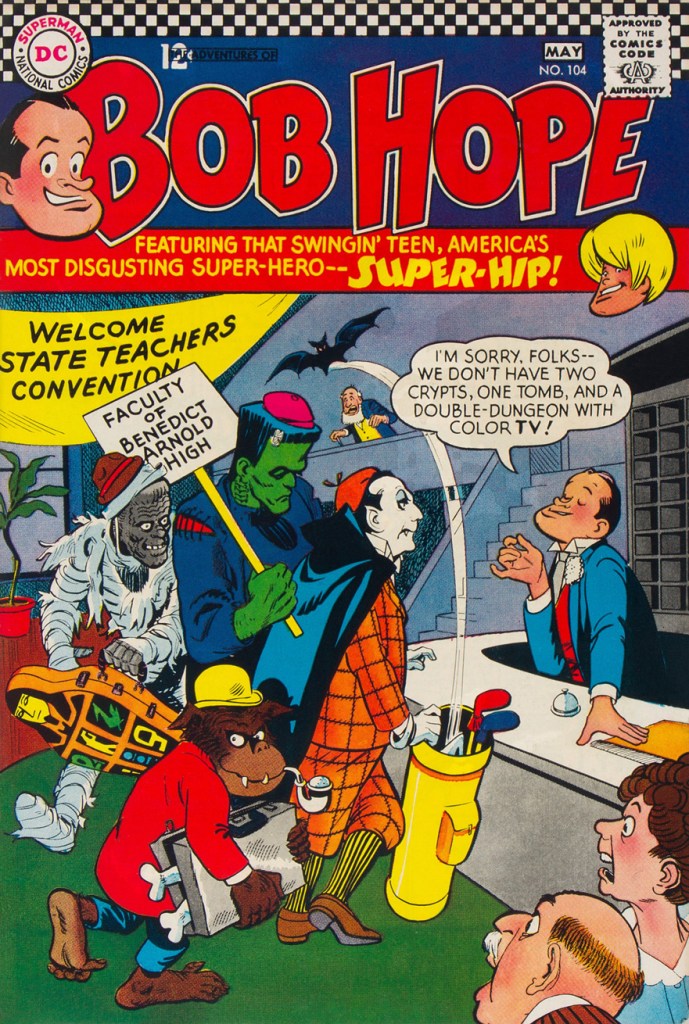
This is The Adventures of Bob Hopeno. 104 (Apr.-May 1967, DC). DC’s celebrity-licensed humour titles followed a parallel course: fading sales led to their nominal stars being more or less sidelined in their own book in favour of increasingly outlandish supporting casts.
An inside page from that issue. Good-looking comics… but they weren’t particularly witty, which can be a bit of a drawback. Arnold Drake was the writer, and while he could be pretty damn funny, it just didn’t work here. Still, you can bet that it was still more amusing than Milton Berle’s comic book.
1940s teenager Binky was pulled out of mothballs in the late 60s (ten years elapsed between issues 60 and 61). A moderate success (especially given it mostly consisted of slightly updated reprints), it returned to oblivion after another twenty-two issues, though the first seven boresome rather fine Oskner cheesecake covers. This is Leave It to Binky no. 67 (June-July 1969, DC).
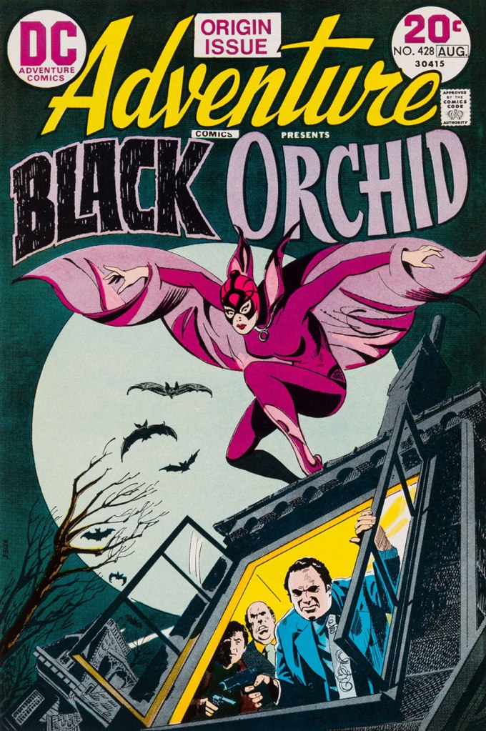
Finally, for a touch of the more ‘realistic’ Oksner style, here’s his cover introducing Sheldon Mayer‘s marvellously-mysterious Black Orchid. This is Adventure Comics no. 428 (July-Aug. 1973, DC). She deserved far more than a mere three-issue run!
« People, chained by monotony, afraid to think, clinging to certainties… they live like ants. » — Béla Lugosi
It’s October first, and you know what that entails, don’t you? Among other ominous occurrences, it happens to be the onset of Who’s Out There’s annual Hallowe’en Countdown!
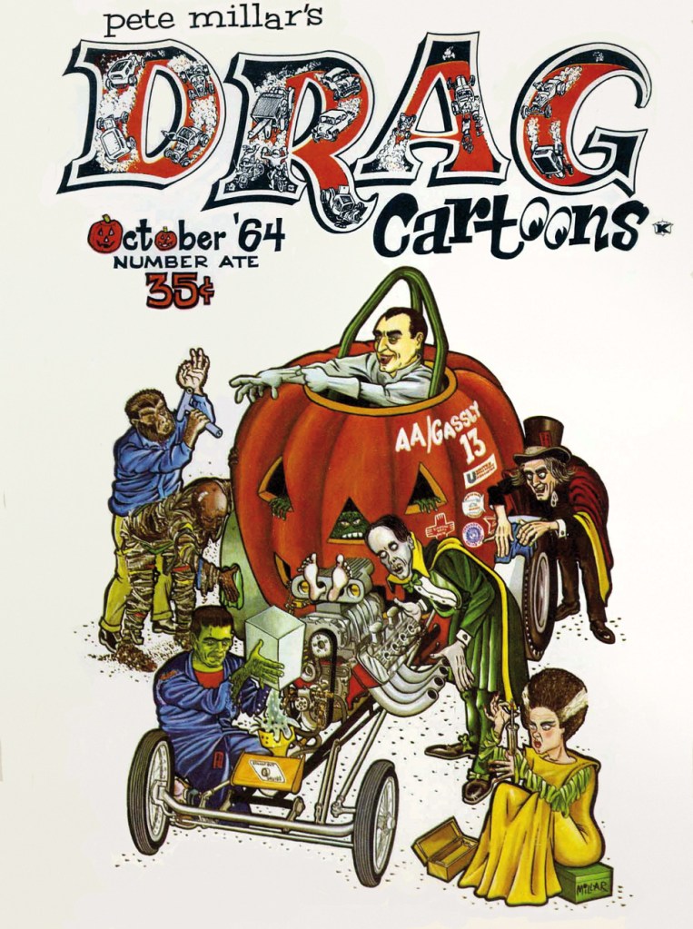
This year, we open hostilities with this fine monster mash by Pete Millar (1929 – 2003), drag-racing cartoonist nonpareil. I suspect we’ll be seeing more of certain members of this ghoulish cast of fiends.
This is Drag Cartoons no. 8 (October, 1964, Millar Publishing Company). Cover by Mr. Millar. What does this… vehicle run on, exactly?
Any goodies to be found beyond the dandy cover? Well, there *is* this little number (of several, actually) by one Alexander Toth…
Just another wrinkle on a familiar story, I realize, but such glorious artwork! Feel free to compare and contrast with Harvey Kurtzman’s interpretation, in a rather more sombre timbre, of the same basic scenario.
Another seasonal bonus from the same issue… that certainly seems like an advantageous deal… yessiree buckaroos!
« I’ve learned that any fool can write a bad ad, but that it takes a real genius to keep his hands off a good one. » — Leo Burnett
Given that they’re often referred to as comics, or funnybooks, mainstream American comic books haven’t been nearly as funny as one might reasonably expect… particularly the ones that set out to be humorous.
Humour being subjective, of course everyone will have their own favourite to contribute. The gist of my argument, however, is that comics books fail to raise guffaws to a level that, say, newspapers strips, animated cartoons and Franco-Belgian bandes dessinées routinely** do.
Meanwhile, DC Comics arguably boasted their singular genius humorist in Sheldon Mayer (Sugar and Spike). DC’s editors loved to divide and conquer, rarely allowing solo creators to take root, let alone flourish, in their tidy corporate garden patch. Given Mayer’s crucial early importance to the publisher’s rise, he was granted free(er) rein. Which leads one to ponder whether the assembly-line method, then, might not be utterly detrimental to quality humour.
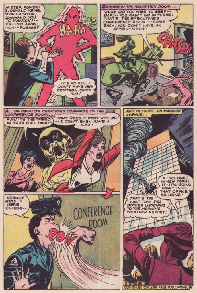
So it was to my elated surprise that I came upon an authentically amusing (imho) tale betwixt the misaligned staples of a 1967 issue of Strange Adventures… what is more, uncredited. A mystery.
Which brings us ’round to another exceptional talent, a writer this time: long-time American Comics Group (ACG) editor Richard E. Hughes, who scripted most of the company’s mid-to-late output under an impressive array of aliases*** with a dry, deadpan, absurdist wit, most memorably deployed through the adventures of Herbie Popnecker, ably illustrated by Ogden Whitney.
In 1967, Hughes found himself at leisure with ACG’s demise (the final issues of its remaining titles, Adventures Into the Unknown and Unknown Worlds, were cover-dated August ’67). He passed through DC, scripting a smattering of stories for Superman czar Mort Weisinger (one might surmise that Kurt Schaffenberger, who worked for both editors, acted as the go-between), for Hawkman editor George Kashdan and Ghosts editor Murray Boltinoff before exiting the field. According to Wikipedia, « His final job appears to have been for Gimbel’s department store, composing response letters to customer complaints. » At least he’s received some posthumous recognition, as he was a 2015 recipient of the Bill Finger Award for Excellence in Comic Book Writing.
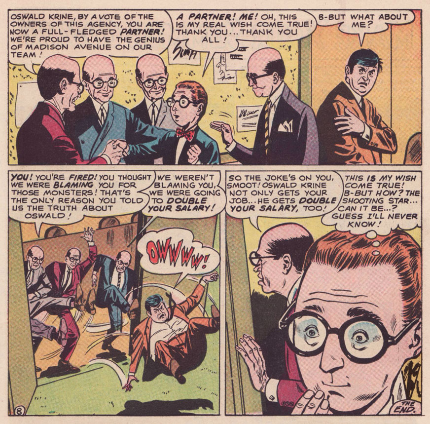
I do believe I can detect the Hughes cadence in The Monster Maker of Madison Avenue! According to GCD, the uncredited story is scripted by one Dennis Marks, an animation writer working for Filmation’s The Batman/Superman Hour at the time… but I just don’t know. It would be Marks’ sole comic book credit, and a speculative one at that. Besides, GCD attributes the artwork to Joe Orlando, which is flat-out, laughably wrong. A frequent problem of self-styled art experts is that they wear genre blinders. Most would never be caught dead reading, say, a romance comic, so they wouldn’t recognize (though they should!) the distinctive stylings of Jay Scott Pike (1924-2015).
On with our tale, which originally saw print in Strange Adventures no. 202 (July 1967, DC).
As for the ads parodied therein, I’m no expert, but I can hazard a few guesses: The Fiend in Your Fuel Tank refers to Esso’s famous Put a Tiger in Your Tank campaign; the housewive bluntly bestowing cleaning tips to her neighbour brings to mind Bold Detergent; The Green Knight surely lampoons Ajax’s White Knight; as for Popso Kooler’s Mister Power, it’s anybody’s guess. Pepsi commercials of the period looked great, but nary featured an animated lightning man. Anyone?
-RG
*Yes, Kurtzman (and Stanley) often worked with others to increase their output (and for the love of collaboration), but they fully controlled the mise-en-scène.
** They make it look easy… but it’s quite a feat.
***His imaginary roster comprised Pierre Alonzo, Ace Aquila, Brad Everson, Lafcadio Lee, Kermit Lundgren, Shane O’Shea, Greg Olivetti, Kurato Osaki, Pierce Rand, Bob Standish, Zev Zimmer… Fittingly, even Richard E. Hughes was a pseudonym: he was born Leo Rosenbaum.
« Matt Fox drew comics like they were carved out of stone. » — Dan Nadel, Art in Time (2010)
As far back as I can recall, I’ve been intrigued by the tremendous latitude to be found in specific penciller-inker pairings. Depending on who’s at the helm, things can go anywhere from manna to mud.
No need to dwell on the damage a bad or lazy inker can inflict, and we’ve all witnessed the magic of inkers that elevate any pencils they’re called upon to finish.
It’s of yet greater interest, I believe, to delve into the rare and mystifying alchemy worked by two flavours you’d never dream of commingling in the same dish… like anchovies and ice cream, or perhaps Nutella and caviar.
One such audacious mixture was given a go in the transitional post-Atlas days of Marvel comics, as the publisher’s long-running anthologies were shedding their mostly-standalone short story format in favour of the resurgent superheroes.
First, though, a bit about our performers:
Recently-retired (in 2018) writer-artist Larry Lieber (born October 26, 1931, and still with us), is Stan Lee’s younger brother (who didn’t anglicise his name nor sport a toupee) and publisher Martin Goodman‘s nephew. From day one (he got his start in comics with Atlas in 1951), Larry toiled on the family farm, so to speak, his entire career (including a chaotic editorial stint with Martin and Chip Goodman’s ill-conceived Atlas-Seaboard company in 1974-75). His most notable work at Marvel was his run as writer-artist on Rawhide Kid (1964-1973); after Atlas-Seaboard, he worked for Marvel-related newspaper strips, frequently with brother Stan (first The Incredible Hulk, 1978-79, then The Amazing Spider-Man, 1986-2018). He did co-create Iron Man, Ant-Man and Thor… but hasn’t seen a dime for it beyond his measly page rate back in the 60s. Once more, that’s the American comic book industry for you, particularly if you’re a bit of a milquetoast.
In the 1950s, he drew a handful of short stories for Atlas, as well as a single story and a trio of covers for Youthful’s Chilling Tales… upon which largely rest his reputation in comics. Peter Normanton, in The Mammoth Book of Best Horror Comics, wrote: « There is an air of disquiet to his vision, yet it charms through a surreptitious blending of the primitive with the mockingly insane. His characters border on the lunatic seemingly at home in his landscapes, concealing a darkness corruptive of the soul. »
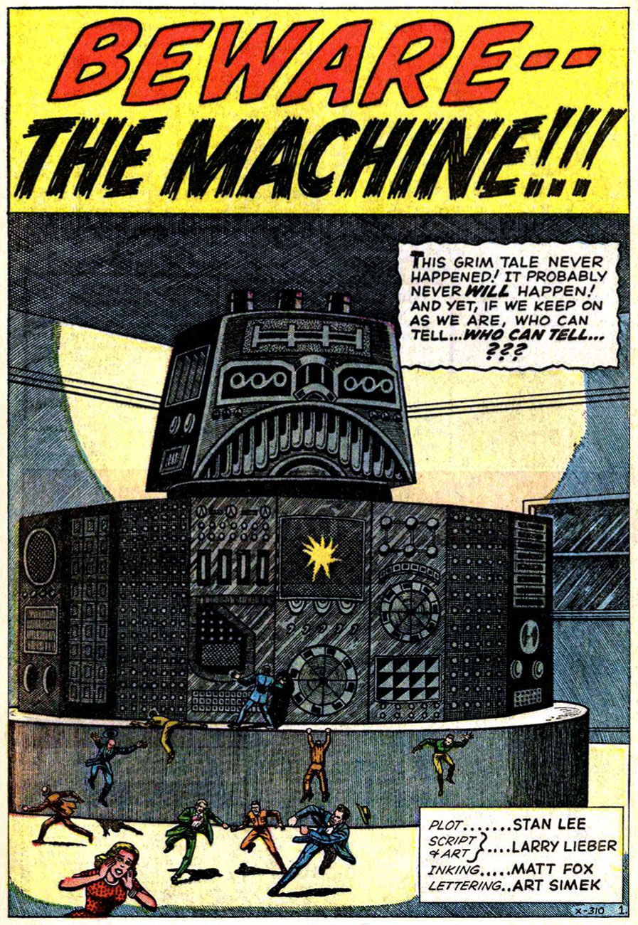
This is Beware — the Machine!!! from Strange Tales no.111 (Aug. 1963, Marvel). Lieber, while he’d never be called (or claim to be, to his credit) a master draughtsman, did possess one irrefutable and priceless artistic quality: he could tell a story clearly, smoothly, without undue fuss.
« Without conscience, compassion, or any other behavioral safeguards that humans possess… » I can certainly think of some exceptions, can you?
Uh, guys, monkeys are hardly low on the intelligence totem pole. Now if the X-200 had been brought down by, say, a slime mould, you’d be closer to the truth of your claims.
Now, you may ask, did Lieber appreciate Fox’s stellar efforts? Short answer: nope. In this chat with Roy ‘Houseroy’ Thomas, he lets it all hang out. [ source ]
Roy Thomas:One of the strangest inkers you had was Matt Fox.
Larry Lieber: I hated that stuff! Oh, God, and years later, I learned that Matt Fox is considered one of the greats by some people, and his artwork brings a buck or two.
RT: Yeah, but not in comics.*
LL:I hated his stuff because I struggled with drawing, and I was trying to make the drawings look as real as humanly possible, and I had a tough time. I remember I once had Don Heck inking me on a five-page western, and I remember saying, “My God, he’s good at making my stuff look better than it is,” and he was. Matt Fox – if my stuff was a little stiff, he made it even stiffer; he made it look like wood cuttings!
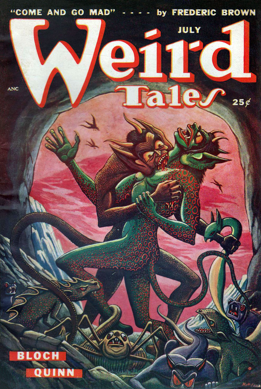
RT: Fox had been in advertising. He’d done lithographs, pulp illustrations; evidently he did some covers for Weird Tales, the magazine that published H.P. Lovecraft and Robert E. Howard, including Conan, back in the ’30s. Fox did color wood cuts; he was a real artist, but his comic inking was so strange – his line just deadened everything.
LL: One of my traits was that I was reluctant to say anything bad about anybody, because everybody has to earn a living. I wouldn’t complain, no matter who they put on. But one day I was working in the office penciling a western, and Stan walked by. He saw my pencils and he said, “This is your penciling?” And I said, “Yeah.” Stan said, “This is pretty good. I’ve been looking at the finished stuff, and that looks terrible.” And he removed that inker – it wasn’t Matt Fox – and gave me a better one. But I, of my own volition, wouldn’t say a word about it.
RT: Fox obviously had a style that just didn’t translate well into comics.
No, Roy: Fox had a style that just didn’t translate into your own, extremely limited idea of comics. This is, after all, the guy who assigned Vince Colletta to ink Frank Robbins, as well as the single individual most responsible for infecting US comics with the dread malady of “continuity“.
It must be said, however, that Fox’s meticulous line work is not particularly suited to the lousy colouring and printing found in comic books of that vintage. So… let’s look at some original art!
Page two of I Was a Victim of Venus!, from Tales of Suspense no. 43 (July 1963, Marvel).
« Camoflauging », Larry? Page five of The Search for Shanng!, from Strange Tales no. 113 (Oct. 1963, Marvel).
Page three of The Enemies! from Journey into Mystery no.101 (Feb. 1964).
Here’s a chronological Lieber-Fox bibliography, comprising 17 stories:
Escape into Space (Tales of Suspense no. 42, June 1963) The Man Who Wouldn’t Die! (Journey into Mystery no. 93, June 1963) We Search the Stars! (Strange Tales no. 110, July 1963) I Was a Victim of Venus! (Tales of Suspense no. 43, July 1963) Beware — the Machine!!! (Strange Tales no. 111, August 1963) I Come From Far Centaurus! (Tales of Suspense no. 45, September 1963) The Smiling Gods! (Tales to Astonish no. 47, September 1963) The Search for Shanng! (Strange Tales no. 113, October 1963) Grayson’s Gorilla! (Tales to Astonish no. 48, October 1963) The Purple Planet! (Journey into Mystery no. 98, November 1963) The Secret of Sagattus! (Tales to Astonish no. 50, December 1963) Stroom’s Strange Solution! (Journey into Mystery no. 99, December 1963) No Place to Turn! (Tales to Astonish no. 51, January 1964) The Unreal! (Journey into Mystery no. 100, January 1964) The Enemies! (Journey into Mystery no. 101, February 1964) The Menace! (Journey into Mystery no. 102, March 1964) The Green Thing! (Tales of Suspense no. 51, March 1964)
Larry! sure! loved! his! exclamation! marks!!!
Most of these have never been reprinted until recently, and since they appeared in key early issues of Silver Age Marvel superhero titles… they’ve largely languished in obscurity. Writing-wise, they deserve it. But the artwork is what we’re interested in.
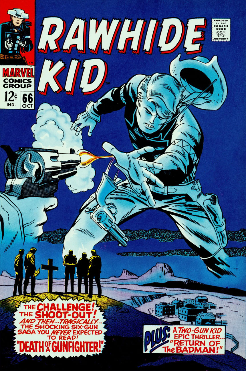
And on that point, it would be fair to feature a solo piece from Fox and Lieber, for a bit of perspective on each man’s respective strengths and peccadillos.
This is Rawhide Kid no. 66 (Oct. 1968, Marvel); pencils by Larry Lieber, surprisingly solid inks by Vince Colletta.
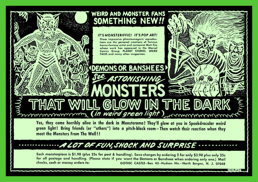
In closing, here’s a bittersweet excerpt from Bhob Stewart‘s vivid recollections of his meetings with Fox in the mid-60s, during Stewart’s time as editor (and just about everything else) of Castle of Frankenstein, when Fox dropped by to place an ad in the magazine.
« Fox came across as a straight-arrow, no-nonsense sort of a guy, and after a brief conversation about Weird Tales, he quickly got to the point. He was selling glow-in-the-dark posters, and he wanted to run an ad in Castle of Frankenstein. With that, he unfurled his glowing poster depicting demons and banshees dancing in the pale moonlight. We took it into a dark corner of the room, and yes, indeed, it did emit an eerie green glow.
He next produced an ad for the posters. He had made a negative photostat of his ink drawing, so the reversal of black to white simulated glowing monsters coming out of the darkness toward the reader. Clever hand-lettering effects added a subtle suggestion of glowing letters seen at night, not unlike the moment when Marion Crane first spots the Bates Motel sign through her car’s rain-covered windshield. »
The advert in question, from Castle of Frankenstein no. 8 (1966).
« … it was the second time I saw him. I admired his tight rendering in ink and crayon on pebbleboard. Then I casually asked, “So how many orders did you get for the glow-in-the-dark posters?” He responded bitterly, “None.” After that day, I never saw him and his demonic entourage again. He became the Phantom Artist, whereabouts unknown. Fox died in 1988… » [ source ]
-RG
*utter half-baked, speculative claptrap from Rascally Roy. The fact is that very little of Fox’s original comics artwork survives. For instance, Heritage Auctions has never sold a single Matt Fox solo page. If anything still exists, it’s been in private hands for a long, long time. Furthermore, the comic books in which Fox’s work saw print do ‘bring a buck or two‘, particularly the issues of Chilling Tales featuring his covers (numbers 13, 15 and 17). Read these sinister beauties here!
(In fact, to fill that gap in demand, renowned fantasy painter Ken Kelly has even produced recreations of Matt Fox covers. Here’s a sample.)
« Mama threw out my Hooded Cobra and Black Widow! »
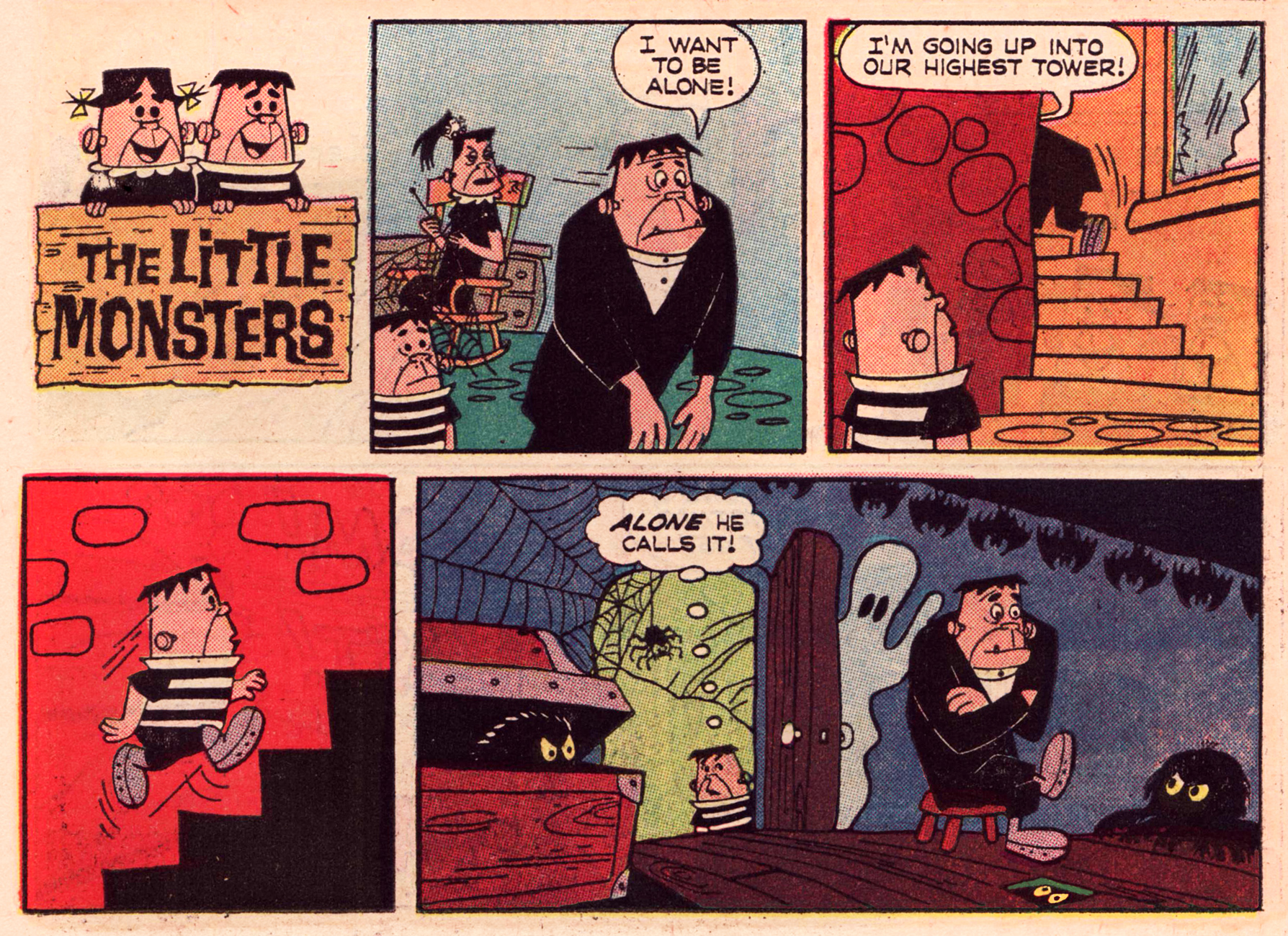
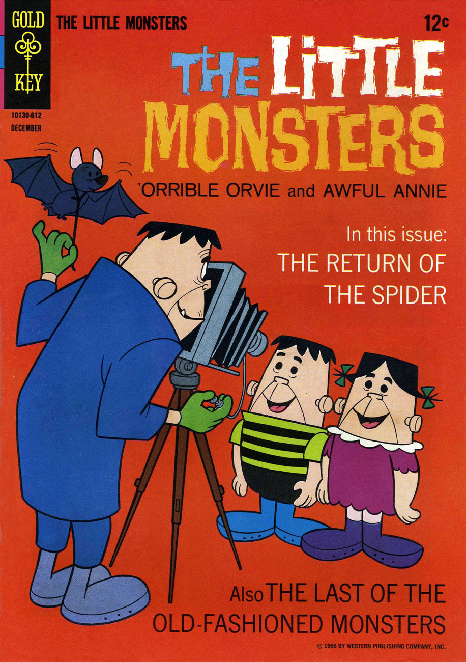
A delightful entry in the 1960s monster craze, Gold Key’s anonymously-created The Little Monsters first reared their fetchingly homely heads in the back pages of The Three Stooges no. 17 (May, 1964), predating by several months the near-simultaneous (just a week apart!) arrival on the tube of both The Addams Family and The Munsters. Now this ghastly family unit, assembled in the laboratory of kindly mad scientist Dr. Frankenfurter, comprised Papa Mildew, Mama Demonica, and their titular kids, ‘orrible Orvie and Awful Annie. The Little Monsters enjoyed a quite respectable rampage in comics, running amok for 44 issues between 1964 and 1978, outlasting by some years the craze that spawned them.
In this half-pager is from Little Monsters no. 7 (Dec. 1966, Gold Key), Papa Mildew essays Greta Garbo’s immortal line. Writer and artist unknown and uncredited, for shame. Pete Alvarado has been proposed as a possibility, but the man’s chameleonic versatility complicates identification somewhat.
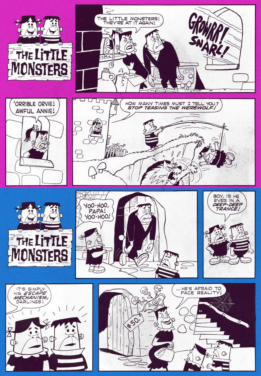
Ah, why be stingy? Let’s have a few more short pieces from the same issue.
« Eeeeeeeeeee! A horrible monster! He wants to… to eat me! »
With the coming of Hallowe’en, you have to get all the bases covered: an ungodly hoard of candy, a pumpkin to carve and assorted decorations to array about the house. Thank your lucky stars for the lightness of your burden: the average Balkan peasant also has to polish his pitchfork, sharpen and set out wooden stakes, gather sprigs of wolfsbane, and round up the requisite number of torches.
A detail from page eight: Grandenetti at his late-period finest, each page crackling with nervous energy and brimming with shadowy ambiance.
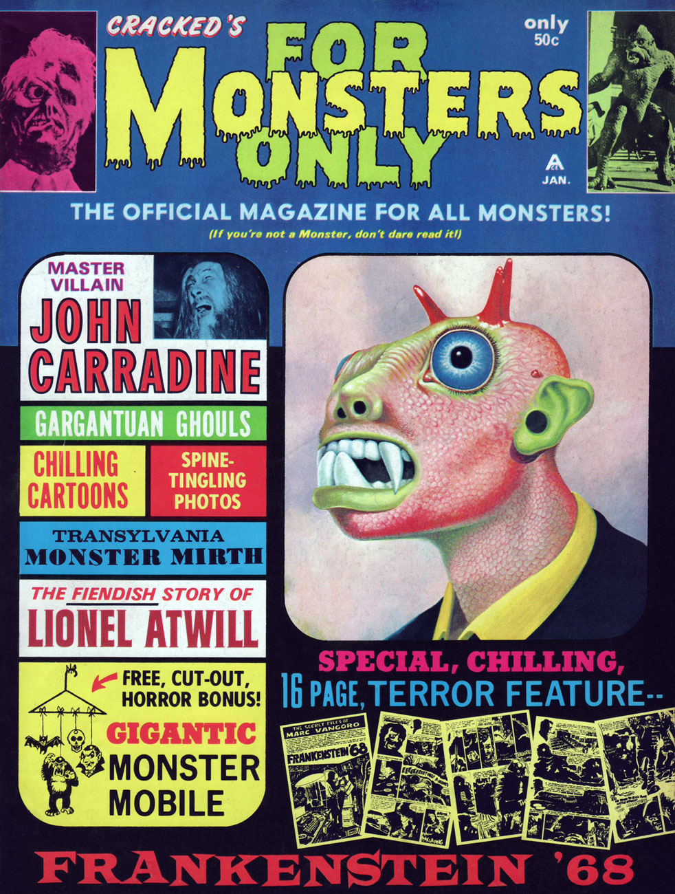
This merry nocturnal chase is brought to you by the team of Otto Binder, writer, and local favourite Jerry Grandenetti, illustrator. It comes from the sixth issue (January, 1969) of Cracked‘s go at a Warren-style Monster mag, For Monsters Only (10 issues… plus a best-of “annual”, sporadically published between 1965 and 1972). This was Frankenstein ’68, the first of three entries in Binder and Grandenetti’s The Secret Files of Marc Vangoro*, featured in issues 6, 7 and 8 of the mag. Well worth hunting down.
While this material has never, to my knowledge, been reprinted, and as copies of these long-neglected mags are getting scarcer and naturally pricier, fear not… for some kind souls have taken the considerable trouble of scanning, and more to the point, sharing them. In this particular case, look here.
Here’s the cover you need to keep an eye for. This is Cracked’s For Monsters Only no. 6 (Jan. 1969). That handsome fella is said to be the creation of the renowned wildlife painter Charles Fracé, of all people.
It’s heartening to know that the original art still exists and is in presumably caring hands.
« Mirrors toins things in revoise! Everything in Mirrorland is opposite! So naturally I’m a tough ghost and you’re a sissy spook! » — Poil in Through the Looking Glass (Spooky no. 121, 1970… read it here)
The Harvey Comics line, in its peak years (from the late Fifties to the mid-seventies, say) was essentially a collection of monomaniacal characters. As Daniel Clowes deemed in his classic lampoon of the Harvey cast, theirs is a Playful Obsession (read it here.)
Richie Rich had his moolah, Little Lotta wolfed down everything in sight, Little Dot found stimulation in… dots, and so on. Casper the Friendly Ghost’s uncouth counterpart, the 30s kid gang-inspired Spooky (complete with Brooklyn accent and « doiby» hat), loved to, well, scare people (and things!) with a hearty « Boo! », Hot Stuff raised the temperature wherever he went. On the other hand, Casper and Little Audrey’s adventures didn’t rely on such gimmicks, possibly from predating the rest of the Harvey gang, originating in animation in Casper’s case, and… folklore in Audrey’s:
« One day, Li’l Audrey was playing with matches. Her mother told her she’d better stop before someone got hurt. But Li’l Audrey was awfully hard-headed and kept playing with matches, and eventually she burned their house down.
“Oh, Li’l Audrey, you are sure gonna catch it when your father comes home!” said her mother.
But Li’l Audrey just laughed and laughed, because she knew her father had come home early to take a nap. »
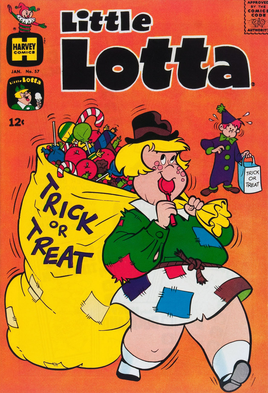
The Harvey line’s covers were by far its most precious asset: endless riffs on a character’s particular motif, granted, but spun out in well-designed, nimbly-executed and brightly-coloured scenes… virtually the work of a single creative whirlwind, art director-illustrator Warren Kremer (1921-2003).
This is Little Lotta no. 57 (Jan. 1965). Lotta may have been a glutton, but she was also super-strong.
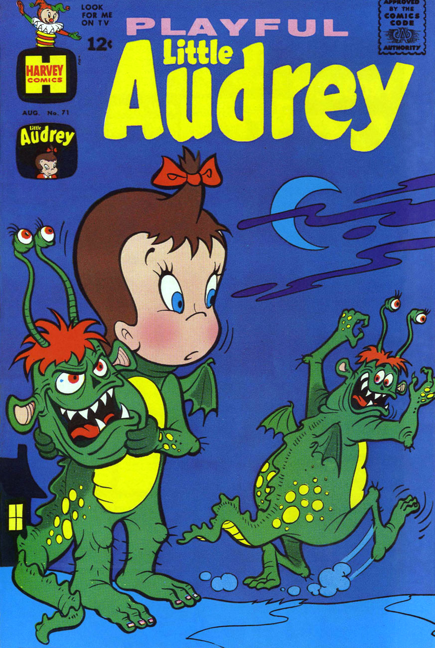
This is Playful Little Audrey no. 71 (Aug. 1967).
This is Playful Little Audrey no. 73 (Dec. 1967).
This is Hot Stuff Sizzlers no. 43 (Nov. 1970).
This is Casper the Friendly Ghost no. 149 (Jan. 1971).
This is Spooky Haunted House no. 9 (Feb. 1974). Note that Spooky’s girlfriend’s actual name is ‘Pearl’… he just pronounces it ‘Poil’. Upon occasion, the ‘tuff little ghost’ essays the rôle of the spookee rather than his usual spooker (or is that “spookist”?)
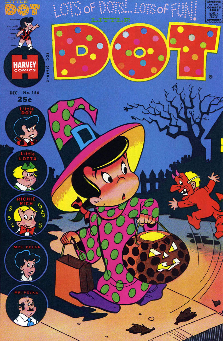
This is Little Dot no. 156 (Dec. 1974). I’m not sure what the kid’s so terrified of… maybe he’s never had the measles?
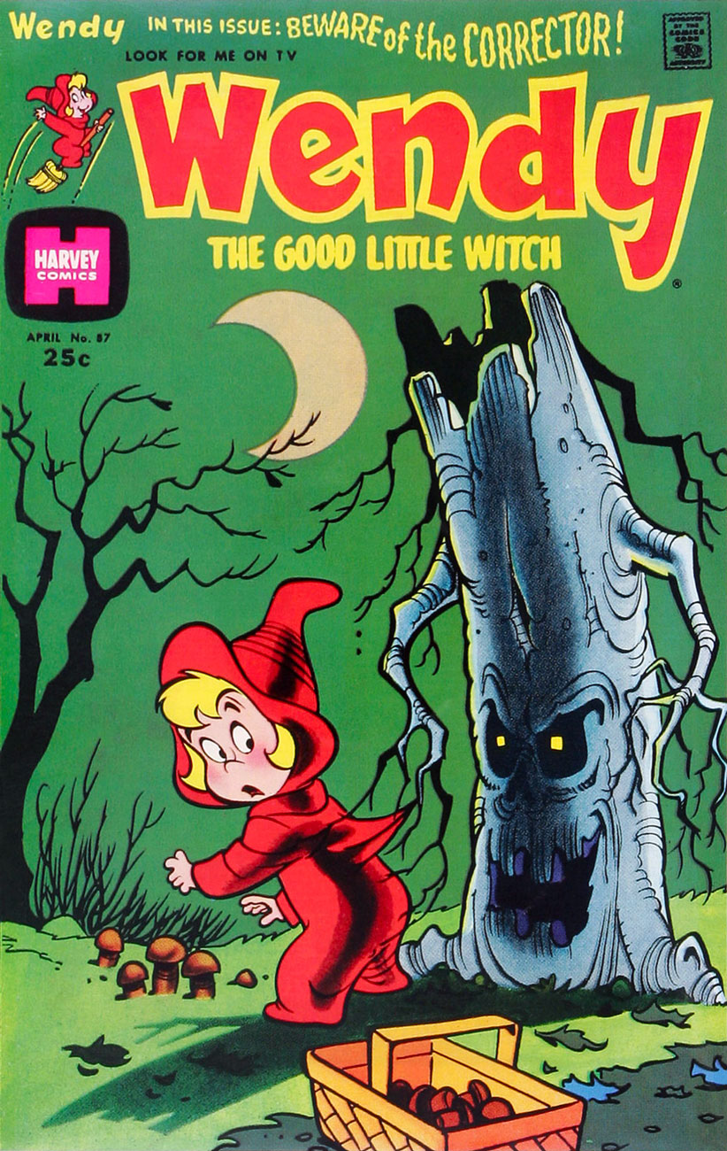
This is Wendy, the Good Little Witch no. 87 (Apr. 1975). [ds: these just might be edible mushrooms.]In all cases, artwork by the legendarily prolific Warren Kremer. As we demonstrated last year, the Harvey house style hardly was the only range he could draw in.
« Each time I enter this fog, it feels as though icy fingers were clutching at me! »
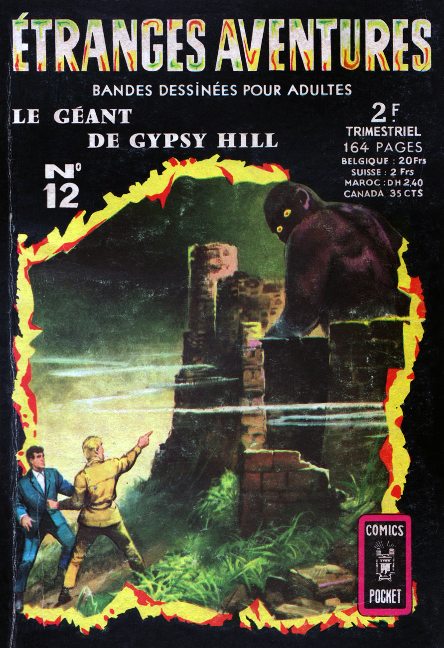
Étrange aventures, a squarebound quarterly digest (roughly 5 x 7 inches, 164 pages), was one of many titles published in France by Arédit / Artima between 1966 and 1984 through its Comics Pocket imprint. Étranges aventures was one of the collection’s flagship titles, with a healthy run of 79 issues from July, 1966 to March, 1984. Its contents were mostly repackaged and reformatted translations of various DC and Marvel (and the odd Charlton) comics in black and white, but with fun painted recreations of the original covers for the twenty-or-so issues. At under fifty cents a pop, they presented a bargain to the cash-strapped aficionado, thrifty access to scarce and/or pricey items.
This issue was a relative exception, cover-featuring an original work (or at least not an American one), the sort of material the publisher usually reserved for its more “serious” titles. These were often comics adaptations of horror or suspense novels issued earlier by mother company Les Presses de la Cité under its Fleuve Noir imprint. Graphic novels? Exactly.
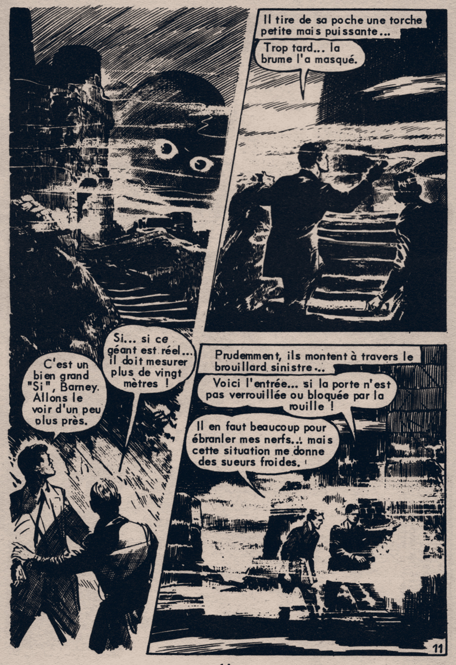
« If… if this giant is real…it must stand over twenty meters high! » « That’s a mighty big ‘If’, Barney. Let’s take a closer look at him. » He pulls from his pocket a small but powerful flashlight… « Too late… the mist has hidden him. » Cautiously, they climb through the sinister fog… « Here’s the entrance… if the door isn’t locked or blocked by rust! » « It takes quite a bit to frazzle my nerves… but this situation has given me cold sweats! »
« Welcome to the giant’s lair. He who has had the courage to venture this far will regret not having been cowardly, for he will find death. »
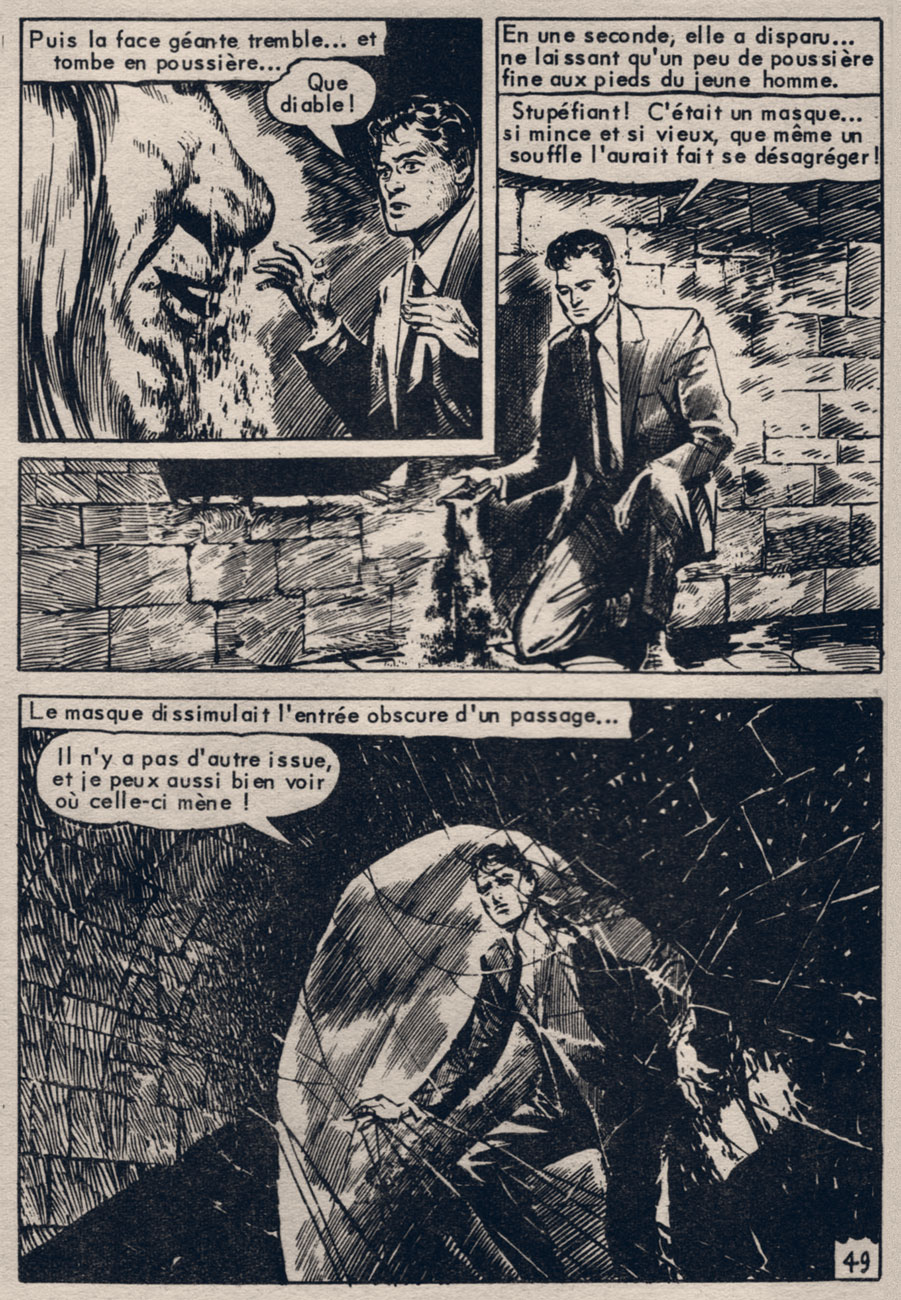
Prosaically, the whole affair turns out to be the work of unscrupulous special effects experts, vulgarly after some jewels. All this imaginative and diabolically elaborate work and expense for some shiny baubles! Still, it’s all about mood.
Writer and artist unknown. And nationality, for that matter. In places, the artwork has clearly been resized and adjusted, and switches back and forth between halftone and line art reproduction. So the lasting mystery lies not in the story, but in its provenance.
« It’s well we cannot hear the screams we make in other people’s dreams. » — Edward Gorey
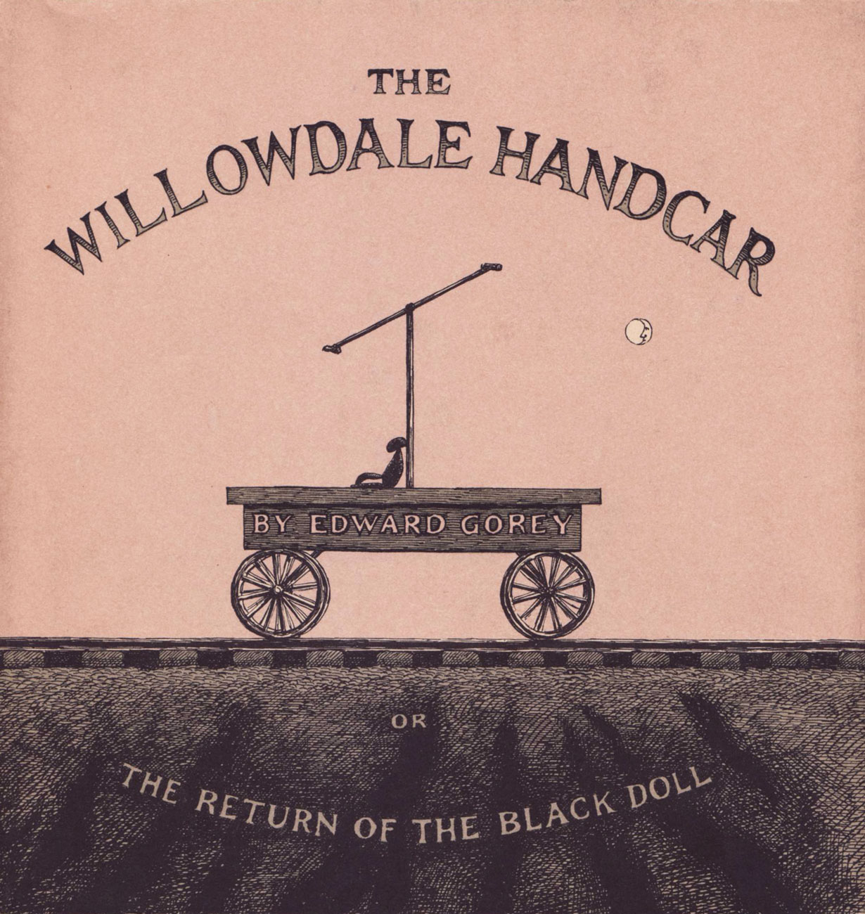
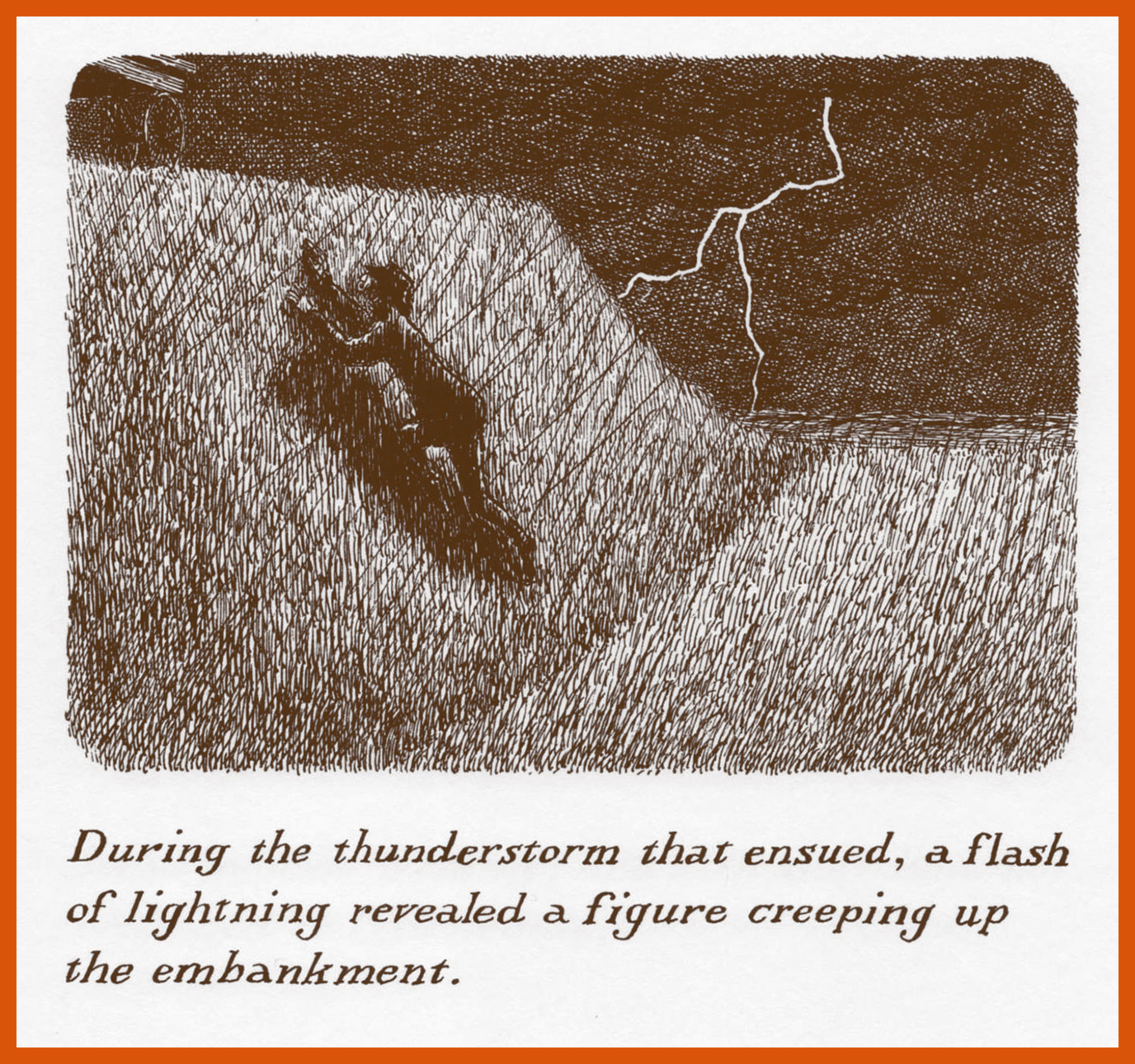
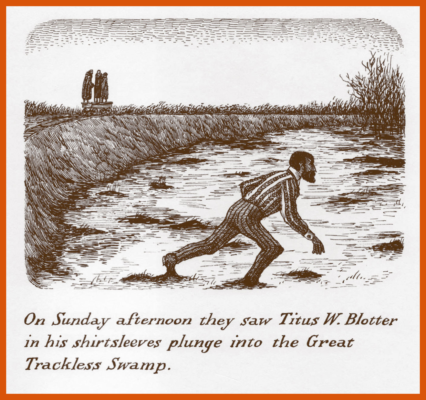
It was inevitable that the eminent Edward St. John Gorey (1925 – 2000) would grace my Hallowe’en countdown… but surely I deserve credit for holding out until midway through the third edition. Instead of the excellent but overexposed The Gashlycrumb Tinies, here’s an excerpt from what is, to my mind, his most ominous tale, The Willowdale Handcar or The Return of the Black Doll (1962), « In which three Pilgrims find mystery abort peril and partake of religious community. And the discerning Reader discovers Meaning in their Progress. » Last February, when I noted Mr. Gorey’s birthday (see that post here), I pledged to return to this specific work, and I wasn’t speaking with a forked tongue… at least not that time.
Gorey’s work largely remains open to interpretation, whether it’s stating something of import or just being coy. Still, not wishing to deprive anyone of the thrill of discovery, I’ve excluded the tale’s beautiful concluding panel. The entire story (I’ve provided seven of its thirty illustrations, not counting the cover) is available separately or as part of the classic 1972 collection Amphigorey (in the company of fourteen of his other works).
In closing, a quote from the man that sums up the essence and appeal of this « at once deeply vexing and utterly hilarious, darkly mysterious and amusingly absurd* » yarn:
« All the things you can talk about in anyone’s work are the things that are least important…. You can describe all the externals of a performance – everything, in fact, but what really constitutes its core. Explaining something makes it go away, so to speak; what’s important is what’s left over after you’ve explained everything else. »
And if you should find yourself in Cape Cod, Massachusetts, don’t pass up the chance to visit Gorey’s house! http://www.edwardgoreyhouse.org/
Golden Age pioneer Rudy Palais (1912-2004) wound down his career in comics with a smattering of terror tales for Charlton between the late 60s and the mid-70s. It’s a shame he didn’t do more, because his highly-stylized approach fit right into the Charlton non-mould. The inaugural issue of The Many Ghosts of Dr. Graves (May, 1967) features a pair of remarkable Palais two-pager sweatfests. Here’s one of them, a simple story effectively told, and wherein Ghostly Tales host Mr. L. Dedd plugs his own book.
Check out the sizzling stiletto heels Mr. Dedd’s sporting in the first panel!