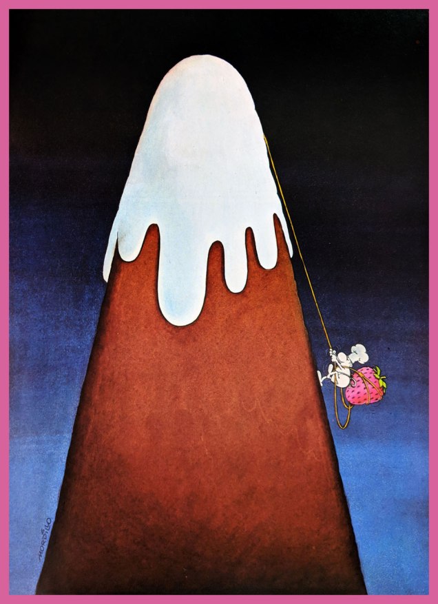
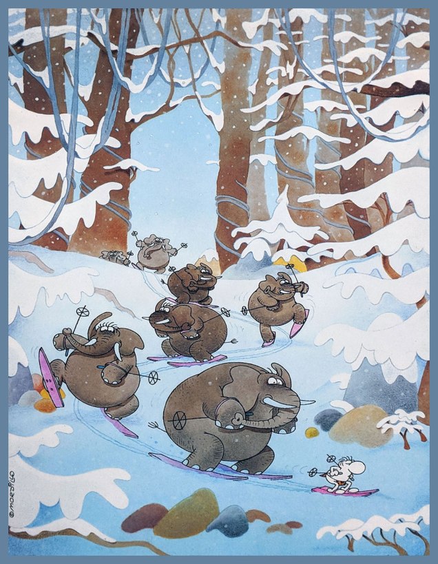
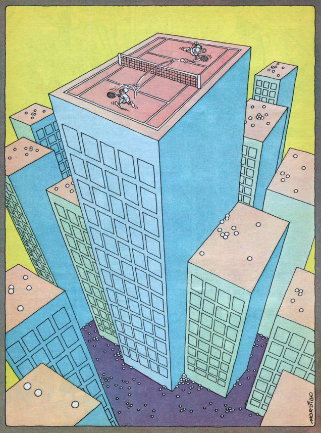
Guillermo Mordillo (1932 – 2019), known simply as Mordillo, was an Argentine artist of Spanish parentage. Through his long and productive career, he released more comic albums than you could shake a stick at… and at 86, was still active in the comics field. His easily recognizable style, love of bright colours and oft-surreal humour make his work memorable despite his persistent profligacy.
It would be impossible to provide an overview of his body of work in one post, but it is my pleasure to furnish a fun sampling of his œuvre. Most images below have been gleaned from Opus 5 (Glénat, 1984) and Safari (Glénat, 1990), unless indicated otherwise.
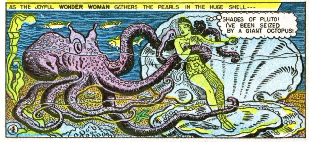
The following two images were scanned from early 1970s issues of Pif Gadget.
In the mid-70s, Mordillo’s cartoons were used by Slovenian artist Miki Muster to create Mordillo, a series of cartoon animations that ended up being 400 “episodes” long (for a total of 300 minutes – each episode is under a minute). These droll snippets were broadcast in over 30 countries between 1976 and 1981. Should you have a few minutes to spare for a chuckle or two, have a look at this video (recorded by somebody in Germany on VHS tape in the 90s and, many years later, uploaded to Youtube – what lovely, contorted pathways some of these things take).
« Or… uh, huh… with the severed neck of a dead ostrich… Yow! Tentacles! Long wriggly tentacles! Woo-WOO! »
Ah, Brian Bolland, the British artist that generally comes to mind when one mentions Judge Dredd. This was certainly *my* introduction to him, and my so-called initiation went over with a bang! (Which is to say, I fell in love with his art instantly. It took me a little longer to learn to appreciate Judge Dredd stories illustrated by other artists.) His crisp line adorns many, many comic titles, and I’m not going to enumerate all the pies he’s had his fingers in. I can, however, kill two birds with one stone by combining Wonder Woman Tentacle Tuesday part 2 (part 1 can be found here) with Bolland tentacles along other lines.
Actually, DC’s 1987 Wonder Woman series is a treasure trove of tentacles even without Mr. Bolland. However, some of these covers are frankly too ugly to feature here (I have high standards, in case you hadn’t noticed), while he can be relied on to always provide us with eye candy and an engaging composition.
Wonder Woman no. 75 (June, 1993).
Bolland is reputedly fond of his work on Wonder Woman covers, marking that it was “one of the few occasions he actually sought work rather than being sought for work.”
Wonder Woman no. 86 (May, 1994).
A bonus WW illustration as a special treat, albeit a follicular extension of the definition of a tentacle, I confess. Well, it *is* Movember.
A pin-up published in Wonder Woman no. 120 (April, 1997): Wonder Woman vs Egg Fu!
Moving on from the powerful, intrepid Wonder Woman to smaller crawfish, we have this maiden in an incredibly silly costume, which Bolland managed to somewhat redeem, mostly by hiding the stupid bow and differently-coloured boot on her left leg.
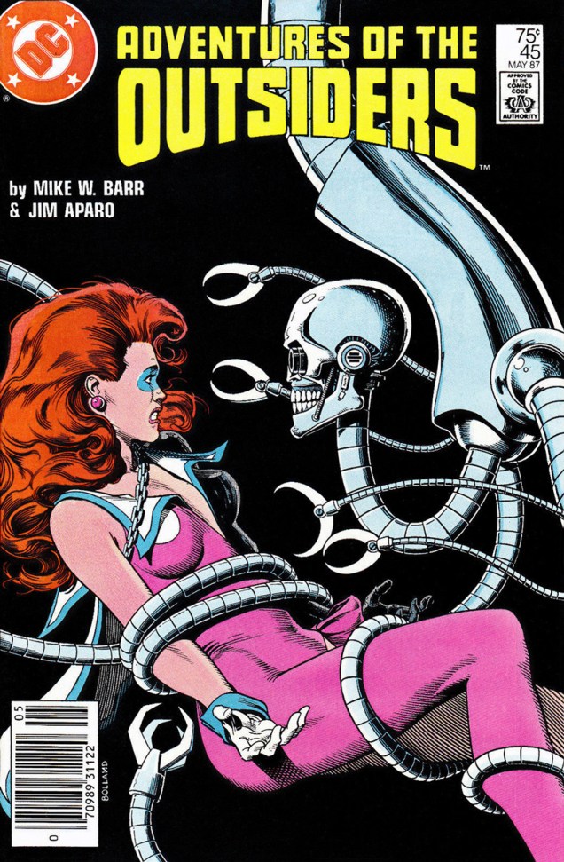
Adventures of the Outsiders no. 45 (May 1987). Mechanical tentacles are all well and good, but it’s Duke of Oil‘s inane grin I like best.
The maiden’s name, by the way, is Looker (!), presumably because the team who created her (Jim Aparo and Mike W. Barr) couldn’t think of a better moniker for a woman who went from a mousy bank teller to a cocotte (oh, sorry, I meant “coquette”) with superpowers. Pardon me going off-topic, but I really must illustrate: here’s what her costume looks (oh, har har) like in its full frontal glory.
Batman and the Outsiders no. 31 (March 1986), cover by Alan Davis.
And a last piece of balderdash:
« Her original costume was manufactured from a material unique to Abyssia; one way fabric, which was invisible from one side. This allowed her to keep her costume handy but not visible. She would turn the clothing out to make it visible. »
Moving on to classic Bolland with creepy-crawlies, fatal beauties and grotesque sub-humans, we have this delightful poster:
And a last madcap entry, amusingly full of non-sequiturs:
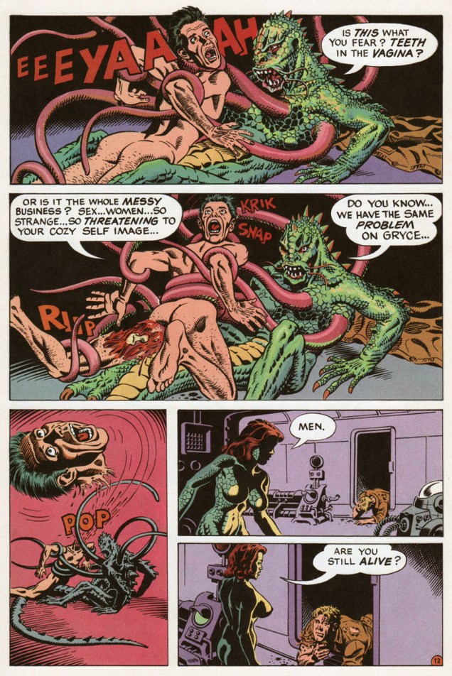
A page from « Silver Sweater of the Spaceways », featuring Zirk, and published in Axel Pressbutton no. 1 (November, 1984), scripted by Steve Moore and illustrated by… well, you know.
If you’re looking for gory tentacles, fountains of flesh and mounds of blood (err… unless it’s the other way around?), screaming hordes being devoured by a famished cephalopod with a mean streak… go look at our other Tentacle Tuesdays posts, for today’s entry is not for you.
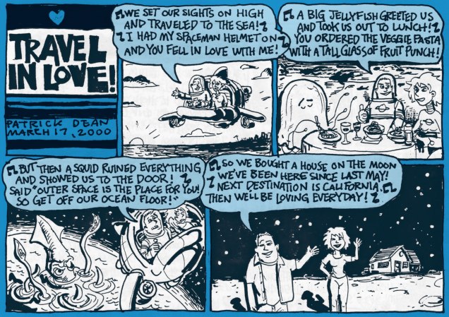
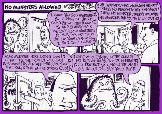
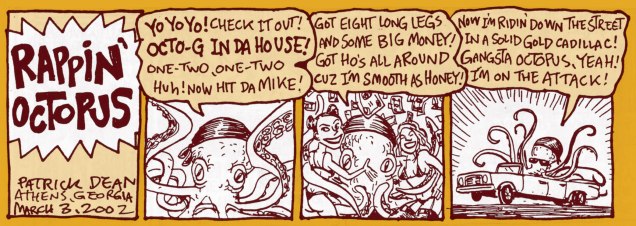
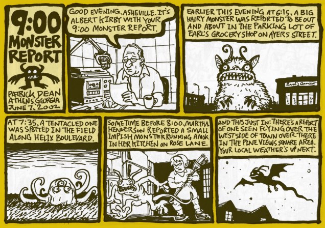
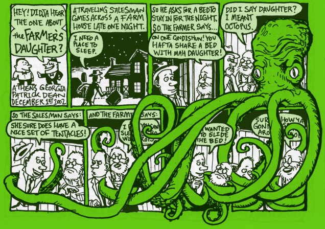
However, those of you who like a friendly octopus and can appreciate understated wit and off-beat humour, stick around as we travel into a land created by Patrick Dean (not British Ambassador to the States). A word of warning – people randomly bursting into song and cohabiting with monsters is quite normal here.
Monsieur Dean likes monsters – nay, loves them – but he likes to contemplate them in their quieter moments: wooing a potential mate, politely asking for a BLT sandwich, watching a Julia Roberts movie or even reciting poetry.
All images in this post have been scanned from Big Deal Comics & Stories numbers 1 through 4 (published from 2000 to 2004), and lovingly coloured by my co-admin-cum-partner. I reread them recently in my ceaseless quest for tentacles, and while I remembered really enjoying them a few years back, I had forgotten how good they were. A lot of comics of a random, episodic nature are very much hit or miss, but these little gems are all gold, if you pardon my mixed metaphor. For instance, here’s PD’s summary of #3:
« More assorted one page strips. 28 pages of witches, cities, investigators, sailors, big shows, haunted houses, bees, record collections, band directors, roommates, octopuses, ham, radio towers, rainy days, treasure maps, J.D. Salinger, pork chops, and four leaf clovers. »
What kind of stone-hearted, dull-witted person would say “nope, not interested” to that? Luckily, not all Big Deal Comics are sold out – three issues are still available for purchase.
The best part of Cathy’s letter is… well, you guessed.
Those musical interludes I coyly alluded to earlier? Here.
The best saved for last? I think so!
Don’t forget to visit Patrick Dean’s website, visit his FB page, or admire more of his art here.
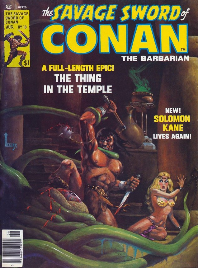
Marvel’s looong-running Savage Sword of Conan (published 1974 – 1995) was not restrained by the Comics Authority Code, being a magazine. So what did the illustrators and writers involved do with all this freedom? They heaped piles of gore and violence (badass violence) into the stories, and they made sure most Conan covers contained (1) naked damsels; (2) a heroic chopping-off-things-with-my-sword pose; (3) tentacles. If there was a shortage of cephalopods that month, other tentacle-like props would be happily used: elephant trunks, serpents ‘n’ snakes, dragon tails, and other grabby appendages.
I recommend reading The 10 Most Brutal Moments from Savage Sword of Conan the Barbarian! f̶̶̶o̶̶̶r̶̶̶ ̶̶̶a̶̶̶ ̶̶̶g̶̶̶o̶̶̶o̶̶̶d̶̶̶ ̶̶̶g̶̶̶i̶̶̶g̶̶̶g̶̶̶l̶̶̶e̶̶̶ for a good look at just how, erm, badass and savage and brutal Conan is. And when you’re done with that, take a gander at today’s line-up of tentabulous and tentarrific covers in which Mr. Conan slashes and hacks his way through rapacious monsters!
The Savage Sword of Conan #13 (July 1976), painted by Richard Hescox. Mostly undressed cutie (who may actually be a drag queen?): check. Bloody knife: check. Murderous, glazed-over eyes, a mask of hate and sadism on Conan’s face: double check. Poor scared octopus who was minding his own business… sigh, I’m afraid he’s mincemeat.The Savage Sword of Conan #20 (July 1977), cover painted by Earl Norem. Braless beauty: check. Interestingly, Conan seems to have only one nipple. The sword hasn’t been plunged it, yet, but I’m sure it will take no time at all.
Incidentally, this is what our Slithering Shadow looks like from another angle:
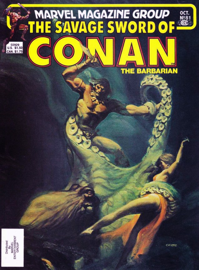
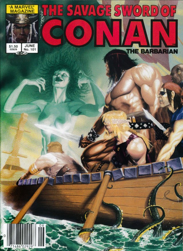
Pencils by John Buscema, inks by Alfredo Alcala.The Savage Sword of Conan #23 (October 1977), cover painted by Earl Norem. It’s a little-known fact that if you squeeze a woman by the midriff, her boobs pop out. At least Red Sonja is a little more feisty than the average helpless maiden.The Savage Sword of Conan #81 (October 1982), painted by Joe Chiodo. Completely exposed woman in lingerie: check. Has she wandered in from a gothic romance in which she was roaming the halls at night, dressed in naught but a flimsy nightie? Oh, sorry, wrong trope.The Savage Sword of Conan #101 (June 1984), painting by Michael Golden (‘when in doubt– smudge!‘). Man, Conan has a heck of a square, prominent chin. I almost didn’t include this cover because of the ridiculous anatomy – the front guy’s arm looks like a bovine leg (complete with hoof??), and Conan’s thigh and its bulging muscles don’t seem to be attached to his body – but the tentacles beckoned.
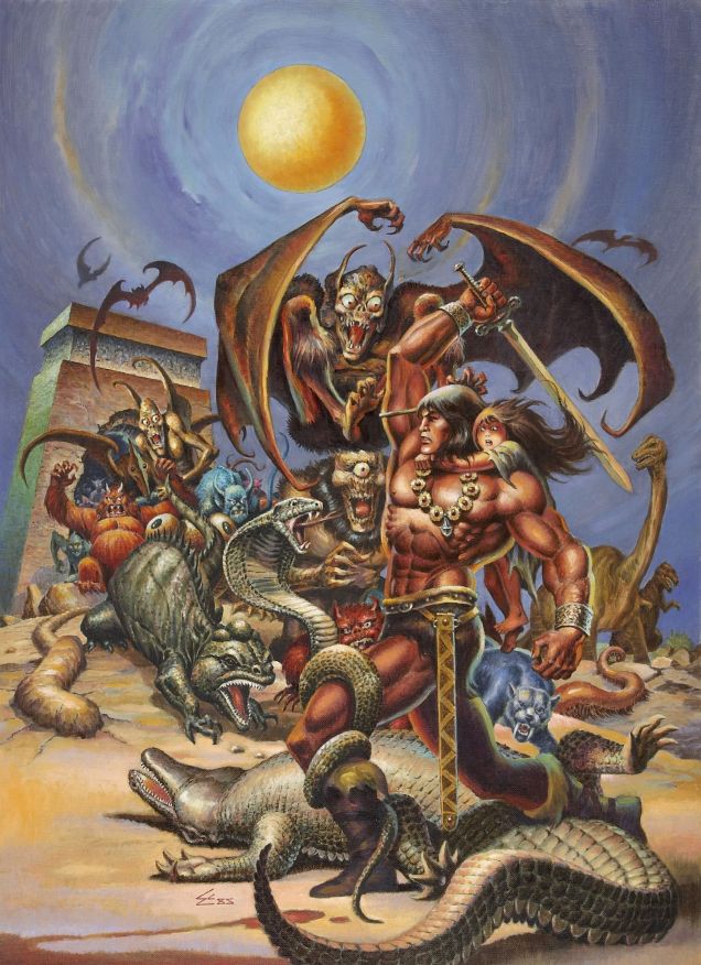
The following may be my favourite cover of today’s post, so here’s the original painting so we can admire the myriad details properly. For a second, I was worried that it couldn’t become part of today’s roster for lack of tentacles, but a scene of this type just *had* to have at least one tentacled creature. This has several, I am happy to report, though sometimes it’s hard to tell who’s who (and what’s what) in this glorious tangle of tails, wings and appendages.
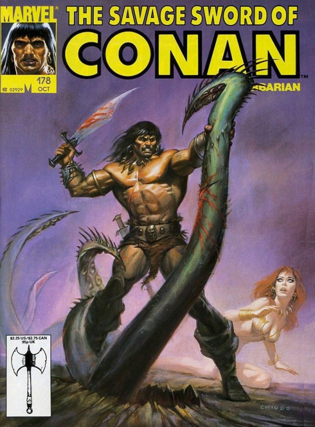
Original painting for the cover of The Savage Sword of Conan #123 (April 1986). Painted by Ernie Chan. Note that there is no, I repeat no naked woman on this cover, just a scared child of indeterminate gender. And Conan doesn’t look like a complete asshole. Ernie Chan, you made my day. ❤ ❤The Savage Sword of Conan #178 (October 1990), painted by Joe Chiodo. Back to our regular program: violent He-Man hero, ghostly mostly-naked chick (who doesn’t have an ass at all, it seems, while her legs are mysteriously floating in the mist generated by the animal heat and moisture given off by Conan).The Savage Sword of Conan #190 (October 1991), cover painted by Earl Norem. Wait, Conan is wearing a vest? And he looks younger and almost scared? What’s happening?
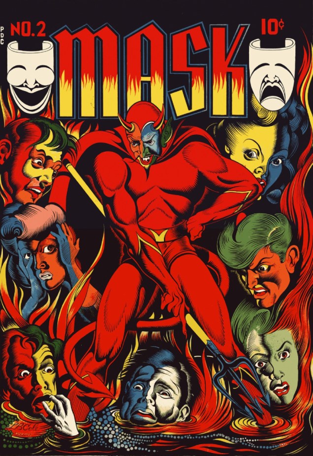
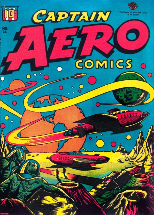
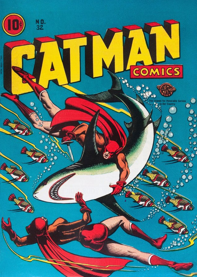
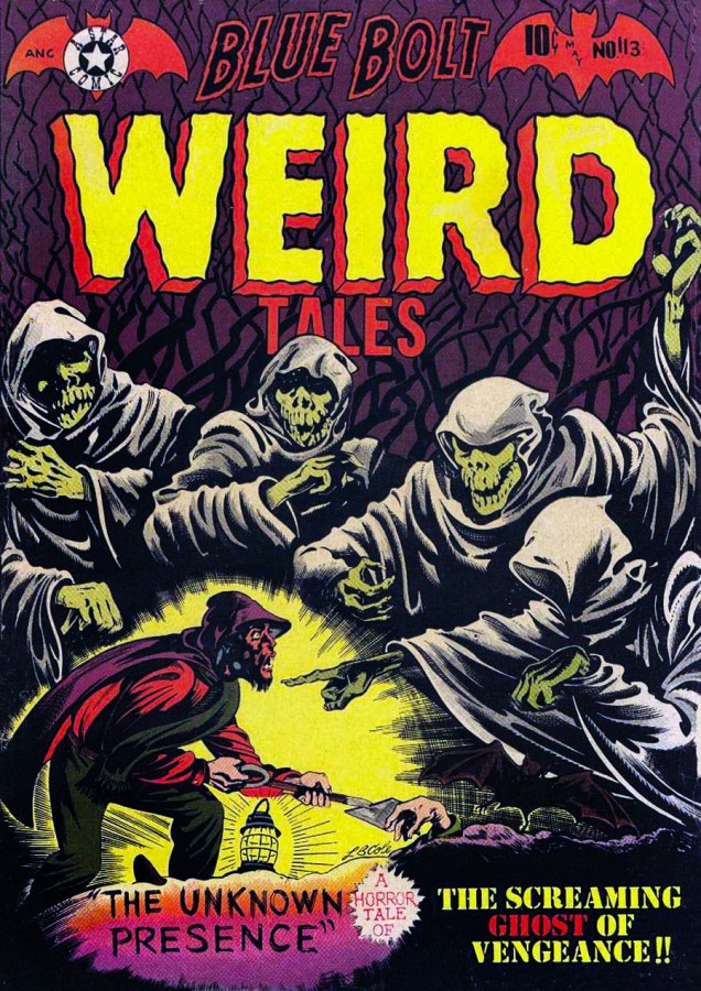
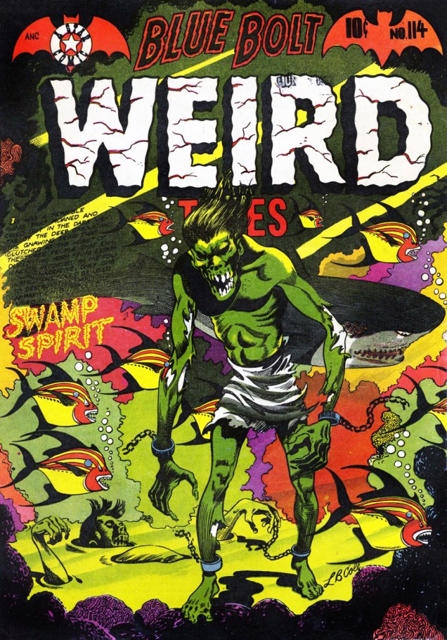
There’s probably no need to write a panegyric on Leonard Brandt Cole, 1918-1995. (But did you know he had a doctorate in anatomy and physiology?) The first thing that springs to mind is his use of primary colours over frequently black backgrounds, what he referred to as “poster colours”. Indeed, most L.B. Cole covers would, and occasionally do, make great posters. Going into biographical detail, one might also mention his publishing company, Star Publications, founded in 1949 and singled out in Fredric Wertham’s 1954 exposéSeduction of the Innocent for the “grisly” nature of its published horror titles. Then there’s his work as art director and editor at Dell in the early 1960s… but as usual, I’ll let others get to the nitty-gritty of his life and career. Here are some of my very favourite L.B. Cole covers, in chronological order.
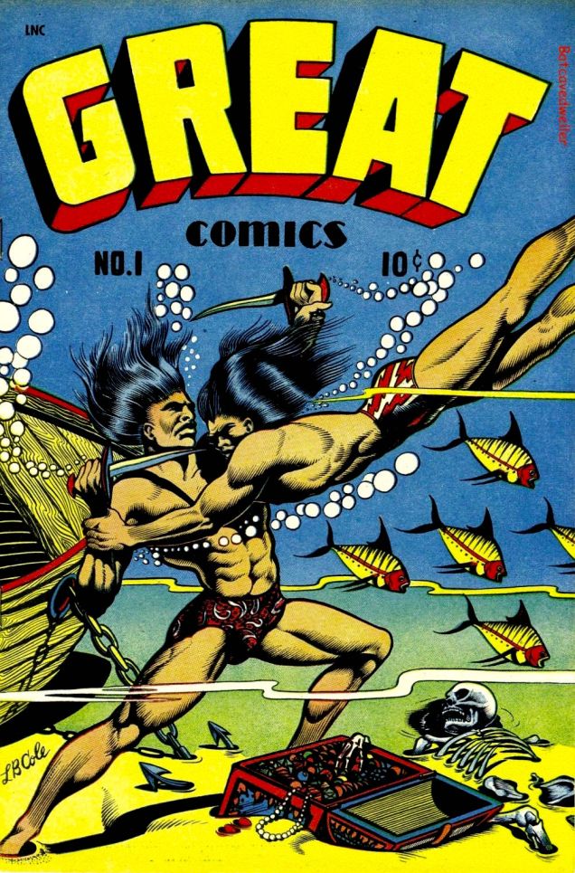
Mask Comics no. 2, April-May 1945 (Rural Home). Read it here. The classically-oriented study of human expressions had me smitten even before I noticed the devil’s muscular thighs.Great Comics no. 1, 1945 (Novack Publishing). Read it here.
« An avid science fiction fan, Cole was known for slipping in sci-fi elements even when they weren’t appropriate, such as rocket ships and ray guns appearing on the covers of Captain Flight Comics and Contact Comics. Both titles were supposed to be devoted to contemporary aviation. » (source) Fuck being appropriate, I say!
Captain Aero Comics no. 26, August 1946 (Continental Magazines). Read it here. This is like a Soviet poster in overdrive.Cat-Man Comics no. 31, June 1946 (Continental Magazines). A great scene, isn’t it? Though shoddily printed, the tension of the moment comes through loud and clear, and I love the dots of snow in the darkness. Cat-man isn’t to be confused with Catman, a supervillain and enemy of Batman (first appearance in Detective Comics in 1963). Catman: a professional trapper of jungle cats turned to crime for the usual reason (i.e. boredom) after procuring himself a costume made out of ancient African cloth (?!) Cat-man: raised by a tigress to be an upstanding member of society and scourge of criminals, with 9 lives, super-strength and night vision at his disposal. The moral – be kind to tigers! Read the issue here.Cat-Man Comics no. 32, August 1946 (Continental Magazines). Cat-Man (created by Irwin Hasen), usually paired up with sidekick Kitten (created by Charles M. Quinlan), a former circus acrobat. That’s them frolicking underwater on this cover – tigers love water, by the way. This is the last issue of Cat-Man, so Kitten, who was 11 years old when her association with son-of-tigress began, is at her shapeliest. Mr. Cole wasn’t well-versed in anatomy for nothing. Read it here.“Into its gurgling ghastliness goes Peep… sailing blithely in the rocket car...” I somehow imagine that read out loud with a British accent. And yes, there’s a character named “Peep” in the story. Jeep Comics no. 3, March-April 1948 (Spotlight Publishers). Read the issue here.Guns Against Gangsters vol. 1 no. 6, July-August 1949 (Premium). Read the issue here. Another cover with that blue-green-yellow gradation, and while I love these colours together, it’s the cartoony shark that gets my vote (and sympathy). Sadly, when one pits a woman in high heels and a miniskirt against a huge shark, the latter will always lose.Blue Bolt no. 105, April-May 1950 (Star Publications). I can’t resist the combination of a dragon/bird flown straight out of a Slavic fairy-tale with stylish space opera.Blue Bolt Weird Tales of Terror no. 113, May 1952 (Star Publications). A genuinely spooky cover.Blue Bolt Weird Tales of Terror no. 113, August 1952 (Star Publications). « It was a terrible thing that moaned and cried out in the dark vistas of the deep bayous… » This cover is busy, no doubt about it, but I think it works. That slow, grotesque shuffle through water… brrr! Say what you will about L.B. Cole’s style or his propensity for using reds and greens, but the guy knew what he was doing.
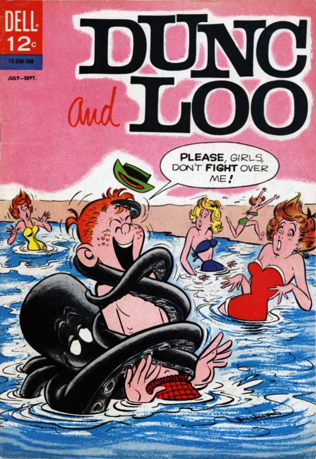
Dunc and Loo (which was called « Around the Block with Dunc & Loo » for the first three issues) was a comic written and story-boarded by John Stanley. (See our initial post about John Stanley, including more D&C covers.) The finished art for the series was provided by Bill Williams. This combination worked perfectly to provide readers with (only eight, alas) hilarious issues of teenage high-jinks and other silliness.
Dunc and Loo no. 7, July-September 1963, art by Bill Williams.
You can read the whole issue over at Comic Book Plus – no tentacles, I’m afraid, but some gorgeous art and zany stories. It’s well worth the detour!
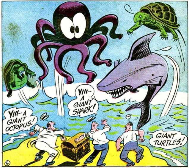
Hey, octopuses like surfing, too. Or maybe this one just wanted the blonde for himself…
The Adventures of Bob Hope no. 94, 1964. Art by Bob Oksner… I think.
The Adventures of Bob Hope were published by National Periodical Publications from 1950 to 1968, for a total of 109 issues. The main stories centred around comedian Bob Hope (or his misadventures, rather); the cover stories often featured some other film-related characters. The original artist of the series was Owen Fitzgerald, with Cal Howard as the writer. Official credits aren’t really available, but these two seemed to provide much of the content for the first 60 issues. In #61, however, Mort Drucker (on main stories) and Bob Oksner (on back-ups) made their debut, and continued on their merry way until, oh, 1967 or so. In case you’re interested, Neal Adams did the last 4 covers for the series (eek).
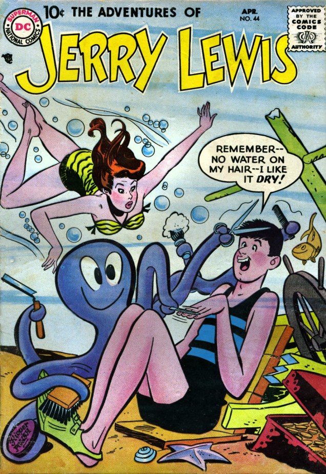
Here’s another series that followed a pretty similar path (unsurprisingly – same publishing house, comparable years, same subject matter): The Adventures of Dean Martin & Jerry Lewis (July-August 1952 – October 1957) that became The Adventures of Jerry Lewis with #41 (November 1957). The art, handled mostly by Owen Fitzgerald in the beginning, gradually landed increasingly into the more-than-capable hands of Bob Oksner, who stayed around until the end with issue #124 (June 1971). Here, also, Neal Adams stuck his nose in, this time for three issues (covers of #102 through to #104).
The Adventures of Jerry Lewis no. 44 (April 1958). Art is, presumably, by Bob Oksner, though GCD tentatively attributes it to Owen Fitzgerald.
Read this issue over at Ominous Octopus Omnibus (what could be more appropriate on Tentacle Tuesday?)
Pacific Comics have already been part of our Tentacle Tuesday line-up (see here), but I’d like to finish what I started. Our intrepid team (read: me and husband) has gone through a bunch of PC comics to save you the trouble of looking for tentacles where there’s none to be found (sniff, sniff). The result? (Only) two covers, and a horrifying (in its implications) inside story.
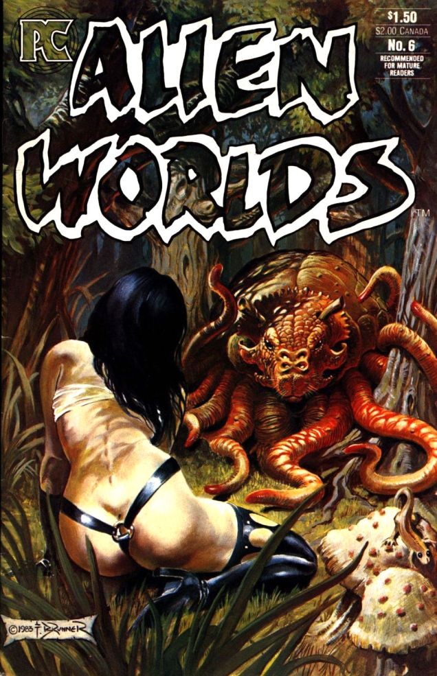
Have you ever seen a Rhunk? That’s the friendly (*too* friendly, as we’ll see later) creature with a snout and a full set of tentacles you see below.
Alien Worlds #6 (February 1984), cover by Frank Brunner.
“Pride of the Fleet” (written by Bruce Jones, pencilled by Frank Brunner and inked by Mike Mignola), published in this issue, is a chilling story, but not because of the alien creature that threatens the swordmistress and her highly impractical costume. Have I already mentioned that Bruce Jones can get seriously nasty?
“Methodically, as if confident of the helplessness of its prey, it advanced on her, muscles riding in sensuous rhythm along its shoulders, tentacles twitching in anticipation. Sheffield felt her blood turn to ice…”
This is the story of a highly intelligent but “funny-looking” man who wanted Dejah Thoris (our heroine) so badly that he transformed himself into a rhunk (and tricked her into doing the same) just so he could rape her. To which I’ll add that she trusted and admired him, and considered him a (platonic) friend. Talk about a horror story about one of those prototypical “nice” guys. Ouch.
I really hope she’ll have the satisfaction of dismembering him at some point, but it seems unlikely. You can read the story here.
I realize that it’s anticlimactic – some straightforward spiky plant tentacles after the previous mindfuckery – but to get PC over with, one more cover:
« Give men an alluring woman stronger than themselves to submit to and they’ll be proud to become her willing slaves. » (William Moulton Marston, co-creator of Wonder Woman)
We might all happily to submit to Princess Diana of Themyscira, but *she* occasionally has to submit to tentacles, although of course she always manages to fend them off. Might this be a metaphor for unnecessarily grabby male hands? I’m not here to psychoanalyze (that was Marston’s job!), just to celebrate Tentacle Tuesday. Lots of versions of Wonder Woman have grappled with tentacles… but no adventures are more entertaining than the ones depicted by the formidable Harry Peter!
Without further ado, today’s roster of tentacles – whether they’re attached to a Neptunian fish or sprout out of a mad doctor’s ectoplasm.
Page from “The Tigeapes of Neptunia“, scripted by Joye Murchison (the first female writer of superhero comics) and drawn by Harry Peter, published in Wonder Woman no. 15 (Winter 1945). Read the issue here.Page from “The Drugged WAC”, scripted by Joye Murchison and drawn by Harry Peter, published in Wonder Woman no. 18 (July-August 1946). Read the issue here.
The following panels are from from “Three Secret Wishes!“, written by Robert Kanigher and drawn by Harry Peter. The story was published in Wonder Woman #81 (April 1956). The whole issue is fun, actually, largely thanks to the gorgeous art – read it here.
We have just come back from a lovely vacation in Nova Scotia, one of Canada’s maritime provinces. In the honour of this all-too-short getaway, this Tentacle Tuesday is about Canadian artist Randolph Holton Holmes, who was born in Nova Scotia in 1942 and passed away in British Columbia in 2002, completely at the other end of this big country.
« Rand Holmes was Canada’s most revolutionary artist in his heyday, the star cartoonist at the Georgia Straight newspaper in British Columbia during the 1970s. His hippie hero, Harold Hedd, became the spokesman of the emerging counterculture as he avoided work, explored free love, and flouted drug laws. The Adventures of Harold Hedd spread across the globe in the wave of underground comix and newspapers of the era and Holmes became famous or at least notorious. While his comic character was bold and blatant, the artist was shy and quiet, well on his way to becoming a complete hermit. » (excerpt from Fantagraphics’ The Artist Himself: A Rand Holmes Retrospective)
Glimpsing through Holmes’ body of work, one quickly becomes aware that he displays a special affinity for drawing busty women… and (of more interest to this current post) that he loves to insert tentacles at the drop of a hat, especially if ETs of some kind are involved. A lot of artists use tentacles as a short-hand for aliens, and he’s not alone in that… much to my personal satisfaction.
Slow Death no. 6 (Last Gasp, January 1974). Colonel “Saunders”?Fog City Comics no. 2 (Stampart, October 1978). “Science fantasy at its finest” may be an unfulfilled promise; by all accounts, Rand Holmes’ Killer Planet is the best story of the issue. Fog City Comics was an all-Canadian underground comix anthology and lasted a mere 3 issues.
As I mentioned Holmes’ story Killer Planet, here’s a peek at its manifold tentacles:
A panel from Killer Planet, both written and illustrated by Rand Holmes, originally published in the aforementioned Fog City Comics no. 2, coloured by Bill Poplaski and reprinted in Death Rattle no. 1 (2nd series, Kitchen Sink Press, Oct. 1985).What kind of idiot eats fruit growing on an obviously life-threatening planet? Panels from Killer Planet, both written and illustrated by Rand Holmes, published in Death Rattle no. 1 (Kitchen Sink Press, October 1985).Panels from Killer Planet, both written and illustrated by Rand Holmes, published in Death Rattle no. 1 (Kitchen Sink Press, October 1985). Note the cute mushrooms in the bottom left corner.
And lastly, for contrast with the cover of Slow Death and its throes-of-ecstasy coupling scene, there’s this:
Vagina Dentata! A page from “Junkyard Dog“, written by Mike Baron. It was published in Death Rattle no. 5 (Kitchen Sink Press, June 1986). The (telepathic) alien female wasn’t unjustified in, erm, chewing up her rapist (the intercourse wasn’t consensual) – he was an unapologetic asshole.
Finally, Tentacle Tuesday is here, and the tentacles are back with a vengeance! I’ve been waiting all week to spring ’em on you.
This cutie, the Triclopus, kindly agreed to let us use his, err, face to kick off the Tentacle Tuesday festivities.
The Triclopus is a Ken Reid creation from August 31st, 1974. There’s a full list of Creepy Creations (published in the British Shiver and Shake) – with pictures! – over at Kazoop!, a great blog about British humour comics of the 60s and 70s. Go check it out. As for Ken Reid, we’ve previously talked about him here.
Excerpt (or, as the Brits would say, extract) from Alienography by Chris Riddell (2010).
Chris Riddell is a British illustrator, writer of children’s books, acclaimed political cartoonist, talented doodler, etc. His hand-lettering (not at all on display in Alienography, I admit) is sort of Richard Sala, Edward Gorey-ish, as is his somewhat macabre sense of humour. Visit Riddell’s blog here.
This splendid illustration by Roger Langridge (tentacle artist par excellence) was published in Doctor Who Magazine no. 300 (February, 2001) to accompany some-article-or-other about “Spearhead from Space” (a Doctor Who episode, the seventh season opener, if you really must know).
A bit more information about the cool Dr. Langridge-and-Dr. Who pairing:
“Within Doctor Who comics, he can be regarded as effectively the current Doctor Who Magazine “house letterer”, having lettered the overwhelming majority of comics since his debut on DWM 272’s Happy Deathday in late 1998. Almost every issue of DWM published in the 21st century was lettered by Langridge.
He has also occasionally pencilled, inked and even coloured some stories along the way. Deathday, for example, was also his Doctor Who pencil and ink debut, and was followed by artistic duties on TV Action!, the back half of The Glorious Dead (where he was co-credited as penciller with Martin Geraghty), The Autonomy Bug, Where Nobody Knows Your Name, The Green-Eyed Monster, Death to the Doctor!, and Planet Bollywood. He is thus perhaps the only artist to professionally draw all eleven incarnations of the Doctor, even though many of his renderings were obvious parodic in Death. Finally, he coloured Me and My Shadow and Where Nobody Knows Your Name.” [source]
The Wizard, a weekly British publication put out by D.C. Thomson (without a P, though it’s tempting), was created in 1922 and lasted all the way until the late seventies (with periodic interruptions for a merger and several title changes, from “Wizard” to “Rover and Wizard” to “Rover” and then again back to “Wizard” in 1970 until its final demise in 1978).
This edition of The Wizard is from October 26th, 1974, but I unfortunately have no idea who the artist is.
Between WWI and WWII (and sometimes beyond), D.C. Thomson published a number of weekly magazines/papers aimed at boys between 8 and 16. They cost 2 pence, and were thus known as “Tuppenny Bloods”, or the Big Five: Adventure, Rover, Skipper, Hotspur and the aforementioned Wizard. What could one hope to find in a Tuppenny? Short stories with illustrations, some comics, some non-fiction articles…. pretty much everything a growing boy (and girl!) with a lively mind would want.
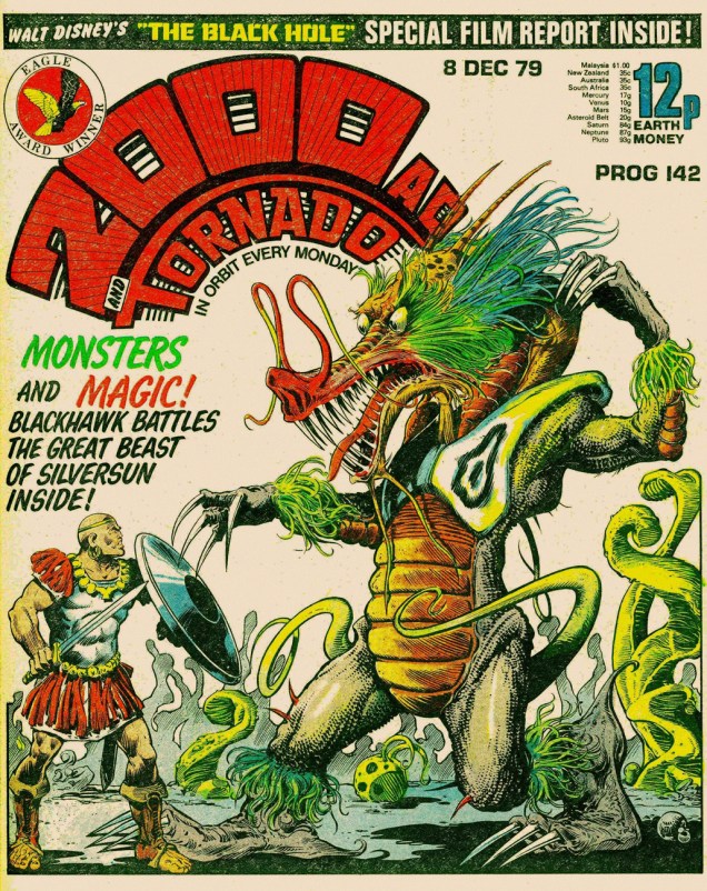
2000 AD no. 142 (1979). I call this the “dragons’n’tentacles” ploy. Other than tentacles on the cover, this issue contains part 3 of Judge Dredd: The Black Plague, which I highly recommend, and some Stainless Steel Rat adventures.


 , those of you who like a friendly octopus and can appreciate understated wit and off-beat humour, stick around as we travel into a land created by Patrick Dean (not British Ambassador to the States). A word of warning – people randomly bursting into song and cohabiting with monsters is quite normal here.