Since the previous instalments of Tentacle Tuesday had specific, unified themes, the time has come for another anything-goes grab bag of goodies. That being said, I am in the mood for bright colours, as the lawns and plants around these parts have acquired that drab, dusty shade of brownish green that’s characteristic of August and its dry spells…
This epic Cthulhu-vs-Godzilla scene was drawn by Chaz Folgar for a 2010 online illustration competition – the exact wording of the challenge was “Cthulhu and Godzilla with the fate of Japan in the balance“. I’m definitely betting on Cthulhu (see Tentacle Tuesday: Ho ho ho, Mr. Lovecraft if you need a refresher!), ancient and powerful and eternal being that he is. Godzilla, in the meantime? Just a prehistoric, overgrown lizard (with apologies to all Kaiju film buffs).
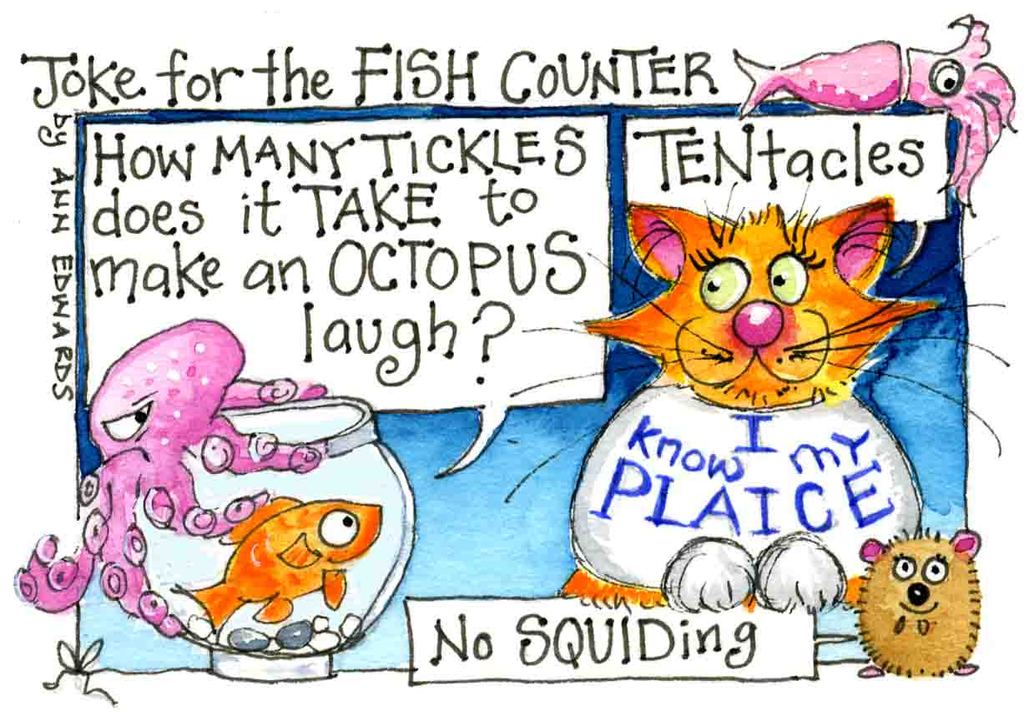
In a somewhat different vein, here is a postcard/cartoon/illustration by British artist Ann Edwards (visit her website!) She has a bouncy, colourful style that’s really fun… especially if there are tentacles involved.
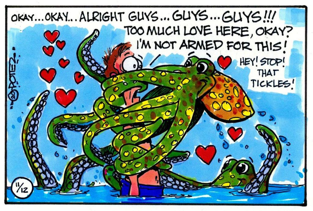
In a similar format, and perhaps even more colourful, is this cartoon that I found in an article about My Octopus Teacher, a movie about the filmmaker Craig Foster and the octopus he makes friends with. Amazingly (and not in a good way), the article did not specifically credit this image to anybody in particular. Did Foster document his octopus shenanigans with cartoons? Is this the work of some completely unrelated artist that was included because it was on topic?
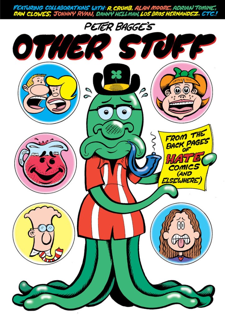
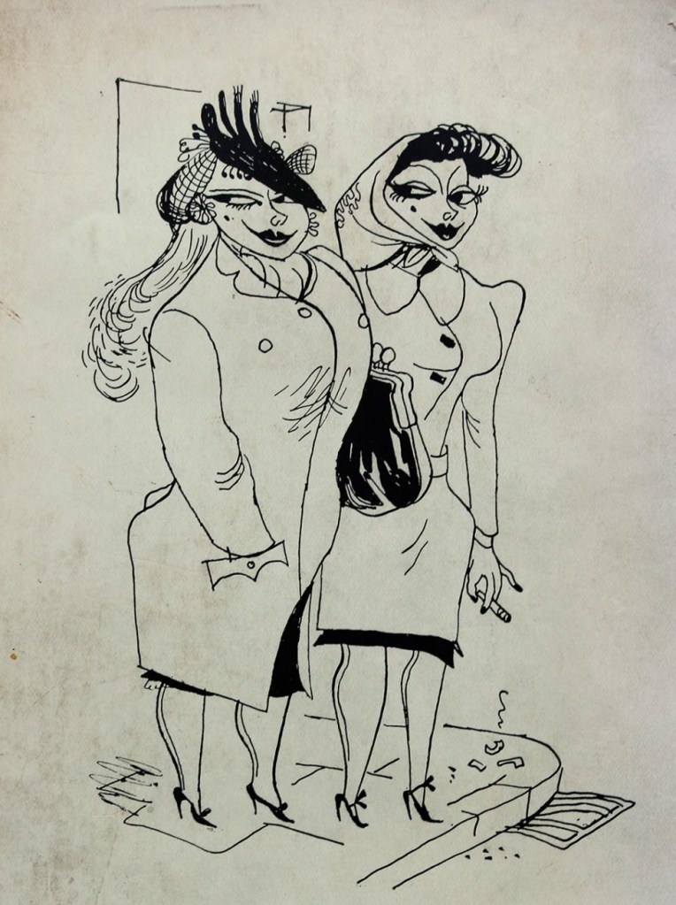
Peter Bagge’s Other Stuff (Fantagraphics, May 2013) is a collection of Bagge’s shorter stories from the 90s and 2000s. I’m not really a Bagge fan (his sense of humour is too based on making audiences cringe), but I enjoyed reading this one, though my inclination to revisit it is very low.
« When I was a young writer if you went to a party and told somebody you were a science-fiction writer you would be insulted. They would call you Flash Gordon all evening, or Buck Rogers. » —Ray Bradbury
We’ve talked about newspaper strip Flash Gordon in Tentacle Tuesday: Lurkers in the Newsprint, and now it’s time for its comic book version! Although I normally have very little interest in FG, this is no second-rate Tentacle Tuesday: there is some prime tentacular material to be enjoyed.
We first concern ourselves with the Flash Gordon Charlton Comics run, which picked up the count where King Comics had left it in 1967. From 1969 until 1970, Charlton published issues 12 to 18, all of which but the first had glorious covers and cover stories by Pat Boyette, an absolute WOT favourite ( you can visit co-admin RG’s Pat Boyette — Hillbilly Makes Good* for a deeper exploration of his career).
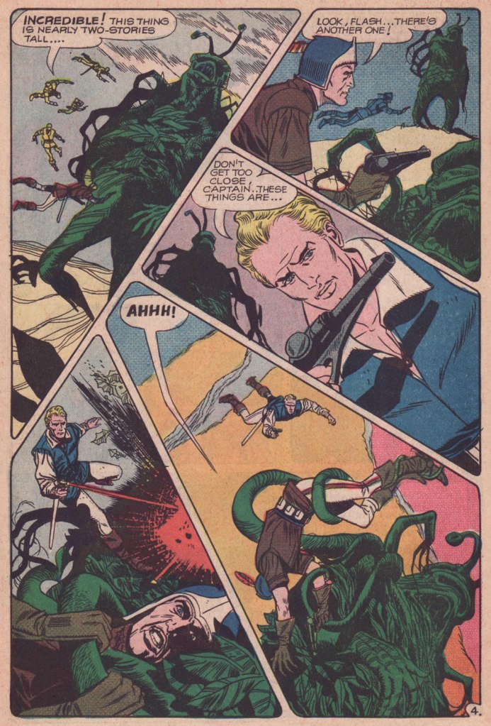
The cover of issue 14 has an octopus shortage (a serious flaw affecting many, many comic book covers!), but the monster o’nine-tentacled-tails the ’emotionless killers’ encounter is a beauty. The following page is also a good example of Boyette’s imaginative page layouts, in which things are kept dynamic, but never engender confusion about who is doing what and to whom.
Page from Rancor and the Seven Shadows of Flash Gordon, scripted by Bill Pearson and illustrated by Pat Boyette, was published in Flash Gordon no. 14 (June 1969).
Then we come to a real bevy of Boyette tentacles a few issues later –
Flash Gordon no. 17 (Charlton, November 1969). Cover by Pat Boyette.
The Creeping Menace, the cover story, is scripted by Joe Gill and illustrated by Pat Boyette. I am including two pages (and a panel) because it’s too difficult to choose between them – all boast the aforementioned dynamic layouts and striking tentacles.
Isn’t this a lovely, stylish panel? I want it on a t-shirt.
The publishing history of comic-book Flash Gordon was an interesting relay race: Gold Key Comics resumed the run with issue 19 (1978), and kept it up until issue 27 (1979); finally, issues 28 to 37 were published under its Whitman imprint between 1980 and 1982. The latter category offers two tentacled covers, and some inside goodies.
Original art (sadly by an unknown artist) for the cover of Flash Gordon no. 29 (Whitman, May 1980).
The cover story The Deadly Depths is scripted by John Warner and illustrated by Carlos Garzón. Oh, this thing is not hostile… just hungry.
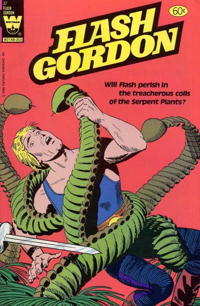
The last Whitman issue also is of some interest, though on the cover Flash looks like he’s fighting caterpillars with an martini olive for a head.
Flash Gordon no. 37 (Whitman, March 1982). Cover by Gene Fawcette.
Cover story My Friend, My Killer! is scripted by George Kashdan and illustrated by Gene Fawcette and features cute serpent plants that look like they’re wearing little hula skirts.
And that concludes our tour of Flash Gordon tentacles in the Silver Age (and with some forays into Bronze).
Dark Horse seems to publish more mini-series heavily dependent on tentacles that you could shake a stick at, and enough spin-offs of spin-offs to make one’s head spin. Still, I have been dutifully saving the… shall we say, less ugly… tentacle-heavy DH covers I have come across, and since there is clearly little point in hoarding them, the time has come for a part III. Visit the previous instalments here: Tentacle Tuesday: Dark Horse, Pt. 1 and Tentacle Tuesday: Dark Horse, Pt. 2. Your mileage may vary!
I have to include at least a couple of things I actually somewhat like per post, whatever pleasure I may get from mocking the rest.
The first is the back cover of Madman Comics no. 4 (October 1994), with art by Dave Stevens, with well-defined, slimy tentacles and plenty of boobage. That’s Madman (created by Mike Allred) in the middle, but he surely ends up ending up in the background of his own adventure, courtesy of the cephalopod and skin-tight costumes of the damsels.
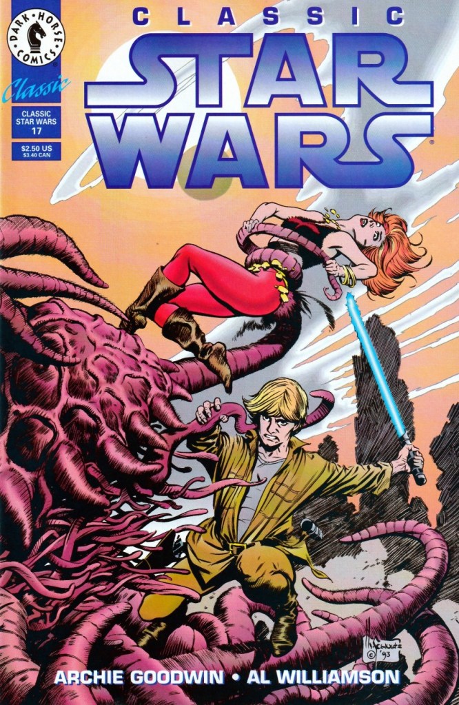
Continuing with the 90s, here are two Star Wars covers by Mark Schultz who’s, err, distinctly not at his best – though bringing one’s best to Star Wars would be a waste, anyway.
Classic Star Wars no. 8 (April 1993).
Classic Star Wars no. 17 (March 1994).
Continuing with the 90s…
Dark Horse Comics no. 15 (November 1993). Cover by John Higgins. The suggestive-yet-fuzzy shapes made me think that this woman is bare-bosomed and possibly vagina dentata-ed at first. The teeth belong to the tentacled monster, the nakedness is still a possibility.
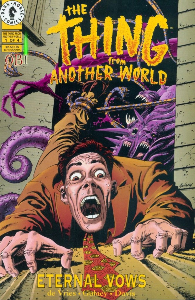
This one I like far more:
The Thing from Another World: Eternal Vows no. 1 (December 1993). Cover by Paul Gulacy. Upon seeing this, co-admin RG quipped ‘oh, what’s left of Gulacy‘ (after his run on Master of Kung Fu, that is).
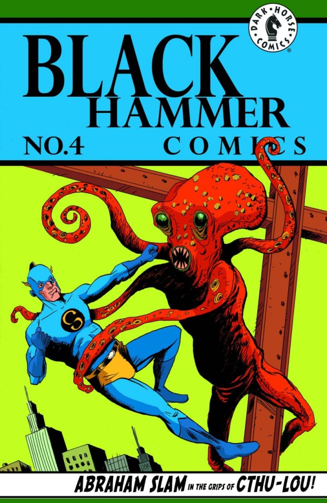
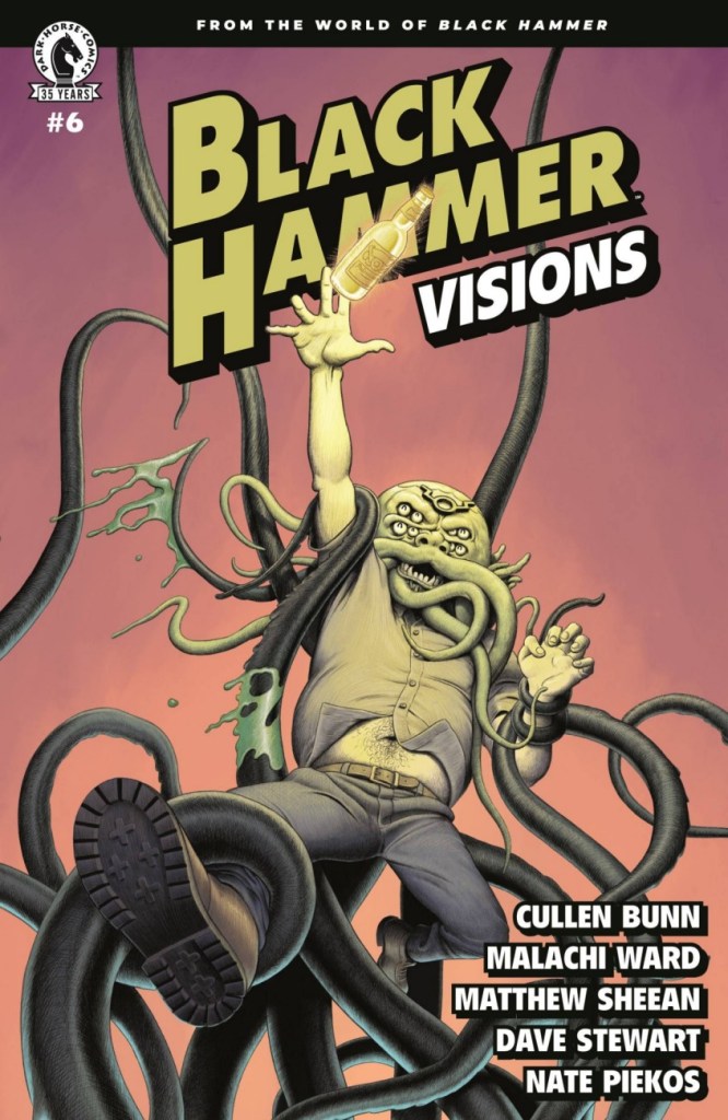
Finally, we have three Black Hammer-related covers, which made me look up this series since I didn’t even know of its existence before spotting these tentacles. Created by Jeff Lemire and Dean Ormston, it’s apparently doing quite well (given that it started in 2016, and is still ongoing with many spin-offs, awards received, and a possible TV show).
Black Hammer no. 4 (October 2016). Cover by Dean Ormston.
Black Hammer no. 4 (October 2016). Variant cover by Jeff Lemire.
Black Hammer: Visions no. 6 (July 2021). Cover by Malachi Ward.
No Dark Horse post about tentacles can avoid the elephant in the room, namely Hellboy and Mignola. If that’s what floats your boat, I covered that ground in Tentacle Tuesday Masters : Mike Mignola.
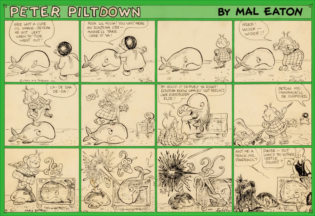
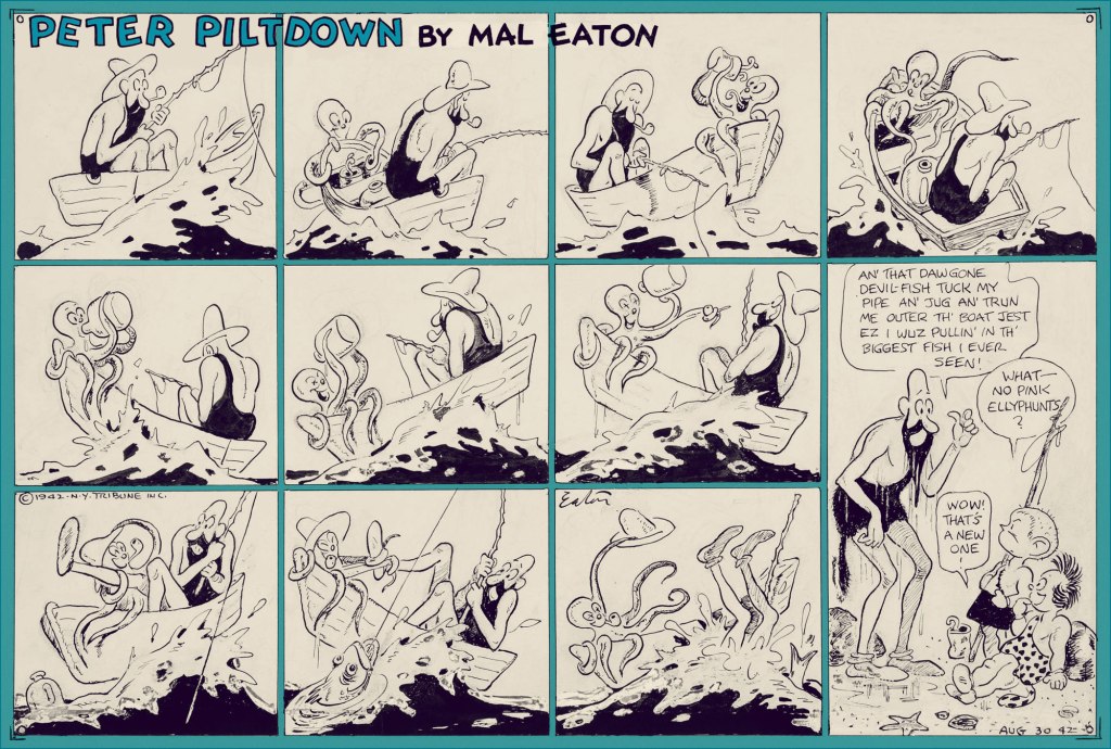
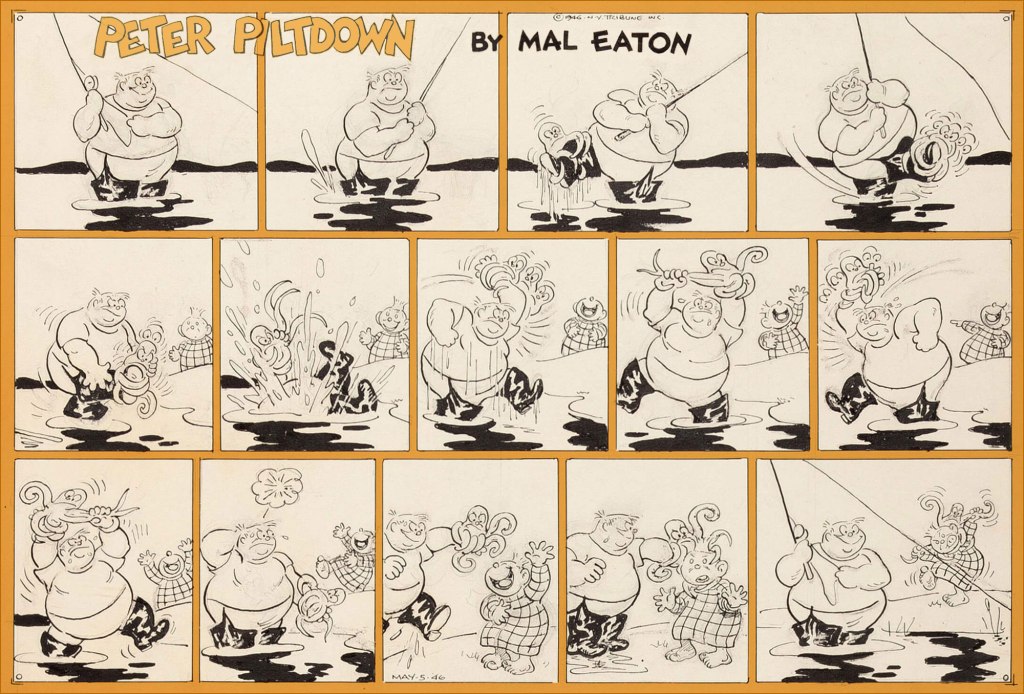
It’s time for a Peter Piltdown Tentacle Tuesday! We have previously written about Peter Piltdown, Mal Eaton’s nearly forgotten strip, but a few Sundays were kept in reserve for very obvious (tentacular!) reasons. Given the paucity of these strips, I am truly amazed that the original art of four octopus strips is available online. Eaton has a great ease with depicting flexible, expressive tentacles, so I am very pleased to be able to raise him to the rank of a 🐙Tentacle Master🐙!
Without further ado (just a little side note: these images were found on Heritage Auctions – I am not lucky enough to own any Mal Eaton art, or at least not yet!) …
May 31st, 1942. I didn’t know that whales ate octopus, but apparently they do – ‘the majority of toothed whales will eat whale food species such as squid, octopus, crustaceans and fish.‘
August 30th, 1942. This octopus knows how to live it up! This strip makes up for the unfortunate end of the member of his species in the previous one.
May 5th, 1946. I don’t know what the octopus wanted the man’s leg for in the first place, but he sure looks peeved by this whole interaction. These fishing bouts are just fraught with octopus danger…
… even if the danger is sometimes imaginary. August 18th, 1946.
Speaking of day-dreaming, I like to fantasize that Mal Eaton had a whole octopus-centric strip, and that one day somebody is going to unearth it and publish a beautiful collection. In the meantime, I’d happily settle for another volume of Jack Kent’s King Aroo…
« Quite suddenly I began to draw. No one paid much attention to this, nor to the fact that the drawings were immediately grotesque. This was assumed to be one of the penalties for being ‘cackhanded’, local dialect for mocking a left-hander, which is what I am. In addition, nobody suggested that there was anything ludicrous in the fact that, for the first time since the Searles had plodded their way through the bogs to escape the Vikings, a left-handed Searle was proclaiming that the had to be An Artist, instead of a gravedigger, or whatever. » from Ronald Searle in Perspective (1984, Atlantic Monthly Press)
Who’s Out There? is a peaceful little family – we don’t often have disagreements about cartoonists or their art, and if occasionally one of us loves something while the other one is neutral about it, it doesn’t often happen that we are in total dissent. However, exceptions proving the rule, British illustrator Ronald William Fordham Searle (1920-2011) is one such point of contention: I like his style, co-admin RG doesn’t much care for it.
I was a little late to the party, and came to Searle’s in a rather circuitous fashion. In a used bookstore (isn’t how these things always start?), I noticed a book called The Grapes of Ralph: Wine According to Ralph Steadman (1996, Houghton Mifflin Harcourt), and was intrigued enough to purchase it. Steadman’s splotchy, wild style was perfect for a book about fermented grape juice – he frequently coloured his art in a manner reminiscent of wine stains, and the unhinged art hinted at the artist being more than slightly soused. Well… where, you may ask, does Searle come in? Steadman was heavily influenced by his style, so much so that for a while I embarrassingly thought that Grapes of Ralph was actually illustrated by the former.
One of the more focused splashes (haha, wine splashes, right) in The Grapes of Ralph.
However, Searle has proven to be a lot more appealing to me from an aesthetic viewpoint – I have kept The Grapes of Ralph, but I don’t glance in its direction often. As for co-admin RG, he explains that he mainly dislikes Searle for being responsible for bad copy-cats like Steadman.
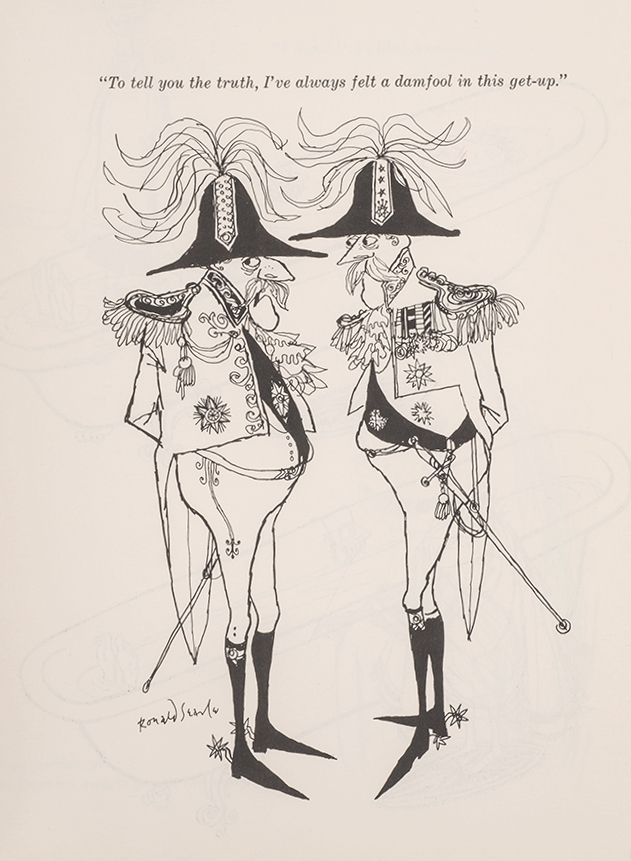
There are plenty of articles written about Searle – his extensive body of work has gained its share of acclaim and awards, and many appear illustrators appear to have been heavily influenced by his style. For example, The War Drawings of Ronald Searle from Illustration Chronicles tells the story of how Searle survived, and chronicled with daily sketches, the experience of being a Japanese prisoner of war. There is no need for me to go over that chunk of history. That being said, a lot of his books are quite out of print, and those are generally the ones I find most interesting. Before Searle’s art went progressively more speckled and unfocused (which is what Steadman, with whom this post started, is mostly channelling), his drawings had a crispness of exaggeration I find really appealing, a certain floweriness under the cover of which very acerbic (and very British) observations are delivered to the delighted viewer.
An example of looser lines of later years (this is from 1980); still enjoyable because the palette is restrained.
My favourite is his St. Trinian series (from 1941 and onwards), chronicling shenanigans at a boarding school for girls. What started as a series of doodles to amuse a friend’s schoolgirl daughters became an institution of its own – this topic was so popular that Searle’s cartoons were even adapted (awkwardly, in my opinion) into seven (!) movies. I recommend this helpful article from Tweedland The Gentlemen’s Club for historical details. For all the popularity of these schoolgirls from hell (in any obituary, you’ll find some sentence to the effect of ‘for many people, the St Trinian’s cartoons define Ronald Searle’s career‘), St. Trinian collections have been long out of print, for the most part, and one has to make do with mostly inferior, dubiously printed paperbacks claiming to be Best Ofs.
Knell Knudel from Lambiek Encyclopedia explains: « The topic [of boarding schools] had inspired many British novels before. But ‘St. Trinian’s’ was far less realistic and darkly disturbing, motivated by Searle’s war-time traumas. The little girls torture each other on a rack, collect mushrooms to poison people, drown each other at the beach or study books on how to shrink human heads. Amazingly enough, ‘St. Trinian’s’ became massively popular, despite the fact that the world was still recovering from a world war. In 1948 the first book compilation was published. Many more would follow. Gags appeared in countless magazines all over the world. Yet Searle quickly grew tired of his hit series. He felt its formulaic comedy severely limited him. In 1952 he brutally discontinued his hit feature by dropping an atomic bomb on the dreaded school! While it presumably killed its characters, it didn’t terminate its popularity. »
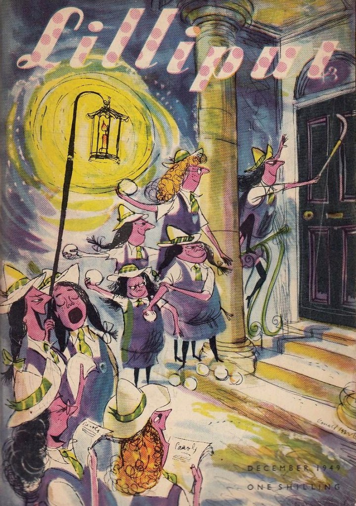
The first St. Trinian cartoon ever published in print appeared in Lilliput (a monthly British magazine which deserves a post of its own) in 1941. This is Lilliput no. 25, December 1949.
Though quite a few collections of cartoons were published at the time, the following three are of main interest: Hurrah For St Trinian’s (1948), The Female Approach (1950), and Back to The Slaughterhouse (1952). Thanks to my bookseller friend Barney (visit his store!), I am the proud possessor of The Curse of St. Trinian’s: The Best of the Drawings (1993, Pavilion Books), a hardcover edition, which scratched the itch but did not quench my desire to own the original editions, with their gloriously yellowed paper and characteristic fragrance.
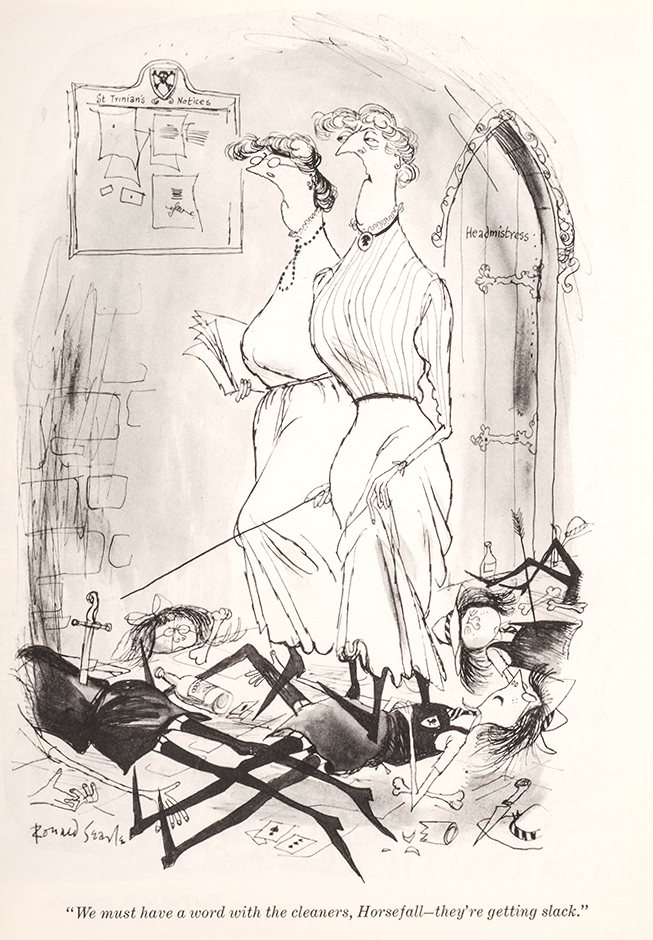
For example, admire the characterization of Angela Menace, as depicted in these three glorious cartoons (one could make a triptych):
« Searle was born, in 1920, in Cambridge, into a socially anonymous background, where male children were expected to be clerks or minor civil servants. Placed almost squarely in the middle of society, he had the ideal vantage point from which to observe his country, without having to suffer the distortion of an undue affection for his origins. It is an easy background to shrug off if you know what you want to do with yourself, and Searle did know, from an early age. We felt obscurely that Searle’s drawings begged authoritarian disapproval simply by existing in such profusion. That they also flayed their subjects with a merciless and unforgiving line – both grotesque and precise – made it all the better. That it was done with such sympathetic relish made it even better than that. Parents were embarrassing, hypocritical cretins, either callous in the victory of worldly success, or living pitiable lives of continual defeat; schoolmasters incompetent frauds, either grasping, sottish, brutal, ignorant or half-dead. Searle got them just right. » — Nicholas Lezard, in an introduction to The Terror of St Trinian’s and Other Drawings (another best-of collection issued in 2006).
I love the new science teacher being so warmly welcomed by both headmistress and schoolgirls – they all seem genuinely delighted.
The Female Approach, interestingly enough, featured plenty of men, too…
… alongside the usual ingénues (who have no idea what they’re doing, but they do it anyway) and temptresses (who know exactly what they’re doing).
“Do you want the time?”
Searle died in 2011 in his beloved France, where he had been living since 1975. He was 91 years old, and spent his last years as a bit of a recluse (though still drawing), far away from the public’s eye – when he passed away, one got the impression that some thought he had done it already years ago. As for St Trinian’s, its popularity seems to sort-of, kind-of linger on: there was yet another movie in 2007, though I would posit that we need fewer movies, and more proper, hardcover reprints of the material that left an enduring trace in people’s memories.
Have a gander at Perpetua, a wonderful website dedicated to everything Searle.
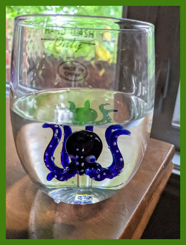
Greetings, tentacle aficionados! First of all, I’d like welcome this new octopus into our household, courtesy of a gift from my mom:
Isn’t he cute?
I felt like going with something more modern this week, though given that the last TT was set in the 60s, that still leaves a healthy 40-50 years to choose from.
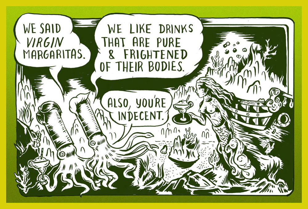
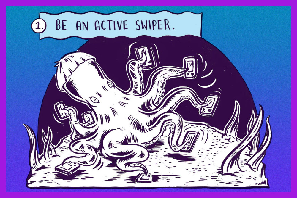
Ali Fitzgerald’s Bermuda Square waved its first ‘hi there!’ on May 16th, 2016 in the The Cut, one of New York Magazine‘s website-only divisions describing itself as ‘a site for women who want to view the latest fashion trends; read provocative takes on issues that matter, from politics to relationships; follow celebrity style icons; and preview new products.‘ I don’t believe Bermuda Square fits that neatly into any of these categories, though Iris the octopus is unarguably stylish, and politics and relationships are definitely involved. Does she and her siren friends ever try out some new face cream, or weighs the pros and cons of that foundation one sees ads for absolutely everywhere? Who knows – Bermuda Square strips only live behind The Cut’s pretty rigid paywall (not that I object to writers and illustrators actually being paid, but I would much rather buy a collection of strips than a subscription to an online-only lifestyle magazine – call me old-fashioned).
Fitzgerald describes the world her comics are set in as “a feminist enclave where everyone can co-exist” and a “delicate ecosystem”. It’s a fully fleshed world, with intricate plot lines tracking relationships between characters and some class warfare, since underwater denizens aren’t at all immune from pettiness or envy. « It’s segmented like New York: There is Astora, a Manhattanite underwater mer-city where Margox imagines building a life, and Orchid Island, which resembles a not entirely gentrified Brooklyn or Queens. Solanas Village is a ‘70s-style, separatist female commune on a rocky shore, while the social, watery Tidelands are like a club where everyone mingles. If a sailor stays too long in Bermuda Square, he goes to (and dies in) the Ghost Vortex… »
The following excerpts have been lovingly coloured by co-admin RG.
First-ever strip, with a lovely abundance of tentacles!
Iris the sex-positive octopus gives tips for using Tinder.
Wonder Woman is probably my most recurring area of focus when it comes to TT posts – although this is just the third, as it turns out, despite feeling like the fifteenth. The first two were devoted to the Golden Age Wonder Woman (Tentacle Tuesday: H.G. Peter and Wonder Woman lend a hand and Tentacle Tuesday: More Golden Age Wonder Woman Wonders!), and having more-or-less exhausted the GA’s tentacles, we move on the Silver Age (which, in my assessment, is considerably less interesting, but sometimes has quite nice art).
All pages are scripted by Robert Kanigher, pencilled by Ross Andru and inked by Mike Esposito, except for the first page from Stamps Of Doom!, which was scripted by Bill Finger.
Page from The Stamps of Doom!, scripted by Bill Finger (credited as Charles Moulton). printed in Wonder Woman no. 108 (August 1959).
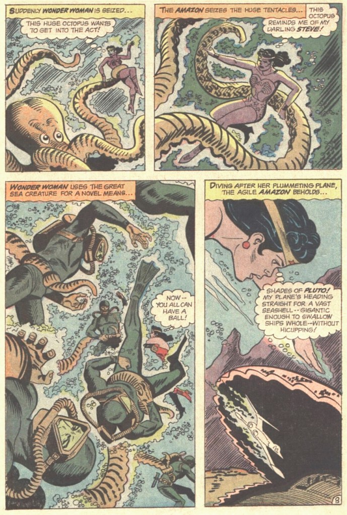
I bitched about Kanigher WW in Tentacle Tuesday: Wonder Girl in the Silver Age, Part I and Don’t Let a Mysogynist Plan Your Wedding: Robert Kanigher and Wonder Woman’s Utterly Unsuitable Suitors. I’m starting to feel like my needle is stuck in the groove, but I will however note one more thing: in my righteous anger about Kanigher’s preposterous depiction of women, I’ve been ignoring that he’s not great at writing men, either. That is… he can write wonderful male characters (see Enemy Ace, for instance), as long as romance is totally off the menu. It’s as if he is saying that romance transforms intelligent, capable men into utter, snivelling dolts (a point of view that one could defend, but within limits). Take a look at what kind of suitors poor Wonder Woman gets saddled with (perhaps their stupidity is one more way of spiting her?) in these panels from Wonder Woman’s Impossible Decision, published in Wonder Woman no. 118 (November 1960):
To reiterate: man is sitting on a rock. One wouldn’t think that this is a particularly dangerous activity. And yet one minute he’s contemplating the injustices of life (sitting!), and the next he’s sinking (at the speed of a locomotive) into sea, right into the welcome arms of an octopus. I think the octopus planned it.
The guy’s suffocating, but he’s still fretting about Merman as a rival for WW’s affections.
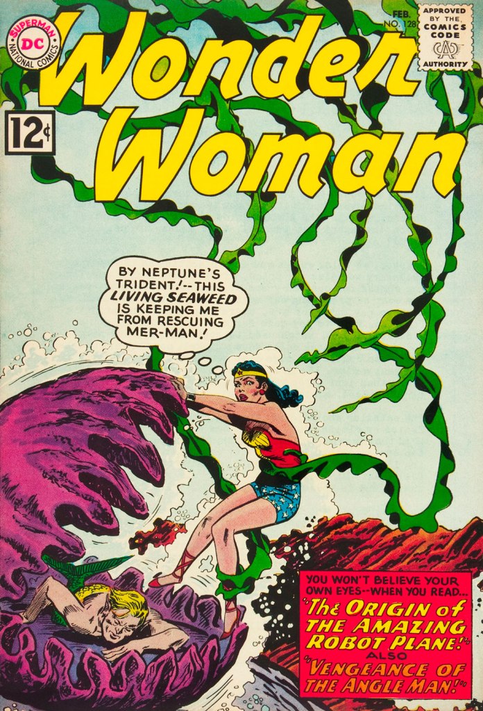
This is Wonder Woman no. 128 (February 1962). Cover by Andru and Esposito.
Allow me to drive one more nail into that coffin, and after this I shall forever hold my peace. I stumbled upon this rather entertaining quote, taken from an interview with Kanigher conducted by Tim Bateman and Steve Whitaker in 1989 (read the full thing here). Here it is, with no further comments from me:
« So Ditko […] tried to force meanings where meanings did not exist. But he tried to tell me that I knew nothing about romance, because his idea of romance was professorial, pedantic. I know what romance is, I’ve written more romance probably than anyone alive. Romance is an excess of passion, and I don’t care if there’re a thousand books that says romance is not that, romance is a time period. Tchaikovsky is a romantic. Excessive, that’s what romance is. So to say that my idea of excessive emotion is not romantic…»
And now, I shall remain mum, and let you savour these tentacles in peace!
Two pages from The Academy of Arch-Villains!, published in Wonder Woman no. 141 (October 1963).
In comics, swordfish are often pitted against octopuses (one doesn’t have to go far for examples – just look at the previous story), but I wonder how often that happens in real life…
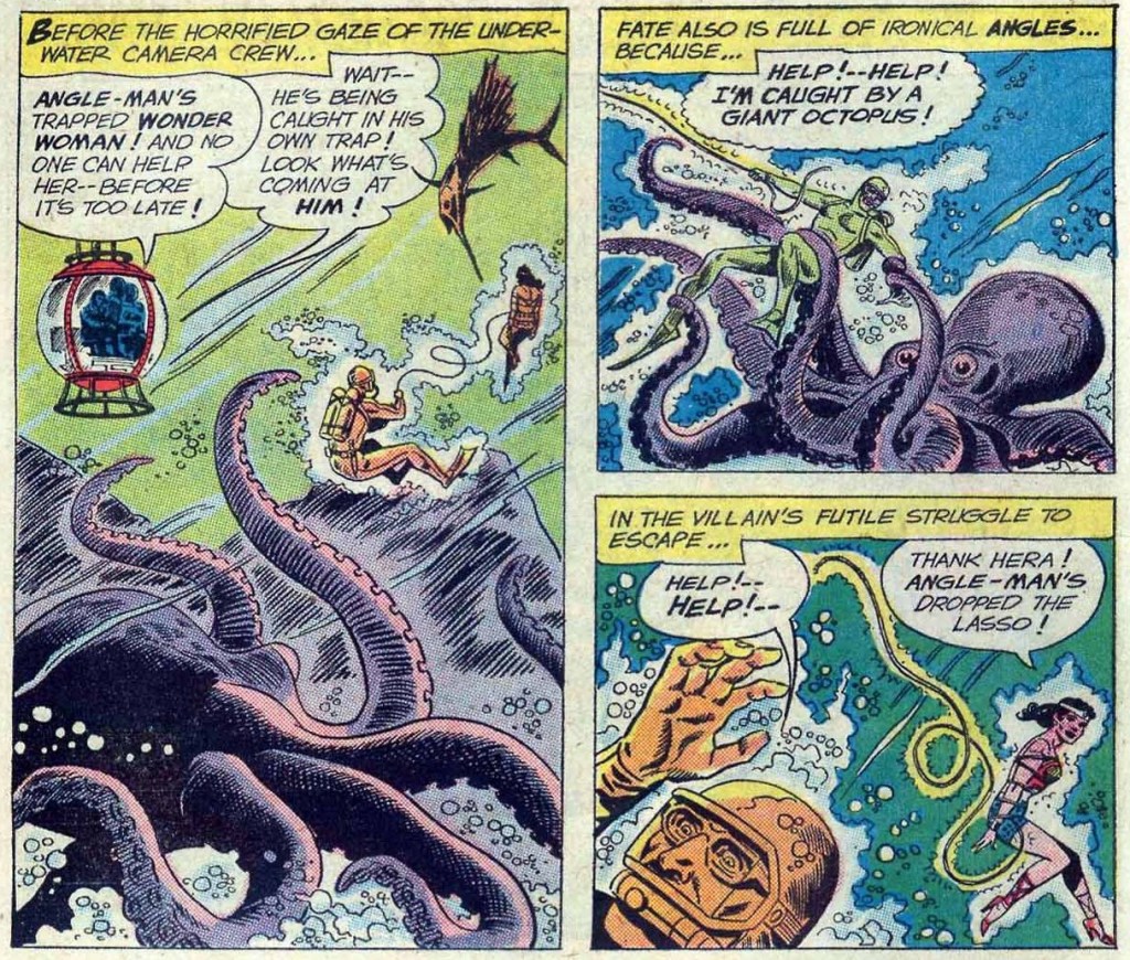
Page from War of the Underwater Giants, published in Wonder Woman no. 146 (May 1964).
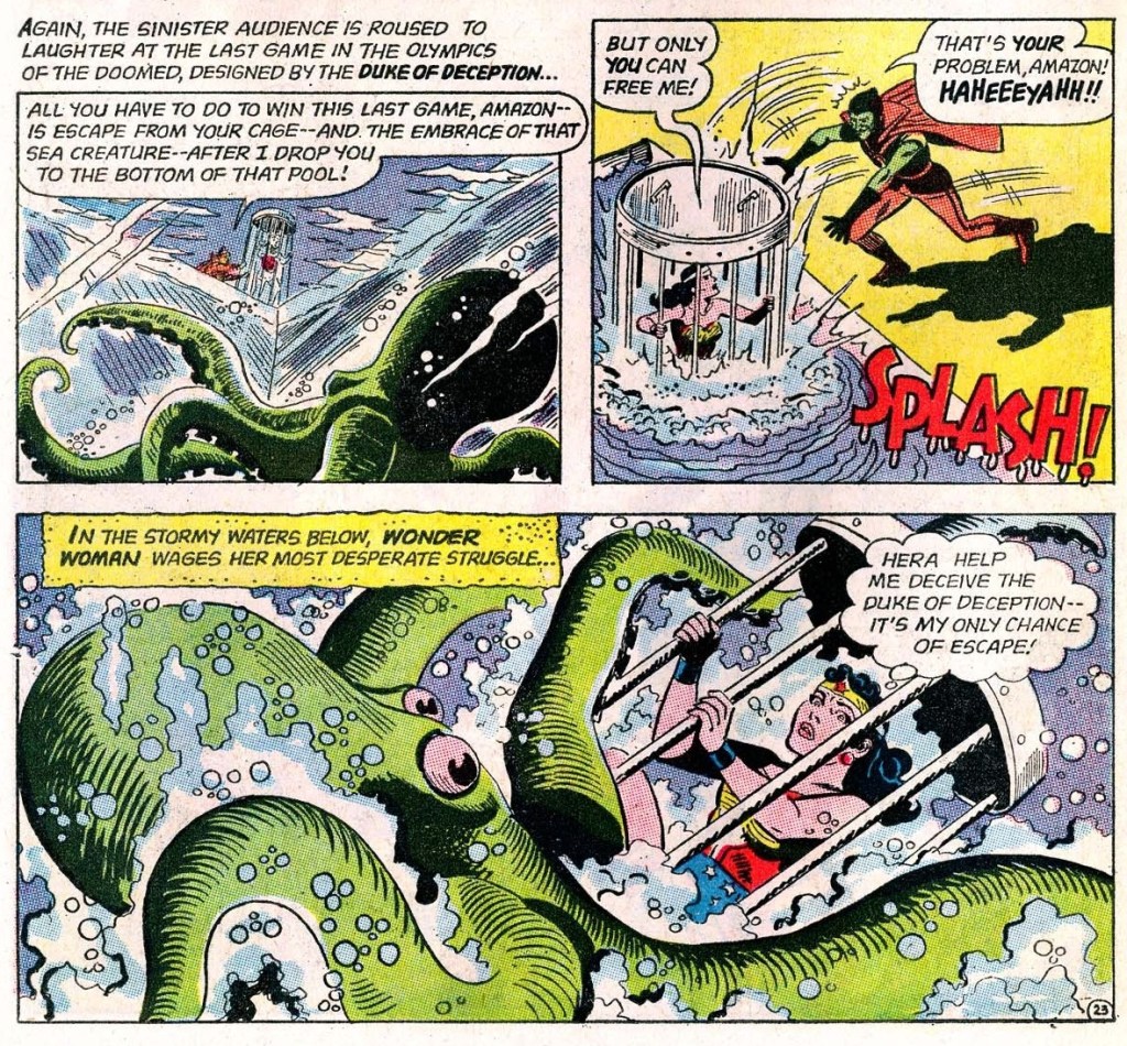
Page from The Olympics of the Doomed, published in Wonder Woman no. 148 (August 1964).
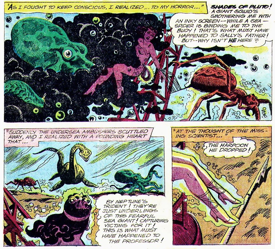
Page from I Married a Monster, published in Wonder Woman no. 155 (July 1965).
The Sinister Scheme of Egg Fu, the Fifth!, published in Wonder Woman no. 166 (November 1966).
Occasionally, I like going with the flow when selecting the topic for a Tentacle Tuesday. I recently traded for a Junji Ito book I’d never heard of, Remina, and as one of its highlights (um… possibly the only highlight, but more about this later) is the profusion of tentacles within, it seemed like a natural fit for a topic of discussion.
We have only mentioned Junji Ito once before (in Tentacle Tuesday: Octopods Dig Manga!), but I am a fan of his work – or at least of the best of his work. In my assessment, that would be the genuinely disturbing Gyo (with the catchy subtitle of ‘The Death-Strench Creeps‘) and the haunting Uzumaki, as well as a handful of excellent short stories.
I’m by no means a horror manga pundit, but I’ve sampled a certain number of works by mangakas whose work has been translated to English, and found most of these œuvres quite unappealing, be it because of incompetent art, more human cruelty than I can stomach, far too much soap-opera-style drama, or glaring plot loopholes. Ito is not without his flaws, but something sets him apart from other authors working in a similar vein: he can depict stomach-churning gore and moments of quiet dread with equal aplomb. Cartoonists who rely on carnage to horrify their readers are ten a penny, those with a more subtle approach are few; those who can effortlessly transition from one to the other are something special.
As in that old joke about the horse that always takes its rider to the nearest pub, Ito does have a favourite approach: he starts with a most mundane object or incident, elicits a delectably menacing atmosphere out of it, and then gives it all a good twirl until the spiralling events send the protagonists (and sometimes the whole country, if not the whole planet as well) into the welcoming arms of total, uncompromising Armageddon. One might argue that he does that because it’s easier to finish it all than to think of a ‘proper’ ending, but it gives his work a certain surreal quality I really appreciate – everybody is going to die, and now that this little matter is out of the way, we can concentrate on the creative ways this is going to happen.
Remina was serialized in Big Comics Spirits from September 2004 to July 2005. The English volume (released by Viz Media, who have published the bulk of Ito material in English, slowly making their way through his whole bibliography in excellently designed hardcover editions) was released in December 2020. The plot concerns itself with a scientist who discovers a new planet and names it Remina in honour of his beautiful daughter. Of course, the planet turns out to be hurtling towards Earth at physics-defying speeds, annihilating everything in its path (which the main scientist somehow is completely unaware of, until his many lab assistants inform him of the latest developments).
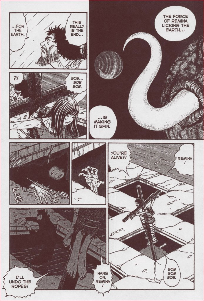
And here it is, eating one of the planets in our Solar System with as much grace as an aristocratic lady carefully nibbling on a sliver of tomato.
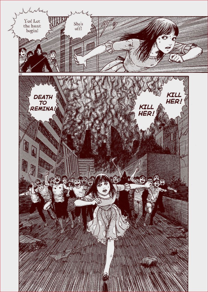
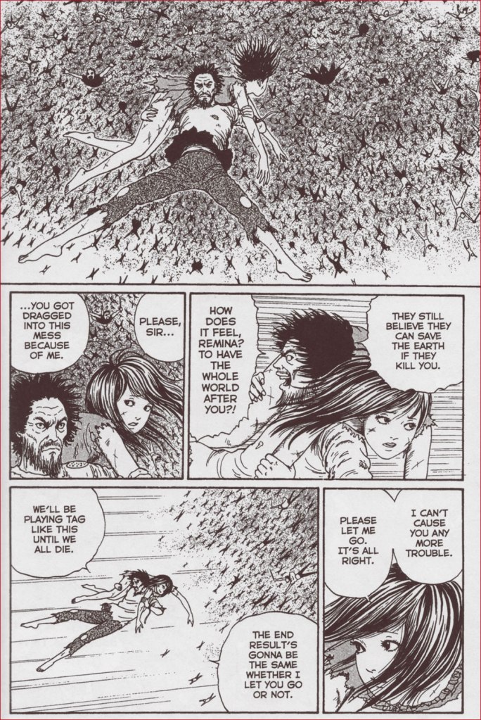
In (not entirely unbelievable) leap of logic, Japanese citizens decide that the impending destruction is caused by Remina, previously an immensely popular and celebrated girl, and that executing this ‘witch’ is going to solve the problem. What follows is a series of chase scenes, with a giant crowd pursuing Remina throughout the progressively more and more destroyed city. Remina’s three protectors (the president of her fan club, her manager, and some uber-rich fanboy who tries to rape her later in the book) drag her around, trying to keep her safe from the murderous crowd, but they don’t do such a great job – she gets crucified next to her dad but survives, set free, captured again, flogged, tortured, crucified again, and so on.
It doesn’t help that Remina, like a lot of Ito’s pretty creations, doesn’t really have a personality. She just sobs, screams for her daddy and her lost love (the manager, who apparently she was profoundly in love with), and implores people to just leave her alone. Scenes of crucifixion and the creepy robes worn by her pursuers indeed suggest religious fervour – as the earth’s gravity changes, cities are destroyed, volcanoes erupt etc., the only thing almost everybody is interested in is Remina’s mutilation and dismemberment.
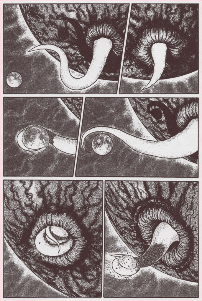
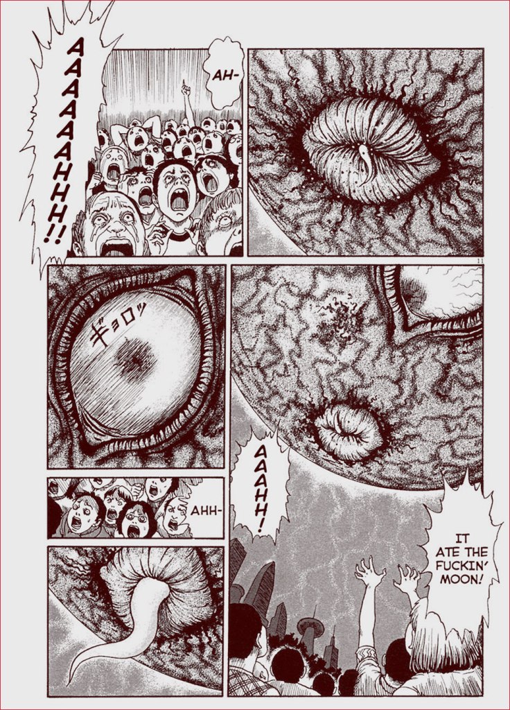
Still, there are some fun moments, most of these involving tentacles! Remina the planet has a giant eye and a coquettish, tentacular tongue that it flicks out to swallow the moon just as Remina the human is about to be killed.
One of more iconic images of Remina, the moment before the moon gets swallowed….
This is a scan from a previous edition of Remina, where the translators were a little looser with language. In the book I have, a laconic ‘it ate the moon‘ is substituted for ‘it ate the fuckin’ moon!‘.
It uses the same ‘tongue’ to lick Earth and accelerate its spinning…
Typical Remina dialogue: “SOB SOB SOB.” Note that this is the second time Remina gets crucified. It is distinctly some sort of unhealthy obsession.
… which sends everyone airborne, and gives rise to funny kung-fu-in-the-air scenes as yet another protector kicks the collective asses of Remina’s would-be executioners.
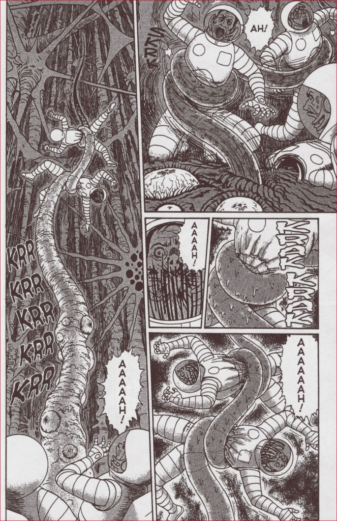
Then there’s planet Remina’s surface, all writhing tentacles, acid pools and noxious fumes. That’s where most of the tentacle enjoyment lies.
Somewhat atypically, there is even a happy ending, albeit one involving some of the main characters floating around in space in an atomic shelter bunker with a year’s worth of provisions (and hopefully oxygen?)
« I will eliminate this ignominious blot on the city’s reputation. I will correct this annoying oversight. And so Ostap undertook the actions dictated to him by his reason, his sound instinct, and the situation at hand. » – the magnificent Ostap Bender, from 12 Chairs by Ilf & Petrov
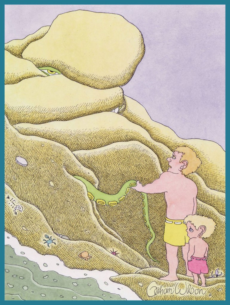
With considerable dismay, I recently realized that Gahan Wilson had yet to be featured as a Tentacle Master, despite having thoroughly deserved this title not only with the sheer number of tentacles in his cartoons, but their impeccable quality as well. Co-admin RG wrote a lovely piece on this prolific artist in Gahan Paints What He Sees!, and we’ve included his work in a multitude of posts, but he certainly deserves this official TT accolade.
Without further ado… and with many thanks to co-admin RG, who figured out where these were published and on what date, as well as doing a lot of scanning and editing while I was grappling with myriad technical issues at work (instead of grappling with tentacles, he-he).
« Looks like this fellow you came across could be bigger than we thought! » (Playboy, Aug. 2007).
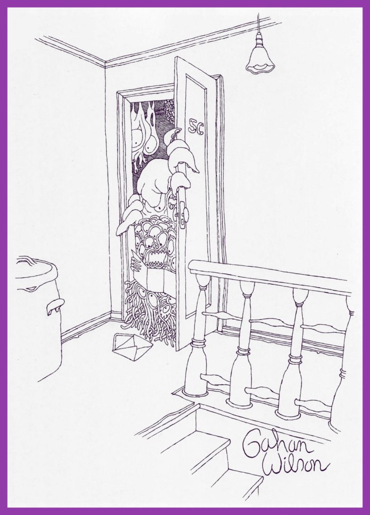
« Occupant, apartment 5C; Congratulations — you may have already won the all-electric Colonial split-level house of your dreams… » (Playboy, July 1974).
« Well, sir — it looks like things are getting pretty serious for Peter and Pauline. » (Playboy, July 1992).
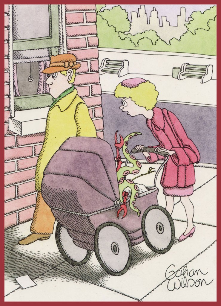
« I think something’s wrong with the baby, dear! » (Playboy, May 1997).
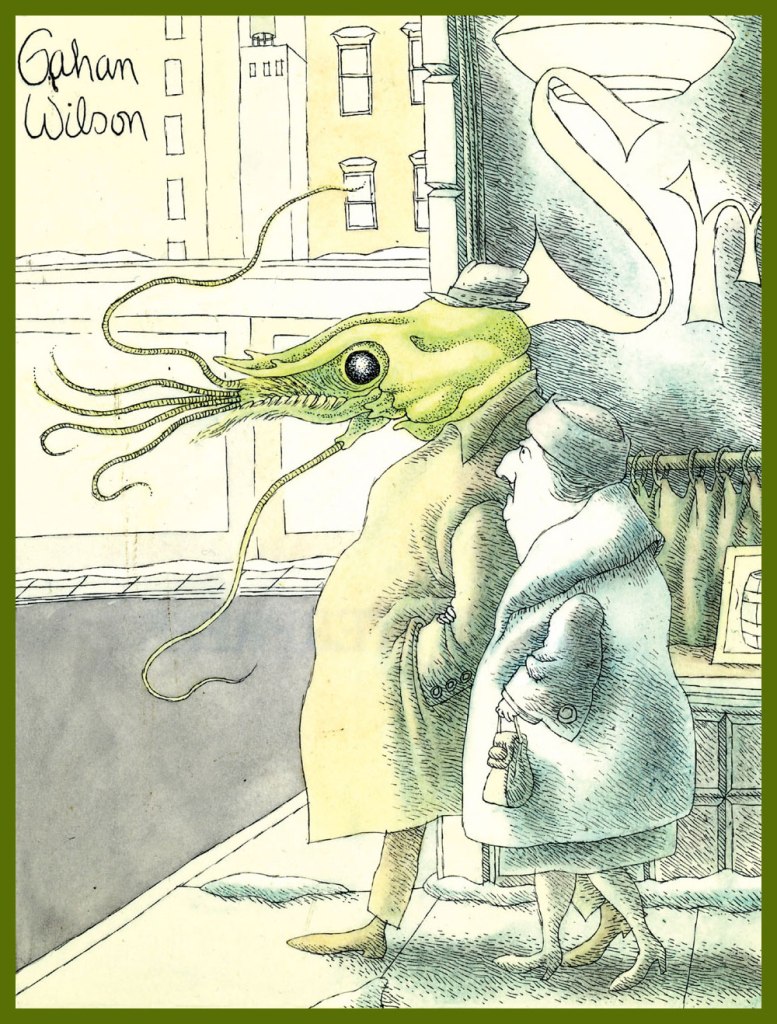
« Harry, I really think you ought to go to the doctor. » (Playboy, Feb. 1968).
From Playboy, Aug. 1973.
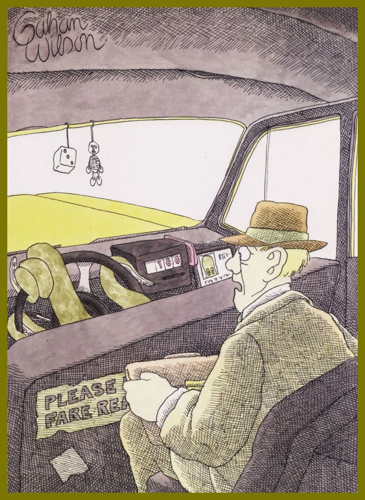
« Er, driver, just let me off right here, please! » (Playboy, Nov. 1981).
From Playboy, Oct. 1979.
A friend sent recently sent me an issue of The Magazine of Fantasy and Science Fiction from November 1974 that has that characteristic, lovely aroma of aged paper. Lo and behold, some Gahan Wilson tentacles lurked within! I came for Mushroom World by Stephen Tall, and stayed for the charming doodles introducing different sections of the magazine… Here are the three together, once again scanned & processed by RG:
Sometimes I stumble upon these comics I’d never previously heard of (or if I had, I had clearly promptly forgotten in a merciful fit of amnesia) but that have a hundred-something issue runs. For instance, I don’t remember this… sophisticated, steel-torso-ed and silver-haired fox at all. How poor my life must have been!
Created by Mike Grell, sword-and-sorcery champion Travis Morgan (actually an American pilot who accidentally discovers a new world in Earth’s hollow core) fights for the freedom of people from Skartaris – and also looks really good in a loincloth. Grell based Morgan on himself, using his experience as a former member of the Air Force (as an illustrator) and his own goatee* as a starting point, though hopefully the loincloth was an improvisation.
That Grell freely borrowed from Jules Verne, Edgar Rice Burroughset al. and peppered this regurgitation with Greek-mythology creatures (harpies, unicorns, a Pegasus, minotaurs, the Atlanteans…) is not by itself enough to condemn this comic, because I’m trying very hard to be fair about it. However, given the stilted dialogue, ridiculous costumes and dubious anatomy, it is distinctly starting to look like Warlord is a chapter of comic book history that’s best forgotten.
But one thing I can say about him is that in his many (MANY) fight scenes, he often struggles against tentacles, whether they belong to an amœba, an actual octopus, a plant, or a dinosaur-thing.
I understand that it’s the 80s and therefore costumes have an obligation to be profoundly embarrassing (not to mention impractical).
Let’s have a look at those tentacles I was promising.
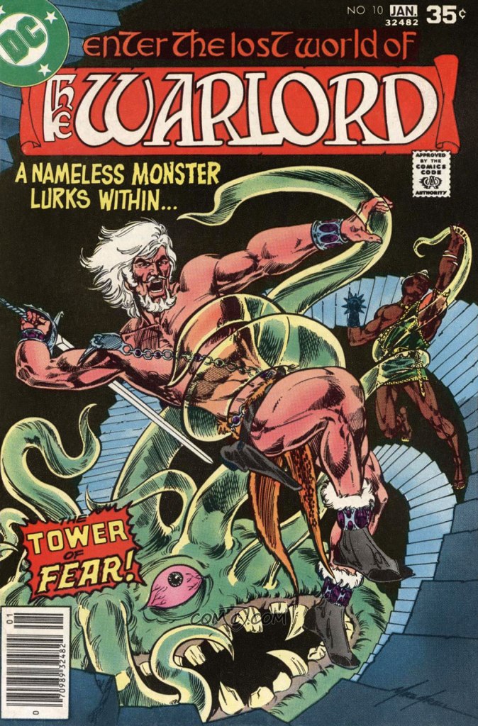
Warlord no. 10 (Dec 1977 – Jan 1978). Cover by Mike Grell.
Page from Tower of Fear, scripted and illustrated by Mike Grell.
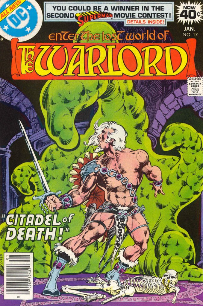
After the Tower of Fear, we get the Citadel of Death – a perfectly logical transition.
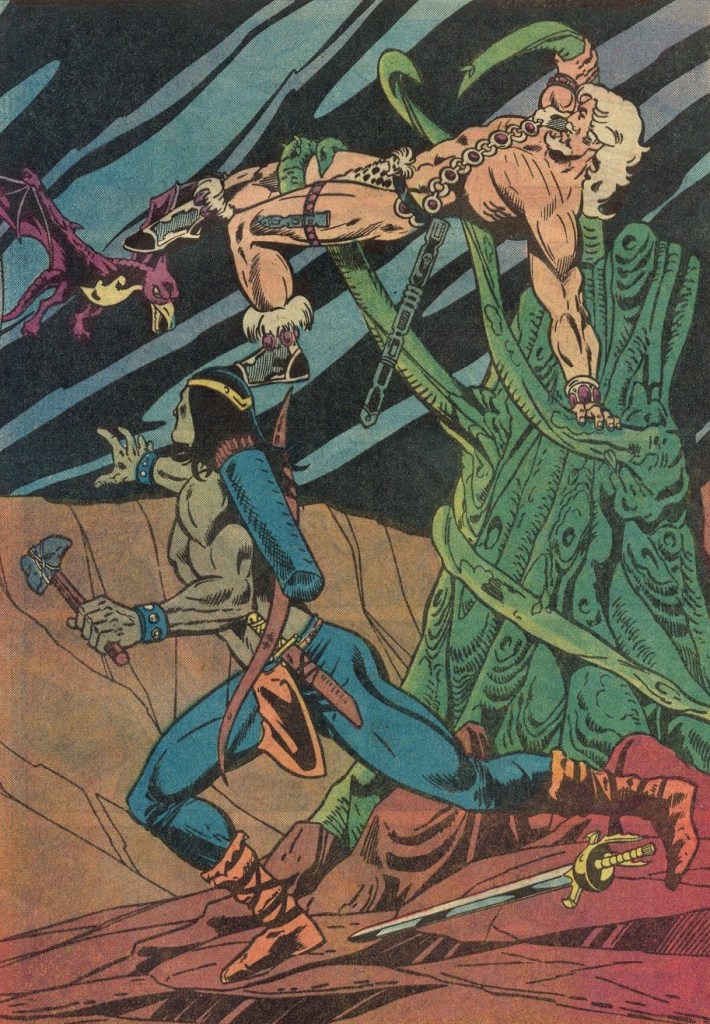
Warlord no. 17 (January 1979). Cover by Mike Grell. This is a good demonstration of what I was saying earlier about dubious anatomy – look at Morgan’s left arm, be suitably horrified, then try to compute how he’s keeping his balance at all, in this position, and give up altogether.
The Quest, Part II: Citadel of Death is scripted and pencilled by Mike Grell and inked by Vince Colletta.
Skipping ahead a few issues, we find that Morgan added some nice billowing sleeves to his outfit.
Warlord no. 41 (January 1981). Cover by Mike Grell.
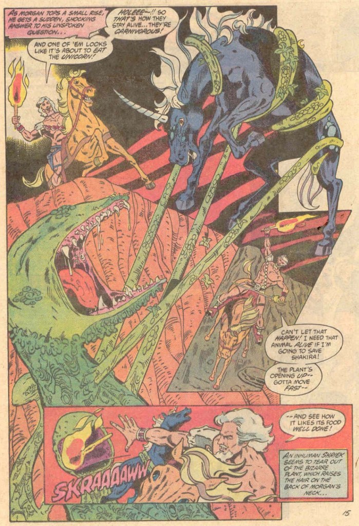
And now we go into non-Grell territory. Does this make the art or the scripting a little better? Yes, actually, for a little while. The Jurgens-Adkins team, for one thing, can draw horses that actually look like horses (okay, unicorns, whatever). They also do some fun stuff with panel transitions. Witness these two, admittedly fun, pages, taken from Curse of the Unicorn, scripted by Cary Burkett, pencilled by Dan Jurgens and inked by Dan Adkins. This was published in Warlord no. 72 (August 1983).
Here is the same team working on the next issue’s continuation, Cry Plague, scripted by Cary Burkett and Jennifer Reinhold, pencilled by Dan Jurgens and inked by Dan Adkins. It was published in Warlord no. 73 (September 1983).
Warlord lasted 133 issues, all the way until winter, 1988. The last couple of years also involved tentacles. For instance, this page from The Kraken Pentacle, scripted by Michael Fleisher, pencilled by Ron Randall and inked by Pablo Marcos. This story was published in Warlord no. 119 (July 1987). Morgan has a bad case of ugly horse teeth in this issue, but thankfully they’re not too visible on this page.
There are tentacles on 120’s cover, too, but it’s just too ugly to share here. The inside stories, alas, just get worse and worse (and they were none too hot to start with), dragging in characters from Jack Kirby‘s New Gods, to add insult to injury.
In case you were wondering about “ugly”. Pencilled by Art Thibert, inked by Pablo Marcos.
And so a comic that was never great to begin with – but had its readable moments, somewhere in the middle – finished as a steaming pile of shit. I can go back to pretending it never existed 😉
Pencilled by Dan Jurgens, inked by Mike DeCarlo.
Admire the dashing near-nudity of jewel-loving Travis Morgan and go on to greener pastures…
~ ds
*Now if Grell based Travis Morgan upon himself, and since Travis Morgan is just Grell’s Green Arrow stripped naked and with white instead of blond hair, and given that Grell’s GA is a continuation of Neal Adams’ GA, does it follow that Adams begat, or at least designed, Mike Grell?