« Better to have a lousy character than no character at all. » — Alain Delon (Nov. 8, 1935 – Aug. 18, 2024)
Quite recently, we lost monstre sacréAlain Delon. He was a complicated man, a bit of a prickly bastard, but he sure made a lot of great movies*. But comics, you ask? Well, I’m sure he never asked for it, but like many a celebrity (Jean-Paul Belmondo, Ornella Muti…) his famous countenance was appropriated by those incorrigible rascals at Edifumetto and Ediperiodici.
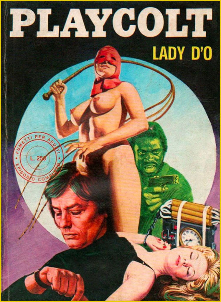
So Alain Delon became… « Alain Velon, a billionaire playboy who lives on an island “a 3-hour flight from New York“. He spends his private life conquering women in a continuous stream even if he is already engaged to the film actress Lizzy Scarlett, but “due to his innate sense of justice” he periodically transforms into Playcolt, a sort of superhero. His enemy is Linda Darnel, also a billionaire: sadistic and fetishist, she turns into the anti-heroine Za the Dead. Another historical rival is the always sadistic but lesbian Mandrakka. »
Now don’t get me wrong: these are virtually unreadable, poorly drawn, sadistic, illogical, reactionary misogynistic claptrap. But the covers are fascinating in their gonzo way, randomly cobbling together purloined bits from famous likenesses to established logos. You’d think this brazen wave of wholesale filching would have led to swift and decisive legal action from several stars’ solicitors, not to mention Hugh Hefner’s… but it seems not. This was, after all, the Italy that gave us Silvio Berlusconi.
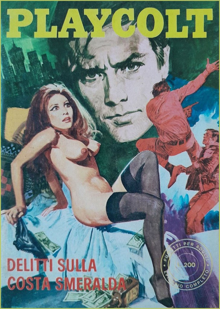
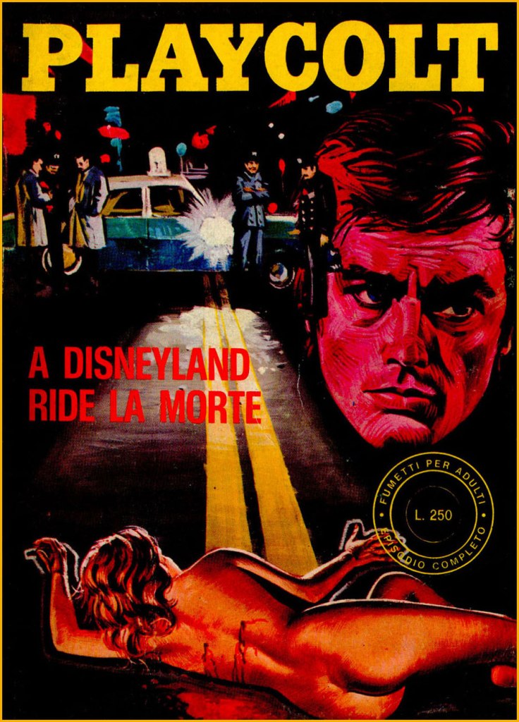
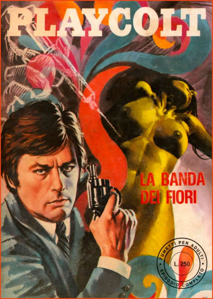
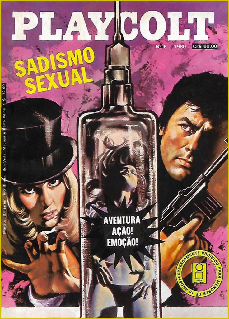
« To the Sound of Punches »; this is Playcolt Series II no. 9 (Nov. 1973, Edifumetto). Cover art by Carlo Jacono, a nice piece, but celebrity likenesses evidently weren’t among his strong suits.« Crimes on the Emerald Coast »; this is Playcolt Series II no. 14 (Aug. 1973, Edifumetto). This one’s *possibly* the work of Alessandro Biffignandi… or his studio.« The Golden Rain » (ahem); this is Playcolt Series II no. 23 (Dec. 1973, Edifumetto). Another Jacono, another botched likeness.« The Divine Sadist »; this is Playcolt Series III no. 1 (July 1974, Edifumetto). « Death laughs in Disneyland »; this is Playcolt Series III no. 11 (June 1974, Edifumetto). « There’s a mess in the middle of the sea »; a 1980 Brazilian edition reprinting Playcolt Series III no. 18 (Sept. 1974) in Portuguese. « The Flower Gang »; this is Playcolt Series III no. 22 (Nov. 1974, Edifumetto). I have no concrete evidence, but the technique displayed here reminds me strongly of British illustrator-cartoonist Ron Embleton (1930-1988), co-creator of Oh, Wicked Wanda! and illustrator of the immortal Captain Scarlet closing credits.No need for a translation, is there? A 1980 Brazilian edition reprinting Playcolt Series IV no. 1 (Jan. 1975) in Portuguese. « Operation Puzzle »; this is Playcolt Series IV no. 12 (Nov. 1975, Edifumetto). Cover painted by the prolific Emanuele Taglietti, who handled quite a few covers in this series. Here’s an impressive gallery of these.« The White Shark »; this is Playcolt Series IV no. 35 (May 1976, Edifumetto). Sharks were all the rage that year.« To Love a Hole »; a 1980 Brazilian edition reprinting Playcolt Series IV no. 2 (Jan. 1975). Dig that strategic blurb placement; the Italian edition was not so coy. Clearly a reference to the previous year’s hit ‘erotic’ film, L’histoire d’O; this is Playcolt Series IV no. 27 (Jan. 1976, Edifumetto). It’s funny how the Delon photos used span his career up to that point, which yields visual whiplash when you go from the Delon of Plein Soleil to the jaded, grizzled one of, say, Monsieur Klein or La mort d’un pourri from one issue to the next.« Terror in California »; this is Playcolt Series IV no. 44 (Oct. 1976, Edifumetto). The obligatory Jaws cash-in. Say what you will, those Italians didn’t miss a trick.
There was, concurrently, another Delon homage in Jean Ollivier and Raffaele Carlo Marcello‘s successful Docteur Justice, a humane but hard-hitting series about a physician and expert judoka who roams the globe’s trouble spots for the World Health Organization. There was even a film adaptation in 1975, with John Phillip Law essaying the title role… and co-starring Delon’s ex — and only — wife, Nathalie. Among Pif Gadget’s adventure series, it was only bested in popularity by the prehistoric blond heartthrob Rahan. I’ll tell you more about it one of these days.
-RG
*So claims the Russian pop song entitled Взгляд с экрана, and who are we to doubt it?
Back of Bob Foster’s Myron Moose no. 1 (Myron Moose Comic Book Works, 1971); this art print was also released years later, as can be seen by the date on it.
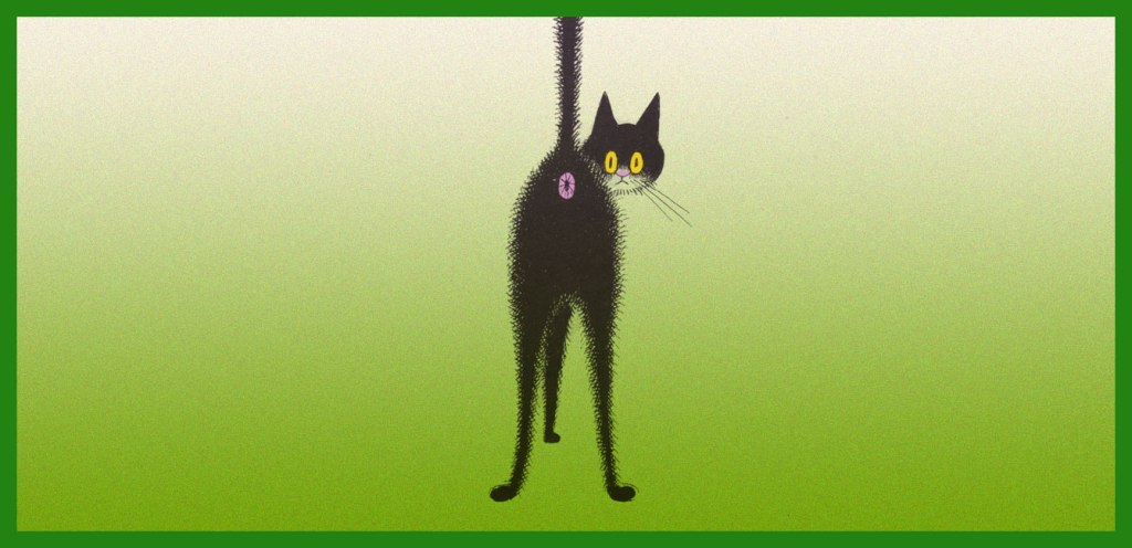
We are technically a three-cat household — that’s how many cats we had decided we could comfortably handle. For a while we stuck to this number, and when one cat departed, another one would come to take his place. Then number four walked through the door — he was sort of a part-time cat, until he became decidedly one of ours. Well, four isn’t that much more work than three. When number five appeared, bedraggled, underfed and with a perpetually sad expression (‘he had that look you very rarely find — the haunting, hunted kind‘, to quote Tim Rice), we wanted to give him to a rescue society… and of course ended up keeping him.
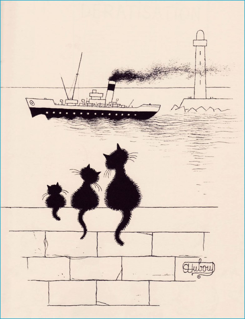
Albert Dubout (born as lbert Dubout, 1905-1976), was primarily an illustrator of books (notably, his amical collaboration with French writer San-Antonio, many of whose novels proudly bore Dubout’s covers and inside illustrations), and, with equal talent, a cartoonist and poster designer (check out some of his film posters here), not to mention a calligrapher with a number of delightfully mellifluous signatures. His official website can be found here, in case you want to take a peek.
The following excerpts have been scanned from Les chats (Editions Hoebeke, 1999).
*I don’t like Hemingway at all, but I do have a certain grudging respect for a man who kept some 40+ cats. Rhetorical question: are cats living at that high a density within one house really having a good time?
« Looking for love is tricky business, like whipping a carousel horse. » — George Cukor
As I’ve noticed that we’ve been dwelling strictly in the cartoonier suburbs of late, allow me to gently nudge us into the realm of high-end draftsmanship and bravura technique for a change. In so doing, let us turn the clock back a century or thereabouts.
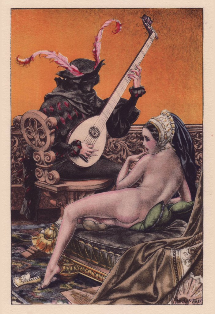
French cartoonist-illustrator Chéri Hérouard, né Chéri-Louis-Marie-Aimé Haumé (1881-1961) is mostly renowned for his lengthy and fruitful (1910-1940) association with the ‘mildly risqué’ weekly La Vie parisienne. It is said that « During World War I, General Pershing personally warned American servicemen against purchasing the magazine, which boosted its popularity in the United States. » There always was — and let’s hope there always shall be! — considerable difference between the French and American mindsets.
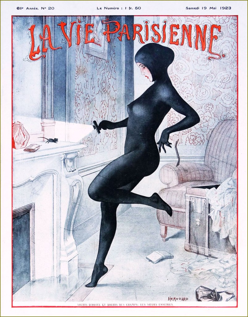
« The Nightmare of Coal », Hérouard’s cover for La vie parisienne’s November 1st, 1919 edition. For those interested, there’s a classy hardcover collection entitled La vie parisienne: Covers & Cartoons 1917-1922 (Dover/Calla Editions, 2018). The art restoration is flawlessly executed and the translation is often hilariously botched. La vie parisienne’s May 19, 1923 issue. « The hotel mouse and the field mouse: enemy sisters ». A ‘souris d’hôtel’ was a thief that plied her trade in chic hotels. A cat burglar of a sort. This sleekly sexy look is clearly based on Musidora‘s legendary turn as Irma Vep in pioneering cinéaste Louis Feuillade‘s epic 1915 serial Les Vampires.
Like many of the best and most free-spirited cartoonists, Hérouard illustrated books and magazines aimed at both innocent and decidedly roué readerships…
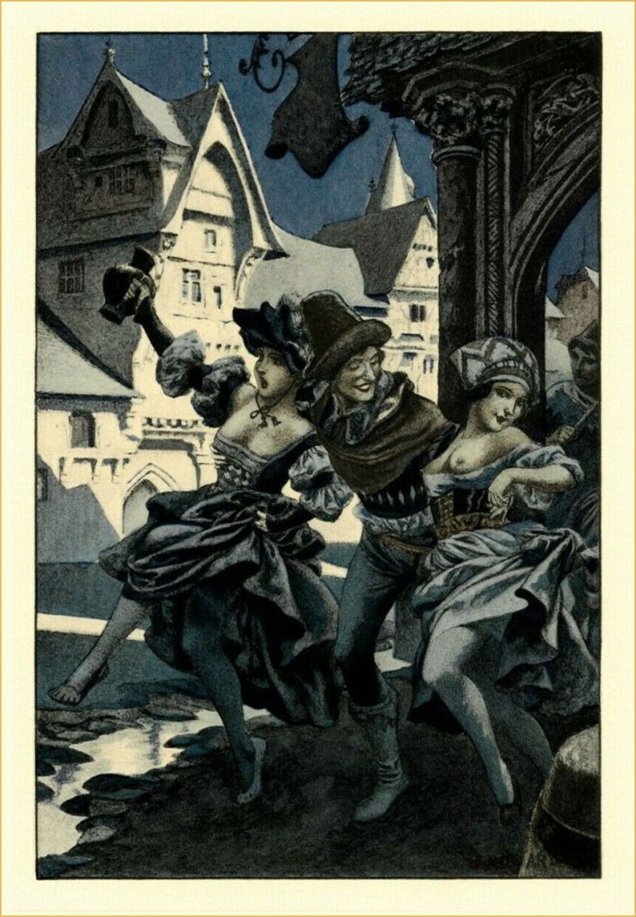
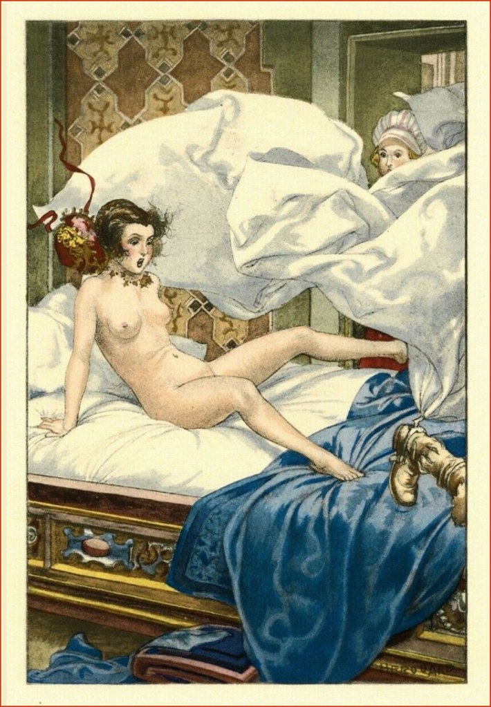
To wit, Hérouard produced sixty-four illustrations for a four-volume set of ribald historical tales entitled L’Heptaméron des Nouvelles de la Reine de Navarre — which is to say Marguerite de Navarre (1492–1549) — in a rather exclusive print run of 1540 copies (Javal et Bourdeaux, Paris, 1932). It was quite a challenge to pick just a handful. If you want them all, here’s a copy for sale while it lasts!
.
Even with a limited colour palette, Hérouard was a master of light and shadow.
.
.
.
.
.
Admire the depth of field in this image… so many planes, and yet it never feels cluttered. That’s composition (among other things).
In addition to the book, hand-coloured engravings of the illustrations were produced in a run of five hundred. I recently acquired my very favourite of the lot, and the kind seller graciously included an uncoloured version for comparison. And so, before:
… and after!
Some background on the technique of stencil colouring: the stencil is created using a zinc sheet one-tenth of a millimetre thick. Using a very sharp metal blade, previously traced openings are cut into the zinc sheet, according to the drawing and colour required. The stencil is then applied upon the printed proof (e.g. engraving, lithograph or phototype). For faithful reproduction, the necessary number of stencils must be traced and cut (an average of fifteen to forty stencils, sometimes up to sixty for more delicate works). In the course of the tracing, one must determine the range of values of each colour, beginning with the lightest, and define with precision the shape and location of the gradations, keeping in mind the effects of superposition. For each stencil, the colour must be prepared, taking care to maintain its tonal intensity throughout the printing process. This colour — be it gouache, watercolour, India ink or wash — will be applied using a special round hog bristle brush. In the case of certain stencils, the colour will be softened after its application, mixed and blended using a small softening brush.
Oof! Given the immensity and delicateness of the task, it must be noted that the colourist in question was one ‘Jacomet’, presumably Daniel Jacomet (1894-1966). Bravo!
And finally, here’s a… striking quartet of sepia rotogravure etchings, which were discreetly sold as a set in the years just preceding the second world war. For these, Hérouard adopted the transparent pseudonym of ‘Herric’… but the style is unmistakable.
« After the horrors of 14-18, the healthy pleasures of peace. »