« This is the very center of everything there is. A huge black hole eating up the galaxy. The end of everything. » — Clifford D. Simak
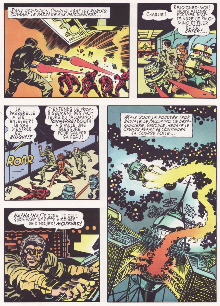
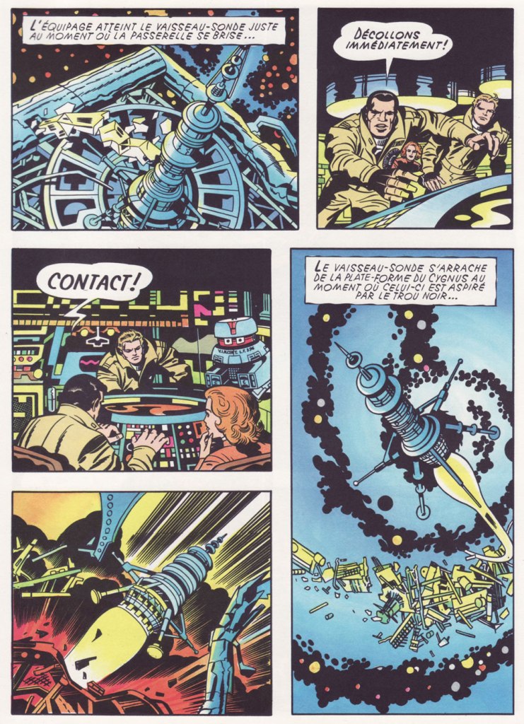
Early in the Fall of 1979, I was pleasantly surprised to discover some new work by Jack Kirby in our weekend paper’s comics section. Things had been awfully quiet on the Kirby front since late 1978, the ‘King’ having unhappily — and quite understandably — left Marvel for the second time that decade.
This new work was part of the long-running anthology strip Walt Disney’s Treasury of Classic Tales (1952-1987). I dutifully collected the shabbily-printed comics sections and patiently hoped for an improved presentation.


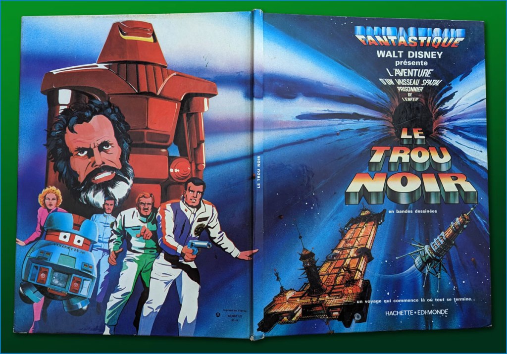
Western Publishing, usual licensee of Disney product since its acrimonious split from Dell in 1962, then issued a Black Hole adaptation, in both a slick magazine and comic book format. But — holy bait-and-switch! — it wasn’t the Kirby version!

I’ve been musing over these riddles ever since (in my spare time). Recently, I decided to act by putting the question to one who was there… namely Mr. Michael Royer, who’s been most gracious to us with his time and recollections (check out our three-part interview with MR!) — and continues to be!
RG: Mr. Royer, I’ve long been baffled as to why Disney (or Western Publishing, at any rate), thought it necessary to commission two separate comics adaptations of The Black Hole. I’ve always surmised that Kirby was considered too wild for them, but that’s just speculation on my part.
Since you were working for Disney at the time, and you inked the Kirby adaptation, I presume that you played some kind of role behind the scenes as well. Could you share some of the facts with me (and my readers)?
MR: Jack Kirby was selected to draw THE BLACK HOLE Sunday comic strip on MY recommendation. Gold Key editors always selected their OWN artist for similar licensed material… plus they were in no position to pay their artist the fee I got Jack. I inked and lettered HOLE and made necessary changes to the robots to protect the image for toy, etc. sales trademarks. Jack was an impressionist and I made the robots “on model.”
Jack became so bored with the scripts, that were done “storyboard” like by someone who had NO understanding of how to make comic art interesting and exciting, that he asked me to layout the FINAL Sunday page, which I did. I had told the powers that be at Disney that Jack must get his originals back but, of course, being Disney, they did not return them as they had promised. Jack only got the remaining pages not yet sold by the Circle Galleries after threatening Disney with a lawsuit. Disney gave me one of the Sunday originals because someone had spilled a cup of coffee on it.
The head of our Creative Services dept. at Disney was not a big fan of Kirby* and after I had inked the first Sunday he had another staff artist “fix” the faces, which stood out like what they became: inept changes. I yelled “DON’T CHANGE THE FACES!” They gave in to my warning.
It was an interesting time back then. Bob Foster and I were the ONLY artists in Creative Services who had worked in comic books and strips. They would never take our word about things until our department head, Bob and I, were on a conference call with Sylvan Beck (King Features Strip Editor in New York) and then they believed what we had to say about the ways a Sunday strip could be drawn to fit many formats. It was very frustrating at times knowing more than your “bosses.”. But… it is the same old story. Middle management was loaded with MBAs who didn’t know shit from shinola! We used to joke that if one had an MBA anyone could get hired at Disney… You didn’t have to know a damn thing about anything else except how to get the MBA.
RG: I’ve read somewhere that the Black Hole scripts were the work of Carl Fallberg. I mean, if that’s true, surely he wasn’t the one who storyboarded the script, as it’s a bit hard to reconcile ‘NO understanding of how to make comic art interesting and exciting’ with a visual artist of Fallberg’s calibre… might he have delegated the task to some flunky?
MR: It was Fallberg… storyboard layouts for each panel/page. I liked Carl and he was a nice man, but he had no idea how to “jazz” up the film visually and Jack wasn’t about to rock the boat, by being his usual inventive self. The script layouts were just like the film… boring. Just a blow by blow of what was going on in the film. The comic strip could have been exciting if Carl hadn’t just “stuck” to the movie. But, perhaps I am being too critical. Carl was probably “following orders” from our department head. When I tried out to do strip art for Disney in the late 60s or early 70s that same department head told me NOT to worry about “likenesses” of the actors. So when I told in my samples they were turned down because “no one looked like the actors.” Gawrsh…as Goofy would say. As I said… Bob Foster and I were the only guys in Creative Services who had ever been intimately involved in comic book or strip art production in our department. Things did change a bit eventually.**


I leave the final words to Mr. Royer, along with my earnest appreciation of his gregarious generosity!
MR: As a point of interest (or none at all), I designed and drew the Sunday page BLACK HOLE title panel as well as lettering, correcting robots and inking. I have a full set of B&W proofs if any one is interested in putting them into print. Offered to loan them to IDW but I guess they weren’t interested. My price must have been too high. Two comp copies of whatever they printed. LOL sigh.
*this was decades before Disney became perfectly fine with reaping billions upon billions from Kirby’s creations.
**but not soon enough to save Tron! Check out the impressively flat adaptation of the studio’s following foray into SF.

Great stuff, as always!
My last contact with Kirby’s work was Demon and Kamandi for DC, which seemed to
be great venues for Kirby to be Kirby, so ably inked and abetted by Royer. (nice
inking here: just look at the back of that guy’s head (and hair) in the last panel!)
I’d love to hear more from Mike on working with Kirby and his experiences in the
industry generally. Sounds like a real straight-shooter.
As usual, depressing to hear yet again about how grotesquely artists were treated
by editors, administrators and managers back then; yet now we have vast corporate
empires, soulless by comparison.
LikeLiked by 1 person
I really enjoyed this one; well done! And, yeah, even at the supposedly impressionable age of 14, I thought THE BLACK HOLE was lame. Admittedly also felt (feel) the same about TRON. Both movies look fabulous, though.
LikeLike
Funny, I just recently rewatched Tron for the first time in 45 years and was impressed by how gorgeous and original the visuals are.
I never saw the Kirby version but can imagine how it would look almost antique next to the saturated digital simplicity of the movie.
Trying to think of an artist who could have pulled it off: maybe Alex Toth, with a full color palette? Richard Corben?
LikeLiked by 1 person
Hi Steve! While I haven’t revisited The Black Hole, I did enjoy rewatching Tron a couple of years ago… sure, the script could have used some zing, but at least the premise was cool, and it was a lovely time capsule of the early days of video gaming.
There was no Kirby adaptation, though; I was just using the existing comic strip version (by Jeannette Steiner and Richard Moore) to illustrate Mike Royer’s point about the utter lack of visual excitement Disney habitually brought to their newspaper strip (the full Tron adaptation is available here: https://libgen.li/ads.php?md5=23b52af8bbfbe2512ced6312f114f282).
As for pulling off a proper adaptation, that’s a toughie indeed. Of course, it would have to be without corporate interference… which was clearly impossible at the time (and likely now — we only see the tip of the iceberg, generally). Toth was never that interested in colour, though. Corben would have had a great time with David Warner’s baddie, that’s for sure. I’m personally not a fan, but while we’re spitballing… I suppose that the most natural choice would have been one of the film’s concept designers, Jean ‘Moebius’ Giraud.
I couldn’t, and still can’t, get my head around Tron being beaten out for the Best Costume Design Oscar by… Ghandi. But I admit it’s pretty funny.
LikeLike
I think probably even worse than TRON being beaten out for the Best Costume Design Oscar by GANDHI was BLADE RUNNER being beaten out for the Best Art Direction-Set Decoration Oscar by GANDHI. Oh, that sweep mentality…
LikeLiked by 1 person
Matt — That *is* even worse. And certainly not funny!
LikeLike
Now that you mention it, I remember seeing that Moebius was listed in the credits, which made a lot of sense, the costumes definitely had his look.
But there’s something about nice line work and hatching that feels obsolete as a response to the film, which is so much about shape, value (Toth) and saturated blocks of color (Corben).
I’m also put in mind of Kirby’s more conceptual photo collage spreads, or Steranko’s Ukiyo-e-inspired compositions…
I don’t know enough contemporary comic artists to come up with a suggestion!
LikeLike
In fact – sorry, I’m going down the rabbit hole – the thing about Moebius’ drawings is that his sci-fi aesthetic encompasses some of the campy 1930s Flash Gordon look, which Tron so cleverly folded into their late-70s digital/video world.
This juxtaposition was especially nicely-done in the way the saturated color washed out values in the faces, becoming an obvious equivalent of the pancake makeup used in early film. So original…
LikeLike
No need to apologize at all, Steve. That’s an excellent observation and connection. I miss those days when special effects guys had to be real wizards and regularly reinvented the wheel in contending with — and rising above! –the technical limitations and difficulties they encountered. Tron’s looking to the past to design the future was truly inspired.
LikeLike