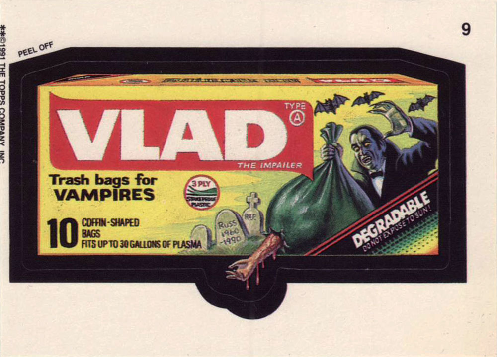
« So, you see the little snot on the right side, move it two inches to the left and add a little bit of green gleam to it. » — Mark Newgarden, doing some art direction
If this one looks sharper than you’d expect, it’s because it’s shot from a larger version of the Wacky card that Norman Saunders (re)painted for Topps’ Wacky Posters series, circa 1973.
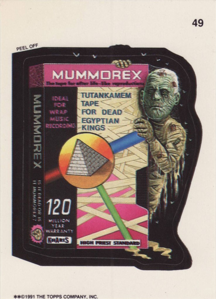
Ladies and gentlemen, Drew Friedman! « In 1991, I was creating many concept sketches and pencil drawings for the TOPPS company, including for their latest set of the hugely popular sticker series “Wacky Packages”. Mark Newgarden was the editor and art director for the 1991 series, and the writers for the card fronts included Newgarden, Jay Lynch, Jordan Bochanis, John Mariano and myself. I drew about 22 tight pencil images which would (with one exception) be painted by the illustrator Patrick Pigott. » If you enjoy being privy to an artist’s creative process, by all means do yourself a favour and feast your peepers on this gallery of Friedman’s roughs, finishes, used and unused pieces. In this (mummy) case, it’s Friedman pencils, finished art by Tomas Bunk.
From the 6th Series (1974, Topps). Most likely painted by Norm Saunders.
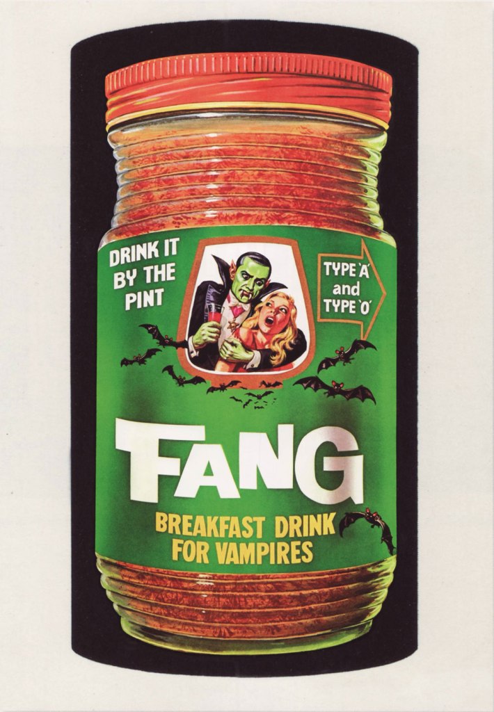
From the 8th Series (1974, Topps)… though mine’s a 1980’s reprint. Painted by Norm Saunders.
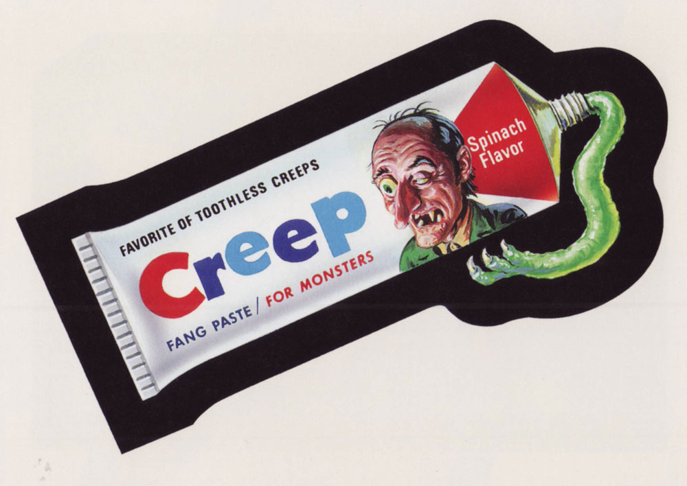
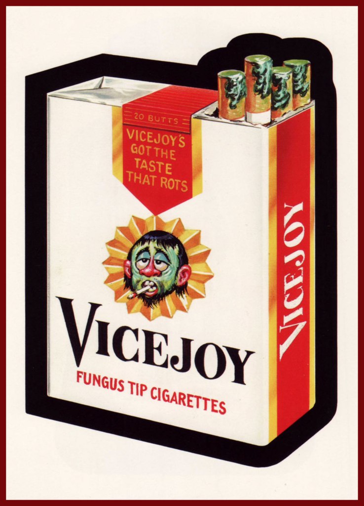
From the lucky 13th Series (1975, Topps). Another fine Saunders vintage. Topps would find Mr. Saunders most difficult to replace.
« When the mind is thinking, it is talking to itself. » — Plato
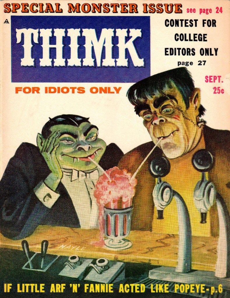
The waning years of the 1950’s marked the beginning of the monster craze, which coincided with Mad Magazine’s ripest period of influence. Here, then, is a publication that sought to capitalize on both occurrences. Alas, chasing fads too eagerly always did land you all-too-promptly in the cultural ditch. Still… Thimk had its moment.
This is Thimk no. 3 (Sept. 1958, Counterpoint). Edited by Alan Whitney, cover by Sam Hayle (1911-1996), who later did a bit of work for Cracked.
This is Thimk no. 4 (Dec. 1958, Counterpoint); cover by Sam Hayle. Elvis finds out first hand how fickle teenyboppers can be, and how a two-year army hitch might as well be an eternity, as far as they’re concerned. Uneasy lies the head that wears a crown!
Thimk was a short-lived (6 issues, 1958-59) would-be Mad, also in the black and white magazine format.
One holiday gleefully bleeds into another… this is Thimk no. 5 (Feb. 1959, Counterpoint). “Free… for 25 cents!”
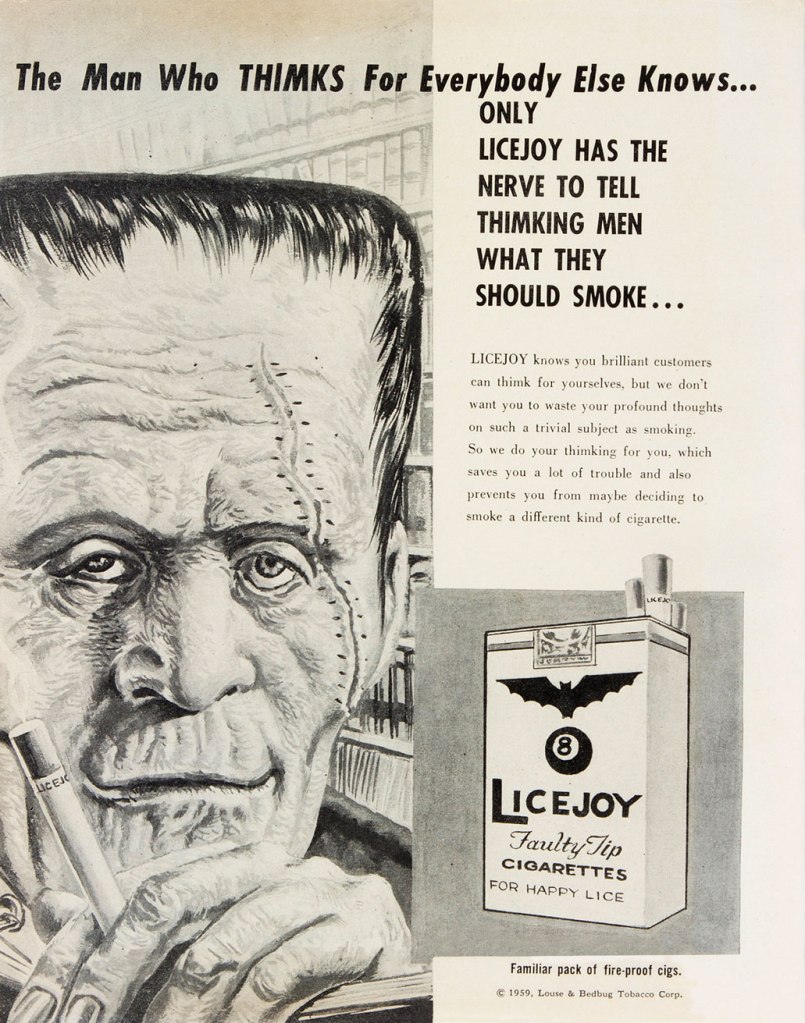
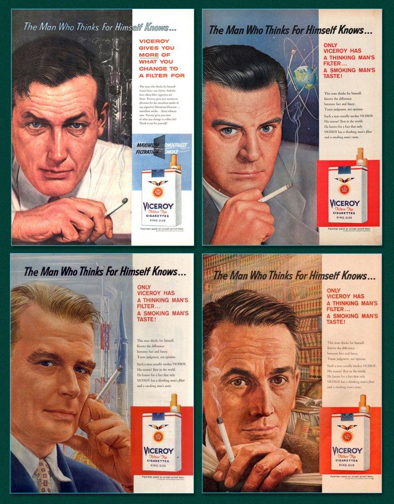
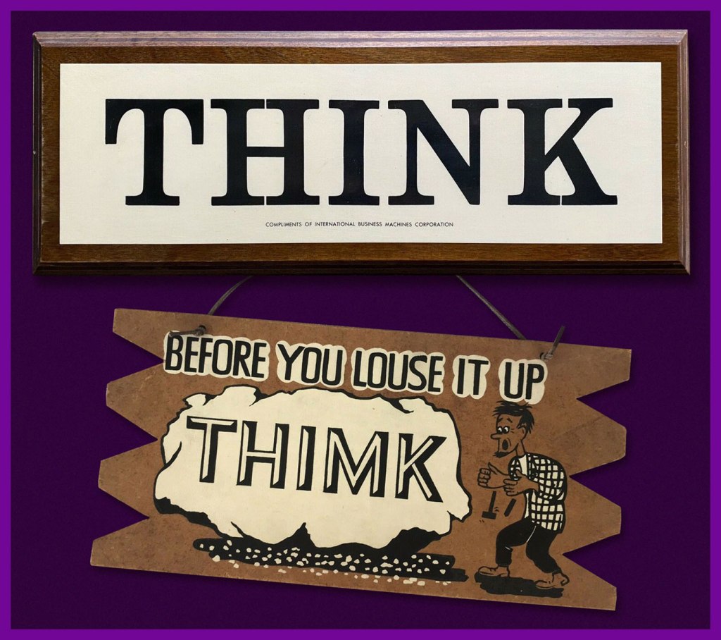
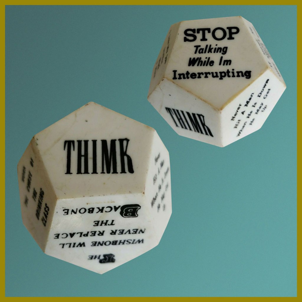
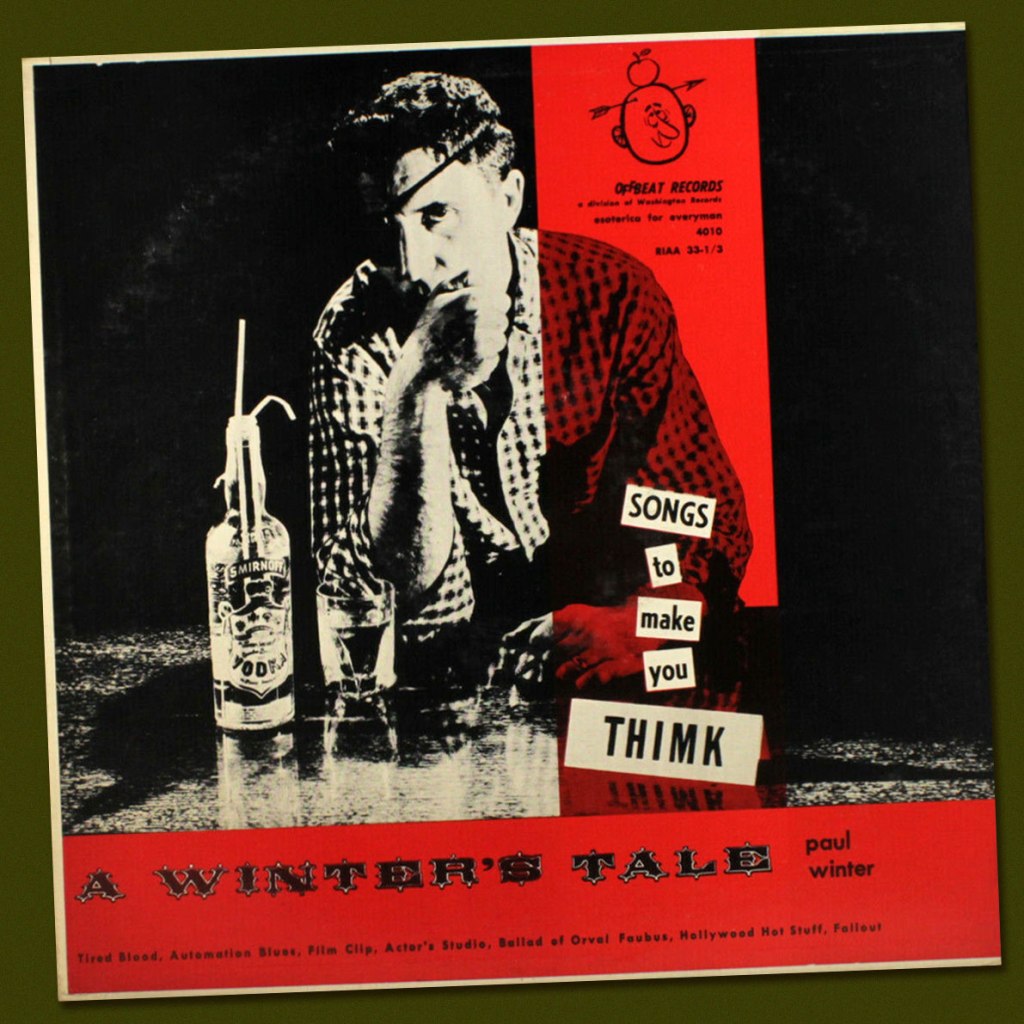
Thimk no. 5‘s back cover… a well-aimed barb at Viceroy Cigarettes.And some samples (there were many, many more!) from the object of parody, Viceroy’s The Man Who Thinks for Himself ad campaign. Lookit all them deep thinkers! (Martin Fry, cancer survivor, bottom left).And it wasn’t to be the last Viceroy parody, either: the brand was also an early Wacky Packages target. This entry hails from Series 1, featuring a rough concept by Art Spiegelman painted by Norman Saunders (1973, Topps). Heads up, Marlon… some… thing is about to cut in for a dance. Is his date dismayed or delighted? Last call: Thimk no. 6 (May 1959, Counterpoint) was the final issue. Cover art, again, by Sam Hayle.From Think to Thimk in one easy step. What began as a ubiquitous IBM slogan soon, inevitably, led to parodic counterpunches.During the late 50s, it spread seemingly everywhere.Legendary Detroit DJ Paul Winter (station WXYZ) got in on the act early (1957). Here’s a sample, Fallout, featuring Charlie Byrd on guitar!And of course, the great Steve Ditko took the slogan to heart (and mind), famously making his own sign. I wonder where it is now.
« Who would have thought, in 1974, as I cruised the aisle of the San Francisco Safeway with Art Spiegelman, hunting for likely targets, that our little barbs sent at consumerism and package design would have such staying power? » — Bill Griffith, creator of Zippy the Pinhead
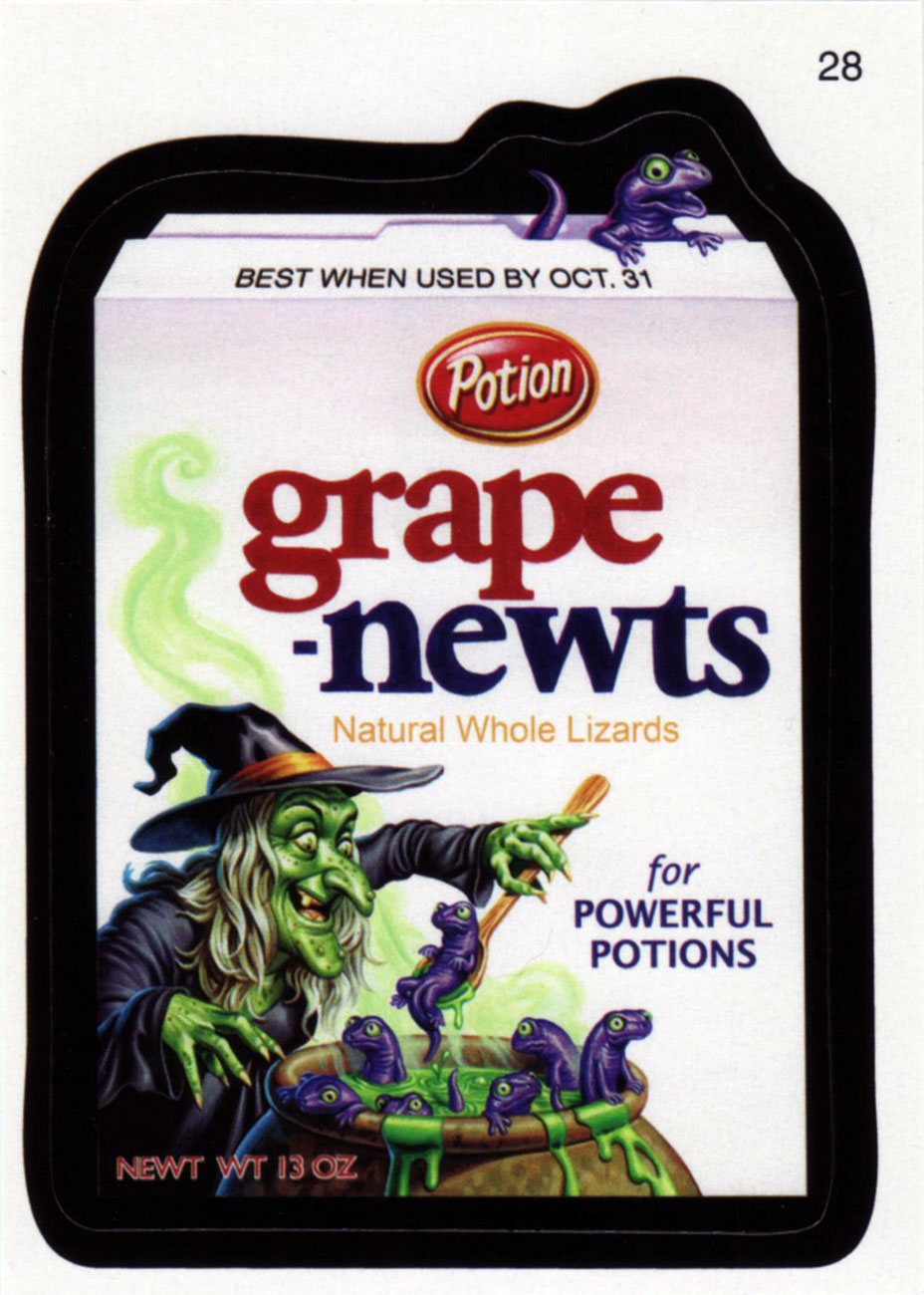
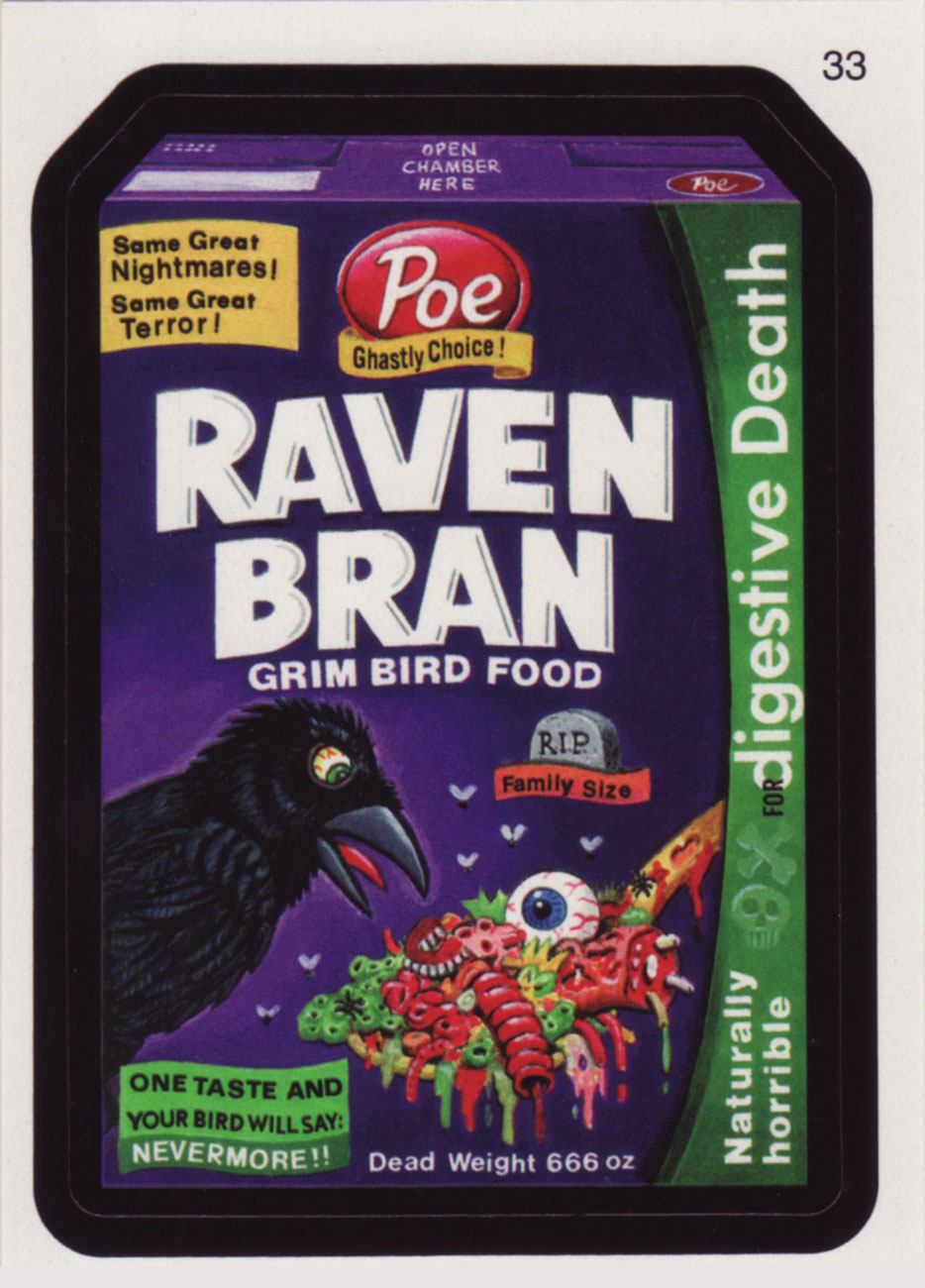
Topps’ legendary Wacky Packages, the bane of school authorities at their peak in the 1970s, have been opening kids’ eyes in the art of tipping over sacred cows for generations. Since everyone’s presumably well-versed in the classics (essentially the initial 1967 and 1973-75 burst of creativity), it wouldn’t be a bad idea to showcase some newer fare. In the wake of an internet-fuelled wave of nostalgic popularity, the Wackies rose again with their All-New Series (2004-), and their quality is every bit as impressive as it ever was… thanks in part to a plethora of new products to lampoon, greater creative latitude for the perpetrators, a motley crew of grizzled veterans and homely new faces.
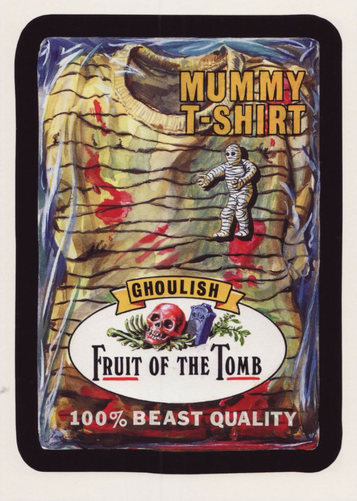
For your contemplation, here’s a trio of Hallowe’en-appropriate cards from new series 7 (2010).