Visionary Meets Mundane: Richard Powers at Western Publishing

« Are all your projects this dangerous, Dr. Solar? »

Dateline: 1962. Printer-packager Western Publishing had just dealt its biggest client, Dell Comics, its slow death sentence (by mutual agreement, it is diplomatically claimed), though Dell should have seen it coming: for decades, Western Publishing Co. had « secured the rights, created the comics, printed them and shipped them out for Dell. Dell acted as the publisher and distributor and did the billing and paid Western for its creatively manufactured products*. » In 1962, Western cut out the middleman and launched its Gold Key imprint (1962-1984.)

Enter, briefly, revolutionary illustrator Richard M. Powers (1921-1996), who successfully wed representational and abstract art for his paperback covers of the 50s and 60s, bringing science-fiction visuals an unprecedented visual maturity. Don’t merely take my word for it: treat your peepers to a gander at his work. You may well find that you know it already.

What with a Cold War on, in the early 60s, atom-powered heroes were understandably in vogue. Charlton even had two: after Al Fago‘s 1955 creation Atomic Rabbit, came Joe Gill & Steve Ditko‘s Captain Atom. In 1962, the newly-founded Gold Key threw their hat into the nuclear furnace with the advent of Doctor Solar, Man of the Atom. He was created by writer Paul S. Newman and editor Matt Murphy.

PowersSolar1A
Doctor Solar, Man of the Atom no. 1 (October, 1962)
PowersSolar2A
Doctor Solar, Man of the Atom no. 2 (December, 1962)

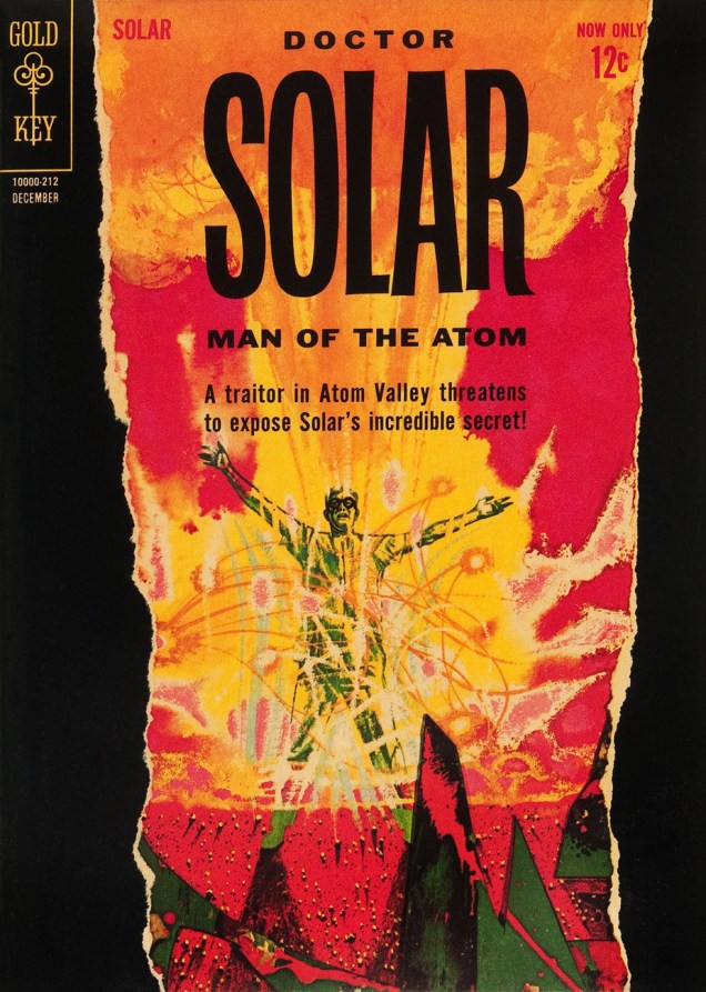
So far so good, right? And then… we may never know exactly what transpired, but I assume that some art director at Western Publishing chose to second-guess Mr. Powers… smothering the tonal and compositional balance of his painting (« can’t… bear… negative space! »), and likely depriving the outfit of Powers’ further services. He was at his peak, was being offered assignments than he could hope to fulfill, assignments surely more lucrative and friction-free. He wisely scooted along.

The printed version:

KarloffThriller2A
Boris Karloff Thriller no. 2 (January, 1963.) It was decades before I realized that this ho-hum comic book cover was the work of Richard Powers. In truth, the scales only fell from my eyes when I caught a peek of the original art. The printed version is so tame, so drained of its power(s) that the issue didn’t even appear in Jane Frank’s checklist of book covers in her fine The Art of Richard Powers (Paper Tiger, 2001).
PowersThriller2A
See? Now *that* is clearly Powers. « Just slap a 60% cyan overlay over the dang thing, Gertrude. It’s too effin’ artsy! »

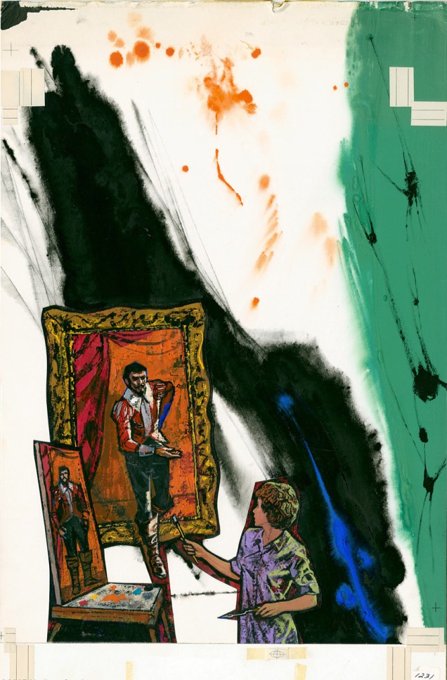
And the tale might have ended there, but here’s the curveball: in the mid-to-late Seventies, Powers provided the fading publisher with a pair of gorgeous, but seldom-seen cover paintings.

Starstream1PowersA
A lovely Rorschach blot of a cover for the inaugural issue of Starstream, issued in 1976 under Western’s Whitman imprint. Starstream‘s four issue-run offered sober adaptations of smartly-chosen science-fiction short stories by the exalted likes of Theodore Sturgeon, Robert Bloch, A.E. Van Vogt, Robert Silverberg, Isaac Asimov, Larry Niven, Jack Williamson, et al.
UFOOuterSpace17A
Let’s hear it for unearthly-looking extraterrestrials. With their translucent skin, these guys remind me of unhatched fish. The fifth and final cover created by Richard M. Powers, this is UFO & Outer Space no. 17 (continued from UFO Flying Saucers), published in September, 1978.

See what I mean?

Anemone_Fish_Eggs

If memory serves, my own Powers epiphany took place in the autumn of 1982, in Lennoxville, a small college town in the Eastern Townships of Québec. There was this little bookstore… and its fine selection of 60s horror and science-fiction paperbacks, priced in the 35-to-50-cents range. The kind of place book lovers dream about stumbling upon, and wake up dismayed to find themselves in the real world… empty-handed.

My favourite (inside and out) of the lot I picked up that day? Fritz Leiber’s (despite the name being misspelled on the cover) Night’s Black Agents (June 1961, Ballantine Books). If you’ve had a similar thrill of discovery with Powers’ art, please do tell us about it!

NBALeiber

-RG

*quoted from an interview with Gold Key’s Matt Murphy.

Bob White, Forgotten Archie Artist

Of course, you can take that ‘forgotten artist’ notion with a grain of salt: most Archie artists aren’t forgotten, because they were rarely acknowledged in the first place. There are cases such as that of Scrooge McDuck creator Carl Barks, aka the Good Duck Artist, whose identity latterly became known through the efforts of a handful of devoted fans… but such fortuitous events are rare as Gladstone Gander’s off days.

No such luck for Robert “Bob” White (1928-2005), who got the short end of the stick despite being the Archie line’s signature artist during its peak period* (pretty squarely 1959 to 1965) and crafting uncluttered, expertly-designed covers and stories. Of course, these years coincide with most of the classic Archie bullpen hitting its stride, bookmarked at one end by the ascent of White (who’d arrived at Archie around 1954, but details are scant) and at the other by Samm Schwartz‘s departure for greener, but sadly ephemeral (1965-69) pastures, an art director post with Tower Comics.

According to The Comics Reporter, writing on the occasion of White’s passing, « He was let go by Archie after working on Tippy Teen for Tower, at which point he moved into other lines of work, including a stint as an artist at United Artists. »

Archie’s illiberal response to a guy simply, and wisely, trying to avoid putting all his eggs in one basket was typical of the publisher, and of the reactionary comics industry in general, but it’s to White’s credit that, unlike Dan DeCarlo and Samm Schwartz (who at least made a break for it), he didn’t just fold, kiss their ring and take their abuse. Who’s to say? Perhaps that principled departure really stuck in their craw.

There are simply too many outstanding White covers to feature in one go; I suppose I’ll have to return to the well a couple of times. Still, these ought to give you a sense of the man’s style.

LWA5A
Before Afterlife With Archie, there was… Life With Archie, which « was a comic book published from 1958 to 1991. It featured Archie Andrews in adventure stories that were more dramatic than the standard Archie tales. » This is Life With Archie no. 5 (November, 1960.)
Madhouse15A
« As I looked there came, I thought a change – he seemed to swell – his face became suddenly black and the features seemed to melt and alter… » ― Robert Louis Stevenson, The Strange Case of Dr. Jekyll and Mr. Hyde
‘Delicious’ is a good start, but what about the side effects? This is Archie’s Mad House no. 15 (Oct. 1961).
Laugh129A
Hey, the Macabre Trio’s in town! This is Laugh no. 129 (December 1961). Cool ghoul Bob White is truly in his element here. Also, do bear in mind that the word “Horror” was banned by the Comics Code Authority, yet they approved this cover. Asleep at the switch!
LWA12A
This is Life With Archie no. 12 (January, 1962.) Correctly acknowledging the facts of evolution? Obviously, Al Hartley hadn’t made the scene yet.
Pep153A
I’m especially fond of the period when you get a sense from the covers (chiefly those produced by White and Schwartz) that Riverdale was built over the Hellmouth or an ancient burial ground, as monsters and aliens routinely ask for directions or take Betty out for a soda. This is Pep no. 153 (March, 1962).
LWA16A
Ah, there’s some of that “more dramatic” stuff. Life With Archie no. 16 (September, 1962.)
Madhouse27A
« So don’t be persistent / Please keep your distance / You know my resistance is low »
It would appear that Madison Avenue’s brand of wizardry is more than a match for Sabrina’s. This is Archie’s Mad House no. 27 (August, 1963).

– RG

*I’m in complete agreement with cartoonist-connaisseur Gregory Gallant, aka Seth, when he writes, in his introduction to John Stanley‘s Thirteen ‘Going on Eighteen’ (Drawn & Quarterly, 2009… where’s volume 2 at?) that « I like Archie comics quite a bit and own hundreds of issues of Archie and its various spin off titles. I can even tell you which years are the good years (1959 to ’65, incidentally) »

« I’m going door to door to make you this incredible offer! »

Surprise! Happy birthday to Lois Lane artist supreme Kurt Schaffenberger (December 15, 1920 – January 24, 2002), here working under the alias of Lou Wahl, (he was also Jay Kafka, which would have been fitting here!) a popular and entertaining practice at ACG and Marvel. The DC brass were presumably *not* amused by these moonlighting shenanigans. I’m looking at you, “Adam Austin”, “Mickey DeMeo” (aka Joe Gaudioso), “Jay Gavin” and “George Bell”…

UW55A
This is Unknown Worlds no. 55 (April-May 1967, ACG), one of the final issues of this fine anthology title.

In case you were wondering: Adam Austin was Gene Colan‘s alias, Mickey DeMeo and Joe Gaudioso were Mike Esposito‘s noms de plume, and Jay Gavin and George Bell were pseudonyms respectively favoured by Werner Roth and George Roussos.

PeeWeeColporteur
« Aaahhh!!! Salesmen! »

– RG

Hallowe’en Countdown, Day 2

« It looks like a rotting coffin… something that should have stayed buried! »

Here’s a relatively restrained cover from one of Eerie Pubs’ flagship series (34 issues, 1969-75). Despite, or because of, notorious sleazoid publisher Myron Fass’ typical bait-and-switch, cheapjack production and ethical values (in this case, all reprints with a flashy new cover), Eerie’s grit and grime must be experienced at least once, preferably through some of its truly unhinged Dick Ayers-illustrated originals, such as, say, « House of Monsters »… in fact, let’s not waste any time: read it here.

WitchesTales8A

This is Witches’ Tales vol. 1 no. 8, in truth the title’s 2nd issue… Chez Eerie Pubs, they loved to keep everyone guessing! (Eerie Publications, Sept. 1969) Cover painting by Bill Alexander. Edited by Marvel-Timely golden-ager Carl Burgos.

– RG

Can You Hear Us?

« Galloping ladybugs! What *are* those things, professor? »

Blackhawk199.jpg

It’s hard to imagine an explanation for this premise that wouldn’t raise more questions than it answered. By the 1960s, DC just didn’t know *what* to do with the Blackhawks. The title had been among DC’s top-sellers since the early 1940s, but it was becoming harder and harder to keep up with the times.

This is issue 199, from August 1964. Cover by Dick Dillin and Sheldon Moldoff. No one rushes forward to claim credit for writing The Attack of the Mummy Insects, but it’s probably Dave Wood.

The title would run until issue 243, in 1968. Ironically, its very finest issues would be its final two (until it was briefly revived in the 70s), an amazing two-parter drawn by Pat Boyette and returning these venerable characters to their roots and original uniforms.


– RG