Virgil Partch is such a bright, shining figure in the cartooning world, his sense of humour so zany and impertinent, that I can understand a certain lack of interest in his newspaper strip Big George, which was designed to be family-friendly and as such is far more comfortable and conventional than VIP’s elegantly absurd output during his halcyon days.
Like the previously discussed Captain’s Gig (see Virgil Partch’s Captain’s Gig), Big George, who strutted into existence in 1960 in daily cartoons and a month later in Sunday strips, was syndicated by Field Enterprises. The strip did not break any sales records, but maintained itself at a respectable level of popularity for an impressive number of years, even living on beyond the death of its creator, thanks for VIP’s habit of working far ahead of the deadline – he died in 1984 in a car crash, but he had created enough surplus strips to last until either 1986 or 1990 (the sources on this are somewhat conflicting).
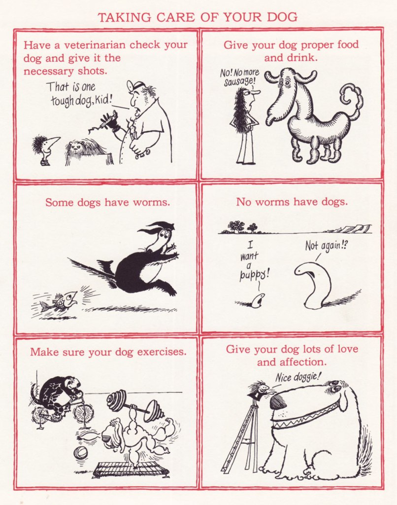
That being said, cantankerous and girthy family man George Filstrup, walking collection of many flaws typical for cartoon (and real-life) husbands, lived through many surreal moments. Oh, he had but 5 fingers on each hand, and did ordinary things like go to work (to get humiliated by his boss) or swagger proudly around his barbeque, last refuge of manliness in this uncertain world, but his life often took a turn for the bizarre. Case in point, his very anthropomorphized and malicious pooch, great fun to watch in action. For a few first-class examples of this, head over to The Fabulous Fifties blog for Ger Apeldoorn’s always reliable newspaper scans.
Frankly, VIP’s art is arresting even when he’s illustrating mundane subjects… I don’t even need a touch of the surreal to enjoy it.
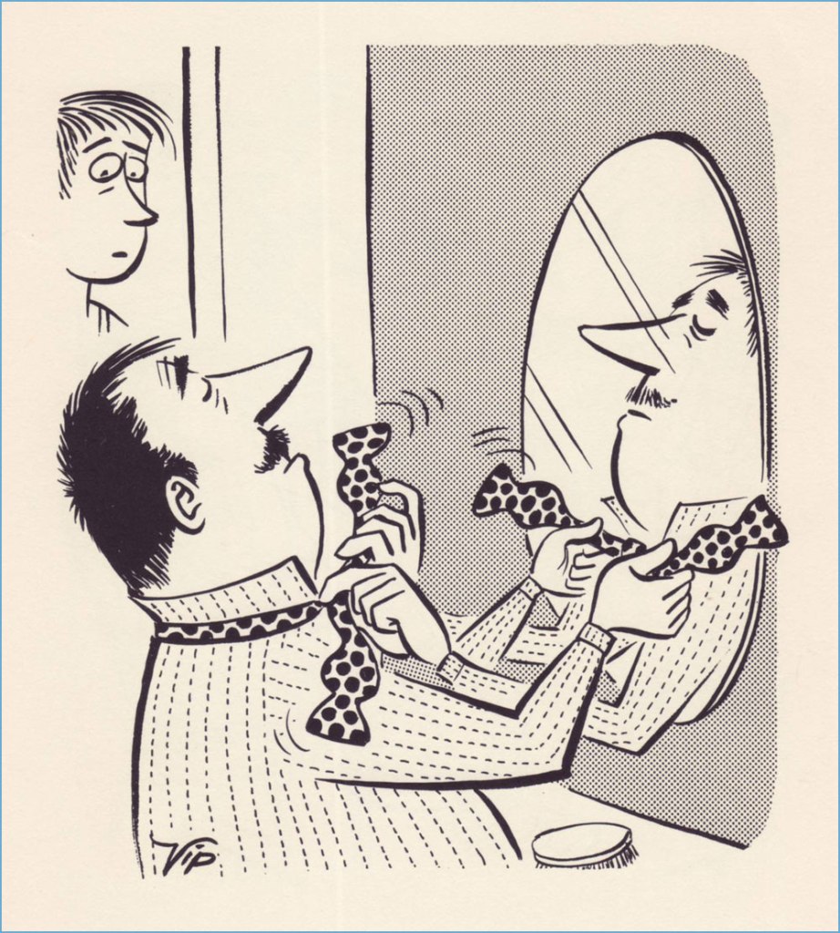
Speaking of scans, here are some Sunday strips from our own collection of newspaper cut-outs from sometime between 1968 and 1970:
George is not a likable character. As a matter of fact, I am overjoyed when something goes wrong for him, as it usually does. If he does something for his family, it’s either because the neighbours are watching and he’s concerned about appearances, or he’s been roped into it with some low-key chantage from his wife. He is vain, full of bluster, and easily manipulated. Frankly, I get the distinct impression that VIP’s sympathies lie entirely on the wife’s side – it’s unclear why she puts up with her lug of a husband at all, given how much smarter (and physically stronger, as Partch delights in pointing out frequently) she is. He does perhaps have one redeeming characteristic – his frequent flights of fancy, which is there VIP’s propensity for the surreal gets a chance to shine.
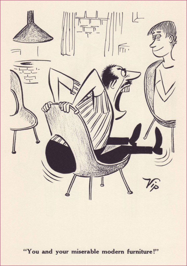
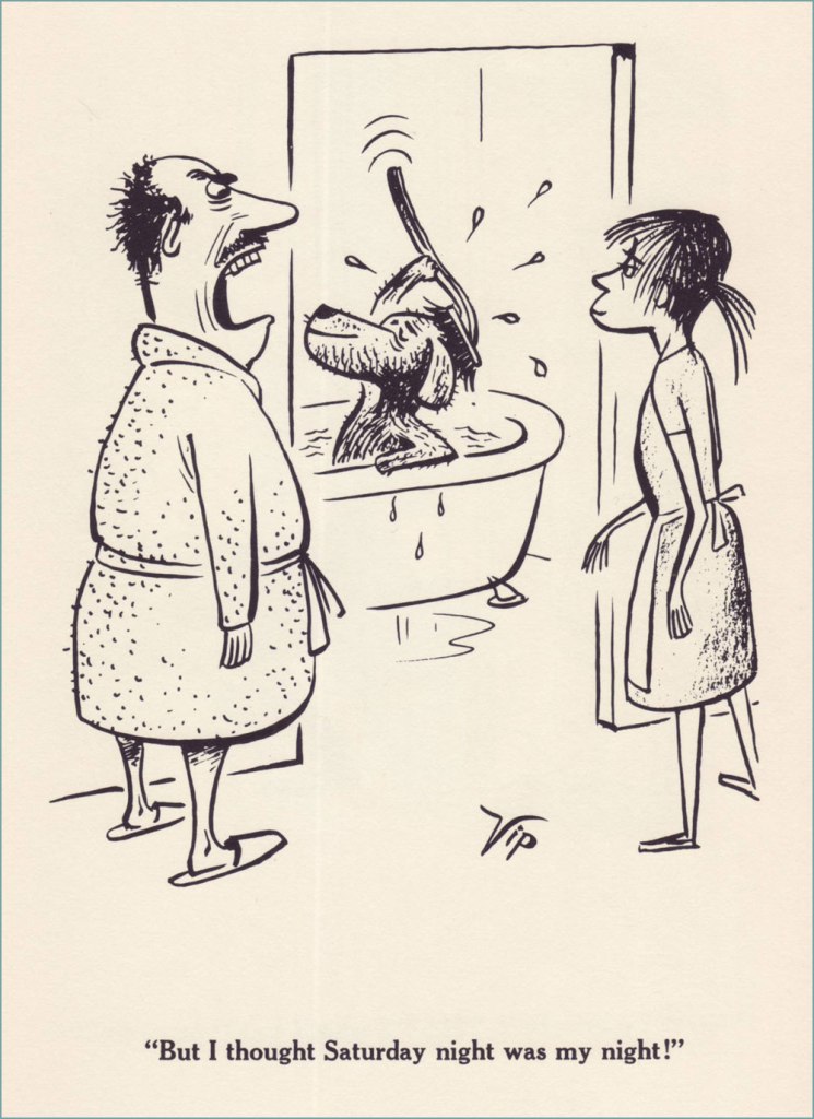
Sadly, there is no complete collection — not even close! — of Big George, and only two small ones – a hardcover from 1962, and a paperback from 1977. The following are scans from the former, published by Meredith Press.
« Time and space intertwined / Elegance, simple lines / Scandinavian Design »
Today’s post is dedicated to shapely posteriors, a particularly estival apparition. Cleavages can be admired year-round, but butts tend to put up an appearance during the season of bumblebees, swim-suit malfunctions, and summer dresses blown about by a warm breeze. There’s no need to take sides in the old battle of boob-man-vs-butt-man (which also entirely ignores the preferences of lesbians etc.), each shall have their day!
«It isn’t often one sees a bowler these days. » A cartoon by Peter Arno published in The New Yorker on August 9th, 1952. The asses may be hidden, but we know they’re there!
«Where the hell where you when I was down here skindiving?» There are many theories about a mermaid’s anatomy, and this particular interpretation opted to emphasize her butt cheeks. This is a Playboy cartoon by Arv Miller, published in May 1957.
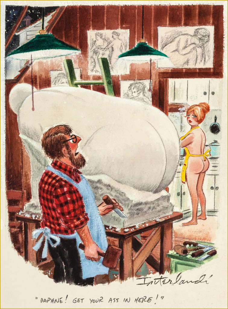
Cartoon by Phil Interlandi (1924-2002), a frequent contributor to Playboy.
Another one by Mr. Interlandi.
Playboy cartoon by Austrian-born Erich Sokol (1933-2003). The secretary could consider no longer choose her undergarments according to the calendar…
Cartoon by Donald Gordon Addis (1935 – 2009), who created several syndicated newspaper strips. He was staunchly anti-religious and a prominent member of the Freedom From Religion Foundation, the latter releasing a retrospective of his work in 2019, Cartoons for the Irreverent.
Presumably I couldn’t get away with a post about asses without featuring some spanking scene. Cartoon by British cartoonist Michael ffolkes 1925-1988, who contributed to a variety of British and American newspapers and magazines and also illustrated an impressive number of children’s books (with a particular proclivity for Roald Dahl ones).
Cartoon by Alden Erikson, about whom not much is known.
«Today We Will Examine the Primary Male Erogenous Zones, Thanks to Dr. Simpson of the Social Sciences Department » . Another cartoon by Erikson, published in September 1966. I had to include a male ass for variety!
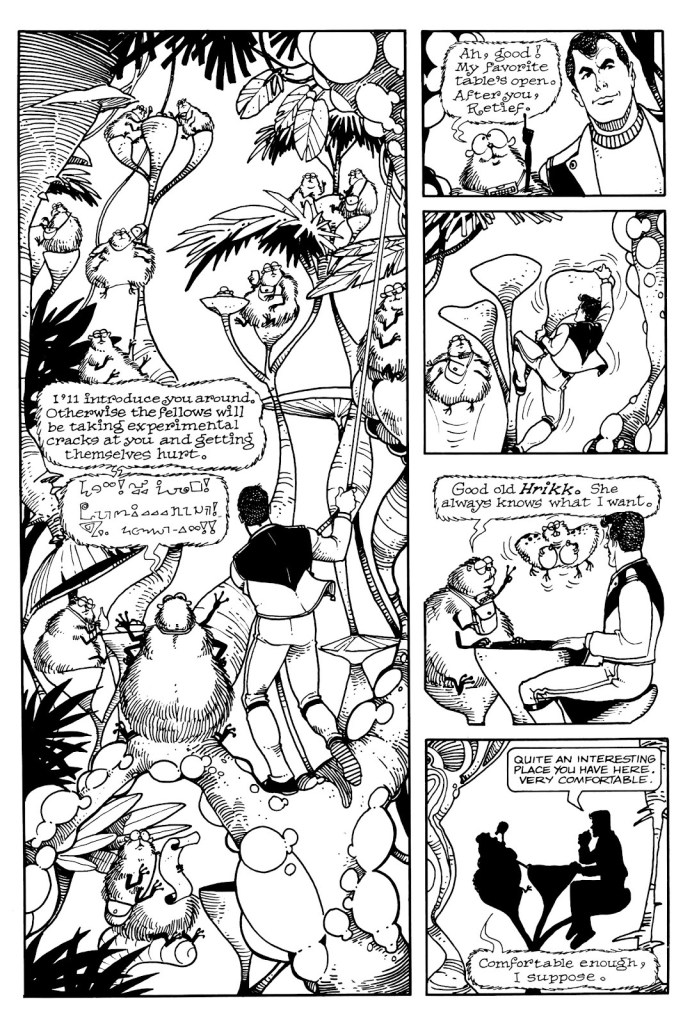
Looking at my shelves, one would be inclined to believe that I am a huge Keith Laumer fan, which wouldn’t be really true. A few of these books have Richard Powers covers (always worth collecting, even if one is not particularly interested in reading the actual book), but the rest have mostly been purchased after I encountered Laumer’s Retief character… in comic book form.
Which is not to say that Laumer’s Retief series is not worth a read, especially if you like a satirical approach to bureaucracy with a geo-political bent. Jame Retief, diplomat for the Corps Diplomatique Terrestrienne*, is the pragmatic voice in an organization mostly focused on excessive paperwork, meaningless awards, and pompous exchanges (in proper attire, naturally) between planetary representatives, all of this governed by a complex system of protocols and other galimatias. Anybody who’s worked for any kind of big company will be able to relate. Laumer served a stint as a vice consul for the United States Foreign Service, so doubtlessly he accumulated a lot of material for this. The novels rarely ascend beyond amusing, though, and the funny bits sometimes feel like somebody’s trying to be Conscientiously Funny.
Writer Jan Strnad, who has a long list of credits under his belt, having worked for pretty much all major comic publishers as well as contributing articles to The Comics Journal and writing novels, and artist Denis Fujitake** adapted several Retief stories into comic book form in the late 80s. These were published by Mad Dog Graphics. This team did such a bang-up job that I by far prefer them to the Laumer material, and no small element of this adaptation’s success is the clean art by Fujitake that brings to vivid life these characters. There were 6 great issues overall (1987-1988), collected in 1990 into Retief!: The Graphic Album.
Let’s have a look at some of my favourite moments. All of the below are excerpts from Keith Laumer stories by Strnad and Fujitake, drawn by Fujitake, and lettered by Gary Kato.
Apparently Laumer himself has always pictured Retief as having dark hair, so one might even say that these comics are closer to his vision than, say, the covers of Retief novels published by Baen Books, where he’s a sort of ditsy blonde*** with a lot of guns and mostly undressed women. I own a few of these… and yuck, one might as well stick to the electronic version.
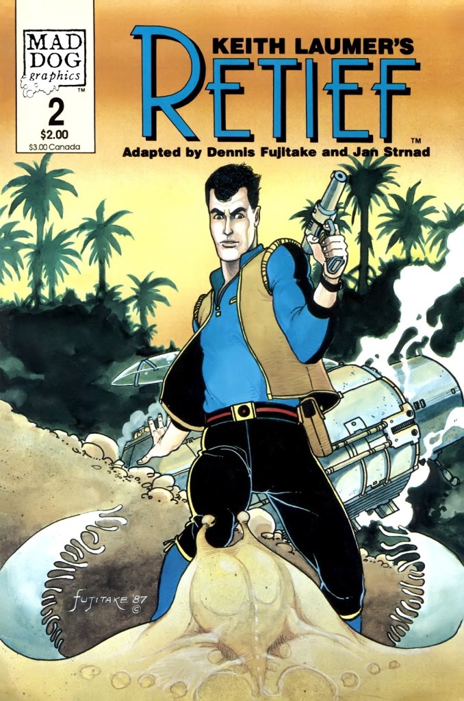
Keith Laumer’s Retief no. 1 (April 1987)
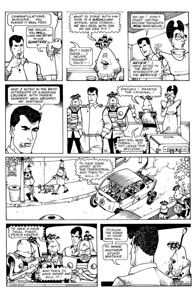
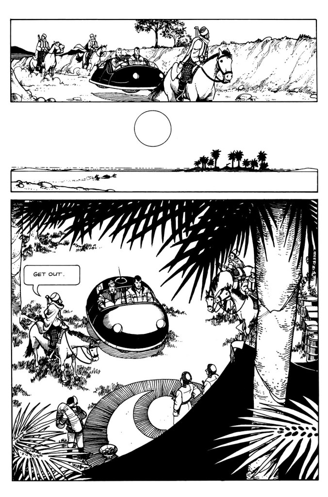
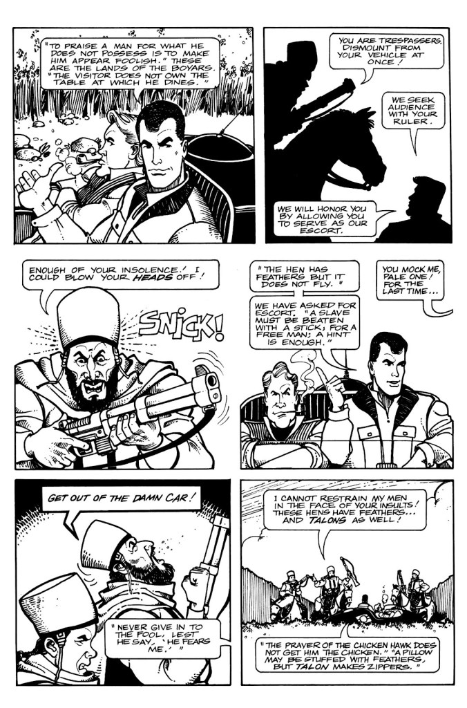
Page from Policy. Issue number 1 introduces us to the sneaky and unscrupulous Groaci, whose representative Mr. Fith has his fingers and 5 eye appendages in all pies. There are plenty of action scenes in Retief, but Fujitake’s art makes an even ordinary conversation fun to watch.
One of the closing pages from Policy, in which Miss Meuhl satisfyingly suffers a slight breakdown (when your values clash with reality, it’s generally an unpleasant process).
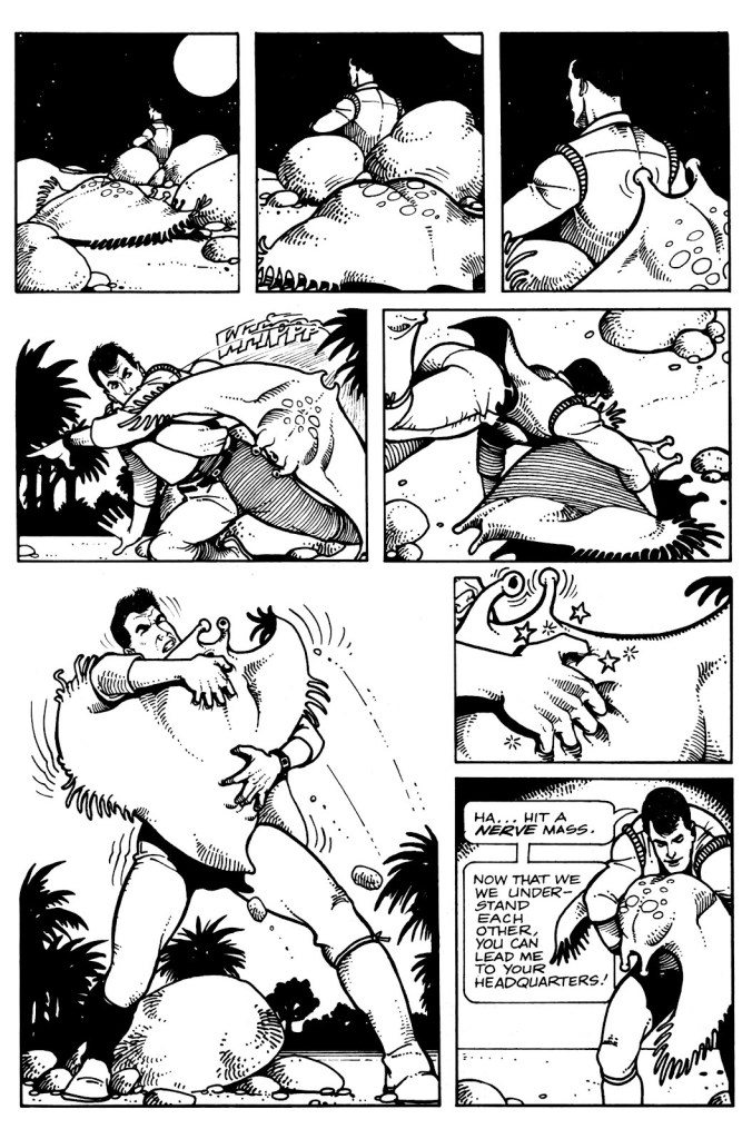
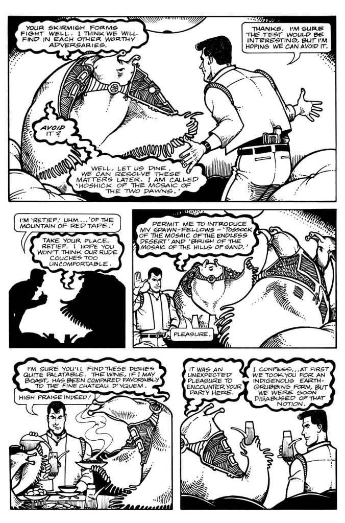
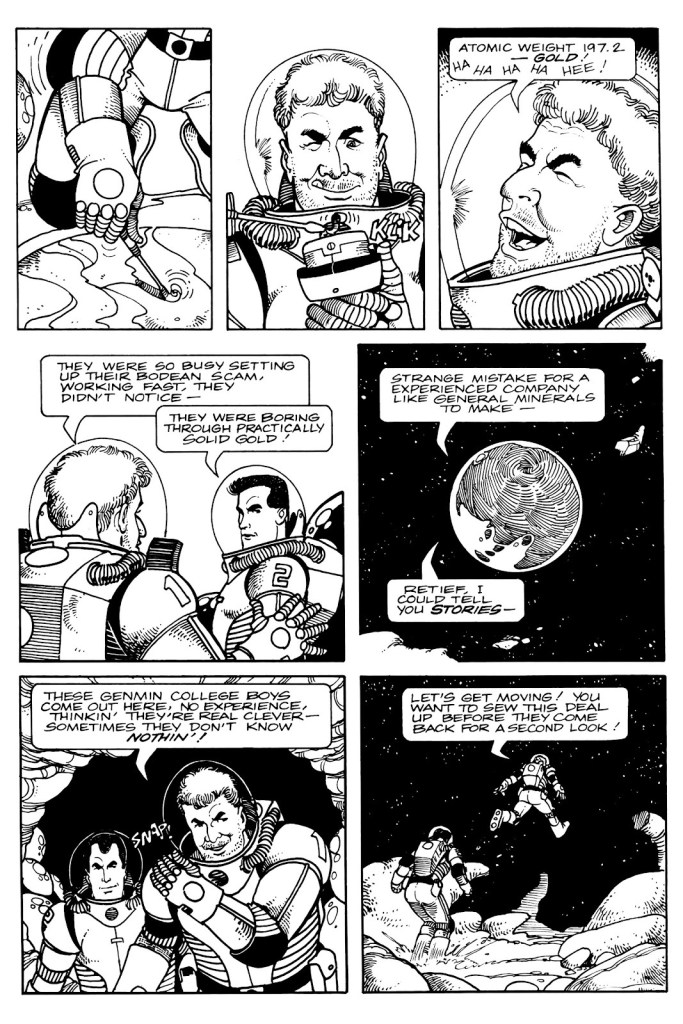
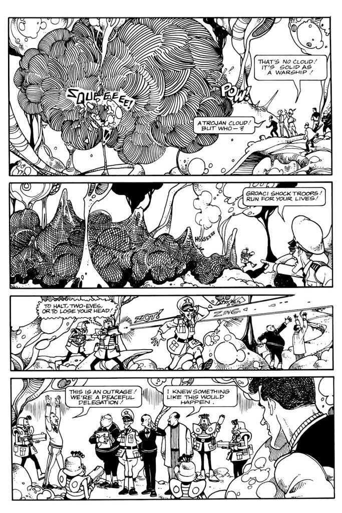
Keith Laumer’s Retief no. 2 (June 1987)
Shades of Brain Bats of Venus, anyone? Page from Sealed Orders, from issue no. 2.
Another page from Sealed Orders, in which Retief is shown to be a bon vivant who can appreciate alien fare.
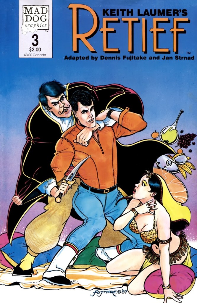
Keith Laumer’s Retief no. 3 (August 1987). One can’t say the series abounds with buxom women (or women at all, really – aside from the secretary who lost her marbles in the first issue), the Corps Diplomatique Terrestrienne is manned entirely by, well, men. Fujitake draws beautiful babes, though, few and far and between as they are.
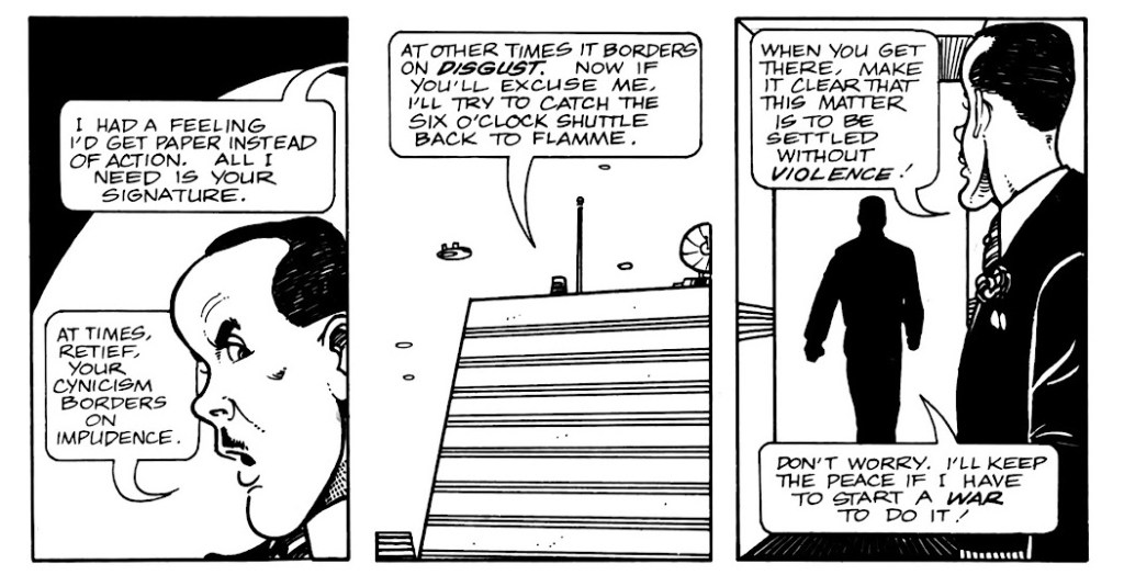
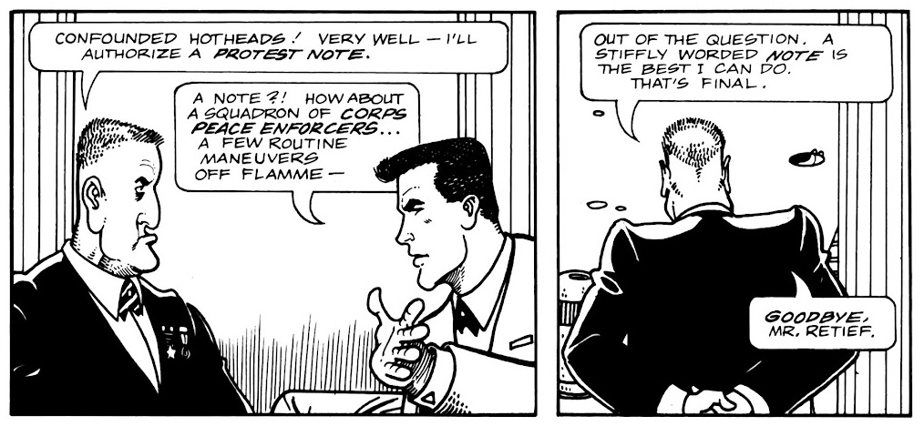
Page from Protest Note, published in no. 3. Retief visits a variety of environments, and Fujitake draws them all with equal conviction.
A fun page from Protest Note with some idiomatic banter.
Page from Saline Solution, published in Keith Laumer’s Retief no. 4 (October 1987). Retief may be a rather refined sort with a taste for fine wine and his own brand for diplomacy, but he does not hesitate to mingle with the plebeian masses – or side with the underdog, which Sam here is a representative of.
Page from Ultimatum, published in Keith Laumer’s Retief no. 5 (January 1988). It must have been a lot of fun to design aliens from a description in a short story, and give them speech bubbles to match (the advantage of hand lettering which, as mentioned previously, is handled by Gary Kato).
The pompous Mr. Magnan (the one in the sort-of baseball cap) has a long stick up his ass, but he’s not without charm, whereas Mr. Ambassador entirely deserves the rag in his mouth (and more).
Page from The Forest in the Sky, published in no. 6.
The hamster-like critters of The Forest in the Sky are adorable.. and voracious, especially their youth.
~ ds
*In French, ‘Terrestrienne’ is feminine (if it were an actual word… ‘Terrestre’ would be the right one) and ‘corps’ is masculine, so there’s a grammatical problem in its title.
** Strnad has also collaborated with Fujitake on Dalgoda, published by Fantagraphics from 1984–1986, which will be the subject of another post as soon as I reread the series. Any day now!
*** unsurprising, given that Baen’s Retief cover model was blue-eyed, blond 1980’s hunk Corbin Bernsen, whom you may recall from L.A. Law.
P.S. There is another comic adaptation from 1989, published by Malibu, with scripts by Bruce Balfour, pencils by Darren Goodhart, and inks by Alan Larsen. One word – ew.
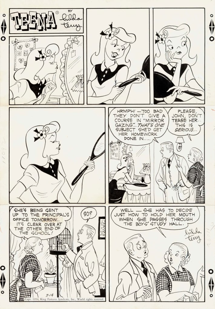
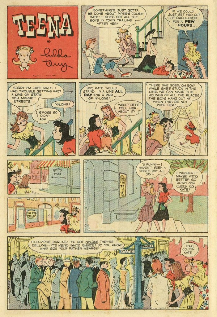
Theresa Hilda Fellman, later Theresa Hilda D’Alessio after marriage, generally known as Hilda Terry (1914-2006), holds the historical footnote of being the first woman to be accepted into the National Cartoonists Society. When her nomination was submitted in 1949 (by her husband Gregory D’Alessio, himself a cartoonist), the organization offered great resistance to the idea – apparently they were worried that men wouldn’t be able to curse if ladies were present. They eventually relented, even though it took a year of discussions as well as the loquacious support of a few male cartoonists like Milton Caniff and Al Capp. Terry was inducted, along with Edwina Dumm and WOT favourite Barbara Shermund, in 1950.
And so Terry tends to get mentioned in articles about female cartoonists because of her ground-breaking inclusion in the NCS. She proceeded to nominate yet more female cartoonists as soon as she got in, so this was a good demonstration of the foot-in-the-door being used for good. Obviously that deserves praise, but focusing on the aforementioned trail-blazing tends to overshadow Terry’s main comic strip Teena, which is genuinely fun – a point that might not be obvious, given that it’s about teenage girls and written for teenage girls.
Teena evolved from a newspaper Sunday feature (It’s a Girl’s Life) that got renamed as one of its protagonists grew in popularity. It was distributed by King Features Syndicate, and ran from 1944 until 1964.
Original art for the Sunday strip from March 14th, 1954.
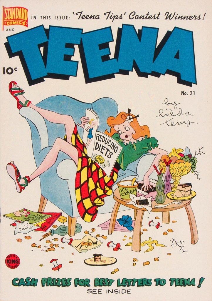
Teena no. 21 (November 1949), published by Pines. These comics books featured mostly newspaper strip reprints.
Teena’s girls are skinny, leggy creatures in motion, always perched in a peculiar manner on benches, draped over chairs (or trees), or lying cross-legged on beds. They may not have the manic savagery of Bonnie and Pepsi of Trots & Bonnie, but their sense of restlessness and a kind of misdirected lust give a similar, true-to-life, vibe (except that thanks to a three-decade difference in mores, while Pepsi is deciding on the optimal length and girth of her next beau’s appendage, Bonnie is planning the height and neck measurement of her future husband – it’s six and two threes). A lot of stories are based on (stereo)typical teenage behaviour – an obsession with clothing and appearance and general ne’er-do-wellness – but conversations often take place while something else is occurring in the background. Unlike a lot of similar comics, Teena feels like it’s set in a real world where people have to sleep and eat (and not just for the sake of a punchline). The dialogues are often staid, but the frame they’re in is dynamic, with art that may seem a bit sketchy at first, but reveals a wealth of detail upon inspection. For an analysis I really liked, head over to the Mike Lynch Cartoons blog.
Original art from the July 23rd, 1961 Sunday strip.
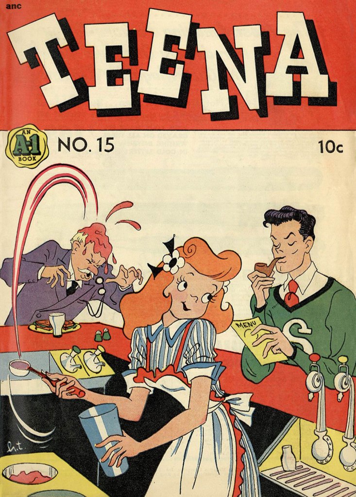
Teena no. 15 (August 1948), published by Magazine Enterprises.
Terry went a bit (or is that a lot?) off her rocker in her later years, seemingly harbouring a conviction that she was the reincarnation of a Salem witch (I am not sure whether she thought the latter was an actual witch, or just an innocently executed woman).
For more Sunday strips in colours, visit the Ragged Claws. You can also read a bunch of scans of comic books over at Comic Book + – the scan quality leaves something to be desired, but I still went though a couple of issues with great enjoyment. We really need a proper Teena collection!
I also highly recommend this amazing article about powder etc. compacts marketed for teenage girls with a great gallery of designs.
«The kind of guy you’d love to have at your next cocktail party, he’s got a million hilarious anecdotes and he’s more than happy to tell them. »
In the early days of this blog, we talked about American cartoonist Arnold Roth (see « All cartoonists are geniuses, but Arnold Roth is especially so. »). But this was some 6 years ago, and back then I wasn’t too generous with images. Roth has now made it to the venerable age of 94, and hopefully with us for many years to come! Even without dipping into his contributions to Harvey Kurtzman‘s Humbugand (unfortunate name association aside) Trump magazines, there is plenty of material to showcase and giggle at.
Did you know Roth not only illustrated many jazz LP covers, but was also a sax man himself? Check out this awesome gallery of some of these covers on Drew Friedman‘s blog!
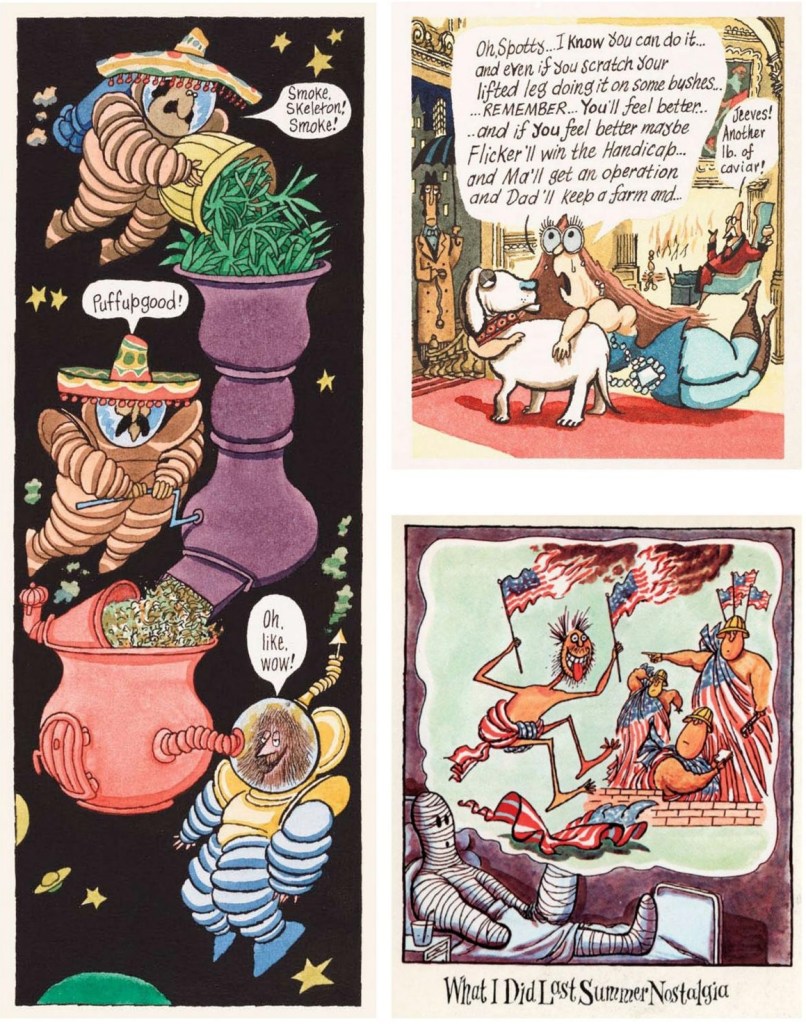
A collage of pages from 1970-1971 issues of National Lampoon published in Rick Meyerowitz‘s Drunk Stoned Brilliant Dead (2010), a massive hardcover gathering highlights from The National Lampoon and interspersed with interviews and biographies of its stable of cartoonists and writers. The bottom right, from a series of cartoons titled ‘Nostalgia is Goodstalgia‘ from NL’s November 1970 issue, feels uncomfortably on the ball for the current political climate (ouch).
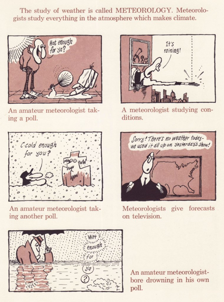
Here are a few pages from Arnold Roth’s Crazy Book of Science (1971), which offers a few suitably madcap pages:
Meteorologists have been the butt of jokes for at least over a hundred years (at least Jerome K. Jerome‘s Three Men in a Boat from 1889 pokes fun at them), but whether the recent weather forecasts have been worse than usual is up for debate.
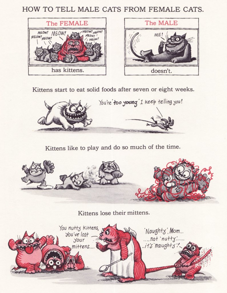
Then there’s my beloved Comick Book Of Pets (1976) – ‘found, raised, washed, curried, combed, fed and cared for in every way‘.
Co-admin RG was swearing a bit while scanning this for me, so please make sure his sacrifice was not in vain by looking at the details.
Read his fascinating interview with Gary Groth here.
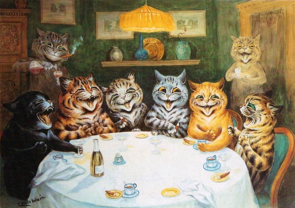
« He made the cat his own. He invented a cat style, a cat society, a whole cat world. British cats that do not look and live like Louis Wain cats are ashamed of themselves.» — H. G Wells
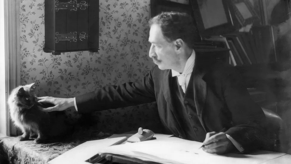
British artist Louis William Wain (1860-1939) had one of those lives that capture one’s imagination* – from a sensitive child born with a facial defect (a cleft lip) and prone to terrifying nightmares, to a youth that would wander around London instead of attending classes, to ultimately a man committed to the pauper ward of a mental asylum. Along the way, he married a lower-class woman ten years his senior despite the scandal this caused, lost her three years later to breast cancer, and produced thousands of cat drawings and paintings.
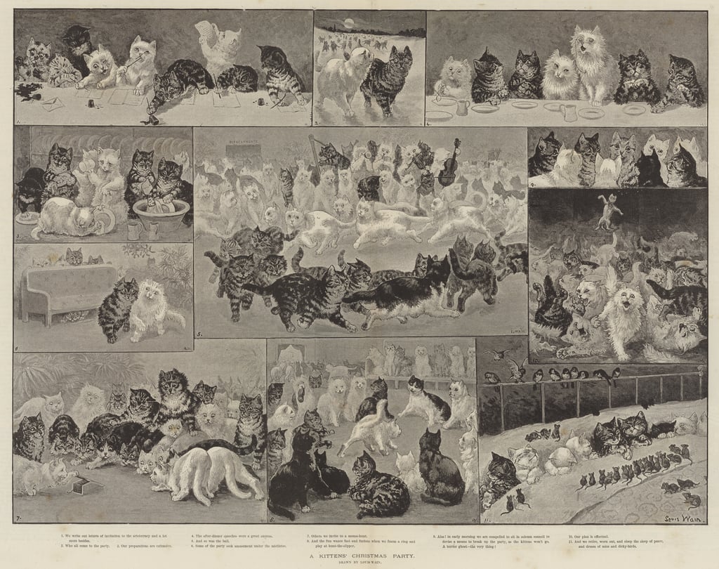
Wain started out as a illustrator of country scenes, houses and estates, livestock at shows, and so on, for publications like Illustrated Sporting, Dramatic News, and The Illustrated London News. His wife’s Emily’s health decline gave Wain the push into feline territory, as he consoled her with caricatures of their cat Peter during her illness. Emily pushed him to try and get this work published, so he showed some drawings to the editor of The Illustrated London News, for which he was freelancing. He was commissioned to paint A Kittens’ Christmas Party, which featured 150 frolicking kittens, took 11 days to finish, and was an instant hit. Emily died soon after in 1887.
Some sources say 200 kittens, I didn’t count them.
Source diverge – according to some, in his grief, Wain threw himself heart and soul into cats and animals in general – he was involved in animal charities and championed a better treatment for animals, including fighting against the routine muzzling of dogs. In another version, he Emily’s death was a ‘merciful release’ and threw himself into work, ended up being considered a ‘cat expert’ just because he drew so many of them (and had distinctly outlandish ideas of their physiology). This can be said of much of Wain’s life, actually – the basic facts are known, but interpretations of the whys and hows vary wildly.
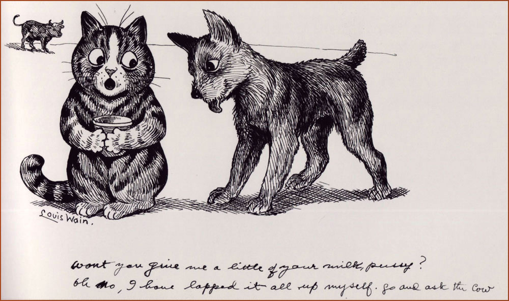
His first cat Peter was black-and-white with a white forehead, and his prototype often appeared in illustrations.
It goes without saying that Wain doubtlessly influenced generations of future artists. These days art with anthropomorphized felines is quite a humdrum sighting, given how much our current culture is obsessed with cats. In this context, it may be hard to recall that several centuries ago people often thought of cats from a practical standpoint, as somewhat filthy-yet-useful vermin-destroyers. This began to change during the Victorian era, and surely Wain’s cats, omnipresent in newspapers and magazines, accelerated this shift in thinking.**
Wain was an immensely prolific artist, but sadly that did not guarantee him a peaceful and wealthy life. When he was 20, his father died, leaving Wain to financially support his mother and sisters, so he had a heavy burden to bear from a young age. By all accounts a modest man, he was quite naïve about financial matters, a walking demonstration of the financially inept artist stereotype***. He often gave his art away, or sold it without retaining copyright, which meant no royalties despite all sorts of merchandise with his cats – postcards, books, toys, biscuit tins, china, et j’en passe. His work was so ubiquitous at some point that publishers did not need to pay him for new material, they could just go on reprinting in perpetuity with nothing but financial gain to themselves while Wain got further into debt.
These cats are obviously cute, but I think what makes them interesting is that Wain would satirize what he saw around him. He might have been an impractical dreamer, but he had a keen eye for human flaws.
He also produced a series of designs for ceramic cats (and some pigs and dogs as well). These sculptures were exhibited in 1914, but did not result in significant sales. A shipment of cats headed for the United States was taken down by a German U-boat torpedo, and that was it – Wain’s financial investment was lost.
« By the time the war broke in 1914, Wain found himself struggling to find a market amid the wartime paper shortage. By the 1920s, he was in poverty. His depression continued, and his mental health deteriorated. Often known to strike out in violent and erratic ways, he was eventually committed to the pauper ward of London’s Springfield Mental Hospital in 1924. »
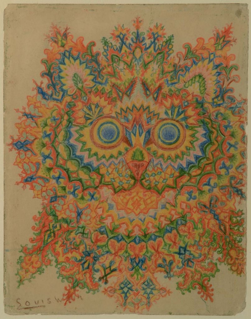
A lot of articles about him focus on mental issues. Did his wife’s death push him into some form of dementia? Was it just hereditary (one of his sisters was committed when he was 30)? Was he autistic? Was he schizophrenic? The former is a more modern view, whereas the latter theory was proposed by psychiatrist Dr. Walter Maclay in 1939 and stuck when he made a whole case out of it.
«Maclay collected the work of artists suffering with mental illness and in 1939 he came across eight pictures by Louis Wain in a shop, which he arranged in an assumed chronological order to demonstrate the progression of the schizophrenic mind. His theory was that as the sequence of cat illustrations became more fragmented, so too had the artist’s mental state deteriorated. […] The series of drawings, now known as ‘Kaleidoscope Cats’, became a popular visual example of the schizophrenic mind. Long gone was the Edwardian interpretation of Wain’s work as ‘charming’ and ‘humorous’. Instead, his art was often presented as ‘psychotic’ or ‘disturbed’, both words used in a major exhibition at the Victoria & Albert Museum in 1972.» [source]
Perhaps it’s a modern perspective, but what on earth is ‘psychotic’ about this image?His later work, colourful and somewhat surreal, has been identified by some as an important precursor to psychedelic art.
I think it’s quite depressing to think of Louis Wain first and foremost as an interesting case of mental illness. While it’s an important topic to address, it’s hard not to interpret this emphasis as a side-effect of the human tendency to bask in someone else’s tragedy – we’re avid of gory details and stories that support the general consensus that artists are tortured souls fighting inner demons. Perhaps that’s what reassures ‘normal’ people – we may not be brilliant or creative, but at least we have a healthy psyche! Except that we don’t, but that’s a conversation for another day.
«It is also highly possible that his experimentation in style was inspired by the family’s background in textile design. […] Indeed, these later kaleidoscopic cat patterns were often constructed around a clear grid system, revealing them as careful compositions rather than the product of impulsiveness coming from someone who is gradually losing his perceptive skills. Additionally, some of Wain’s later work was figurative and proves that he continued to be an accomplished and coherent artist whilst in a mental health care setting.» [source]
In 1930, Wain was transferred to Napsbury, which had a colony of cats, and stayed there fairly peacefully until his death in 1939. I hope he’s surrounded by friendly cats, wherever he may be now.
~ ds
* As a matter of fact, a movie about his life, The Electrical Life of Louis, was released in 2021 .
** I am obviously not saying that Wain introduced anthropomorphism to art, as that has been around since the days of early human history, but he did make a large dent in the public’s perception of cats.
*** Such skills have to be taught, as artistic temperament need not necessarily go hand-in-hand the inability to handle everyday matters such as finance, but add that to the list of ‘things we should do as a society’.
I’ve mentioned Canadian artist Emily Carroll before in Of Ducks, Russian Folklore, and the Mysterious Gamayun. While her illustrations for children’s series are quite lovely, I think her strength (and obvious interest) really lies in horror.
Today I’d like to feature a few selections from the 2015 collection Through the Woods, which received a few awards and a lot of compliments. While the stories within are generally lauded by critics and readers, I have seen a few reviews complaining that they’re not scary. I suspect that kind of reviewer is the same type of person who starts grumbling that there’s not enough action in Dostoevsky’s Crime and Punishment* (only one murder! gimme Midsomer Murders’ body count!)
Emily Carroll is excellent at conjuring the kind of slow dread that makes one skin’s crawl (which is not to say that she shies away from gore). This is not horror where a serial killer is chasing his victim around with a chainsaw – I think the latter is a lot easier to set up than conjuring a fragile, haunting atmosphere of menace and stalking shadows. Carroll’s work can be visually stunning, with bright colours and swanky layouts, but it can also be sepia-coloured, quiet, intimate and unsettling. She combines these two settings to great contrast and advantage, sometimes within the same story.
A page from His Face All Red, arguably Carroll’s breakout comic that she posted online in October 2010 and which went viral. Read it here. In now occurs to me that her art is sometimes a bit Richard Sala-esque.
Page from A Lady’s Hands Are Cold. Carroll’s hand lettering contributes to a lot of the atmosphere. In a world of typeset speech bubbles that spoil the mood, it’s really nice to come across comics where the text is part of the design.
A page from My Friend Jenna, a story of two friends who conduct fake séances…
… and get a little, shall we say, embroiled in the lives of the dead. It was difficult to decide which pages to include, as I don’t want end up spoiling the plot.
Nightmares about losing teeth are very common (apparently, they’re ‘one of the most universal dream themes‘), so perhaps that explains why The Nesting Place is especially unsettling. Here is a sample of a few pages:
Carroll’s tales often feature somebody who is not what they seem, the unusual or scary hiding behind the veneer of a normal human being. Those wiggling teeth are fucking creepy.
A definite plot spoiler, sorry.
Finally, two pages from In Conclusion, which wraps up this collection with a brightly coloured epitaph:
Don’t forget to visit her website, with plenty more comics to read. A lot of her work is accessible online only, and makes great use of this medium** – for example, in A Pretty Place, you can select the room you want to visit in a sort of Clue-ish set-up; in Margot’s Room, you can click on objects (a mirror, some dried flowers, the window…) to learn their story. Definitely read the sexy, creepy, gory Writhe*** – it’s available for free download. Read her smart interview with Sean T. Collins for The Comics Journalhere, or check out her latest book (not yet published), A Guest in the House, here.
Self-portrait.
~ ds
* To be fair, I am no fan of Crime and Punishment, as I thought it was quite a slog to get through… but not because only one person gets killed. Have a gander at some entertaining reviews of it here.
*** When I Arrived at the Castle, published in 2019, strikes a similar vibe, featuring a blood-laden love/horror story between a sort of cat girl and a vampiric Countess, all of it wrapped up in the heavy, shifting logic of a dream you want to escape from but can’t.
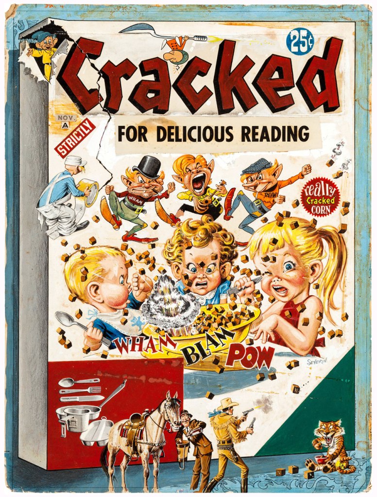
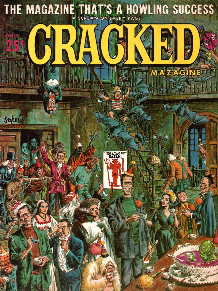
Long before Cracked* was ‘America’s Only Humor Site’ deluging its readers in hit-or-miss listicles (5 Stupid, Stupid Things Humanity Has Shot Into Space, 15 Bonkers Crossovers That Somehow Happened, and so on), it was a satirical mag consciously aping Mad Magazine‘s schtick. I don’t know if anybody is actually hanging on to fond memories of it – Fantagraphics’ Kim Thompson famously quipped ‘I don’t think I’m alone in thinking of CRACKED for most of its run as “a bunch of crap, and John Severin” – but it’s undeniable that quite a few great artists have contributed to it over the years (including the aforementioned Severin, who was a powerhouse** whatever you may think of his art).
Cracked was born in 1958 and shuddered its last in 2007 (more about said demise later). Here are a few Severin covers I like!
The original art for the cover of Cracked no. 5 (published in October, 1958). How cute/feral is the tiger in the bottom right corner?
Cracked no. 9 (May, 1959). Severin really excelled at these action-packed melée scenes.
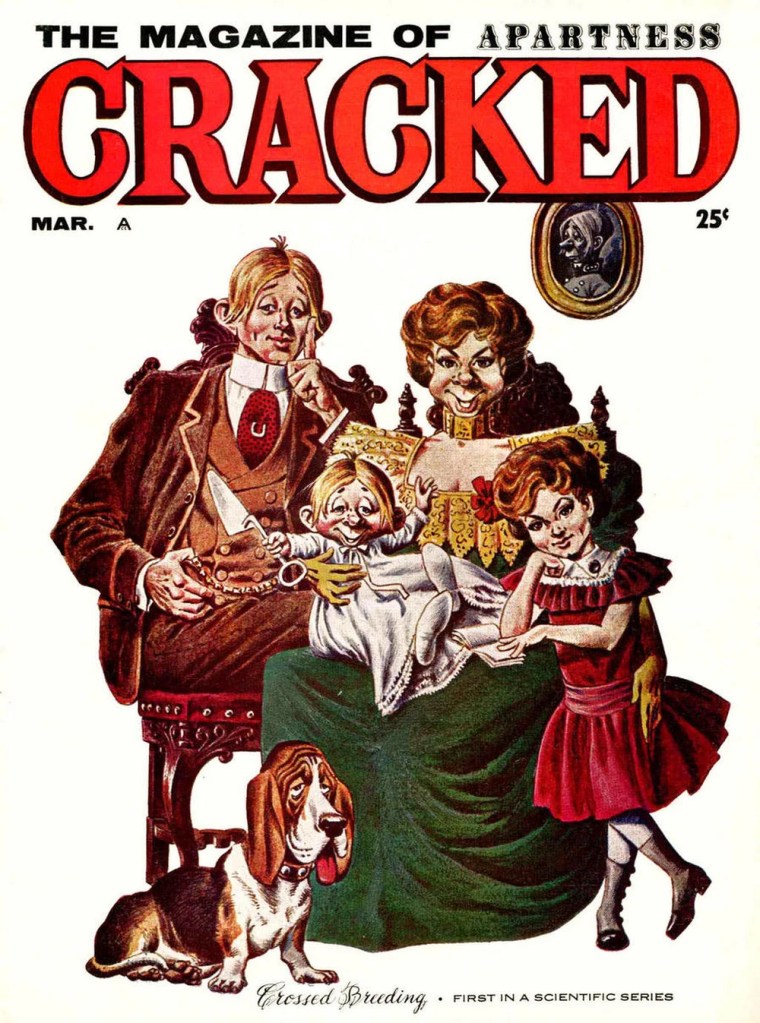
Cracked no. 13 (March, 1960)
Cracked no. 28 (February, 1963). You may note that Cracked’s mascot Sylvester P. Smythe is meant to remind one of another country bumpkin-ish mascot… though I like Alfred E. Neuman‘s mug better.
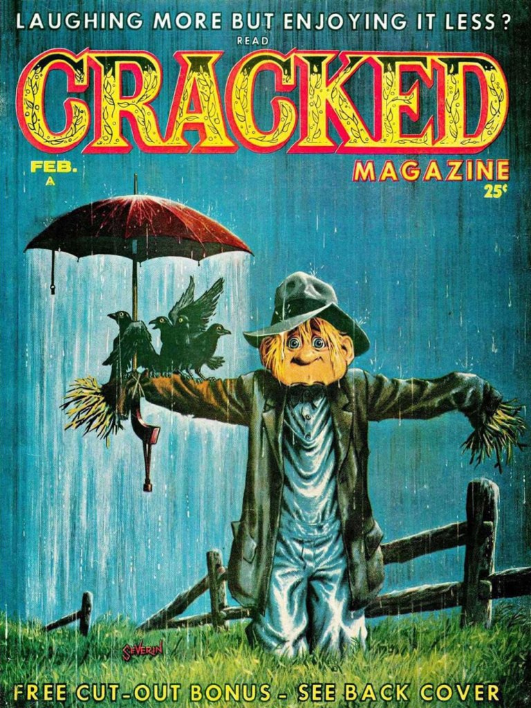
Cracked no. 43 (May, 1965). This party looks like serious fun!
Original art for Cracked no. 49 (January, 1966). The printed version invited the reader to « Find the mistakes on this cover ». Won’t you give it a whirl?
The original art for the cover of Cracked no. 90 (January, 1971). In order to make the scene more properly nocturnal, a blue tone was judiciously added to the final version.
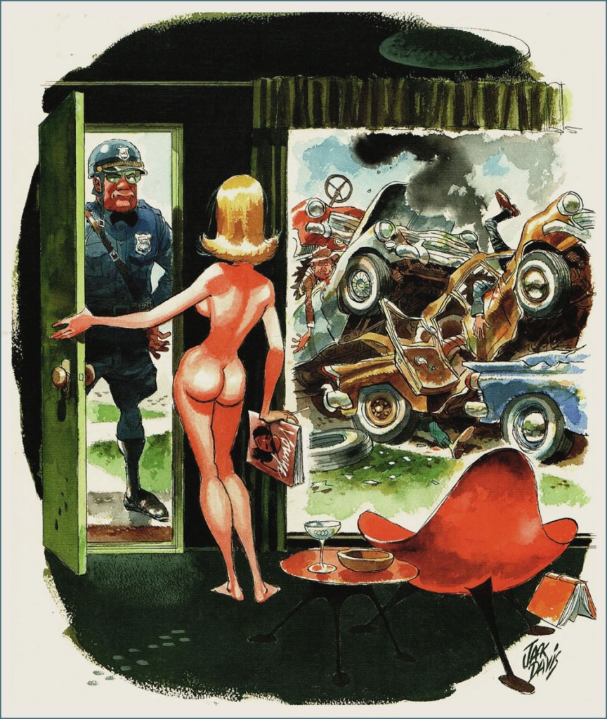
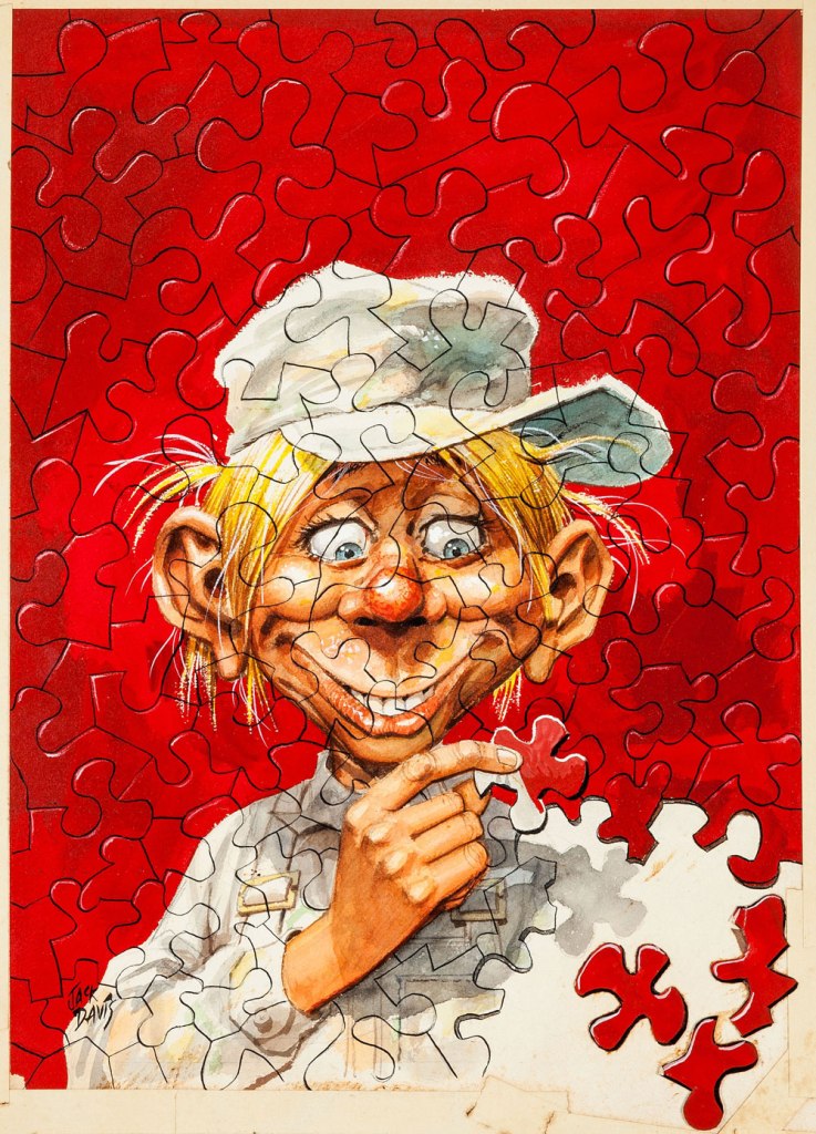
As a bonus, here is ‘Phooey’ Smythe as depicted by the amazing Jack Davis for the cover of Cracked no. 12 (January, 1960).
Head over Mort Todd’s website for a more extensive look at Severin’s contribution to Cracked!
~ ds
* When Cracked Magazine was sold to a group of investors in 2005, it was supposed to return in force with a new design à la ‘lad mags‘ like Maxim. Website Cracked.com launched several months later, outdid its parental unit, and when the magazine folded in 2007 (new design and all), the website stuck around, gaining popularity in exponential numbers. My only interest in it is the fact that Winston Rowntree occasionally contributes articles.
**«After being one of the founding artists for Mad, he began working for the Mad imitation Cracked in the late ’50s and stayed there for nearly 40 years, because he was paid as well as the Mad contributors and was allowed to contribute several features in every issue. In addition to the mountain of work he produced for Cracked, he was simultaneously working for Marvel, Warren and DC. Severin was the consummate professional who editors and art directors knew could draw anything, from a Roman legionary to Cracked mascot Sylvester P. Smythe, and everything in between. Like fellow EC colleagues Jack Davis and Frank Frazetta, Severin could crank out great humor comics with the same facility he drew war, Western and historical tales.» [source]
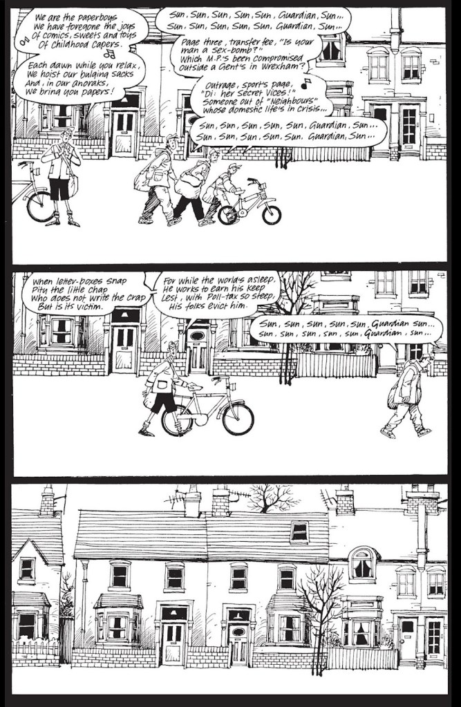
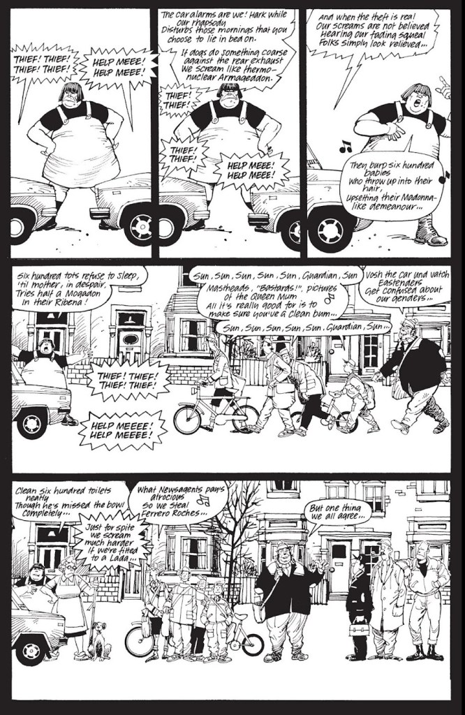
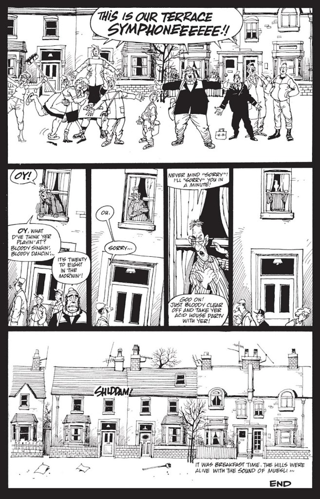
Something about the current spring weather, with its contrast between the warm wind perfumed with chlorophyll and the trash liberated from its snowy prison and strewn about artistically, reminded me of 6-page story Song of the Terraces. Originally published in A1 no. 4 (1990, Atomeka Press), it is officially part of Alan Moore and Steve Parkhouse’s Bojeffries Saga, and as such was also collected in the The Complete Bojeffries Saga published in 1992 by Tundra Press (and reissued in a new collection in 2013 by Top Shelf Productions).
I don’t know if it’s a universal rule, but it seems that people either love to read plays, or hate the very idea. I belong to the former category, and have happily spent my young years on a steady diet of plays. Sometimes these included musical interludes, and I was not in the slightest bit perturbed by being given basically lyrics with some details about the mood of the singers, but no melody.
Perhaps that is part of why I am so fond of Song of the Terraces, or perhaps it’s the familiarity of this scene – its row of lovingly depicted council houses (Parkhouse has a really lovely, fluid style) and its hodgepodge of denizens in various states of spiritual and physical dishevelment are part and parcel of British shows I’ve watched and loved. Be as it may, I find the following tremendously endearing.
This interlude features two characters from the mighty Bojeffries family line – Raoul (the werewolf) and powerful but lonely Ginda – but otherwise is not particularly linked to any storyline.
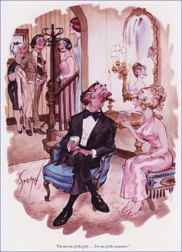
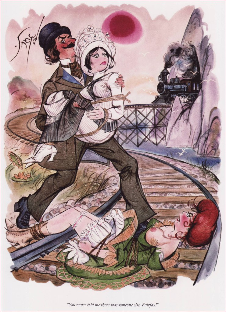
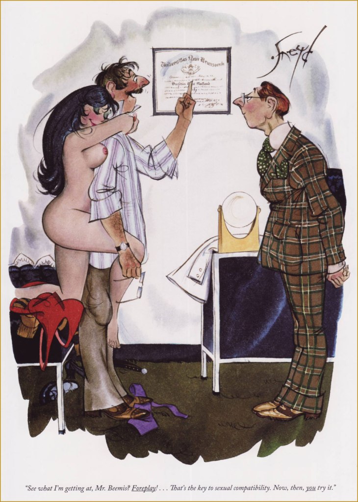
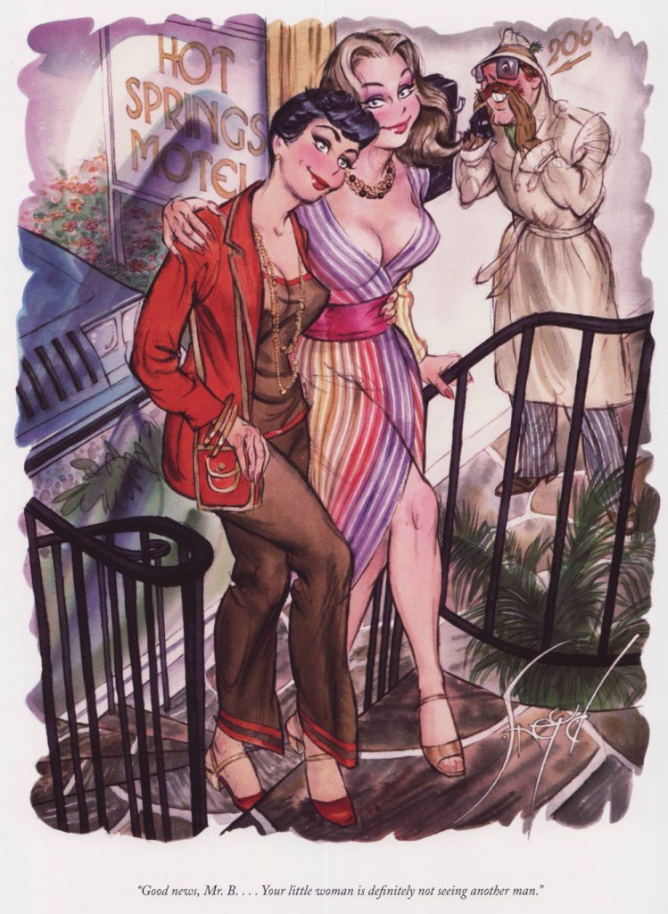
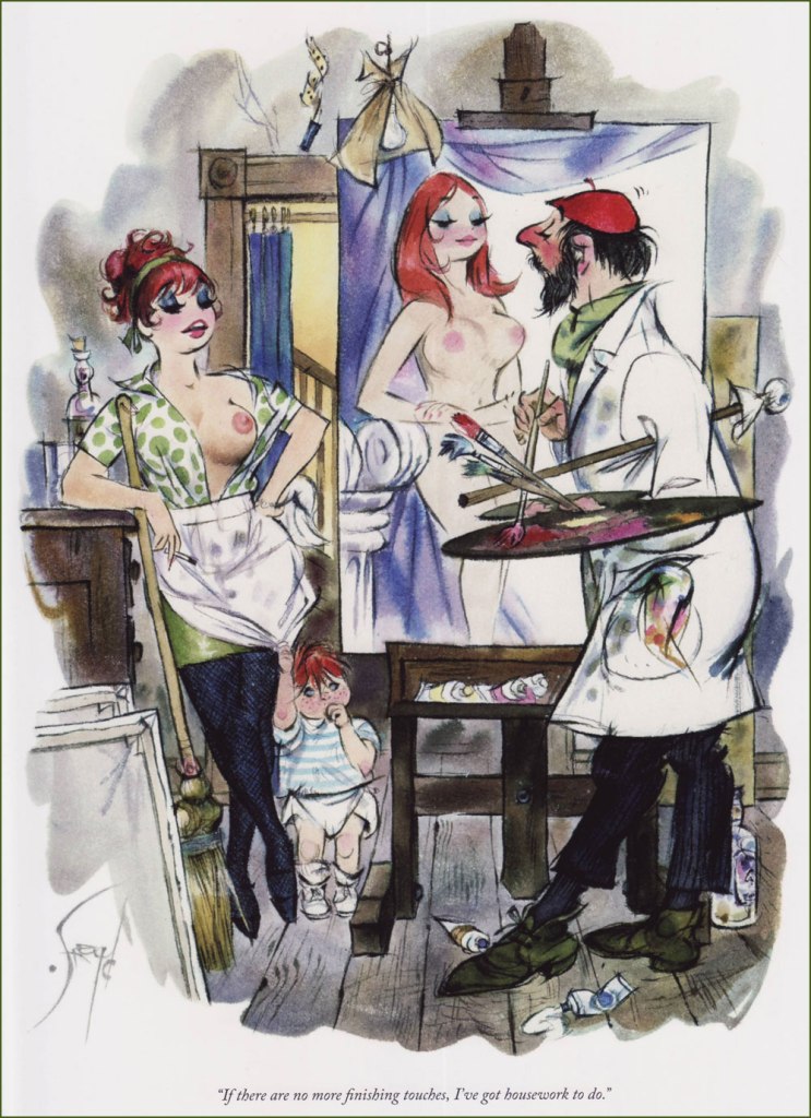
You probably remember Ontarian artist Doug Sneyd from Playboy magazine (well, those of you who read it for the cartoons!), which he began drawing for in 1964. Co-admin RG is distinctly not a fan… and as for me, well, it depends on my mood. I like his watercolour technique, and the way he draws noses and mouths* somewhat less so. There is such a bevy of wonderful Playboy artists that one is a bit spoiled for choice (for a few favourites, see previous posts, for example Happy Birthday to Eldon Dedini, Don Madden’s Luxuriant Oasis of Dames and Dogs, or Dink Siegel’s Swingin’ Roommates), but one can always use some more cheesecake.
Somehow I ended up with The Art of Doug Sneyd: A Collection of Playboy Cartoons (2016, Dark Horse Books) without even noticing. Like most similar monographs, it’s now out of print, so one could perhaps consider it an investment of sorts! Canada is proud of Sneyd, who was born in Guelph, Ontario and spent most of his time in NYC-wannabe Toronto – a bunch of his cartoons are included in the National Archives of Canada, thirty of them from Playboy.
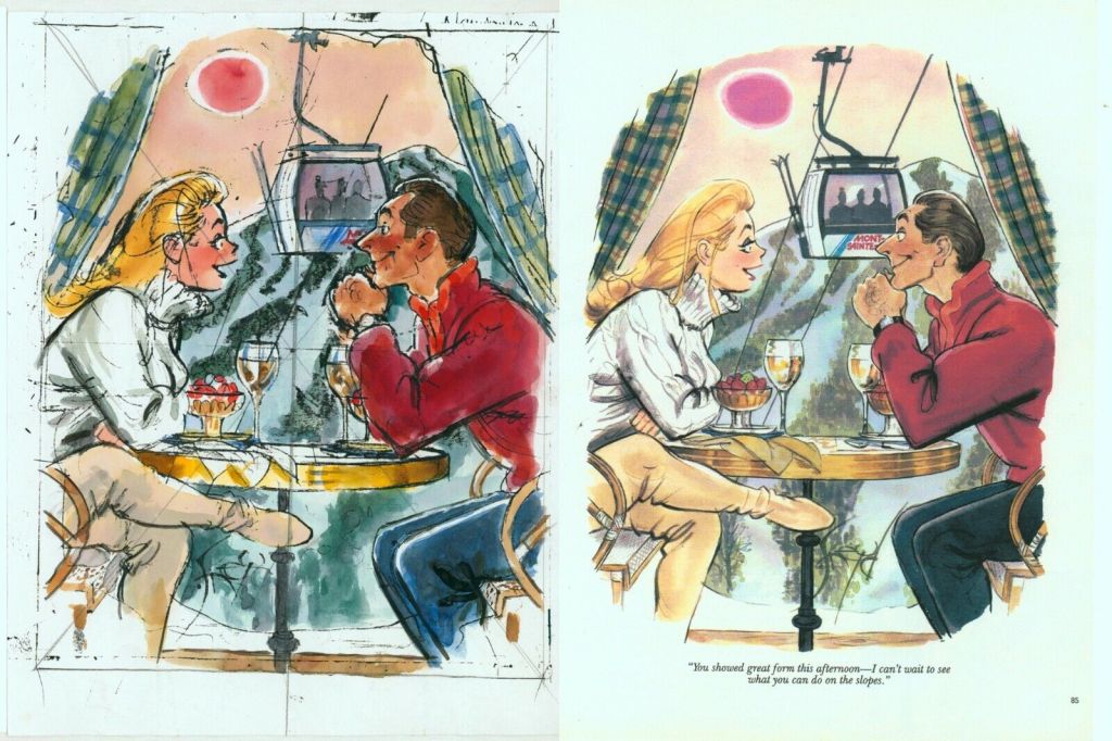
Here are a few examples from the aforementioned collection – I tried to go for a combination of the visually interesting** with a decent gag. It can perhaps be argued that all such cartoons can’t age well by virtue of their very nature, but many have passed through decades with considerably more dignity and grace than Sneyd’s. I suppose it depends on whether the jokes is at the expense of the woman involved and whose side the sympathies lie. Anyway, here we go!
« Bah! » — our old fiend (and dashing all-Canadian villain) Snidely Whiplash would never sink so low!
This one is my favourite, because the therapist/professor looks really likable and goofy, and the girl seems to be genuinely floating on cloud nine.
A comparison between the preliminary sketch and the final rendition. This strip from 1997 has a cute story – Sneyd used the backdrop of Mont-Sainte-Anne (a ski resort in the Laurentians) for this cartoon since he had recently visited it. When the cartoon was published, the management of the resort was apparently quite enchanted to get this free publicity.
~ ds
* Speaking of wide ‘fish’ mouths and no noses, I generally prefer Erich Sokol.
** I distinctly object to the claim that ‘he is by far the best cartoonist Playboy magazine has seen‘ (source), and scoff in dismay at the idea that ‘all [of his cartoons] are beautifully drawn, richly colored, and very very funny, and each one is an exceptional work of art‘ (introduction to The Art of Doug Sneyd by Lynn Johnston — pushing Canuck solidarity quite a bit too far.
**********************************************
Update: Mr. Sneyd « … died on January 21, 2025 at Soldiers’ Memorial Hospital in Orillia. »