Brimstone Bureaucracy, Bah! Hyena Hell’s Demons

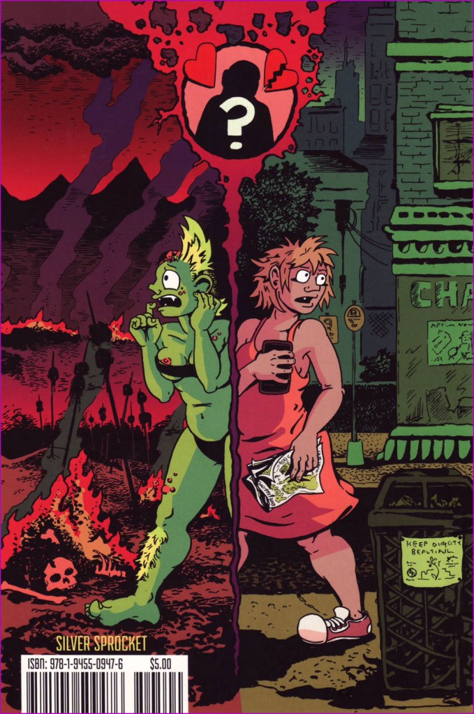
I was very excited to come across the comics of Hyena Hell. I don’t even remember where I got No Romance in Hell (2020), but it was cheap and intriguing. A funny comic about a cantankerous dick-driven demoness that also is excellently drawn? Well, sign me up, and pronto. Anyway, I read it, enjoyed it greatly, and stuck it on a shelf (after pursuing co-admin RG with it for a bit to get him to read it, which I’m still not sure he has done*). Recently, I discovered that there are two more instalments — Demons: To Earth and Back (2021) and Demons: Bloodlust (2022), and devoured them with great delight, one recent Sunday afternoon.

The transition from demon-girl to normal-girl and back again – back cover of No Romance in Hell.

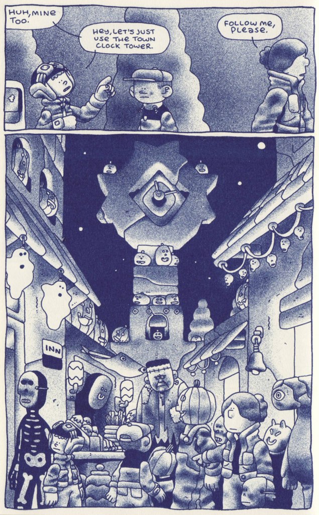
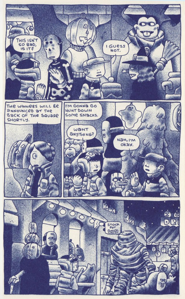
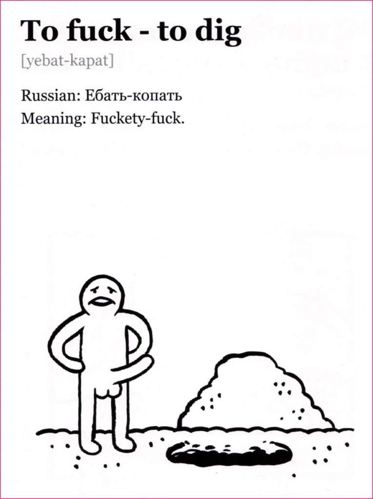
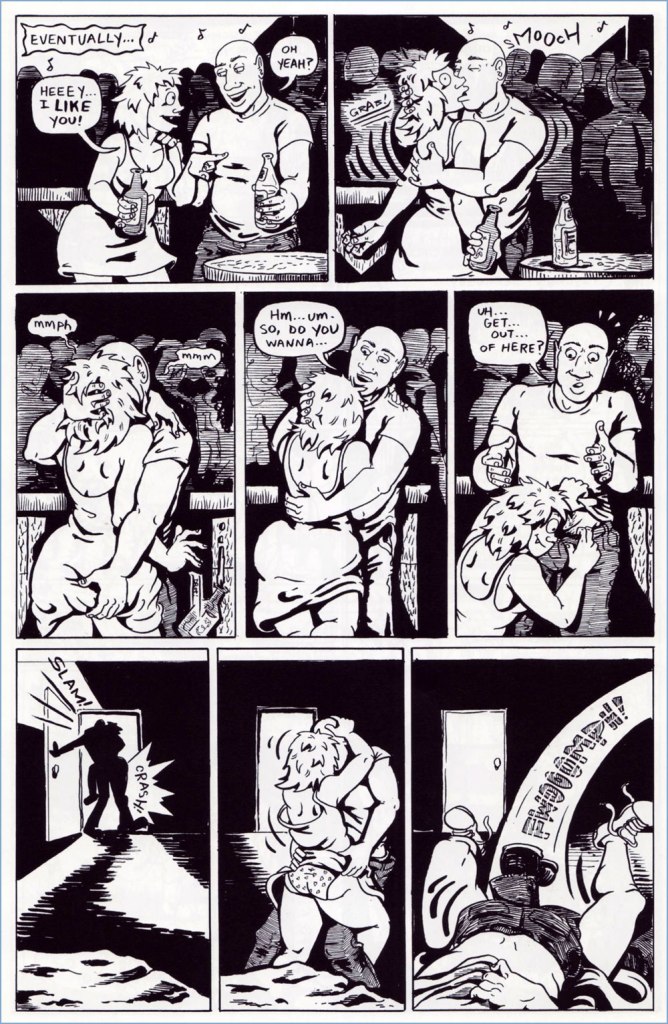
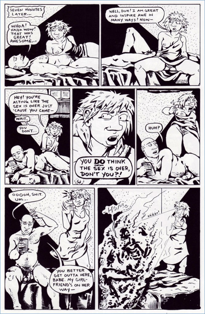
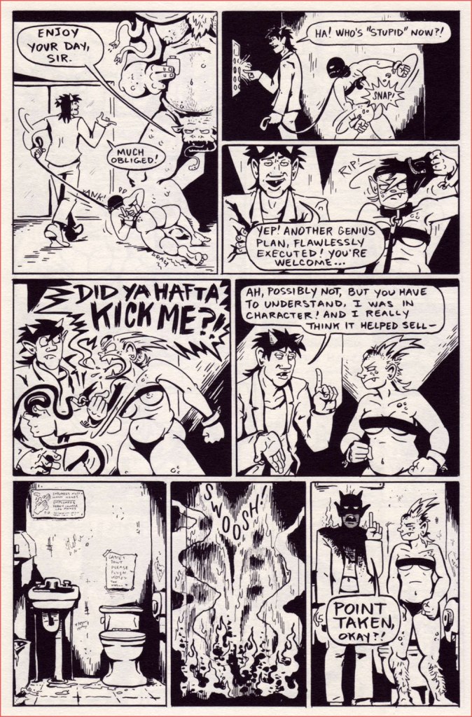
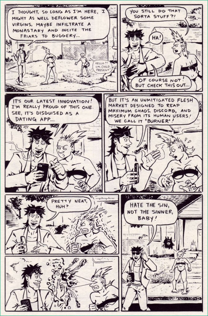
HH’s art is dynamic and convincing – bodies have real weight and a variety of shapes. There is also stuff happening in the background, so the reader feels like these are real… well, err, maybe not people, but real creatures walking on real streets (and equally tangible depths of hell). I love her main characters, fully-fleshed, quick-witted, and flawed in a way that makes one sympathise even when they’re being irrational. No Romance in Hell is a jaunty (if violent) romp with great social commentary on the state of the dating scene, happily skewering the endless parade of ‘nice’ guys who think life owes them.

If that’s how it is… Maybe I’ll just LEAVE then!‘ — and our heroine makes her way to the surface to see whether humans can give her satisfaction where the demon failed.

After a cavalcade of brief dates with men spouting the usual nonsense (distinctly not sex-worthy material), Bug finally comes across a contender…

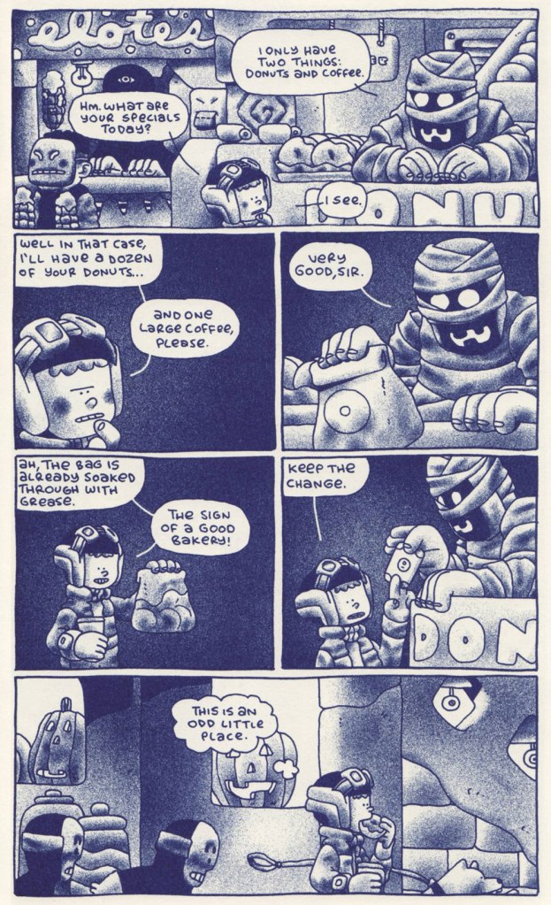
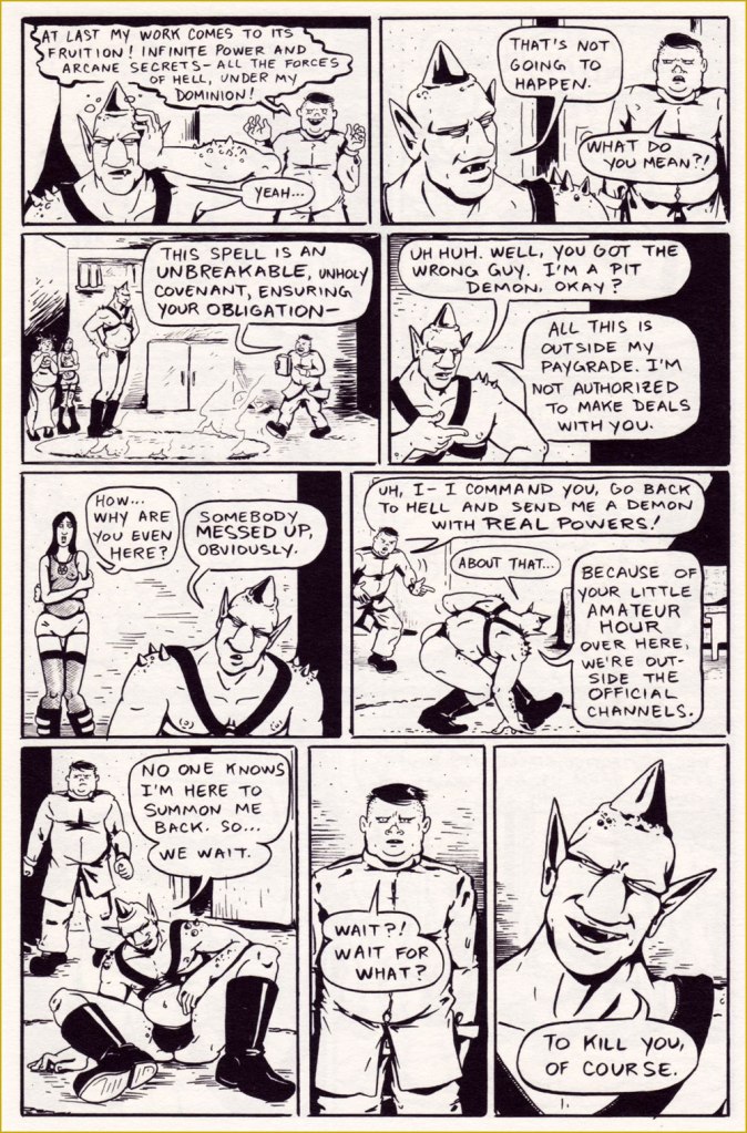
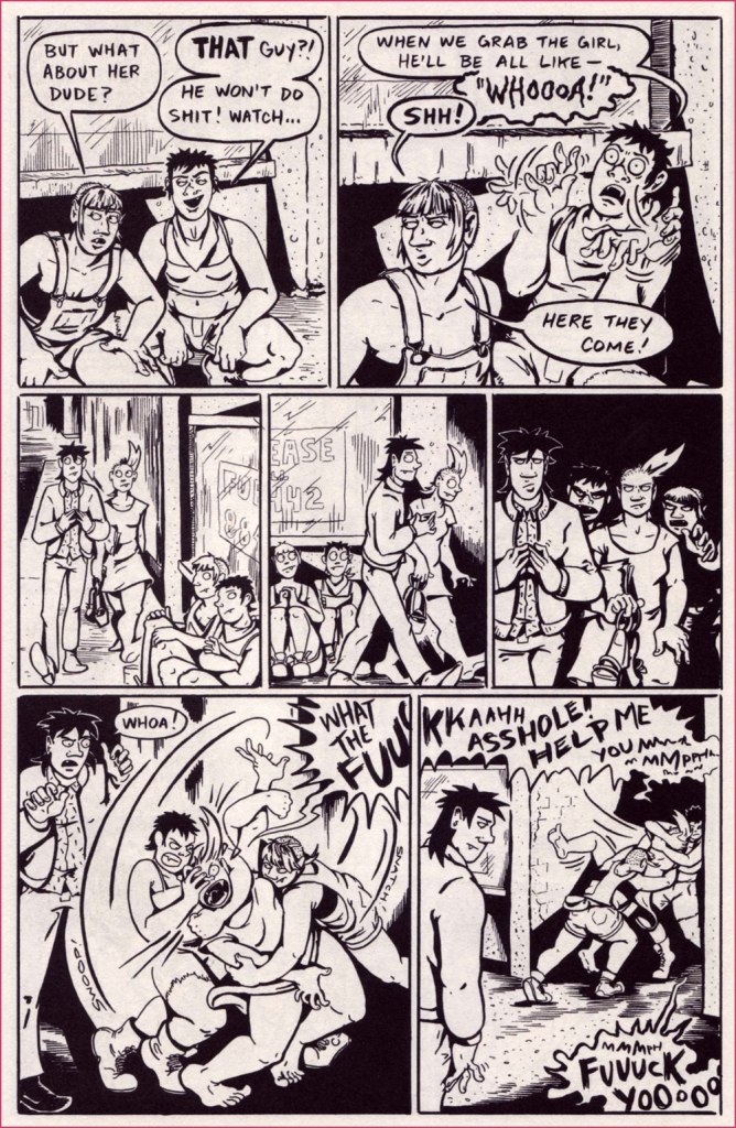
As much as I enjoyed No Romance in Hell, I was even happier to find that Demons: To Earth and Back featured a longer story and more glimpses into the organisation of the pits of Hell, home sweet home. When Bug needs to rescue her demon sweetie from his forced summoning to earth, Bug’s sibling Skud comes up with a plan to sneak her out of Hell, since obviously the former is built on the solid foundation of bureaucracy and endless pencil-pushing —

Hyena Hell says she has a tough time with spelling, but ‘monastery’ is the only typo I noticed.
This demon’s actually pretty bright-eyed and bushy-tailed, aside from badly wanting a cup of coffee. The pimple-faced fascist teenage jerk who summoned him, however, is in distinct danger of having his face smashed in.

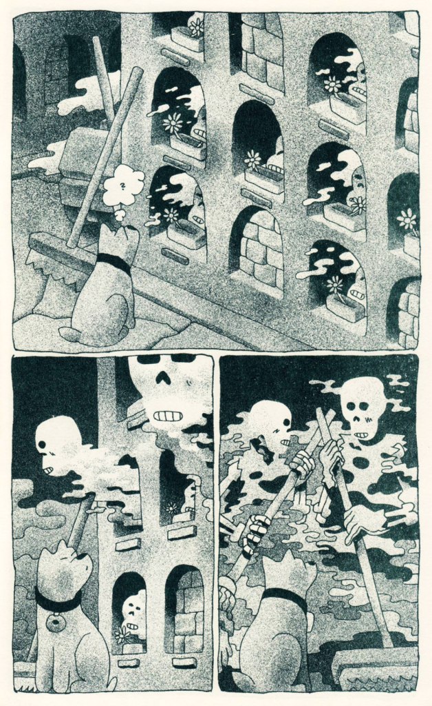
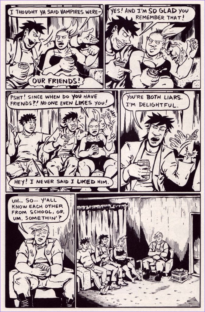
Demons: Bloodlust is even more ambitious, telling the gruesome (with many incinerations) tale of Bug and Skud embarking on a vampire-annihilating mission (and introducing a vampire trio of old friends whom I would love to hang out with).

Social anxiety, the vampire/demon edition.

At the end of the story, we are treated to a couple of ages of Cass, Marco and Baby Jay answering questions, which is possibly my favourite bit of the whole thing.

There is a fourth Demons book in production as we speak — follow HH on instagram to get a peek of the pages she’s working on. Also pay a visit to The Comics Journal for a sampling of the Fair Warning – Hyena Hell interview.

~ ds

* Given that he was kind enough to scan a bunch of pages for me, I’m sure he’s read some while scanning, at the very least.

A Fading Presence of Lived Memories: Denys Wortman’s New York

« I can’t decide whether to give up peanut butter on account of its calories, or to eat it on account of its vitamines… »

When it comes to what Amazon loosely classifies as ‘literary graphic novels’ (very much a meaningless category), it’s rare for me to stumble across something completely unfamiliar on a bookstore shelf, unless of course it’s something hot off the press. Denys Wortman’s New York: Portrait of the City in the 30s and 40s (Drawn & Quarterly*, 2010), which I spotted in the well-stocked The Comic Hunter (Moncton, Canada), looked unfamiliar and intriguing. 

The edition I purchased is from 2010; I wasn’t able to find out when this one, with an arguably more striking cover, was published. This illustration had the caption of ‘If I have to come down to buy them, you’ll have to come down on your prices’, and was drawn on August 30th, 1948.

I’d never heard of Wortman, but just a quick skim through this volume showed that he clearly had an amazing ability to evoke a certain place and time, and fill it up with characters so real that one wouldn’t be surprised to run into them on the street. Nostalgia for a place one never experienced is a recurring feature of the human mind – Wortman’s New York is one I am familiar with from books and movies, and that faded away long before I was born. One would also be remiss in failing to express admiration for DW’s living, breathing linework. His attention to the minutest details are used to recreate scenes from lives of people who certainly didn’t have an easy time of it, yet still inspire a sort of familiar comfort almost a hundred years later.

To get some bibliographical stuff out of the way (for a full story, I shall direct you to the website maintained by Wortman’s eighth son), Denys Wortman was born in 1887 and died in 1958 at 71. Among other things, he also drew Metropolitan Movies, a comic strip that ran between 1924 and 1954 and is mostly remembered (if that’s the right term here) for two of its characters, a couple of cheerful vagrants named Mopey Dick and the Duke.  

It was a tad difficult to decide which pages to feature, so I tried to go for a variety of scenery. Wortman must have been a Gerald Kersh character to possess such an intimate knowledge of all these industries, markets, streets, and types of human beings… I invite you to a bit of time travel.

« In art school days there was much talk about “character,” but I feel there was a small amount of misapprehension mixed up with its interpretation. I could not see then and I can’t now why a man with a lot of whiskers has any more character than one who is clean-shaven. Nevertheless I would prefer to draw the former. And I would prefer to draw him after he has lived long enough for Experience to have etched lines in his face — the more the better. Because the more lines and markings he has in his face the more chance I have of finding ones that I can match with lines on my paper to help create the illusion that the face I am drawing has bones under the skin, that the eyes are seeing things, that the mouth is speaking, and that the man has a soul. »

It must be mentioned that these drawings have been rescued from the mists of forgetful time by WOT favourite James Sturm (see Free Inside Package: James Sturm’s The Cereal Killings (1992-95)), who hunted down Wortman’s son and his astonishingly large, apparently languishing archive of his dad’s illustrations.

I’ll end this with a great quote from the foreword to Denys Wortman’s New York, written by Robert W. Snyder

« You can still see traces of Wortman’s New York in crowded Manhattan side streets, spirited New Deal Murals, and soaring skyscrapers**. Harder to find are the feelings and lived memories of this place. The sailors and their sweethearts who strolled the boardwalks of Coney Island are now, in their eighties, a fading presence. To understand them, and how they lived in a city that inspired hope and fear, idealism and wisecracks, solidarity and individuality, there is no better place to look than a Denys Wortman cartoon. »

~ ds

* I tend to not like what D&Q publishes, but this is another pleasant exception to the rule (here’s the original exception).

** This immediately comes to mind.

Hallowe’en Countdown VII, Day 24

If you remember my enthusiastic blabbering about Ben Sears (see Convivial Meals, Spirited Skirmishes: Ben Sears’ Double+ Adventures if you don’t!), you may recall that I mentioned some self-published short stories featuring a trash cleanup robot, a cat and a bird. After writing that initial post, I ordered a few of these comics from Sears’ website, whatever was available at the time. Two of these stories are perfectly appropriate for Halloween (as a matter of fact, they’re now being touted as a Halloween Three Pack). Here are a couple of pages, then, from Petroleum Spirit Daze and The Sweeper & the Graveyard Shift, and after you’re done with soaking up some of that fog-bound atmosphere, head over and purchase a couple for yourself (as a matter of fact, I ordered a few more… writing for this blog is clearly detrimental to my budget, alas).

First up is Petroleum Spirit Daze. It’s quite short, so it was a bit difficult to choose some pages without revealing the plot, but I think the following give a good sense of the story’s expert cocktail of spooky shenanigans tempered with the spirit of adventure and a solid moral compass. Like most Sears narratives, this one would surely interest kids (thanks to the young protagonist as well as easy, evenly-paced storytelling) and unjaded adults alike. Personally, I think Halloween is best appreciated through the eyes of somebody who can still marvel at some bat-shaped shadows or a lit-up pumpkin.

The second offering today is mute, The Sweeper & the Graveyard Shift, 2021. « The Sweeper gang has relocated to Bolt City, and added a new member: Rocky the dog. Their first job is to clean the run-down cemetery outside of town. What will they find after the gates close and the sun goes down? » As with a lot of Ben Sears offerings, I kind of want to inhabit that world, where one can roam with an animal-and-robot crew, all corners are pleasingly rounded (even furniture – no more bruises when accidentally crashing into a sharp corner!), and ghosts float about after midnight to ensure their graveyard is properly cleaned.

~ ds

Hallowe’en Countdown VII, Day 17

Look, some vintage horror movie posters! Or are they really?

Nope, they’re just posters reminding factory workers of some basic precautionary measures when working with all sorts of heavy equipment.

Don’t launch the motor using your hands‘ – ‘Don’t clean the machine while it’s on‘ – ‘An unprotected saw is dangerous – all clear?‘ – ‘Careful with the pitchfork

These images are undeniably striking, featuring bold fonts and surprisingly graphic imagery sending one’s imagination into the unpleasantly tactile land of torn appendages and squirting blood. Produced in the early-to-mid 20th century, these were meant to bring home a specific message* during dark times when safety measures were sorely lacking and working personnel was mostly illiterate. Unfortunately, it’s rather difficult to find these posters in decent condition, so today’s selection was somewhat dictated by what could be located online. This leaves out, alas, a couple of particularly gory examples. Still, I think you’ll agree that these fit a Hallowe’en count-down in graphics, if not necessarily in spirit!

*Something that goes like ‘don’t stick your body parts into the machine‘ is a good beginning.

Beware of railway couplings‘ – the distorted face of the victim expresses the grotesque horror of a saint being impaled by a devil. These posters must have been a great opportunity for artists to try out different styles in the restrictive atmosphere of the early Soviet union.
I was drunk in the workplace!
Don’t open the lid of the brake before the machine stops completely
Watch where you’re going
Careful with that shovel‘ – with its ‘pow in the face with a shovel‘, somehow this reminds me of Here Comes Sally the Sleuth… and There Goes Her Dress!
People working above – don’t stand under the scaffolding‘… unless getting your skull smashed by a wrench seems like fun, that is.
Don’t leave anything unsecured on the scaffolding
Mind the wheels! In 1925, 200 people were injured under tramways.
Acid – follow the rules for its transport

The USSR was not the only country to resort to such candidly illustrated images in an effort to improve safety (let’s face it, a worker with fingers missing is no longer a good worker) – for example, Holland seemed to have its share of posters of chopped off fingers and electrocution.

~ ds

Hallowe’en Countdown VII, Day 10

As a few of our readers may know, we used to have a Facebook page dedicated to comics… the day we switched to a blog format was a blessed one, as dealing with FB’s daft algorithms, restrictions and stupidities would give the most resistant trooper a headache. However, occasionally we pilfer material from those earlier years – but while co-admin RG can practically quote his past self verbatim, I find myself often disagreeing with my opinion from, say, 10 years ago, from which I can only deduce that I am prone to bouts of fickleness.

Case in point, in 2014, I called Millie The Lovable Monster (whom I tend to refer to as Modern Monster Millie, getting slightly confused with Thoroughly Modern Millie, a movie from 1967) wholesome, wacky, and syrupy-sweet. Rereading it today, I think it perhaps sailed away from ‘lovable nonsense’ a long time ago, though it didn’t quite moor at the port of ‘balderdash’. It is, however, extremely well-meaning, and virtuous to the highest degree, which in a world which favours the spectacle of back-stabbing and various unethical shenanigans is, well, not exactly refreshing, but a nice change of diet. It is also not that easy to come up with proper randomness that’s equal parts fun and puzzling. Finally, this comic is likely oriented towards young readers, who have a considerably sweeter tooth than adults.

For proper historical details, head over to Toonopedia – I shall just mention that this strip was created by Bill Woggon (1911-2003) of Katy Keene fame (which I talked about a bit in Tentacle Tuesday: Splashing With the Octopus), and that Millie’s arguably entertaining romps lasted by 3 issues (1962-1964).

Thanks to a friend, I am the proud (?) owner of a full Millie collection. Here are some excerpts of Halloween-appropriate material, which doesn’t necessarily showcase the depth of absurdity this comic can attain (moments that linger in my memory include Millie riding a horse that’s about a third of her size; Millie promenading her pet tiger while showing off a series of new outfits – she’s quite the fashion maven; and especially Millie playing guitar for a bunch of singing cows performing Cry Me a River that cause a flood with their tears).

Whatever one can say about Woggon, he had a cute style.
White = bad, pink = good, is that the moral we’re supposed to derive here? Though the new colour does make Goodie look less like a spermatozoid.
On the other hand, ‘tea is the solution to any situation’ is a moral I can get behind.
I kinda want to know what Goodie is eating there.

Since this is distinctly Halloween related, here is a picture from our long-Thanksgiving-weekend trip (taken at J & P’s Farm Market, in Trenton, Maine).

~ ds

Hallowe’en Countdown VII, Day 3

Hi there! Co-admin RG asked for some assistance with his Halloween count-down (admittedly, 31 posts in a row is a bit much), so I’m here each Tuesday for the month to come, a throw-back to the Tentacle Tuesdays of yesteryear.

As you probably noticed, we like supposed bad omens around here, and lean into superstitions, too. I consider a black cat crossing my path is as a definite stroke of luck, as is having one of those beautiful silky beasts at home at all times (we are blessed with one such beast). The anglophone world has long had a tortuous relationship with black felines. Harbinger of luck or malevolent pawn of Satan? Flip a coin. Nevertheless, in the 20th century black cats seemed to have had a charmed streak, and appeared in many postcards as definite auguries of good luck. For my own self, I am sympathetic to witches (though not to the point of actually believing in their existence) and also of anarchism, of which the black cat has been adopted as a symbol from the late 19th century. Whatever way you look at it, black cats are cool.

Here are some postcards from the very early 20th century, say around 1905-1906. Unfortunately I cannot say who R. L. Wells is, other than noting that they have a very district style and seem to have created a wide array of postcards.

Our very own silky black beast. My camera usually has trouble focusing on his blackness, so this is a rare decent — and most recent! — photo.

And the following postcards are by the equally mysterious H. M. Rose (or is my Google-fu weak as water, today?), from 1913.

For a great selection of vintage black cat postcards, affix your peepers on this collection, among which is found this cat, my absolute favourite for its strangely human teeth and dazed expression of sorrow mixed with euphoria.

~ ds

Lucy and Sophie: Saying Good Bye, Over a Century Ago

I hesitated about doing a post about Lucy and Sophie Say Good Bye because it seemed too obvious. Then I thought, obvious to whom? Surely a comic from 1905 can’t be all that widely recognized, a century hence. Besides, there’s a cool little bonus: the mystery surrounding the artist of this strip.

Some think that this mystery has been solved. Case in point, in 2021, the intrepid Eddie Campbell and Ron Evry of Mister Ron’s Basement made great use of their eagle eyes and spotted the similarity between Lucy and Sophie Say Goodbye and Cholly Cashcaller, both strips running almost concurrently in The Chicago Tribune. When Campbell pinged Barnacle Press, its sleuthing team (after some tracking down signatures, styles, and historical details) decided that the heretofore anonymous author was Robert James Campbell (1873-1938)*. Read the story here.

Chapter closed? Not quite. Kevin Cooley argues (and quite persuasively**) that this was a hasty and incorrect assumption, and that the artist is actually George O. Frink (1874? – 1932). Given that people far more erudite than I have spent years studying this topic, I’m resolutely staying away from having an opinion on the subject, but it’s all rather fascinating. Suffice it to say that Cooley has written a highly perceptive analysis of this strip and I highly recommend reading it (here)…. but that I tend to trust Campbell’s judgment, given that he’s not only an excellent cartoonist, but also a comics historian.

Has this strip gained traction and garnered interest in recent years because lay people (as opposed to comic historians) are titillated by the idea of two women kissing in a newspaper strip from the very early 20th century? That goes without saying. Yet this historical importance doesn’t take anything away from the art or humour of this strip. Besides, most people will be able to relate to the feeling of being s̶o̶ ̶i̶n̶ ̶l̶o̶v̶e̶ such close friends that the outside world fades into nonsignificance, even as horses collide, waves crash, and a crowd gathers.

I picked some of my favourites, but you can see more of these over at Barnacle Press.

As you may have noticed, Lucy is often bodily torn away from her companion by some passing contraption, be it a boat or a montgolfière . As mentioned earlier, Cooley wrote a detailed analysis on the subject, from which I will now quote:

« Lucy and Sophie’s fears are not in vain. One of these threats is ultimately carried out, and it cannot be dodged, ignored, or avoided. In the strip’s final installment on October 15th, 1905, the lovers are carted off by sinister mustachioed men in brown trench coats. “Say we got two crazy ones send the wagon,” says one. The women are wrestled into separate streetcars and held apart as they say their final goodbye. A young man in typical newsboy hat, papers and bell tucked under his arm, says “Gee dats der finish.” »

~ ds

* I don’t know how many Campbells are running around this world, but presumably quite a few.

** Speaking of being persuasive, I’d be remiss in not including part of Campbell’s rebuttal, at least in part — read the full thing in the comments section of The Lucy and Sophie Cartoonist – Another Look (Updated with Part Two – A George Frink Profile). Co-admin RG (himself a cartoonist) has often argued that artists have a different, deeper perception of other artists (as compared to those not at all versed in the craft/art of comics), enabling them to recognize someone’s style, even if it’s, say, subtle pencils buried under someone else’s forceful inking. Campbell’s point is similar, I think.

« I’ve been thinking about this strange affair today and it occurs to me now that K. Cooley doesn’t understand that there are some who are well versed in the study of cartoon art who can recognize an artist’s voice, or personality, by looking at a comic, the way one recognizes a friend’s voice on the telephone. Being told a more or less persuasive story doesn’t change the situation that the Frink comic he shows, with its depth of field and crackly angles and energy, all typical of Frink, is incompatible with the balloony lines and easy-going patterns of the Lucy and Sophie compositions. There are two distinct artistic personalities at work, one of whom is Frink and the other of whom shares a multitude of qualities with Robert Campbell, who drew many pretty ladies adorning the Sunday magazine pages of the same issues of the newspaper, all of whom had a tendency to look exactly like Lucy and Sophie. “One” does not ascribe works according to artists’ complicated backstories, or at least not until the primary issue of the looks of things have been analyzed. »

Grains of Golden Sand: P. Craig Russell’s Fantasies

In his introduction to Isolation and Illusion (2003, Dark Horse), a collection of short stories illustrated and sometimes scripted by Philip Craig Russell between 1977 and 1997, Will Pfeifer argues that ‘the key to Craig’s art – what really brings it to life – is the small stuff‘.

I would rephrase that to ‘personal stuff’. Russell’s own stories (such as Breakdown on the Starship Remembrance or La Sonnambula and The City of Sleep A Fragment of a Dream that appeared in Night Music no. 1 and no. 2 published by Eclipse Comics in 79 and 85) blew me away when I first encountered them. Imagine my initial enthusiasm when I finished reading them and anticipated exploring Russell’s bibliography… to find myself amidst seemingly endless comic book adaptations of Wagner and Mozart operas and traditional fairy tales. His work with Neil Gaiman did not spark any further curiosity on my part.* Artistically speaking, almost all Russell draws is impeccable, majestic, and ambitious in scope — but what is the pleasure in all this splendour without an emotional connection? Again and again he deploys a lush romantic carpet upon which innocent youths frolic… but it is a walk, alas, through a rose garden in which everything is scentless.

Today we’re running The Insomniac  (originally published in Night Music no. 1, February 1985), one of my favourite Russell stories. It also makes for a great showcase of his artistic abilities as well as his landmark celestial landscapes. His favourite main character, a wide-eyed young man, is present and accounted for, but he’s not nearly as doe-eyed as usual, instead presented as a squinty, vaguely nerdy type, with no classical musculature with a proud Roman profile in sight.

Russell explains: « The Insomniac was conceived in 1979 and realized in 1984. Its walking/dreaming shifts in tone enabled me to work in various visual styles. From the early 80’s sketchbook surrealism to record album covers to photorealism, it incorporated about 15 years of drawing into a 12-age story. »

There’s something Eddie Campbell-esque in these panels of everyday life… As for the aforementioned celestial landscapes, they bring to mind the music of Jon Lucien (for example).

~ ds

*This is not a pro-Neil Gaiman household, unless the cats are hiding their proclivities on that subject.

Circus Acrobats of Life: E. O. Plauen’s Father and Son

Today’s featured strip was once immensely popular in its native Germany, but who now remembers the name of Erich Ohser  (1903 – 1944) or his nom de plume E. O. Plauen*? Sic transit gloria mundi, alas.

Cartoonist and illustrator Ohser belonged to a set of three Erichs, the other two being Erich Kästner, a satirist and journalist, and Erich Knauf, a newspaper editor and poet. The three met in Leipzig and found in each other sympathetic souls with a common aesthetic and worldview. The Erich trifecta moved to Berlin at the end of the 1920s, where Knauf became the editor of publishing house Büchergilde Gutenberg, which published Ohser’s cartoons and illustrations as well as volumes of Kästner’s poetry.

All Erichs were ardently opposed to the emerging scourge of Nazis, but Ohser’s caricatures were particularly biting and ‘depicted [HItler and Goebbels]’ cohorts as gangs of dull-witted thugs, employing all the weapons of caricature: exaggeration and distortion, one-sided emphasis and intentional grotesquerie**. When Hitler came to power in 1933, Ohser’s work opportunities dried up completely as he was not admitted to the Reich Chamber of Culture, which meant that he couldn’t work at all. Fortunately, the editor of Berliner Illustrirte Zeitung finagled a special permission from the Ministry of Propaganda – Ohser could continue working, as long as he used a pseudonym and stayed firmly away from political material. Such was the birth, in 1934, of the weekly strip Vater und Sohn and the sobriquet ‘e.o.p.’, later expanded more officially to E. O. Plauen.

Ohser and his son Christian, who was surely an inspiration for the strip.

Father and Son won Ohser public acclaim, as well as financial success, but also many copycats and some inevitable appropriation – to Ohser’s chagrin, the strip’s characters were used to advertise Nazi charity drives and political events. Ohser ended the strip in 1937, probably because he felt that his creation was being misused by other hands, but he continued to work on cartoons and illustrations under the same pseudonym. He also had to put his talent at the service of the reviled enemy to survive, producing caricatures of anti-Nazi figures such as Churchill and Roosevelt for Nazi weekly newspaper Das Reich.

« I draw against the Allies – and not for the National Socialists’: This is how Ohser justified his disturbing caricatures of the 1940s to a friend of his, the writer Hans Fallada. He drew Russia as a murderous bear beast, America as a greasy, greedy capitalist, England as a bloodthirsty colonial ruler – it’s hard to believe that the same man gave the world the touching ‘Father and Son’ picture stories. » [source]

This uncomfortable position of living a sort of double life screeched to a halt when Ohser and Knauf were arrested in 1944 after being denounced by their roommate for anti-Nazi sentiment. Ohser committed suicide in his cell the night before the hearing. Knauf was killed a month later after being sentenced to execution by the court.

There are a few collections in various languages drifting about, but the definitive English-language one was published in 2017 by New York Review Comics. Here are a few excerpts from the latter, lovingly colorised (as is often the case around here) by co-admin RG. I also limited my selections to one-pagers, which leaves out (for example) the pleasantly surreal episode spanning many weeks when Father and Son get stranded on a desert island.

The advantage of mute strips is their universality! (Speaking of mute strips, go check out Mr. Mum’s International ‘Anything Can Happen’ Club…)

« Resemblance ». Ohser and his son Christian were regulars at the Berlin Zoo, which is reflected in a lot of strips, as is Ohser’s clear love and respect for animals.
« Nicely cropped »
« Unsuccessful overture »
« Too bad! »
« Cautionary example »
« A letter from the fishes »
« The birthday surprise »
« Trading sobs »
« Occupation: inventor »
Ohser’s son Christian holding a collection of Father and Son strips.

~ ds

* Plauen is the name of the town where Ohser grew up.

** From the afterword to Vater und Sohn (2015) by Elke Schulze, translated to English.

Curse Like a Russian: The Language of Peasant Revelry

« The world of mat is virtually inaccessible to foreigners studying Russian. It is too situational and semantically capricious, too dependent on ludic intonational subtleties. Mat is linguistic theatre, verbal performance art. It exploits the Russian language’s flexible range of suffixes and prefixes, and toys with phonetically similar words from the standard lexicon in order to generate anthropomorphic images. »

Invariably people ardently desire to learn bad words when encountering an immigrant who speaks a language they do not*. While one could surely write an essay arguing that the type of words used as expletives reveals something about the soul of the people in question (as a minimum, it’s a quick way to check what is considered more scandalous in that culture – genitals or religious terminology?), the allure of being able to say ‘fuck’ or whatever when it’s the only thing you can say in that language escapes me.

Idiomatic curses are another kettle of fish, a fascinating topic. Being the bearer of a language, one doesn’t often pause to think how weird a lot of sayings would sound to foreign ears. Russian cursing is quite popular in non-Slavic circles (see Elizabeth Olsen swearing at Conan in Russian on TBS**), and its basic components are very straightforward (assorted body parts). However, there is considerable artistry involved in combining these blocks and spinning them into a scathing sentence that will inflict proper psychological damage to the target. This could be said about many cultures indeed, but I can confirm that the Slavs cherish their curse slang and go about using it with tender love and great gusto.

Journalist Elmira Kuznetsova and Canadian cartoonist and animator Jess Pollard have undertaken the charming task of (literally) translating and illustrating some choice Russian curses. I’ll quote from an article about this project:

« Jess is learning Russian and one night I was trying to translate to her the Russian curse “На хую я вертел.” The phrase translates as “I don’t care” but the literal meaning is “I spun it on my dick”. Just for laughs, Jess drew a sketch depicting random things being spun on male genitalia. We laughed so hard both at the image and at the absurdity of the literal translation, we decided to make more illustrations. This turned into a comic magazine that we called “An Illustrated Treasury of Russian Curses” that was printed in a batch of 50 copies and sold to our friends. »

Please consider the following as a sampler of A Treasury of Russian Curses (A selection of curses for community building, successful business, and ideal first dates) — I selected a few favourites from volumes I, II and III. Follow this project’s Instagram account, and support a cool idea by buying printed copies or PDFs over at Pollard’s website.

I’d like to point out that the word ‘dick’ selected for these translations doesn’t carry even half the clout of the Russian equivalent, which is one of the Really Bad Words, with arguably more punch than ‘fuck’. The non seven-armed eight-dicked person looks genuinely horrified.
This is a downright poetic and melancholic mental image. Poor little dick.
Co-admin RG rightly pointed out that the bird illustrated resembles a swallow far more than a sparrow.
You will not be surprised to learn that this rhymes in Russian. This scene (complete with Pollard’s favourite smoking raven/crow that appears on the cover of every collection, as well as on her website) is very Slavic indeed, evoking folklore in which a bogatyr must choose which path to follow at crossroads (also note the typical helmet).
More like surfing — and infinitely more stylish, wouldn’t you say?

I give the highest recommendation to The unique power of Russia’s underground language, written by Victor Evrofeyev and published in The New Yorker (a beautifully translated version by Andrew Bromfield) on September 15, 2003. This post’s introductory paragraph is from it, but here are a few more quotes to whet your appetite:

« When I think of mat, I think of the monstrous energy field of that planet. Mat is a protean language in which archaic strata mix with modernity. It has a unique ability to break free of its erotic context and to characterize universal human feelings and conditions, to express admiration and contempt, ecstasy and catastrophe. »

« Although it retains its sense of blasphemy, mat, in its original form, was also a language of peasant revelry and the liberation of the flesh. In traditional folk culture, women sang obscene ditties as a challenge to their husbands or an invitation to their suitors. Pushkin’s bawdy early poem « Tsar Nikita and His Forty Daughters » describes a culture that has lost the cunt, or, rather, forty cunts: the Tsar dispatches his heralds in search of them and after arduous ordeals they are recovered. »

~ ds

* Life is full of such little repetitive ‘pleasures’, like having to tolerate jokes about magic mushrooms whenever talking about about how one likes to go mushroom picking…

** Why they’re both amused that a reference to the ‘female region’ can be used as a bad word in Russian is puzzling, as English easily offers ‘cunt’ as an equivalent.