« I’d rather have my stuff in pulp magazines where people can see it than in a museum where they don’t. » — Lee Brown Coye
Despite the passing of nearly a century, a lot of Weird Tales (“The Unique Magazine”) illustrators are somewhat well-remembered today: Virgil Finlay for his stunning, eyesight-ruining pointillist technique, Margaret Brundage for the cheesecake, Hannes Bok — more pointillism – for his graphic invention…
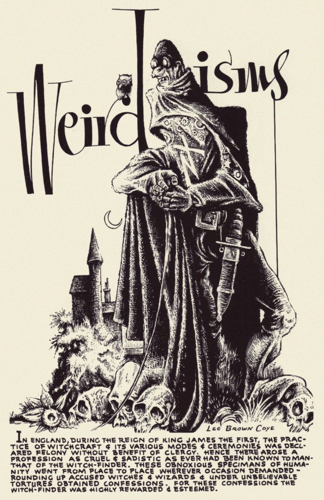
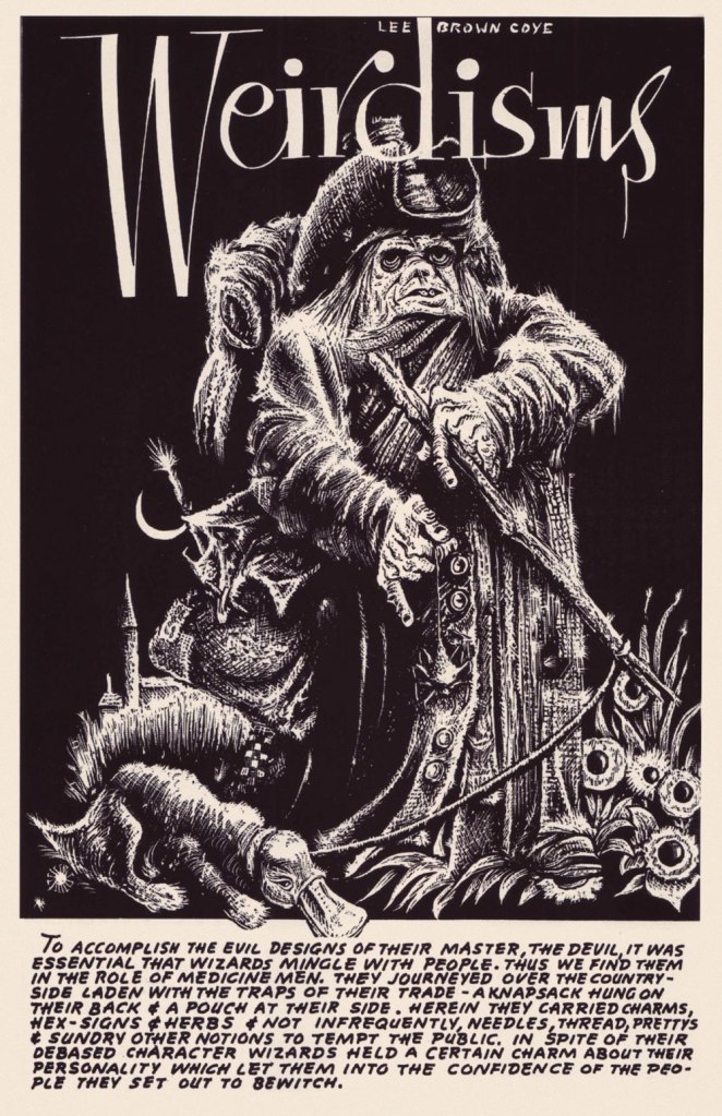
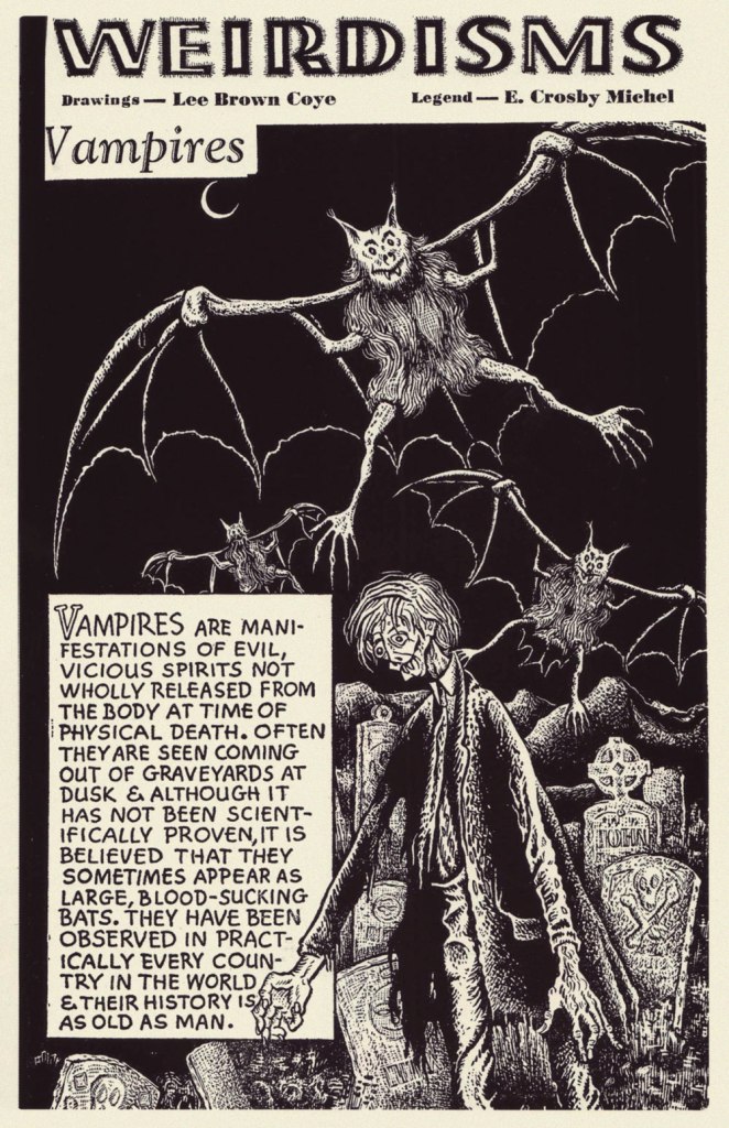
My own favourites are inarguably the true-blue weirdos in the deck, Matt Fox and Lee Brown Coye (who, at five foot ten and 136 pounds when the Army deemed him unfit for service, kiddingly referred to himself as ‘Lean Brown Cow’); while Fox created a fine passel of WT covers, that frankly wasn’t Coye’s forte, though he did produce his share. In truth, the starkness of black and white was his element.
Now, I could go on quite a bit about Mr. Coye, but as I always do in such cases, I’ll sharpen my focus. So focus I shall: on Weirdisms, a semi-regular feature LBC enjoyed in the pulpy pages of Weird Tales for a couple of years, circa the late 1940s — a precursor, if you will, to Warren’s Creepy’s Loathsome Lore a couple of decades later.


Incidentally, I recommend to the interested Luis Ortiz’s fine Arts Unknown: the Life and Art of Lee Brown Coye (Nonstop Press, NY, 2005), as well as Pulp Macabre: The Art of Lee Brown Coye’s Final and Darkest Era (2015, Sacred Bones). Oh, and Matt Fox is finally getting his own deluxe monograph, which I preordered ages ago and is about to emerge, The Chillingly Weird Art of Matt Fox (2023, TwoMorrows); here’s a preview. I trust Rascally Roy Thomas won’t be ordering a copy.
-RG

I have been a fan of Hannes Bok’s work since I first saw it more than fifty years ago, possibly in a comic book fanzine.
Mr. Coye’s work above looks a bit like woodcut art and is perfect for the old pulps!
No new words here but a groovy coincidence: I just borrowed a boxed set of five DVDs with eight Vincent Price movies just to see WITCHFINDER GENERAL, which I am not certain I ever heard of before two weeks ago.
NEAL
LikeLike
Was it perhaps Jan Strnad’s Anomaly no. 2, from 1970?
In these cases, Coye worked in scratchboard, which is pretty close to woodcut, but allows much finer detail. You start from black and scratch in the highlights. Here’s what happened when Coye landed his first Weird Tales assignment: « On his way to his hotel, Lee stopped at a drugstore where he bought some razor blades. Then he found an art supply store where he picked up India ink and scratchboard. The next morning, he returned to Rockefeller Plaza and presented the startled [ art director ] Buchanan with a finished drawing… » The man sure was handy.
And I love your bit of Vincent Price serendipity. Sometimes, after I hear of something for the first time, I suddenly find references to it seemingly everywhere; it just shows, I suppose, how much we filter out the unfamiliar… until we don’t!
LikeLike
I have not heard Jan Strnad’s name in a long time. Could have been Anomaly 2.
We will probably watch WITCHFINDER GENERAL on All Hallow’s Eve.
“Sometimes, after I hear of something for the first time, I suddenly find references to it seemingly everywhere.” Ah, the ol’ Baader-Meinhof phenomenon …
LikeLiked by 1 person
Strnad is a favourite around here, thanks to his excellent collaborations with Dennis Fujitake on Retief and Dalgoda.
If all goes as planned, our own All Hallow’s viewing should be Bubba Ho-Tep. We shall see what we shall see…
I had no idea the “Frequency Illustion” was known as the “Baader-Meinhof phenomenon”! For my part, I first heard of that infamous terrorist cell courtesy of Mr. Luke Haines:
We’re *all* learning new stuff — cheers!
LikeLike
Dennis Fujitake? Another name I haven’t heard in years. Next, you’ll be talking about Grass Geen!
LikeLike
Don’t be surprised if I do! I might feature one of his cool short pieces from Charlton’s often quite bizarre Go-Go (1966-67). Time will tell…
LikeLike
I, too, greatly appreciated Hannes Bok’s artwork. Mr. Coyes’ art seems not unlike Bok, with an admixture of Basil Wolverton. And the Bokishness makes the Wolverton MUCH more approachable.
LikeLike
“Bokishness”? I love it. With your kind accord, a fine addition to my verbal arsenal, Ellen!
LikeLike
I think it was this year that I discovered Lee Brown Coye at this website (https://www.pulpartists.com/Coye.html) with a selection of art that to me screamed Richard Corben influence. I don’t feel that as strongly here, but there are touches like the skulls and the ravens that I think Corben may have lifted. That being said, I think that first Witchfinder illustration with that impossible physiology is the best-looking one here despite not looking very Corben-like at all.
Oh, yeah, I’m sure I would be one of a very few, but I would gladly shell out for a collection of the Marvel Lieber/Fox fantasy stories. The writing is less than stellar, but artwork that can evoke both Basil Woolverton and Dan Clowes at the same time is a sight worth seeing, whatever Roy the Boy may think.
LikeLike
Hi Eric! pulpartists.com is a most outstanding resource on the topic. From what I’ve gathered, Corben was a massive pulp fan, and Coye definitely made it into the mix. And yeah, the first Witchfinder piece is as gorgeous as it is grotesque. Not the contradiction that most might declare it to be. 😉
As for Lieber/Fox, I’m hoping that there’ll be plenty of well-reproduced samples in that imminent Matt Fox monograph. Given that it’s (regrettably) a TwoMorrows publication, I’m sure they’ll devote plenty of space to Silver Age Marvel.
Wolverton and Clowes? Good description! I’m afraid The Rascally One with the Dorky Hair has a very limited perspective on what constitutes ‘good comics’.
LikeLike